Show Me How – Tableau TreeMap
Job-ready Online Courses: Knowledge Awaits – Click to Access!
In this Tableau tutorial, we are going to study about treemap and How to create them with example. So, let us start our learning journey.
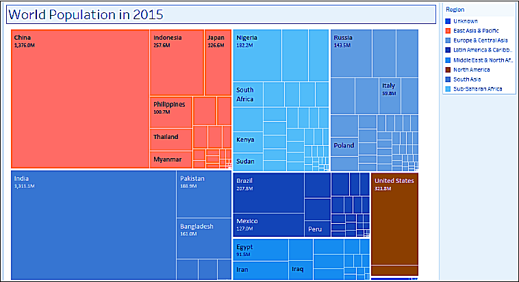
Tableau TreeMap
Treemaps represent part-to-whole and hierarchical relationships using a series of rectangles. The sizes and colors of rectangles will vary based on the values they represent. Typically, the larger rectangles, or rectangles with most concentrated colors, depict the highest values.
Let’s See Tableau Motion Chart in detail
In this recipe, we will represent the 2015 world population as a Tableau treemap.
How to Create TreeMap in Tableau
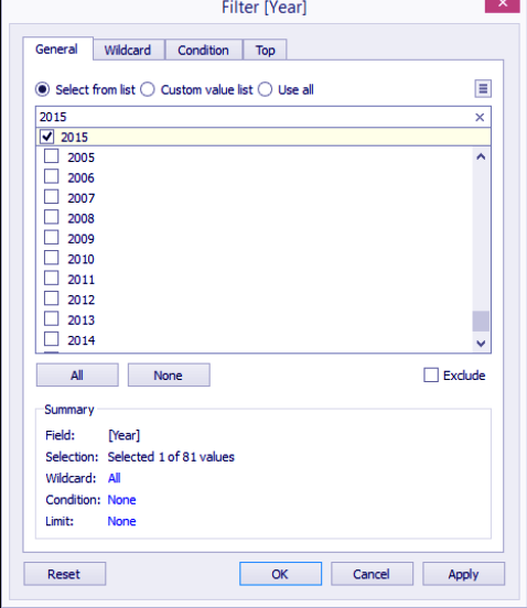
i. From Dimensions, drag Year to the Filter shelf. This will open a new window for the filtering options.
ii. Under the General tab, while Select from list radio button option is selected, type 2015 in the search text box to find this value from the list of years, and check it.
iii. From Measures, drag Population to Size in the Marks card.
iv. From Dimensions, drag Region to Color in the Marks card.
v. From Dimensions, drag Country to Text in the Marks card.
Read about Tableau Bubble Chart in detail
vi. From Measures, drag Population to Text in the Marks card.
vii. Click on the drop-down arrow beside the color legend card and choose Edit colors….
viii. Choose the Color Blind 10 palette and click on Assign Palette. Click on OK when done.
ix. Click on Label on the Marks card, and select the ellipsis button under Label Appearance to modify the style of the text.
Read Tableau Donut Chart in detail
x. Adjust the label so Country is shown with a larger font, and the population appears underneath it with a smaller font.
Conclusion
In this tutorial, we learned about Tableau Treemap and how to create it with example.
If you are Happy with DataFlair, do not forget to make us happy with your positive feedback on Google


