Tableau vs Qlik Sense vs Power BI – Best BI Tool for Big Data Visualization
Expert-led Courses: Transform Your Career – Enroll Now
Big data is the gold mine for businesses of all kinds. Every organization wants the best data analysis and visualization tool for their Big Data. In this article, we will try to give you all the information about the best BI tool for Big Data Visualization. Here, we will learn the difference between Tableau vs Qlik Sense vs Power BI.
So, are you ready to explore Top BI Tool for Big Data Visualization?
BI Tools for Big Data Visualization
In today’s time, business relies greatly on big data and the information encrypted in it to be able to comprehend current trends and business scenarios in order to make wise and informed decisions in the future. Hence, this makes having a good business intelligence tool to analyze and visualize big data imperative.
It is without a doubt that we have quite a few BI tools that aim at big data visualization in the market presently. Most of them serve a particular purpose and it really comes down to your requirements and use-case that which of such tools are going to suit you the best. However, we are here in our quest to find the best general-purpose BI tool for big data visualization and analysis.
Do you know the current trend of Big data in the IT Industry?
What is needed in a good tool?
Before we get into the dichotomy of individual BI tools, we must understand what are the basic needs for any big data visualization tool to be good.
- Every data visualization tool is expected to transform unfathomable data into eye-pleasing charts and graphs and let them convey the hidden message in the data to the business users and analysts.
- Rather, a tool must also have the capability to analyze, process and present the data in a digestible manner.
- The tool must be efficient in creating understandable data reports and dashboards by assimilating and aggregating massive and complex data from different sources.
- The tool must be so designed that every user, regardless of their background and skill set can learn to use it like any other software or application used daily.
- A tool must focus on being an interactive self-service analytics, development, and visualization tool. This is unlike the traditional enterprise-wide, IT-developed software which can only be used by a small group of technical users. A tool should give entry-level users the capability to use it efficiently and gain insights into big data.
- Filtering, processing, and slicing-dicing of big data should be easy.
- A tool must provide enough features for collaboration and insight sharing within and outside the organization.
- The visualizations must be plenty and intuitive for any technical or non-technical user to understand it and draw meaningful insights from it.
Recommended reading – Why should you learn Big Data?
Top BI Tools for Big Data Visualization
Top three Business Intelligence tools for big data visualizations are Tableau, Qlik Sense and Microsoft Power BI. Let us understand what role each plays in big data visualization and how good is it with big data. Also, all three tools are declared to be the leading BI tools according to the Gartner’s Magic Quadrant for Business Intelligence and Analytics Platform (2018).
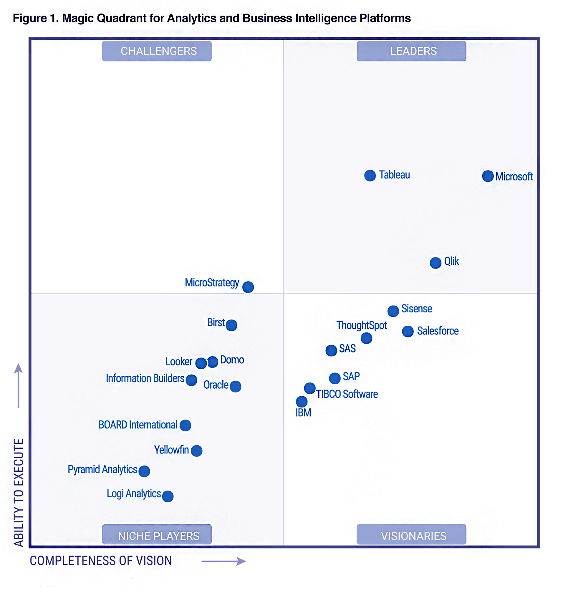
Gartner’s Magic Quadrant for Business Intelligence and Analytics Platform (2018)
i. What is Tableau?
Tableau is the most popular and leading BI tool presently. It has the best visualization capabilities with a perfect front-end graphical UI. It also has some built-in analytics modules which can be used directly by the user on their data. Also, it gives its users the ability to develop app objects, customize dynamic visuals, and distribute reports and documents to other users via the web.
ii. What is Qlik Sense?
Qlik Sense is a simple and interactive data visualization tool that enables users to import and aggregate data from varied big data sources. They can further use the data visualization tools of the software to shape raw data into meaningful information. Qlik also claims QlikView as a potential contender as an efficient big data tool as it can also capable of integrating with multiple data sources at a time.
iii. What is Microsoft Power BI?
Microsoft Power BI is Microsoft’s very own data visualization tool. It becomes better than the rest in some ways as it is compatible best with Microsoft Azure and Microsoft cloud environment. Also, users can connect to Excel to import data and create personalized data dashboards.
Tableau vs Qlik Sense vs Power BI
In the fight of best BI tools for Big data Visualization, we will discuss the difference between Power BI, Tableau and Qlik Sense:
Tableau vs Qlik Sense vs Power BI
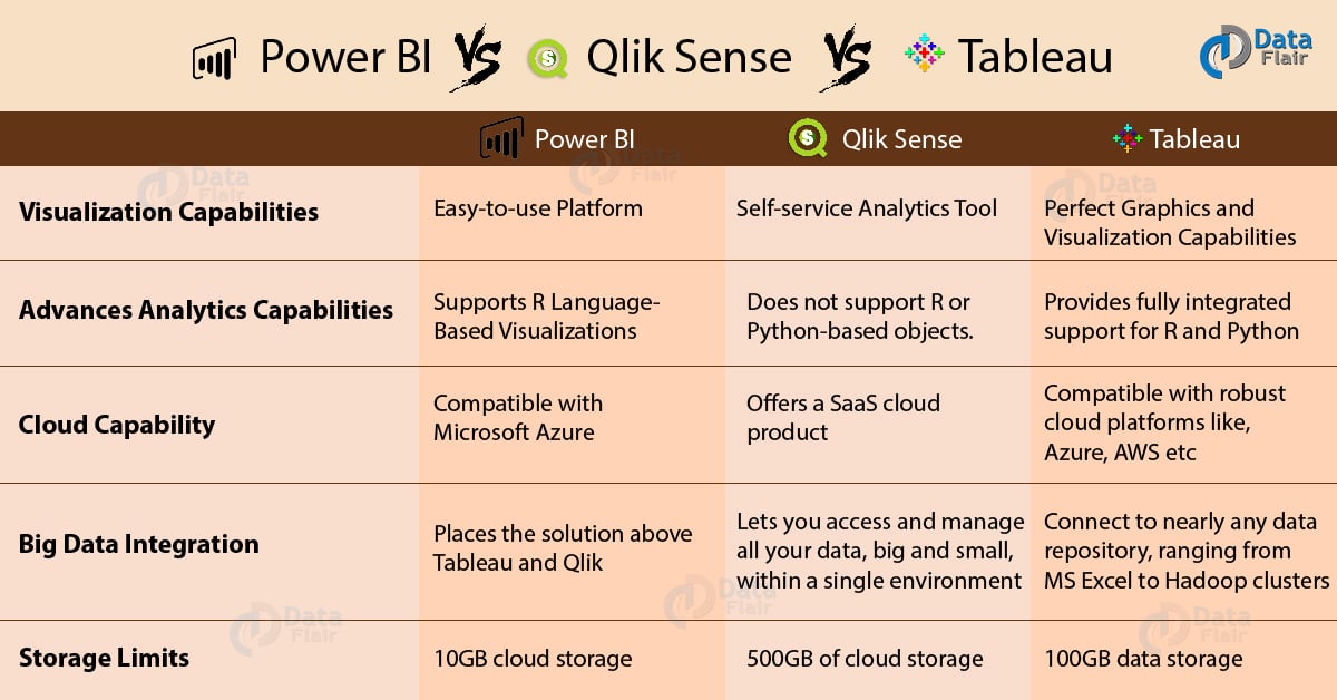
i. Visualization Capabilities
Power BI: It is an easy-to-use platform that enables users to import data from varied sources and use it with charts, graphs and tables to visualize it. It has been regarded as “the simplest to use tool among the leading BI vendors” by Gartner’s Magic Quadrant for Business Intelligence and Analytics Platform (2018). It supports data integration from various sources like Hadoop, on-premise files, or cloud-based sources.
Qlik Sense: It is a self-service analytics tool with an in-memory data storage engine. It provides good visualizations which are dynamic due to the in-memory engine. Data is linked to creating associations which updates the visualizations as soon as data behind them is updated at the source. Meanwhile, users can keep on exploring and working on the dashboard.
Tableau: Tableau is known for its perfect graphics and visualization capabilities. Along with this, it is easy-to-use software. It enables data integration from varied sources. Also, it can take data in-memory or access it directly from the source if files are large to accommodate in-memory. It was regarded as “Most attractive and intuitive visualization tool” by Gartner’s Magic Quadrant for Business Intelligence and Analytics Platform (2018).
ii. Advances Analytics Capabilities
Power BI: It supports R language-based visualizations. Also, it provides advanced features such as forecasting, clustering and decision trees.
Qlik Sense: It does not support R or Python-based objects. However, Qlik promises to provide language support in the coming versions. You can use features such as regressions, clustering, and predictive analytics via API connections to third-party apps.
Tableau: It provides fully integrated support for R and Python. Also, it has in-built tools for clustering and forecasting.
iii. Cloud Capability
Power BI: It is compatible with Microsoft Azure which offers cloud-software called “Cloud-first”. If you wish to leverage the cloud capabilities on a desktop, you need to have a cloud account in order to share insights and visualizations on the cloud.
Qlik Sense: It offers a SaaS cloud product. Although, users prefer the server version.
Tableau: Tableau is compatible with robust cloud platforms such as Microsoft Azure, Amazon Web Services etc. You can use Tableau’s cloud capabilities either through a Tableau managed cloud system or through a third-party cloud platform.
iv. Pricing
Power BI: Microsoft Power BI services cost about $9.99 per user per month.
Qlik Sense: For the enterprise version, the price is $15,000 for one token. It grants 10 timed login passes and unlimited use for one user. For the cloud version, the prices are $20 for a single user and then $25 per user for multiple users.
Tableau: Tableau charges for different services are,
- For Tableau Desktop Personal $35 user/month.
- For Tableau Desktop Professional $70user/month.
- Tableau Server $35 user/month.
- Tableau Online $42 user/month.
v. Storage Limits
Power BI: The subscription limits allow total storage of 10GB cloud storage for data. Additional charges are applied if you want to expand the data storage capacity.
Qlik Sense: The Qlik Sense Cloud Business subscription limits allow 500GB of cloud storage of data per workgroup.
Tableau: The online subscription offers a total of 100GB data storage on the cloud.
Other BI tools for Big Data Visualization
Along with the three big players that we just discussed, there is a lot of other good big software in the market. We have provided some names of highly-rated big data software in the list below (2019).
- SAP HANA
- Sisense
- Google Charts
- Domo
- Cluvio
- SPSS by IBM
- Phocas
- Statistica by DELL
- Datorama
So, this was all about BI Tool for Big Data Visualization. Hope, you liked our explanation.
Conclusion
Thus, declaring one tool as the best for big data visualization is a tough task as all of them have something unique to offer and are developed to serve a particular purpose. However, we have managed to come up with three potential tools which are better than the others when it comes to big data visualization. We hope the explanation provided by us will help you in deciding the best BI tool serving your needs best.
Furthermore, if you have any query, feel free to share with us. Surely, we will get back to you!
Did you like this article? If Yes, please give DataFlair 5 Stars on Google


SAP HANA is not a BI Tool, wrong information
if i want to choose one bi tool as a career ,which one would u prefer