Tableau Bubble Chart – Don’t trouble just use tableau bubble
Expert-led Courses: Transform Your Career – Enroll Now
In this Tableau Tutorial, we are going to learn about an interesting chart that is a bubble chart or packed bubble chart. Here, we will learn how to create a bubble chart in Tableau in a stepwise manner. You can create your first Tableau bubble chart with us on your own device. All you need, as of now is a sample data set and Tableau software in your device.
What is Bubble Chart?
A bubble chart is used to show data in bubbles or circles with varying sizes and according to a color scheme. A bubble chart has the ability to show multiple variables through its design. Dimension field values are represented by individual bubbles and measure field values that define the size and color of the bubble. Thus, we can analyze a plot with at least three variables that is one dimension and two measure fields.
So, a bubble chart or packed bubble chart in Tableau is a simple yet detailed and insightful visual that you can easily learn to create by the steps given in the section below.
Time to visualize your data to the fullest with tableau bullet.
How to Create Bubble Chart in Tableau?
Follow the steps given below to make a packed bubble chart in tableau:
STEP 1: Add Dimension Field
To begin with, we add a dimension field, Category into the Columns section.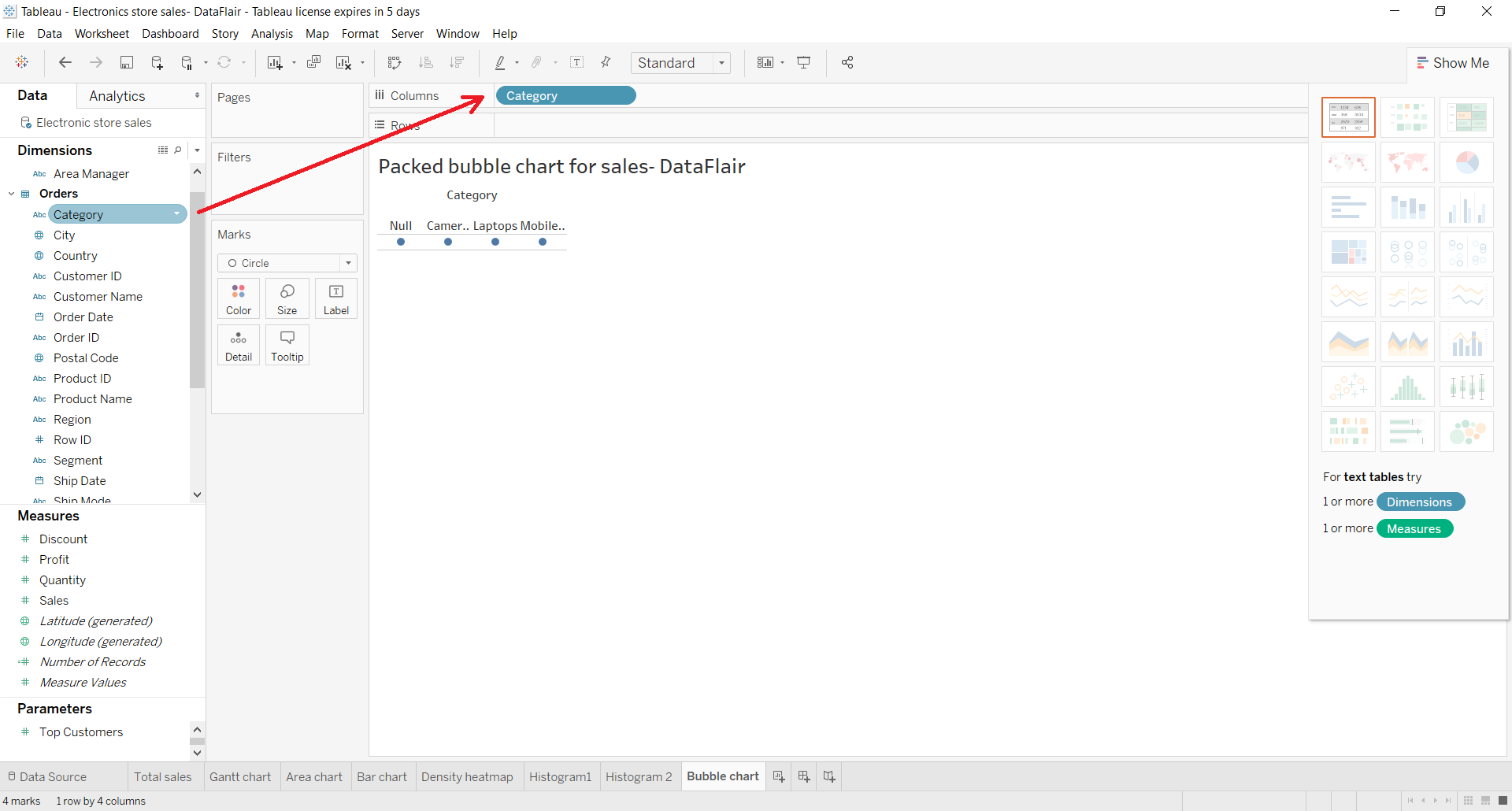
STEP 2: Add Measure Field
Next, we add a measure field, Sales and keep its aggregation type as SUM.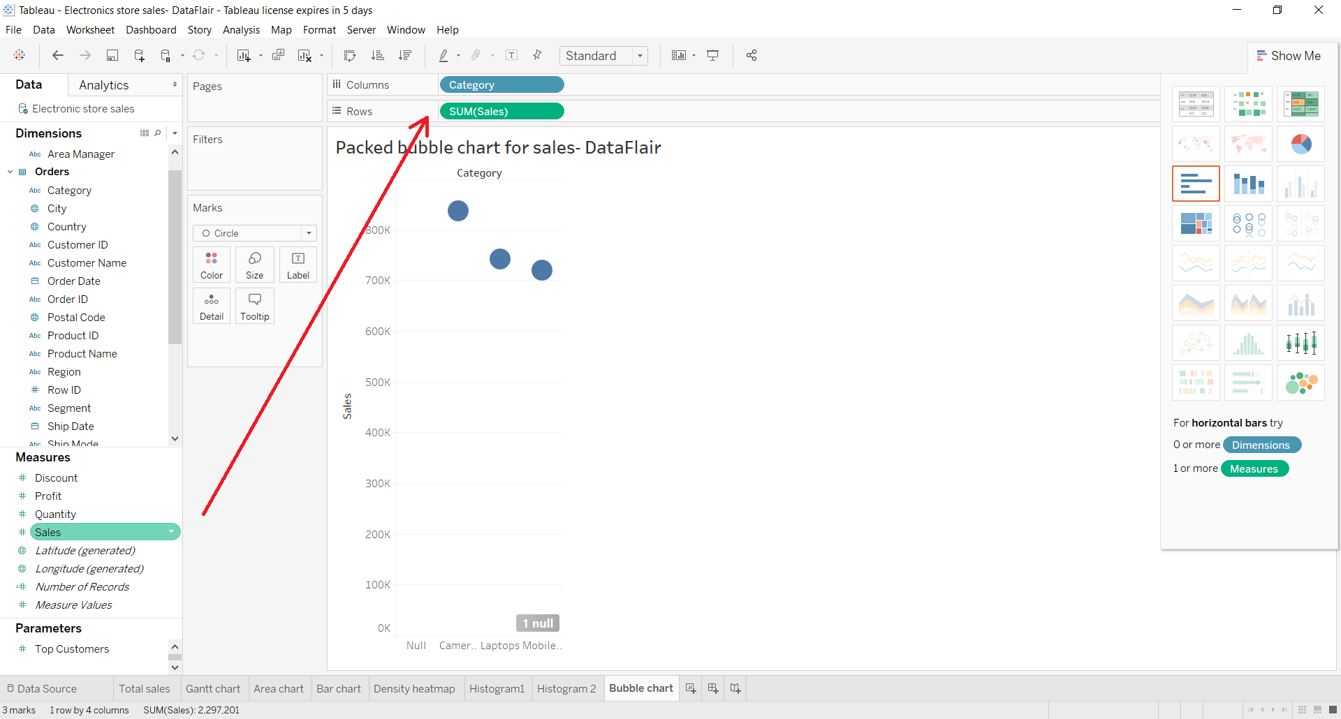
STEP 3: Select Packed Bubble Option
Now, we select the Packed bubbles option from the visualization pane. Click on Show Me option to access the visualization pane.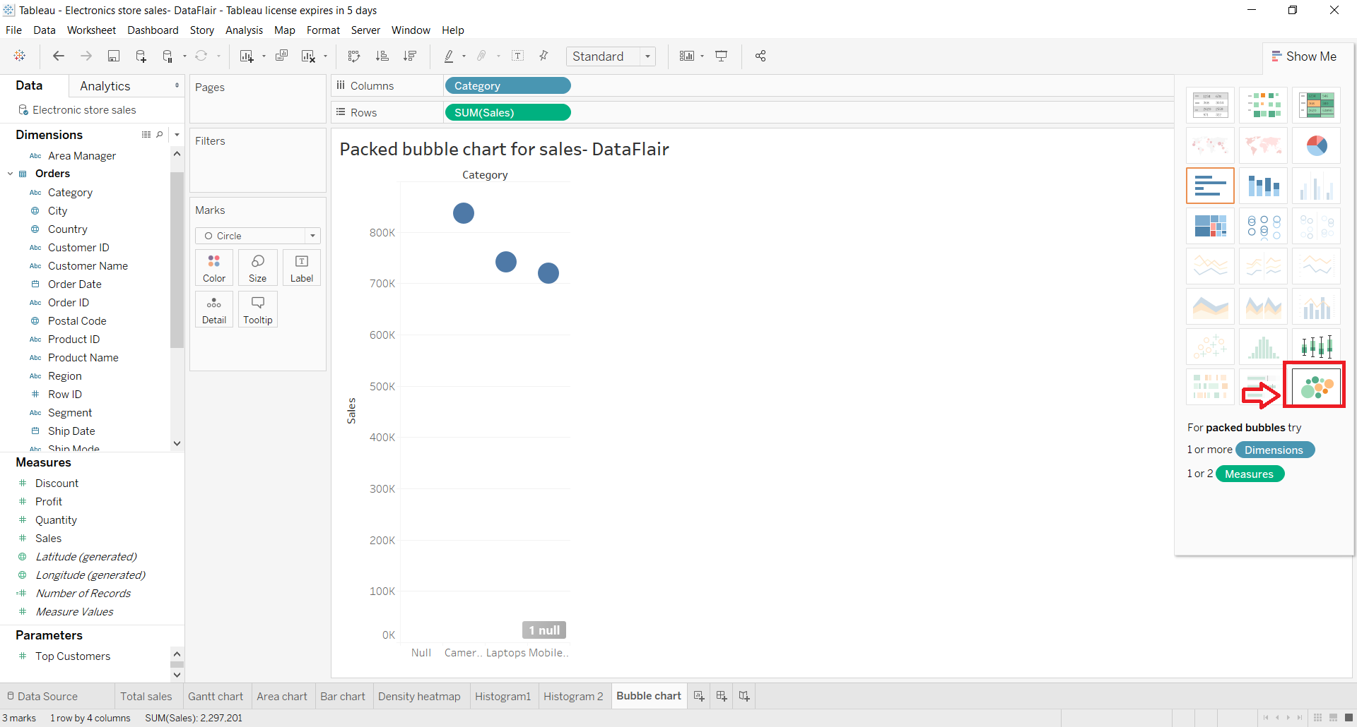
This creates a bubble chart having bubbles of different sizes and colors (according to color gradient). Here, the size of the bubble is proportionate to the value that the bubble represents and its color is according to where the field value falls between the value range.
As you can see in the screenshot below, the bubble chart shows category wise sales. The color gradient shows the range of profits from lowest to highest.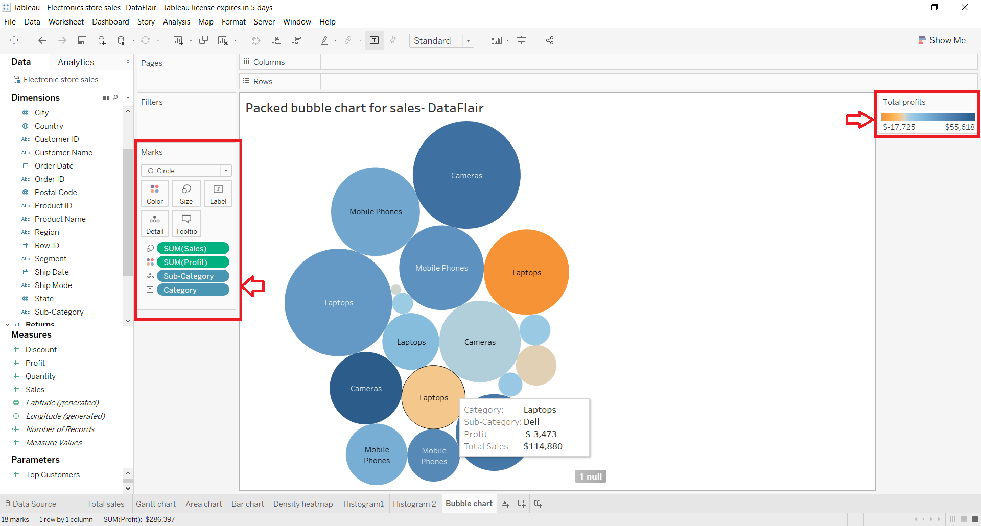
Also, you can see all the fields used to create this bubble chart in the Marks section. We can drag and drop fields of our choice from Dimensions and Measure sections into different cards such as Color, Label, Detail, Tooltip, etc. To change the color scheme, right-click on Color card and use the options given.
STEP 4: Edit and Format Bubble Chart
We can also format the bubble chart by right-clicking on it and exploring the format panel.
The format pane appears on the left from where we can edit and format almost every aspect of the chart.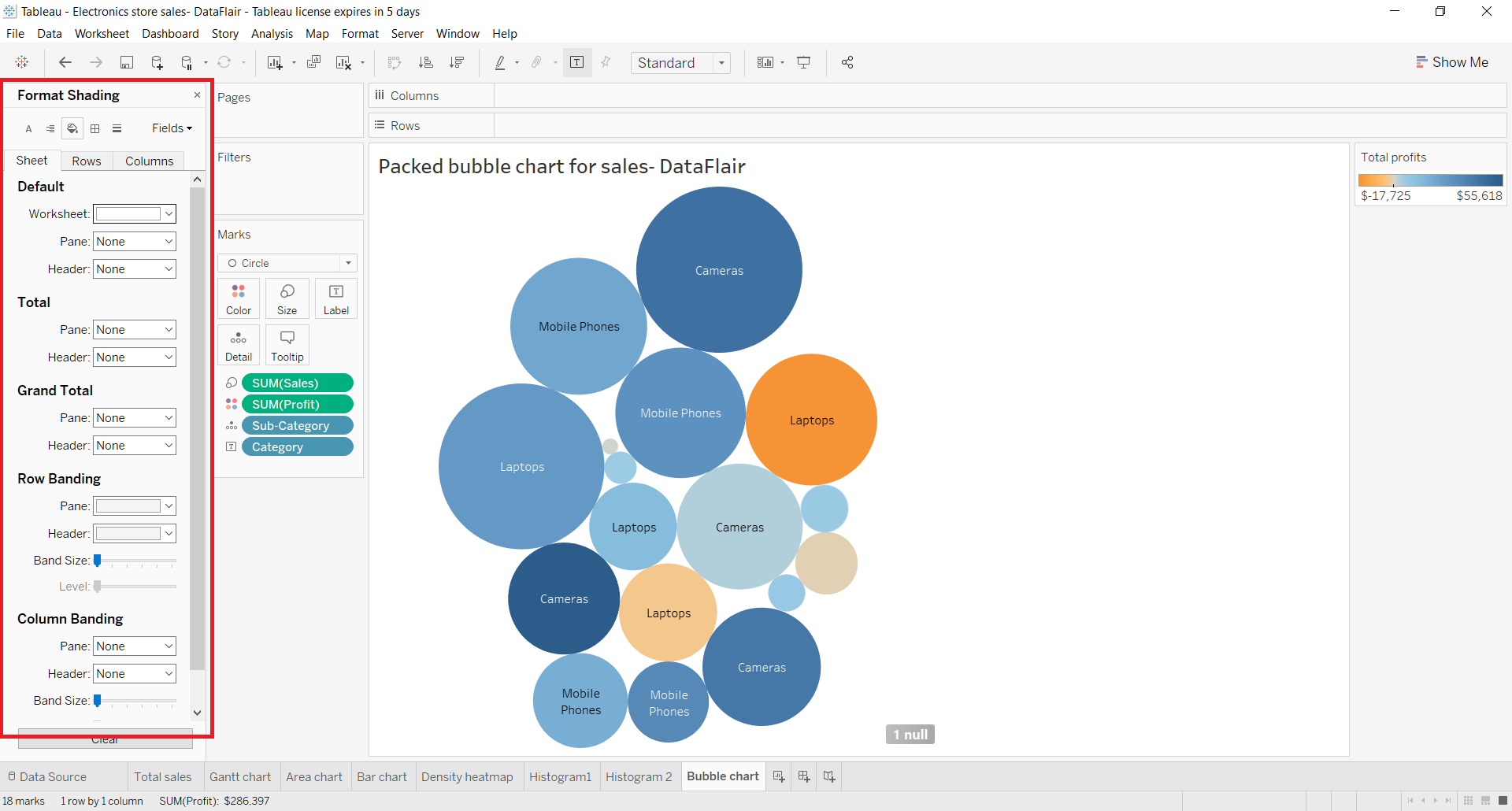
STEP 5: Final Representation of Tableau Bubble Chart
In this way, we create a bubble chart, also called a packed bubble chart in Tableau. The bubble chart shown below shows total sales and profits for each category and sub-category having their size proportional to the values and color as per the color gradient.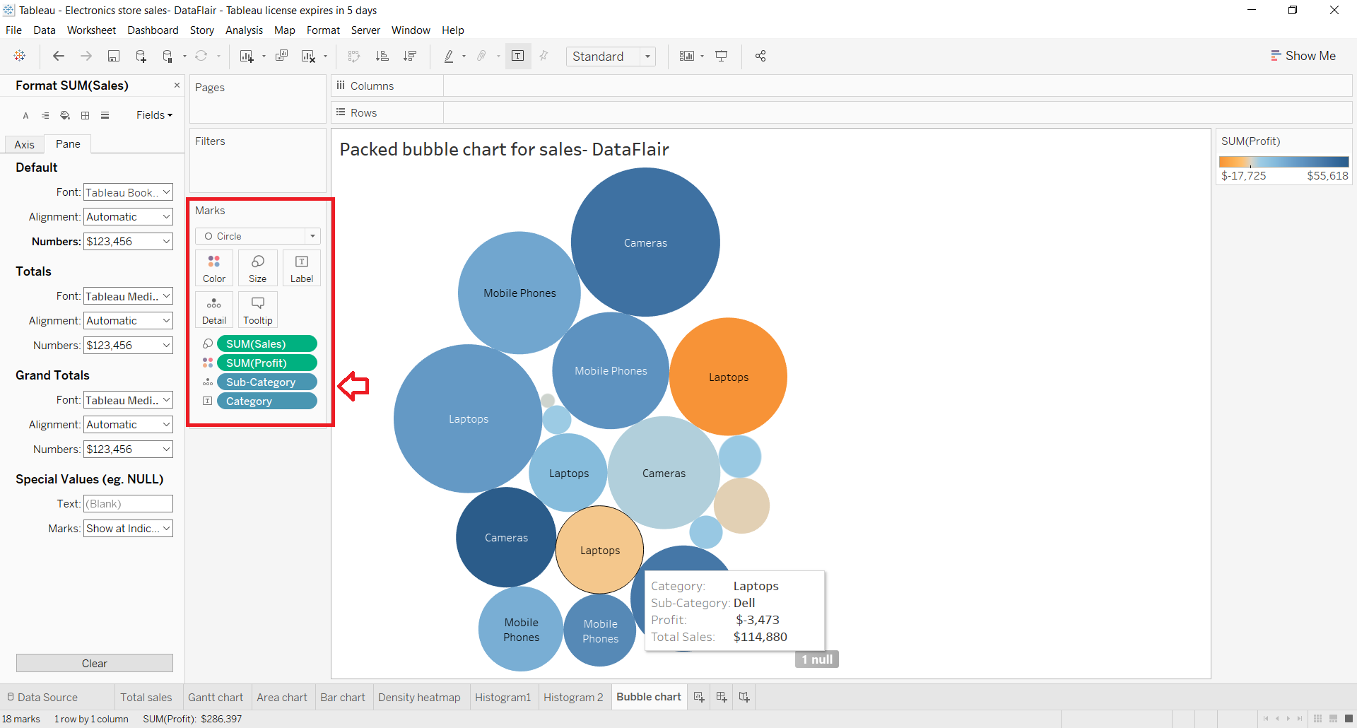
There is another kind of bubble that we made here that shows the total sales value for each subcategory or brand. Although, if you pay attention, you can see that the color scheming is according to the three categories; Cameras, Laptops and Mobile Phones.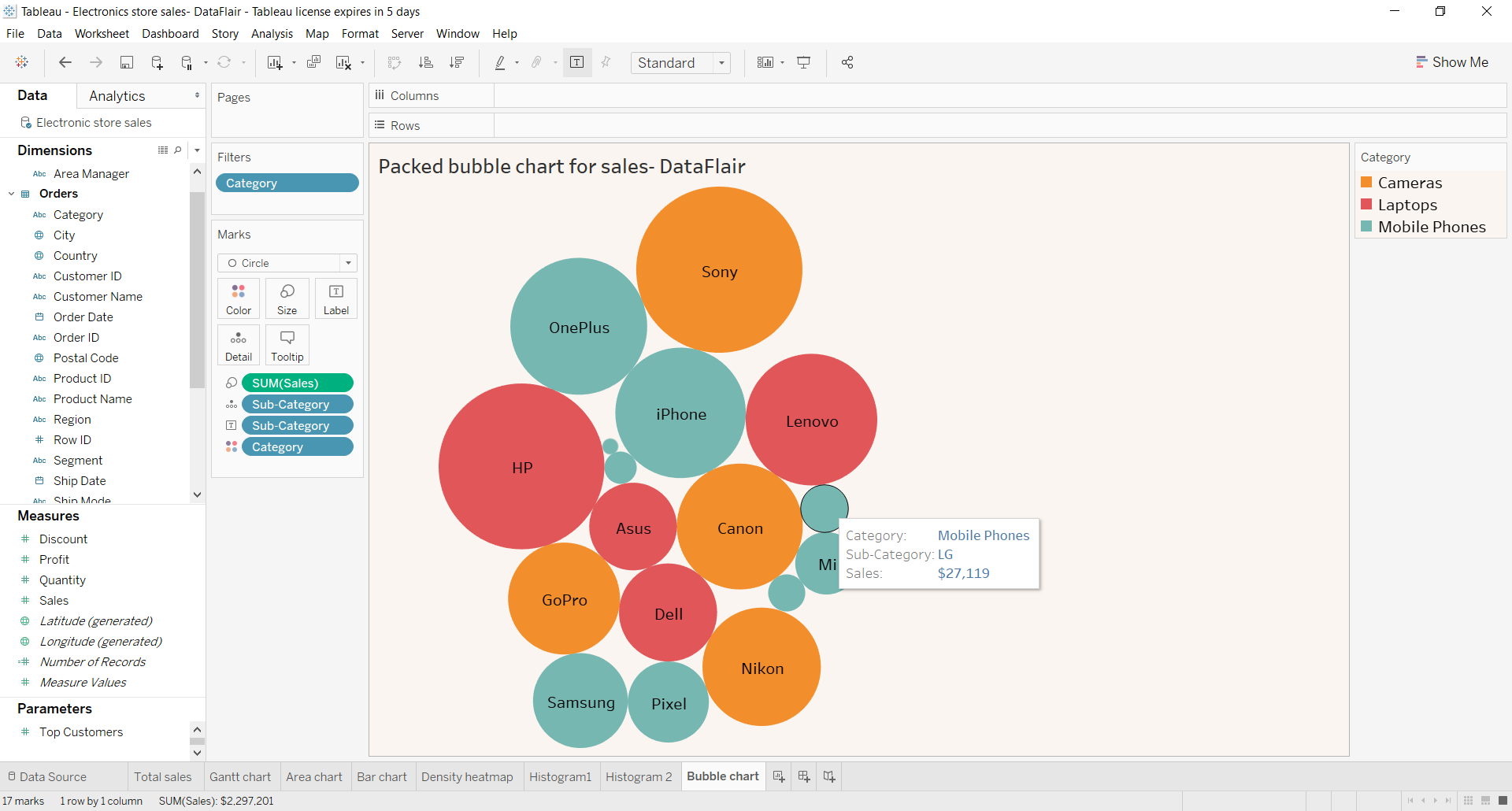
Sort in Tableau Bubble Chart
Tableau also gives us the option to sort the bubbles in ascending or descending order of the concerning data values. You can sort in ascending or descending manner by clicking on the two sort options present on the toolbar.
Format Text in Tableau Bubble Chart
We can also format the text of the data labels that we see on bubbles. To format the text, click on the Labels card in the Marks section. There, you will find several formatting options such as Text, Font, Alignment and Marks to Label, etc.
To edit the data labels, click on the … icon and add new fields with their names to show as data labels on bubbles. Also, you can explore a list of options of available fonts, set the alignment as per your liking and set other options as well.
Summary
This concludes our tutorial on Tableau bubble charts. Here, we learned the definition and use of a bubble chart in analysis and then saw how to create a bubble chart in Tableau.
Get drowned in the ocean of Tableau Motion.
We hope that this article was helpful and easy to understand. If you have any problems or queries in any of the steps you can mention them in the comment section below.
If you are Happy with DataFlair, do not forget to make us happy with your positive feedback on Google


