Bullet Chart in Tableau – Utilize your data to fullest with tableau bullet
Placement-ready Courses: Enroll Now, Thank us Later!
In this tutorial, we are going to learn about bullet chart in Tableau. The bullet charts are an advance type visualizations which provide detailed information on the dataset. Here, we are going to learn the basics of a bullet chart and see how to create them in Tableau.
What is Bullet Chart?
A bullet chart is an advanced sort of bar chart where we can compare two measures on a single bar. In a bullet chart, the primary measure is shown by the main dark bar on the front and the secondary measure is shown beneath the main bar as a reference line. Further, we can divide the reference line into segments like 50%, 80% and then 100%.
Thus, we can say that bullet charts are one of the most informative charts occupying less space and accommodating more detail and data. Let us suppose that we want to compare two measures, actual sales and expected sales. So here, our primary measure meaning the dark line will be actual sales and the reference line will be expected sales.
Using a bullet chart, we can easily have these two measures on a single bar of bullet chart. Then we can see whether or not our actual sales are lagging, equaling or exceeding the expected sales value using the visualization.
Similarly, we can use a bullet chart as a gauge or measure visualization where we can compare measures with respect to each other and therefore analyze the progress of a measure.
Get to know about Tableau Bar Chart in detail.
How to Create Bullet Chart in Tableau?
Follow the steps given below to create a bullet chart in Tableau. We would suggest you to have your dataset uploaded in Tableau before you start making this chart. We are using a dataset of electronics store sales.
Step 1:
Open a blank/new sheet in a Tableau workbook with your dataset uploaded. We select one dimension field; Sub-category and two measure fields; Profit and Sales from the list of fields. Then, we select the bullet graph option from the visualization pane. Click on Show Me option to access the visualization pane.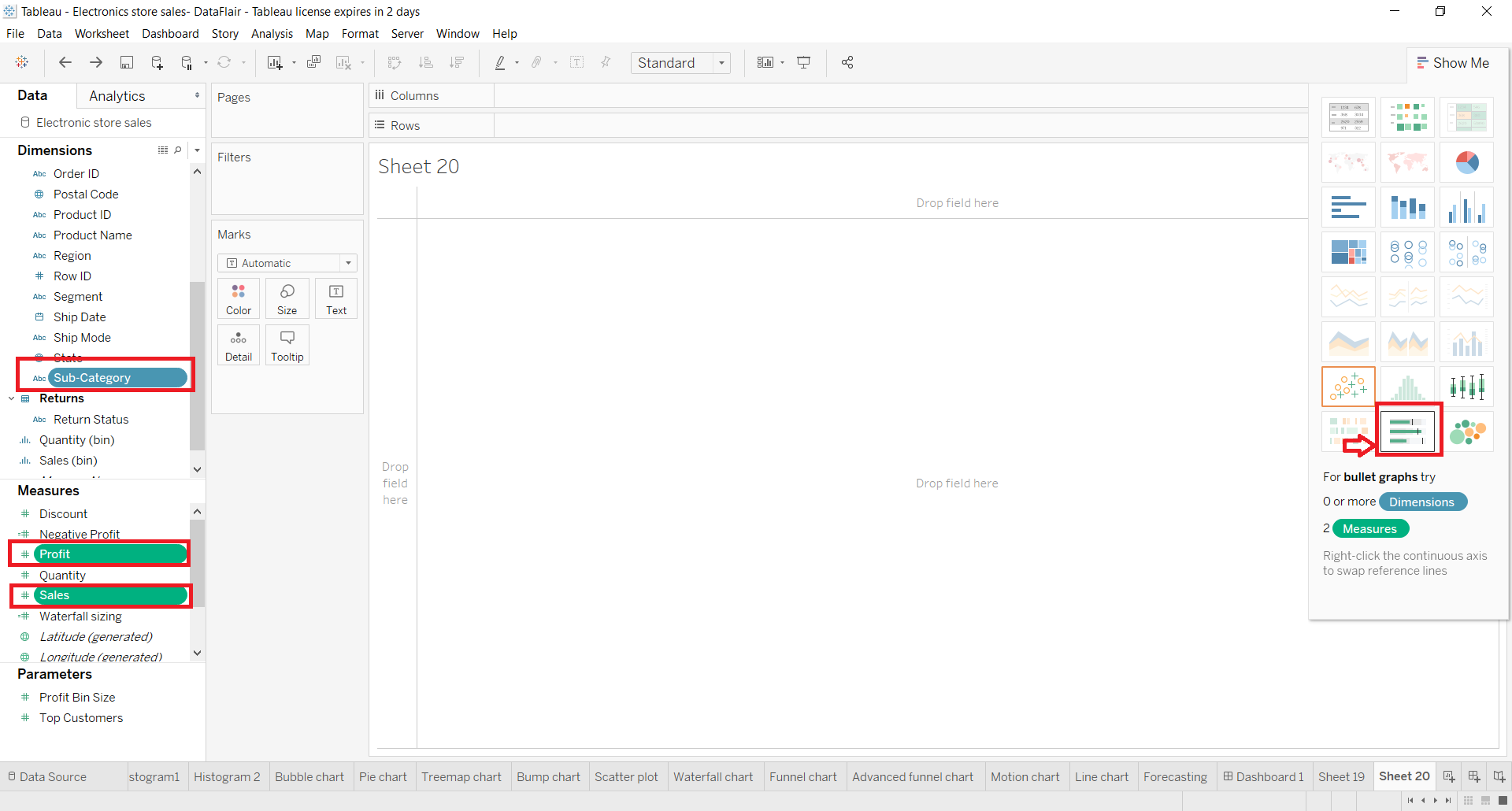
Step 2:
Now, we will get a bullet chart which will have bars with grey lines in the background and blue lines on top of that. The grey lines are known as reference lines and the blue ones are the actual lines. So, from our two selected measures, one will become the reference line and another will become the main line (blue). The reference line field is the one that is shown on the Detail card of the Marks section.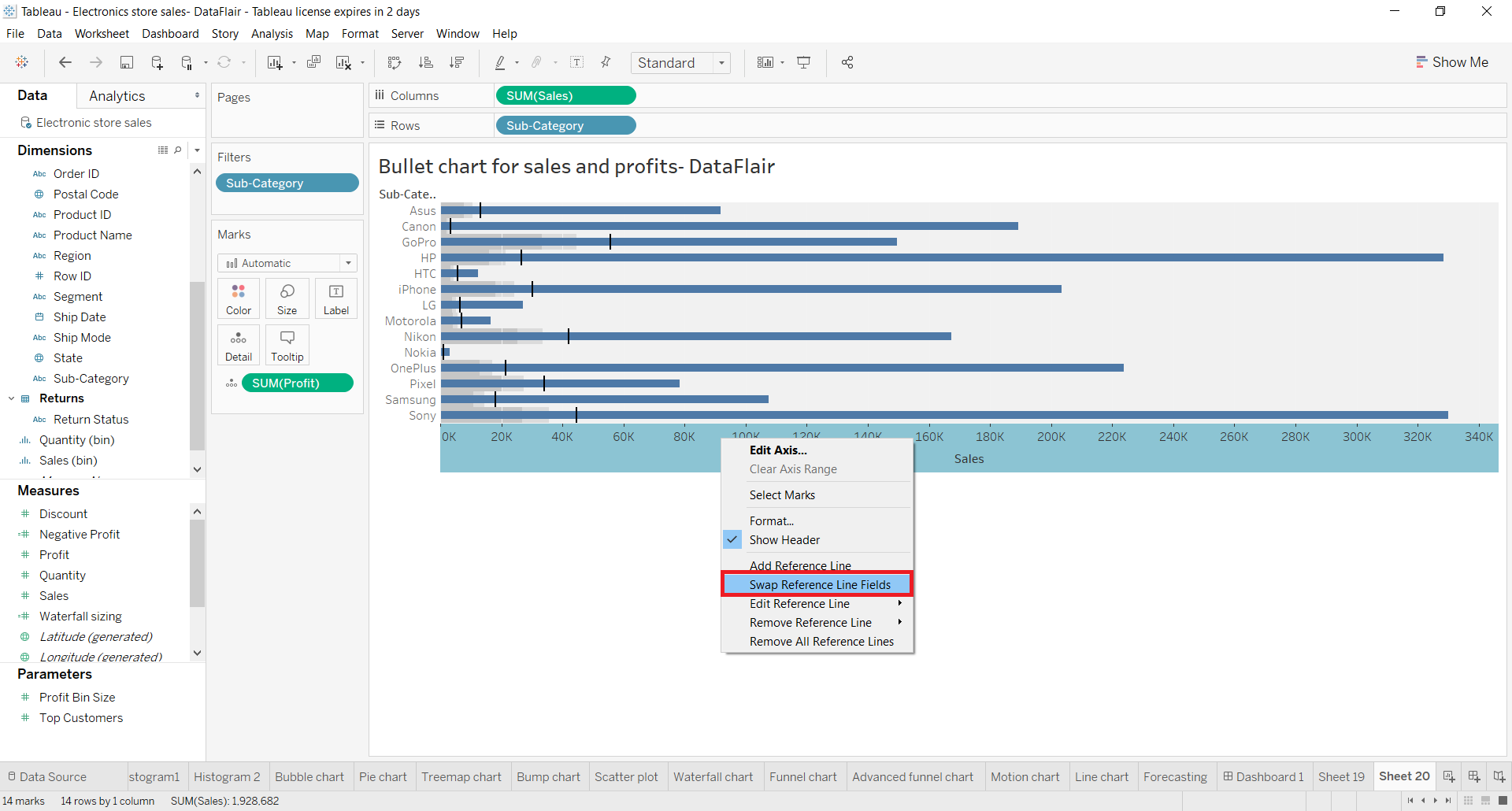
We can change or swap the two fields with each other. To make the reference line field as the main line field, right-click on the x-axis and select Swap Reference Line Fields option. Also, we can change the view type from Standard to Entire View so that the chart covers the entire sheet.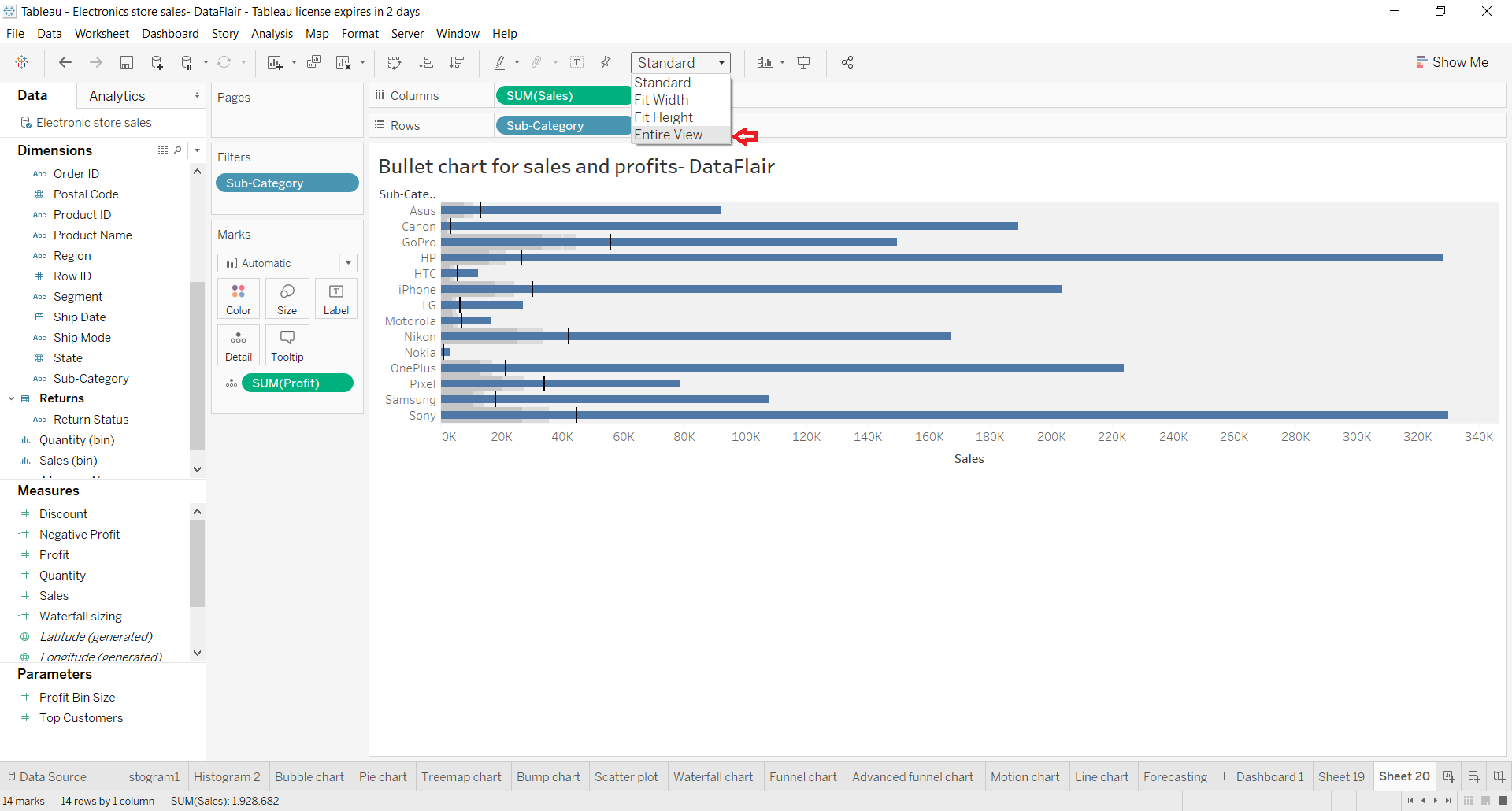
Step 3:
Next, we set the aggregation type for our line. We select it as Average. You can also set the bar type, scope, line, label, tooltip, formatting of the bars and lines, etc from the editing box in tableau. To access this editing box, right-click on the x-axis and select the Edit Axis option.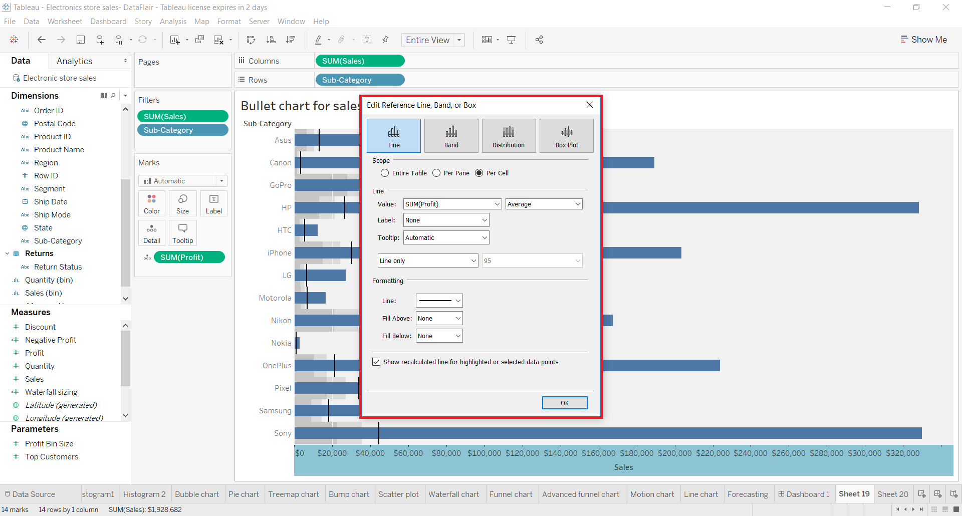
Step 4:
Now, we edit the reference line to put percentage-wise segments of average profit values on the reference line. To do this, we right-click on the Sales axis and select the Edit Reference Line option. Then, we select 50%,80% of the Average Profit.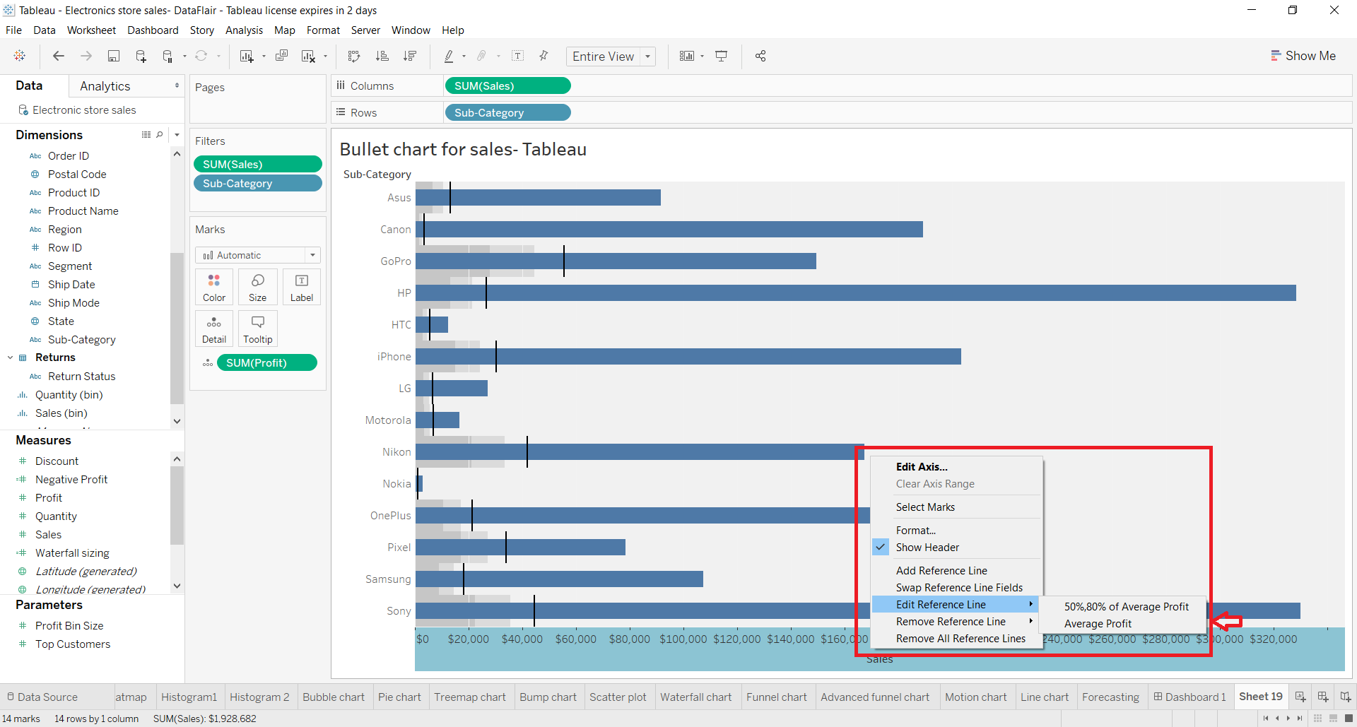
This opens a dialog box from where you can edit and format the computations of the reference line.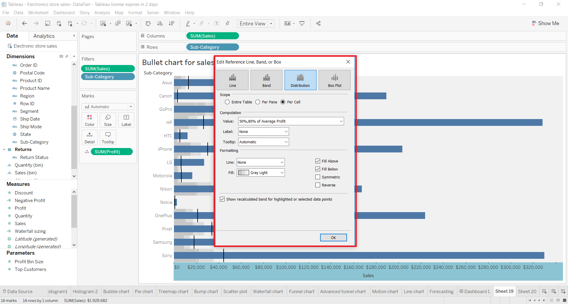
By selecting the percent average option, the reference line divides itself into three segments. When you hover the cursor over the reference line, you will first see a 50% of Average Profit mark with the value.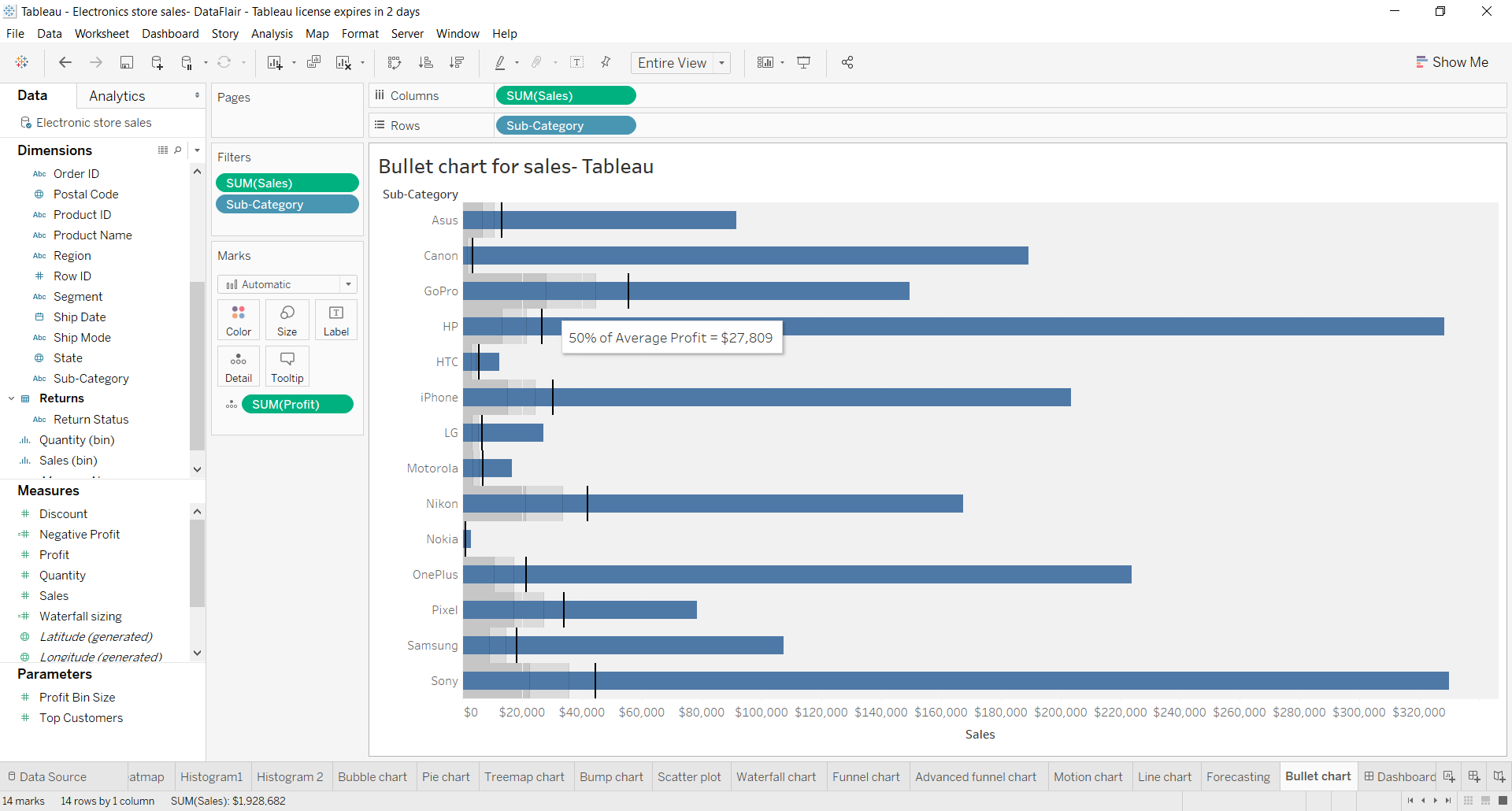
Further ahead on the reference line, you will find 80% of the Average Profit mark with the value. In this way, we can see the main values on the blue bar and reference, more detailed values on the reference line.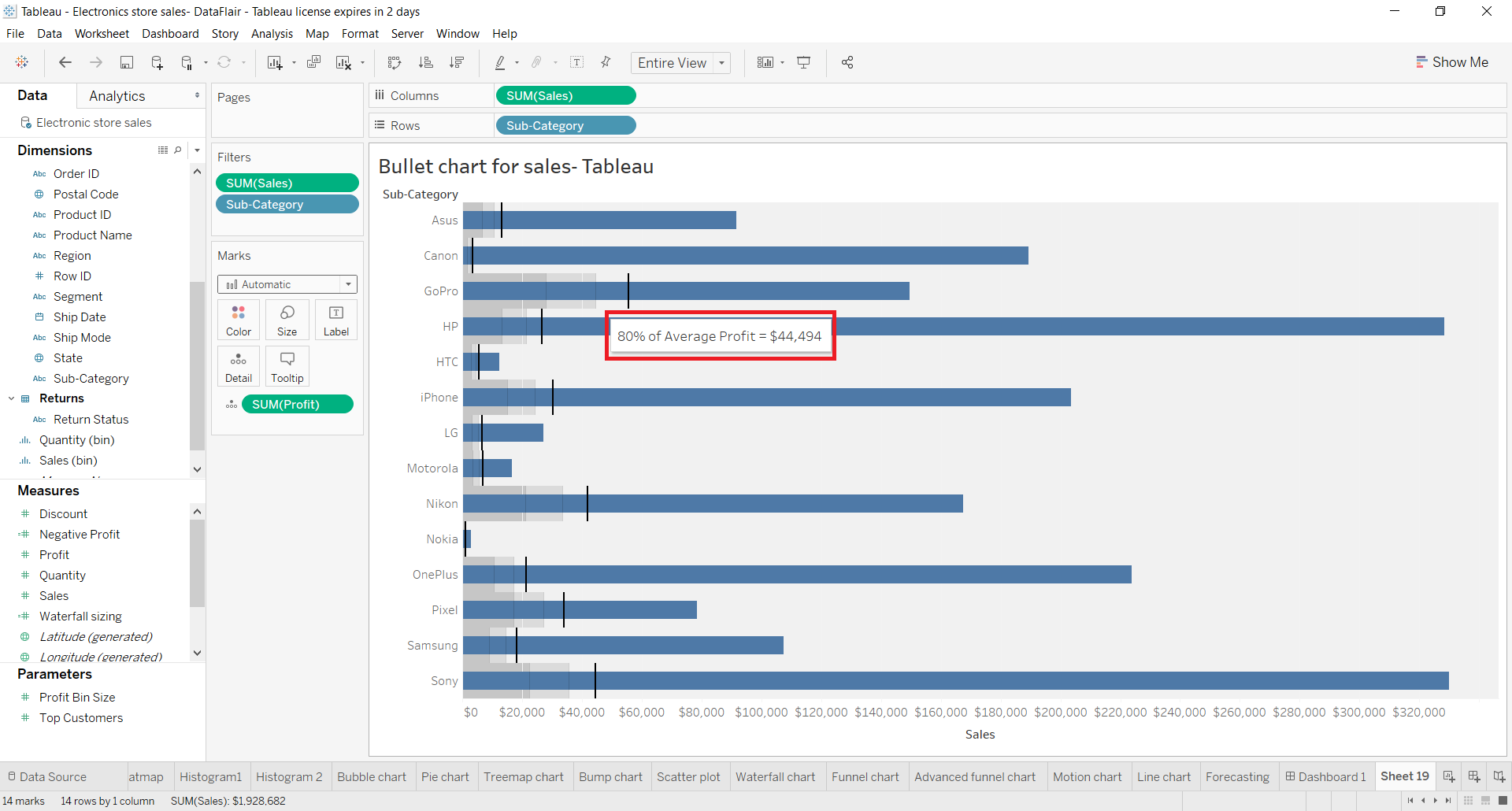
Step 5:
Thus, our final bullet chart showing sales and profit values for each electronics sub-category or brand is ready. When you hover over any of the individual bars, you will get more information regarding it such as sub-category name, total profit value for the sub-category and total sales for the sub-category.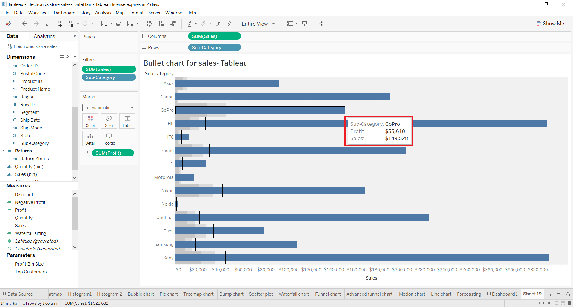
Summary
This concludes our tutorial on bullet chart in Tableau. Here, we learned how to create a bullet chart in a step-by-step process and saw what is a bullet chart.
Don’t Waste time!! Scrabble the insights of your data with Tableau Bubble.
We hope our explanation on the tableau bullet chart proved helpful for you and enabled you to create bullet charts on your own. However, if you have any queries, mention them in the comment section. We will be happy to help you!
Your 15 seconds will encourage us to work even harder
Please share your happy experience on Google


