Tableau Pareto Chart – Create Pareto Chart in Tableau
Job-ready Online Courses: Click, Learn, Succeed, Start Now!
In our previous session, we saw Sparkline Tableau chart. In this Tableau tutorial, we are going to study what is Tableau Pareto Chart. Moreover, we will learn how to create a Pareto Chart in Tableau with an example.
So, let us start.
What is Pareto Chart in Tableau?
Tableau Pareto Chart, named after Vilfredo Pareto (say that 20 times quick!) is an outline that portrays the marvel where 80% of the yield in a given circumstance or framework is delivered by 20% of the information. This extraordinary proportion isn’t generally present, however, at times, it is shockingly precise.
The accompanying demonstrates to make a Pareto outline in Tableau 8.1 utilizing the example information source that boats with the product (Sample superstore Sales.xls). The initial step to building a Pareto outline is choosing a measurement and a measure. For this situation, I am utilizing Customer Name and the total of Profit.
Creating Bar Chat in Decreasing Order?
For creating Tableau Pareto Chart first we have to create a bar chart.
Refer our old article How to Create Bar Chart in Tableau
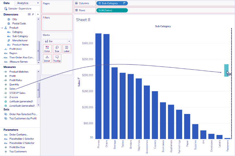
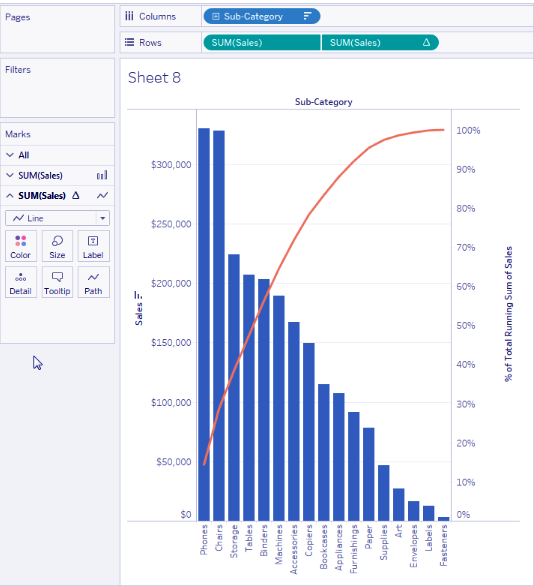
a. Create a bar graph that shows Sales by Sub-Category in downward-sloping order.
i. Connect to the Sample – Superstore knowledge supply.
ii. From the size space of the information pane, drag Sub-Category to Columns.
iii. From the Measures space of the information pane, drag Sales to Rows.
iv. Click Sub-Category on Columns and select kind.
In the kind panel, do the following:
i. Under the kind order, select downward-sloping.
ii. Under kind by, select Field.
iii. Leave all alternative values unchanged, as well as Sales because the chosen field and add because of the chosen aggregation.
iv. Click alright to exit the type panel.
Products area unit currently sorted from highest sales to lowest.
Read about how can we create Bump Charts Tableau
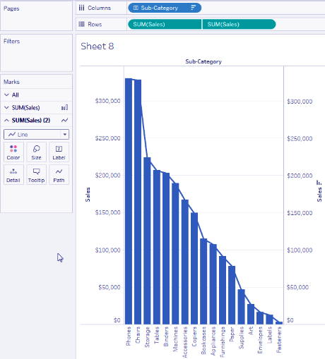
Add a Line Chart
Add a Line Chart that additionally shows Sales by Sub-Category
i. From the Measures space of the information pane, drag Sales to the so much right of the read, till a line appears:
ii. Drop Sales, to make a dual-axis read. it is a bit exhausting to envision that there area unit 2 instances of the Sales bars at now, as a result of they’re organized identically.
Let’s see How can we create Waterfall Chart Tableau
iii. Select SUM(Sales) (2) on the Marks card, and alter the mark kind of Line.
This is what the look ought to appear as if at this point:
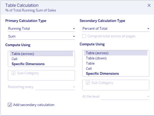
Add a Table Calculation
Add a Table calculation to the road chart to indicate sales by Sub-Category as a running total and as a p.c of total
i. Click the second copy of SUM(Sales) on Rows and select Add Table Calculation.
ii. Add a primary table calculation to SUM(Sales) to gift sales as a running total.
iii. Choose Running Total because of the Calculation kind.
iv. Do not shut the Table Calculation panel.
Read this How to create Pie Chart in Tableau
v. Add a secondary table calculation to gift the information as a p.c of the overall.
vi. Click Add Secondary Calculation and select p.c of Total because of the Secondary Calculation kind.
vii. This is what the Table Calculation panel ought to appear as if at this point:
viii. Click the X in the upper-right corner of the Table Calculations panel to shut it.
ix. Click color the Marks card to vary the color of the road.
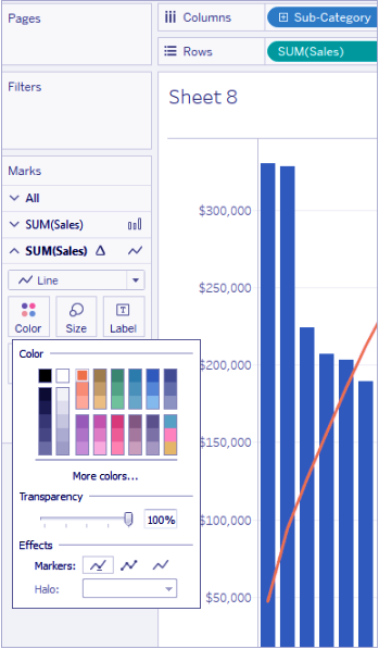
The result’s currently a sociologist chart:
So, this was all about Tableau Pareto Chart. Hope you like our explanation.
Conclusion
In this Tableau tutorial, we learned about What is Tableau Pareto chart, how to create a Pareto chart in Tableau and how to use Pareto chart, thus completing another table in our list. Furthermore, if you have any doubt, feel free to ask in a comment section.
Did you like this article? If Yes, please give DataFlair 5 Stars on Google


