Top 60 Tableau Interview Questions and Answers for 2025
Expert-led Courses: Transform Your Career – Enroll Now
It’s time to turn your dreams of becoming a Tableau developer into reality by practicing these Tableau interview questions with their answers for 2025.
These Tableau interview questions are curated by our experts which will help you to stand out in your Tableau interview and to get the best jobs as a Tableau Developer, Tableau Solution Architect, Tableau Analyst, etc.
In this article, we will be discussing the important Tableau interview questions and answers to brush up your skills.
We have divided this article in the following categories:
- Basic Tableau Interview Questions and Answers
- Tableau Real-Time Interview Questions and Answers
- Top Tableau Interview Questions and Answers
- Tableau Developer Interview Questions and Answers
- Tableau Interview Questions for Experienced Professionals
Let’s start with some basic Tableau interview questions with their answers.
Basic Tableau Interview Questions and Answers for 2025
Q.1. What is Tableau?
Tableau is a data analytics and business intelligence platform which is flexible and easy to use ensuring a smooth experience to the users.
The main pillars of strength for Tableau are interactive dashboards, quick responsiveness, and real-time data analysis.
Also, it offers a wide range of eye-catching graphics or visualizations to represent your data set pictorially like charts and graphs.
Basically, Tableau provides all the capabilities that we require for a successful data analysis like data extraction, processing, representing/visualizing and sharing the final reports/dashboards/worksheets with others.
Q.2. What are the advantages of using Tableau?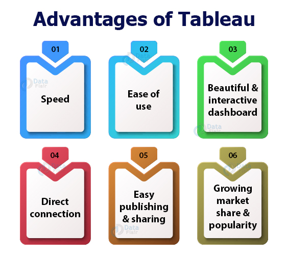
Tableau is a BI tool that is designed to help the user to create visuals and graphics. One can do this without any technical help or prior knowledge of programming.
There are a lot of advantages of Tableau such as:
- Speed
- Ease of use
- Beautiful and interactive dashboard
- Direct connection
- Easy publishing and sharing
- Growing market share and popularity
- Data Connectivity
- Real-Time Data Analysis
- Ad-Hoc Analysis
- Data Blending
- Collaboration and Sharing
Q.3. What are the main features of Tableau?
The reason behind Tableau gaining immense popularity in little time is its attractive set of features and functionalities.
Some key features of Tableau are:
- Drag-and-drop functionality
- Range of native data connectors
- Data highlights and filters
- Share dashboards
- Dashboard embedding
- Mobile-ready dashboards
- Data notifications
- Tableau Reader (for data viewing)
- Dashboard commenting
- Creating “no-code” data queries
- Queries to visualization conversions
- Import data of all sizes
- Creating interactive dashboards
- Creating guided stories
- Metadata management
- Automatic updates
- Security permissions at any level
- Tableau Public for data sharing
- Server REST API
- ETL refresh
Q.4. What is Tableau Server? Discuss its components.
Tableau Server is a communication tool that is used in sharing visualizations and data connection information with the end-users or clients.
It is an important component in the working of Tableau because it is designed to manage and execute crucial processes.
Tableau Server consists of several components such as: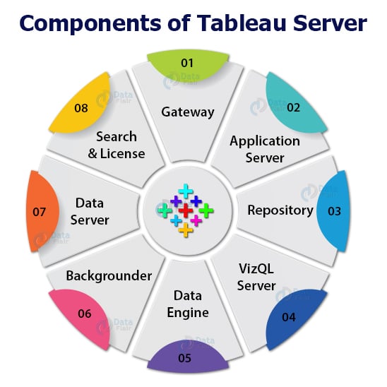
- Gateway
- Application Server
- Repository
- VizQL Server
- Data engine
- Backgrounder
- Data Server
- Search and License
Q.5. Can you explain the Tableau design flow?
The process of developing data visualisations and dashboards in Tableau is referred to as the Tableau design flow. The process of turning raw data into actionable insights and interactive visualisations often comprises a number of crucial processes. A brief description of the Tableau design flow is provided below:
Connect to Data: Your data source must be connected to Tableau before continuing. Databases, spreadsheets, cloud services, and big data platforms are just a few of the data sources that Tableau supports. Tableau will extract and load the data for analysis once it is linked.
Explore Data: You may begin studying and comprehending the data after you have connected to it. You may drag and drop these fields into the workspace to build visualisations since Tableau includes a data pane that displays all the accessible data fields.
Construct visualisations: You can easily construct various visualisations by dragging and dropping your data fields into the workspace. There are many other chart types available in Tableau, including bar charts, line charts, scatter plots, and more. By changing the visualisations’ characteristics, colours, and labels, you may make them more unique.
Create Dashboards: You may put your individual visualisations together into a dashboard when you’ve finished them. A dashboard is a grouping of many visualisations as well as additional components like text boxes, filters, and settings on a single screen.
Add Interactivity: Tableau offers a number of choices for interactive visualisations. Users may utilise actions, filters, and parameters to dynamically explore data. The user experience is improved through interactivity, which also makes it easier to explore data.
After generating your dashboard and visualisations, you may format and polish the design to make it look more polished and professional. Fonts, colours, layout, and titles and captions may all be changed.
Analysis and Sharing: You may begin analysing the data and gaining insights after your dashboards and visualisations are prepared. You may save and distribute your work with Tableau in a variety of forms, including Tableau files, PDFs, pictures, and web pages.
Iterate and Improve: The Tableau design flow is not necessarily linear. As you analyze and receive feedback, you may need to iterate and make improvements to your visualizations and dashboards to meet changing requirements or to refine the presentation of insights.
By following this Tableau design flow, you can create compelling and interactive data visualizations and dashboards that enable better understanding and decision-making based on your data.
Q.6. What are data extract files in Tableau?
The data extract files are the ones that contain a local copy of the entire dataset or in other words, we take a subset of data from the source.
The Tableau Data Extract files have a “.tde” extension.
They do not contain a file path or information about the data source, workbooks, dashboards, etc in them.
Tableau Data Extract files are useful as they are highly compressed and optimized to improve Tableau’s performance especially when we are using data connections that are slow.
Tableau Real-Time Interview Questions and Answers
Q.7. How to create a .tde file in Tableau?
To create a Tableau Data Extract (.tde) file we have to,
- Go to the Data tab present on the top left of the Tableau toolbar.
- Select a data source.
- Click on the Extract Data option.
- Then, either select fields from the data source or just click on Extract to create a data extract file (.tde) of the entire data set from the data source.
Q.8. What is a Tableau Dashboard?
A dashboard is a collection of different data views.
Different data views are different kinds of visualizations that we create on Tableau.
We can bring together different elements from multiple worksheets and put them in a single view on a dashboard.
In a dashboard, we can import and add charts and graphs from worksheets to create a dashboard.
Also, on a dashboard, we can place relevant charts and graphs in one view and analyze them for better insights which help in informed decision-making in business.
Q.9. What are user functions in Tableau?
The user functions in Tableau are unique functions that we use to perform operations on the registered users on Tableau Server or Tableau Online.
We use the User functions to apply user-specific filters or row-level security functions on Tableau users.
For instance, if we want to restrict a view to just one user we can do so by using one of the user functions. Some commonly used user functions are FULLNAME, ISFULLNAME, ISMEMBEROF, ISUSERNAME, USERNAME, USERDOMAIN, etc.
Q.10. What is the difference between Tableau Workbook and Tableau Packaged Workbook?
Both the Tableau Workbook and Tableau Packaged Workbook are file types used in Tableau.
The Tableau Workbook type of file contains information about worksheets and dashboards that are present within a Tableau workbook.
The Tableau Workbook files have an extension as .twb.
We can only create these files from a live data connection and share them with users having access to that live connection.
So, the .twb files contain metadata related to the existing data connection and does not contain the actual data from the workbook.
The Tableau Packaged Workbook file type is different from the .twb files as it contains both the metadata or information about the data of a workbook and the data extracted from the data source.
They have an extension .twbx.
The .twbx file type is used in place of a .twb file when you want to share a workbook with a user who does not have access to the live data connection.
Thus, in this case, your .twbx file contains data extracted from the source along with the other information about the workbook.
Q.11. What are the different data types in Tableau?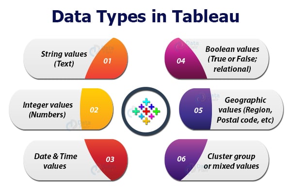
Tableau identifies and categorizes the incoming data in various categories of data.
The different data types available in Tableau are:
1. String values (Text): This data type consists of zero or more characters.
The string values have the characters enclosed in a single or double quote (as known as single or double inverted commas).
2. Integer values (Numbers): The values of this data type can be either an integer type or floating type numbers. It is a numeric data type.
3. Date & Time values: This data type consists of date and time values in different formats such as dd-mm-yy, dd-mm-yyyy or mm-dd-yyyy, etc. for date and hr:min:sec for time.
Tableau also has a separate Date data type which contains only the date values of different types like a year, month, quarter, week, day, etc.
4. Boolean values (True or False; relational): The values of this data type are in the form of True and False that is a result of relational calculations.
Therefore, boolean values are also known as logical values.
5. Geographic values (Region, Postal code, etc): The data values of this data type are those which are used in a map. It consists of values related to country name, state name, city, region, postal codes, etc that belong to the geography of a region.
This data type is denoted by a globe icon.
6. Cluster group or mixed values: This data type is assigned to the fields having values of more than one data type.
Top Tableau Interview Questions and Answers
Q.12. What are measures and dimensions in Tableau?
Measures: The measure values are the quantifiable values which we use in calculations.
Thus, all the measure values are predominantly numeric values as it is only them that are processed and calculated to give results that can be analyzed.
For instance, the sales field is a measure field as it will have a numeric value, that is, sales data that we can use in our analysis in a lot of ways like calculating the average sales, total sales, yearly sales, trends, sales forecast and much more.
Dimensions: The dimension values are the values of specific characteristics or attributes.
The fields having dimension values known as the dimensions fields. We do not use them in calculations.
They only assign specific attributes to fields such as date, product, area, category, city, etc.
So, the dimension fields are descriptive fields describing what type of data does a field contains.
One basic difference between measure and dimension fields in Tableau is that dimensions are not aggregated while measures are aggregated.
Q.13. What are the different types of functions generally used in Tableau?
In Tableau, we have a lot of processing and analytical freedom with the virtue of functions available.
With the help of different types of functions, we can perform a lot of analytical operations on the data.
The main categories of Tableau function are: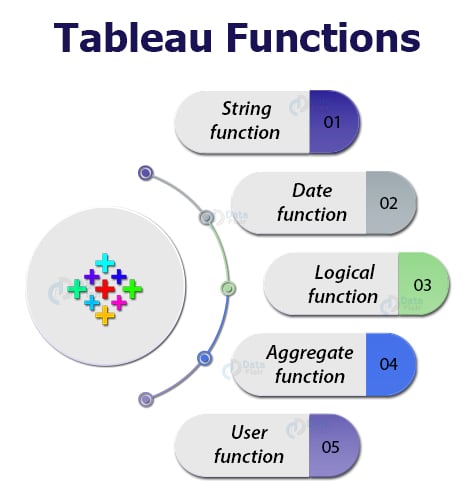
1. String function: These functions like ASCII, CHAR, FIND, ISDATE, LOWER, etc, are known as string functions because they work on the string values or characters to manipulate them.
2. Date function: We use date functions to apply logical as well as arithmetic operations on date values present at the data source.
Using the date functions we can manipulate the date values by changing the old values, creating new ones or searching data on the basis of specific dates.
Some commonly used date functions in Tableau are DATEADD, MAKEDATE, ISDATE, MAKETIME, MONTH, MIN/MAX, TODAY, NOW, etc.
3. Logical function: We use logical functions to perform logical or relational operations on data in Tableau.
Some commonly used logical functions in Tableau are, CASE, IF, IFNULL, ISNULL, ZN, etc.
4. Aggregate function: We use aggregate functions to apply aggregation on data values in different ways.
Some important aggregation functions used in Tableau are; AVG, ATTR, MAX, MEDIAN, MIN, PERCENTILE, SUM, STDDEV, etc.
5. User function: We use functions to manage the users registered on Tableau Server or Tableau Online.
Commonly used user functions are, FULLNAME, ISFULLNAME, ISUSERNAME, USERDOMAIN, USERNAME, etc.
Q.14. What do you understand by Data Extracts in Tableau?
The data extracts are also called the subsets of data that we extract from the main data source.
Using data extracts optimizes Tableau’s performance, speed and offers flexibility to handle large sets of data easily.
A local copy of that portion of data gets saved in Tableau’s memory when we create a data extract.
Working and managing data in the form of such extracts is much easier than having to manage the entire data from a live connection as extracts are saved offline in Tableau’s memory.
Q.15. What is data blending in Tableau? How is it different from joins?
The data blending brings data from two different data sources together in a single view or in a single Tableau worksheet.
For data blending in Tableau, there are two data sources; a primary data source and a secondary data source.
The relevant data of the secondary data source is taken and added with the main data of the primary data source and a blended table is displayed.
Blending is different from creating joins because blending only combines relevant data from different data sources, whereas joins work on a row-level and often duplicates data that is repeating in several rows.
Also, both data blending and joining create a left join between two data tables.
But the main point of difference is when the aggregation takes place, that is, when a join is created, the data is combined first and then aggregated.
Whereas, in data blending, the data from primary and secondary data sources are queried independently, aggregated, combined and then used for visualization.
So, the order of operations are different in both.
Q.16. What are custom data views in Tableau?
The custom data views in Tableau are views that a user can customize according to their analysis needs.
A custom data view is made from a normal data view by making some modifications in it or adding advanced functionalities and features in it.
In other words, custom views are views that represent a set of data in different ways.
Custom data views are alternate views of the same underlying data which presents a different story in every new view.
We can create custom views by making a drill-down dimension with predefined hierarchies.
In this case, every time you drill-down the next level, you will find data at a different level of granularity.
Another way of creating a custom view is by simply swapping the position of fields or dimensions in the Columns or Rows sections.
By swapping the position of dimensions, we can view our data in a new way.
Tableau Developer Interview Questions and Answers
Q.17. What are the different field operations we can perform in Tableau?
Fields are the most important element in managing data as well as analyzing it.
All the data values are sorted and kept accordingly in the fields of particular data tables.
In Tableau, we can perform a variety of operations on the data fields like:
- Add new fields to a worksheet.
- Combine two or more fields.
- Create a calculated field.
- Make parameters from fields.
- Create a set of two fields.
- Group multiple fields.
- Search for existing fields.
- Rename or reorder fields.
Q.18. Can we create custom territories on a map in Tableau?
Yes, We can create custom territories on a map by grouping existing locations or territories together.
Do you know? We use custom territories in Tableau as a separate geographic cluster field without modifying the existing geographic fields.
For instance, if on a map of India, we have sales for different states like Madhya Pradesh, Maharashtra, Gujrat, Chhattisgarh, Rajasthan, we can group all of these to create a single sales territory which will be a custom territory.
Q.19. What are the different kinds of filters in Tableau?
Tableau offers a good range of filters that we can apply on the data for better analysis.
Filters allow us to view our data at different levels of granularity and detail.
We can exclude unnecessary data through filters and conduct our analysis on only the required data.
There are five different types of filters available in Tableau.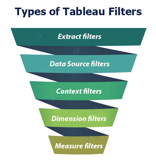
1. Extract filters: These filters create an extract or subset of data from the original data source.
In other words, the extract filters extract a portion of data from the whole from its source. We can use the data extract anywhere in the analysis once it is created.
2. Data Source filters: The data source filters are the filter conditions that we can directly apply at the data source level.
Using the data source filters we can apply filters on the data present in the data source itself instead of first importing it into Tableau.
3. Context filters: The context filters are used to apply a context for the data that we are working on.
Once we apply a context filter on a worksheet or workbook, the entire analysis is done in that applied context only.
4. Dimension filters: Dimension filters are applied specifically on individual dimensions present in the Dimensions section on a Tableau sheet.
We can easily apply dimension filters on the dimension fields by dragging and dropping the field into the Filter card present on the sheet.
5. Measure filters: Such filters are applied on individual measure fields present in the Measures section on a Tableau sheet.
We can easily apply the measure filters on the measure fields by dragging and dropping the field into the Filter card present on the sheet.
Q.20. What do you understand by context filters?
Context filters are useful to apply context on the data under analysis.
By applying a context we set a perspective according to which we can see the charts and graphs.
For example, we have sales data of an electronic store and we want to conduct our analysis only for the corporate sector or segment.
To do this, we have to apply a context filter on our Tableau sheet. Once we add the context for the Corporate segment from the Add to context option, all the charts present on the sheet will only show data relevant to the Corporate segment.
In this way, we can apply a context to our analysis in Tableau.
Q.21. What is Quick Sorting in Tableau?
Tableau gives us the option to Quick Sort data present in our visualizations.
We can instantly sort data from the visualization by simply clicking on the sort button present on the axes of a graph or chart.
An ascending sort is performed upon one click, the descending sort is performed on two clicks and an applied sort is cleared on three clicks on the Quick Sort icon.
Q.22. What is Tableau Show Me?
The Show Me option in Tableau is one of the most important features of Tableau as it is a showcase of all the available visualizations in Tableau.
It has a variety of graphs and charts that we can use in our analysis in Tableau.
The Show Me menu has charts such as pie chart, bar graph, horizontal bar graph, stacked bar graph, histograms, scatter plots, treemap charts, whiskers plot, area chart, maps and much more.
The charts get activated in the Show Me menu according to the dimensions and measures that we select.
Q.23. What are the different kinds of formatting operations that we can perform in Tableau?
One reason why Tableau is a much preferred Business Intelligence tool is that it offers a wide variety of formatting options on its charts and graphs.
The formatting options gives a lot of flexibility to create visualizations of our choice as per our requirements.
We can format a visualization in a lot of ways like formatting the axes, changing the font, formatting the shade and alignment, formatting the borders, changing the color scheme, etc.
Q.24. What is a Tableau worksheet?
A Tableau worksheet is a single view sheet that can contain numerous visualizations.
A typical Tableau worksheet consists of elements like shelves, cards, Show Me menu, legends, filters, Data and Analytics pane, and a blank area to create the visualizations on.
Anything that we create on Tableau starts with creating a basic Tableau worksheet.
We can use one or more worksheets to create workbooks, dashboards, stories, etc.
Q.25. What is a paged workbook in Tableau?
A paged workbook in Tableau consists of different pages based on certain criteria.
For instance, if we want to see sales performance based on different regions, we can create a separate page for each region in a workbook.
In this way, a single workbook, that is, a paged workbook will show sales based on every region making the workbook more detailed and insightful.
Tableau Interview Questions for Experienced Professionals
Q.26. In what ways can you connect to a data source in Tableau?
We can connect to a data source in Tableau mainly in two ways; a live connection or creating an extract from a data source.
In a live connection, we get to connect directly to the data source via a connector.
So, the live connections are online connections. Whereas when we create an extract, data is taken offline and stored into Tableau’s memory.
Q.27. What is the maximum number of tables you can join in Tableau?
The maximum number of tables that we can join in Tableau is 32.
Q.28. What are shelves in Tableau?
The Shelves on a Tableau worksheet are demarcated areas used for specific purposes.
There are several shelves on a Tableau sheet like, Page shelf, Filter shelf, Marks shelf, Rows and Column shelf.
Each shelf has a specific purpose or functionality assigned to it that you can use to make your analysis better.
Q.29. What do you understand by groups and sets in Tableau?
Sets: Sets are subset of data according to specific conditions or criteria.
Once created, we can use the sets in analysis. A set can have data based on a condition like sales values greater than 50,000.
Groups: Groups in Tableau refer to the group of dimensions brought together to create a category.
For instance, if we are analyzing test scores for different majors, we can create a group called Major that will contain all the majors for a test.
Q.30. What are hierarchical fields in Tableau?
The hierarchical fields are those which have data arranged in hierarchies.
Hierarchies organize relevant data on different levels. We can dive deep into data and analyze it at a finer level by doing a drill-down into hierarchical fields.
Q.31. How would you distinguish between Reference Band and Bollinger Bands ?
Reference band: Such bands are shaded areas in a chart showing the points that fall in a particular reference area.
For a reference band, we need to set a range. Thus, from a reference band, we can set a range of reference and analyse the data points falling in that range.
Bollinger band: Bollinger bands are unique charts which have a more specific view than the reference bands.
These bands analyse the prices and variation in prices with time for a financial commodity or instrument. Also, we can say that bollinger bands can show a moving average with time.
Q.32. What are Histograms in Tableau? What is its use in analysis?
Histograms show or graphically represent the distribution of values in intervals or bins of equal sizes. These charts are specifically used to represent the distribution of continuous data.
Histograms allow us to do statistical analysis of business related parameters like sales, profit, loss, quantity sold etc. Such quantities come under the category of continuous measures.
In order to create a histogram, Tableau takes the continuous measure values and places them into bins of equal sizes.
Bins are nothing but sets of value ranges like 0-5, 5-10, 10-15 and so on. The measure values corresponding to these ranges fall into their respective range.
Q.33. Explain Bar charts in Tableau. What are the different kinds of Bar Charts?
Bar charts represent data in categories by arranging it in rectangular bars. The height of each bar is proportional to the value that bar is representing.
For instance, a bar representing the value 1000 will be taller or greater in length than a bar representing the value 500.
In Tableau, we can make different kinds of bar charts such as; Segmented bar chart, Stacked bar chart, Side-by-side bar chart etc.
1. Horizontal/ Vertical bar chart: A horizontal or vertical bar graph is a simple graph having bars of vertical or horizontal orientation.
2. Segmented bar chart: A segmented bar chart is a bar chart where a bar chart contains more than one set of bars.
Each set of bars belongs to a particular segment. For instance, we can have a sales bar graph for three or four different segments all seen in a single view.
3. Stacked bar chart: A stacked bar chart has a single bar divided into smaller parts.
For instance, a single bar for the year 2019 can show sales for different countries or regions or cities.
We can also set a color scheme for the subdivisions in a bar as we can see in a stacked bar chart below.
4. Side-by-side bar chart: A side-by-side bar chart will have multiple bars standing next to each other for a single segment.
Instead of stacking multiple values one upon the other like in stacked bar charts, this chart places them side-by-side.
Q.34. What is the difference between Shared axis chart, Combined axis chart and Dual axis chart?
All of the three charts are related to the axis of a chart i.e. either the x-axis or y-axis. The main difference between the three of them is;
- Shared axis chart: This type of chart has a common or shared axis between more than one measures in a chart.
- Combined axis chart: This type of chart has one common axis (x-axis) and two separate axis (Y-axis) for specific dimension and measures respectively.
- Dual axis chart: These charts have two axes for two measures. We can use it specifically when we have different measure ranges.
Q.35. What is a Heat Map?
Tableau heat map shows data values as density spots or heat spots on a map.
A heat map is also known as density heat map as it shows colored spots whose intensity and shade vary based on the number of values in a cluster of values.
More the number of values in a cluster, more dense it is and shown with a dark color on the map.
Therefore, we can use density heat maps or heat maps to analyse areas with densely or sparsely populated data.
Q.36. What is the difference between a Motion chart and a Line chart?
The main difference between a line chart and a motion chart is, a line chart is a static and a motion chart is a moving chart.
A line chart simply shows a line connecting various data points whereas a motion chart is a moving chart that moves along every single data point showing the trail or path of a line.
Both motion charts and line charts are very useful in data analysis.
Q.37. Why do we use a Waterfall chart in Tableau?
A waterfall chart shows the gradual transition of data values from start to end.
It represents a running total with successive increase and decrease happening in between the start point and end point.
In a normal running total, we cannot see how individual categories are contributing to the whole or total.
Using a waterfall chart, we analyse how each category’s positive values increase the total value and the negative values decrease the total value.
Such ups and downs lead to a resultant final value. And this is what we analyse in a waterfall chart. This allows for an insightful analysis in Tableau of how individual elements of dimensions or measures contribute to bringing a total value of a parameter.
Q.38. What is a Sparkline chart? Why do we use it in analysis?
Sparkline charts are line charts or trend line charts that are compact and do not have any axis.
As it is used to show data trends, it is predominantly a time-series chart having a speciality to fit in small areas.
Sparkline charts are small charts that are very useful in analysis as they do not take up much space allowing you to put more information on a report.
Also, they graphically represent highs and lows of a data depicting a data trend.
Q.39. What do you understand by a Pareto chart in Tableau?
A Pareto chart is a chart that consists of both a bar chart and a line chart in single view.
The bars represent data values in a descending order and the line represents a cumulative total of all the values.
Such charts are useful when we want to show data in more than one way on a chart.
We can get to analyse data from two different perspectives i.e. bars and lines giving us different insights into data.
Q.40. How can we create a Donut chart in Tableau?
Tableau donut chart is a pie chart with a hole in its center. That donut like hole in the center is used to show some cumulative values related to the data in the donut chart.
We can create a donut chart by following some simple steps.
1. To begin with, we create two aggregate measure fields.
2. Then we select the mark type Pie for the first measure field of the two.
3. Add a set of fields to the Color, Label and Angle cards.
4. Select Circle as the mark type for the second measure.
5. Change the color of the circle to white.
6. Add a measure field that you want to show at the center of the donut chart to the Label card of second aggregate measure.
7. Select Dual Axis option from the Rows column for the second aggregate measure.
8. Reduce the size of the inner circle.
9. Our donut chart is ready.
Q.41. How will you fix commonly occuring data quality issues in Tableau?
We can fix some commonly occuring data quality issues in Tableau by using a number of ways.
- Renaming fields.
- Grouping of fields together that have the same name but the names are written differently. For instance, H&M and Hennes and Mauritz are going to be the same names written differently.
- Entering Aliases for fields where required.
- Making suitable corrections in the map when it is unable to process some geographic areas on the map. We can remove them or make changes in the map to rectify such geographical errors.
- If we are having a lot of null or invalid values, we can bunch them together with non-invalid values or correct the join that is causing the occurrence of null values.
- Make corrections at the data source if needed.
Q.42. What is forecasting in Tableau?
Forecasting is a process of showing future trends by identifying regular patterns existing data values.
The technique of identifying regular patterns from existing data values is known as exponential smoothing. Tableau uses exponential smoothing and gives an accurate forecast graph that they can use in predictive analysis.
Forecasting in Tableau is based on two important concepts i.e. Trends and Seasonality.
A trend is the increase or decrease in data over time and seasonality is a repeating variation in values over a determined or fixed period of time (such as weekly, quarterly, yearly, etc). These are known as seasons.
These seasonal and repeating variations are predictable giving us accurate forecasts for predictive analysis.
Q.43. Explain how we do Reporting in Tableau?
Reporting is the process of collecting raw data from the data source, processing it, visualizing it using graphs and charts and sharing it with others to get meaningful insights from data.
Tableau comes with a lot of reporting features like dashboarding, creating stories, sharing the reports with other users.
One unique characteristic of reporting in a BI tool like Tableau is that it encourages all the users to work on the same platform, with the same dataset and the same vision to get the best possible output.
A good report ensures best results in the form of accurate data insights that are used in decision making in businesses and in other domains.
We can create a report by some really simple steps that we can follow.
- Open a new worksheet in Tableau
- Add dimensions and measures
- Create a visualization
- Add more visualizations to your worksheet if needed
- Create a dashboard
- Share the dashboard as Report
Q.44. What is a Sankey chart in Tableau?
Tableau Sankey charts are flow diagrams that graphically show the flow of values between different sets of data.
This chart gives multiple flow lines that intersect each other giving us a flow pattern of data values and sets. In a sankey chart, data points or nodes are connected via links creating a flow diagram for data set.
Q.45. What are bins in Tableau?
Tableau bins are analogous to containers that are of equal size and that store data values corresponding to the bin size.
The bins group a set of data into groups of equal size. This gives a systematic distribution of data.
In Tableau, we can take data from any discrete field and create bins. Although, Tableau users mostly use measure fields to create numeric bins.
Bins are very useful in data analysis as they provide a systematic data range that helps us organize information better and discover patterns easily. Bins are created by using calculated fields in Tableau.
Q.46. What is Tableau Pivot?
The Pivot feature in Tableau allows us to switch the rows with columns in a table.
For instance, let’s imagine a scenario where we have five interview candidates and we ask 10 questions from each one of them.
Now, when we create a normal table to store this data, we will have to create 10 columns for each candidate. This will make our table oddly big.
To prevent this, we can pivot the fields in the table and we have a single measure column that will store the score value for each question corresponding to each candidate instead of having ten columns of candidate score.
This is how pivoting works in Tableau as it is commonly used in cases where we want to make the data analysis and visualization easy.
Q.47. What are TreeMaps in Tableau?
A TreeMap is a chart type used in Tableau to graphically represent data. The treemap charts show the data in a part to the whole manner i.e. you get to see how individual parts make up the whole.
For instance, if we see that the majority of sales occurred in the Phone segment in an electronics store.
A treemap chart can show you a bigger rectangle for the Phone segment and then a number of small rectangles within the big rectangle showing the sales of different brands like OnePlus, iPhone, Oppo, Samsung, Pixel etc.
In this way, treemaps represent multi-layered data in a part to the whole manner.
It consists of rectangular boxes of different sizes. The size of the boxes is directly proportional to the data value i.e. bigger the value, larger the box.
The treemap chart is colored and it assigns distinctive colors to different sets of values.
Q.48. What are Trend lines in Tableau? How to use them?
The tableau trend line shows or reveals unique patterns in data. Using trend lines we can discover new patterns emerging from data points present in a graph or chart.
For instance, if we have a trend line over a sales chart, we can infer whether the sales are increasing with time,decreasing or not changing at all.
Also, trend lines help us in interpreting data trends, predicting future scenarios and draw a correlation between two variables in the analysis.
Q.49. How are Density maps different from normal maps?
The density maps specifically show a focus area of the whole data drawing the users attention at the points where data is concentrated or sparse because it helps in understanding data trends and patterns overall.
Whereas, a simple map in Tableau is used to graphically represent geographic data such as voters in every state of India, sales of product in different countries etc.
Q.50. What is Branding in Tableau?
Tableau branding is nothing but customizing the appearance of a visualization in a Tableau way.
In an attempt to Tableau Branding, we can customize different aspects related to the appearance of a visualization such as font, color, size, shape, background, boundaries, transparency, highlighting etc.
Q.51. What are Parameters in Tableau?
Parameters are containers for variable data values or those values that do not originally exist in the data source.
For instance, we can create a parameter field by setting a condition to it that it can take only of a certain type and a particular range.
Similarly, parameters gives us the flexibility to give any condition for the field like less than, greater than, top five, top ten etc.
A parameter can be a string value, a numeric value, a range of numbers, a currency etc.
Q.52. Why do we use Lasso and other such tools in Tableau?
Tableau offers us different kinds of selection tools like,
- Lasso selection tool: In a lasso selection tool, we select data points by drawing a free shape over an area. This free shape usually resembles a lasso.
- Radial selection tool: In radial selection method, there is a circle of a certain diameter (depending upon your area of selection) that is drawn over an area.
- Rectangular selection tool: When you use this tool, there is a rectangle drawn over the area that you select. The area will contain the data points that we wish to select. In all the selection methods, the selected area is shown in blue.
The selection tools are used to select a particular group of values so that we can focus our analysis just on that set of values.
All these three types of selection methods are based on the shape of the selection area i.e. circular in radial, free shape in lasso and a rectangle in rectangular selection tool.
Q.53. Explain clustering in Tableau.
- Cluster analysis is also known as clustering in Tableau is the process of dividing a data set into segments or clusters having relevant data values.
- Clustering helps us in doing a comparative analysis of data in. In clustering, similar or closely related values are clustered together into different clusters.
- While the values that are not closely related fall into another cluster.
- Clustering is done using specific clustering algorithms where similar values are kept together as a part of the group.
- In Tableau, we can have a cluster of up to seven color shades or codes at a time.
- The clustering algorithm used in Tableau is known as K-means clustering. This algorithm divides a data set into K clusters or segments based on their similarity metrics.
- After this, it calculates the mean (mean of all the values in one cluster) for each cluster which gives the Centroid (cluster center) of a cluster.
- Then by using the centroid value for each cluster present, the values are placed in such a way that the total sum of distances between the centroid and concerning members in a cluster is minimum or as small as possible.
- In this way, the K-means algorithm gives us closely packed clusters each made of closely related or similar values.
- For instance, if we have sales data for a product for different types of consumers or buyers.
- Now, we want to analyze the purchasing capacity of consumers. For this, we can create clusters where we can segregate consumers based on their purchasing capacities.
- With the help of such a cluster, we can come up with strategies to maximize sales depending upon the purchasing or spending capacities of each group.
Q.54. How can we enhance the appearance of a Tableau workbook?
There are a number of ways through which we can improve the appearance of our work in Tableau and make it more attractive for the users.
- By changing the looks of dates that we use in Tableau by formatting options.
- By formatting and improving the look of Tooltip contents.
- By changing the order of color expressed in charts.
- By exposing the header.
- By making parameterized axis labels.
- By using continuous fast filters for range values.
- By creating a custom date hierarchy.
- By formatting table calculation results.
Q.55. Give us some performance optimization techniques in Tableau.
In Tableau, we can employ a number of techniques which are essentially troubleshooting techniques that help in optimizing Tableau’s performance.
We can optimize Tableau’s performance by practicing the methods given below.
1. Work with Log Files: Having your server log records with you can help in detecting issues that affect the working of Tableau Server.
2. Troubleshoot Data Sources: If we are having issues regarding data sources not being able to connect to a data source, unable to discover a data source, etc.
We need to take care of the permission settings for data source connections and of the data source connection page.
3. Troubleshoot Subscriptions: If you are having issues with your membership subscriptions and getting messages regarding inability to render information from Tableau on mail.
Then you need to take care of certain things such as incident database shutdown, foundation process timeout, no membership symbol, invalid memberships, etc.
4. Troubleshoot SAML: We can investigate issues related to SAML (Security Assertion Markup Language) by using the log files that store SAML related information.
5. Troubleshooting Mutual SSL Authentication: In order to resolve SSL authentication issues, we need to contact the Tableau Server Administrator.
6. Handle Extract Refresh Alerts: We need to take care of the extract refreshes if they are not happening properly.
If the automatic refresh of data extracts are not timely, then we need to address this issue at the Tableau Server.
Once this issue is resolved, Tableau’s performance is improved greatly.
7. Troubleshoot Inconsistent Process Status: Tableau’s performance is affected if there are issues in showing process status consistently.
We need to troubleshoot this issue at the Tableau Server to ensure smooth working of the software.
Q.56. What is a Word Cloud in Tableau
A Tableau Word Cloud is a visualization type which displays words in a cluster or cloud like manner.
The size of words will depend on the frequency of their occurrence in a given body of text. We arrange our word cloud in different shapes, sizes, manners like horizontal lines, columns etc.
Q.57. How can we create a calculated field in Tableau?
Calculated fields are of great use in Tableau. Calculated fields are most useful in Tableau to create bins.
To create a calculated field we need to;
- Go to the Data pane and right-click on a dimension.
- A drop-down menu will appear.
- From there select Create and then select Calculated field.
- A small window will appear from where we can set parameters to create a calculated field and name it.
Q.58. How to automate reports in Tableau?
We can automate the rate of data refreshing in our reports in Tableau. When we upload a report on the server, we can set the time intervals when we want to update our report with the latest data. This is known as automation of a report where we do not need to update a report manually.
Q.59. How can we embed data views on webpages?
Tableau has a feature to embed data views created in Tableau on web pages, internet portals, web applications, wiki pages, blogs etc.
The embedded data views are originally uploaded to the Tableau Server and their data is automatically updated on the web at regular intervals.
In order to access or use Tableau data views or worksheets or workbooks or dashboards on the web, the user needs to have proper licensing and access permissions from Tableau Server.
Therefore, a user who wishes to embed a Tableau view into a web page must have an authentic Tableau account.
That user can give access to other web users to view the Tableau data view by using the Guest user option. If we enable Guest user, anyone who accesses the web page can access the Tableau data view.
Q.60. What do you understand by aggregation and disaggregation of data in Tableau?
Data values in Tableau are broadly treated in two ways; aggregation or disaggregation. In aggregation, data values (particularly measure values) are combined together or aggregated to give a summarized or higher level of data for analysis. For instance, if we have a measure field containing sales values for different cities. We can aggregate these values to create averages, sums, etc. Aggregated fields are very useful in analysis.
On the other hand, when we disintegrate grouped or aggregated data into its basic form then it is called disaggregation of data values.
For instance, if in an analysis we need to see which age group has the most frequent buyers of a product, we need disaggregated values of data because it makes the data values distinct and discrete instead of clubbing them together.
Summary
So, this was all about most frequent Tableau interview questions with answers. Hope these were useful to you and you learnt a lot from them.
Do share your tableau interview experience with us in the comment section.
You give me 15 seconds I promise you best tutorials
Please share your happy experience on Google


i have one question how can i display 2017 sales as well as 2018 sales month vies year vies quater vies .. with good formating dashboard
filter