Show Me Menu In Tableau Part-III
Placement-ready Courses: Enroll Now, Thank us Later!
In this Tableau tutorial, we will discuss the last seven options in show menu of Tableau. The First fourteen options, we already discussed in Tableau Show Me Menu Part – I and Tableau Show Me Menu Part – II.
Description of Tableau Show Me Menu
Today, we will discuss the last few options in Show me menu in Tableau, some examples are mention to understand them better.
a. Area charts in Tableau
The area chart in Tableau show me menu, is a combination of a line graph and a stacked bar chart. It shows relative proportions of totals or percentage relationships. By stacking the volume beneath the line, the chart shows the total of the fields as well as their relative size to each other.
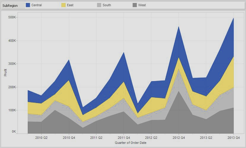
Tableau show me menu – Area Chart 1
In this example, I am comparing profit performance by region for our fictional company by quarter. The strength of this chart type is that I can immediately see that the west (in gray) is consistently the largest portion of the area for each quarter. As you trace along each quarter, the west is the largest portion of the stacked volumes.
In addition, we can visually see that Q4 is always the strongest performer throughout the year with a sharp decline in the following Q1. You can also see that the Q4 peak is getting higher and higher, year after year.
A quick trend analysis is the strength of a line graph. With an area chart, we can see the underlying performances and relative totals of the sum.
Continuous vs. Discrete
Just as with the line chart, the show me menu offers the option of area chart (continuous) and area chart (discrete). The easiest way to think of this is that continuous data is measured whereas discrete data is counted.
For instance, the length of an object is a continuous field. It can be any length, and the number line stretches to infinity. The value can be any value in that number line. A discrete number could be the number of stores in a franchise or the number of employees in the HR database.
In Tableau Software, continuous fields are colored green while discrete fields are colored blue.
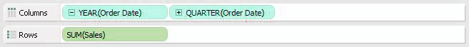
Tableau show me menu – Area Chart 2
Let’s switch our chart type in Figure 1 from continuous to discrete and see how it changes our view:
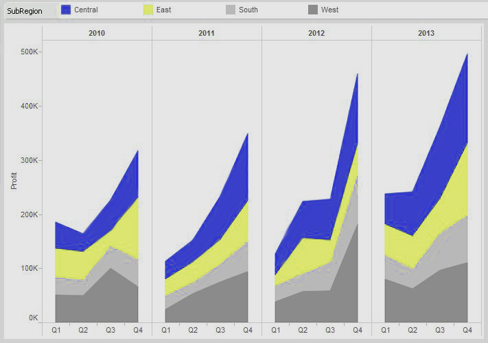
Tableau show me menu – Area Chart 3
Just like with the line chart, each year is split into discrete date parts. This gives us a clearer idea of seasonal trending while still letting us see the underlying relative performances of each region.
Area charts are useful tools in your visualization arsenal, but be sure that you use them only when appropriate. If you’re trying to show performance against other business units, customer segments or product categories, then you’d definitely want to use a line chart. The area chart is great for showing a total trend with relative performances of individual components of that sum.
Let’s watch out Tableau File Types & Tableau Data Types
b. Scatter Plot
The scatter plot in Tableau show me menu, additionally referred to as a scatter diagram, scatter chart, scattergram or scatter graph, is used to examine exclusive measures for patterns. Just like the circle view and the facet-with the aid of-facet circle chart, the scatter plot also uses symbols to visualize facts.
The big difference with a scatter plot is that both axes in the chart are measures rather than dimensions (one measure on the column shelf and another measure on the row shelf).
In parent 1 beneath, we’re inspecting the peak and weight measurements from the 2014 NFL draft (Weight is on the column shelf and top at the row shelf).
Tableau show me menu -Scatter Plot 1
Simply from an informal look, we will see that the scatter plot appears to form two fundamental clusters. There appear to be two one-of-a-kind varieties of physical sorts that excel on the elite degree in soccer. Let’s change the mark type to shape and drop a measurement that lists positional groupings (backfield, QBs, LBs, and so on.) onto the shape shelf and notice if we can pick out a pattern within those clusters. The effects are proven in parent 2 under:
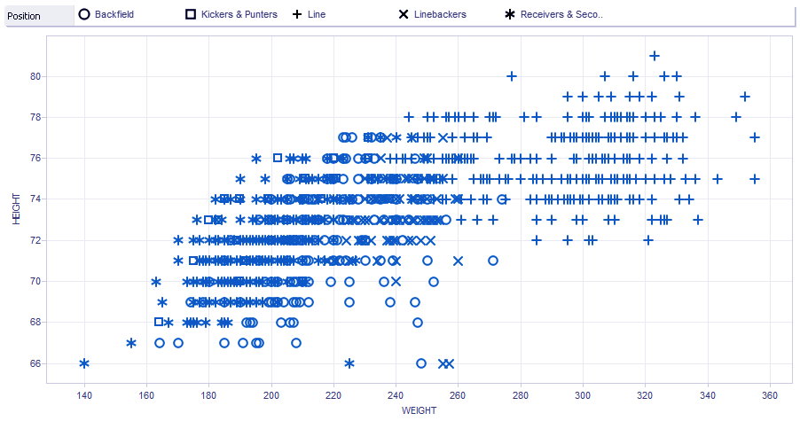
Tableau Show me menu – Scatter Plot 2
No wonder there, the biggest players on the sphere are the linemen and overwhelmingly so. Bridging the gap between the offensive and protecting line to the rest of the percent is the tight ends. On the other aspect of the scatter plot are the velocity positions, mainly the receivers, corners, and safeties, mixed in among kickers and punters.
Allows adding a few completing touches to our visualization.
First, we’ll color code the marks with a BMI rating adjusted for athletes via dragging and losing the BMI rating discipline onto the color shelf in the marks card. We’ll edit the shade legend to reveal something over 30 shaded in pink.
Next, we’ll consist of a brief filter through the positional institution (by way of proper-clicking on the positional institution measurement and deciding on display brief filter out) and filter the whole thing except receivers & secondary and the linemen. Finally, let’s upload a fashion line—right-click on within the white area inside the visualization and choose show trend Line.
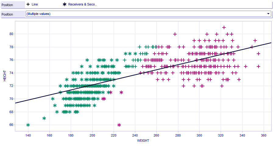
Tableau Show me menu – Scatter Plot 3
The validity of the body mass metric apart, we will see that it cuts nearly right down the middle of this fact set with a steep incline of weight advantage for every inch in height for the typical soccer participant.
Analyzing the athlete info from the NFL draft offers us an illustration of the strengths of a scatters plot, using granular statistics points to build the impact of a pattern.
c. Histogram
A histogram in Tableau Show me menu, is a visual illustration of the distribution of statistics. There are ways to create a histogram:
1. Pick out an unmarried measure. Proper-click on that measure to create a bin area. Drag the bin subject from dimensions to the column shelf. Drag and drop your degree on the row shelf and alternate the aggregation to depend.
2. Pick out an unmarried degree, then just click on the Histogram chart kind on display Me. Tableau will do all the extra steps indexed in #1 for you!
Both way you pick to move about growing the visualization, you’ll note that a brand new bin discipline of your degree is created, dividing your degree into discrete durations or “packing containers.” by using default, Tableau will name this field, so as to be a measurement, field call(Bin), but you could rename as needed.

Tableau Show me menu – Histogram 1
In the instance above (figure 1), I’ve constructed a histogram that breaks down man or woman sales into containers of $20 increments. I’ve introduced a quick filter out, acting on the pinnacle of the visualization, to lessen the scope of the statistics we are interested in searching at. You can see that it best consists of income of much less than $500.
You can also see that for this imaginary employer, sales transactions of much less than $one hundred are a totally essential element of their enterprise.
This could lead to the question: Are small-rate objects worthwhile? Permit’s use our analytical tools to dig deeper and upload more price to our visualization. To do this, permit’s drag the profitability measure onto the color button at the marks card with a purple to green gradient. Any sales containers that are not profitable will now be shaded purple whilst profitable ones can be shaded an increasing number of darker shades of green.

Tableau Show me menu – Histogram 2
You can now see that our fictional company is certainly dropping cash on these much less-than-$20 income transactions. Actually, this histogram furnished a vast commercial enterprise insight that requires in addition analysis and development. This is the electricity of Tableau. Analyses like those provide the organization intelligence on their enterprise in an effort to lead to impactful choices. This is the middle of commercial enterprise intelligence.
d. Chart Types – Box-and-Whisker Plot
Contrasted with the other diagram writes, the crate and-stubble plot (otherwise called the container plot) is more muddled. Before we can dive into a case of how it is utilized inside Tableau Software, we need to clarify the rationale behind this sort of view. From that point onward, we’ll assemble an illustration.
Here is a container and-bristle visual:
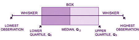
Chart Types – Box-and-Whisker Plot
The container speaks to the qualities between the first and third quartile (otherwise called the interquartile range=Q3 – Q1). The bristles speak to the separations between the most minimal incentive to the primary quartile and the fourth quartile to the most elevated esteem. Every quartile has a particular numeric esteem, decided from the informational index.
You begin by deciding the middle of the informational collection. That is the place the crate abandons dark to light dim. At that point, the upper and lower quartiles are resolved. These are essentially the middle of the upper portion of the information and the middle of the lower half of the information, that structures the “case.” The greatest of the informational index is the upper range while the base of the informational index is the lower extend. That structures the “hairs” of the plot.
4, 5, 11, 12, 13, 15, 17, 17, 19
Consider the numbers above as an exceptionally basic informational index. We’ll outline how a base, Q1, the middle, Q3, and the most extreme are gotten from them.
Minimum: 4 the most reduced number in the informational collection.
Q1: 11 the middle of the lower half or first quartile.
Median: 13 the center number of the informational collection.
Q3: 17 the middle of the upper half or third quartile.
Maximum: 19 the most noteworthy number in the informational collection
Things get somewhat more confounded when you begin to consider exceptions or information focuses that are not illustrative of the informational collection. For example, consider the possibility that the informational index above had another number in the range like 287. That is so far out of the typical arrangement of information that it wouldn’t bode well to give it a chance to fill in as the most extreme.
Rather, it is an exception, which is spoken to by a solitary spot.

Chart Types – Box-and-Whisker Plot 1
The plot above (Figure 2) is an extraordinary method to outline the viability of the case and-hair plot. The perception is a portrayal of the 40-yard dash times from the 2014 NFL scouting combine broken out by position. You can see the standard gathering of speed by each position in the case and the scattering of augmenting scores in the stubbles.
In the watchmen (OG) and tight finishes (TE), you can see the main two exceptions on the plot. On the off chance that you take a gander at the upper hair (i.e. the slower players) and the contrast it with the lower hair (i.e. the speedier players), you can see that they are roughly a similar size for those two positions. On the off chance that the base bristle stretched out down to both of those exceptions, the lower stubble would be essentially longer than the upper hair (or quartile). That is the reason that information point is an exception.
How about we tap on one of the case and-stubbles for more data:
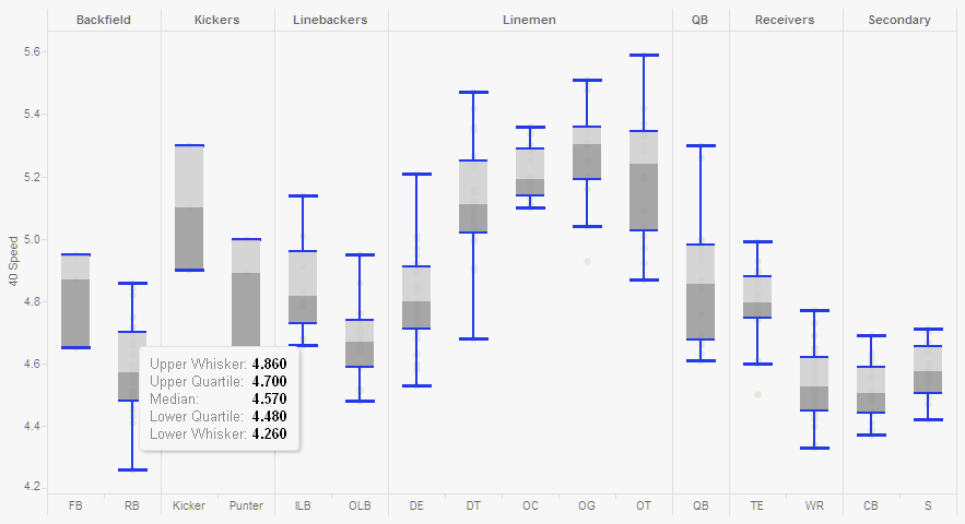
Chart Types – Box-and-Whisker Plot 2
Tapping on one will raise a tooltip with the distinctive information focuses characterized. The upper bristle is another name for the most extreme, and the lower stubble is another name for the base. For running backs (RB), the average speed for this position in the 2014 draft was 4.57 seconds.
The case and-hair plot is more complicated than the other graph composes.
e. Gantt Chart
Gantt graph in Tableau show me menu, is of task administration technique. Each errand can be arranged as an individual information point with interdependencies on different assignments and assets. You can perceive how a convoluted venture. For example, building up a product application could utilize a device like this.
To display the adequacy of the Gantt outline and to represent an alternate way that it can be utilized outside of undertaking making arrangements for venture administration, how about we think about a case. How about we take a gander at to what extent it takes to transport things by means of various conveyance strategies utilized by our imaginary organization.
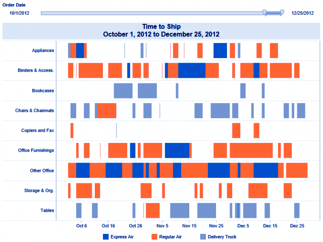
Tableau Show me Menu – Gantt Chart 1
To make the representation above, we require the following details:
- A measurement on the row rack (I utilized a field that shows different classes of things)
- A ceaseless date field on the column rack (I utilized the exact date an incentive for my transportation date field)
- A measurement of color (I utilized ship mode has appeared in the shading legend beneath the diagram)
- The check compose set to Gantt Bar with a measure on size to decide how substantial the portions of the bar will be (for this situation, it’s a field called time to ship that ascertains the distinction in days between the order date and ship date).

Tableau Show me Menu – Gantt Chart 1
Ideally, this entire exercise outlines two things. In the first place, the Gantt graph is an extraordinary visual instrument for delineating data in connection to time, regardless of whether it is for booking or something else. Second, information and Tableau can be entertaining. I absolutely trust you had a great time in adapting more about this diagram compose
f. Bullet Graph
A projectile chart is a capable method to analyze information against recorded execution or pre-allocated edges. As you’ll see, we can incorporate a considerable measure of data in a little space with this sort of diagram that is additionally Tableau’s response to those searching for a check or meter perception.
A shot diagram is like a standard structured presentation with the exception of that there is an appropriation demonstrating progress towards an objective behind the bar. Like a standard reference diagram, a shot chart can display either on a level plane or vertically.
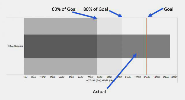
Tableau show me menu – Bullet Graph 1
In the picture over, the dull dark bar speaks to genuine execution while the red reference line is an objective. The fundamental dissemination extend has been set to recognize 60% and 80% objective consummation. The case above demonstrates that the present income is well over the reference line objective, showing that the current year’s execution was more grounded than the past one.
Thinking about whether you can alter the look of a reference line or alter the dissemination you need to show? If all else fails, right-click! Right-tap on the hub to include (and if necessary, alter) reference lines and conveyances!
Here’s a more nitty gritty perspective of how we can utilize a projectile chart to show a considerable measure of data in a smaller space utilizing the sample coffee chain information source that accompanies your establishment of Tableau desktop:
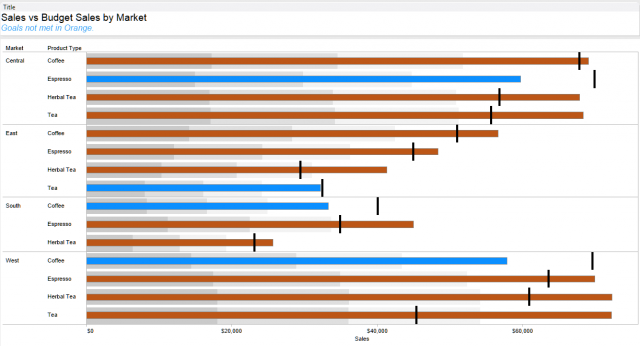
Tableau show me menu – Bullet Graph 2
Here, we can see real deals esteems (bars) for different item composes in each market and the comparing deals objective (line) for each. I included an appropriation for each bar to demonstrate 25%, half and 75% of the budget sales. Hoping to additionally upgrade your utilization of a shot diagram?
Shading the bars in view of regardless of whether the real esteem meet their separate objectives (make a straightforward ascertained field to decide if the objective is met or not, and drop that field on the color rack). Note the utilization of the space in the worksheet title to incorporate a touch of setting — bars in orange have not met the budget sales objective.
The slug diagram adds another level to the standard structured presentation with the capacity to look at against an objective. When you have the fitting fields chose in the data window (hold down CTRL and tap on numerous fields to choose a few on the double), the show me catch will do the majority of the work setting up your shot diagram. You can likewise do it physically by tapping on the measuring hub. Then choose add reference line and add reference distribution.
g. Packed Bubbles
The packed bubble view is a way to demonstrate social incentive without respects to tomahawks. The packed bubble are stuffed in as firmly as conceivable to make proficient utilization of room.
There are many approaches to utilize this data, especially with an informational collection that uses a vast assortment of fields. However we’ll begin with a genuinely straightforward view.
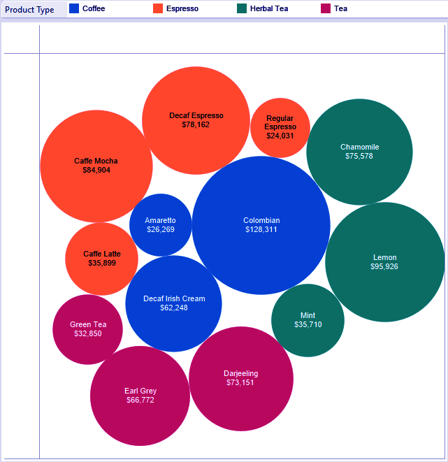
Tableau show me menu – Packed Bubbles 1
Above, we are taking a gander at different items inside product types. The game plan of the packed bubble is out of our control. Yet we can control how huge the packed bubble is by putting a measure on size (for this situation, I utilized sales). The way to making bubble outlines helpful is having the correct fields in the opportune place on the marks card, particularly on the color, size and detail rack.
We should grow our information collection to see more rises on the screen in a solitary view so we can show signs of improvement thought of how a stuffed air pocket diagram composes a bigger extent of information.
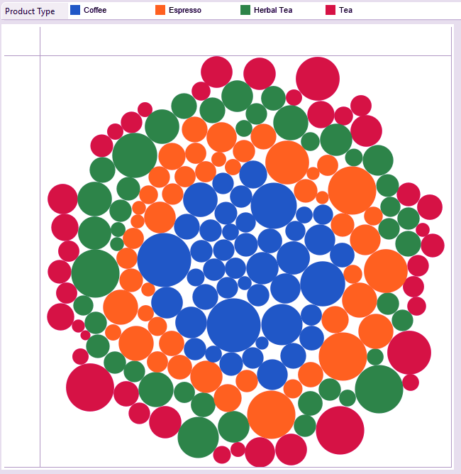
Tableau show me menu – Packed Bubbles 2
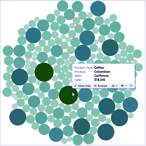
Tableau show me menu – Packed Bubbles 2
Above, I added a state to detail to add more data to the primary air pocket graph. Presently, we get one air pocket for every product, product type, and state. Note the course of action of the air pockets. Once more, we can’t physically move rises around.
An air pocket diagram can be an approach to see various esteems in connection to another – all rely on the fields you use on the imprints card. In the view underneath, I have similar fields on the marks card as above. However, I swapped out product type on color for sales. We see two or three the bigger circles in a dim green shade, showing high deals.
Need to find out about why that air pocket is dull green? Here’s the place we advantage from the astounding device tips! The device tip contains the majority of the data we might need to think about a point.
Ideally, this article delineates a couple of the utilization for unpacked bubble diagram.
Conclusion
In this article, we discussed last seven options of show me menu of tableau. These are Area charts, Scatter Plot, Histogram, Box-and-Whisker Plot, Gantt Chart, Bullet Graph, and Packed Bubbles. We hop you found this article helpful in your learning.
Feel free to share your feedback in the comment section.
You give me 15 seconds I promise you best tutorials
Please share your happy experience on Google


