Bar Chart in Tableau – The Art of Portraying Data
Placement-ready Courses: Enroll Now, Thank us Later!
In this Tableau tutorial, we are going to learn about the most basic type of chart – bar chart and then move on to stepwise learning of how to create different types of bar charts in Tableau. So without delay, let’s start the journey!!!
What is Bar Chart in Tableau?
A bar chart or graph is used to represent category wise data of a dataset. The length of the bars is proportional to the value that each category represents. This gives instant insight into the data pictorially. In Tableau, we can create several variants like a simple vertical bar graph (also known as a line graph), segmented bar graph, stacked bar graph and side by side bar chart. In the next section, we will learn how to represent our data in a bar chart using color schemes and other options.
Previously, we learned about the creation of a Bump Chart in Tableau to compare the two-dimension values of their data.
Now, let’s learn the steps for the creation of a bar chart in tableau.
How to Create a Bar Chart in Tableau?
Follow the steps given below to create bar charts in your Tableau software:
1. Vertical Bar Chart
Open a new worksheet in your Tableau Desktop with your data set loaded. We are using a dataset of electronic store sales. From our list of dimensions, we add Order Date to the Columns section.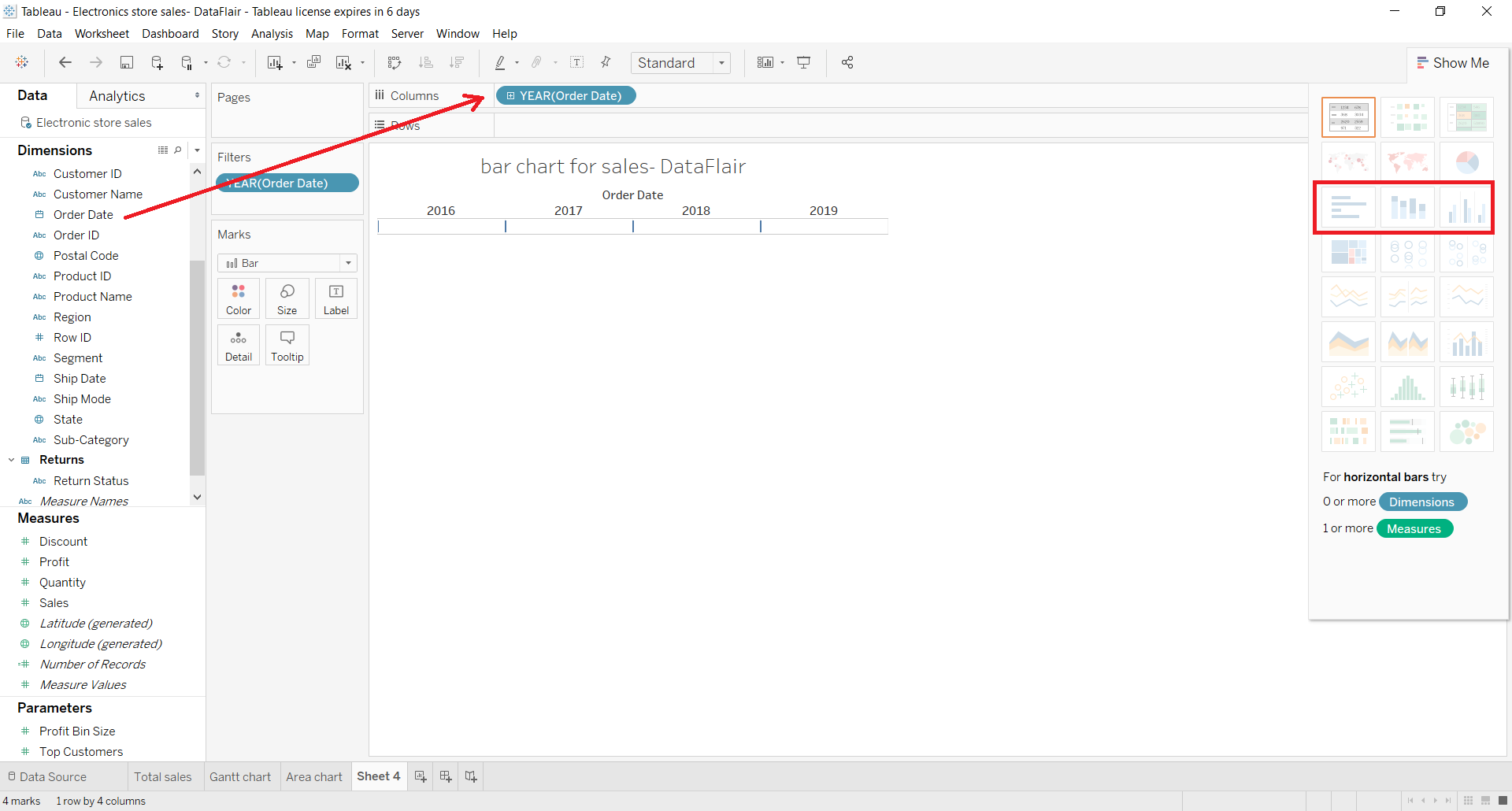
Then, we add a measure Sales into the Rows section.
This creates a normal bar graph showing total sales for each year.
We can add one more detail into this bar chart by dragging and dropping a Region field into the Color card present in the Marks section.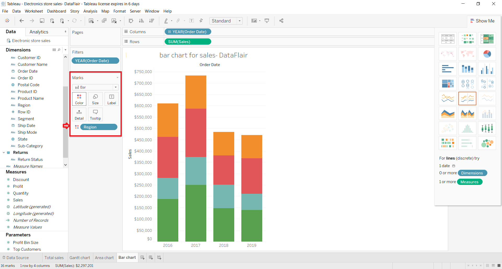
This divides each bar (representing a year) into four colored sections which represent sales in four regions; Central, East, South, and West.
The sales detail for each section is visible when we hover the cursor over any colored section on a bar.
Grab the opportunity to represent the accumulated sales data through the Tableau Area Chart.
2. Segmented Bar Chart
We can also create a segmented bar chart in Tableau. For this, we just need to add one more dimension to the Rows section. Like we have added the Segment field into the Rows section along with the SUM(Sales) measure.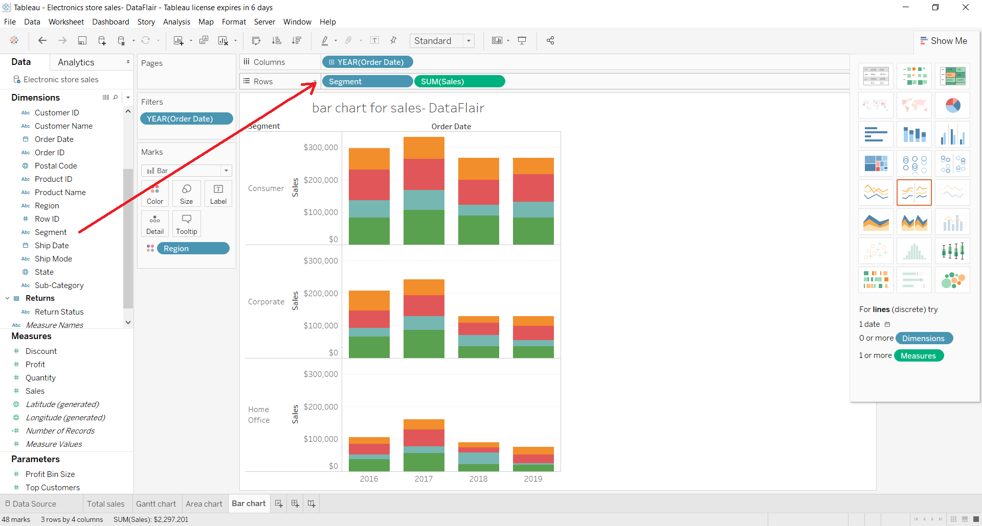
This divides the bar chart into three segments; Consumer, Corporate and Home Office. There are three different bar graphs for each segment shown individually in one space.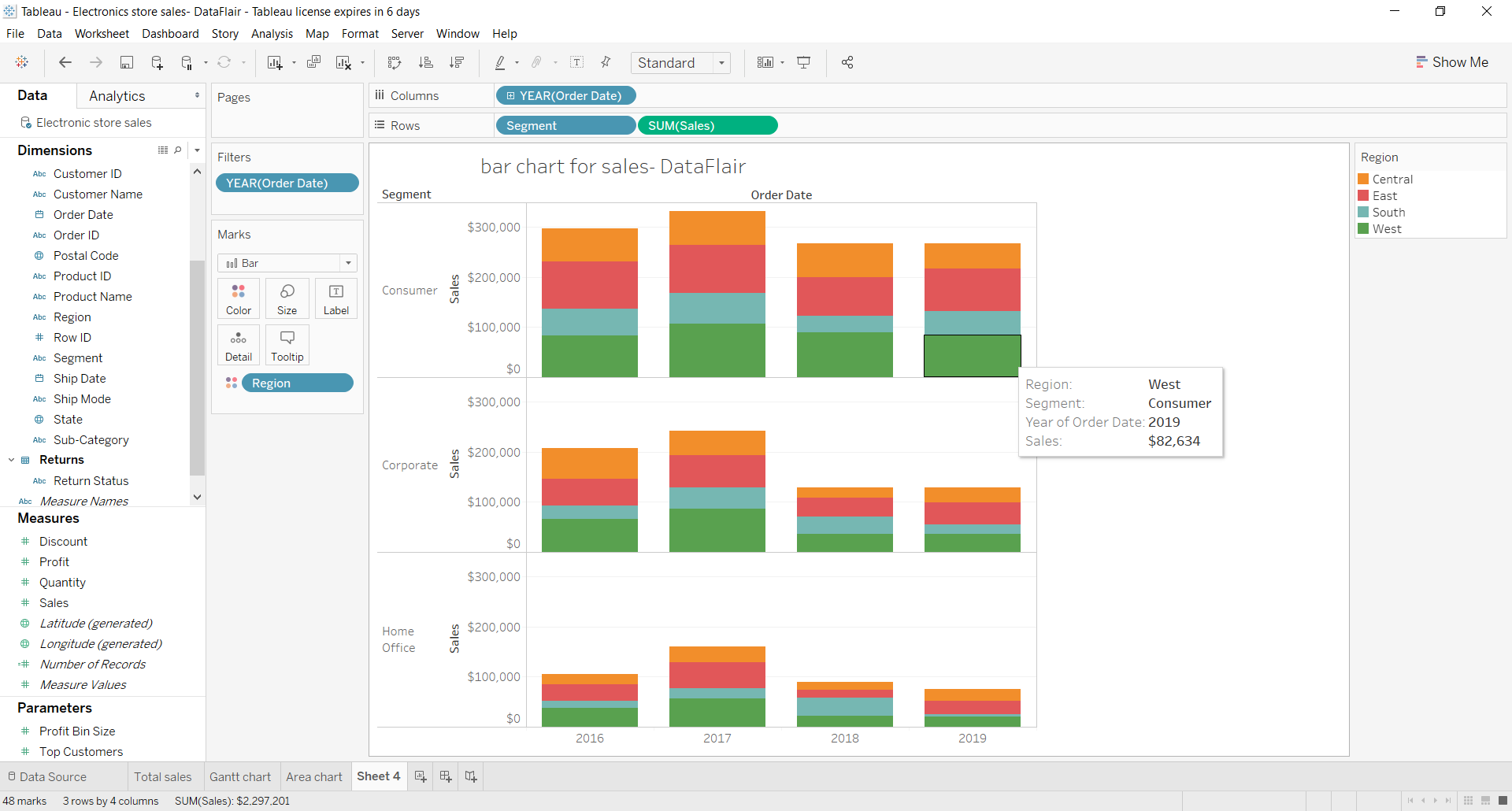
Tableau offers a lot of other formatting options such as adding reference lines. To add a reference line, we go to Analytics pane and select, for instance, the Average line.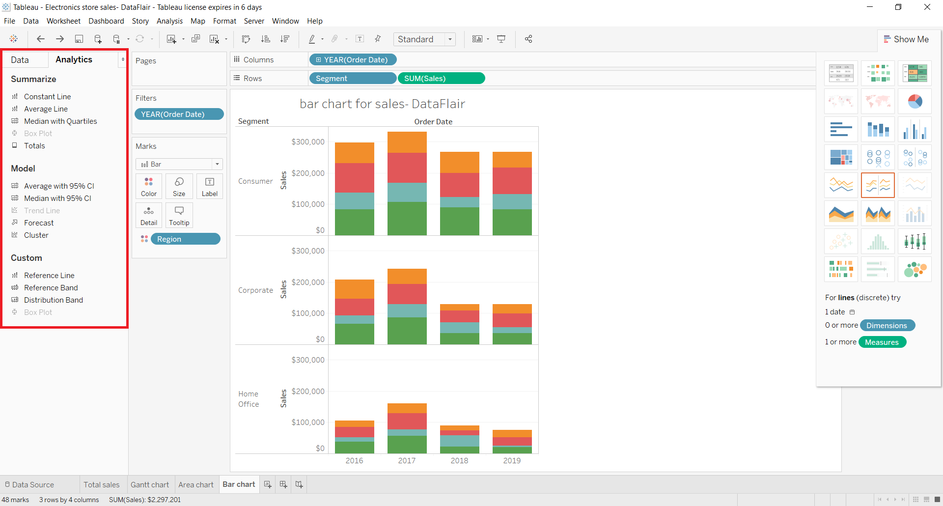
As soon as we select this option, we get to select a reference line type from three options. We select Pane style.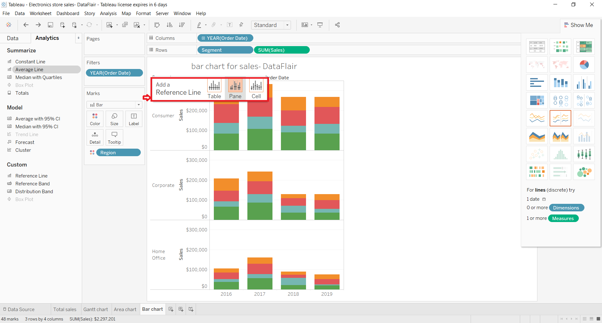
This adds a reference line showing the average sales for each set of bar graphs in the segments.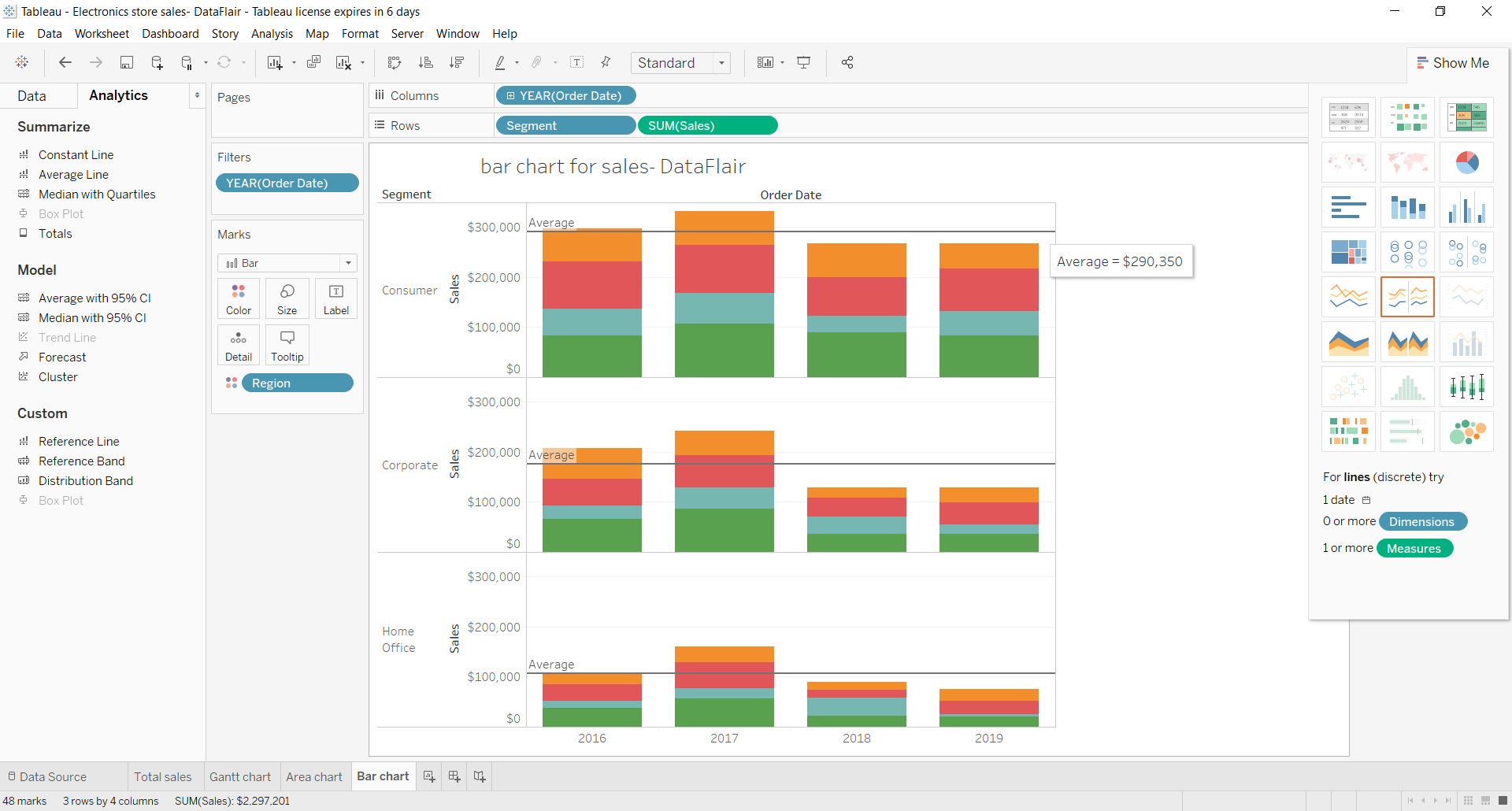
We can also format the bar graph and the fields used in it by right-clicking on a field and selecting Format… option from the list.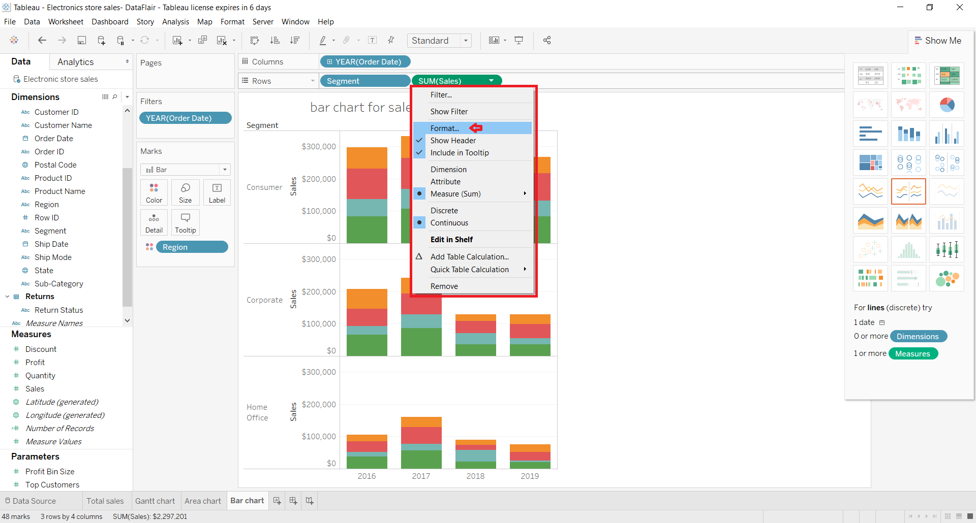
A Format Pane will open on the left from where you can format the axis, values, background, fonts, pane, etc., as per your requirements.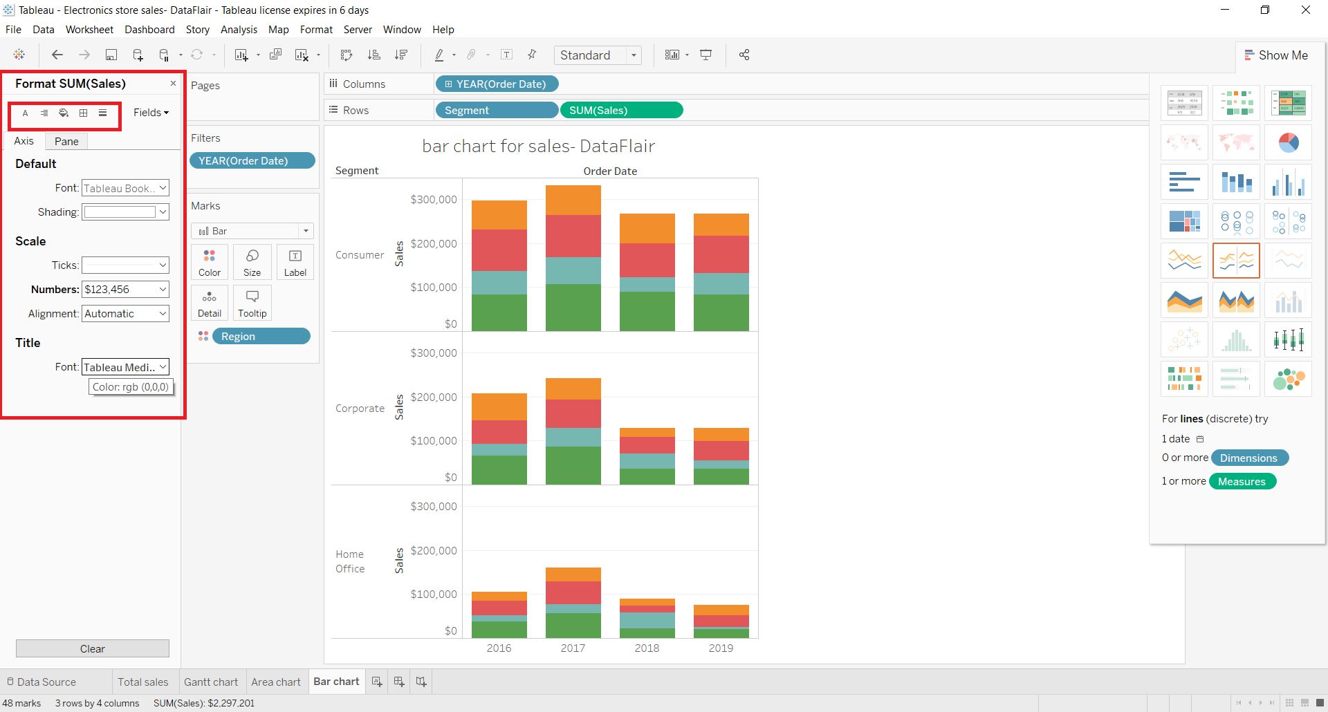
If you have any doubts or confusion in the Tableau Bar Chart article till now, mention in the comment section.
3. Stacked Bar Chart
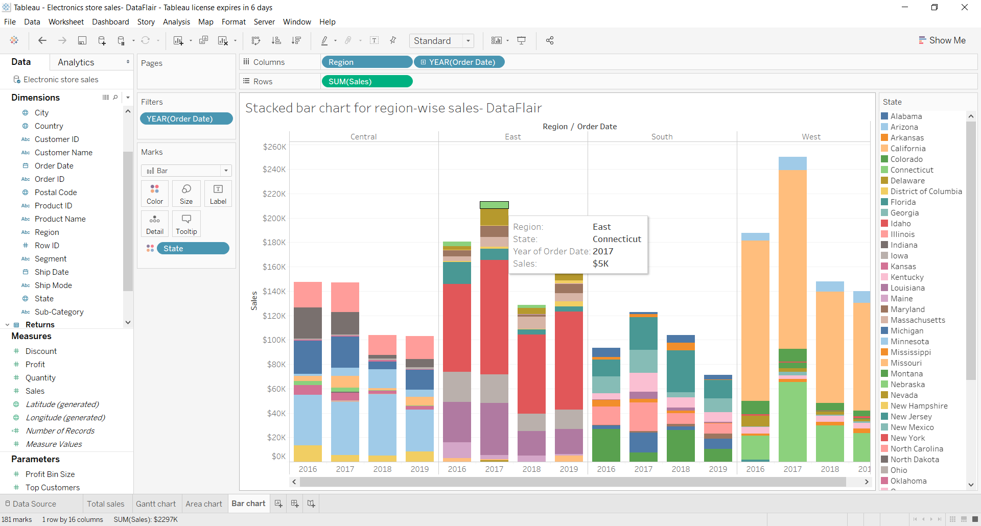
We can also create a stacked bar chart where a single bar is divided into different sections that are stacked one upon the other. The size of each stacked section depends on the value that the section is representing. Also, each section in a stack is assigned a unique color.
4. Side-by-Side Bar Chart
Another way of showing multiple values corresponding to a single dimension is by creating a side-by-side bar chart. In a side by side chart, all the values corresponding to a dimension are placed side by side instead of getting stacked upon one another.
As you can see in the screenshot below, there are separate bars showing total sales for each brand for each year in separate sections. That is, we have a set of bars for the year 2016, another for 2017, 2018 and 2019. Such bar charts provide information and insight in great detail for analysis.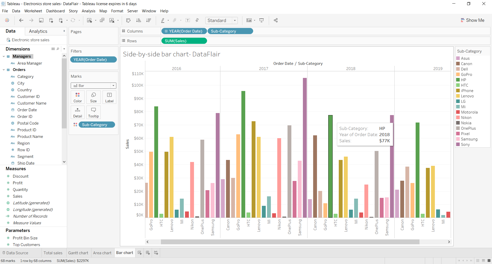
Summary
So this was all about the bar chart and its variants in Tableau. We learned how to create a simple vertical bar chart, segmented bar chart, stacked bar chart, and adjacent or side by side bar chart.
Hope this article was helpful to you. Do share your feedback in the comment section.
We work very hard to provide you quality material
Could you take 15 seconds and share your happy experience on Google


