Tableau Show Me Menu- Part I
Job-ready Online Courses: Click for Success - Start Now!
In this Tableau Software module, we are going to learn one of the most important Tableau Show me menu. So let’s start with what is Show Me Menu and various options available in it.
Introduction to Tableau Show Me Menu
In the event that you mouse over each diagram write Tableau Software, will offer direction on which graph compose is most appropriate for the information you’re attempting to introduce. For stacked bars, Tableau prescribes at least one measurements and at least one quantifies.
Graph writes that are not material to your worksheet as it is as of now built will be turned gray out and not selectable until the point when you have the fitting mix of measures or potentially measurements.
There are such a significant number of little adjustments and changes you can make with your arranging, naming and different traps. You’re just restricted by your creative ability.
List of Options Available to Tableau Show Me Menu
- Text Table (Crosstab)
- Heat Map
- Highlight Table
- Symbol Map
- Filled Map
- Pie Chart
- Horizontal Bar Chart
- Stacked Bar Chart
- Side-by-Side Bar Chart
- Tree Map
- Circle View
- Side-by-Side Circle View
- Line Charts (Continuous & Discrete)
- Dual-Line Chart (Non-Synchronized)
- Area Charts (Continuous & Discrete)
- Scatter Plot
- Histogram
- Box-and-Whisker Plot
- Gantt Chart
- Bullet Graph
- Packed Bubbles
Before we proceed towards Tableau Show Menu options, let’s Discuss Tableau Navigation & Tableau Data Terminologies
Brief Description of Tableau Show Me Menu
a. Text Table (Crosstab)
In Tableau Show me menu, it’s content table (otherwise called a crosstab) is basically a similar view you would see from an excel information source or by tapping the view data caught in the sidebar. The check writer is content, and the information is composed basically of lines and sections.
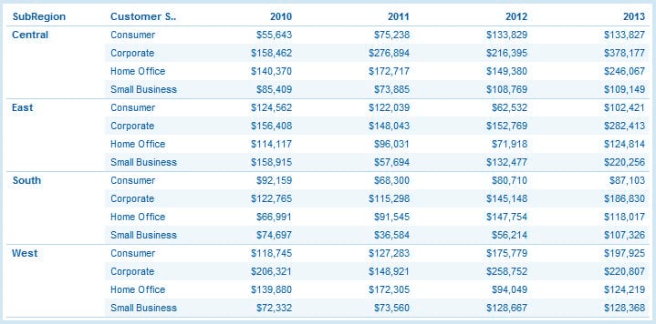
Tableau Show Me Menu – Table Text 1
While content tables are relevant to most informational collections, they don’t recount an exceptionally convincing story or feature imperative bits of information without extra organizing on your part. Content tables are not regularly prescribed as the essential perceptions in your dashboard or introduction. Consider utilizing them as an index incorporation for those report customers that need more detail in a conventional configuration.
All things considered, you can add more data and setting to your content table. Because it’s a content check write doesn’t mean your table must be totally exhausting.
Some add-ons
We take a similar table underneath and included a title at the best, an inscription on the privilege and shading organizing. The business figures are currently shading coded in green for a positive normal overall revenue and red for a negative normal net revenue.
With this extra data about our anecdotal organization, we can see that the east district is woefully failing to meet expectations with numerous client portions. It’s losing cash a seemingly endless amount of time. That basic expansion of shading arranging on a moment measure opened up a radical new viewpoint to this representation and totally changed the story.

Tableau Show Me Menu – Table Text 2
b. Heat Map
The next option in Tableau show me menu is heat map. To adopt a more visual strategy to demonstrating information than we may regularly find in a crosstab, how about we consider a warmth delineate. A warmth outline an incredible method to look at classes utilizing shading and size. In this, you can look at two changed measures.
In the case underneath, I have made a warmth guide to indicate execution by a worldwide district for the diverse product offerings of our anecdotal organization.
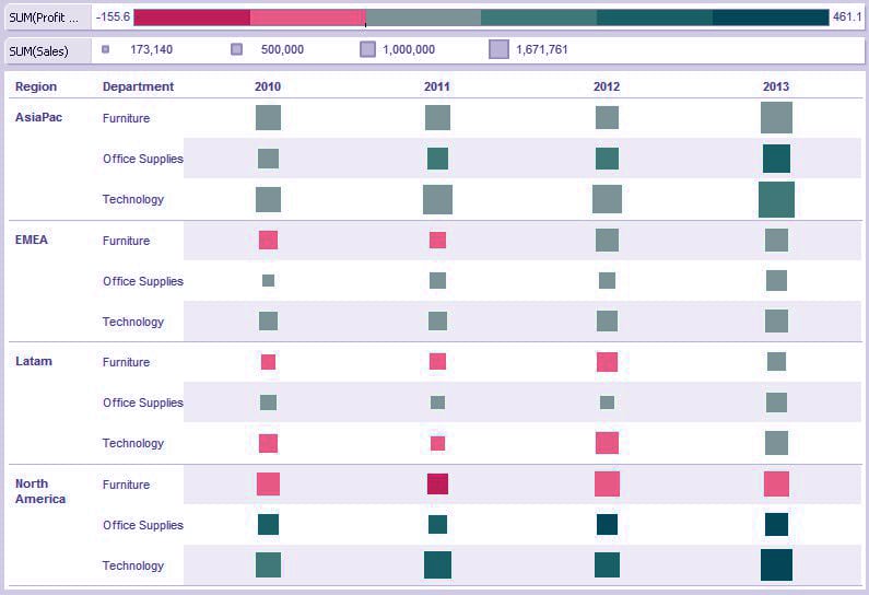
Tableau Show Me Menu – Heat Map
The measure of the square demonstrates the volume of offers. You can see the legend separating the four levels into a base ($173,140), bring down center ($500,000), upper center ($1,000,000) and greatest ($1,671,761). In our anecdotal organization, technology deals have reliably been a major deals generator over the distinctive worldwide districts. You can consider this to be the imprints in the technology lines are nearly bigger than the others. North America and the Asia Pacific are obviously the best entertainers crosswise over areas.
We additionally shading coded the imprints in view of net revenue. Our anecdotal organization needs to see each worldwide product offering that is performing underneath a specific edge (half). Those are featured in progressively darker shades of red while the beneficial locales are coded in expanding shades of green. The darker the green, the more gainful the item classification is in that locale.
We can quickly observe that crosswise over worldwide districts and years, the furniture item class is among the minimum productive in the organization. While this is by all accounts enhancing by 2013, North America is still beneath our subjective overall revenue edge. On the other hand, technology deals appear to be the most grounded entertainer – aside from in Latin America as of not long ago.
That is the narrative of this specific representation, and the warmth outline lets it know pleasantly. There are many approaches to utilize the Heat Map. Ideally, this perception gives you thoughts to use with your information.
c. Highlight Map
The Highlight table enables us to apply restrictive arranging to a view. A scene will naturally apply a shading plan in either a nonstop or ventured cluster of hues from most elevated to least. It is extraordinary for contrasting a field’s esteems inside a line or segment.
In the case underneath (Figure 1), I’ve taken select nations from our business locales and contrasted them and our client portions and divisions. The subsequent network is shaded in a green slope scale from most elevated (darkest) to least (lightest) in deals volume. I’ve incorporated the slope scale as a reference, running along the highest point of the table.
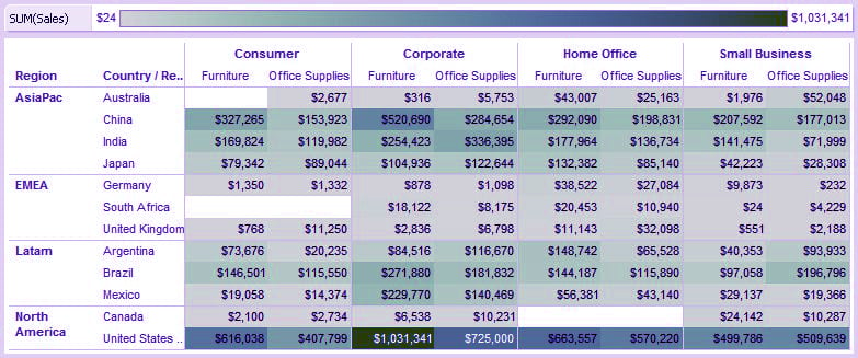
Tableau Show Me Menu – Highlight Table
As opposed to a smooth inclination in differing shades of green, we can make it a ventured shading example and change the base portion of the range to red. This will enable us to better feature poor entertainers, especially on the off chance that we set custom ranges on our shading arranging.
Here is the refreshed view:
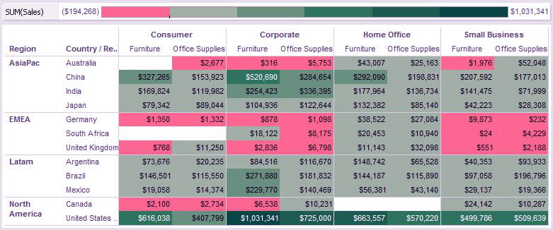
Tableau Show Me Menu – More Option
I set the center of my shading range self-assertively to $10,000. Any area creating under $10,000 incomplete deals would be organized in the base half or the red portion of the shading range. It is clear from the information over that our anecdotal organization is exceptionally solid in the US, Latin America, and Asia, yet maybe is just toward the start of a building a toehold in Europe.
A feature table is I, in reality,hut-in style to a warmth outline write, and it might be an extraordinary vision to help a progress from a customary crosstab to the more conceptual warmth delineate.
d. Symbol Map
For better understanding, let us take an example of soccer teams.
We’ve made a database of the greater part of the players from the 2014 FIFA World Cup – the world’s most noteworthy wearing scene. The last competition highlights 32 national groups from around the globe. All in all, where do these national cooperative people, apparently among the absolute best on the planet, play their club soccer?
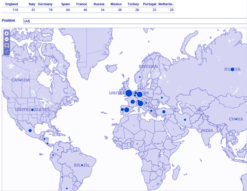
Tableau Show Me Menu – Symbol Map
The bigger the circle, the bigger the player check. To maintain a strategic distance from the messiness of names in such a thickly checked region, for example, Europe, we’ve added the image guide to a dashboard. This dashboard has a content table summing up the main 10 nations at the best alongside a positional channel (protection, midfielder, assailant, and goalkeeper).
On the off chance that you take after global soccer, it’s nothing unexpected that England (119), Italy (81), Germany (78) and Spain (64) are tops. Out of the main 20 most profitable soccer clubs on the planet, 19 of them have a place with these four alliances. Demonstrate to me the cash!
The nearer we zoom in, the more geographic detail Tableau will give on our guide. We should center on Western Europe, where the lion’s share of players profit.
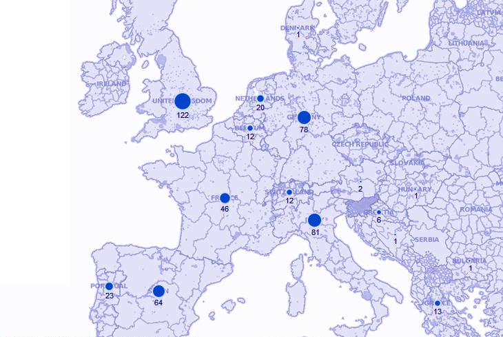
Tableau Show Me Menu – Continental zoom
With this nearer see, you would now be able to see the sub-district divisions inside every nation. Truth be told, you can get a considerable measure nearer. How about we break out every nation’s clubs into urban communities and see what happens when we do that for the 122 club players in the UK.
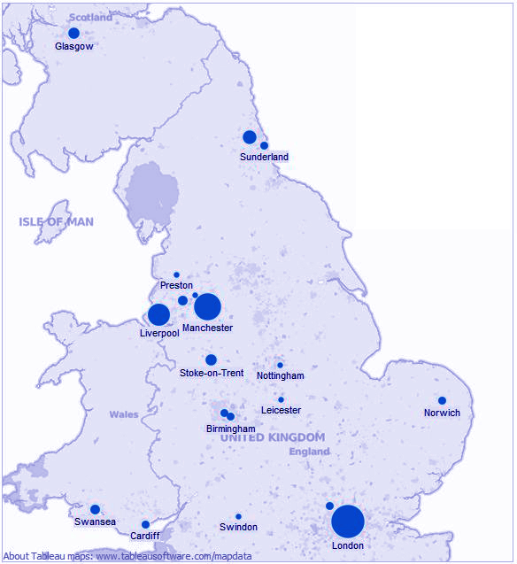
Tableau Show Me Menu – Country zoom
The thickness of World Cup players’ club areas in the UK is driven by London (36), with Manchester (24) and Liverpool (16) following firmly behind. Those are the homes of the best clubs in the UK – Arsenal, Liverpool, Manchester United, Manchester City, Everton, Tottenham Hotspur, and so on. You can see that Tableau can give an awesome level of geographic specificity to your information.
You can go significantly more profound:

Tableau Show Me Menu – City zoom
Above is the city of London with the River Thames running directly through the center of the guide. The dim dark patches are gardens, stops and save inside the city. You could add more detail to this guide by choosing the map menu and investigating the map options board.
Guide perceptions are one of the genuinely imaginative highlights of Tableau Software. With the standard level of computerization and instinctive controls, you can include bona fide business understanding with staggering perspectives.
Let’s revise Tableau Installation & Top Tableau books
e. Filled Map
We’ve effectively secured the other kind of guide see in the image outline. Presently, we should take a gander at the filled guide diagram write. The filled guide is another view perfect for geographic information. Rather than circles or squares to show information focuses, the filled guide utilizes shading on a nation or state premise to demonstrate connections. You can control the shading with the edit colors choice in the Marks card.
Allows simply survey the guide navigational device before we begin:

Tableau Show Me Menu- Filled Map 1
This device has four controls. They are (beginning start to finish): zoom in, zoom out, and zoom into a chose territory utilizing a tick and-drag and reset delineate. For a more controlled zoom in and zoom out, hold CTRL and look with your mouse wheel. These controls will enable you and your report watchers to explore around your view, especially in the event that you have a considerable measure of detail spread over the globe. To skillet over your guide, hold SHIFT and left-click drag your mouse over your screen.
Illustration: Visualizing Sales Around the World
Staying with the information source we’ve been investigating in this blog arrangement, suppose we need to envision our deals in our storage areas over the world. We have a field in our information source which Tableau perceives as having a geographic part (State). When you double tap on that field, Tableau will consequently produce a guide. You may see a couple of little hiccups in getting your information to change over into geographic areas. A scene will alarm you by putting a little dim box—the invalid pointer—in the base right-hand corner of your perception.
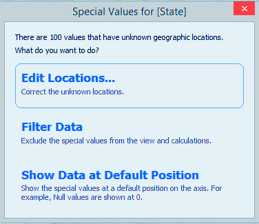
Tableau Show Me Menu – Filled Map 2
This implies you have a few areas that Tableau isn’t precisely certain where to put. Tapping on the dim box will raise a menu:
Unique Values for [State]
Frequently, our classification in what we are calling a particular state or place doesn’t work with Tableaus. It’s additionally conceivable to stir up universal information with US states in a similar field. How about we endeavor to settle this issue by first tapping on edit locations.
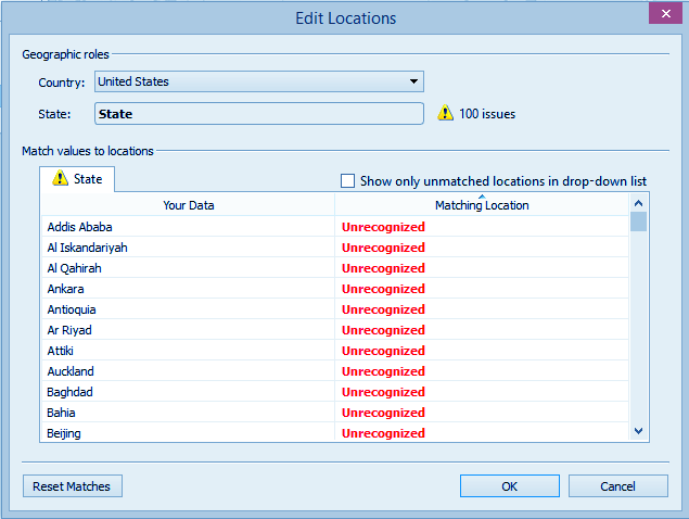
Tableau Show Me Menu – Filled Map 3
There are 100 expresses that are not coordinated in Tableau’s state list. As we look through the rundown, we see the motivation behind why Unrecognized is recorded—Tableau is hoping to coordinate states in the United States (which is chosen above for Country).
Revising the issues distinguished by Tableau should be possible several ways. On the off chance that you tap on the red content that says unrecognized you will see a rundown of states. From this rundown, you can choose the express that matches your information point. This is especially useful in completing a little information tidy up in Tableau.
You would then be able to change the hidden information source later. In our example see here, it would bode well to pick one of two courses to redress the issues. Tap on the drop-down choice where the United States is recorded for a country to see the accompanying choices:
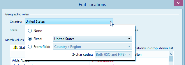
Tableau Show Me Menu – Filled Map 4
You can choose none, implying that Tableau won’t restrain your areas to a specific nation. You could likewise choose from f the eld, another field in your information source that contains extra points of interest for the specific area you are attempting to plot. With this choice, Tableau knows the correct state and nation in which you need to show your information.
I’ll choose from the field and include the country/region field from my information source to illuminate where my state information ought to be shown.
Snap OK, and you’ve settled the issue! I would now be able to drag sales to color, and the mark type will consequently change to a filled map. This brisk procedure gives me the perception beneath where higher deals are reflected by darker shades of green:
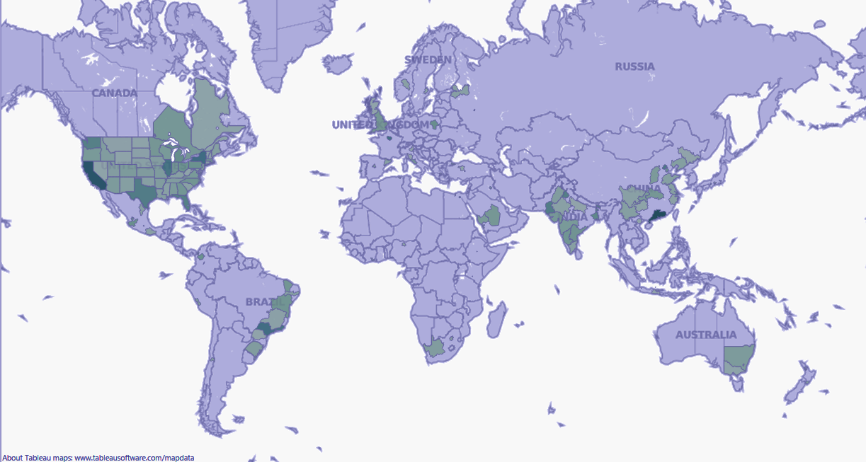
Tableau Show Me Menu – Filled Map 5
There you have it! it’s anything but difficult to perceive how filled guide representations are one of the finest perspectives to make in Tableau.
f. Pie Chart
Pie charts are among the most popular, if terribly overused, charts in business presentations. They are best suited to show proportional or percentage relationships. When used in the right circumstance, pie charts can quickly show relative value to the other data points in the measure.

Tableau Show Me Menu- Pie Chart 1
The case above demonstrates the pie cut for each of the departmental deals for our anecdotal organization. With just four classes, the pie outline is clear, succinct and has names that are effortlessly situated for lucidity. Things being what they are, what’s the enormous issue?
Most information masters emphatically urge you to utilize the popular pie graph specifically. For example, if your worksheet has various classifications, every one of the fifty states, you’ll see that the pie graph turns out to be so burdened with marks that it stops to have much visual esteem.
Investigate this giant:

Tableau Show Me Menu – Pie Chart 2
The main thing you can even start to recognize from the pie diagram above is that California, New York and what has all the earmarks of being Illinois are enormous entertainers. The rest is a scatter of covering marks and each shading in the range. Regardless of whether I did exclude the names to overstate the point, good fortunes endeavoring to coordinate the six distinctive pastel shades of blue to a legend of 50 states.
g. Horizontal bar chart
The even bar outline is somewhat of a misnomer, on the grounds that basically exchanging the tomahawks with the swap catch in the Tableau toolbar will mystically influence a level bar to diagram into a vertical bar graph! That is really not the core of this outline – it is just that the measures are displayed in remain solitary bar. Should your bars be even or vertical?
All things considered, it relies on space and your names. On the off chance that you need to turn your make a beeline for the left for a drawn-out stretch of time to peruse the marks on a vertical bar outline, at that point it’s best to swap your view.
A few cases for the Horizontal Bar Chart
An even outline write is straight up there with the pie diagram as far as fame, however, it has significantly greater utility. The graph makes speedy work of data utilization for the report watcher. They can quickly observe near connections and in addition estimated numeric esteems.
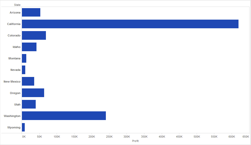
Tableau Show Me Menu – Horizontal Bar Chart 1
Level bar outlines are additionally effectively arranged to introduce highs and lows. The case beneath features the genuine estimation of a bar outline in telling the “story” of the information.
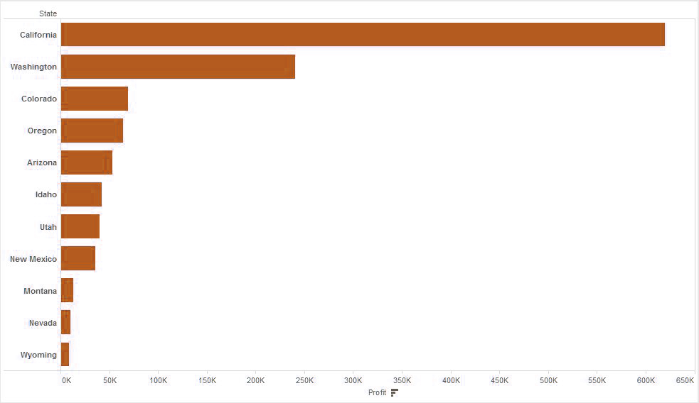
Tableau Show Me Menu – Horizontal Bar Chart 2
At long last, these kinds of diagrams are incredible for extra designing to give another level of data. An illustration may be a shading plan in light of profit margin.
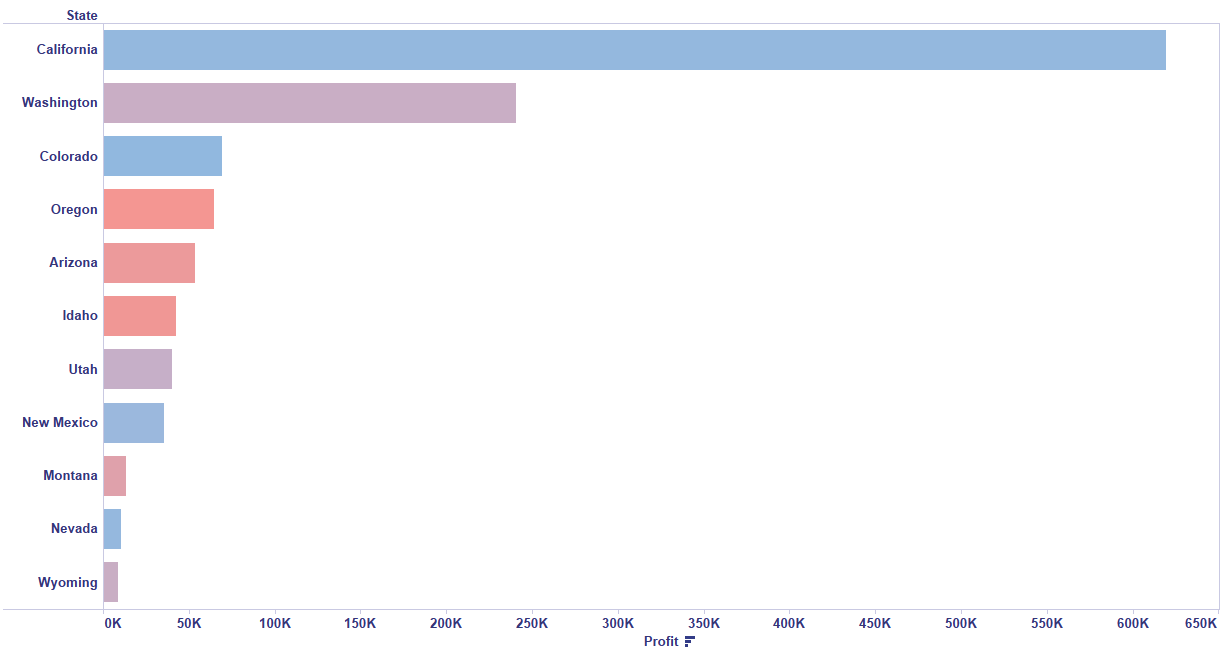
Tableau Show Me Menu – Horizontal Bar Chart 3
In the last case above, I designed the shade of our bar checks by profit margin. Any esteem that was beneath half was shaded with an orange plan, and any esteems over that were hued in a blue plan. The darker the blue, the higher the esteem.
There you have it! A level bar outline is a straightforward yet powerful approach to convey certain sorts of information, which is precisely why they’re so famous. They may not be ostentatious, but rather less complex is now and then better.
Conclusion
In this Tableau module, we learned what is show me and seven Tableau Show Me Menu Options. We also learned a lot of types of a graph by taking different examples. In next part, we will discuss further menu options of Tableau Show me Menu.
If you want to ask any query regarding it, feel free to ask in the comment section. We will definitely respond.
See Also- Tableau Show Me Menu Part II & Tableau Show Me Menu Part III
For reference
Did you know we work 24x7 to provide you best tutorials
Please encourage us - write a review on Google


