Tableau Forecasting – Learn to choose forecasting models wisely
Expert-led Courses: Transform Your Career – Enroll Now
In this tutorial, we are going to learn about forecasting in Tableau. As we have already learned about creating line charts in Tableau, we will go a step further here and learn how to add forecasting lines in a line chart. So, stay with us, as we are going to learn how to add forecasting lines into our charts in a stepwise manner.
How does forecasting work in Tableau?
Forecasting is a process of depicting future trends by identifying regular patterns in measure values. This technique of identifying regular patterns from existing data values and giving a forecast is known as exponential smoothing.
There are several models of exponential smoothing. Tableau selects seven to eight best models and then the one having the highest quality is chosen as the final forecast model.
There are two important concepts on which the process of forecasting is based; Trends and Seasonality. The trend is the increase or decrease in data over time and seasonality is a repeating variation in values over a determined period of time (such as weekly, quarterly, yearly, etc) known as seasons. These seasonal and repeating variations are predictable giving us accurate forecasts.
Usually, Tableau considers variations occurring in a 12-months cycle to predict a forecast as the time values are in a yearly manner. If the data values are given on a 6-months basis, a 12-month trend is determined with two sub-trends underlying it. Tableau calculates seasonality and trends for different periods using different methods and models suiting the requirements of the data set.
Tableau gives us a number of options to select from, for a forecasting model. Either, we can keep it on Automatic and let Tableau decide which forecasting model is the most appropriate for our data and requirements. Or, we select the Custom option and then make a choice from the three types of trends and season characteristics which are; None, Additive, and Multiplicative. We will learn how and where to make these selections in the following section.
How to Create a Forecast in Tableau?
Follow the steps given below to create a forecasting graph in your Tableau chart. Please make sure that you are using at least one date dimension and one measure in order to create a forecast graph.
Step 1:
Before you start with creating a forecast, you must have a line chart as an extension of which, your forecast will be made. The forecast models will use data from this line chart to calculate and give an accurate forecast.
As your first step, add a date dimension in the Columns section and a measure field in the Rows section. This will give us a simple line chart.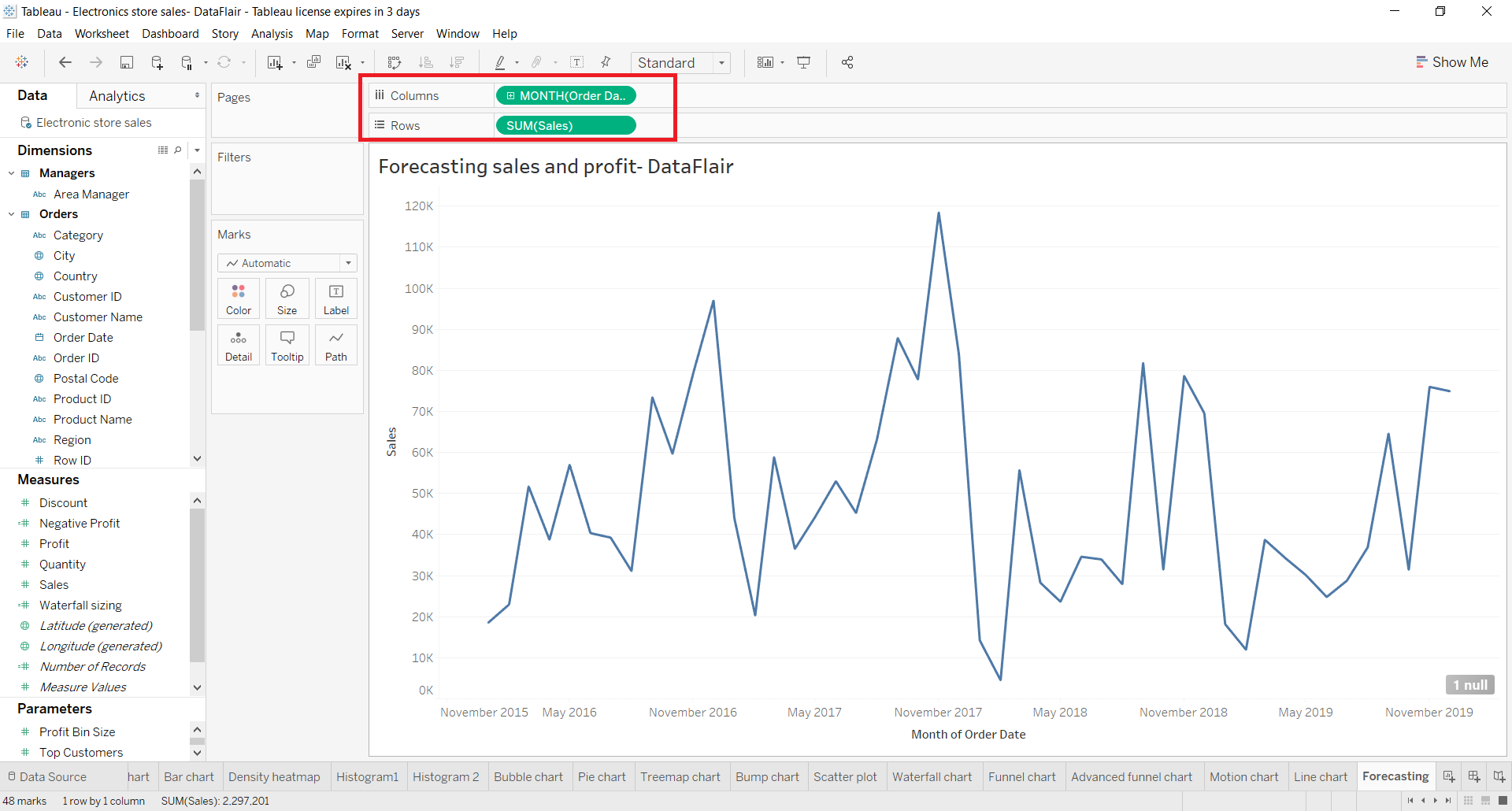
Step 2:
Now, go to the Analytics pane and select Forecast from the available Model list.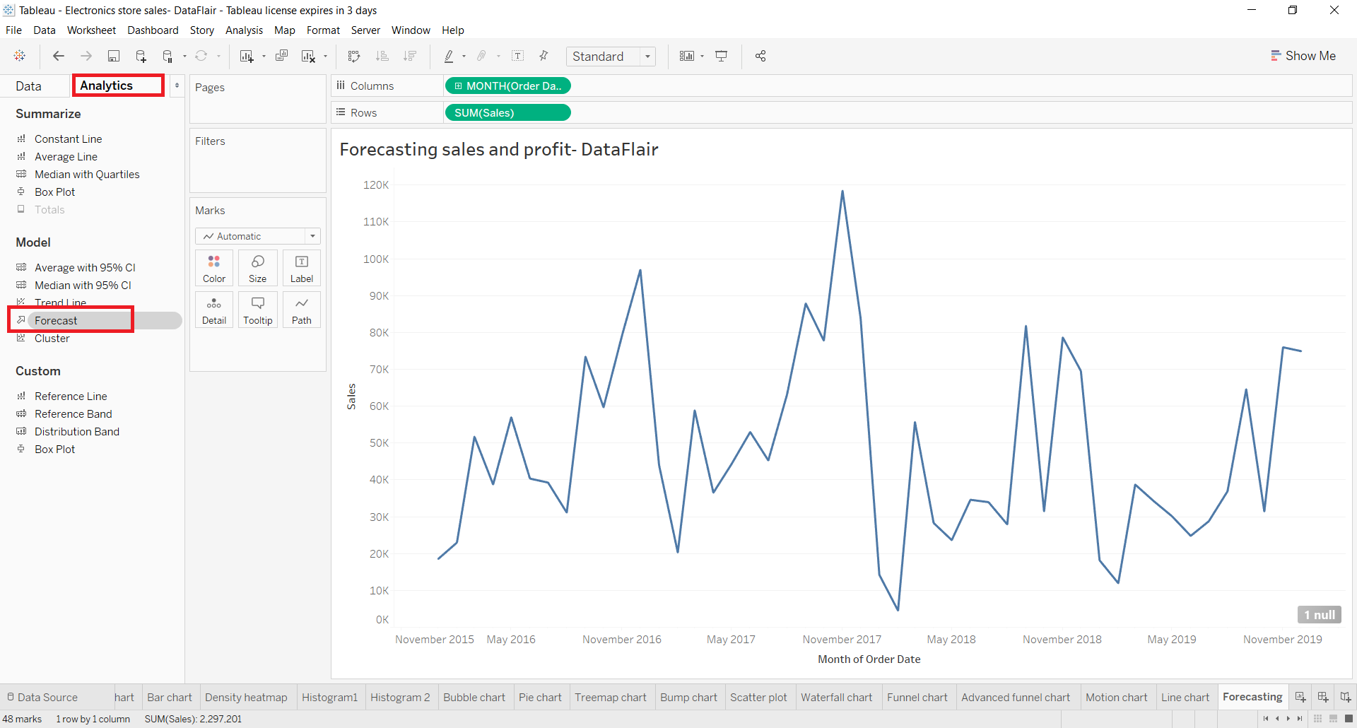
Step 3:
To apply the Forecast model on our existing line chart, you need to drag the Forecast option to the graph area as shown in the image below.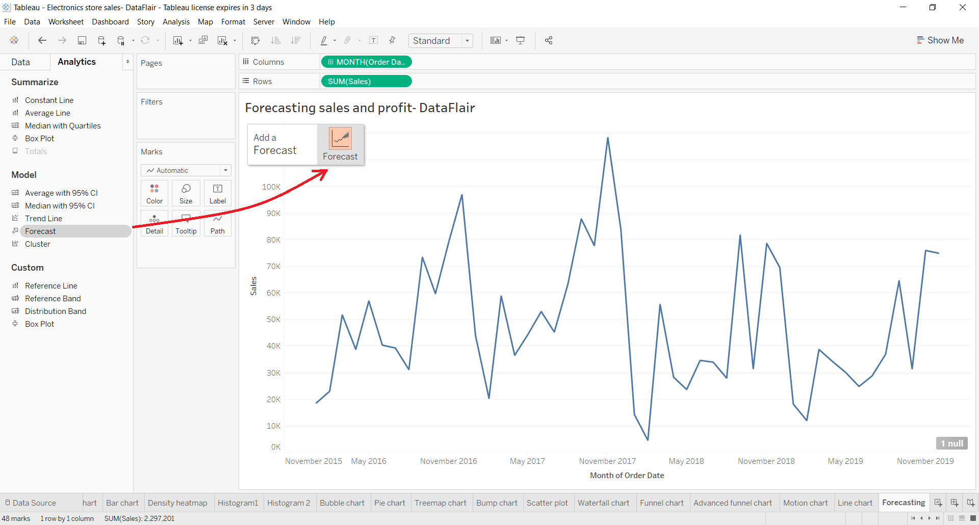
This will instantly add a future forecast line as an extension to your existing line chart. You can also get some basic information about the forecast on the data label.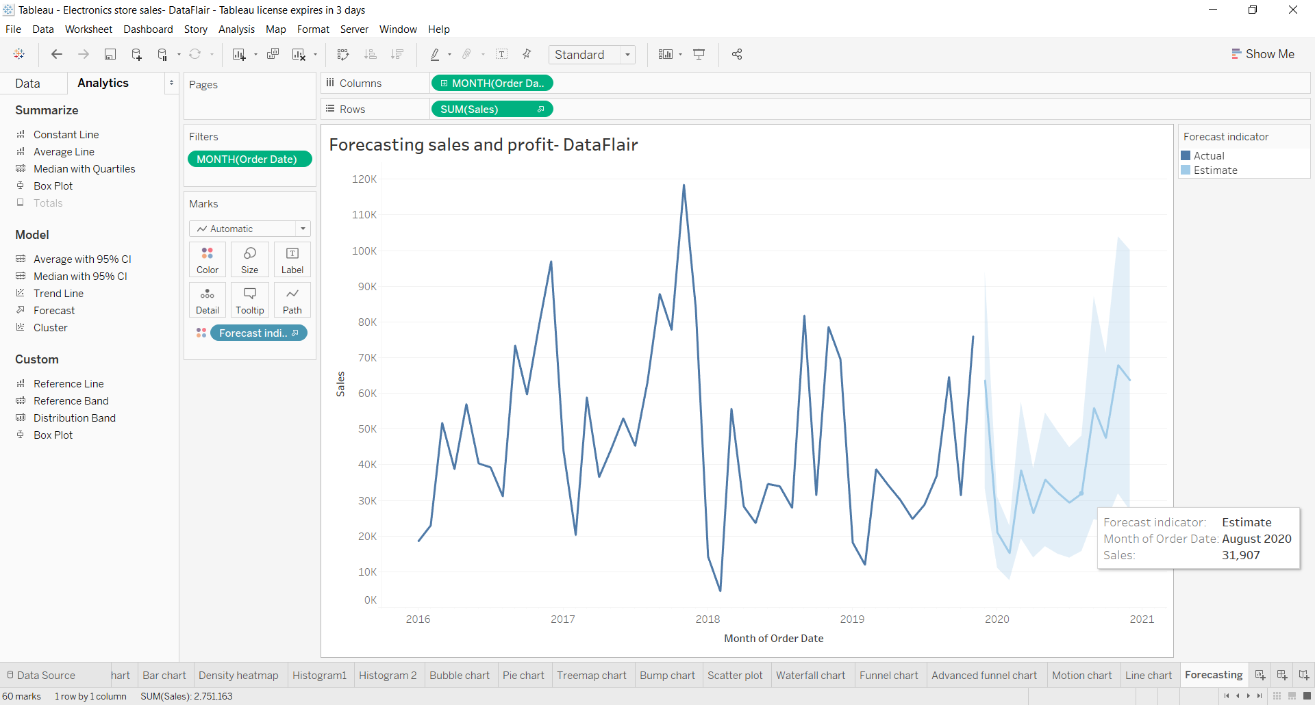
Step 4:
To explore more options related to forecasting, right-click on the forecasting section and go to Forecast option and select Forecast options.. from the list that opens further.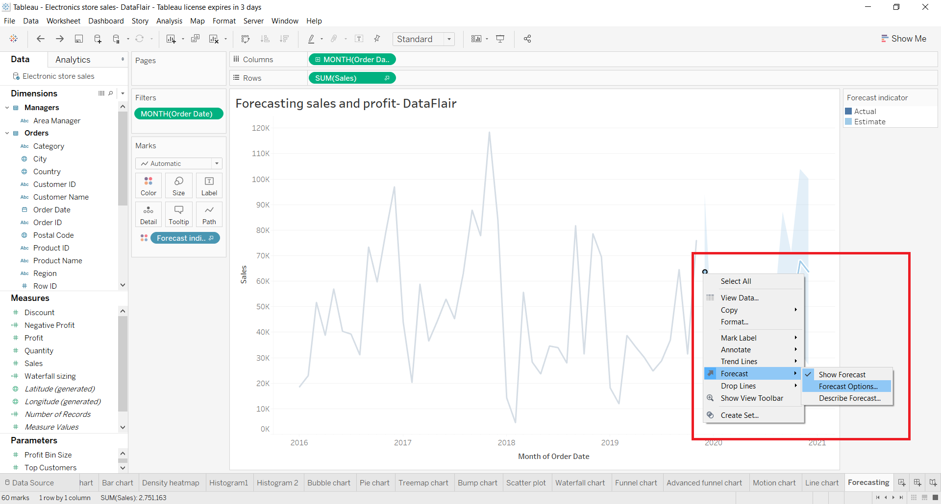
From the dialog box that opens, you can select and set the forecast length, source data, aggregation type, and the forecast model type. The forecast model is usually set to Automatic as it gives the best and the most appropriate forecast graph. You can also select or deselect the Show prediction intervals option and adjust it as per your liking.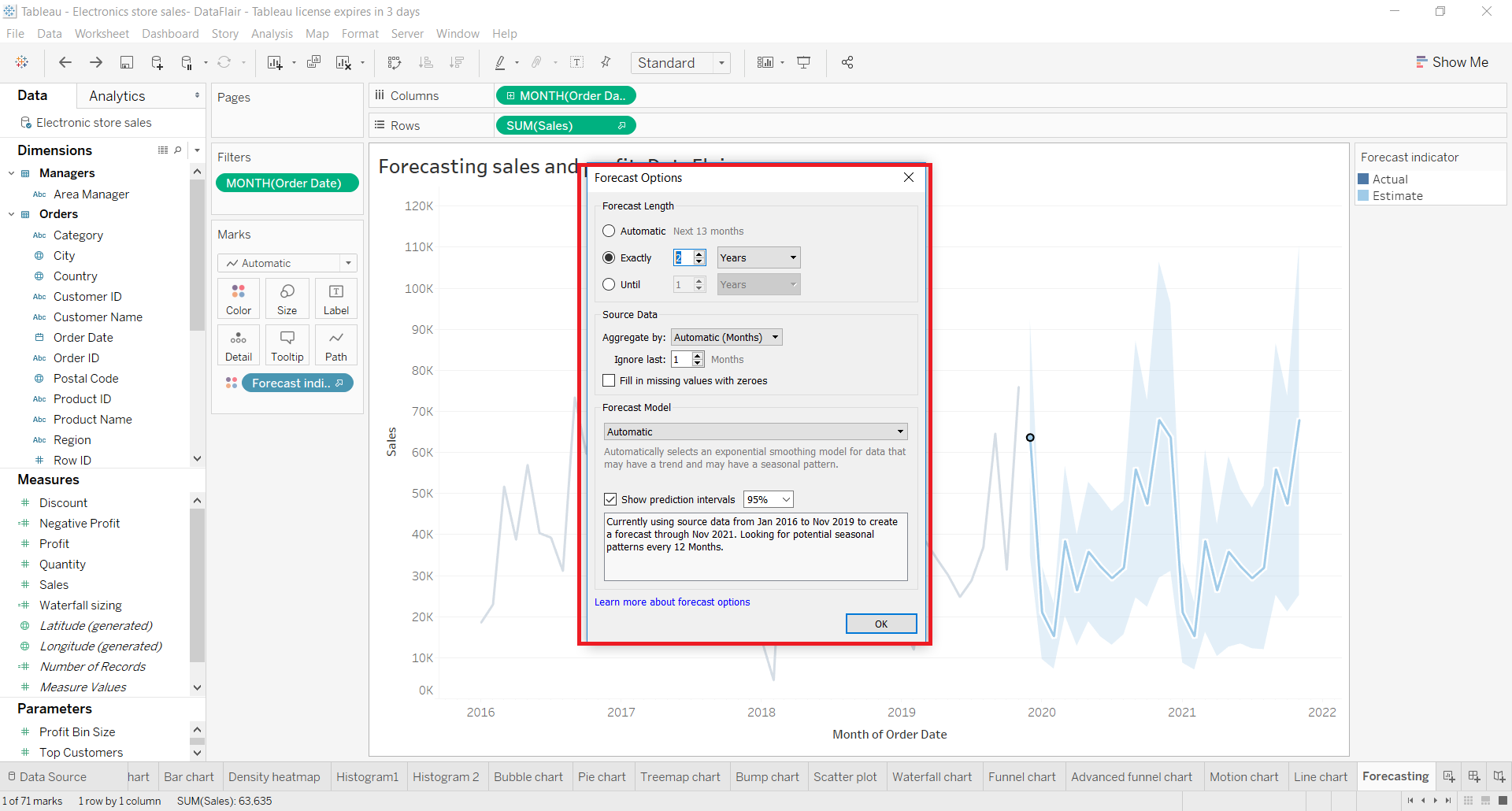
Any doubts in DataFlair’s Tableau forecasting tutorial till now? Ask in the comment section.
Step 5:
You can also view a detailed description of the forecast by right-clicking on the forecast section and then go to Forecast and select the option Describe Forecast.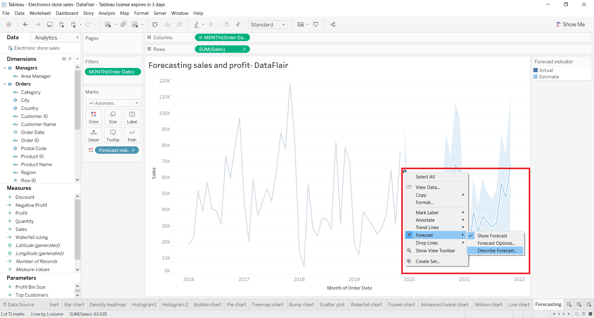
This will open a Describe Forecast dialog which has two tabs; Summary and Models. On the Summary tab, you can have all the information about the forecast as shown in the screenshot below.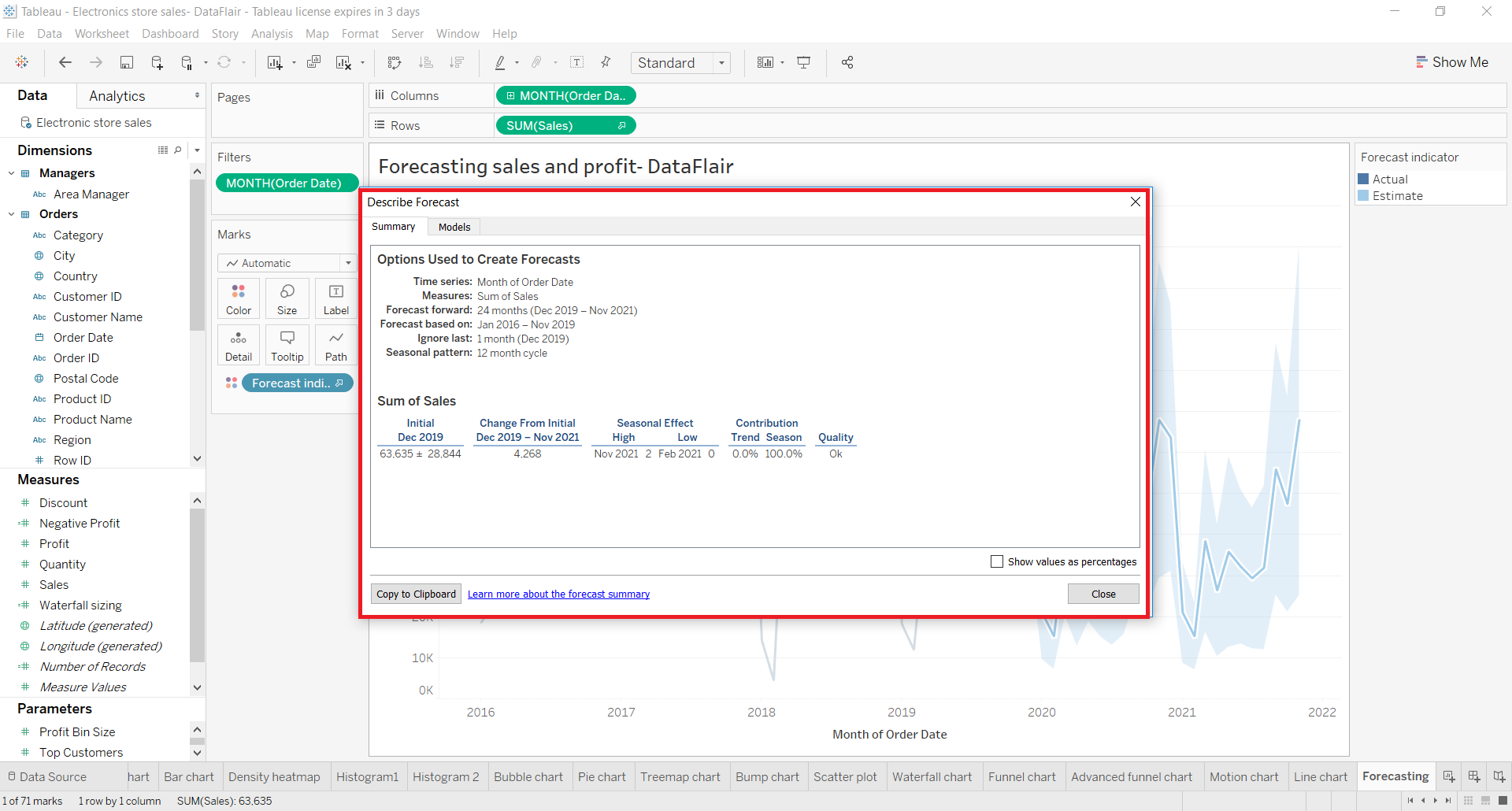
In the Models tab, you can see the model type, trend, seasonality, etc.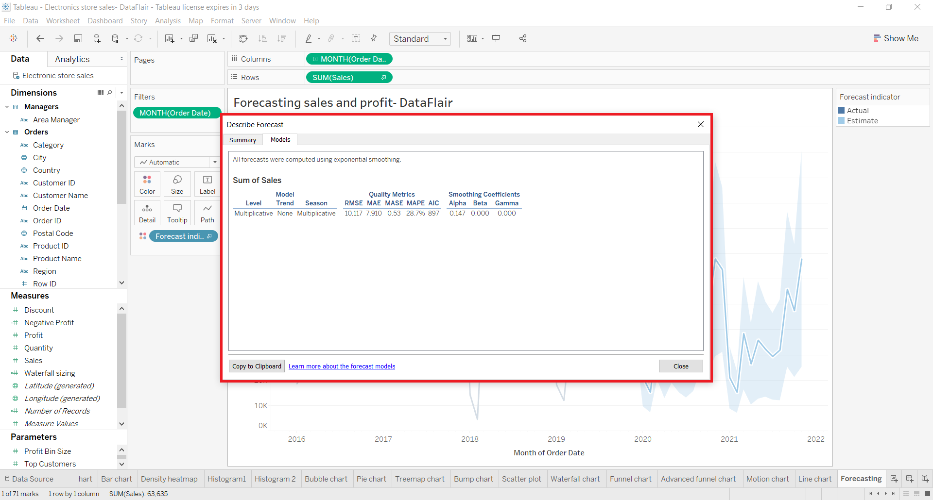
Step 6:
You can also add another measure on the same line chart. You will have a split view where you can compare the line charts and forecast of two fields with respect to the same time interval. In the screenshot below, we add a Profit measure in addition to the Sales measure. To add a new measure, drag and drop the measure field on the chart area as shown below.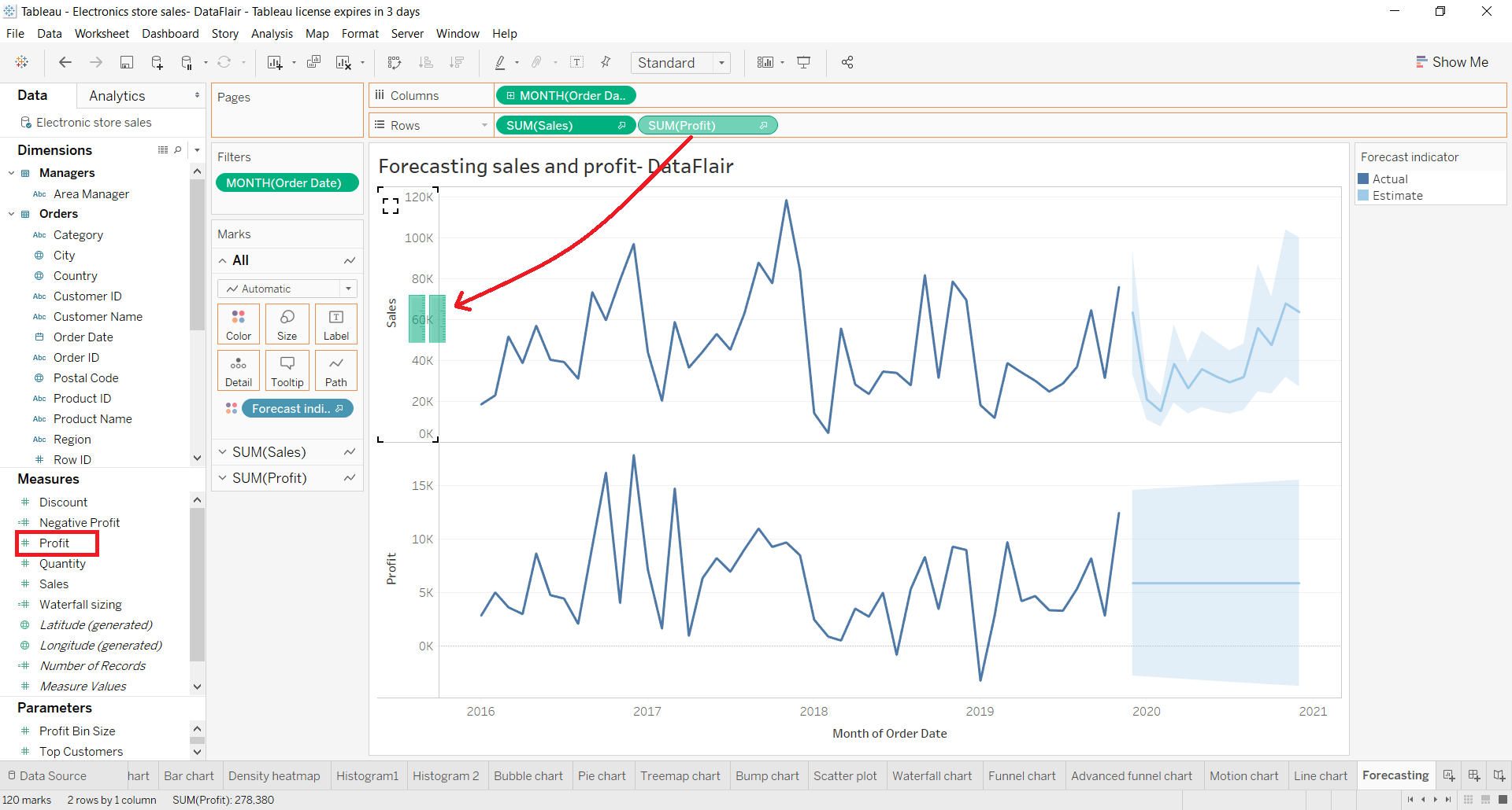
Step 7:
You can also change the color of the forecast region. To do this, click on the Color card and click on Edit Colors.. option. This will open dialog from where you can select the color palette of your choice.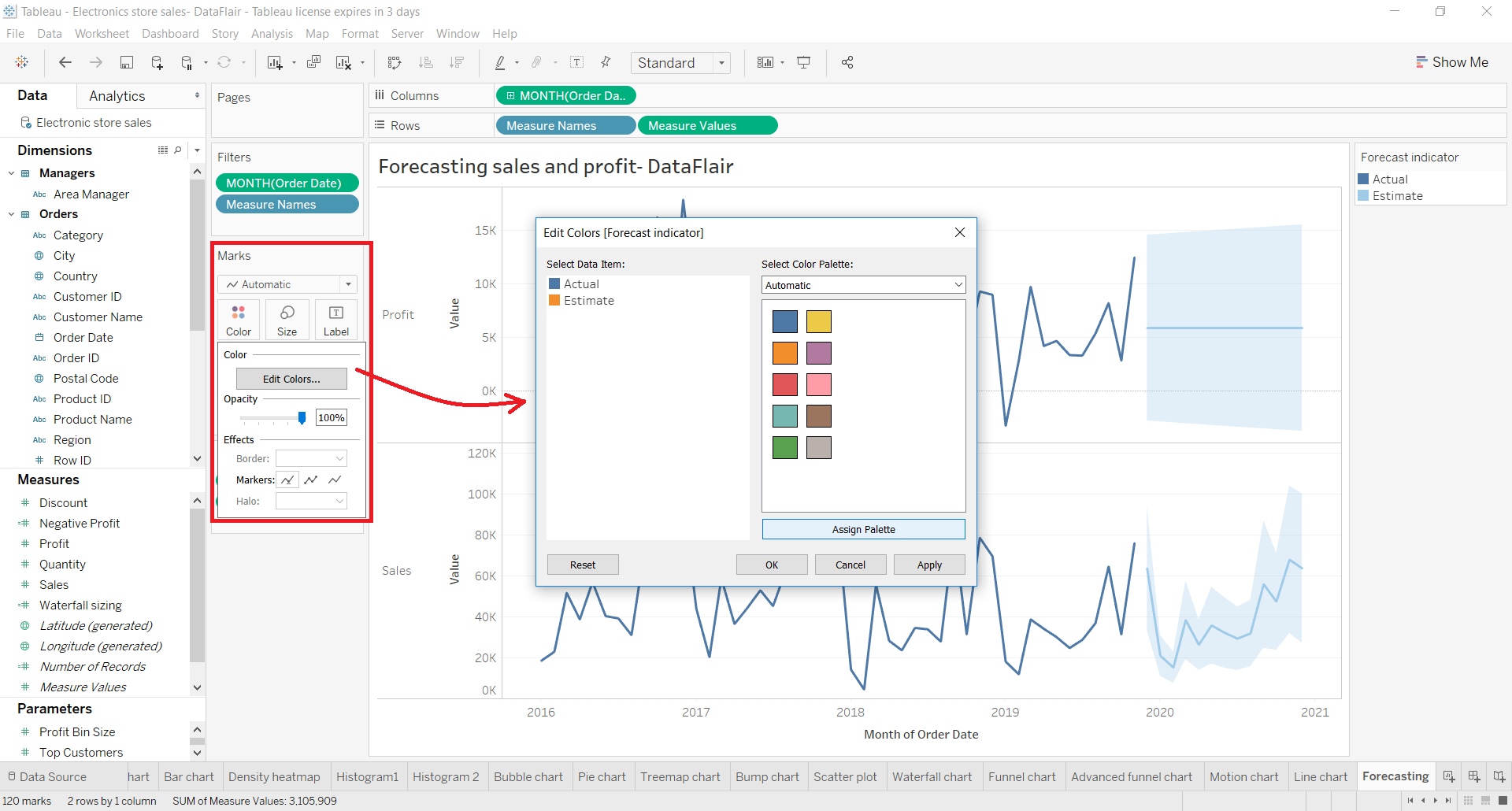
As you can see in the screenshot below, we changed the color of our forecast indicator from blue to red. Similarly, you can select the color scheme of your choice.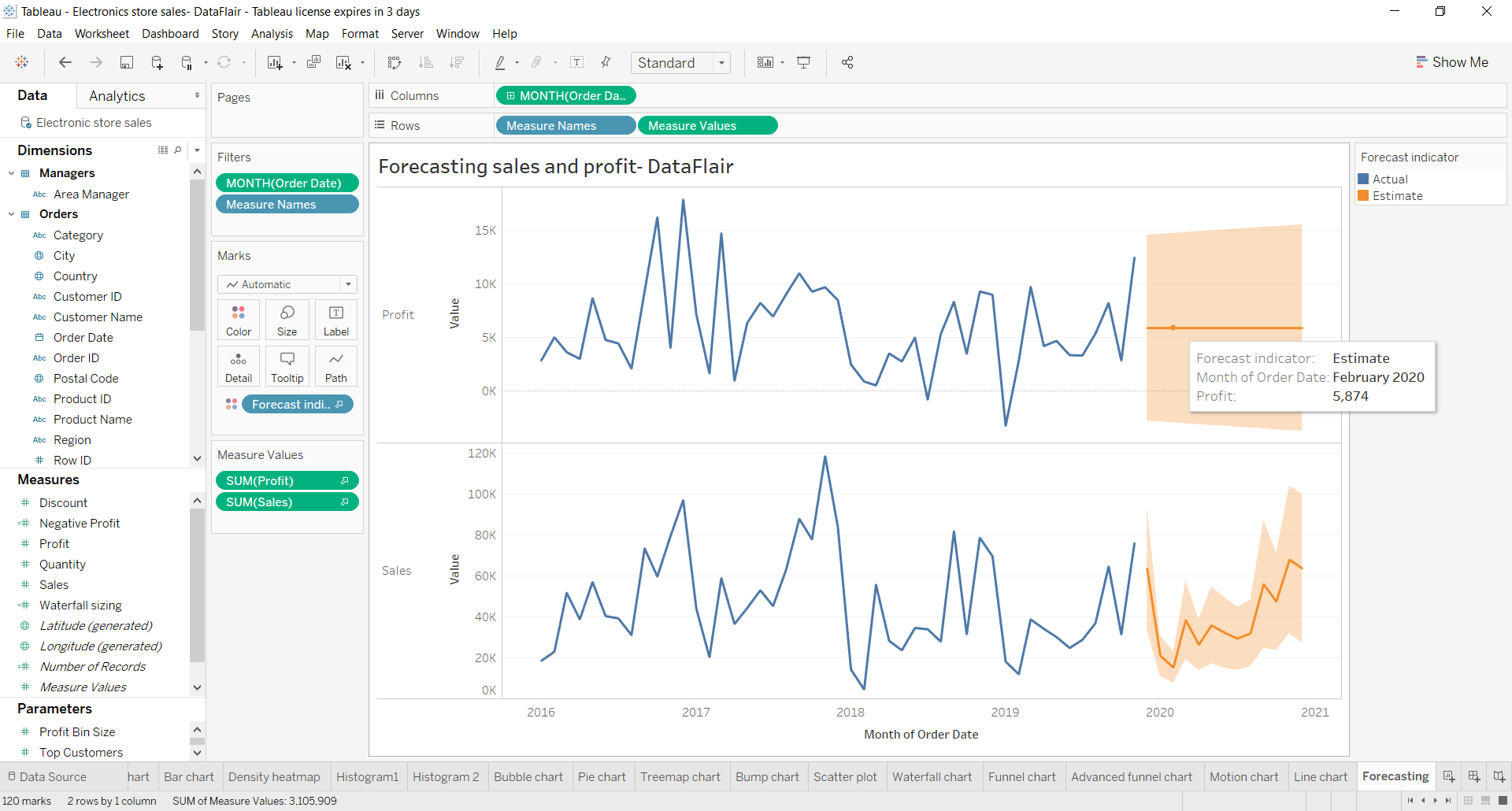
Summary
This was all about Tableau forecasting and how to create a forecast indicator graph in your Tableau graphs.
If you want to add more steps in DataFlair’s Tableau forecasting tutorial, do let us know in the comment section.
Jump into the next Tableau tutorial, that is, Reporting in Tableau.
Happy Learning😃
Did you like this article? If Yes, please give DataFlair 5 Stars on Google


Dear Tableau,
I am a registered student in South Africa, studying a short programme on Data Analysis. In a module towards the end specific reference is made to Tableau, and some insight shared on your specialities.
In the mean time i would like to make contact with somebody specific at Tableau (more notably somebody involved in training) as i intend to further my studying in data analysis once the current course ends.
My particular and keen interest is towards data / statistical forecasting since i have identified a need in my field of expertise & qualification.
Thanks & regards,
Jasper
Lesotho
Can you share the datasets that you are working on for us to follow along and learn simultaneously
We have used following dataset in Tableau Forecasting practicals: Electronic Store Dataset