Tableau Sparkline Chart – How to Create Sparklines Chart
Job-ready Online Courses: Click for Success - Start Now!
In last tutorial we had seen Tableau Population Pyramid, in this Tableau tutorial, we are going to study about Tableau Sparkline chart, what is Sparkline chart, how to create Sparkline Chart in Tableau, a stepwise procedure to do so with Tableau Sparkline Chart example.
So, let us start with Tableau Sparkline Chart.
What is Tableau Sparkline Chart?
Sparklines are great for representing a lot of information in a very small space. Creating a sparkline chart in Tableau requires creating a small multiple and formatting the small multiple so it’s smaller and without many of the axis labels.
In this recipe, we started by creating a small multiple of line charts by cuisine description.
We adjusted the formatting so that the rows and columns are smaller than the default style.
Overall, these steps are fairly similar to creating a small multiple chart recipe in this chapter.
The enhancement to Tableau Sparkline chart is the addition of indicators at the end of the line. Since the indicators are a different mark, this means we need to use a dual axis chart to accomplish this visual.
Read about How to build Bar Chart in Tableau
How to Create Sparkline Chart in Tableau?
Steps to make tableau Sparkline chart:
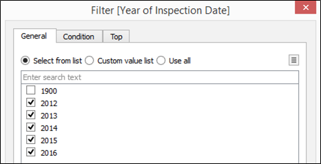
i. From Dimensions, drag Inspection Date to the Filters shelf.
ii. When prompted on what to filter, choose Years.

Step 2. Tableau Sparkline Chart
iii. In the next window, under the General tab, select all years except 1900.
Step 3. Tableau Sparkline Chart
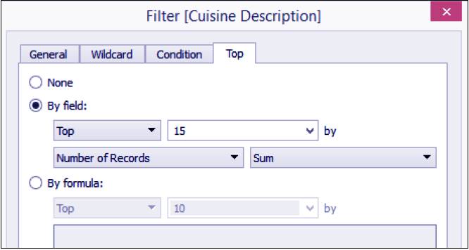
iv. From Dimensions, drag Cuisine Description to the Filters shelf and under the Top tab, select Top and 15 by Sum of Number of Records.
Let’s learn How to Create Heat Map in a tableau
Step 4. Tableau Sparkline Chart
v. From Dimensions, drag Cuisine Description to the Rows shelf.
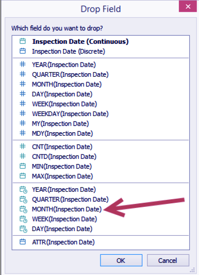
vi. From Dimensions, right-click drag Inspection Date to the Columns shelf, and choose continuous month. This is the fourth field from the bottom of the list.
Step 6. Tableau Sparkline Chart
vii. From Measures, drag Score to the Rows shelf to the right of Cuisine Description.
Tableau Pie Chart – How to build Pie chart in tableau
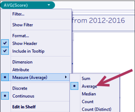
viii. Right-click on Score on the Rows shelf and change aggregation to Average.
Step 8. How to Create Sparkline Chart
ix. Under Dimensions, right-click on Inspection Date and choose Create, and then Custom Date….
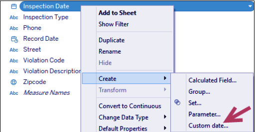
Step 9. Tableau Sparkline Chart
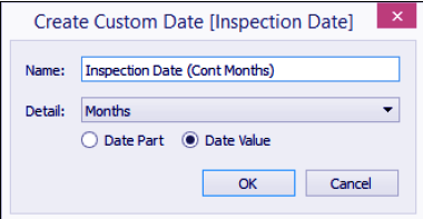
x. Choose Months under Detail and provide the name Inspection Date (Cont Months).
Let’s revise Tableau Bubble Chart – Building Bubble Chart
Step. 10 How to Create Tableau Sparkline Graph
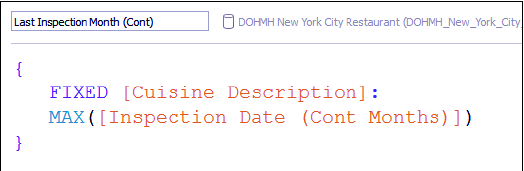
xi. Create a calculated field called Last Inspection Month (Cont), which will hold the last inspection done for that particular cuisine family.
Step. 11 How to Create Tableau Sparkline Graph
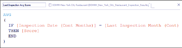
xii. Create another calculated field called Last Inspection Avg Score, which will hold the average score for the last inspection month for that cuisine family. Note that if the inspection date does not fall on the last inspection month, the score is not included in the average calculation.
Step. 12 How to Create Tableau Sparkline Graph
xiii. From Measures, drag the new calculated field Last Inspection Avg Score to the Rows shelf, to the right of AVG(Score).
xiv. Right-click on Last Inspection Avg Score pill in the Rows shelf and select Dual Axis.
Tableau Waterfall Chart – Steps to Create Waterfall Chart
xv. From Measures, drag Score to Detail of any of the Marks cards. We will use this to create a quick table calculation on Score that we will save back to the side bar.
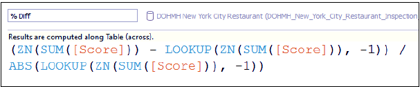
xvi. Right-click on Score on the Detail property in the Marks card. Go to Quick Table Calculation and select Percent Difference.
xvii. Drag the Score pill with the table calculation back to the side bar, and rename this field to % Diff. Note that when the quick table calculation was set, this pill automatically got the following formula:
Step 17. How to Create Tableau Sparkline Graph
xviii. You can delete the Score in the Detail on the Marks card now. We simply needed this to auto-generate the formula for us.
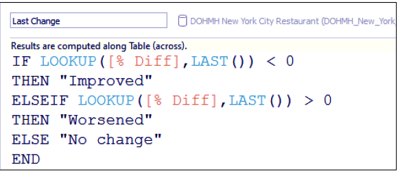
xix. Create another calculated field called Last Change, which checks the last change and assign an overall status of Improved if the final % Diff is positive, Worsened if the last % Diff is negative, and No change if there was no change.
Step. 19 How to Create Tableau Sparkline Graph
xx. Select the AGG(Last Inspection Avg Score) in the Rows shelf to activate its Marks card.
xxi. From Measures, drag Last Change to Color in the Marks card.
Let’s discuss Tableau Date Functions with Examples
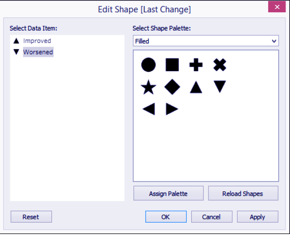
xxii. Change the mark type to Shapes.
xxiii. From Measures, drag Last Change to Color in the Shape property in the Marks card, and choose the Filled Shape Palette.
xxiv. Choose a filled upwards arrow for Improved, and a filled downwards arrow for Worsened.
Step. 24 How to Create Tableau Sparkline Graph
xxv. Change the titles of the shape and color legends to display Latest Score. You can do this by right-clicking on the top-right corner of each legend box, and selecting Edit Title….

Step. 25 How to Create Tableau Sparkline Graph
xxvi. Adjust the width and height of the rows and columns. You can do this by moving your mouse pointer to the column or row edge of a film until you see a double-headed arrow. The left-right double-headed arrow allows you to adjust the width, and the up-down double-headed arrow allows you to adjust the height.
xxvii. Remove the grid lines. You can do this by selecting Format menu item, and select Lines….
Let’s read about Tableau Custom Data View – Drill Down, Swapping Dimension Operations
xxviii. Under the Rows tab, select Grid Lines and set it to None.
xxix. Go to Format menu again, and this time select Borders….
xxx. Under the Sheet tab, set Pane line to None for both the Row Divider and Column Divider section.
xxxi. The format sidebar will replace the original data sidebar. In this format borders sidebar, under the Sheet tab Default section, add borders to the Cell, Pane, and Header.
xxxii. Right-click on all the green pills in the Columns and Rows shelves and uncheck Show Header.
So, this was all about Tableau Sparkline Chart. Hope you like our explanation.
Conclusion
In this Tableau tutorial, we learned about What is Sparkline chart, Tableau Sparkline chart, how to create Sparkline chart in the tableau and how to use Sparkline graph in a tableau, thus completing another table in our list. Furthermore, if you have any query, feel free to ask in a comment section.
Did you know we work 24x7 to provide you best tutorials
Please encourage us - write a review on Google


