Tableau Donut Chart – Let your Data Erupt with Tableau Donut
Interactive Online Courses: Elevate Skills & Succeed Enroll Now!
In this tutorial, we are going to learn Donut chart in tableau and how to create it. Open your Tableau and upload a dataset in it. Then follow the steps given in the section below and create your first donut chart with us. So let’s start!!
What is Donut Chart in Tableau?
As the name suggests, a donut chart is a pie chart with a hole in its center thus, looking like a donut. Now you will ask why to use a donut chart when we already have a pie chart?
Well, as all good things can always be better, when we have an empty space in the middle of a pie chart (making it a donut chart) we can include cumulative figures on them along with the values pertaining to individual categories in a pie chart.
Learn the art of making Tableau Pie Chart.
Thus, a donut chart is a hollow circular chart that is divided into multiple segments in proportion with the related values. In the center of it is an empty space where we can add labels showing a total value or a parameter as a whole so that you can instantly compare it with the segment values.
How to Create Donut Chart in Tableau?
Follow the steps given below to create a donut chart in your Tableau software.
Step 1: Create Two Aggregate Measure Fields
We will start by creating two aggregate measure fields in the Rows section. In this section, we double-click and write avg(0) then click enter.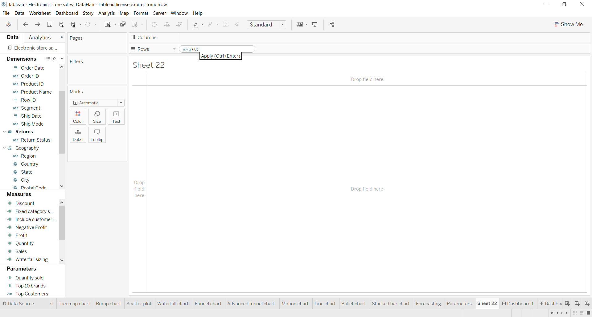
Similarly, we enter another aggregate measure.
Step 2: Select Mark Type for Measures
Next, we select the mark type for the first measure as Pie from the Marks list. Also, note that by creating two aggregate measures, we have two sections for each measure in the Marks card. We will use these two sections for both measures discreetly to create our Tableau donut chart.
Step 3: Add Set of Fields to Get Pie Chart
Now, we will add a set of fields in Color, Angle, and Label cards of the Marks section. Please note that we are adding these fields in the first AGG(avg(0)) field column. By adding these fields in the appropriate columns, we get a pie chart as seen in the screenshot below, with three sections, name labels, and value labels.
We apply a Quick Table Calculation to our SUM(Sales) field by right-clicking on it, selecting the option Quick Table Calculation and then selecting Percent of Total. This will show the percent of the total sales for each category in the labels of the chart.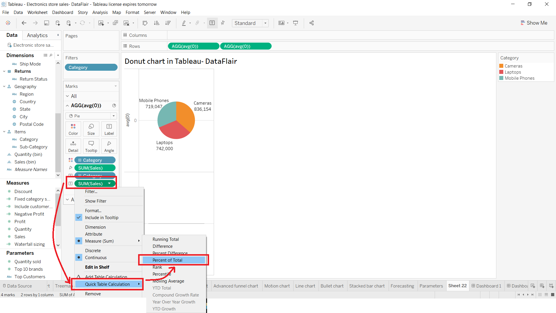
Step 4: Select Circle from Drop-Down List
Next, we right-click on our second measure field (i.e. AGG(avg(0))) in the Marks section and select Circle as the mark type from the drop-down list.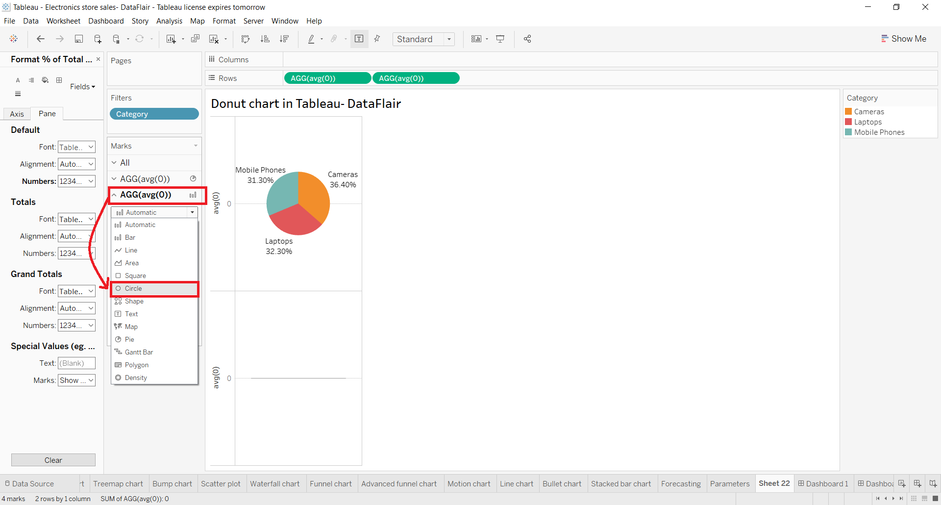
Step 5: Select Color Card to Change Circle Color
We change the color of the circle from grey to white. To do this, click on the Color card and select white from the given color palette. Again, make sure that you are performing this step for the second measure field.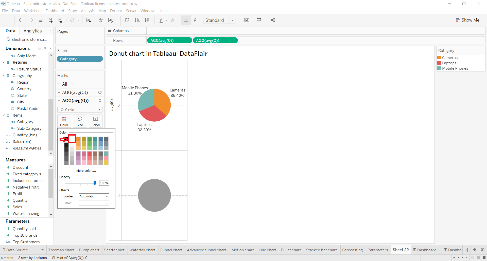
Step 6: Add Measure Field into Label Card
Look closely, our last step creates a white circle on the lower half of the plot area. Before we go ahead, we add a measure field, Sales into the Label card of the second aggregate measure section. This adds a value showing total sales for all three categories below the white circle.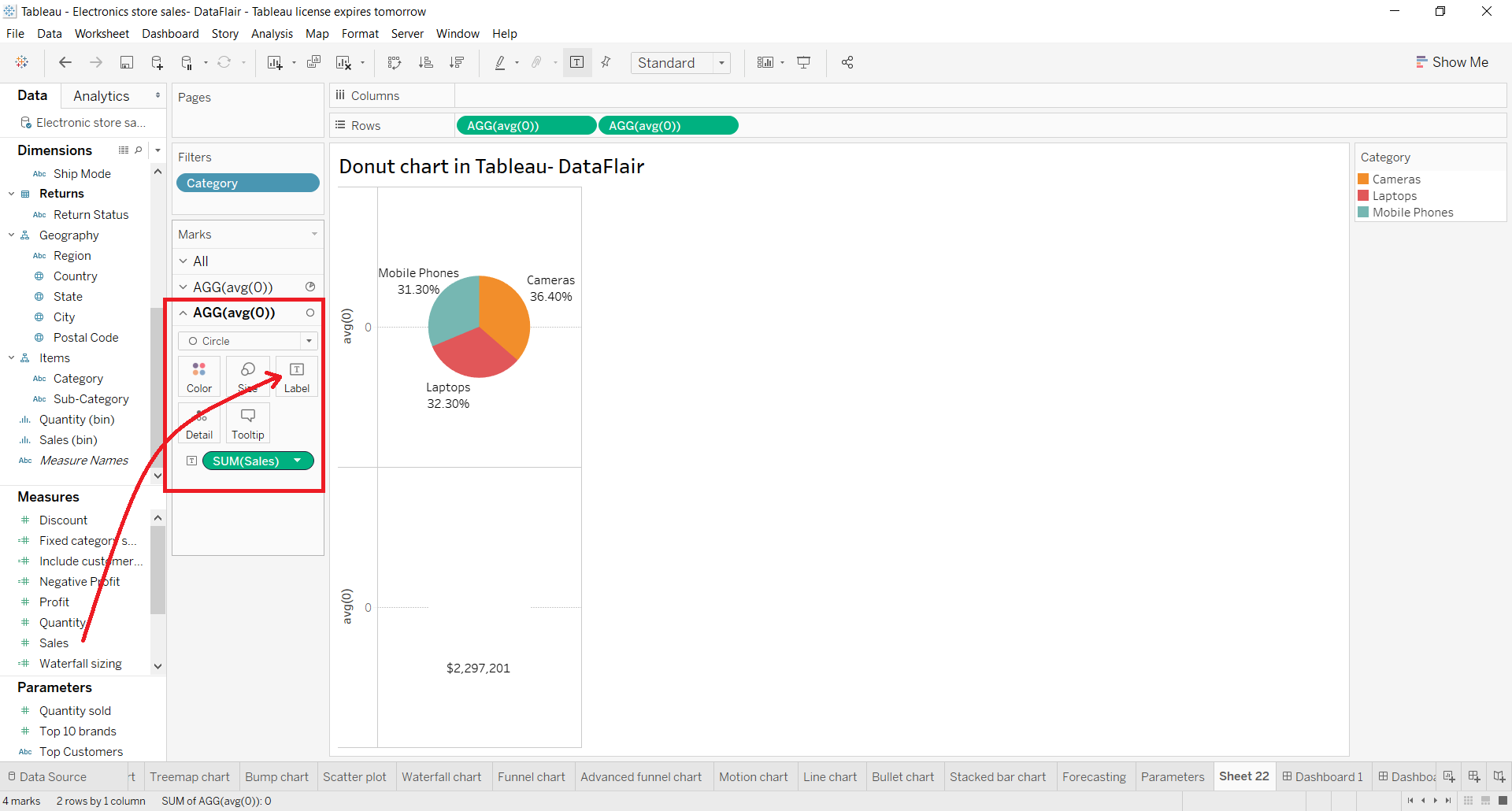
Step 7: Select Dual Axis to Combine Charts
Now, it’s time to combine these two charts and get a step closer to our final tableau donut chart. To do this, right-click on a measure field name present in the Rows section and select Dual Axis from the drop-down menu.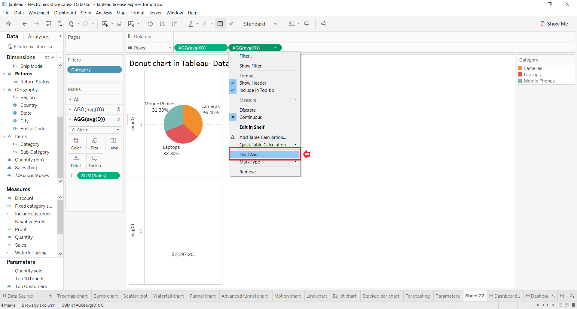
Step 8: Click on Size Card to Reduce Size
Right now, all we see is a white circle, with data labels around it. It is because the two charts completely overlap each other. To bring the second chart in the front, click on the Size card and reduce the size of the white circle.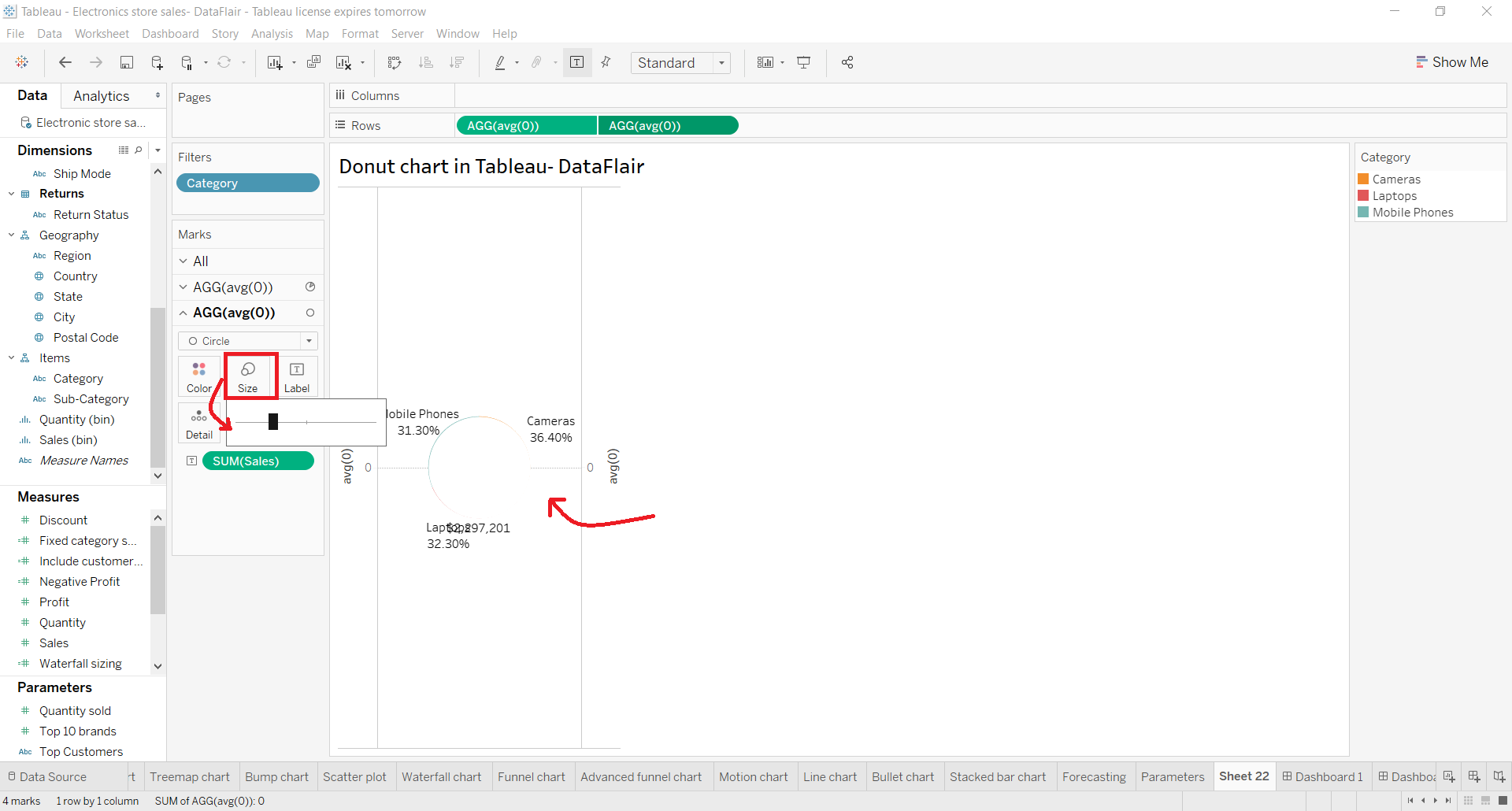
Step 9: Finalise Tableau Donut Chart
Once we adjust the size of the inner white circle, we could see a donut-shaped chart having three sections and data labels. In the center of the donut chart, we have the total sales value for all the three categories.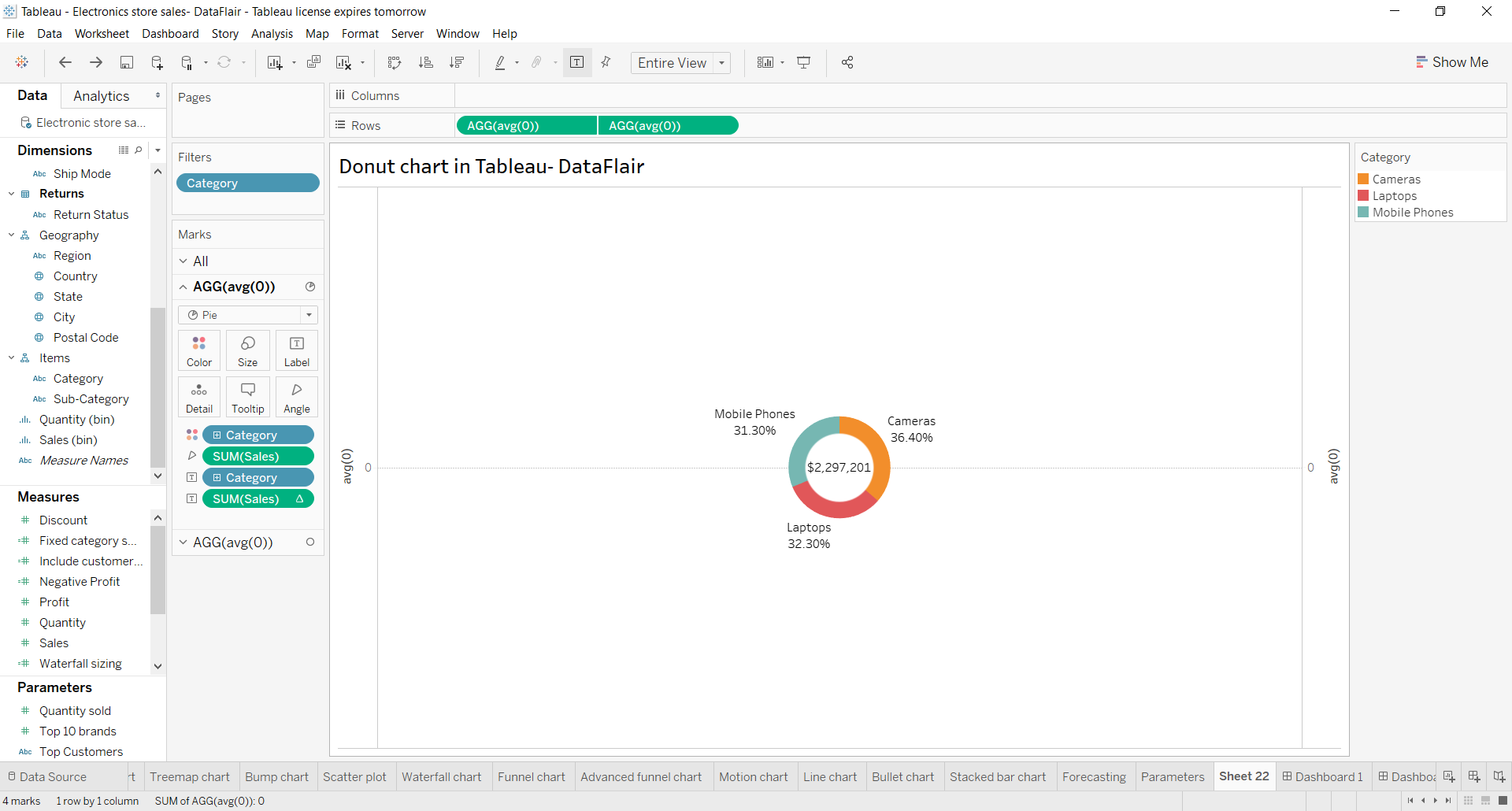
Step 10: Change the Color Scheme of the Chart
We can also change the color scheme of the chart by clicking on the Color card in the first measure field section.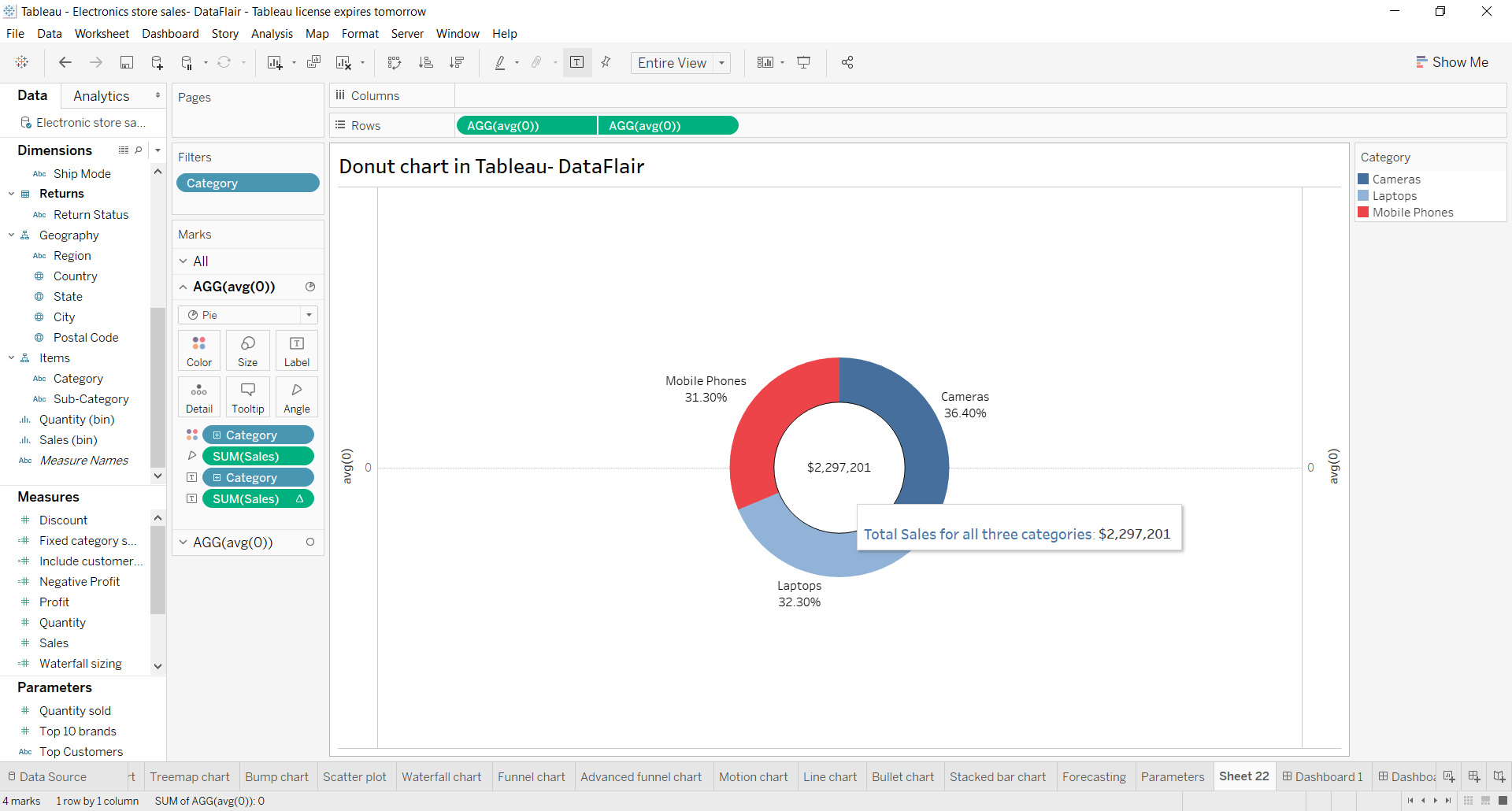
In the same way, we can format our tooltip from the Tooltip card. In this way, our donut chart, showing total sales value for all three categories, sales value for each category and sales percentage for each category is ready. The three categories are shown in different colors making it easy for us to identify them.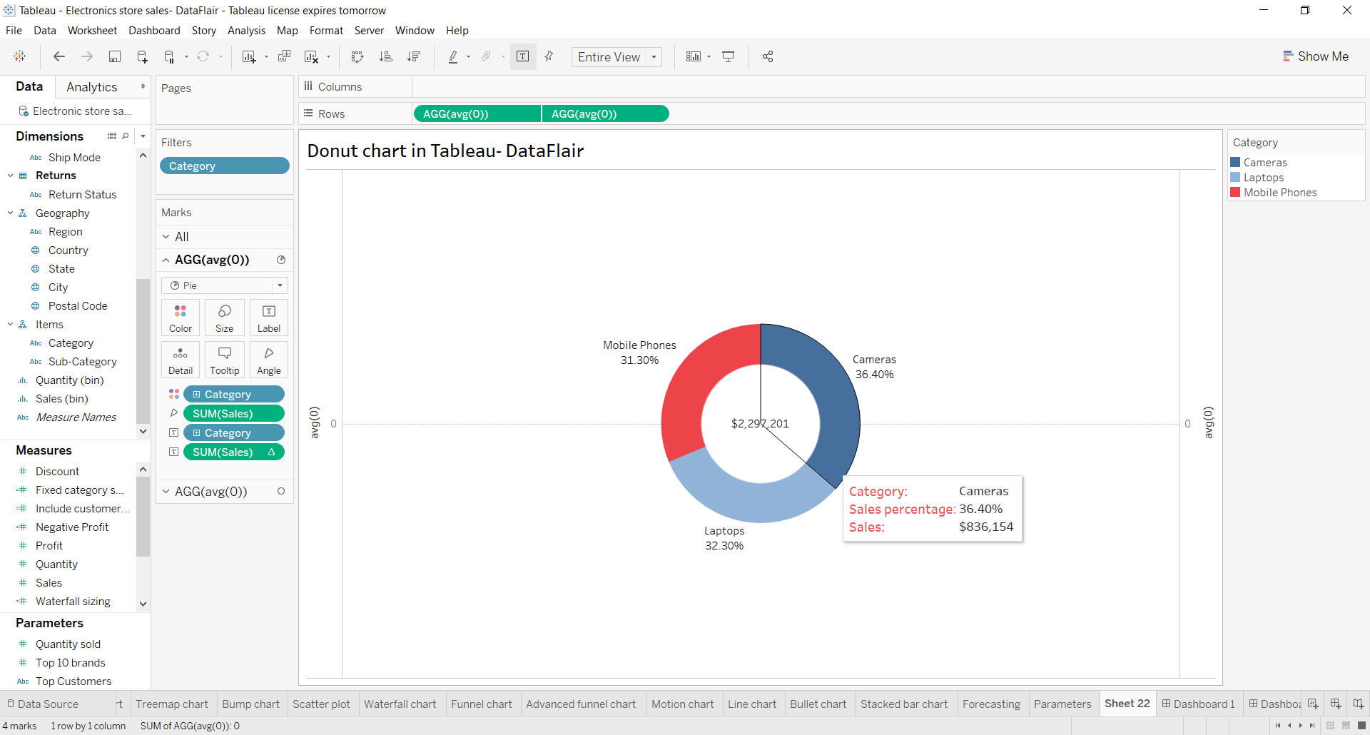
Summary
So, this was all about donut chart in Tableau. We hope you liked it and found it useful in enhancing your knowledge.
Give your data a head start with Tableau Waterfall Chart.
Still, if you have any queries or suggestions, please leave your comments in the comment section. Our experts will happy to guide you!
Happy Learning😃
Did we exceed your expectations?
If Yes, share your valuable feedback on Google


How to create action filters for inner circle so that it shows details for all the Genres?
This is brilliant but two questions:
Is there a way to remove the display of the axes & the horizontal line through the middle of the donut?
Is there a way to conditionally color the center circle Green or Red dependent on the aggregated value used to label the middle circle ?
Clear explanation