Tableau Histogram – Insightful & Informative Analysis of your Data
Placement-ready Courses: Enroll Now, Thank us Later!
In this Tableau tutorial, we are going to learn about using a Histogram in Tableau. Here, we will find answers to questions like what is a histogram, and how do we create it in our Tableau software.
What is Histogram?
Histograms are used to represent value distribution along an axis on a graph. A histogram gives statistical information about the probability distribution of values occurring in successive intervals of equal size. Thus, we can carry out an insightful and informative analysis using histograms.
Before proceeding, you must complete the Tableau Data Sources Tutorial
How to Create a Histogram in Tableau?
Follow the steps given below to create a histogram in your Tableau software:
Step 1: Create Bins in Tableau
The very first thing that we need to do in order to create a histogram is to create bins. Bins are a type of measure where we define bins of the fixed value range. Every value in a field then falls into a certain bin. This makes the distribution of data values continuous.
To create a bin, select a measure ( we selected Quantity) and right-click on it. Then click on Create and select Bins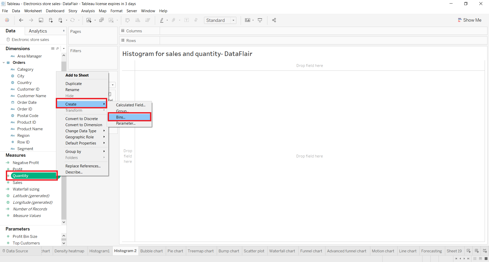
Now, in the Edit bin dialog, we enter the name of the bin or new field and set a size for the bin. The size of the bin decides the intervals on the axis and is set according to the values in the field. If you are unable to decide the bin size you can click on the Suggest Bin Size button to get a suggestion from the system.
Here, we set the bin size to 1.5. This means that all the values in the Quantity field falling between 0 to 1.5 will come in the first interval. Then the values falling between 1.5 to 3.0 will come in the second interval and so on. This gives a continuous distribution of values in the chart so that it is easier to plot and analyze.
Step 2: Add Quantity into Rows and Columns Section
Now, we add our newly created measure Quantity(Bin) into the Columns section and Quantity into Rows section. Make the aggregation type for the selected measure as Count.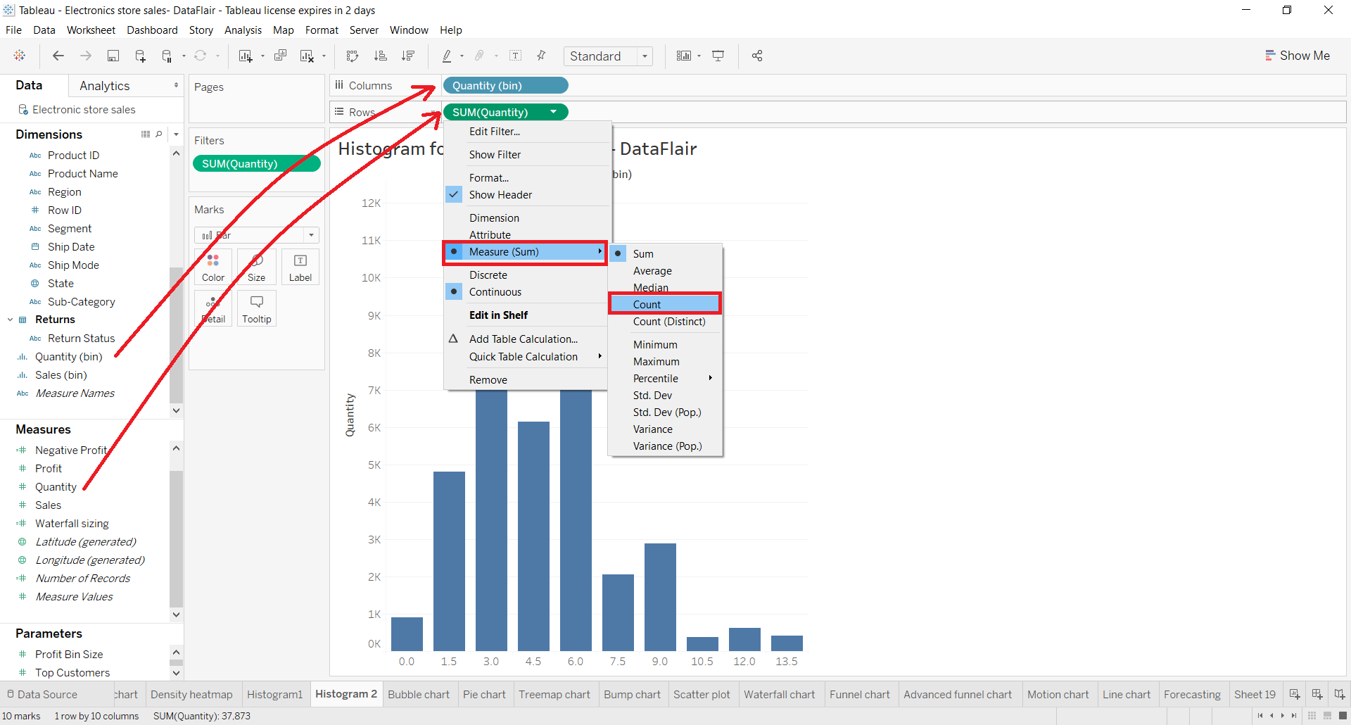
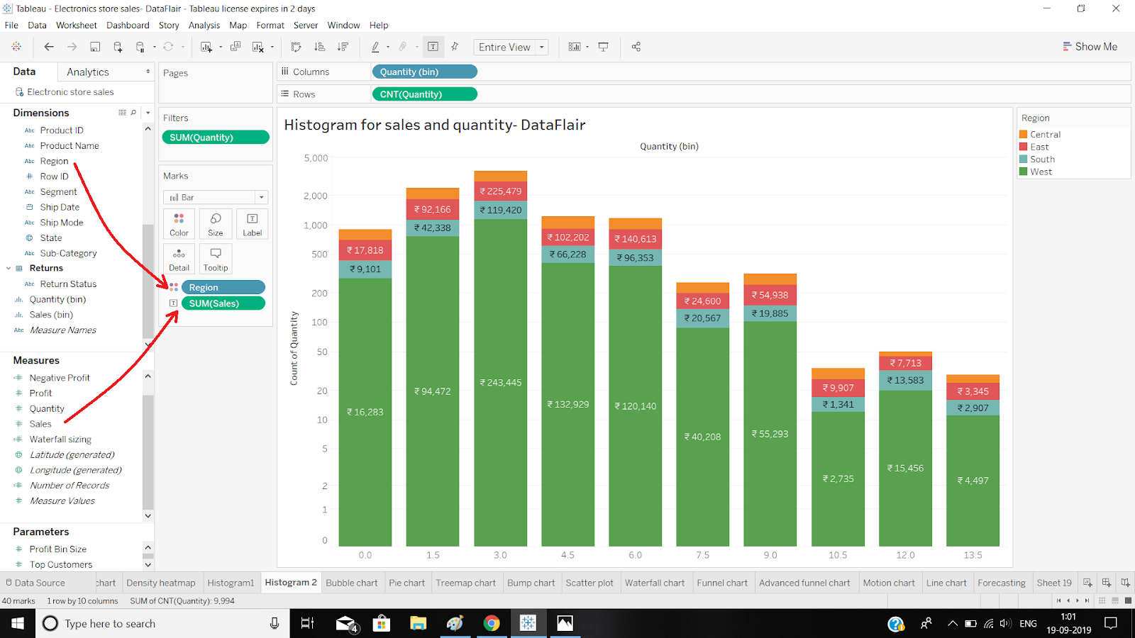
Step 3: Add Dimension Field to the Color Section
Next, we add a dimension field Region to the Color section and measure SUM(Sales) into the Label section. This adds four regions into each bar of the histogram and text labels showing total sales for each region.
Step 4: Select the Logarithmic checkbox and Symmetric radio button
Right now, our bars in tableau still have gaps in between them, that is, it is not in true sense a histogram which shows the continuous distribution of values on an axis. To achieve what we need, right-click on the y-axis and select the Logarithmic checkbox and Symmetric radio button in the Scale section.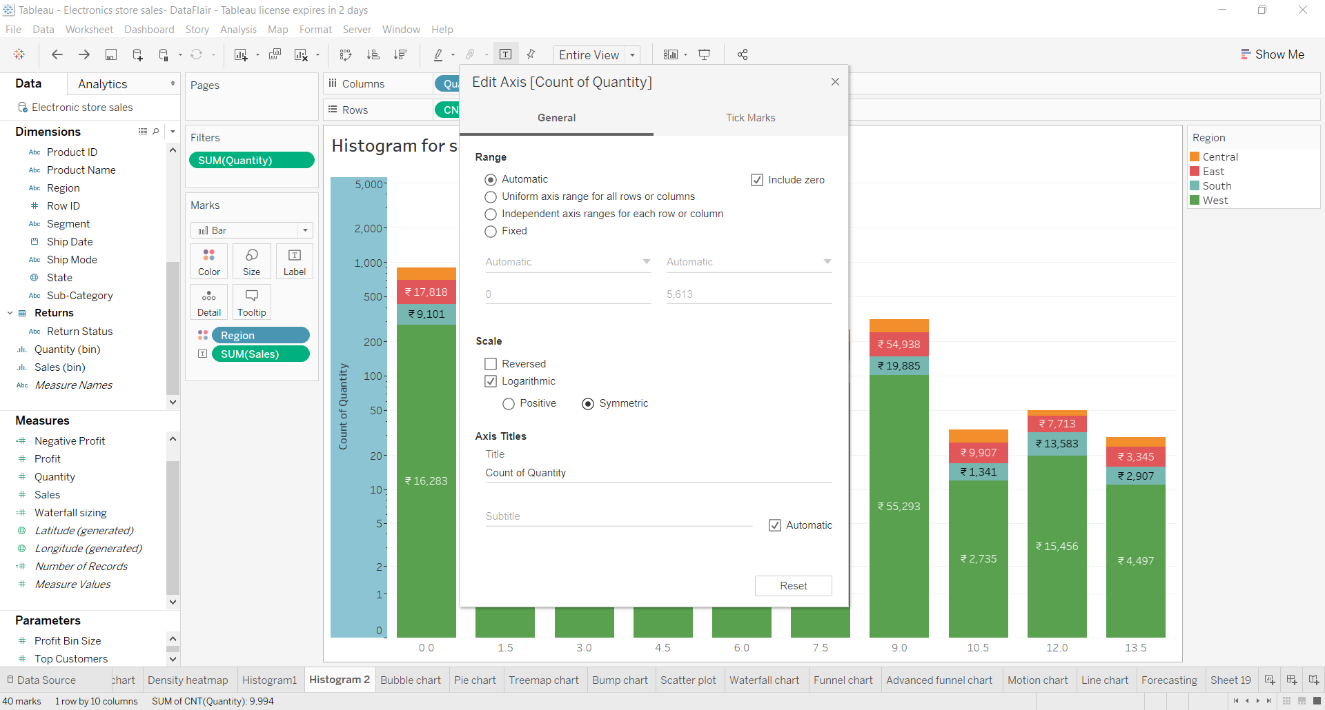
Step 5: Finalize Tableau Histogram
In this way, we get our histogram ready. This here is a histogram showing quantity distribution where the x-axis has bins of size 1.5 containing values from the Quantity field and the y-axis has a count of values from the Quantity field. The bars have heights corresponding to quantities sold and they also show total sales done in different regions for the quantity sold.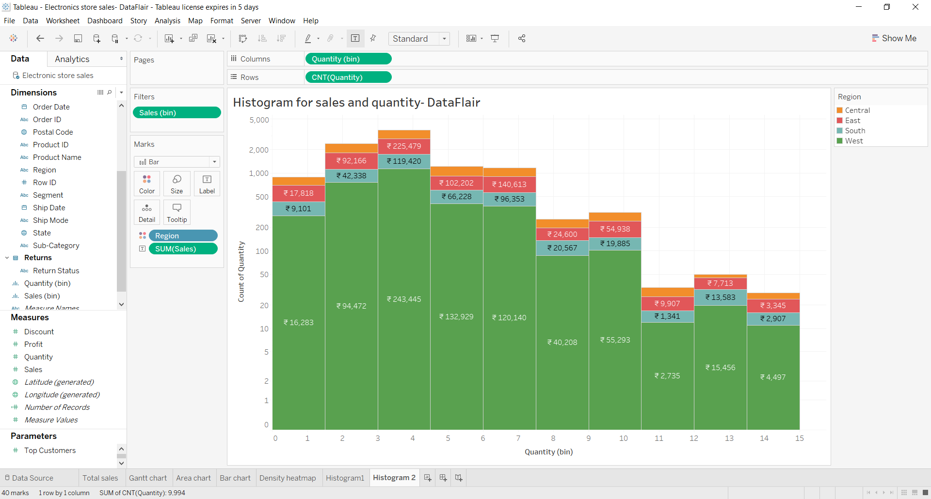
In a similar manner, we can create a histogram for Sales values.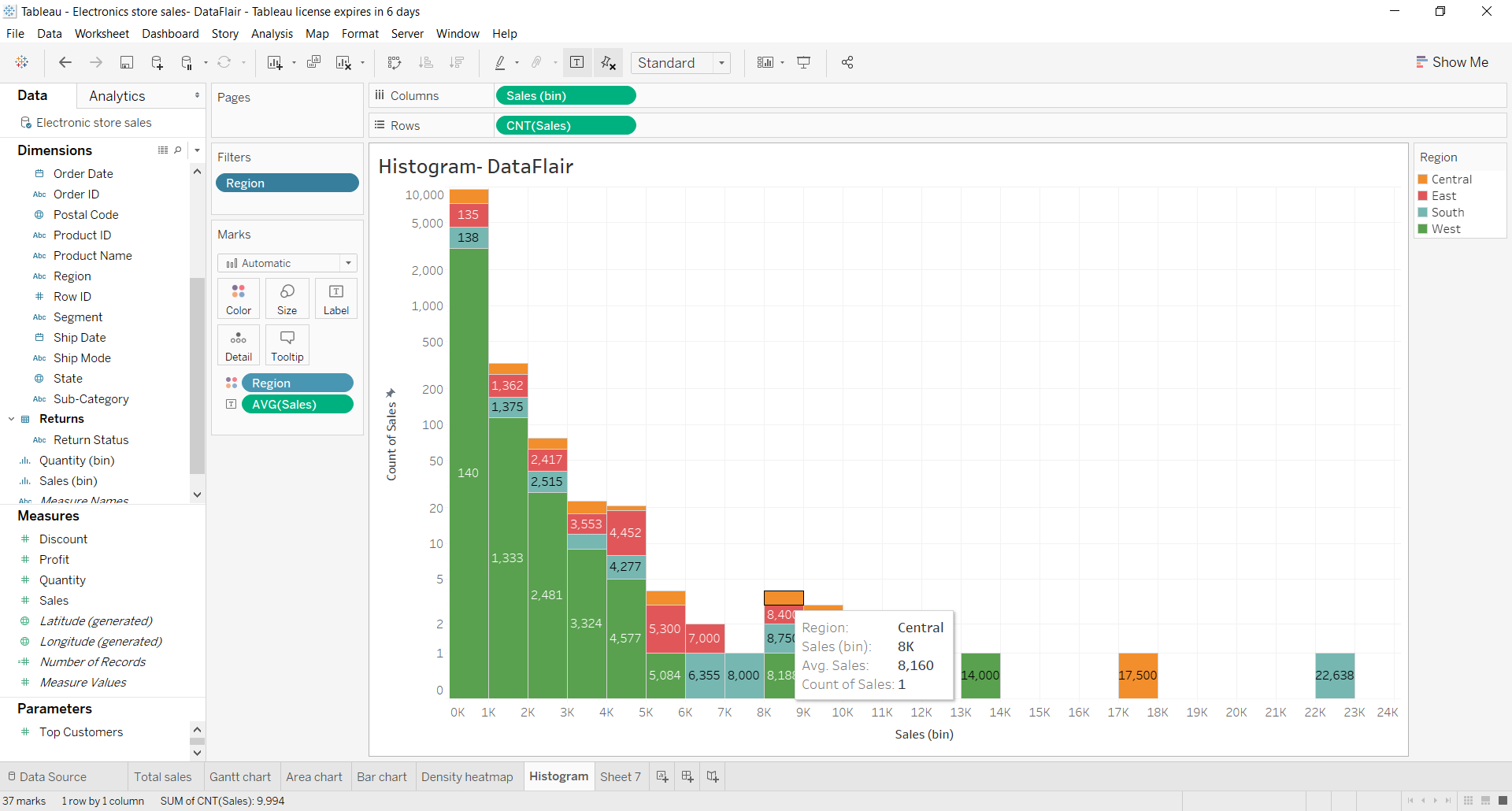
Summary
In this tutorial, we learned about histograms in Tableau. In the beginning, we understood the definition of a histogram and saw where it is used. Then further on, we learned the steps on how to create a histogram in Tableau Desktop.
Just like the histogram in tableau gives an insightful and informative analysis of data, Tableau Gantt Chart gives an analysis of data on a daily, weekly, monthly or yearly basis.
I hope this article was helpful to you and if you have any doubts or suggestions, mention them in the comment section below.
Did you know we work 24x7 to provide you best tutorials
Please encourage us - write a review on Google


