Scatter Plot in Tableau – 6 Quick Steps to Create a Scatter Chart
Job-ready Online Courses: Knowledge Awaits – Click to Access!
In this Tableau tutorial, we are going to learn about the scatter plot in Tableau. Here, we will find answers to questions like what is a scatter plot and how do we create it in our Tableau software?
What is a Scatter plot?
Scatter plots are typically used to visualize two measure values or similar field values as a single dot on a graph. It is a two-dimensional graph where the position of a data point or dot is decided by two measure values; one on the x-axis and another on the y-axis. In Tableau, we can also add trend lines along with the dots of the scatter plot to see and analyze the trends hidden in our data.
Before reading further check out the steps for creating a tableau waterfall chart.
How to Create a Scatter Plot in Tableau?
Follow the steps given below to create a scatter plot in Tableau Desktop. For explanatory purposes, we have a set of sales data of an electronic store. We will create a scatter plot using this data so that you can understand the process better. You can use your own data source and create a scatter plot according to your requirements.
Step 1: Select the Measure
Open the Tableau worksheet in which you wish to create a scatter plot and connect to your data source. From the Measures section, select a measure and drag it in the Columns section. We took the Sales measure.
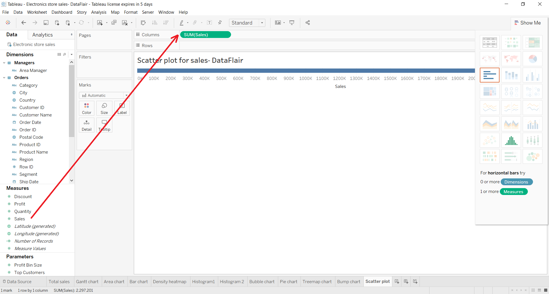
Step 2: Drag Measure to the Rows Section
Select another measure from the list of Measures and drag it to the Rows section. We took Profit measure.
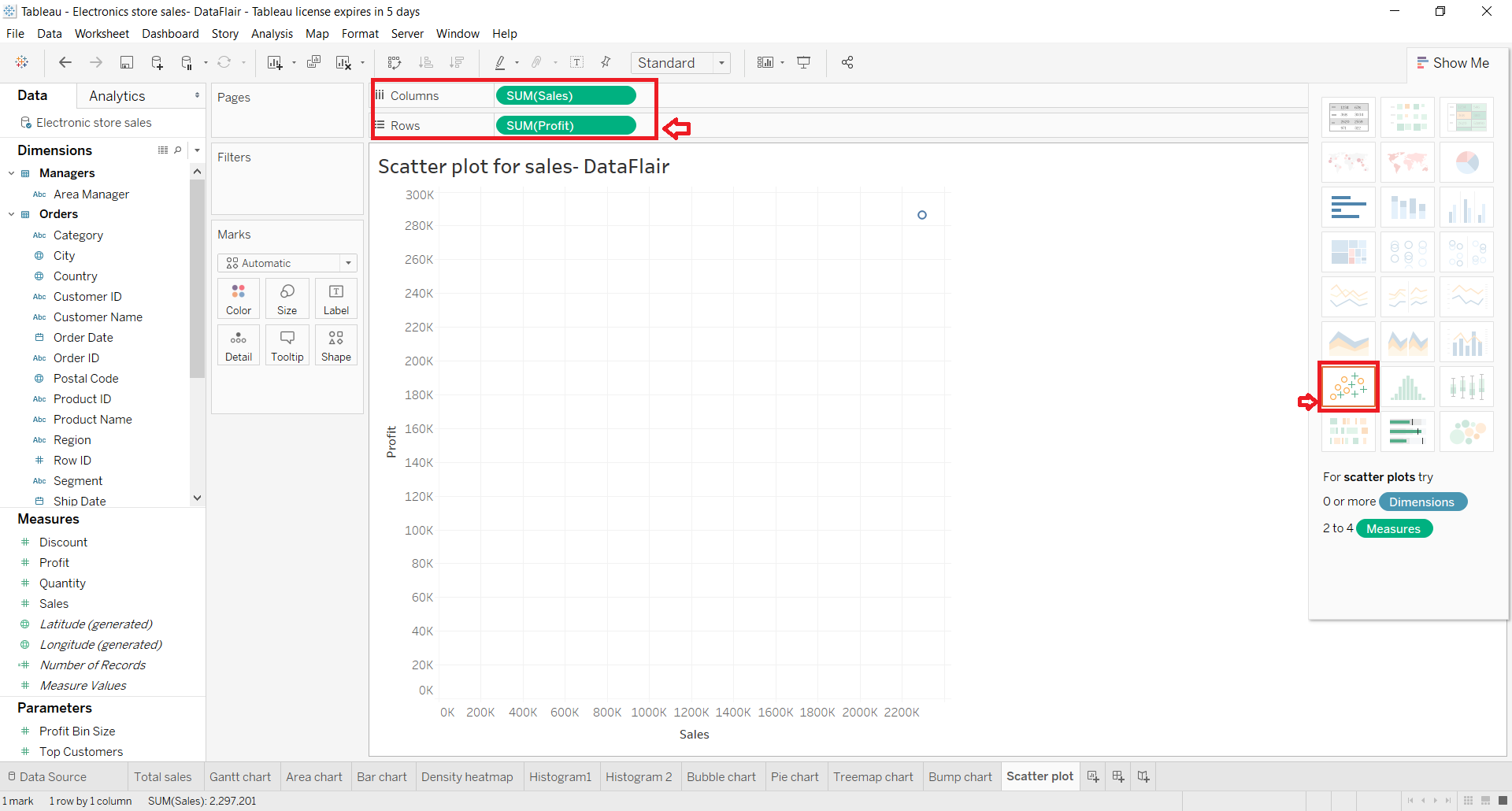
Ideally, Tableau automatically detects the type chart that we should use depending upon the measures and dimensions we select. If it hadn’t already, select Scatter plots option from the Show Me visualization pane given on the right.
Step 3: Select Two Dimension Fields
In the next step, we select two dimensions to provide with values to show with respect to x and y-axis. For this, we select two-dimension fields; Sub-category and put it in a Color box of the Marks card and Category which we put in the Details box.
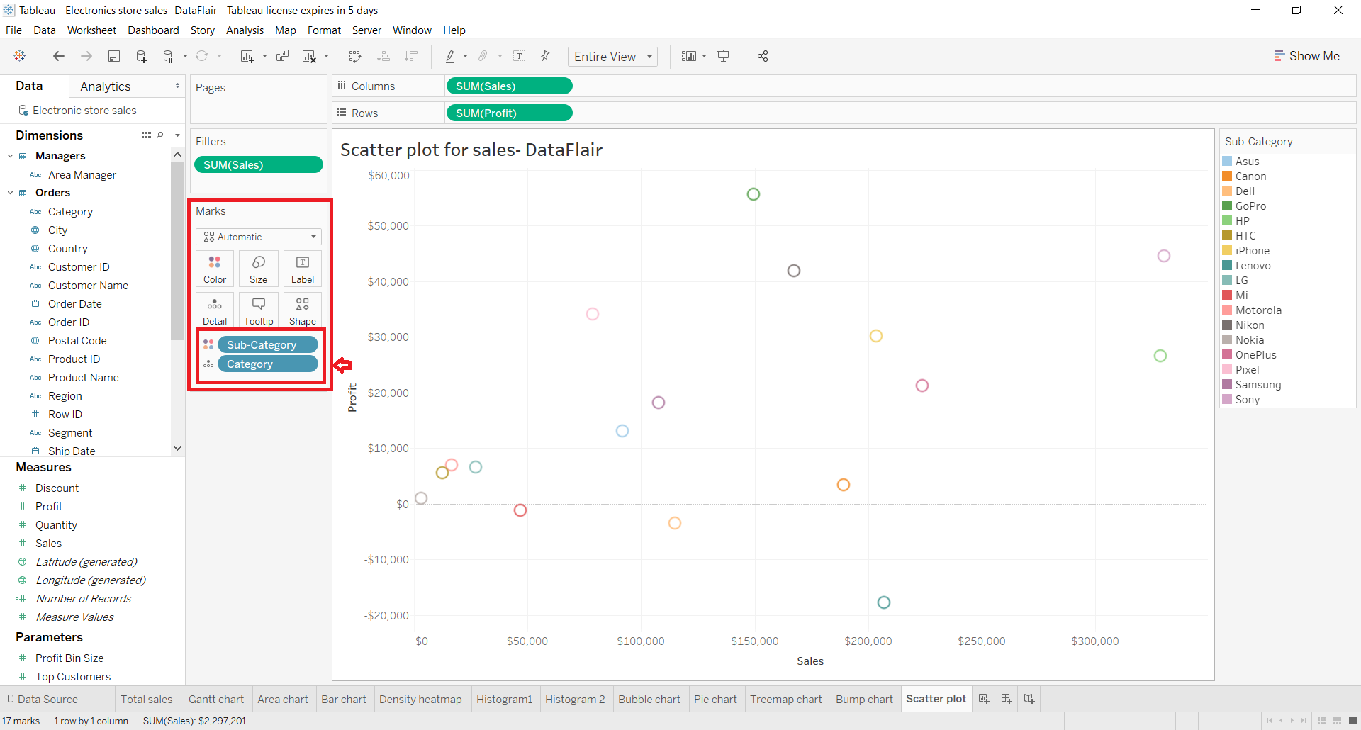
This creates a rough scatter plot with hollow circle shapes representing the value points for each brand. On the left is the color scheme for each brand i.e. the value of the sub-category field we are using.
Step 4: Customize Scatter Plot in Tableau
Now, we can customize the look of this chart as per our liking by making changes to different options like Color, Shape, Size, Detail, etc. of the chart points. You can manage such a setting by clicking on the respective boxes in the Marks card.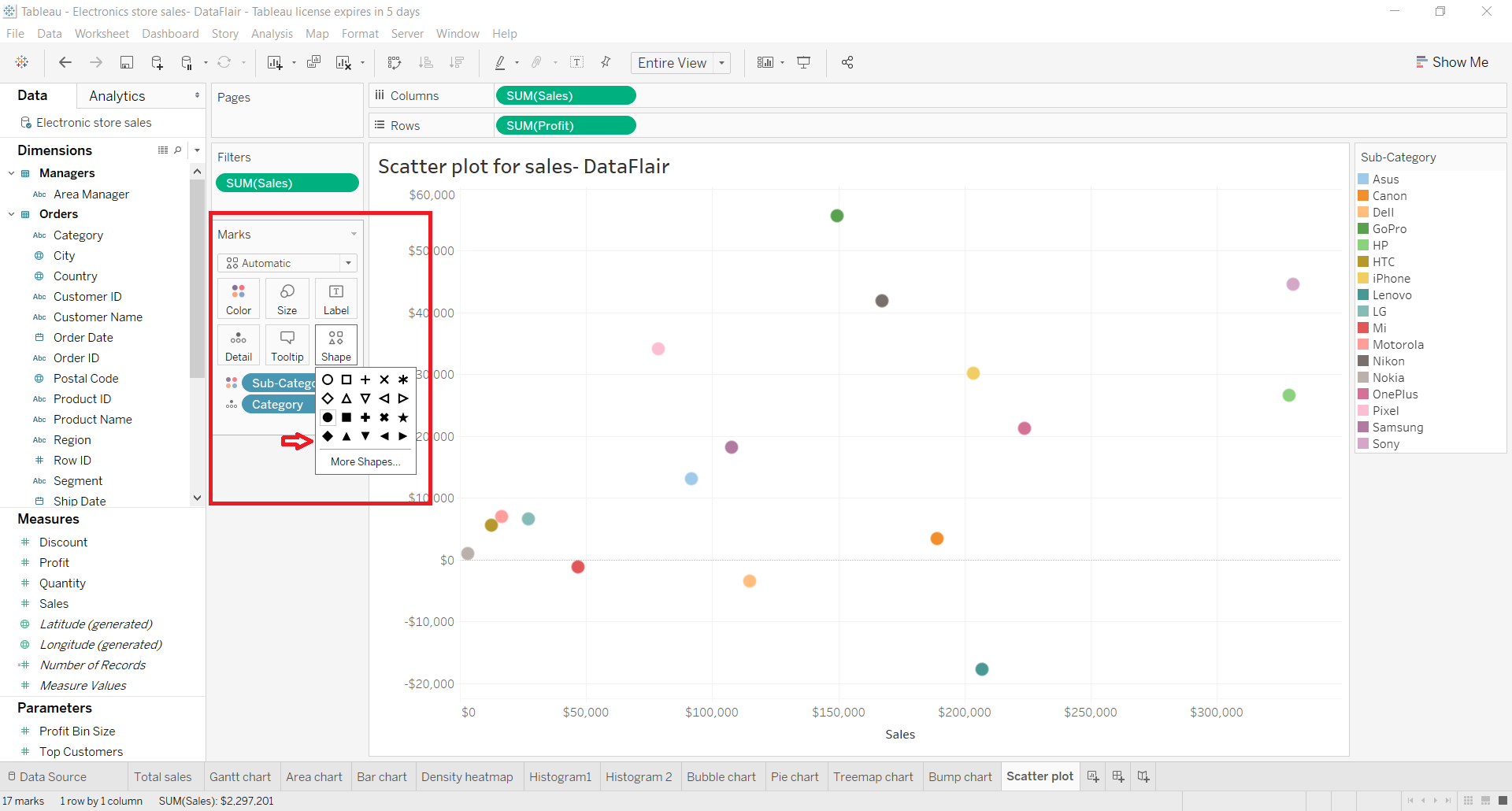
In addition to this, you can edit the entire visualization as well as format the worksheet by right-clicking on the visualization and selecting the Format option from the drop-down list.
Step 5: Increase Detail of Scatter Plot
Furthermore, Tableau provides an option to increase the detail of the scatter plot. For this, we can add certain reference lines and trend lines to show data trends. To add a trend line in your scatter plot, go to the Analytics tab. Select, hold and drag Trend Line option towards the scatter plot.
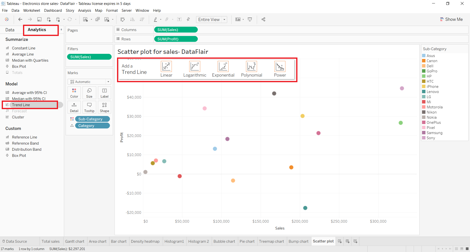
You will see a hovering pane with four available options of trend line. We select the Linear option.
Step 6: Finalize Scatter plot in Tableau
This will create trends line for each category that is present in our Category field. With the help of trend lines, we can instantly infer the performance of that particular parameter.
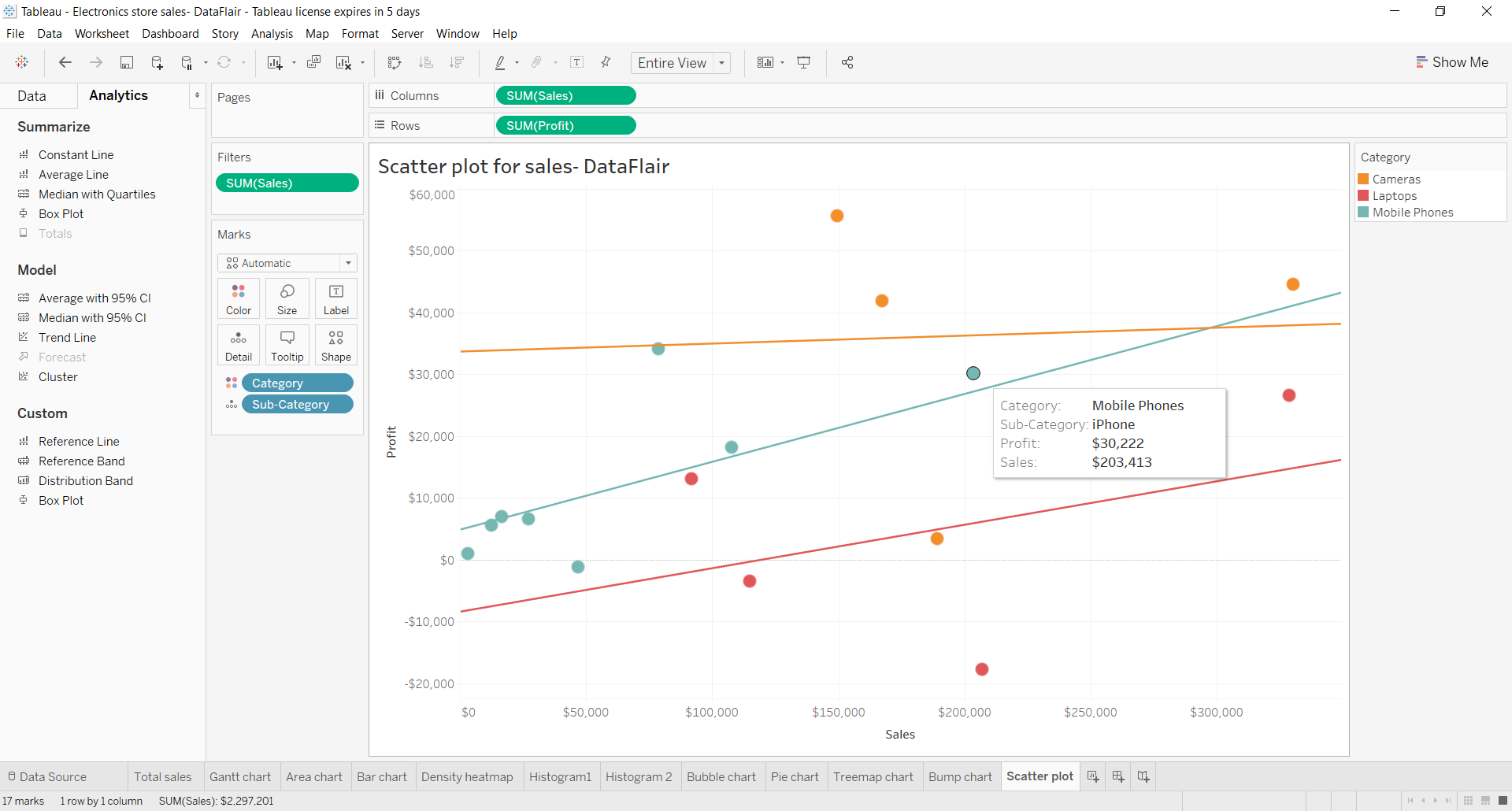
As we can see in our scatter plot, the blue trend line helps us infer that with an increase in sales for the category Mobile Phones, profit is also increasing. But, in the case of Cameras (orange trend line), the profit does not show any significant increase with the increase in sales.
Summary
This was all about scatter plots in Tableau. Here, we learned how to create a scatter plot and where to use it. We hope you were able to learn the process of the creation of a scatter with ease.
Explore Tableau Hierarchy Data and learn to create groups in tableau.
If you have any queries or suggestions regarding the tableau scatter plot, drop them below in the comment section.
Did you know we work 24x7 to provide you best tutorials
Please encourage us - write a review on Google


Hello, I am wondering if there is a functionality in Tableau that lets you toggle between trendlines in the same dashboard view.
thanks for this helpful info about scatter plot