Tableau Gantt Chart – An Easy Way to Track your Data Trend
Job-ready Online Courses: Knowledge Awaits – Click to Access!
This Tableau tutorial focuses on Gantt charts in Tableau. We will start with the definition of the Gantt chart and then learn the process of creating a Gantt chart in Tableau software.
What is a Gantt chart?
A Gantt chart is a horizontal bar chart that shows the duration of an event for multiple values. You can have a detailed yearly, quarterly, monthly, weekly or even daily representation of your data values using a Gantt chart.
Also, we can assign different colors for each year or month so that it is getting easier for us to track the data trend for value over time. Gantt charts are extremely useful as they have the ability to represent data in great detail.
Wait!! have you checked our previous article on LOD expression in Tableau, to deal with the complex data.
How to create a Gantt chart in Tableau?
Before we start making our Tableau Gantt chart, take note of a few things that you must keep in mind and select while creating the chart.
- Mark type: Gantt bar or automatic
- Column shelf: Date or time field (continuous measure)
- Rows shelf: Dimension
- Size: Continuous measure
Follow the steps given below to create a Gantt chart in your Tableau worksheet. Please note that we are using our sample data set for electronic sales to make this chart. You can understand the basics of this chart and create your own Tableau Gantt Chart with your dataset.
Step 1: Drag Order Date Dimensions to Columns Section
Open your Tableau Desktop and open a new worksheet in it. You will find a list of Dimensions and Measures in the Data pane on the left. We drag the Order Date dimension to the Columns section as shown in the screenshot below.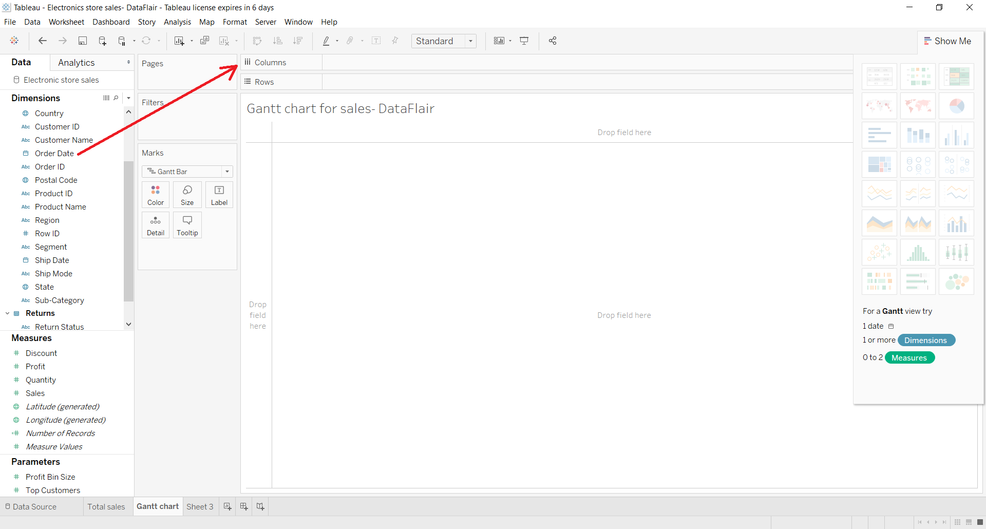
Now, our date dimensions are set on Discrete by default. We will make it Continuous from the drop-down menu.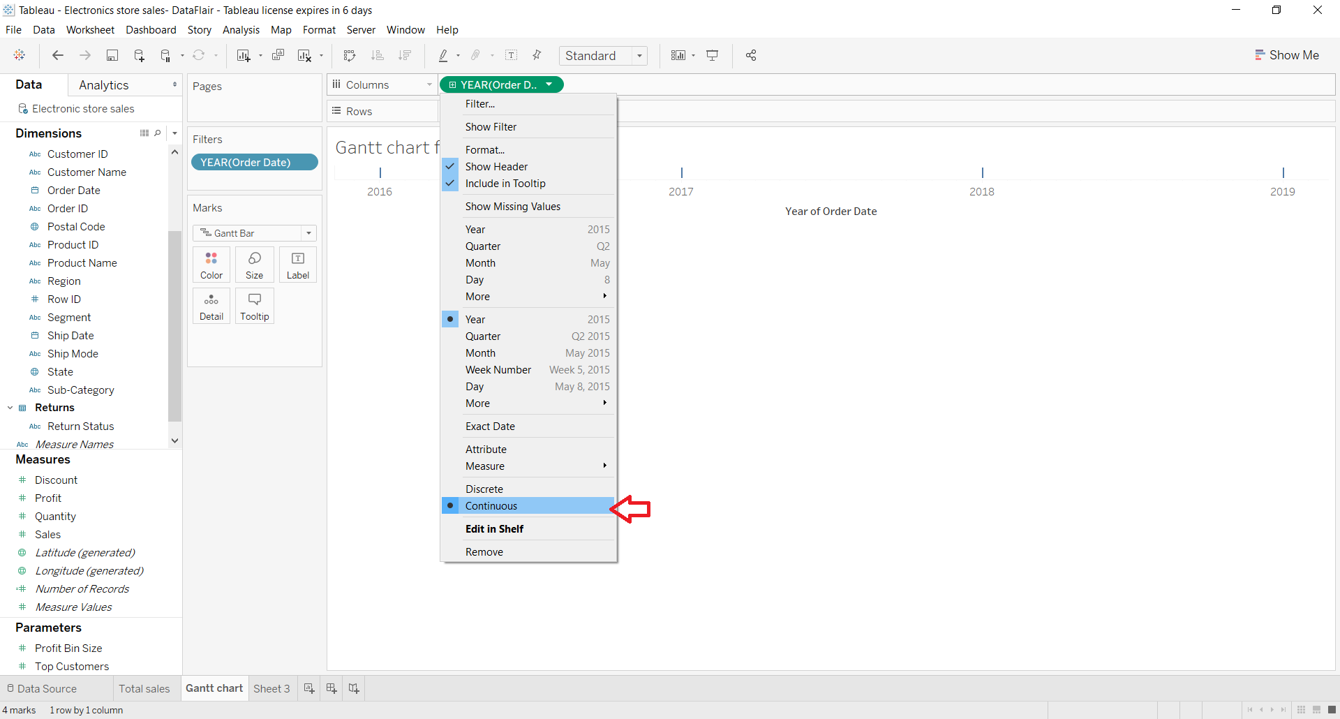
Step 2: Drag another Dimension in Rows Section
In the Rows section, we drag and drop another dimension (Sub-category).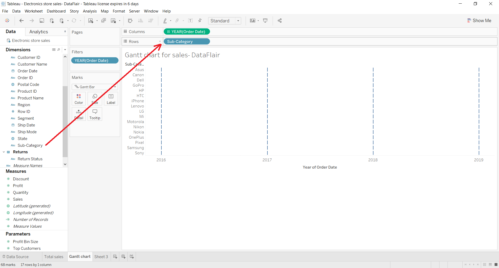
Step 3: Add Order Date in Marks Card
Now again, we add our Order Date dimension to the Color box in the Marks card. This will show single dashes at each data point.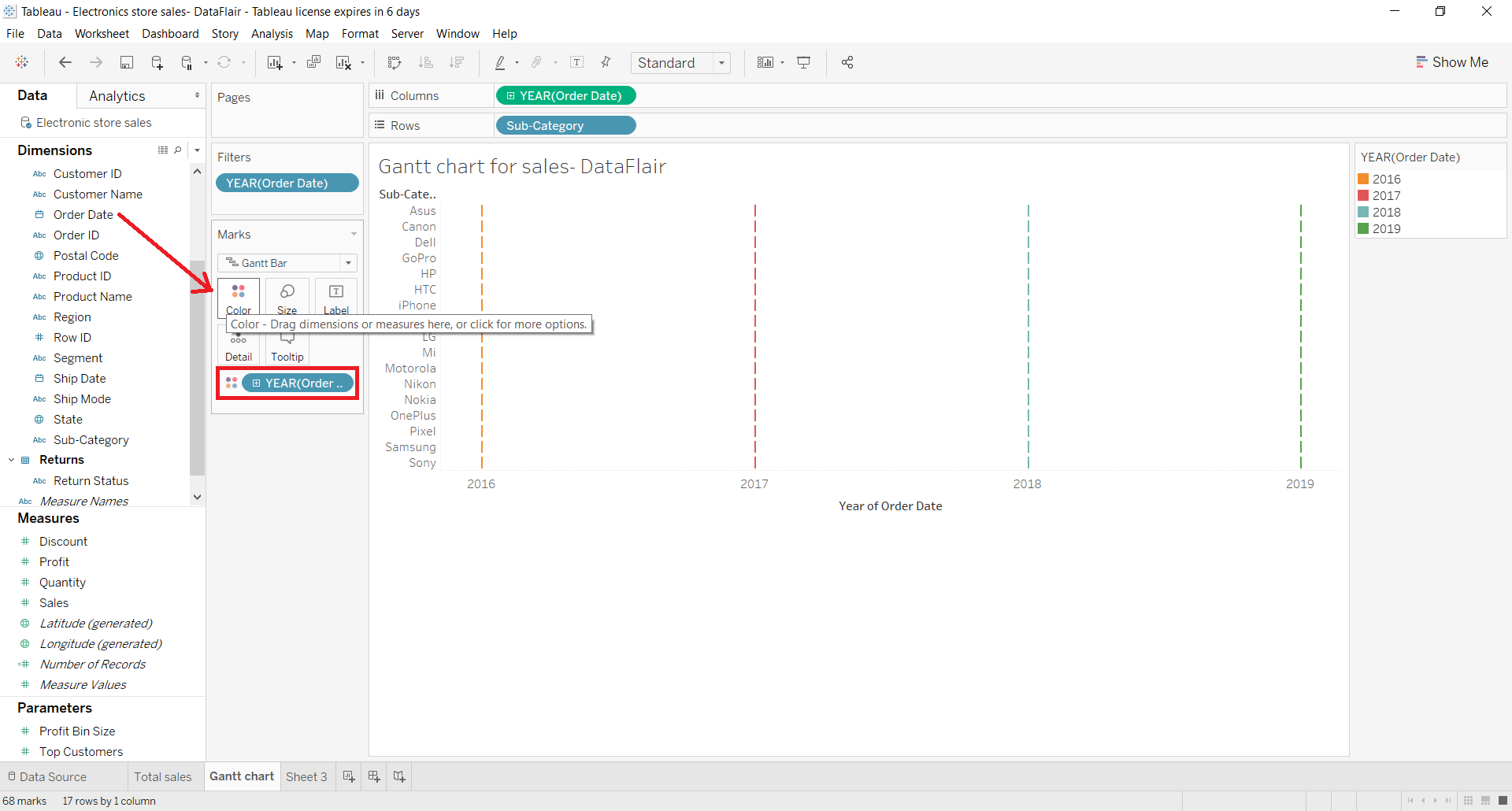
Step 4: Add Measures in the Marks Card
Next, we add our measure Quantity to the Size box in the Marks card. This provides bars for the total quantity sold for each category in its respective year.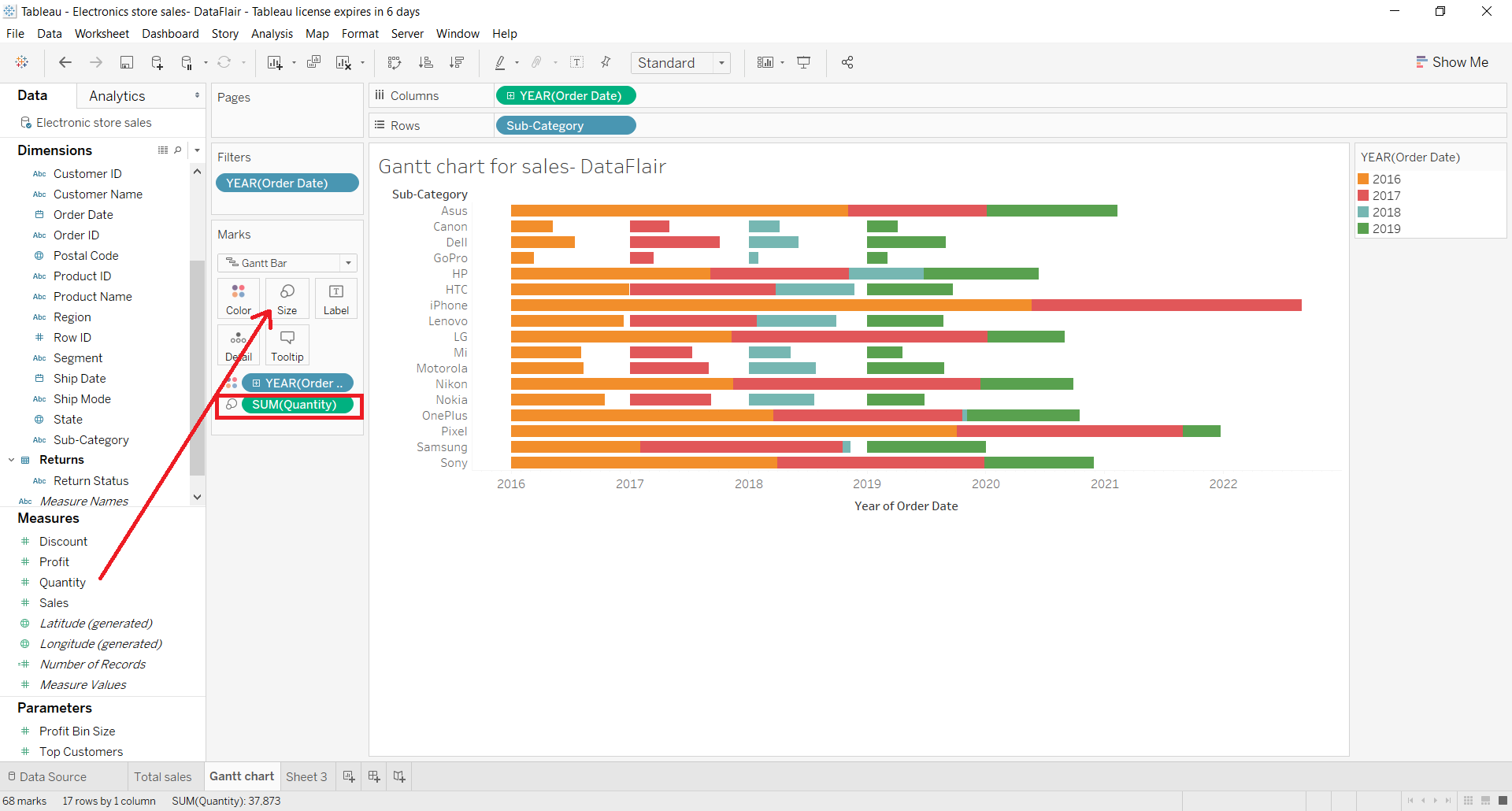
Step 5: Simple Tableau Gantt Chart
This gives us a simple Tableau Gantt chart showing the total quantity sold for each brand or Sub-category in the span of five to six years. As you can notice in the screenshot attached below, there is a separate bar with distinct colors for each year so that you can get the value of the total quantity for each brand in each year specifically.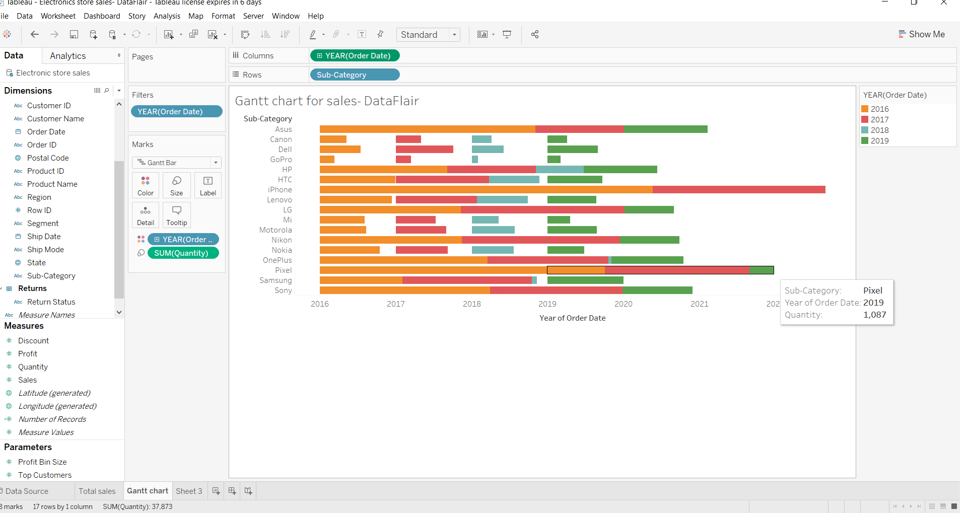
Step 6: Add Detail in Tableau Gantt Chart
We can add as much detail in our Gantt chart as we like. For instance, we change the years to months. As you can see, the chart became more detailed showing distinct bars for total quantities sold each month.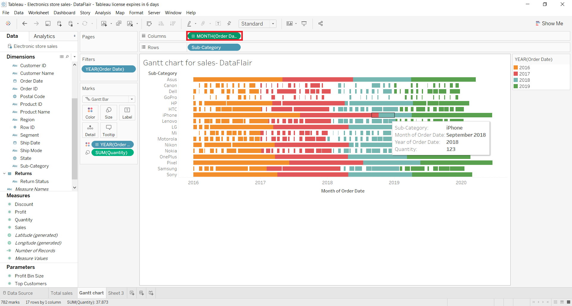
We can also change our measure calculation from the Marks card. Right-click on the measure (Quantity) name, select Measure () and change the aggregation type to Maximum or whichever you require.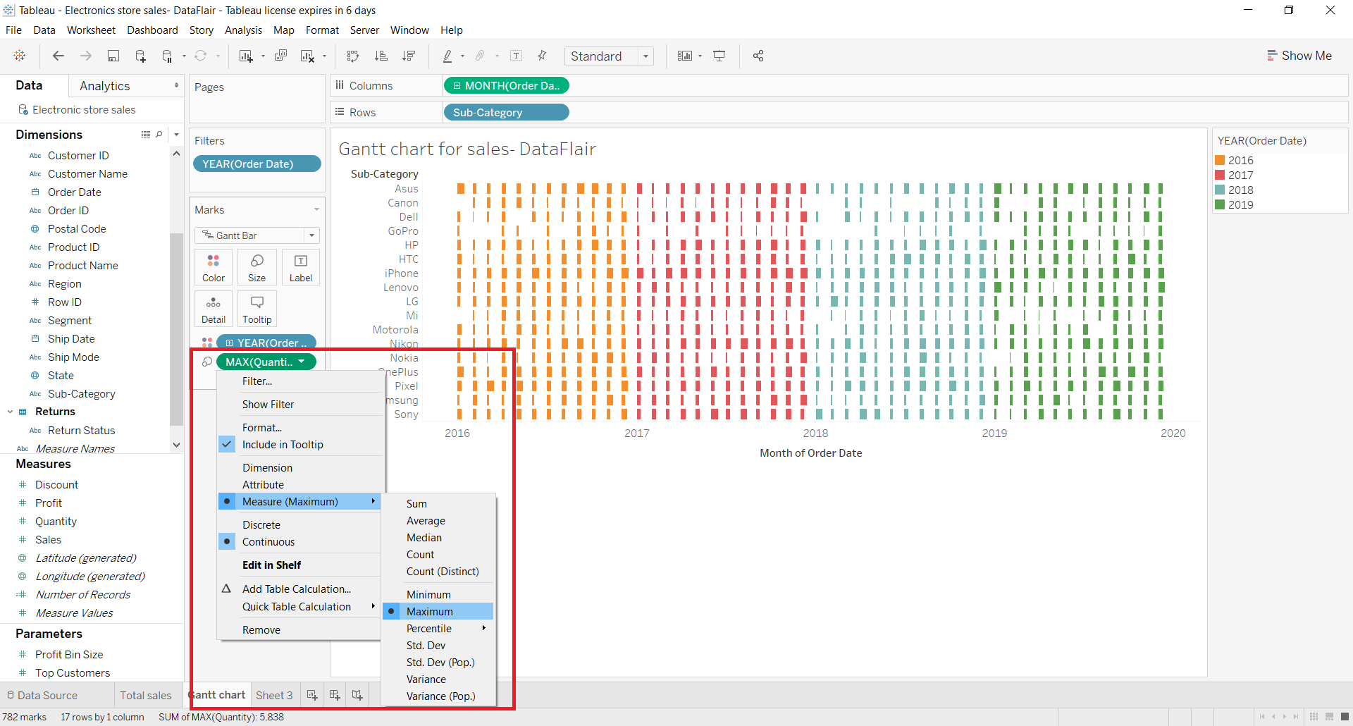
This will show only the maximum quantities sold for each brand in each year distinctively.
Step 7: Set Filters on Date Measures
In addition to this, we can also set filters on the date measures. Right-click on the date dimension and select Edit Filter.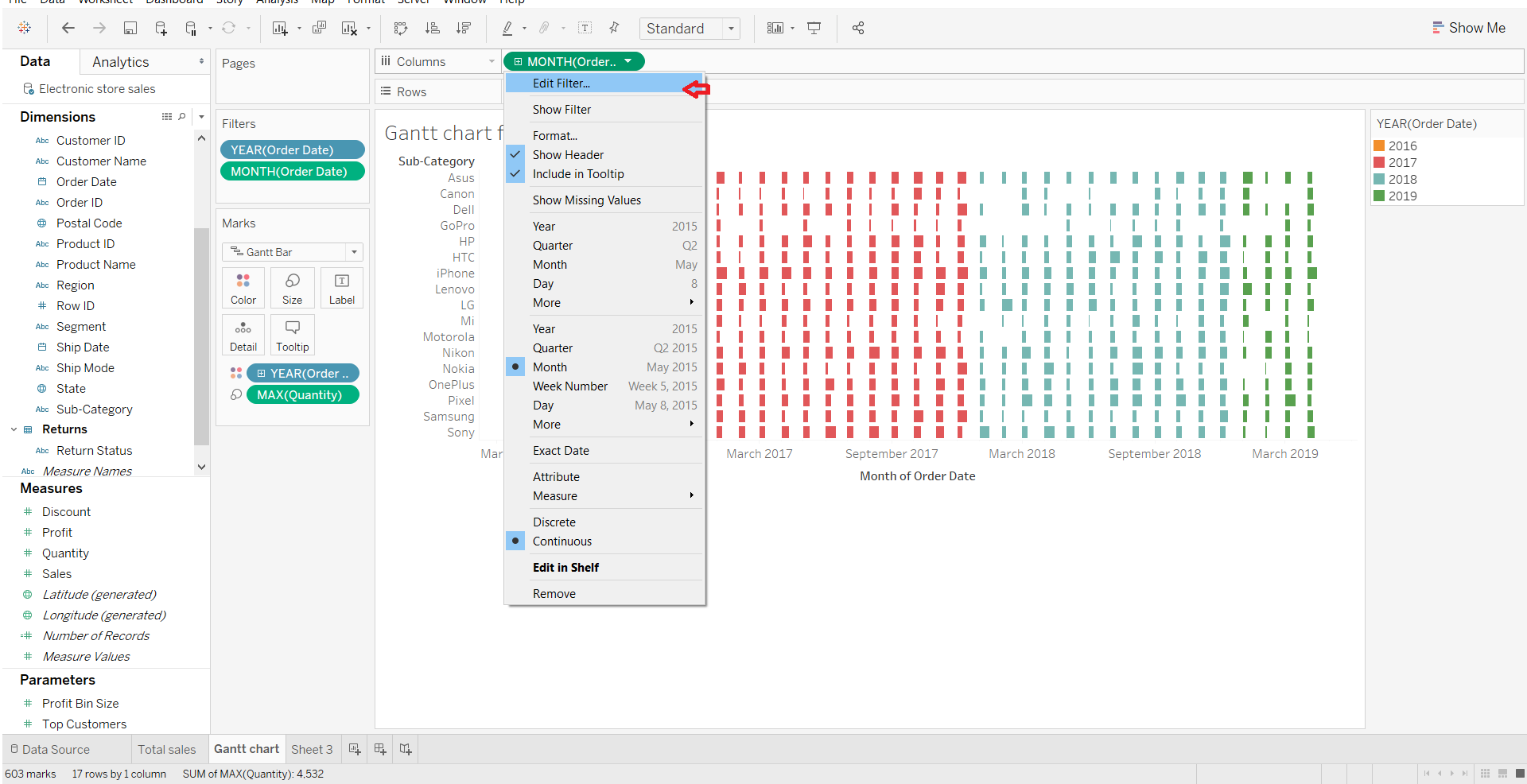
Know more different types of filters in Tableau.
Step 8: Check Data in Gantt Chart
A filter dialog will open from where you can set a range of dates for which you wish to see data in the Gantt chart. Click on OK.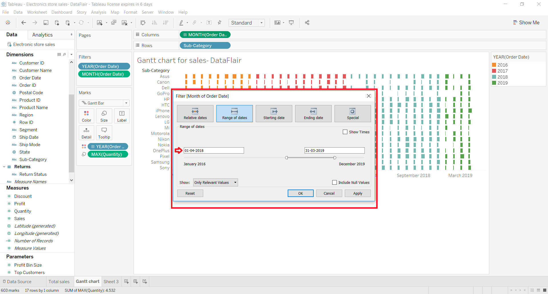
The dates we selected in the range belong to the years 2018 and 2019 so there are bars of only two colors.
Thus, this Gantt chart is showing data only for the years 2018 and 2019.
Now!! Jump into the steps for creating a Tableau Funnel Chart.
Summary
So this was all about Gantt charts in Tableau. We hope you can now easily create Tableau Gantt charts with your dataset for analysis.
Do not hesitate to ask your queries in the comment section.
Happy Learning!!
We work very hard to provide you quality material
Could you take 15 seconds and share your happy experience on Google


could please make a video on this chart
Thank you
Alekhya