Tableau Dual Axis Chart | Creating Tableau Combination Chart
Job-ready Online Courses: Knowledge Awaits – Click to Access!
In this Tableau tutorial, we are going to study about what is Tableau dual axis chart, a stepwise procedure to create Dual Axis multiple measures chart in Tableau with some tableau combination chart example.
So, let us start with tableau Dual Axis Chart.
Tableau Dual Axis Chart
Dual axis chart is also known as Tableau Combination Chart, that uses two axes for two different measures. Tableau dual axis chart is useful when two measures have different types or ranges (for example, monetary value and percentage), or if the two measures need to be displayed differently (for example, one as a bar and one as a line).
Creating Tableau Combination Chart
Following are the steps to create a combination chart in tableau:
i. From Dimensions, drag Team Name to the Filters
ii. Under the General tab, check Suns.
iii. From Dimensions, drag Year to the Filters
iv. Under the General tab, choose 2009.
Do you know Tableau Bar Chart and How to build Bar Chart in Tableau
v. From Dimensions, drag League to the Filters
vi. Under the General tab, check N for NBA.
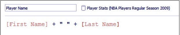
vii. If it doesn’t exist yet, create a calculated field called Player Name, and provide the following formula that concatenates [First Name] and [Last Name]:
Step 7. Create Tableau Combination Chart
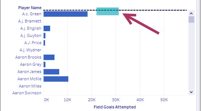
viii. From Dimensions, drag Player Name to the Rows
ix. From Measures, drag Field Goals Attempted to the Columns This creates a horizontal axis for your view.
Let’s look at How to Create Line Chart in Tableau
x. From Measures, drag Field Goals Made to the opposite side of the Field Goals Attempted Do not let go of the mouse until you see the dashed line or the arrow icon.
Step 10. Create Tableau Combination Chart
xi. This creates another axis opposite to the Field Goals Attempted
xii. Click on the SUM(Field Goals Attempted) field in the Columns shelf to activate its Marks Change the mark for this field to Bar.
xiii. Adjust the Bar size that represents SUM(Field Goals Attempted) so that it is narrower.
Read about How to Create Tableau Bullet Chart
xiv. Click on the SUM(Field Goals Made) field in the Columns shelf to activate its Marks Change the mark for this field to Gantt.
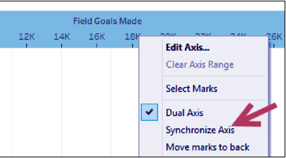
xv. Right-click on the Field Goals Made axis, and select Synchronize Axis.
Step 15. Create Tableau Combination Chart
xvi. Right-click on the Field Goals Made axis, and unchecked Show Header.
xvii. Right-click on the Field Goals Attempted axis and choose Edit Axis. Change the Title to Field Goals Attempted. Close the window when done.
Conclusion
Hence, in this tutorial, first of all, we learned about what is tableau dual axis chart, how to create a combination chart in tableau and use them, thus completing another table in our list. Furthermore, if you have any query, feel free to ask in a comment box.
You give me 15 seconds I promise you best tutorials
Please share your happy experience on Google


How to create 1 Bar chart & 2 Line charts.
Data:
Dimension: Date
Measures:
Bar chart – The values are in thousands(K)
Line chart – The values are in thousands(K)
Line chart – The values are in percentage(%).
Please help. Let me know if you need anything more.