Bump Chart in Tableau – Learn to create your own in just 7 steps
Job-ready Online Courses: Click, Learn, Succeed, Start Now!
In this tutorial, we are going to learn about bump charts in Tableau. Follow the steps along with us and easily learn creating and using a bump chart in your Tableau software.
What is a Bump Chart?
A bump chart is used to show the progression of value or dimension with respect to another dimension over time. It follows a rank system where the changes in the rank of particular field values are noted over a period. Thus, we can say that bump charts are used to compare two dimension values. We normally use two dimension fields and at least one measure field to create a bump chart in Tableau.
Before reading further check how to create Tableau Funnel Chart.
How to create a Bump chart in Tableau?
In this section, we will learn in a stepwise manner how to create a bump chart in Tableau. Follow the steps given below and make your first bump chart in Tableau.
Step 1: Add dimension and measures
To start creating a bump chart, open a new worksheet in your Tableau Desktop or whichever version of Tableau you are using. Firstly, we need to add two dimensions and a measure. From our dataset (sales of an electronics store), we add Order Date and Region from the Dimensions section and Sales from the Measures section.
Note that we add YEAR(OrderDate) into Columns section, SUM(Sales) into Rows and Region into the Color box of Marks pane.
Step 2: Select a Quick Table Calculation
Right-click on the SUM(Sales) field to access options for it. From the drop-down list, we select a Quick Table Calculation option and then select Rank.
![]()
Step 3: Select a field to compute
Next, we right-click on the SUM(Sales) field to access options for it. From the drop-down list, we select the option Compute Using and then select Region as our criterion for computing.
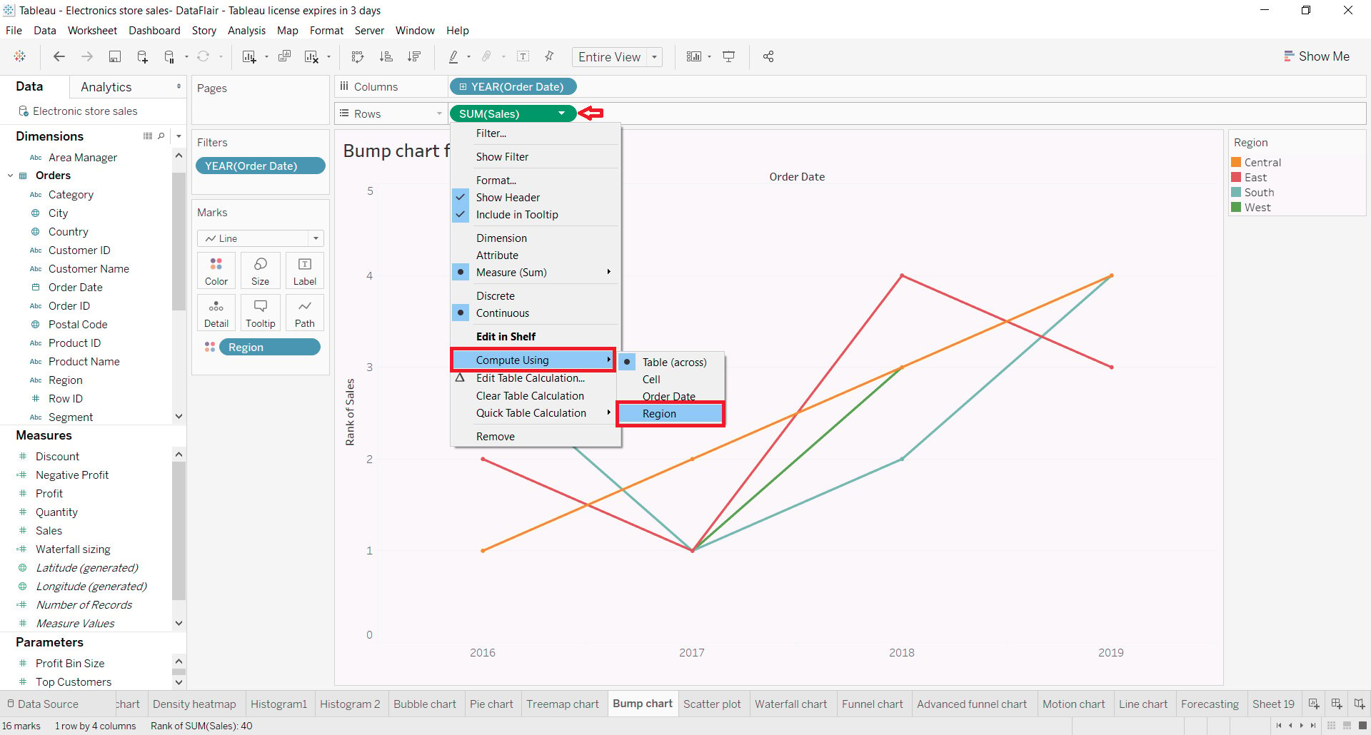
This will arrange the lines of the line chart according to the ranks of their data points. Also, right now that measure values are continuous type which we need to make Discrete.
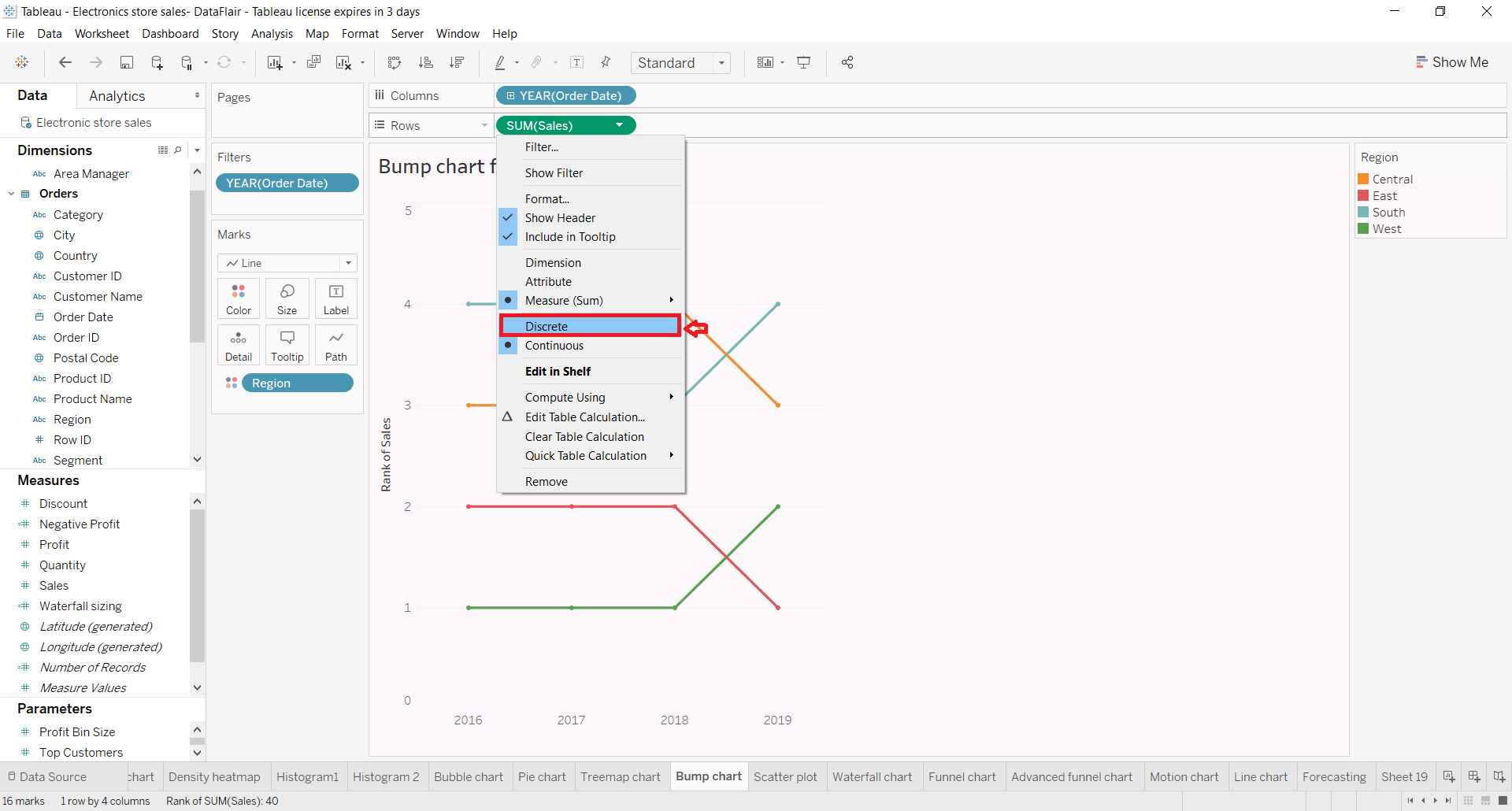
discrete measure values
line bump chart in tableau showing ranks
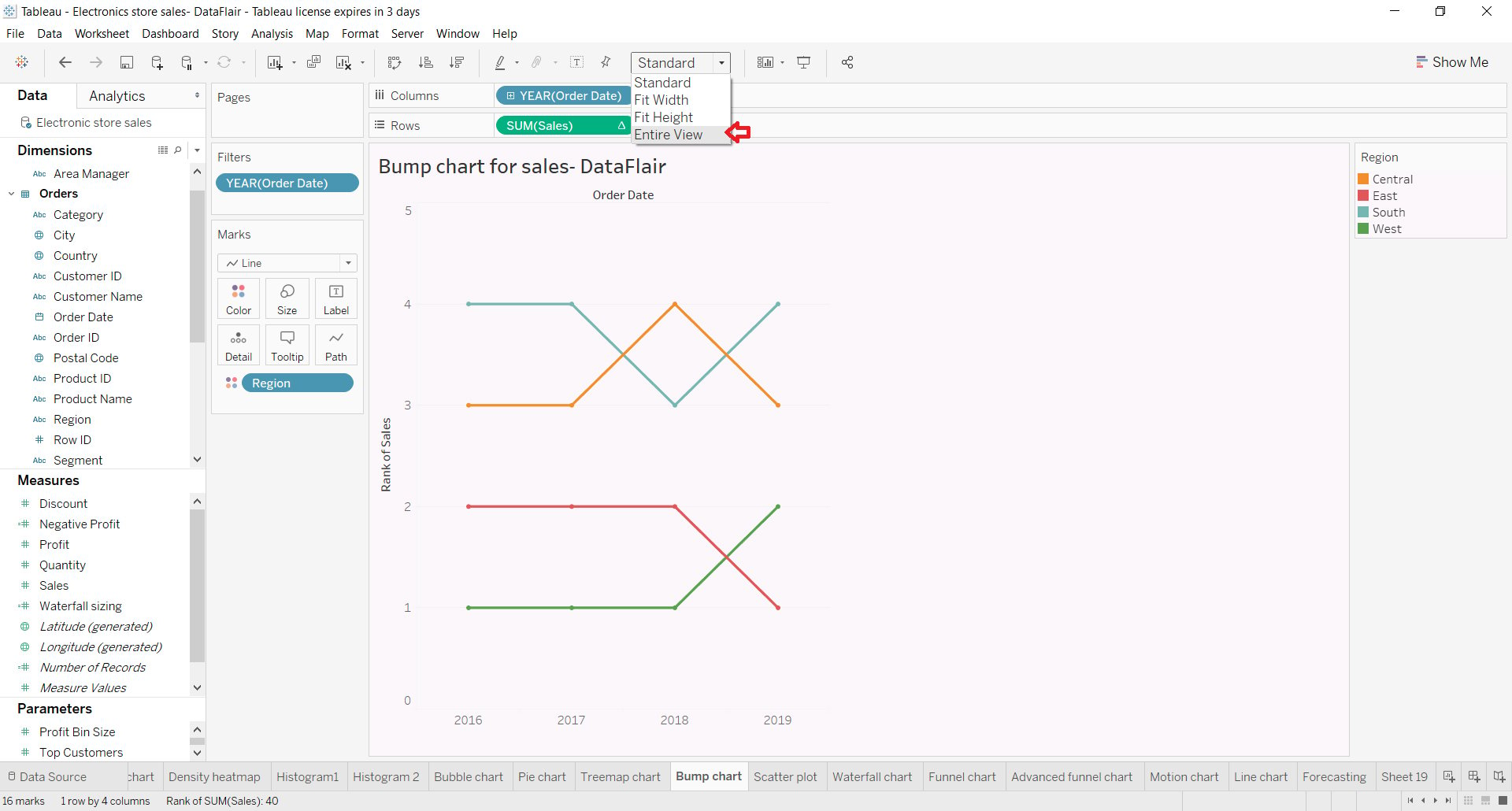
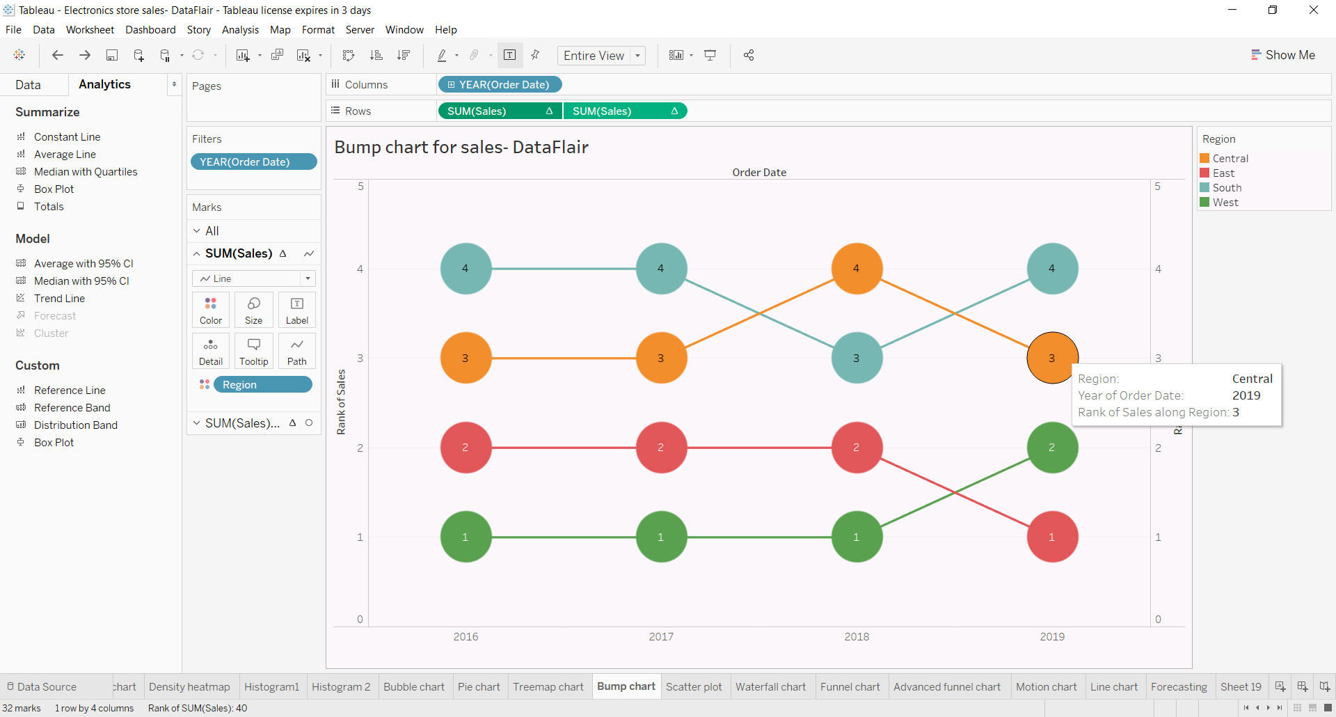
The chart we have by default is set in a Standard view mode, we can change the mode to Entire View to fit the chart on the editing canvas.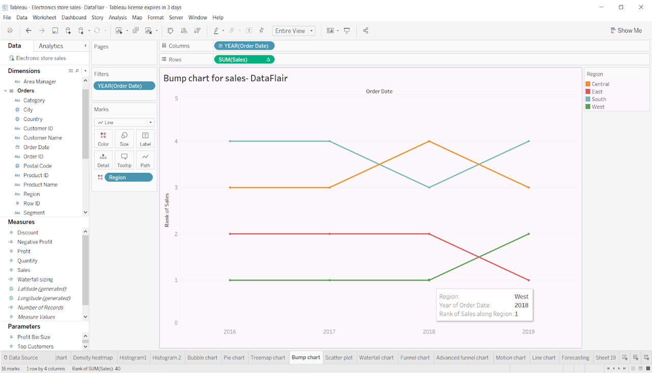
Step 4: Duplicate measure
In the next step, we duplicate our measure SUM(Sales). This will give us two separate line charts as shown in the screenshot below.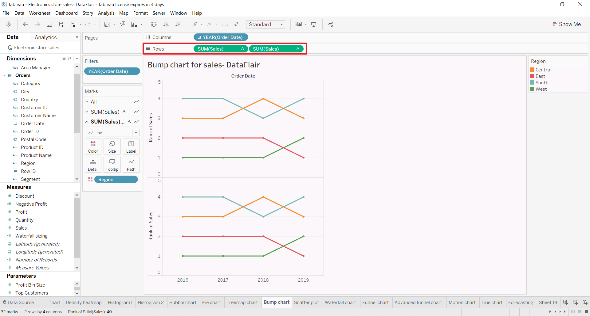
Step 5: Change mark type
In order to create a bump chart, we need to convert the mark type of the second (duplicate) line chart measure SUM(Sales). We change the mark type of this measure from lines to circles. Select the option Circle from the drop-down list of mark types.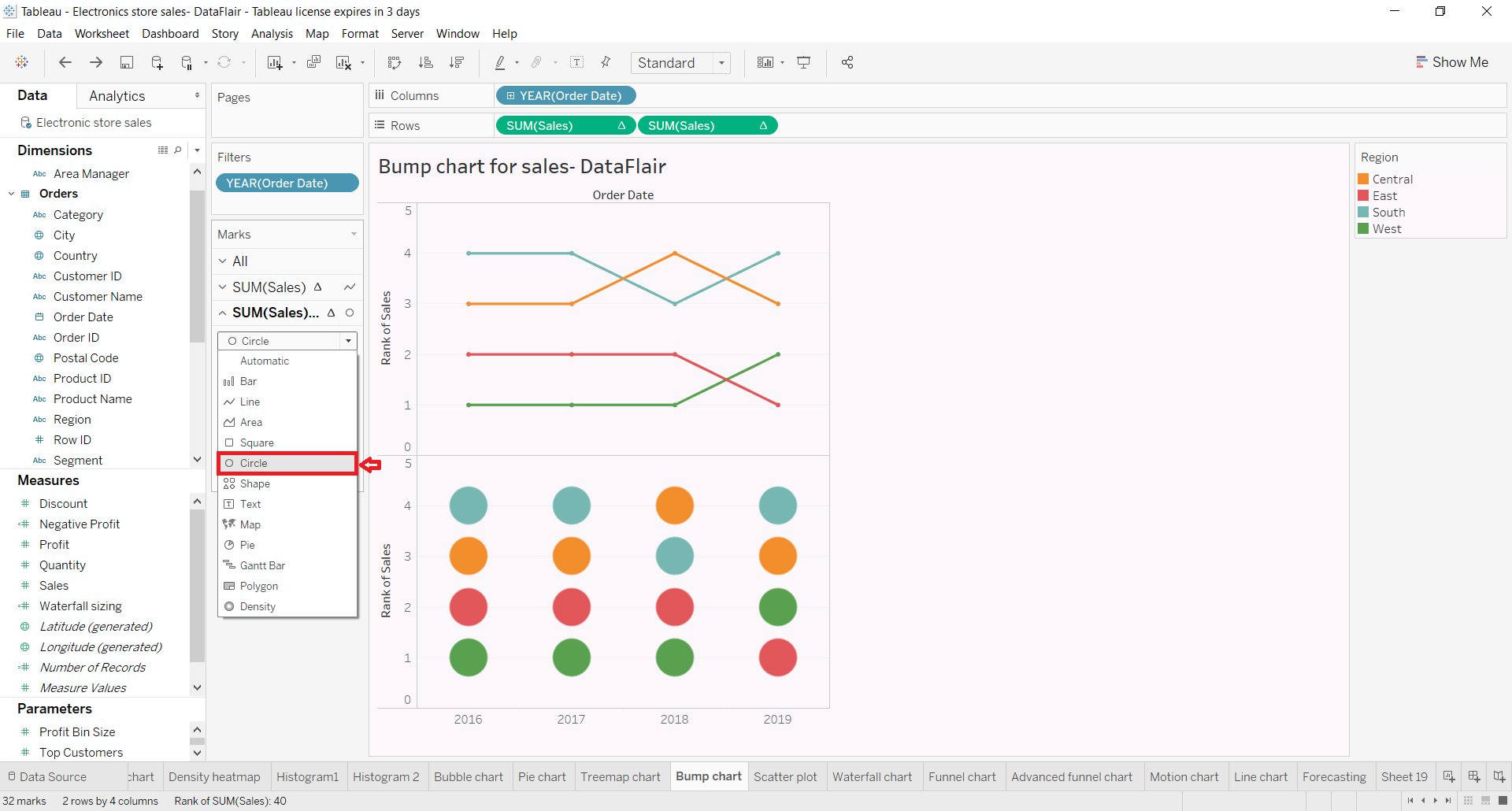
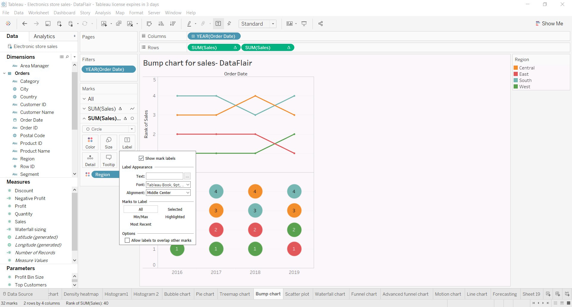
Next, we click on the Show mark labels from the Labels box so that the rank labels appear on the circles of the second chart. You can format the labels with more options given in the label editor.
Step 6: Select Dual Axis
Now, so far we have two different charts one showing the data trends by a line and another showing data points by circles and ranks on them. To make a bump chart, we need to merge these two charts together. To do this, right-click on a measure field SUM(Sales) and select the option Dual Axis from the drop-down list.
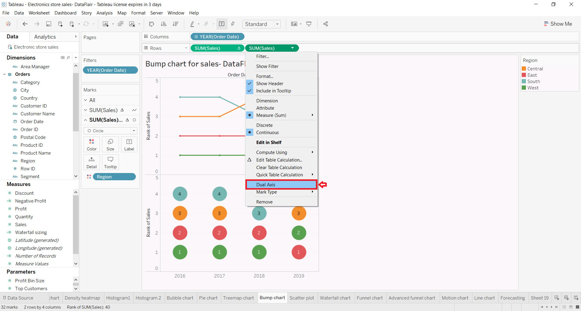
This does two things, first, it merges the two charts into one and second, it adds one more axis on the right of the chart.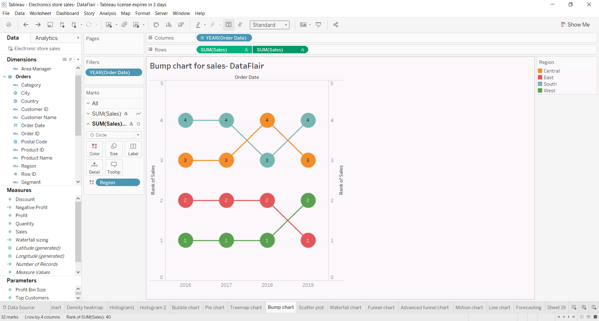
Step 7: Final Bump chart
With this step, our bump chart is ready. Here, we made a bump chart in tableau to show year wise sales for four regions and the progression of their ranks with respect to each other over the years. All four regions i.e. Central, East, South, and North are assigned specific colors.
Consider the Central region that is indicated in yellow, we can see that the total sales for this region remained 3rd highest for two consecutive years, which were 2016 and 2017. Then it went down to 4th rank in 2018 and again regained the third spot in the year 2019.
So, this is how bump charts work to represent rank wise progression of data points with respect to a certain dimension.
Summary
In this way, you can easily create a bump chart for your own dataset in Tableau. You can pick a bump chart as an option when you want to put two dimension values in a chart and do a rank based analysis.
Now!! Get to know about how to make Tableau Bar Chart by DataFlair.
We hope you found our tableau bump chart tutorial helpful. If you have any suggestions or queries, mention through comments.
Did you like this article? If Yes, please give DataFlair 5 Stars on Google


Need more details in screenshots for charts design to practical purpose.
very clear! Amazing! Thank you!
Hello, there’s an error in step 3, you tell us to make the mesure discrete, but the screenshots show that you’ve kept it continuous. Actually, a discrete measure would not fit the bump chart.