27 Types of QlikView Visualization – How to Create Visualization
Job-ready Online Courses: Knowledge Awaits – Click to Access!
This tutorial is like an overview of all the visualization offered in QlikView. Here, we will discuss each of them in brief, as to what purpose they serve and how do they look.
Types of Qlik Visualization
All the charts or visualizations offered by Qlik in Qlik Sense and QlikView fall under one of the four visualization categories discussed below.
The four categories of Qlik visualization are; comparison charts, composition charts, relationship chart, and distribution charts. Understand them better with the explanation provided on each in the sections below.
1. Comparison visualizations
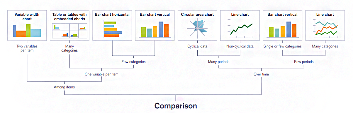
The comparison charts are used to compare two data sets with each other. The magnitude of values can be compared for analyzing old vs current trends, to see the lows and highs of values etc.
The charts used commonly under this category are bar charts, mekko charts, line charts, combo charts etc.
2. Composition visualizations
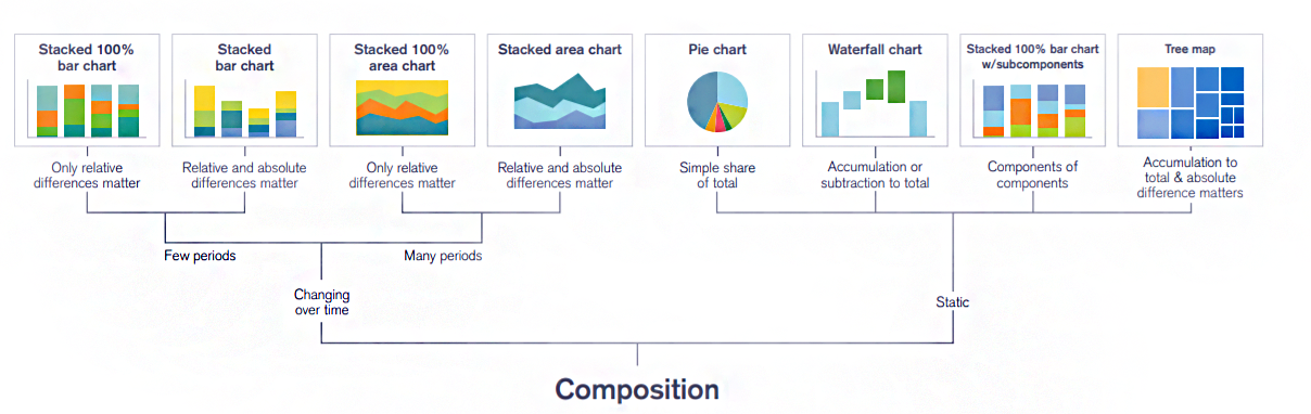
The composition charts are used to analyze a part of the data against the whole. It also helps in analyzing how a data set can be divided into shares. Thus, such charts typically show relative values in comparison. It is only in specific cases like looking at a percentage difference that we get the absolute values.
3. Distribution visualizations
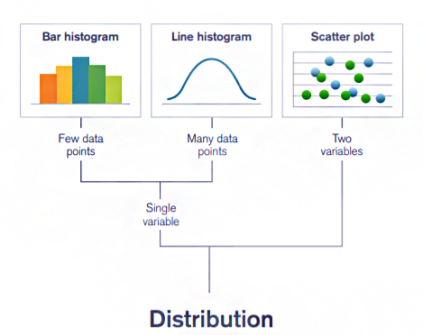
The distribution charts like scatter plots and histograms visualize the distribution of a set of data values along an axis ranging from the lowest to the highest. The patterns of distribution curves are analyzed in order to gain meaningful insights into the data.
4. Relationship visualizations
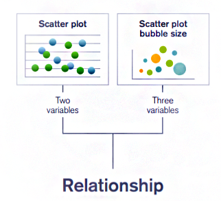
Scatter plots in specific, come under the category of relationship charts. Such charts are used to display the relationship or correlation between two attributes of a data set.
For instance, we can use them to analyze the relationship between revenue spent in advertisement and sales incurred from a product. We can also see the outliers and clusters of data in relationship charts.
Types of QlikView Visualization
1. Bar Chart
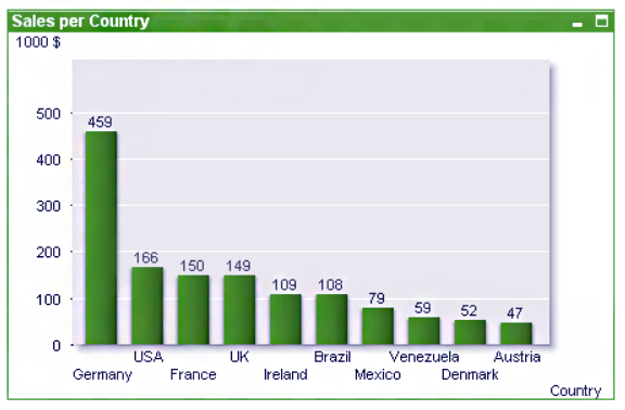
It is the most basic method for comparing two sets of values visually. In a QlikView bar chart also, we study the relationship between two fields or dimensions with each other. The height of one dimension shows the relation with the value mentioned in the second dimension.
2. Pie Chart
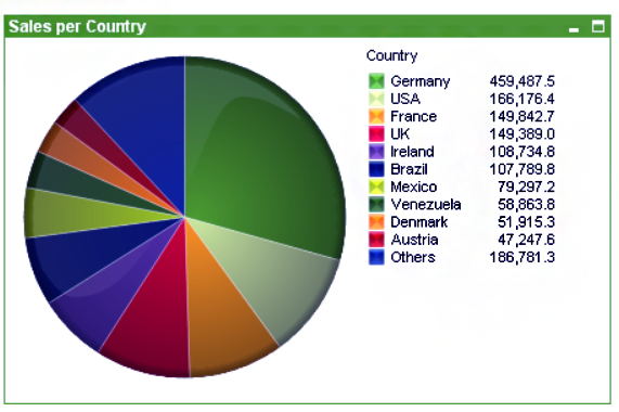
A pie chart is a circular representation of the data values in QlikView Visualization. All the different data fields are represented by the individual slices or sections of the pie like a circle. The value of the field can determine the size of each pie slice.
3. Combo Chart
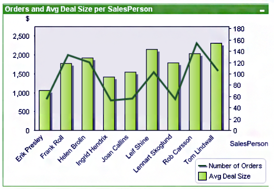
A combo chart, as the name suggests, is a combination of two QlikView charts; bar chart and line chart. The numerical data information displays as mixed graphic bars of a bar chart and lines of a line chart. Thus, one dimension/measure values represent as bars and another dimension/measure as lines.
4. Scatter Chart
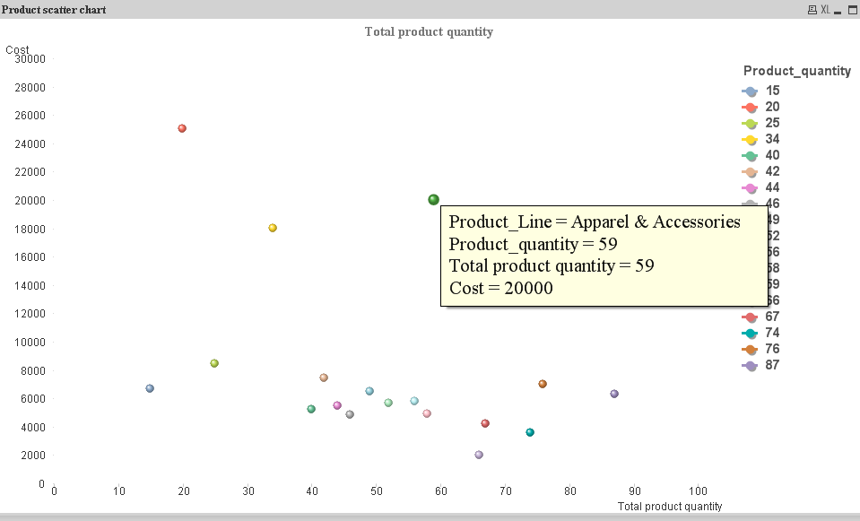
It is used for plotting and displaying data values of a dimension or field which has two values. We can select different symbols in place of simple dots and also modify the size and color of it.
5. Line Chart
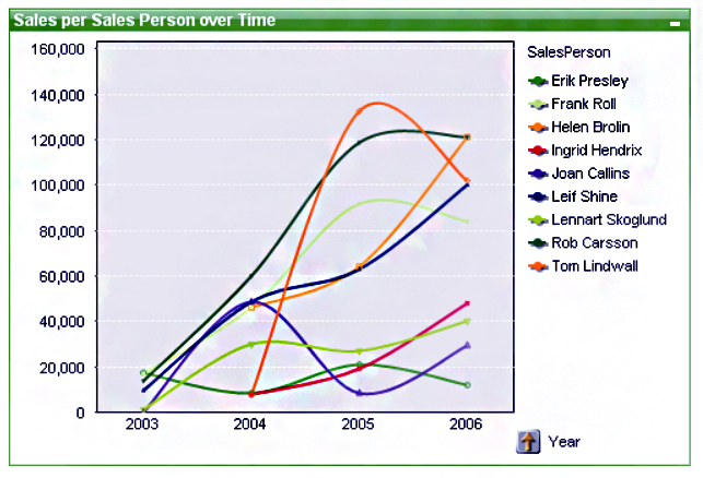
A line chart represents information by connecting the numerical value points with lines. We use this type of chart in identifying trends or changes in business with time as it makes trend lines.
6. Radar Chart
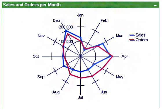
A radar chart displays the numeric information on the radar like a pattern in QlikView Visualization. The x-axis is wrapped in a 360-degree round and so there are separate y-axes (for each product line) for each x-axis value or point.
7. Grid Chart
A grid chart plots the dimension values on the axes and numerical data values display as single dots or symbols on the chart plane.
8. Gauge Chart
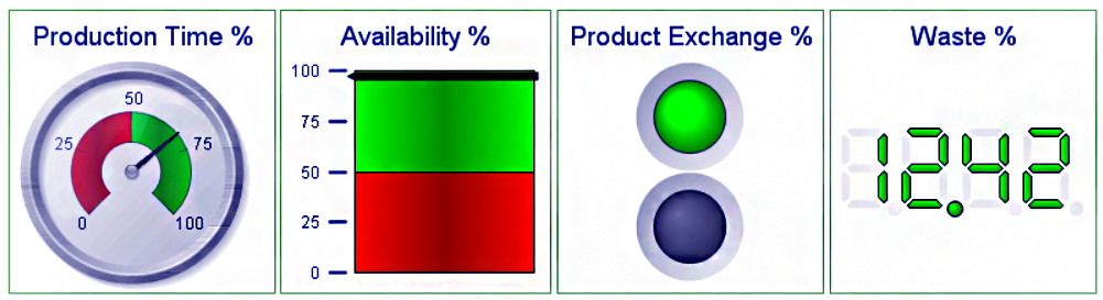
A gauge chart is used to display the information like in a meter gauge. By analyzing the gauge needle we can decide the highs and lows of values. Gauge charts display a single expression or data value and not the entire dimension. With the help of properties dialog, we can put in different expressions for calculating percentage etc.
The needlepoint of the gauge changes as soon as we make any selection in the table objects and shows the information relating to the particular selected value. There are many styles of a gauge chart which we can select from in the Style properties menu (as shown in the image above).
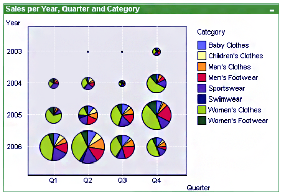
9. Block Chart
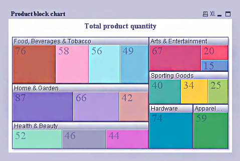
A block chart displays the numerical data values in blocks of varying areas. The values can also be shown on each block. In the block chart shown above, we can see there are big blocks of each product line and within those blocks are smaller blocks of each product specifying the quantity.
10. Funnel Chart
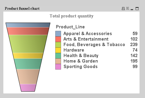
The purpose of the funnel charts is to display a process or the flow of data. The funnel chart designs in two ways, either each section in the funnel remains the same size or the sections within the chart are proportionate to the data value in the field. It is called a funnel chart because it looks like a funnel.
11. Pivot Table
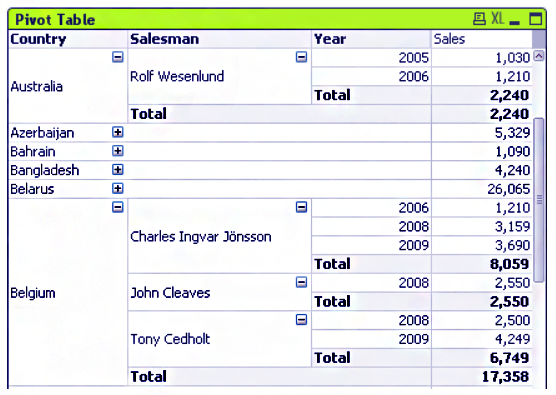
A pivot table shows the sum of values across different dimensions in a table. It has a unique structure and has collapsible fields. The Pivot Table creates through the chart object and retains all the properties of a chart. In some cases, a pivot table can also show grouped data ready to be drilled-down.
12. Straight Table
A straight table is a basic tabular form of data representation. It provides a benefit to visualize our data in tabular form by creating it through a chart object. Straight tables cannot display sub-totals and cannot be used as cross-tables (which a pivot table can).
13. Mekko Chart
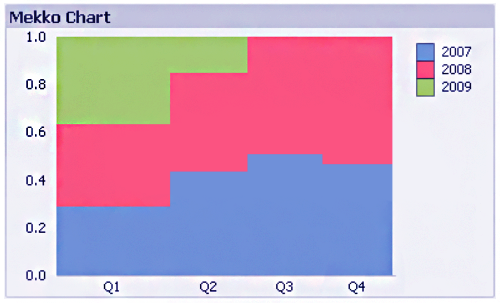
Mekko charts represent data in the form of bars of varying sizes or width according to the data values it is representing.
Such charts hold great importance in business or market analysis. We can click on the individual bar for further insight. Mekko chart activate the same selection in the other objects present on the sheet-like a list box or table box etc
14. List box
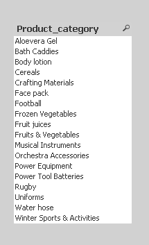
Through list box, we can select one field or column from the table currently loaded in QlikView document script.
15. Statistics box
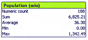
A statistical box enables us to perform statistical operations on any field of a table. Here, we will get to select from a wide range of available statistical functions and also apply multiple functions on one field at the same time. We can see the results separately within the statistical box.
16. Multi box
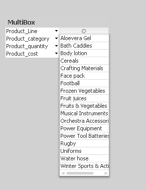
A Multi Box allows us to create a small table in which we can select the fields for display. Here, we can also see the field names and beside their name will be a drop-down menu for accessing the entire list. In a multi-box, we can promote or demote field.
17. Table box
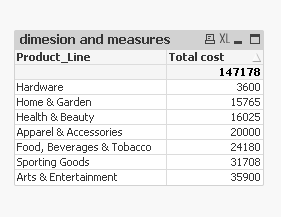
Table Box is probably the most used sheet object or visualization in QlikView. A table box displays data or information in a simple columned tabular form.
18. Input box
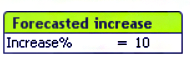
Using an input box, we can enter or define a variable. We can change a value or enter a new value by clicking on the right side of the ‘=’ sign to a defined variable.
19. Current Selections Box
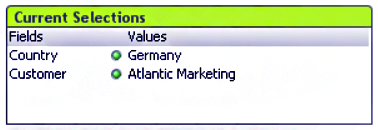
The current selection box will display the currently selected fields or row data by us. It enables us to get a comprehensive view of all the selections in an app and let’sus lock/unlock selections. The box will get empty when we remove the selection from our table.
20. Button
![]()
It can allow to takes control of many actions from a button. Actions that relates to bookmarks, layout, selection, printing and many more get implements by making a button for it. We can change the font, style, hue, action that button will perform through the properties window.
21. Text Object
A text box displays descriptive text relating to the information we are working with.
22. Line/Arrow Object
![]()
We can use the lines and arrows for several purposes. They offer visual clarity to the user by horizontally or vertically dividing the sheet. We may use an arrow to point on something noteworthy or some object.
23. Slider/Calendar Object
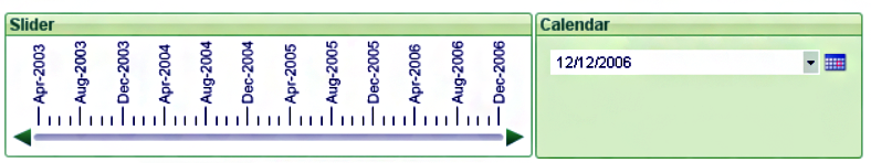
Slider/calendar object provides us a unique feature, which can provide a sliding bar where the scaling will be according to the data from the field we choose.
We can control a table with this slider easily and can select a field value or enter variables in the script variables. The calendar object servers as an in-built calendar which we can use in chronological reference to other data values.
24. Custom Object
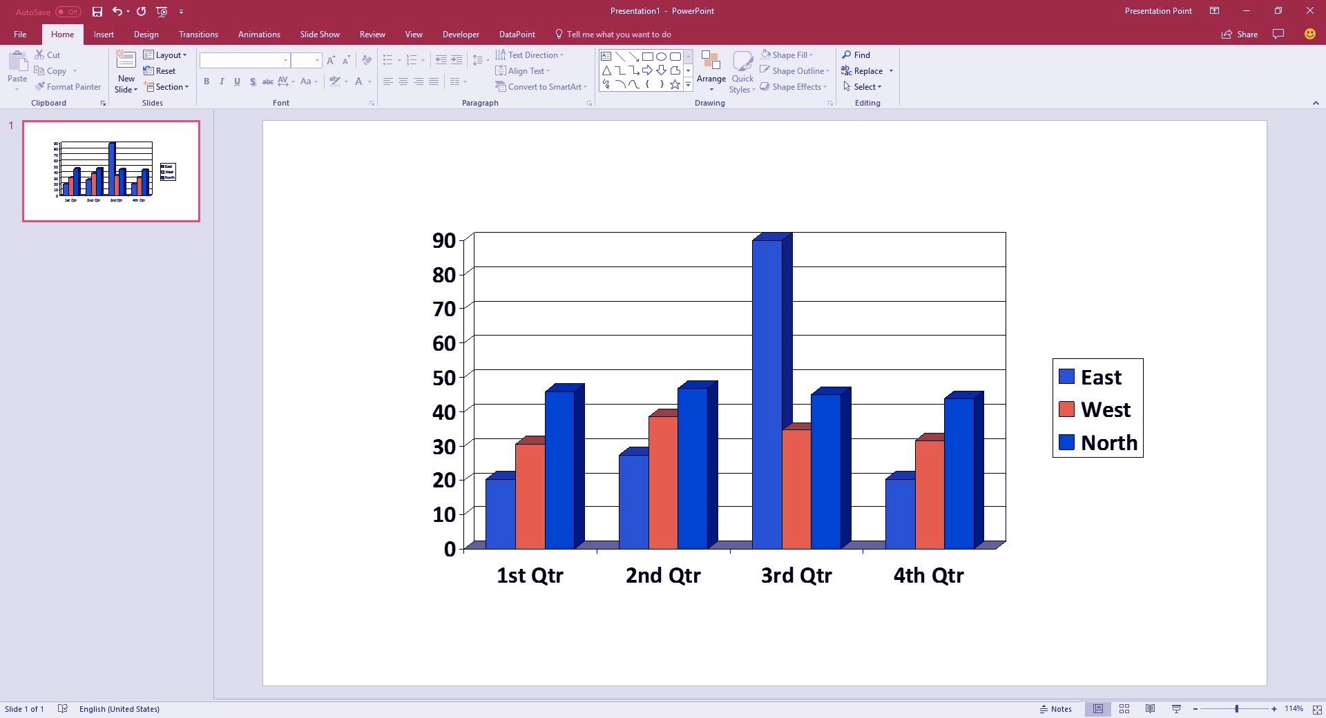
The custom object option enables us to create customized extension objects as OCX (OLE Control Extension) replacements. We can select from a wide range of extension objects like files, controls, Adobe or Microsoft objects etc. In the image shown above is a Microsoft bar graph which we can use as a custom object. The OCX replacement controls programs by Qlik, a third party or yourself.
25. Search Object
We can search for field names, specific field values, QlikView documents and files with the help of this object.
26. Bookmark Object
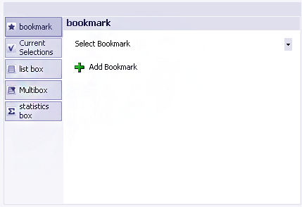
The bookmark object saves a current state of selections as a bookmark for later use. Also, we can use it for tagging an important bookmark on a sheet for immediate use.
27. Container Object
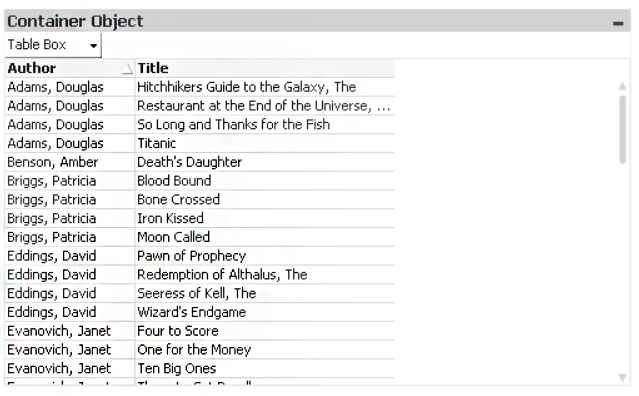
A container box is like a big carton box where we keep everything together. We can assimilate and access multiple sheet objects from the container box. Below is the screenshot of the property window of a container box.
How to Create a QlikView Visualization
Given below are the steps to create a visualization in QlikView.
Step 1: In a new sheet, go to the Layout menu in the menu bar or right-click anywhere on the sheet.
(vis32)
Step 2: Go to New Sheet Object option to access the list of available visualizations.
Step 3: Select the visualization (table, chart, graph) of your choice from the list and start working on it.
This comes to the end of QlikView visualization article. Hope you liked our explanation.
Summary
We conclude our introductory account of QlikView visualization and hope it was helpful in establishing a fundamental knowledge base in your mind about each kind of visualization (chart and sheet object) available in QlikView.
Did we exceed your expectations?
If Yes, share your valuable feedback on Google


