QlikView Trellis – Applying Trellis in Pie & Bar Charts in QlikView
Job-ready Online Courses: Knowledge Awaits – Click to Access!
After studied QlikView Themes Tutorial, we are ready to learn QlikView Trellis. As QlikView is known for its unique feature, Trellis feature is one of them. In this QlikView Trellis Tutorial, we are going to study QlikView trellis pie chart and bar chart.
The focus of QlikView as a tool has always been on making data visualization better and user-friendly. The QlikView Trellis is a step in the same direction.
So, let’s start QlikView Trellis tutorial.
What is QlikView Trellis Features?
Trellis is a term whose meaning in general sense falls around the term – Grid. So, it can say that trellis is a grid-like structure. Similarly, in QlikView, a chart can create in such a way that it displays in a grid and in each section or block of the grid is represented a single field value from a field.
It can also say that a bigger chart is broken down into numerous smaller charts, each representing a field value. For instance, in a QlikView document data, there is a field called Month.
Then a chart use the QlikView trellis feature so that 12 separate pie charts are made for each month. To create a trellis type of chart, you need to select at least two dimensions or fields from the table. You can select more than two dimensions, but it will make the chart very clumsy and difficult to understand.
Do you know what is QlikView Chart Expressions?
QlikView Trellis Example
How to Apply QlikView Trellis in Pie Chart?
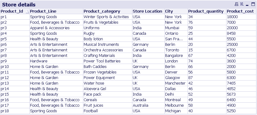
We will make a QlikView trellis pie chart. Basically, what we want is to represent the data values in such a way, that a separate pie chart will be made for each product line field value. So, our first or base dimension becomes Product_Line (refer to the data table given above).
Now, we want to see total sales in each product line based on cities. This makes City our second dimension. Next, as I mentioned, we want the sum of sales for individual cities, so we will enter an expression defining the sum of the field Product_Cost.
i. Step One
Select the Chart sheet object by right-clicking anywhere on the sheet then selecting New Sheet Object>Chart.. or by going to the Layout menu and doing the same.
ii. Step Two
Select the Pie chart from the chart wizard.
iii. Step Three
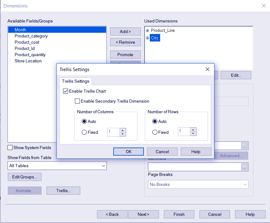
Add two dimensions of choice from the list of dimensions and click on the Trellis option given at the bottom of the window. A new dialog box will open where select the Enable Trellis Chart option. Click OK to exit.
Step.1 Applying QlikView Trellis in Pie Chart
Follow this link to know about QlikView Join Functions
iv. Step Four
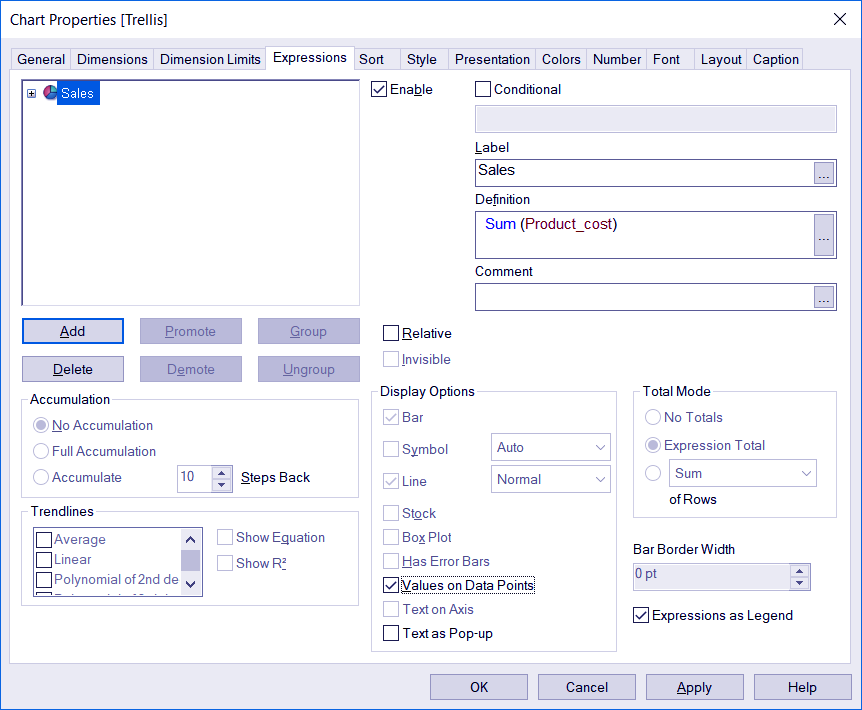
Enter the expression.
Step.2 Applying QlikView Trellis in Pie Chart
v. Step Five
Go through all the other properties tab if you wish to make any change and click on Finish once you are done. Your trellis pie chart will appear.
Step.3 Applying QlikView Trellis in Pie Chart
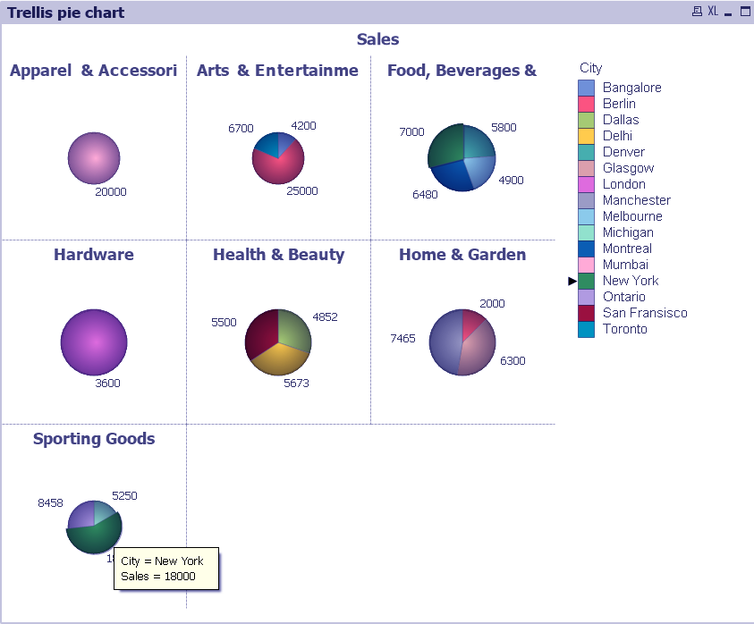
As you can see in the QlikView trellis chart created using the sample data. Separate pie charts are made for each Product Line value like Health & Beauty, Hardware, Home & Garden etc. The small pie charts have sections for cities in which sales of the corresponding product line has occurred.
The values shown in front of each section is the sum of sales from each concerning city. When you put the cursor on a particular section of the chart, the details related to that section will displays. Also, in the chart created is a list of all the cities and colours representing them.
Let’s Explore the System Requirements of QlikView Version 11 & 12
How to Apply QlikView Trellis in Bar Chart?
Just like how QlikView trellis works in a pie chart, it works in a bar chart. Just the mode of representation changes. Let us see how a QlikView trellis bar chart creates. We will make a bar chart where we have to represent the total sales happened in each country based on product lines.
Step 1: Select a bar chart from the chart wizard. Click OK.
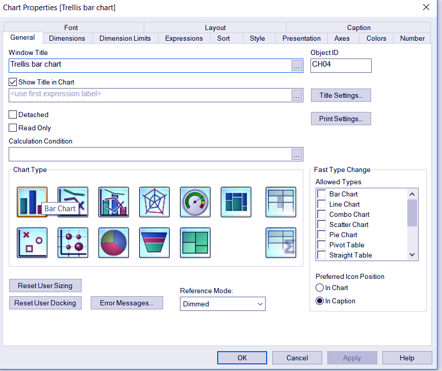
Step.1 Applying QlikView Trellis in Bar Chart
Step 2: Select two dimensions for the QlikView trellis chart. The one the top is the base dimension (Store Location in this case). Go to the Trellis option and check Enable Trellis Chart box. Click OK.
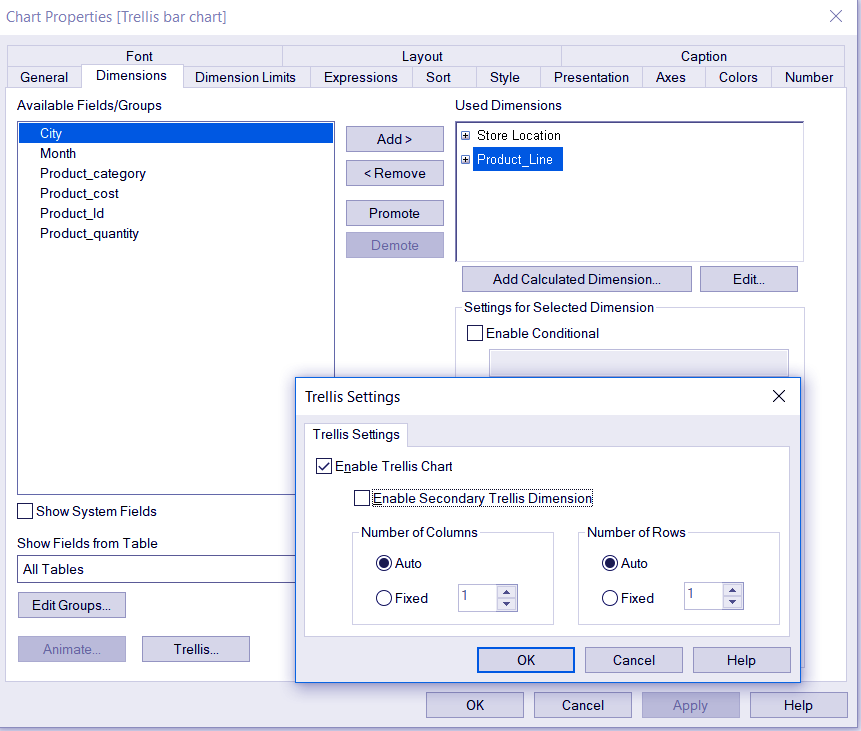
Step.2 Applying QlikView Trellis in Bar Chart
Step 3: Add the expression. Explore other properties tab as well if you wish to make any other changes.
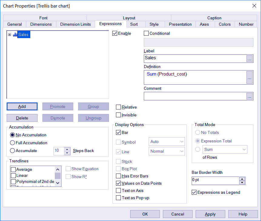
Step.3 Applying QlikView Trellis in Bar Chart
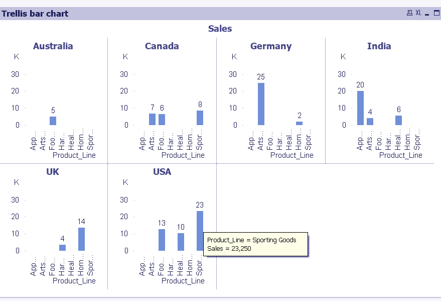
Step 4: Click Finish and the trellis bar chart will appear. Stretch or squeeze it from the border to adjust its size.
Have a look at – QlikView Bar, Pie Chart & Text Box
Step.4 Applying QlikView Trellis in Bar Chart
The QlikView trellis bar chart shows bars for the total sales occurred according to each product line in respective countries.
So, this was all about QlikView trellis Tutorial. Hope you like our explanation.
Conclusion
Through this tutorial, it gets obvious how important is the QlikView trellis feature in charts. It can use in place of multiple selections made in a chart as it provides a well-distributed view of individual field value existing in a field. You can use these charts to normally populated charts for comparative analysis.
Still, had a confusion? Share your query/doubt/feedback with us!
Related Topic – QlikView Backus Naur Form
Your 15 seconds will encourage us to work even harder
Please share your happy experience on Google


