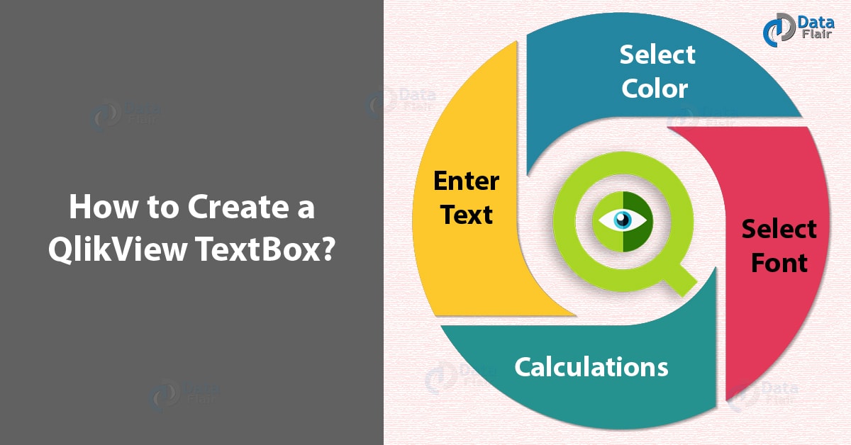
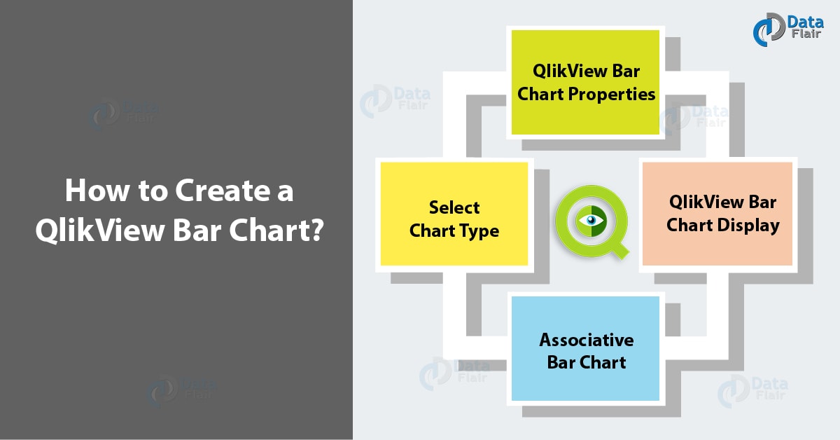
QlikView Bar Chart – How to Make Pie Chart & Text Box
Expert-led Online Courses: Elevate Your Skills, Get ready for Future - Enroll Now!
In our last QlikView Tutorial, we talked about QlikView List & Multi Box. Today, in this QlikView Bar Chart Tutorial, we are going to explore How can we draw the QlikView Pie Chart. Along with this, we will cover How to create QlikView TextBox. They are distinct tools and can be used together to analyze data better.
So, let’s start the QlikView Chart.
QlikView Text Box
QlikView text box is used to display descriptive text relating to the information you are working with. It is very convenient to create a Textbox in QlikView on the go while working with minimal steps to follow.
Do you know the Difference between QlikView and Tableau
QlikView TextBox
a. How to Create a QlikView TextBox?
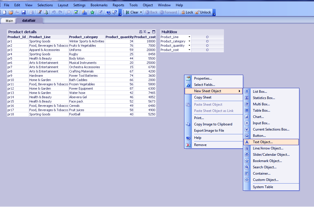
To create a QlikView text box, go to Layout menu and select TEXT BOX from the new sheet object drop-down menu. Or for time’s sake, you can randomly right-click anywhere on the sheet you are working on and follow the same steps mentioned above.
How to Create a QlikView TextBox?
i. Enter Text
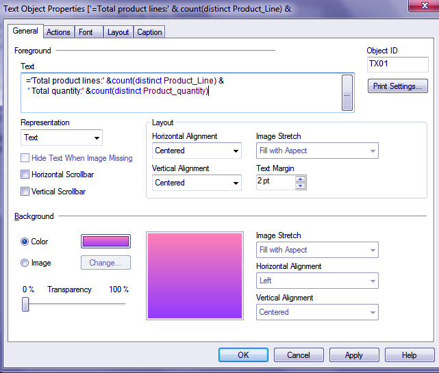
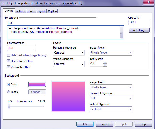
Once the QlikView textbox properties window opens, you have many options to make the text box as you like. First of all, you would want to enter the text that is to be displayed. The text is entered in the Text field. You can play with a number of options like background color or image, a form of representation, alignment of the text etc.
Step. 1 QlikView TextBox – Enter Text
Let’s read about What is QlikView IntervalMatch – Match Function in QlikView
ii. Select Color
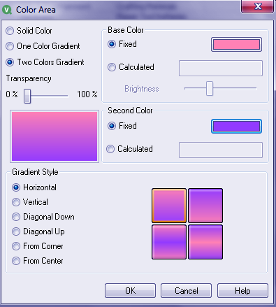
While choosing the background as color, there will open a new dialog box named COLOR AREA. Here you can set the color background any way you want, you can select whether you want a single gradient color or a solid color or two gradient color. Then you get to select from a wide range of color scheme by tapping on the color strips given. Also, you can decide the gradient style accordingly.
Step. 2 QlikView TextBox – Select Color
iii. Select Font
The text font can also be chosen by you along with selecting details of font style and font size. Confirm your choice by referring to the text shown in the preview window and click OK.
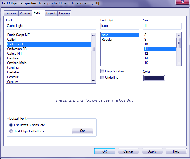
Step. 3 QlikView TextBox – Select Font
iv. Calculations
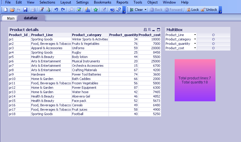
You can enter mathematical function expression within the text you enter if you want the displayed text to show some calculated values. Here in the data we have used as a sample we have applied two functions on the table fields, one is count function and second is the sum.
When we apply the count function on the fields Product_Line and Product_quantity the results count the total number of product lines and product category items. The expression we entered in the text box is,
QlikView TextBox =’Total product lines:’ &count(distinct Product_Line) &
‘ Total quantity:’ &count(distinct Product_quantity)
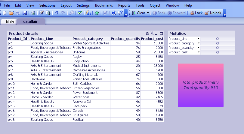
The results attained as the text box got displayed were total product lines: 7 and Total quantity: 18. Please refer to the screenshot attached below. Here, as we have applied the count function on the product line field it has simply counted the number of entries done under that field and returned 18.
Let’s Discuss QlikView Star Schema in Detail
Step. 4 QlikView TextBox – Calculations
Whereas, if we use the function sum on the product_quantity field it will calculate the total quantity of all the products sold.
Step. 5 QlikView TextBox – Calculations
Step. 6 QlikView TextBox – Calculations
QlikView Bar Chart
Since school, we have been familiar with a bar chart. It used to show up every now and then whether you were in science or commerce. Point being, you must very well know that what a crucial role does a bar chart play in a business analytics tool. Bar charts are the most fundamental method of comparing two sets of values visually.
In the Qlikview bar chart also, we study the relationship between two fields or dimensions with each other. The height of one dimension shows the value mentioned in the second dimension. Let us understand this better by creating a QlikView bar chart using a stores products record.
QlikView Bar Chart
a. How to Create a QlikView Bar Chart?
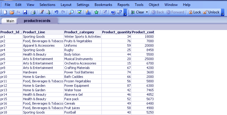
We have loaded our data table product records in the QlikView document we want to create our chart on.
How to Create a QlikView Bar Chart?
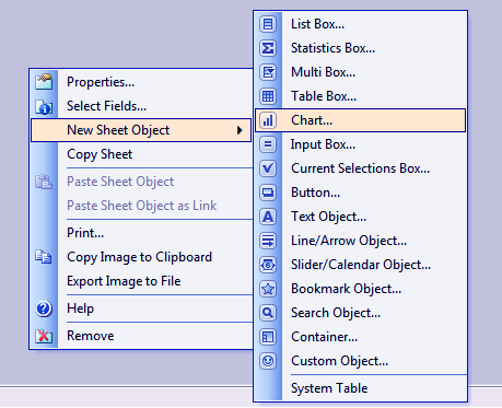
Then after saving and reloading the script, right-click anywhere on the screen and select CHART from the NEW SHEET OBJECT option.
Step. 1 Creating QlikView Bar Chart
Do you know How to Download & Install QlikView?
i. Select Chart Type
Next, you will see a chart wizard window opening on the screen with many Chart Types you can choose from. Here we will select the Bar Chart. Click NEXT.
Step. 2 Creating QlikView Bar Chart – Select Chart Type
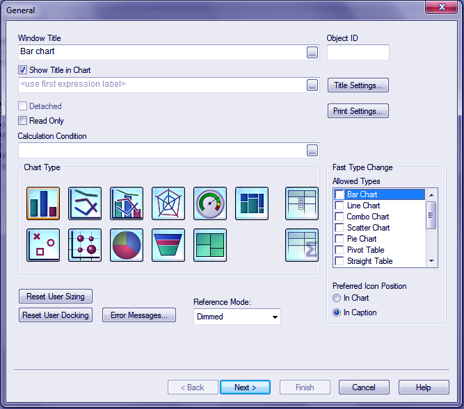
ii. QlikView Bar Chart Properties
Next will open a heavy loaded chart properties window where you get to make many selections in the way of making your final chart you want to. There are many properties tab from you can make preferable chart settings like setting the layout, font, axes, dimensions, style, presentation, expression etc.
After entering the chart name and selecting the type, you will be asked to select the two dimensions (or more if you require), which will be the two axes of the chart. In our chart we want to see the relation between the product lines and the total quantity of each line item sold.
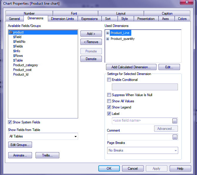
Step. 3 Creating QlikView Bar Chart – Property
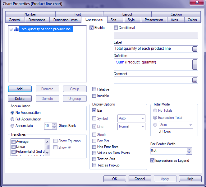
Next comes the expression tab where you have to select an expression or function like count, sum etc to apply to the fields you chose. We have taken the sum expression on the product_quantity field. You can also add a label to be displayed for this on the QlikView bar chart.
Follow this link QlikView Database Connection & Inline Data
Step. 4 Creating QlikView Bar Chart- Property
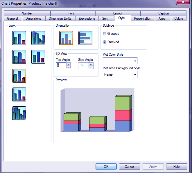
Now you can choose the style of your QlikView bar chart, its orientation, plot color and background styles and finalize your choice by looking in the preview section.
Step. 5 Creating QlikView Bar Chart- Property
iii. QlikView Bar Chart Display
Finally, after doing all the properties changes, click on Finish to get the final chart on display.
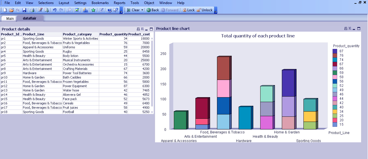
QlikView Bar Chart – Display
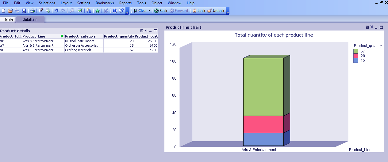
As you can see in the screenshot the bars are stacked (it can also be grouped) one upon the other showing the different category of products in one product line. The horizontal and vertical axis values are shown very clearly.
Have a look at QlikView Scripting & Features of QlikView Script Editor
iv. Associative Bar Chart
The QlikView bar chart like many other sheet objects is also associative. If we select on one product line say ‘Arts & Entertainment’, both the chart and table values will automatically filter to just the selection made. You can also see the three different stacks on the bar and the values of each category specified with their color on the top right corner.
QlikView Bar Chart – Associative
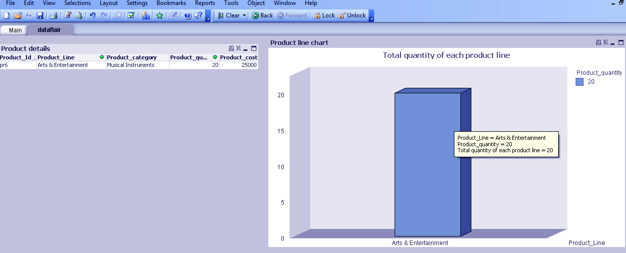
Now as we click on the middle section on the bar, the values in the chart and table again change to just the single values of category ‘Musical Instruments’, showing all the related data.
QlikView Bar Chart – Associative
QlikView Pie Chart
A QlikView pie chart is a circular representation of the data values. All the different data fields are represented by the individual slices or sections of the pie like a circle. The size of each pie slice is determined by the value of that field. QlikView Pie charts are usually used in the population statistics etc.
You can create a pie chart in Qlikview quite conveniently.
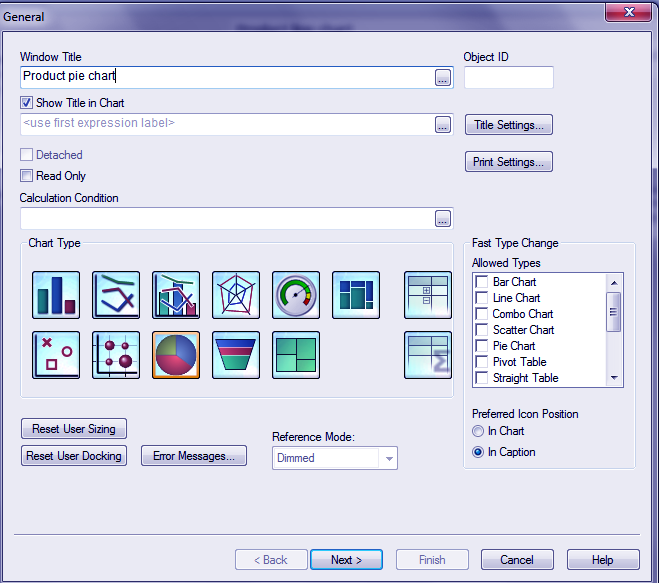
Select Pie Chart from the chart type and add a title to the chart.
Step.1 QlikView Pie Chart
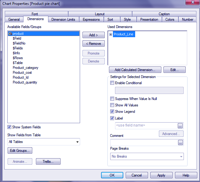
Add a dimension or field to be used in the pie chart representation.
Do you Know What is Business Intelligence?
Step.2 QlikView Pie Chart
Apply an expression accordingly.
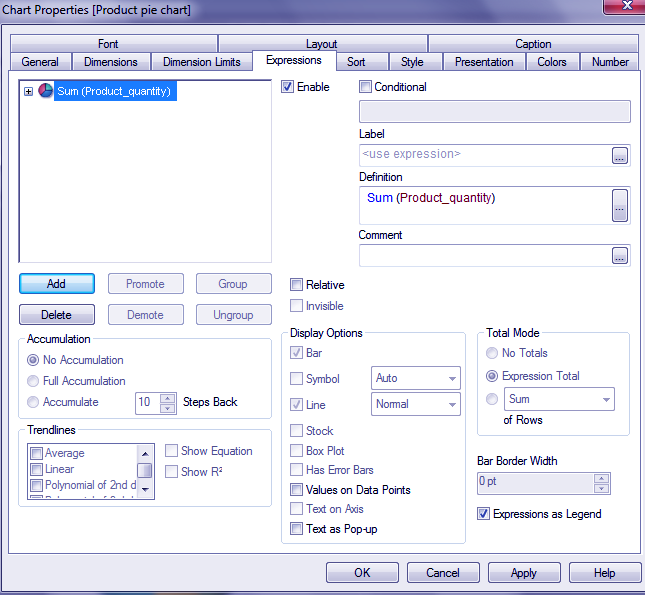
Step.3 QlikView Pie Chart
Choose the chart style.
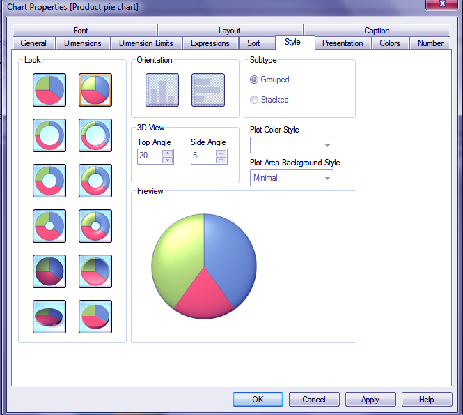
Step.4 QlikView Pie Chart
Click on Finish to see the pie chart.
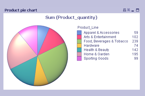
Step.5 QlikView Pie Chart
So, this was all about QlikView Bar Chart. Hope you like our explanation on Pie chart & TextBox.
Conclusion
Hence, in this session, we learned how to create and work with a text box and two kinds of QlikView charts, bar and pie. We hope you are not finding working on Qlikview very overwhelming as it is the most practical and convenient tool to work on once learned it properly. There are many other kinds of charts which we are going to discuss in our next lesson.
Furthermore, if you have any query, feel free to ask in the comment box.
Related Topic – QlikView Architecture
For reference
Your opinion matters
Please write your valuable feedback about DataFlair on Google


