QlikView Charts – Funnel, Grid, Line, Mekko, Scatter Chart
Placement-ready Online Courses: Your Passport to Excellence - Start Now
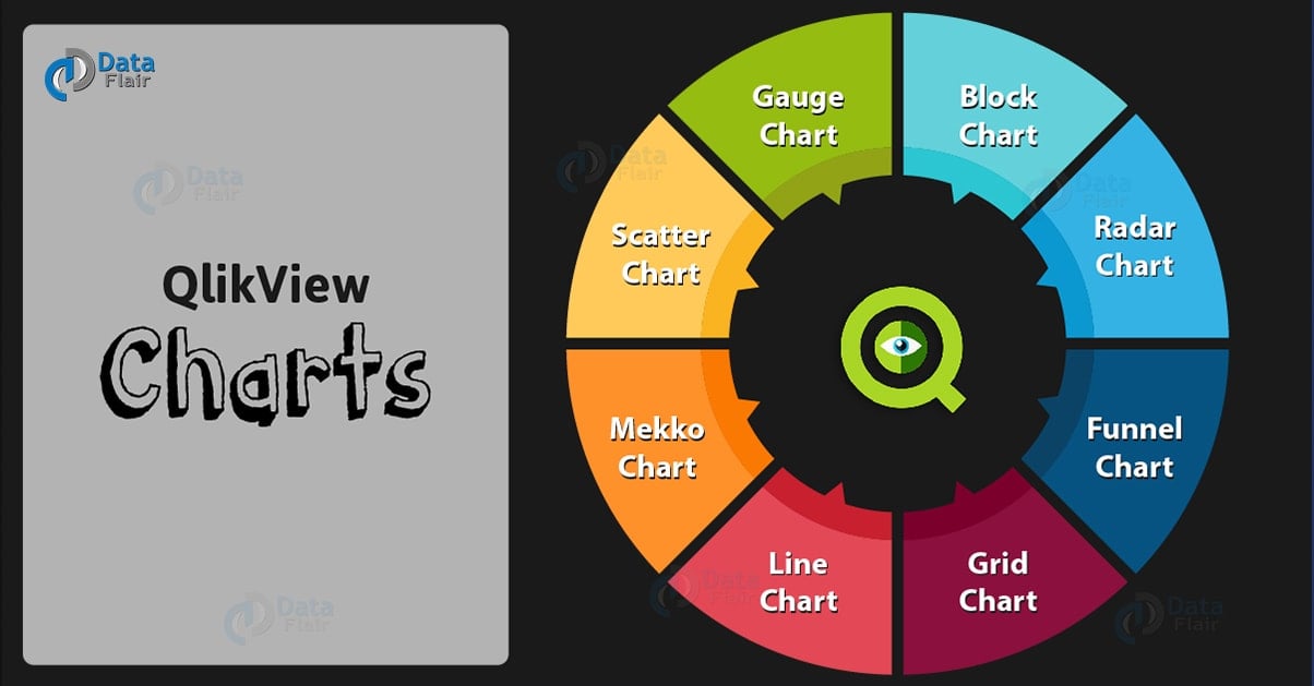
In this QlikView Charts tutorial, we will learn about seven unique and important chart types in Qlikview. All of these QlikView charts differ from each other in terms of their way of representing numeric data or displaying information.
Like a radar chart in QlikView will look like a radar or a spider web, a QlikView scatters chart will have single dots or crosses scattered. The purpose of having such different kinds of charts and ways of representation is to let the analyzer have different perspectives and thus better inferences drawn from the data.
So, let’s start QlikView Charts Tutorial.
QlikView Charts – Funnel, Grid, Line, Mekko, Scatter Chart in QlikView
Types of QlikView Charts
Let’s discuss 8 types of Charts in QlikView:
- QlikView Block Chart
- QlikView Funnel Chart
- QlikView Radar Chart
- QlikView Grid Chart
- QlikView Line Chart
- QlikView Mekko Chart
- QlikView Scatter Chart
- QlikView Gauge Chart
Do you know What is QlikView Chart Expression?
QlikView Block Chart
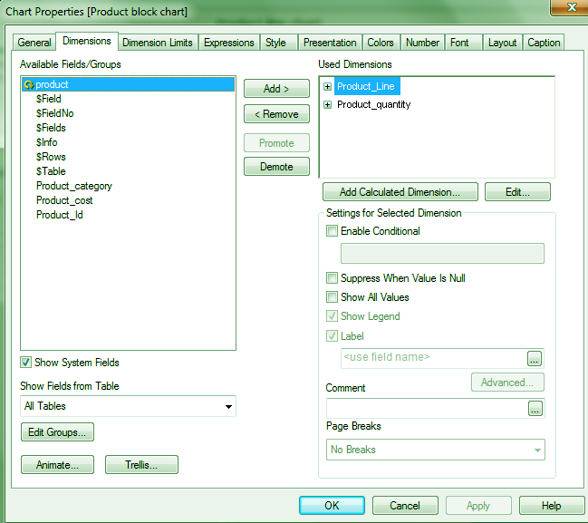
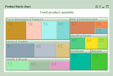
A block chart in QlikView displays the numerical data values in blocks of varying areas. The values can also be shown on each block. As you can see in the screenshots, we have taken two dimensions from our product record table, Product_Line and Product_quantity.
In the final block chart you can see there are big blocks of each product line and within those blocks are smaller blocks of each product specifying the quantity.
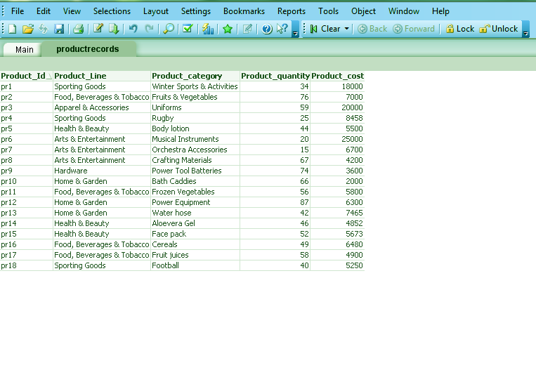
We have taken the data from ‘productrecords’ file (an excel file). The table box of the data looks like this.
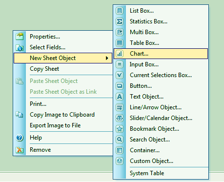
Step.1 QlikView Block Chart
Now to create a QlikView Block chart, right-click anywhere on the sheet, go to NEW SHEET OBJECT, select CHART.
Step.2 Block Charts in QlikView
Follow this link to know about QlikView Time Chart Wizard
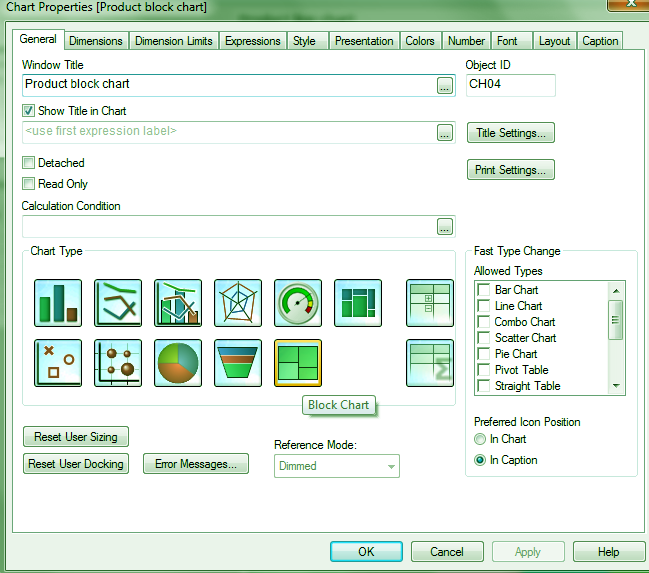
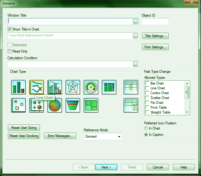
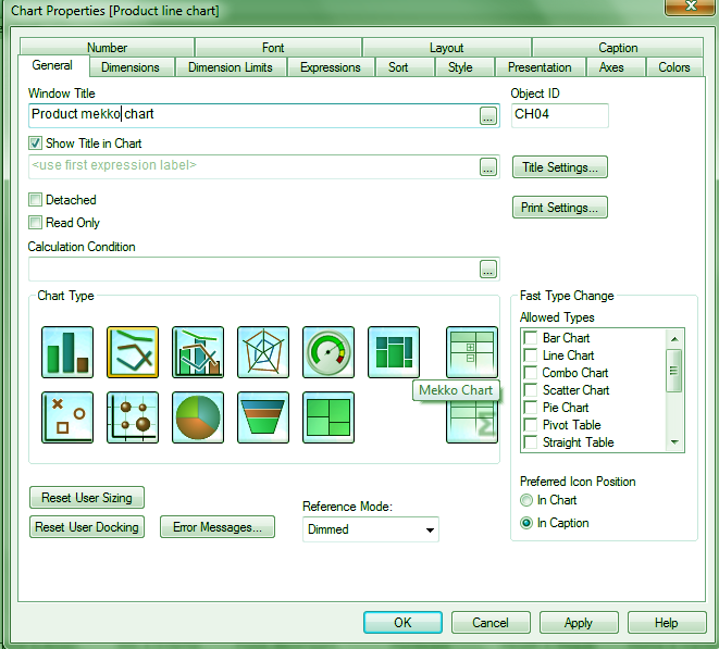
A dialog box named CHART PROPERTIES will open. Select a Block Chart from here.
Step. 3 QlikView Block Charts
Coming back to creating QlikView block chart, click on NEXT and select dimensions or fields from the table that you want to create the chart with.
Step.4 Block Charts in QlikView
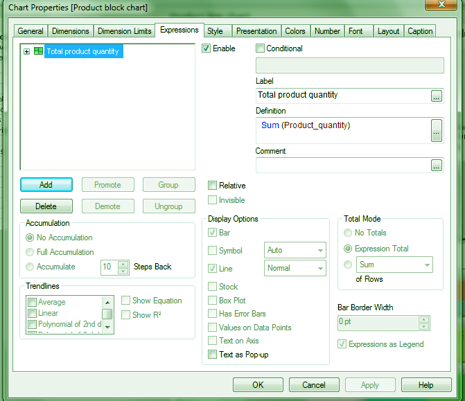
Next, choose an expression for the field (we have applied SUM function on the Product_quantity)
Step.5 QlikView Charts – QlikView Block Charts
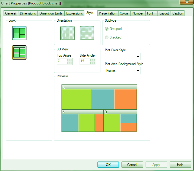
Select the chart type from the options given.
Step.6 QlikView Block Charts
Do you know How to apply Trellis in Pie & Bar Charts in QlikView
You can also change the presentation settings, fonts, layout, sorting preferences. After this, click on FINISH to see the chart.
Step. 7 QlikView Charts – QlikView Block Charts
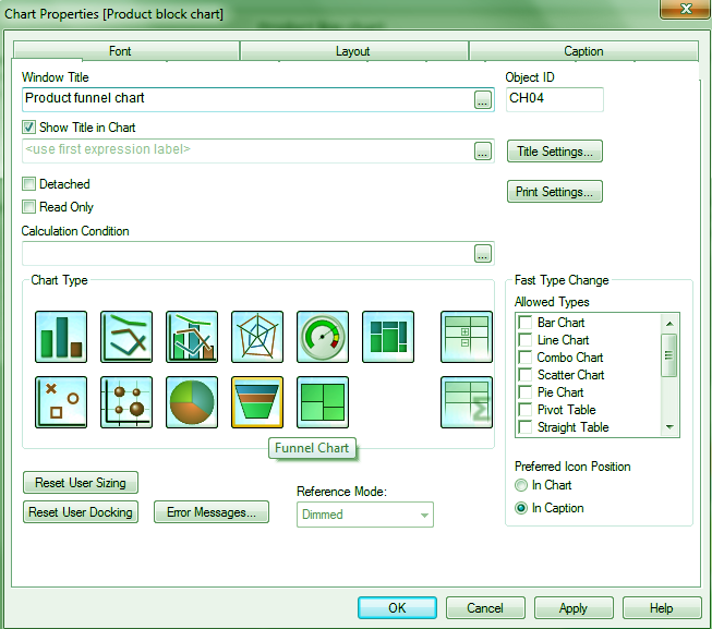
QlikView Funnel Chart
A funnel chart in QlikView is called so because of its shape. The purpose of QlikView funnel charts is to display a process or flow of data. The funnel chart in QlikView can design in two ways, either each section in the funnel remains the same size or the sections within the chart are proportionate to the data value in the field.
QlikView Charts – QlikView Funnel Chart
Let us understand this by looking at the QlikView funnel chart below, as you can see, the green section is the largest because it corresponds to the total quantity (239) of products of the line Food, Beverages & Tobacco. Similarly, the section blue in color, representing Apparel & Accessories is the smallest of all as it corresponds to the lowest value 59.
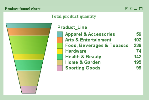
QlikView Charts – Funnel Chart in QlikView
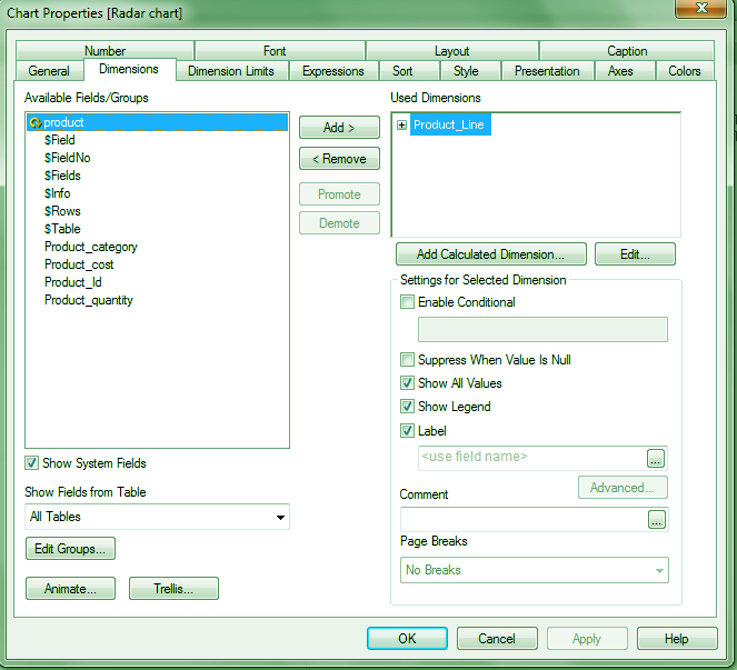
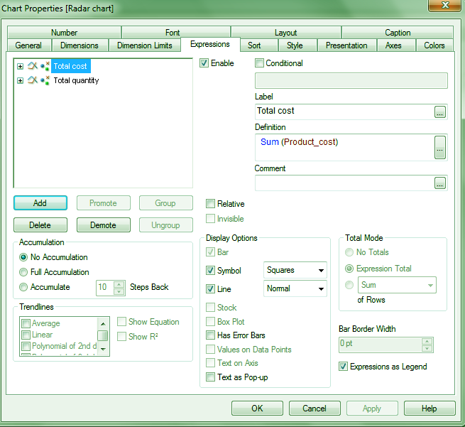
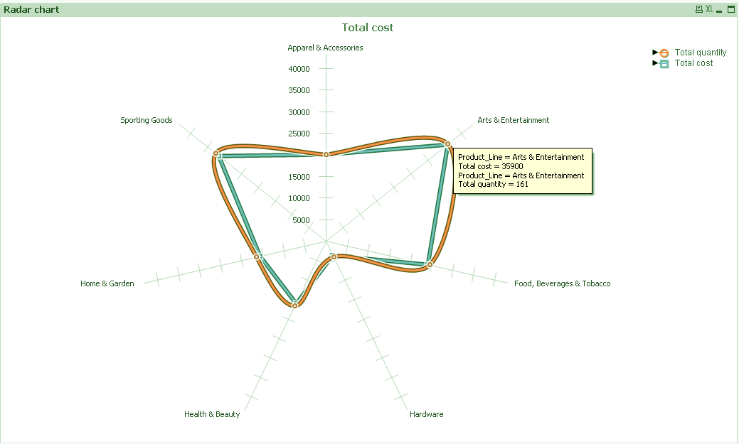
Radar Chart in QlikView
A radar chart in QlikView is a unique chart as it displays the numeric information like on a radar. The x-axis wrap in the 360 degree round and so there is one y-axis (for each product line) for each x-axis value. You can create a QlikView radar chart in the same way as you create other charts.
We have taken one dimension of product_line which is the y-axis.
QlikView Charts – Radar Chart in QlikView
Then we have set two expressions (both SUM) for product quantity and product cost.
Let’s Explore Quick CHart Wizard in QlikView
QlikView Charts – QlikView Radar Chart
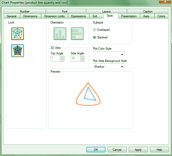
After selecting the chart style, the radar chart in QlikView is ready.
Radar Chart in QlikView
Radar Chart in QlikView
Revise This – QlikView Set Analysis – How to Define Concatenate
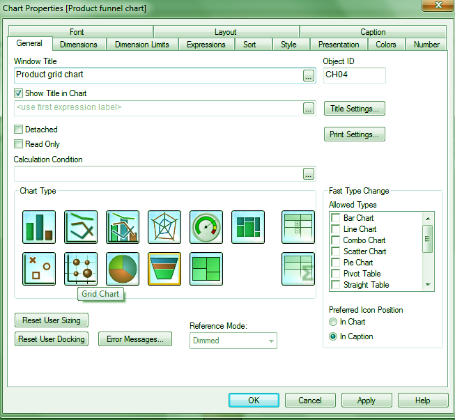
QlikView Grid Chart
A QlikView grid chart plots the dimension values on the axes and numerical data values are displayed as single dots or symbols on the chart plane.
QlikView Charts – QlikView Grid Chart
As you can see in the screenshot below, the QlikView grid chart for product quantity, plotted against product line gives dots in place of each item’s quantity aligning in line with names of product lines written on the x-axis. If there are three entries for health and beauty, there are three dots in that line for each value.
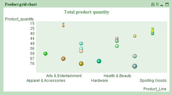
Grid Chart in QlikView
QlikView Line Chart
A line chart in Qlikiew represents information by connecting the numerical values with lines. This type of chart is useful as it is used in identifying trends or changes in business with time. You can either have a line connecting all the value points or just symbols or both.
QlikView Charts – Line Chart
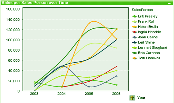
Line Chart in QlikView
Also, Read – Different Types of Search Options in QlikView
Mekko Chart in QlikView
Mekko charts in QlikView represent data in the form of bars of varying sizes or width. Such QlikView charts hold great importance in business or market analysis. As you can see in the QlikView mekko chart shown in the screenshot, each colored bar represents a product item bought from a store.
Mekko charts in QlikView
The colors assign to each product line. Now if you notice closely here, each bar tells the quantity bought for a particular product and the width of the bar also depends on the magnitude of the value. More the quantity bought, wider the bar. You can click on the individual bar for further insight. This will also activate the same selections in other objects present on the sheet-like a list box or table box etc.
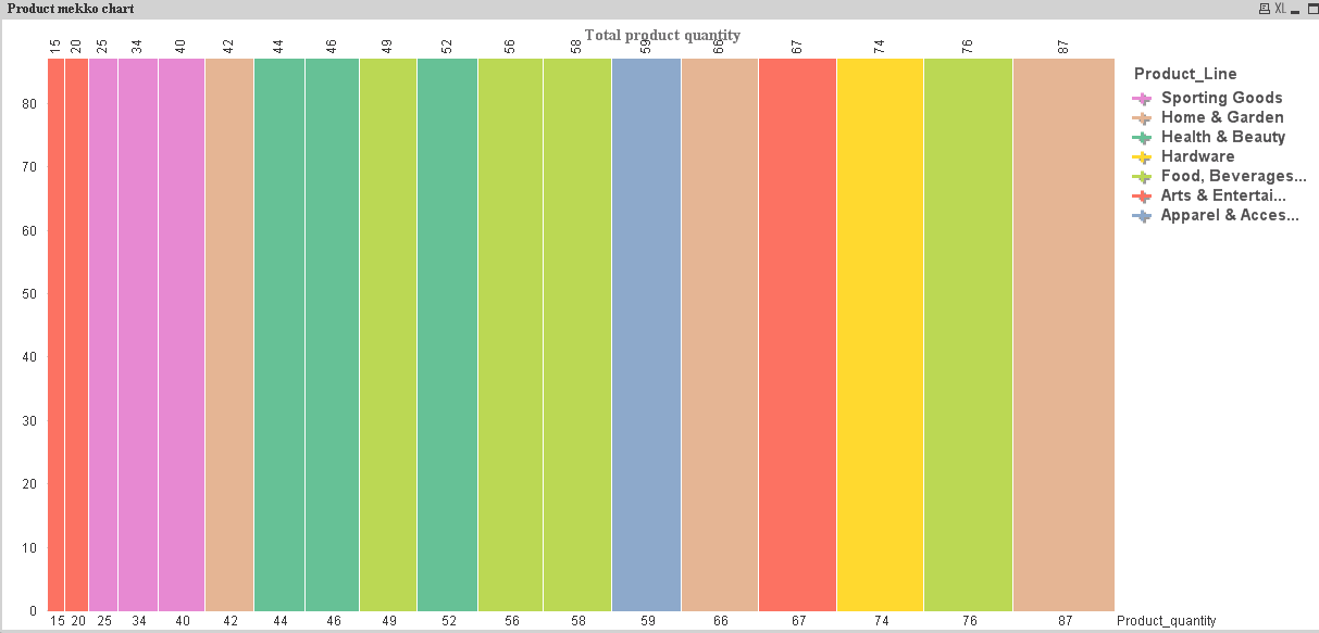
QlikView Charts – Mekko charts in QlikView
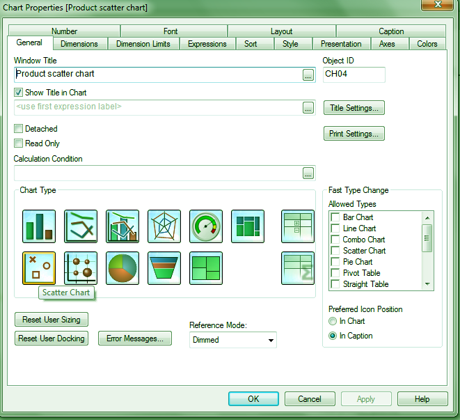
QlikView Scatter Chart
Scatter chart in QlikView is more or less similar to a grid chart. The only difference is that a scatter chart is used to plot and display data values of a dimension or field which has two values.
Scatter chart in QlikView
Like in the data we used, we have plot a QlikView scatter chart between product cost and product quantity keeping product line as the base dimension. You can select different symbols in place if simple dots and also modify the size and color of it.
Have a look – How to Create QlikView Data Files (QVD)
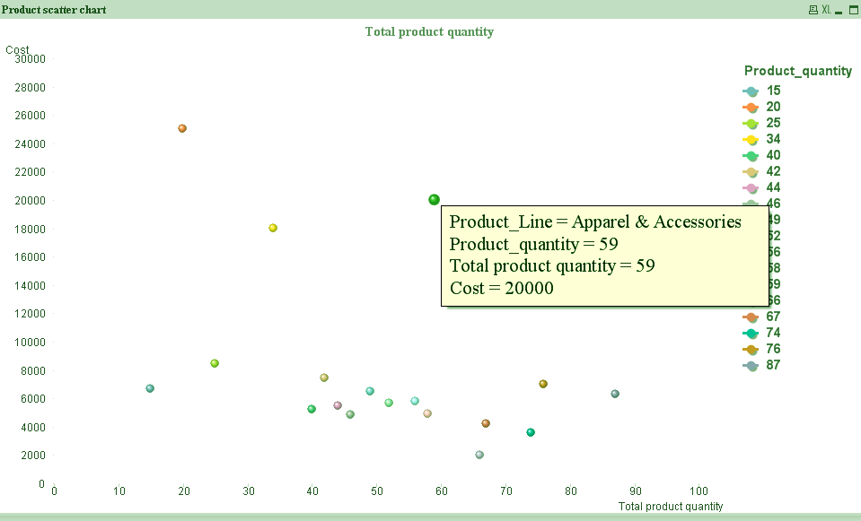
QlikView Charts – Scatter chart in QlikView
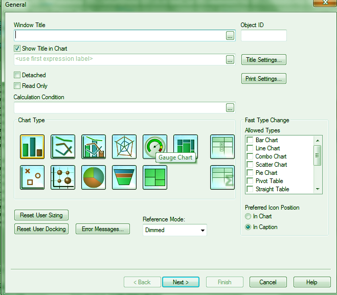
QlikView Gauge Chart
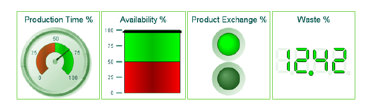
A gauge chart in QlikView use to display the information like in a meter gauge. You can decide the highs and lows of values by looking at the gauge needle. QlikView Gauge charts display single expression or data value and not the entire dimension. You can put in different expressions for calculating percentage etc., through the properties dialog.
QlikView Charts – Gauge chart in QlikView
The needlepoint of the gauge changes as soon as you make any selection in the table objects and shows the information relating to that particular selected value. There are many styles of a gauge chart which you can select from the STYLE properties menu.
Gauge chart in QlikView
Conclusion- QlikView Charts
All these QlikView charts are very significant and unique in terms of the purpose they serve. We now know very well about these charts and how to create them. You can do many minute alterations in the properties of these charts and make them as you like. Hope you found this this tutorial helpful. Keep practising, keep learning!
Furthermore, if you have any query, feel free to ask in the comment box.
Related Topic – QlikView Silent Installation
Your 15 seconds will encourage us to work even harder
Please share your happy experience on Google


