Creating QlikView Dashboard – Components & Features
FREE Online Courses: Transform Your Career – Enroll for Free!
In our last tutorial, we studied the QlikView TextBox, Bar & Pie Chart. Now, in this QlikView Dashboard Tutorial, we are going to see how to use them collectively as a system we will understand about qlikview dashboard in this tutorial. Here, we will learn how to create a dashboard in QlikView and its components. Moreover, we will discuss the associative features of Qlikview Dashboard with examples.
So, let’s start the QlikView Dashboard Tutorial.
How to Create Qlikview Dashboard?
Qlikview Dashboard is basically a sheet or a document which consists of different kinds of sheet objects containing the loaded data in qlikview script when you load. For example, a movies database, you would want to gain the best possible insight using the tools of QlikView.
Do you know the difference between QlikView Vs Tableau
The first thing to do in order to optimize the data analysis process is creating a dashboard. In order to create a complete QlikView dashboard, you need to know what all information you want on the dashboard and the relation you want to study between different data values or information.
Next is selecting and creating sheet objects (like table box, buttons etc) to get the data values displayed and applying functions or expression on data values and fields and your QlikView dashboard is ready.
Let us understand it better by studying the screenshot of a QlikView Dashboard provided here.
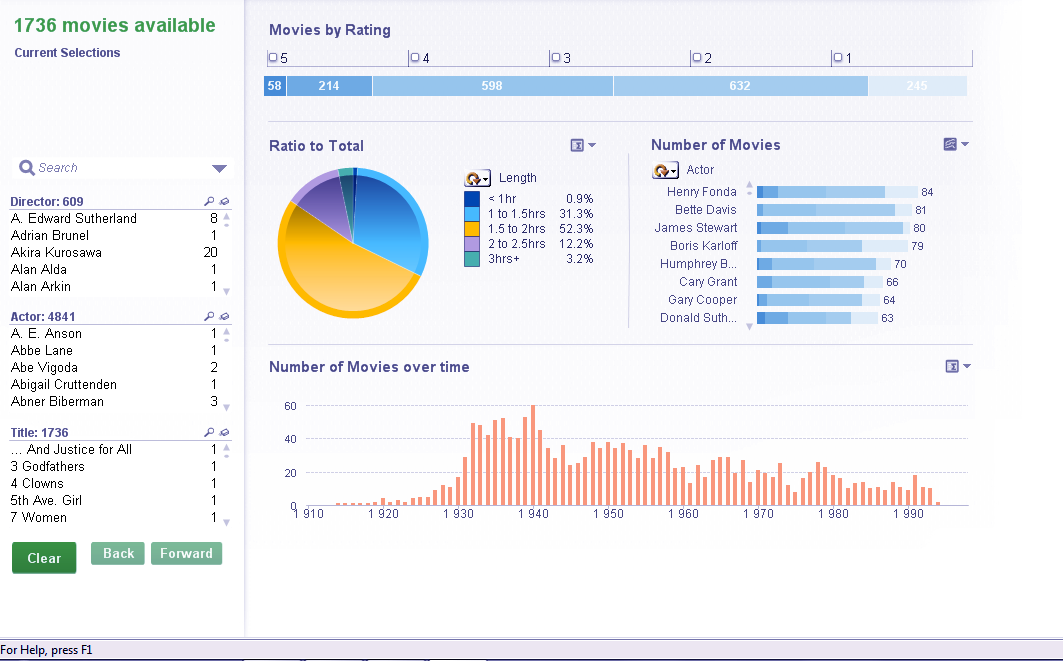
Image.1 QlikView Dashboard – Example
This is a movies database having information of a total of 1736 movies available. The information we have here is directors, actors, movies, movie ratings, movie duration, movies done over time (specifying years). If we notice here, it has many sheet objects, on the left, the director, actor and movie title boxes are list boxes.
In centre top, the rating bar is a list box and the blue value bar beneath it is a mekko chart. Other objects like a pie chart, a bar chart are quite obvious to identify. Several buttons are also used.
Follow this link to know How to Create QlikView List Box & Multi Box
Similarly, you can create your own QlikView dashboard using as many and whichever sheet object you require to use.
QlikView Dashboard Components
The dashboard is made up of several components. The different types of charts that we have studied, input boxes where you input variables, selection boxes are the ones where you can make selections that automatically deactivates all the other values. Table box, multi-box, list box can call as selection boxes. Buttons are created to carry out an action easily, like forwarding, Back, Clear etc.
You can many other objects from the list of sheet objects like bookmark, container, search, line/arrow object. Also, adding a descriptive note or comment on the dashboard can do by a text object.
- Charts
- Input Boxes
- Selection Boxes
- Buttons
- Objects
- Notes & Comments
The Associative Feature of Dashboard in QlikView
It is safe to presume that you must be having a fair idea about it. This associative feature is best displayed and utilized on a QlikView dashboard. The movie database dashboard that we referred to earlier also works on the associative nature. Let us suppose that we want to get information about an actor say ‘Al Pacino’. We search for this name on the search bar on the actors list.
Click on Al Pacino and you see all the objects change their information instantly to only that relate to Al Pacino. You can see which directors and co-actors did he work with, how many and which movies did he do and can get the data about an individual movie by clicking on the movie title. You can also get to know how many of those movies fall on which rank.
Let’s Discuss QlikView Star Schema in detail
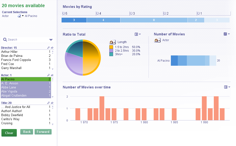
Image.2 QlikView Dashboard – Example
Now, if we want to know about the director ‘Francis Ford Coppola’ . We search and select this name from the list and get all the objects displaying information related to this director.
On the top right, the total number of movies (changes according to the selection made) count and a current selection tab is also given. If you want to unselect something click on CLEAR.
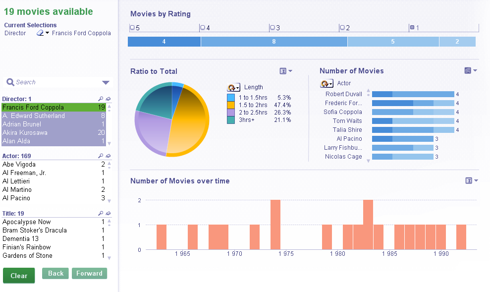
Image.3 QlikView Dashboard – Example
After this, we further make a selection from the movie title list (the movies Franis has made). We select the movie ‘The Godfather’. The dashboard now displays only the details related to the movie The Godfather.
Have a look at QlikView Documents
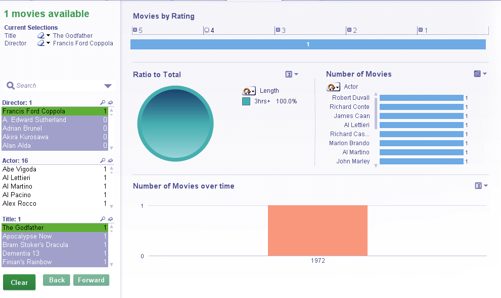
Image.4 QlikView Dashboard – Example
This explains the associative nature of the QlikView dashboard here filtering out information to just what you need at that instant is possible.
So, this was all about QlikView Dashboard Tutorial. Hope you like our explanation.
Conclusion
Hence, in this tutorial, we have seen what is QlikView dashboard, what are its components and how it complies with the associative data model. With the virtue of all this, dashboard proves to be a very interactive platform for data analysis. Still, have a query, feel free to approach us!
Related Topic – QlikView IntervalMatch & Match Function
For reference
If you are Happy with DataFlair, do not forget to make us happy with your positive feedback on Google


I need to do qlikview Testing, can I get braid level test scenarios that are standard.
*broad