QlikView Box Plot Wizard – 4 Simple Steps to Create Box Plot
FREE Online Courses: Click, Learn, Succeed, Start Now!
In our last session, we talked about Time Chart Wizard in QlikView. Here, we are to learn Qlikview Box Plot Wizard in which we will discuss how to create QlikView box plot using box plot wizard.
So, let’s start QlikView Box Plot Wizard Tutorial.
What is QlikView Box Plot?
We have studied several kinds of charts in QlikView till now, like, bar chart, pie chart, mekko chart, gauge chart, line chart, scatter chart etc.
However, there is one more chart which uses statistical metrics to represent data sets and the information hidden in it. The box plot can also create through the New sheet object option>Chart>Combo chart>Box plot.
But for some of us, box plot can prove to a little complex to create from scratch. So, to ease up the process of creating a box plot chart with Box Plot Wizard.
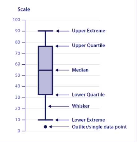
A box plot is a way of displaying variations in a data set graphically. The name box plot uses probably because of the shape used to represent the distribution of data on the plotted graph.
The distribution display in three parts, a middle part (coloured box), an upper part and a lower part. The upper and the lower part shows the two extremes of the data distribution.
Box plots are useful for visual data analysis as it shows whether data set is distributed symmetrically or not, it helps in analysing several data sets together in one chart.
Also, if a value is outlying and not the part of the distribution, the box plot chart will also show that. Another term use for box plot is Five Number Summary because it gives insights on and represents a given data set by means of five statistical metrics,
Maximum value
- Upper quartile or Third quartile
Median or Second quartile
Lower quartile or First quartile
Minimum value
Introduction – QlikView Box Plot
How to Create Box Plot Using QlikView Box Plot Wizard?
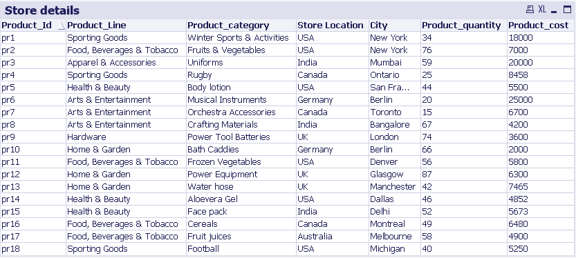
In QlikView, you can easily create a box plot using the Box Plot Wizard. We have taken a sample data on store’s sales to create a box plot chart.
Create Box Plot Using QlikView Box Plot Wizard
The wizard has two main steps:
- Define data
- Presentation
i. Step One – Open Tool Menu
Open the Tools menu and select Box Plot Wizard.. option.
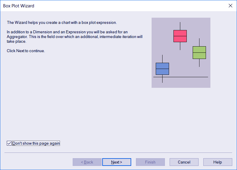
ii. Step Two – Check the Box Plot Wizard
An introductory dialog will open on Box Plot Wizard if you are opening the wizard for the first time. Check the box Don’t show this page again so that it never shows this dialog again.
Step.2 Create Box Plot Using QlikView Box Plot Wizard
iii. Step Three – Define Data
In this step, you have to select a Dimension which will be at the x-axis. Then an Aggregator has to be chosen whose value gets iterated over with each calculation being made using the expression.
Lastly, the Expression condition is entered. The field used in the expression value will be on the y-axis.

Step.3 Create Box Plot Using QlikView Box Plot Wizard
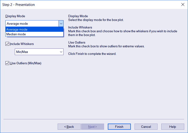
iv. Step Four – Presentation
In the presentation step, you get to select the display mode, i.e. whether you like the data to be distributed and give an average value or a median of the distribution.
Also, you can include the minimum/maximum whiskers and outliers (if any). Click Finish to exit the wizard.
Step.4 Create Box Plot Using QlikView Box Plot Wizard
Step.4 Create Box Plot Using QlikView Box Plot Wizard
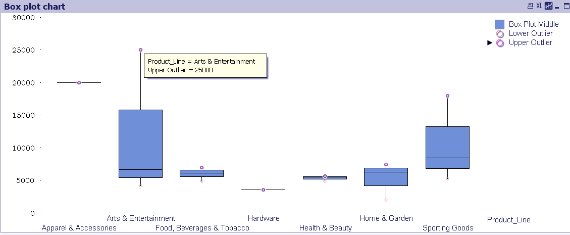
The final QlikView box plot made has individual box plots showing the distribution of data values for each type of product (Hardware, sporting goods etc).
The two circles at each end of the whisker show the upper and lower outliers in the data set. The middle box portion shows the variation or distribution of total sales for each product line.
So, this was all about QlikView Box Plot Wizards Tutorial. Hope you like our explanation.
Conclusion
This was all about the feature of QlikView Box Plot Wizard available in the Tools menu. In this addition, we learned about box plot and it’s significance in data visualization.
We also learned how to create a box plot chart using the QlikView Box plot wizard.
Hope you understood it better with the help of the sample data we used. In case of any queries, drop your comments in the comment section below. We would be happy to help.
If you are Happy with DataFlair, do not forget to make us happy with your positive feedback on Google