Qlik Sense Gauge Chart | Creating A Gauge Chart
Expert-led Courses: Transform Your Career – Enroll Now
1. Objective – Gauge Chart in Qlik Sense
Today, we will see the Qlik Sense Gauge Chart Visualization. It is a special visualization tool for all the BI software. Moreover, in this lesson, we learn about gauge chart in Qlik Sense along with seeing how to create a gauge chart in Qlik Sense. Moreover, we will discuss Qlik Sense properties panel in Qlik Sense Gauge Chart.
So, let’s start Qlik Sense Gauge Chart Tutorial.
Qlik Sense Gauge Chart | Creating A Gauge Chart
2. Introduction to Gauge Chart
We use a gauge chart to display a calculated measure value on a meter gauge or a horizontal meter/bar. usually, we use a gauge chart to visualize KPI values or other such performance indicators. If you want to display one metric result like a percentage, average, sum etc., you can go for a gauge chart as it shows a gauge with minimum and maximum limits. The measure value indicates by a needle in between the minimum and maximum limits.
Gauges being a very convenient choice for visualizing and analyzing the data using a single value result. But, there are some cases where gauges consider as unnecessary as they take up a lot of space and so suggest KPI visualizations in place of gauge charts.
3. Creating a Qlik Sense Gauge Chart
In order to create a gauge chart in Qlik Sense, follow the steps given below.
- Open the editor of the sheet in the application in which you want to create a gauge chart. We open the editor from the Edit option present on the toolbar.
- Select the option Gauge (from the Assets Panel) and add it to the editing grid at the center by dragging and dropping.

Gauge Chart in Qlik Sense
- Add a measure to be used as the indicator value in the gauge by Add measure option. Then select an aggregation type to be applied on the measure values you selected.
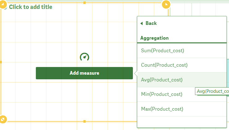
Qlik Sense Gauge Chart – Add Measures
- Set the min and max values such that the gauge indicator value falls between this range. Make other required changes like color, titles, scale etc. from the properties panel. Click on Done once you are happy with your gauge chart and it will be displayed on the sheet.
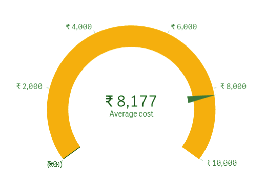
Radial Type Presentation in Gauge Chart
The gauge chart comes in two types of presentations, a radial type which is like a speedometer such as shown in the image above. And another is a bar type of presentation which is a flat gauge shown in the image below. You get two choices of the orientation of the bar type, vertical and horizontal.
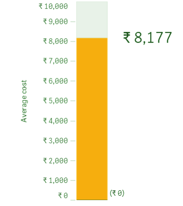
Bar Type Presentation in Gauge Chart
4. Properties Panel in Qlik Sense Gauge Chart
The properties panel allows the users to set properties and design gauge chart according to their needs. The properties panel, also known as exploration menu is present on the right of the sheet editor and has three section in gauge chart’s case.
a. Data
From the data section, you can add the measure of your choice in the gauge chart. To make one gauge chart, only one measure is needed. Here, you can add an expression, label, set the number formatting and formatting pattern.
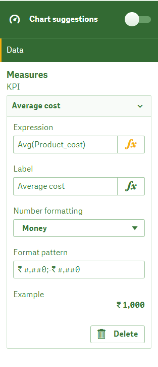
Data in Qlik Sense Gauge Chart
b. Add-ons
From this section, you can put a condition for the data being used by the gauge chart and add a reference line for a better understanding of the data result being displayed.
Qli
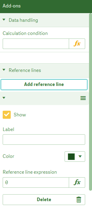
Add-ons in Gauge Chart
c. Appearance
This section is responsible for how the gauge chart will look. There are three subsections of the appearance section. The first is the general section where we can shoe or hide titles and details.
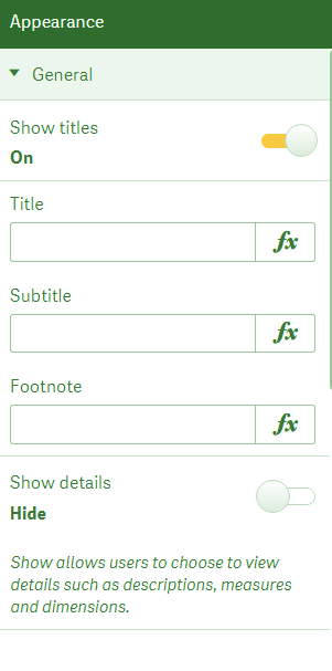
Gauge Chart – Titles and Details
The second section is the presentation section from where you can set the range limits for the gauge meter, select whether you want to use segments, and select the color of the gauge.
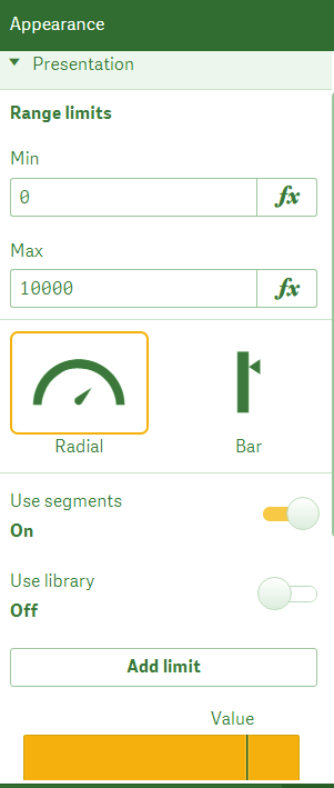
Presentation Section in Gauge Chart
In the third, measure axis section, you can select the labels and titles and scale type of the markings done in the gauge meter. There will minimum markings (widely spaced) in wide scaling, moderately place markings in medium scaling and in narrow there will a close to each other marking and more in number.
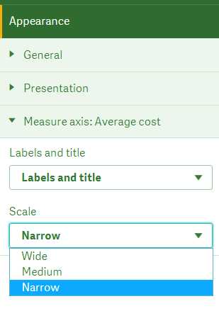
Measure Axis Section – Qlik Sense Gauge Chart
So, this was all in Qlik Sense Gauge Chart. Hope you like our explanation.
5. Conclusion
Hence, in this Qlik Sense Gauge Chart tutorial, we discussed creating Gauge Chart in Qlik Sense. Also, we saw properties panel in Qlik Sense gauge Chart.
Still, if you have any query regarding Qlik Sense Gauge Chart, ask in the comment tab.
You give me 15 seconds I promise you best tutorials
Please share your happy experience on Google


using this guage chart can I navigate to another sheet.