Selections in Qlik Sense Visualizations – Types & States
Placement-ready Courses: Enroll Now, Thank us Later!
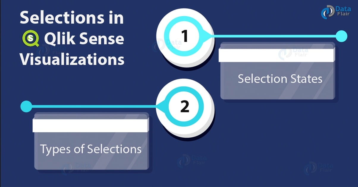
1. Objective
In our last Qlik Sense Tutorial, we discussed Qlik Sense Data Model. Today, we will see Selections in Qlik Sense. Moreover, we will look at the selection state and types of selections in Visualizations. Also, we will discuss the color scheme for selections in Qlik Sense.
So, let’s start Selections in Qlik Sense.
Selections in Qlik Sense Visualizations – Types & States
2. Selections in Qlik Sense
Selections and Smart search are the most basic yet efficient ways of interacting with data in Qlik Sense. The Selections filter the irrelevant data out and show only the relevant data values by the virtue of associative model. Making selections on specific data values creates a subset of data having the only those values which link or associates to the selected value.
Have a look at Qlik Sense Use Cases
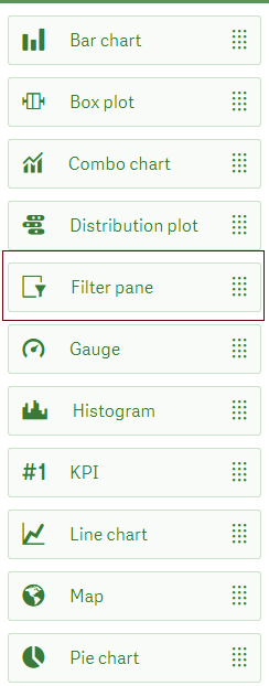
A dedicated visualization in Qlik Sense editor which you use when you want to filter out data through making selections. This visualization is called Filter Pane and is given in the list of charts in the sheet editor.
Selections in Qlik sense
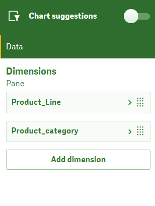
When you drag it on the editing pane in the center, you will have to add dimensions from the loaded tables. The data values from the selected dimension fields will show in the filter pane on the main sheet. Click on Done to see the filter pane on the sheet.
Let’s revise Qlik Sense Capabilities
Selections in Qlik sense – Add Dimension from the loaded table
Filter pane in Selections in Visualizations
3. Selection States in Qlik Sense
Upon selection, the values take up different colors like green, white, grey etc. Such a color scheme represents different states of selections like selected, excluded, possible, alternative etc.
Know more about Qlik Sense Filter Pane
| COLOR | SELECTION STATE |
| Green | Selected |
| White | Possible |
| Light Grey | Alternative |
| Dark Grey | Excluded |
| Dark Grey (with a tick mark) | Selected Excluded |
There is four basic type of selection states. We have explained each with examples below.
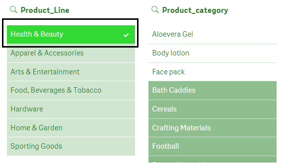
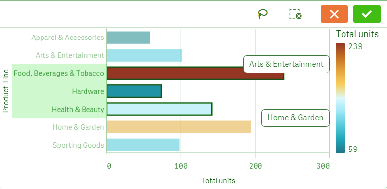
i. Selected State
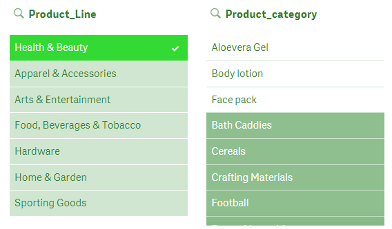
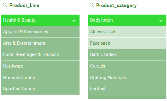
The selected state in green with a tick mark, on the values which you click on as the basis for filtering out data and create a subset of relevant or associated data. In our example shown below, we have selected the value ‘Health & Beauty’.
Selections in Qlik sense – Selected State
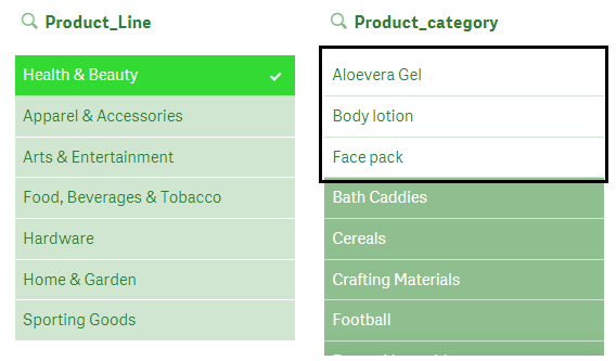
ii. Possible State
The possible state represents all possible values related to the selection we have made. The values in the possible state show in white. In the image given below, the possible values for the selection Health & Beauty are Aloe Vera Gel, Body lotion and Face pack which is shown in white.
Let’s discuss Qlik Sense Histogram Visualization
Selections in Qlik sense – Possible State
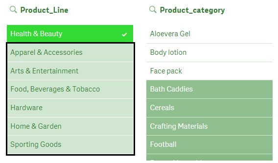
iii. Alternative State
As you can see in the image below, the values of the field Product_Line expect for one selected value (in green) are light grey in color. This represents the alternative state of those values. By alternative state, we mean we have other options available to select. If you deselect the current selection, all these values in light grey become white i.e. the possible state which is, ready to select.
Selections in Visualizations – Alternative states
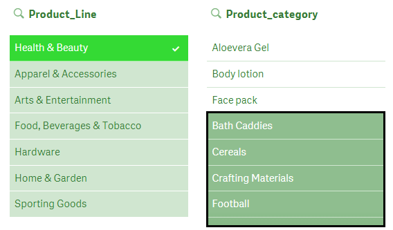
iv. Excluded State
The values which are not associated logically with the selected value attain the excluded state represented by dark grey color. Such values have no relation with the selected value (in green) and are deactivated or filtered out.
Have a look at Qlik Sense Text and Image Visualization
Selections in Visualizations – Excluded State
The values having in the alternate state are excluded when you make a selection within the possible values of the current selection. For example, our current selection is Health & Beauty and if we select Body lotion from the three possible values, the alternate states’ values will also get excluded and turn dark grey.
Selections in Visualizations -Excluded State
Learn more about Qlik Sense Nul Functions
4. Types of Selections in Visualizations
There are several ways in which you can make a selection in the visualizations on the sheet.
i. Click selection in Qlik Sense
Selection is made when you click on a data value or data point in the visualization. This is the most basic way of selecting values. You can deselect the values by again clicking on them.
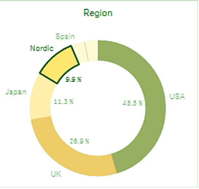
In the image, the sector Nordic is selected in the pie chart by clicking. You can use this mode of selection in any type of chart.
selection in Qlik Sense
ii. Draw selection in Qlik Sense
The draw selection, as the name suggests is made by manually drawing a line on the data values or data points that you want to select. There are two ways to make a lasso selection, click inside the visualization and either click on the lasso icon or by pressing the Shift key and then drawing a line from the cursor on the data values. This will make the selections and show the selection line drawn by you.
Let’s revise Qlik Sense Box Plot
Draw selections can be made in all types of visualizations except for Gauge chart, Waterfall chart, KPI and Text & Images.
Examples of draw selections are given below.
In a bar chart.
Draw Selection in Bar charts
In a filter pane
Draw Selection in Qlik Sense – In a Filter Pane
In a line chart.
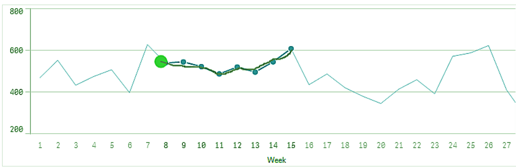
Draw selection in Line Chart
Do you know about Qlik Sense Treemap Visualization
And, in a scatter plot.
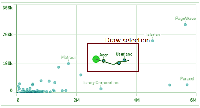
Draw selection in Scatter Plot
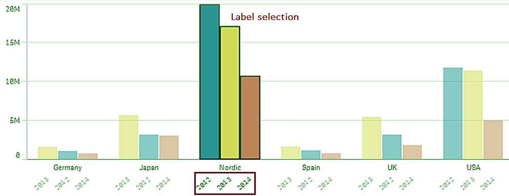
iii. Label Selection in Qlik Selection
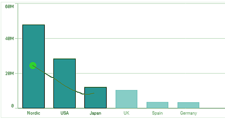
We use the label selection to make selections using labels on the chart exes. The image shows a label selection, in the bar chart having grouped or stacked dimensions by selecting any one of the three label values (2012, 2013, 2014). We select the dimensions corresponding to those labels. This selection type is only applicable in chart visualizations.
Label Selection in Qlik Sense
Know more about Qlik Sense Color Function
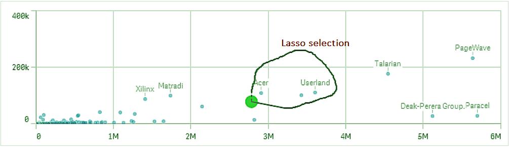
iv. Lasso Selection in Qlik Sense
The lasso selection is also like the draw selection. Such a selection is made in a visualization by activating the lasso icon or by pressing the Shift key and making a free-hand circle around the data points you want to select. We use Lasso selection especially in scatter plots or maps where dots or small symbols represent by data values and we can encircle in a lasso.
Lasso Selection in Qlik Sense
v. Legend Selection in Qlik Sense
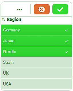
Legend selection is selecting data values (especially in charts) from the legend of that chart. Like in the example shown in the image of a pie chart, we make selections UK, Nordic and Germany from the legend given below the pie chart as highlighted by the red box.
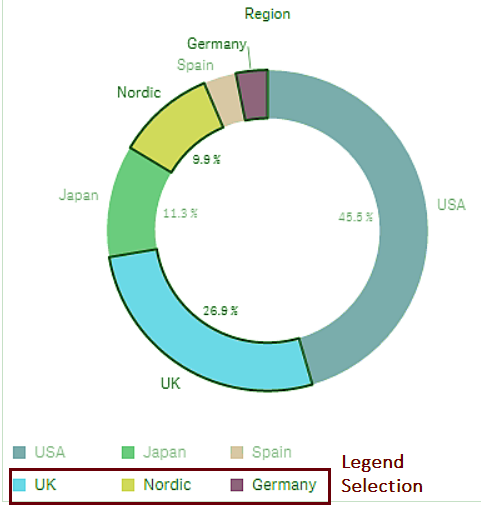
Legend Selection in Qlik Sense
Let’s take a tour to Qlik Sense Conditional Functions
vi. Range selection in Qlik Sense
We use Range Selection for selecting a range of data values on x or y-axis of charts. We make the selection by pressing and holding the right click of the mouse and dragging the cursor over the range of values you wish to select. It creates a range box, blue in color around the set of values selected. The range selection that shows in the images given below.
In this image, we select a range of four values.
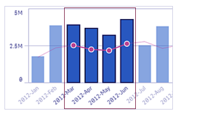
Range Selection in Qlik Sense
This image selections made on the y-axis of a line chart.
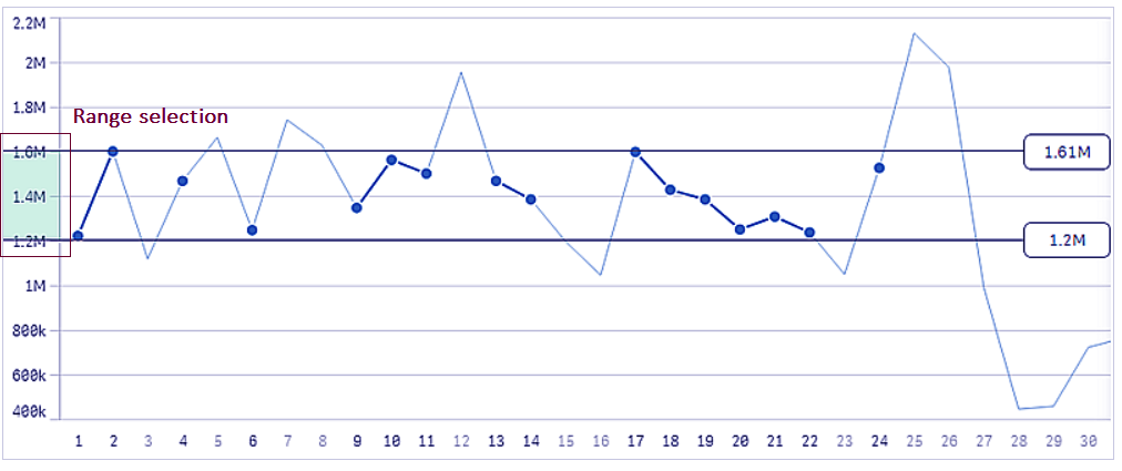
Range Selection – y axis
In this example, we select three values as a range in the horizontal bar graph on its y-axis.
Range Selection – Horizontal Bar Graph
Let’s revise Qlik Sense Pie Chart
So, this was all in Selections in Qlik Sense Visualization. Hope you like our explanation.
5. Conclusion
Hence, in the Selections in Qlik Sense Visualizations tutorial, we saw the selections used in visualizations of Qlik Sense. We hope this will help you while you work with your own data, make your own app on Qlik Sense. So, understanding the selections and the selection states and using the suitable types of selections in Qlik Sense on different data visualizations will save you a lot of time and ensure a hassle-free experience of data analysis.
Is this article helpful to you? Share your feedback through comments.
See also –
Your 15 seconds will encourage us to work even harder
Please share your happy experience on Google


