Treemap Visualization In Qlik Sense | When To Use Treemap Chart
Job-ready Online Courses: Click, Learn, Succeed, Start Now!
1. Objective
Today, we will see Treemap Visualization in Qlik Sense. Moreover, we will look at the use of Treemap Qlik Sense Visualization. Also, we will learn to create Treemap in Qlik Sense. So, the treemap chart is another very useful visualization available in Qlik Sense. As every visualization in Qlik Sense serves a special purpose, we use the treemap to present hierarchical data.
So, let’s start Treemap Visualization in Qlik Sense.

Treemap Visualization In Qlik Sense | When To Use Treemap Chart
2. Treemap Visualization in Qlik Sense
The treemap visualization has got its name from the fact that data is referred to and handled as tree parts i.e. branches, nodes, leaves. It is used to display hierarchical data i.e. data that is present in many layers of logic. The hierarchical data is represented in nested rectangles or boxes i.e. small boxes within large boxes.
Let us understand this with the help of an example, suppose we want to analyze sales of an online shopping site. The data of such a site will be hierarchical that is, there will be many groups like electronics, clothing, home & kitchen, health & beauty, sports, automobiles, entertainment etc. These categories will become the branches of a treemap chart and the sub-categories within these categories like mobile phones, TV, laptops, tablets, cameras, stereo systems etc. will be the leaves of the branch, electronics.
Notice in the image of a treemap chart given below.
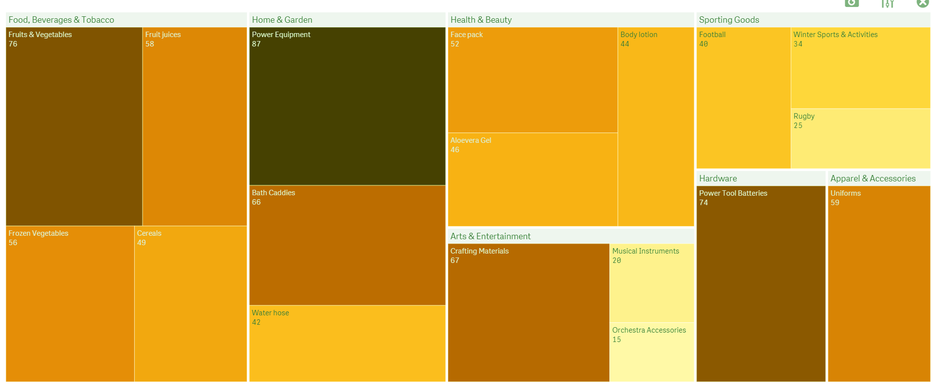
Branches in Treemap
This treemap has seven branches shown in the bigger boxes titled, Food, Beverages & Tobacco, Home & Garden, Health & Beauty, Hardware, etc. Each of these boxes further has smaller boxes i.e. leaves of the branches namely, Frozen vegetables, Cereals, Power equipment, face pack etc. We can divide or drill down these leaves into smaller boxes having sub-sub category entries. The color and size of each box are in proportion with the quantity of that has been sold. More the sold quantity, darker the color, and bigger the box. You can set the color and size gradation from the properties panel in three ways, by dimension, by the expression, and by measure. In the sections to follow, we will learn how to create a treemap visualization and configure it accordingly using the properties panel.
3. When to Use a Treemap Visualization?
A treemap is the best choice to make when you have loads of hierarchical data and not that much space on the sheet. Treemaps save a lot of space on the sheet as it can contain as many data values as it can in the form of small to smallest boxes (nested rectangles). The color scheming and size grading reveals the highs and lows of the situation and tells you at an instant which product is doing good and which needs more attention and strategy. The one major drawback of a treemap chart is that it does not show negative values.
4. How to Create Treemap Visualization in Qlik Sense?
To create a treemap chart in Qlik Sense follow the steps given below.
- Open the sheet editor from the Edit option present at the toolbar of the app you are working in.
- Go to Charts in the assets panel and select Treemap from the list that opens.
- Drag the treemap on the editing pane and add the dimension and measure of your choice from the options Add dimension and Add measure.

Add Dimensions and Measures in Treemap
- Edit the treemap by adding aggregation functions to the measure if you want, adding more dimensions, editing titles and labels, selecting the size and color sort criterion etc using the properties panel. Once you are done with making desired changes, click on Done to view the treemap chart on the sheet.
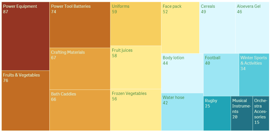
Treemap Chart on Sheet
As you can see, the treemap created here is a simple one having leaves that show product quantity of each product specified on the smaller boxes/leaves. The color grading is in play here as well, where the color is getting lighter and the box size is getting lighter as the quantity of the product decreases.
5. Properties Panel in Treemap in Qlik Sense
The properties or exploration panel appear at the left of the editor and consist of three sections that we will discuss below.
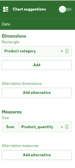
a. Data
From this section, you can add dimensions and measure fields. You can add expressions and labels to individual dimensions and measures. You can add as many dimensions (rationally possible) as you require. Alternative dimensions and measures can also be added.
Data in Treemap Visualization
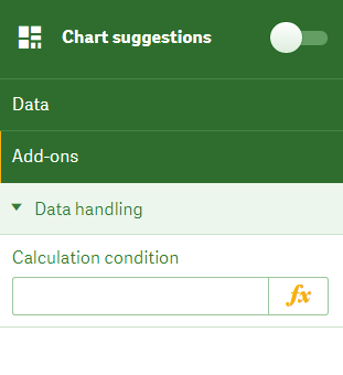
b. Add-on
In the add-ons section, you can apply conditions for data that we use in the treemap chart.
Add-on in Treemap Qlik Sense Visualization
c. Appearance
In the appearance section, you get to do a lot of things to enhance and customize the look of the treemap visualization. From the General section, common in all of the visualizations, you can add, show/hide titles, footnotes and other descriptions about dimensions and measures.

Show/Hide Details in Treemap
From the Presentation section, you can manage headers, labels, leaf labels and value labels. If you want to customize these labels turn off the auto mode.
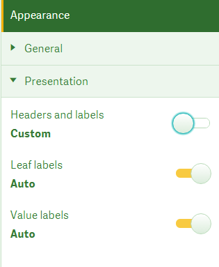
Presentation in Treemap Qlik Sense Visualization
Another section in the Appearance section is Colors and legend which provides choices for coloring scheme being used in the treemap chart. You can select the criterion for coloring, labels, and color scheme from the four schemes given.
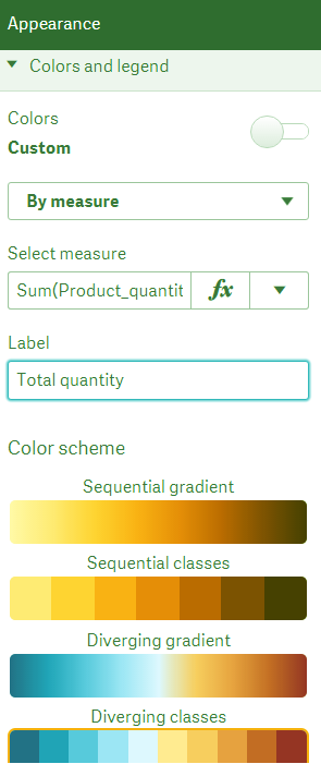
Colors in Treemap
Any change you make in the properties panel reflects instantaneously on the actual treemap visualization. That proves helpful when adding visualization which performs a certain function and serves a certain purpose while building an app.
So, this was all in Treemap Visualization in Qlik Sense. Hope you like our explanation.
6. Conclusion
Hence, in this tutorial of Treemap in Qlik Sense, we saw when to use Treemap Visualization. Moreover, we discussed the properties panel and creating Treemap Visualization in QlikSense. Once you are familiar with the basics of the visualizations in Qlik Sense, they are the most fun to work with as they make handling data very easy and engaging task. We hope using the information provided here, you are able to create visualizations on your own, in your applications.
Share your feedback with us through the comment section below.
Did you like our efforts? If Yes, please give DataFlair 5 Stars on Google


