Box Plot In Qlik Sense Visualization – Creating a Box plot
Job-ready Online Courses: Click, Learn, Succeed, Start Now!
1. Objective – Qlik Sense Box Plot
In our last Qlik Sense tutorial, we discussed Qlik Sense text and image visualization. Today, we will see Box Plot in Qlik Sense Visualizations. Also, we will see the significance of the box plot in Qlik Sense and when to use it. Moreover, we will learn how to create a box plot in Qlik Sense along with managing it.
So, let’s start Qlik Sense Box Plot Tutorial.
Box Plot In Qlik Sense Visualization – Creating a Boxplot
2. Box plot in Qlik Sense
We use a box plot to show the distribution of a grouped data set using a whisker’s box plot. Each value point on the box plot will be a whisker’s bar plot.
Do you know about Qlik Sense Filter Pane
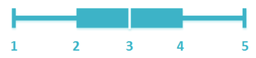
Box Plot in Qlik Sense
The whisker’s and box symbol can be broken down into components as marked in the image above.
- The first whisker marking the lowest/minimum value of the range or distribution.
- Box start, which marks the first quartile.
- Centerline, or median of the data distribution. It is the center of the box and also the second quartile.
- Box end, marking the third quartile.
- Last whisker, marking the maximum or highest value of the range.
Box plots are the best way to analyze a large amount of data with such small representation symbols as whiskers and boxes. You can set presets for making and analyzing data in a box plots, like for median, for percentile, or for standard deviation. Notice the box plot given in the image below.
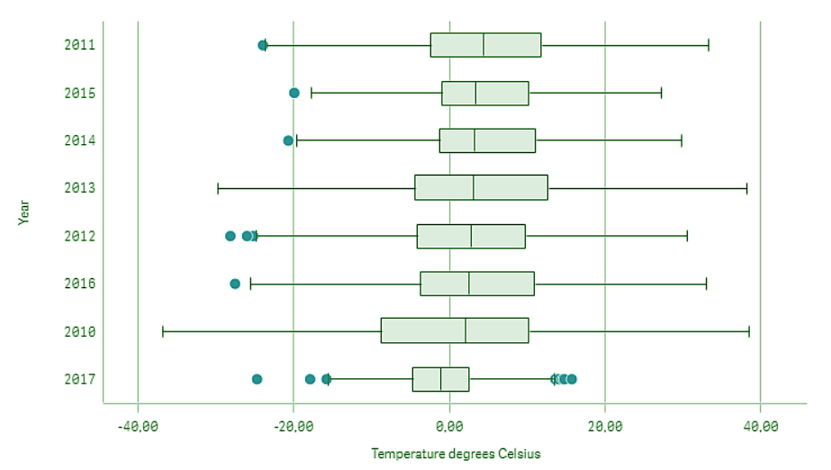
Qlik Sense Box Plot
It represents the data distribution for temperature recorded yearly in Sweden. The given box plot shows the distribution of average temperatures recorded for distinct years. It can be inferred from the plot that the year 2010 has the most widely ranging distribution of temperatures. Also, the average temperature for each year will be the value corresponding to the central line of each plot. The blue dots are the outlier values which do not fall within the distribution range of whisker’s plot.
Do you know about Qlik Sense Treemap Visualization
3. Creating a Box Plot Chart
Follow the steps given below to learn how to create a box plot in Qlik Sense.
Step 1: Select the option Box plot from the assets panel of the sheet that you are editing. Drag and drop the box plot onto the editing grid. You will see an incomplete box plot created on the grid.
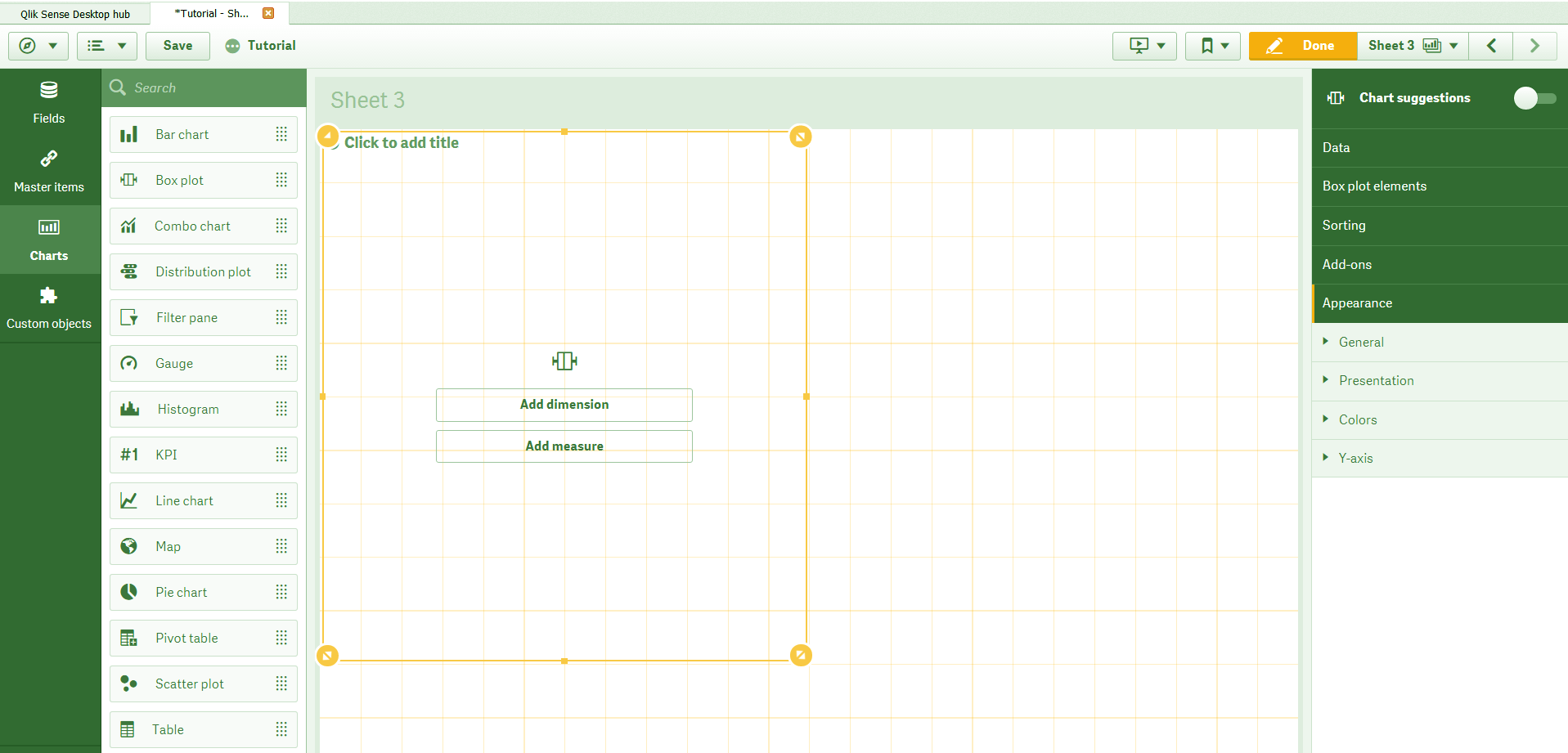
Box plot Chart in Assets Panel
Step 2: Now it is time to add dimensions and measure for the plot. You can add up to two dimensions and one measure in a box plot. The order in which you add a measure matters a lot. The first dimension that you add defines the box. The second dimension defines the Y-axis whereas, the measure defines the values and ranges of the X-axis. After adding dimensions and measure, you can use more settings options to customize the box plot as you like from the properties panel which we will discuss in detail in the next section. The default preset for a box pot is set on Standard(Tukey). You can change it from the Preset option if you want to.
Let’s learn more about Qlik Sense Color Functions
Step 3: Once you have created the box plot as per your liking, click on Done to exit the editor and go to the sheet view. The final box plot displays on the sheet.
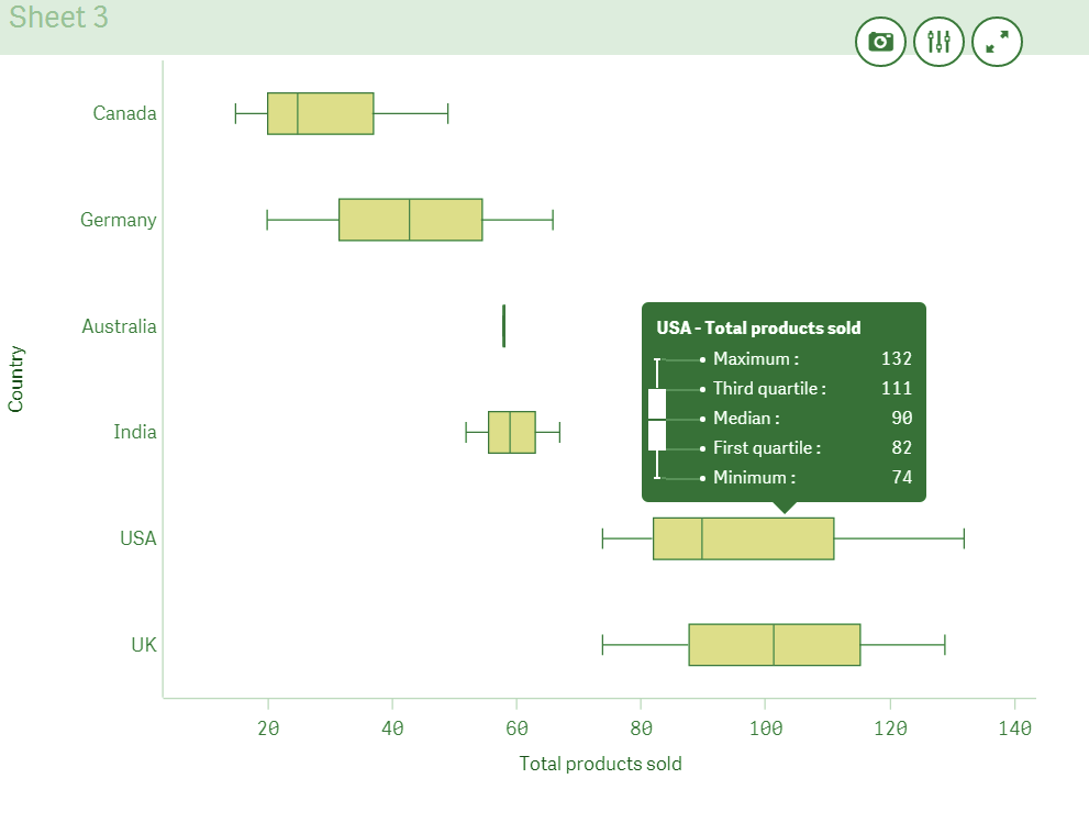
Sheet View – Final Box Plot
In the box plot shown above, the distribution of values is for total products sold in each country. The first dimension we used in this box plot was Product type, then Y-axis dimension was ‘Country’, and for X-axis it was ‘Sum(Product Quantity)’labeled as ‘Total sold products’. A standard box plot for each country is represented which shown the maximum and minimum values, third and first quartile and the median value. You might have noticed, the box plot for Australia is not properly created because there were too few values for them to make a wide distribution range.
4. Properties Panel in Box Plot in Qlik Sense
All the settings and customization of the box plot is done using the properties panel.
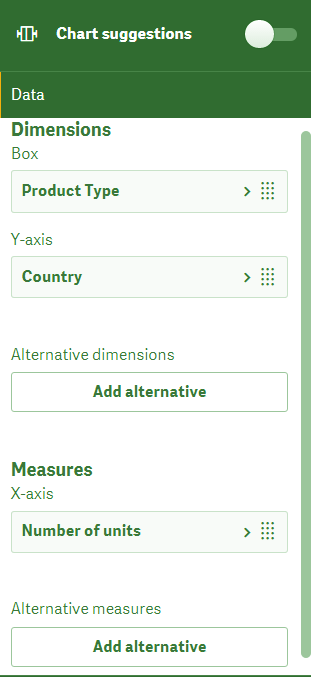
a. Data
From the Data section, we can manage all the dimensions and measures. You can add the box and Y-axis dimension, add an expression or label to them. Next, you can also add an X-axis measure field. No aggregation is added by default. If you want to add an aggregation function, then you will have to do it from this section.
Do you know about Qlik Sense Conditional Functions
Data in Qlik Sense Box Plot
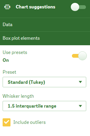
b. Box Plot elements
From the box plot elements section, you get to set the preset type from the three options of Standard (Tukey), Percentile based, and Standard deviation.
Box Plot Elements
- The Standard (Tukey) preset is the basic standard preset introduced by J. Tukey (hence the name). This preset has a box whose start and end are the first and the third quartile, and the central line is the median. The whisker marks show the minimum and maximum values. The whisker’s length corresponds to the inter-quartile range and can be set at 1, 1.5 or 2.
Let’s revise Qlik Sense Pie Chart
- The Percentile-based preset sets the whisker’s length according to the percentile settings that you make from 1st/99th percentile, 5th/95th percentile or 10th/90th percentile. These set the two ranges min and max for the two ends/ticks of the whisker. The box start and end points represent first and third quartile whereas the center or midline represents the median.
- The Standard deviation preset follows the standard deviation logic and the whisker’s and box represents the same. The central line represents the average value, where the box start and end represents one variation of standard deviation. The whiskers length can be decided by different variances like One standard deviation, two standard deviations or three standard deviations.
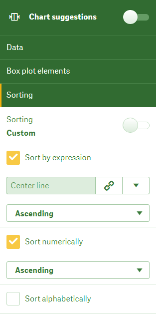
c. Sorting
From this section, you can set a sorting criterion for the box plot. You can sort by the expression, sort numerically and sort alphabetically. We can configure all the three sort criterions individually either in ascending or descending order.
Sorting in Box Plot
Have a look at Qlik Sense Counter Functions
d. Add-ons
The Add-ons section allows you to set a condition which evaluates to be true displays the box plot. Also, using the Add reference line option you can add a reference to the box plot.
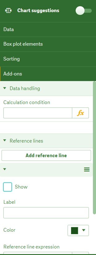
Add-ons in Box Plot
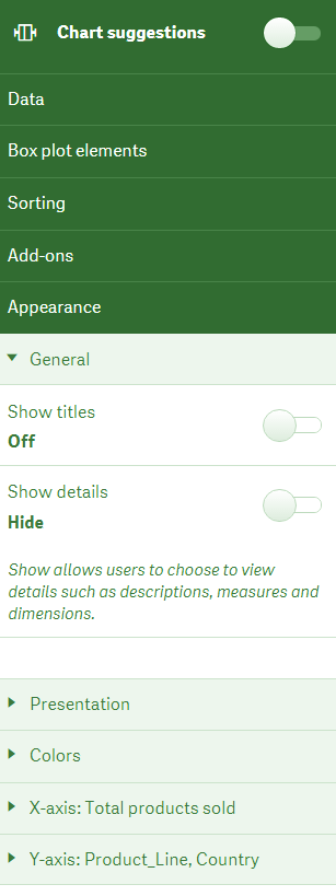
e. Appearance
The appearance load with options to customize the appearance of the box plot. There are five sub-sections of the appearance section dedicated to set up different elements of box plot visuals.
i. General
From this section, we can enable the titles and descriptions to show on the box plot. You can enter titles, footnotes etc. in the editing space given.
Do you know about Qlik Sense Capabilities
Appearance in Box Plot
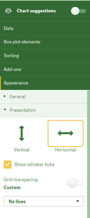
ii. Presentation
You can choose the orientation of the box plots, show/hide the whisker tickers and adjust the grid line spacing as you like.
Have a look at Qlik Sense Counter Functions
Box Plot Presentation in Qlik Sense
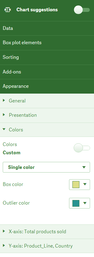
iii. Colors
You can select the box and outlier colors from this section. You can choose the coloring criterion as a single color or color by expression.
Colors in Box Plot
Let’s revise Qlik Sense Line Chart
iv. X-axis: (Measure)
You can set the labels, titles, position, scale, and range of X-axis which shows the measure values that you have selected.
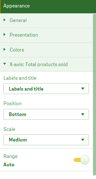
The x-axis in Box Plot
v. Y-axis: (Dimensions)
From this section, we can set the labels and position of the axis for the Y-axis which represents dimensions.
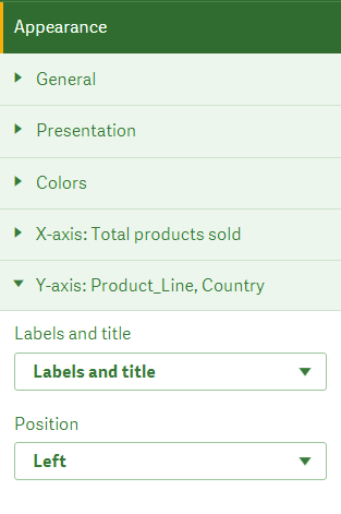
Y-axis in Box Plot
Learn more about Qlik Sense Null Functions
So, this was all in Box Plot in Qlik Sense. Hope you like our explanation.
5. Conclusion
Hence, in this Box Plot in Qlik Sense Tutorial, we discussed creating a Qlik Sense Box Plot. Also, we saw the properties panel in Qlik Sense. This completes our lesson on understanding and making box plots in Qlik Sense. We hope it was helpful enough for you to be able to make box plots using your data.
Still, if you have any query regarding Box Plot in Qlik Sense tutorial, ask in the comment tab.
See also –
Did we exceed your expectations?
If Yes, share your valuable feedback on Google


Hi,
Good day!
Just gone through “Box plot” details on qlik sense. It has been mentioned as below.
Y-axis: (Dimensions)
X-axis: (Measure)
Is it correct?
Usually, Y-axis deals with ”Measure” and X-axis deals with “Dimensions”, doesn’t it?
Please clarify.