Qlik Sense Combo Chart – Advantages and Limitations
Expert-led Online Courses: Elevate Your Skills, Get ready for Future - Enroll Now!
Earlier, we have discussed the Qlik Sense Gauge Chart. In this lesson, we will see Qlik Sense Combo Chart or the combo chart visualization available in Qlik Sense. Every visualization in Qlik Sense serves a unique purpose and is used to display data in a certain way. Here, you will learn what are combo charts, how to create them and how to manipulate them according to your need using the properties section.
So, let’s start Qlik Sense Combo Chart Tutorial.
Qlik Sense Combo Chart
1. What is Qlik Sense Combo Chart?
A combo chart is a combination of more than one type of chart displayed within a single chart. In a combo chart, two measures can be displayed using a single dimension field common between the two. Using two sets of measure values together is otherwise a difficult task because the scales are different. But in a combo chart, there are two different axes each showing one measure set against a dimension.
Recommended Reading – Qlik Sense Line Chart
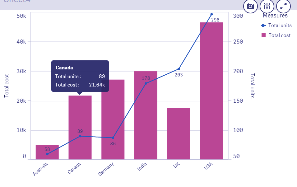
Refer to the combo chart shown below to understand the concept behind it better.
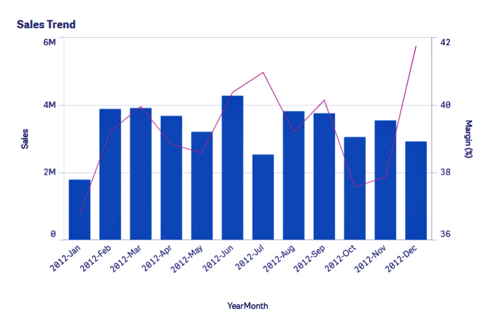
Combo Chart in Qlik Sense
In this chart, there are two measure sets used, sales and margin. Both these measure sets are shown in different sides as the y-axis against the same dimension YearMonth. A combo chart makes plotting two measures with different scales (Million and % in this case) possible without any error or difficulty in displaying it. If you wish to add another measure, it will be added as one more set of bars either grouped or stacked.
Add another measure
Thus, a combo chart is the best option to take if you want to show two or more sets of measure values with different scales.
2. How to Create a Qlik Sense Combo Chart?
In order to create a combo chart in Qlik Sense, follow the steps given below.
Step 1: Open the editor of the sheet of the application in which you want to create a combo chart. The editor is opened, from the Edit option present on the toolbar.
Step 2: Select the option Combo chart (from the Assets Panel) and add it on the editing grid at the center by dragging and dropping.
You must read – Qlik Sense Pie Chart
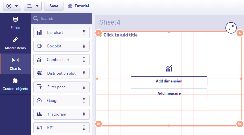
Select Combo Chart from the Assert Panel
Step 3: Add a measure and dimension to start with creating the chart. You add more measures from the properties panel later.
Step 4: Once you are done with selecting and adjusting all the aspects of it. The combo chart will be displayed on the editor instantly. Click Done to bring it on the sheet.
Displaying Combo Chart
3. Properties of Combo Chart in Qlik Sense
From the properties panel present at the right of the editor, you can manage different aspects of the combo chart and make it according to your requirement.
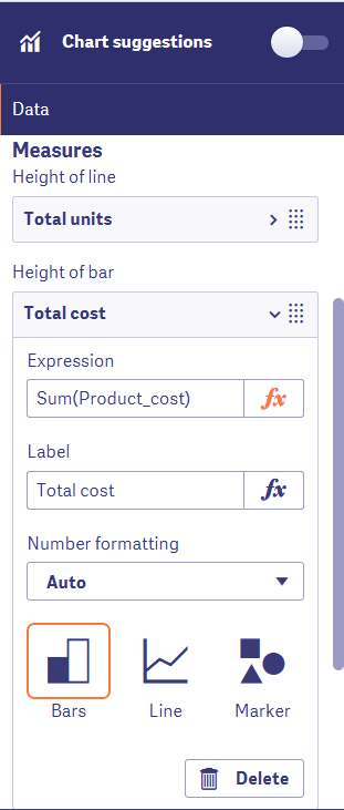
i. Data
From the data tab, you can add and manipulate dimensions and measures. You can edit an expression, add a label, set the number formatting and select the way in which you would want to display a measure, bar, line or marker (shapes).
Have a look at Qlik Sense Visualizations
Data Tab in Combo Chart
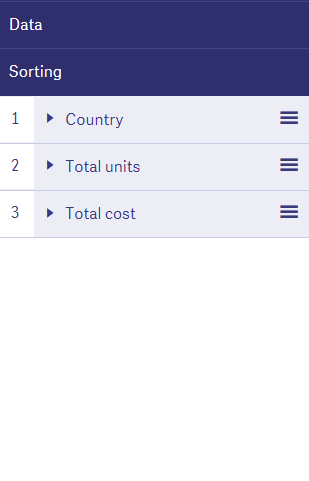
ii. Sorting
From the sorting tab you can sort the dimensions and measures in different ways, like sort by the expression, sort by load order, sort numerically, sort alphabetically etc.
Sort the Dimensions and Measures
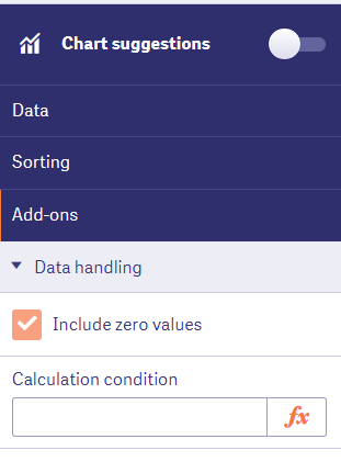
iii. Add-ons
In this section, you can use the data handling option to apply certain display conditions on the data used in the combo chart. The ‘Include zero values’ option includes all the 0s that are present in a measure field as value and displays them.
Let’s revise the concept of smart search in Qlik Sense
Add-ons in Qlik Sense Combo Chart
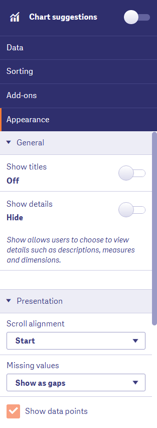
iv. Appearance
The appearance section contains all the setting related to the appearance of the chart.
The first section is the general section has options for showing or hiding titles or details. The presentation section gives you options to adjust the scroll alignment point, show/hide missing value and show/hide data points.
Appearance in Combo Chart
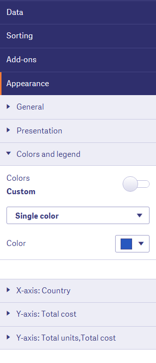
From the Colors and legends section, you set the coloring criteria for the chart.
Set the Color for the Chart
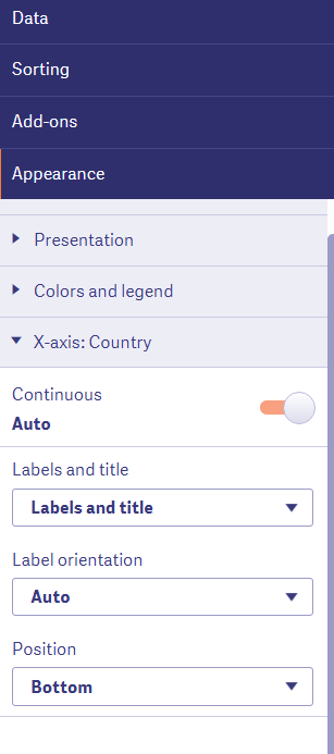
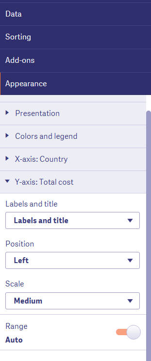
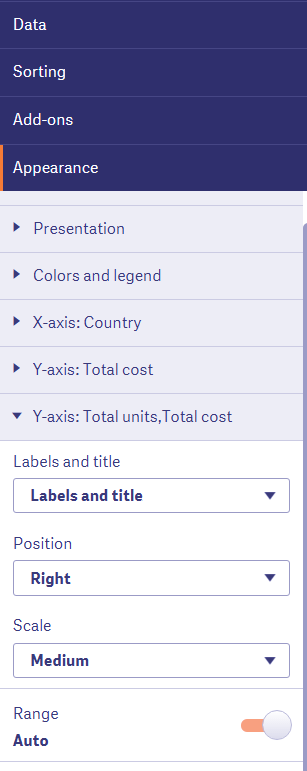
From the X-axis and Y-axis sections, you can set the label and title, label orientation, positioning, and scaling.
Do you know about Qlik Sense Bookmarking Selections
Appearance in Combo Chart
Qlik Sense Combo Chart – Appearance
Combo Chart Appearance Section
4. Advantages and Limitations of Combo Chart
One major limitation of a combo chart is that you cannot use more than one dimension in it. However, an evident advantage is that it can easily display more than one measure with different scales against the same dimension.
So, this was all in Qlik Sense Combo Chart. Hope you liked our explanation.
5. Summary
We hope through this tutorial, you have learned how to create and use a combo chart for an appropriate purpose in your Qlik Sense app. If you have any queries related to the combo chart, leave it in the comment box below.
You can also check –When you should use Treemap Chart
You give me 15 seconds I promise you best tutorials
Please share your happy experience on Google


How can you make a combo chart become a line chart with two y-axis measures? I see that its possible for a line and bar chart, but I would like to only have a line chart with this type of layout. Please let me know. Thank you.