Qlik Sense Data Model | Associations in Qlik Sense
We offer you a brighter future with industry-ready online courses - Start Now!!
1. Objective
Earlier we saw Qlik Sense System Requirements. Today, we will see the Qlik Sense Data Model. Moreover, we will look at how to make associations in Qlik Sense. So, as the associative model is not an unfamiliar term for us, it will be easier for us to walk through this lesson. In this tutorial, we will learn how the data association works in Qlik Sense and how to manually make associations between tables you load in Qlik Sense.
So, let’s start the Qlik Sense Data Model Tutorial.
Qlik Sense Data Model | Associations in Qlik Sense
2. Qlik Sense Data Model
The associative model powered by the QIX engine of Qlik Sense makes data discovery and analysis a very easy task in the BI tools. Basically, through these associations between data tables, we make a logical connection, by linking relevant data fields and data values with one another. When all the relevant data residing in the entire data set link with one another. Then it forms a logical structure of data and gives it some meaning.
Do you know about the Qlik Sense Capabilities
Now, when you use different fields and data values to create visualizations on the sheet, you would obviously not do that to only watch the visualizations idly. You would want them to be responsive and interactive. This interactive nature is achieved by the associative selection data model, where the software reacts or responds in a suitable way upon making a selection. In the following sections, we will learn ways to make your data tables interactive and dynamic ensuring better results of data analysis.
3. How to Make Associations in Qlik Sense?
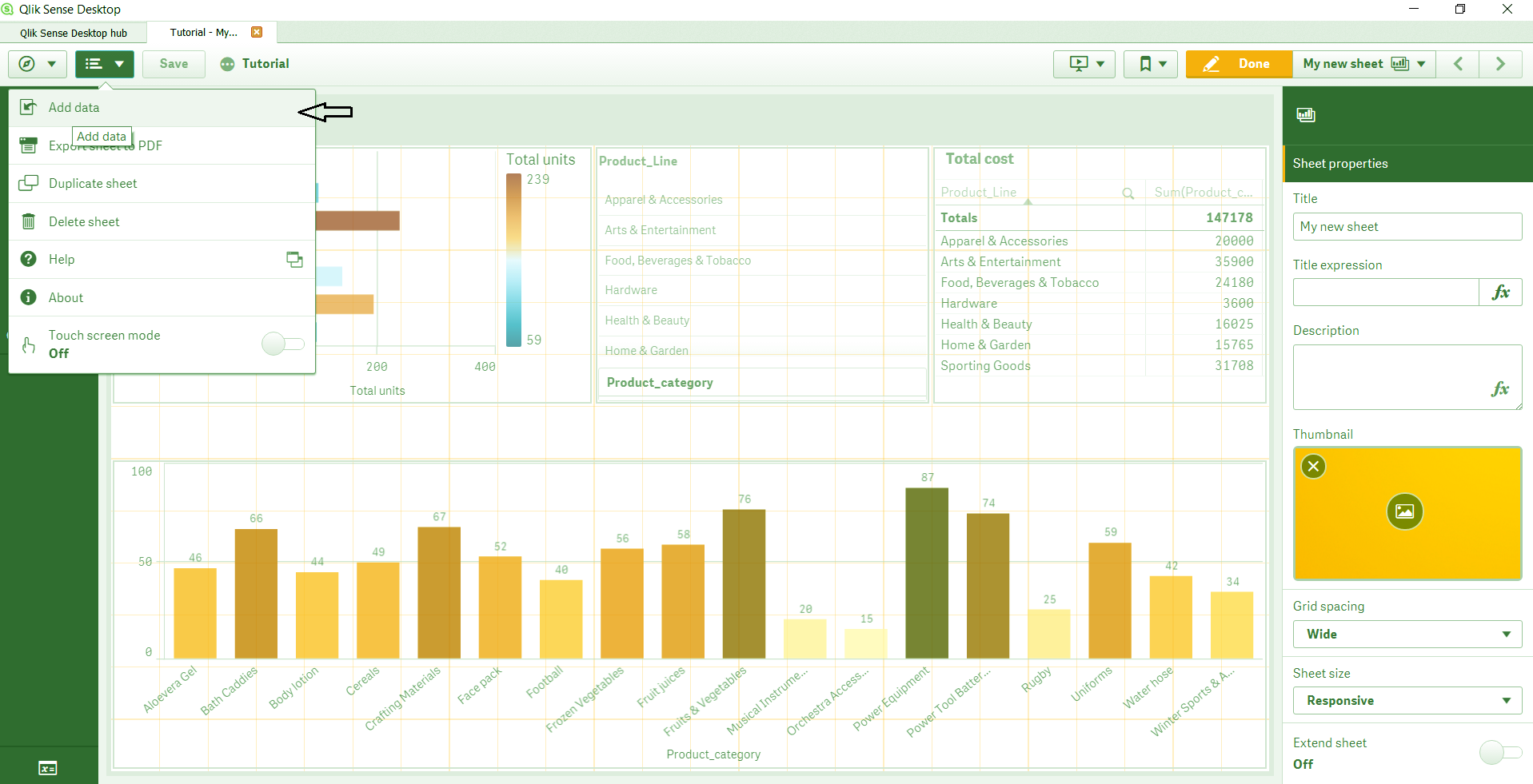
In order to make an association between data tables, let us suppose that we have two tables already loaded in Qlik Sense. The two tables are named Product Records and Order Details which are sample tables used by us. Now, we want to add a third table named Sales Record. So, we will open Qlik Sense, open the app which contains the two tables and we want to add the third in. Click on Edit option from the toolbar of the sheet.
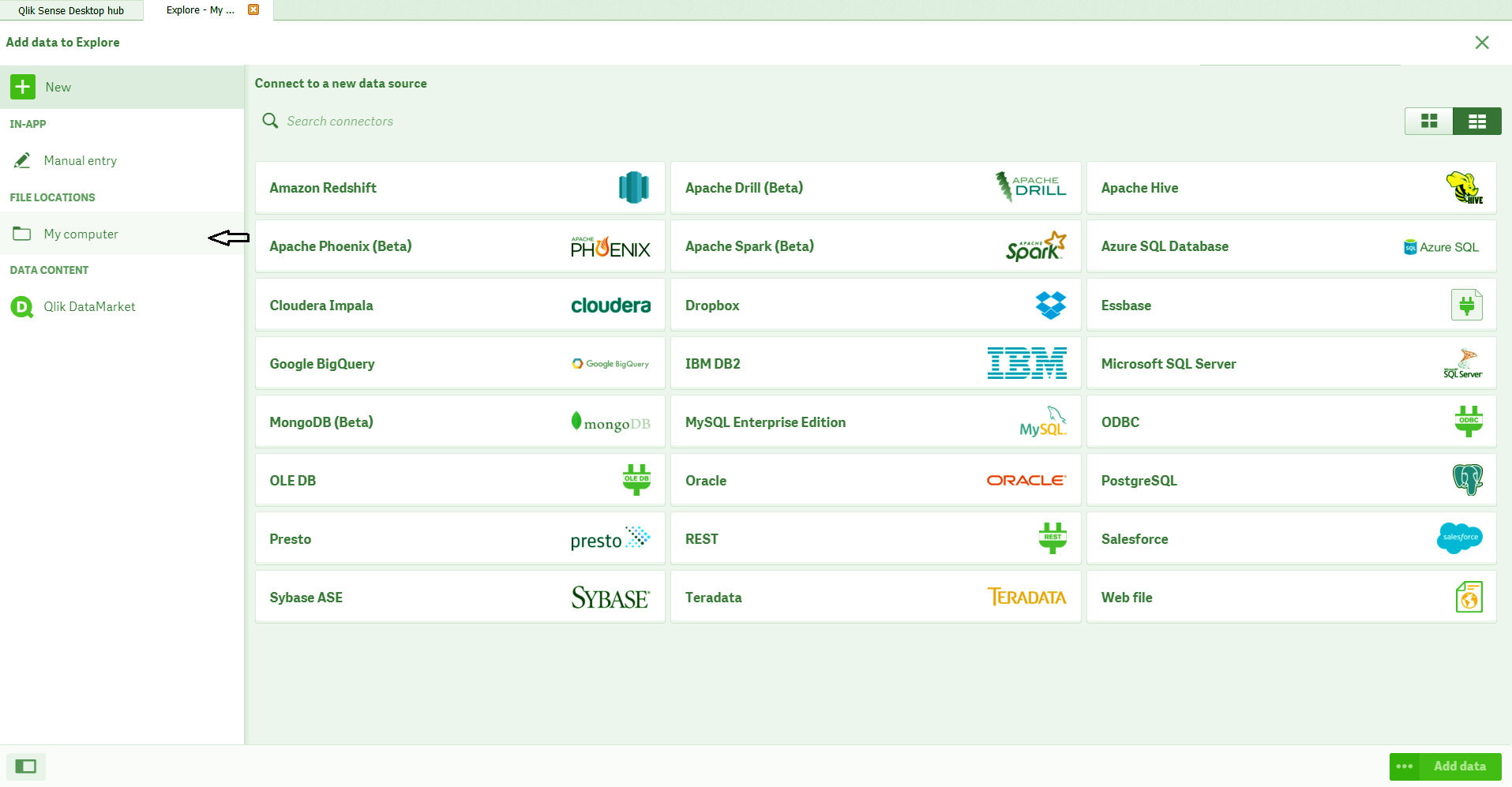
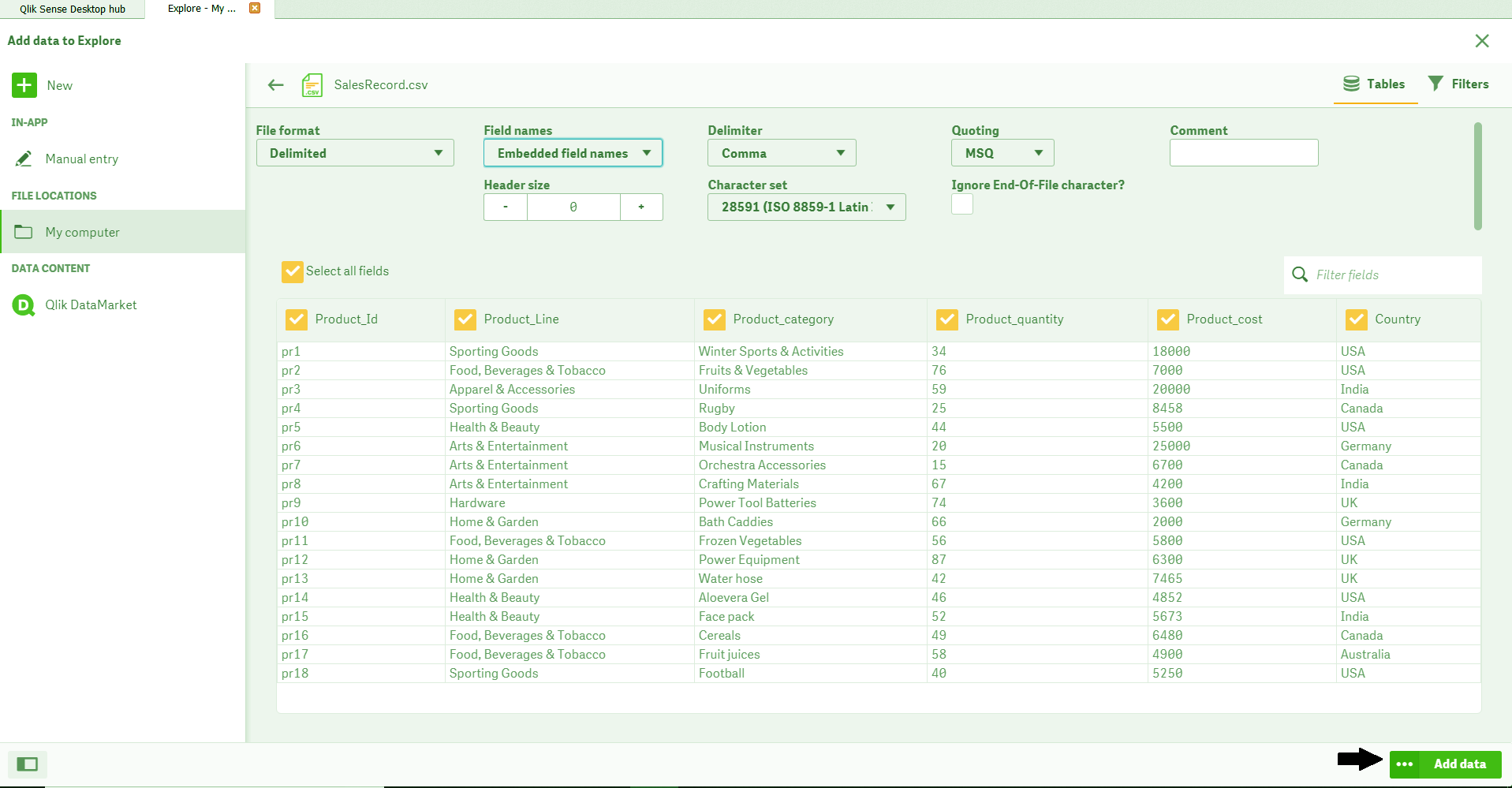
Open the Global Menu and select Add Data option. This will add the third table. Select the data file from the source is located in your system and click on Add Data button.
Qlik Sense Data Model – Associations
Have a look at Qlik Sense Selections Visualizations
Data Model in Qlik Sense – Associations
Qlik Sense Data Model – Association in Qlik Sense
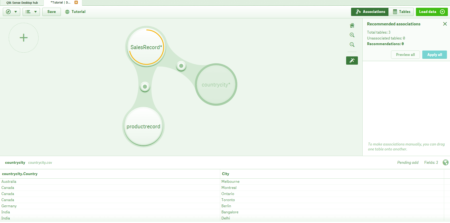
This will load the table and automatically show the tables as bubbles in the Data Manager. Notice the Recommended associations section present at the right side which shows the system recommended associations. In our sample, the recommended association is between the tables ProductRecord and SalesRecord, because these tables must have one or two fields in common.
Let’s discuss Qlik Sense Filter Pane
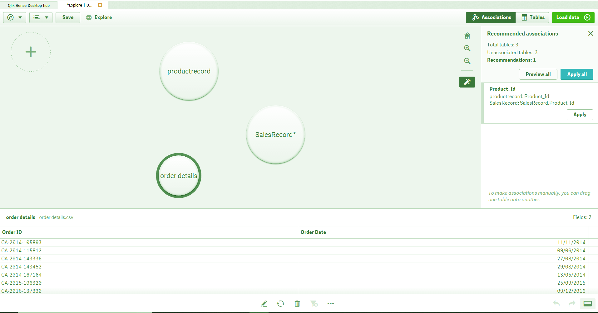
Qlik Sense Data Model – Tables as Bubbles
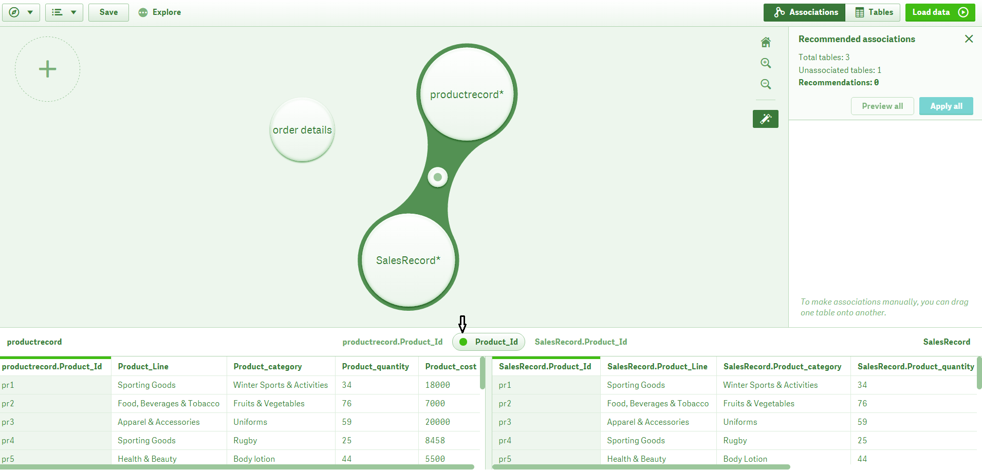
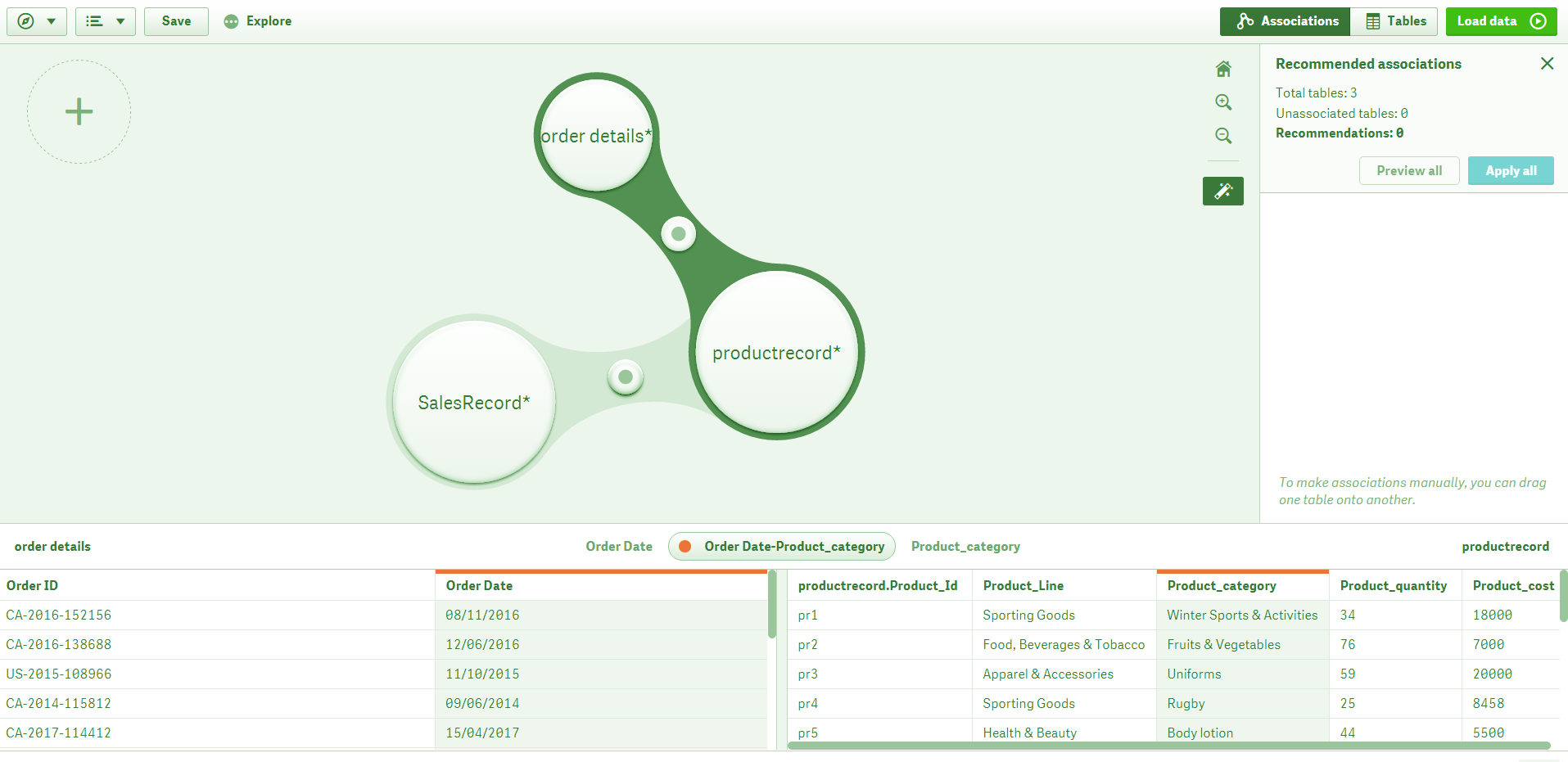
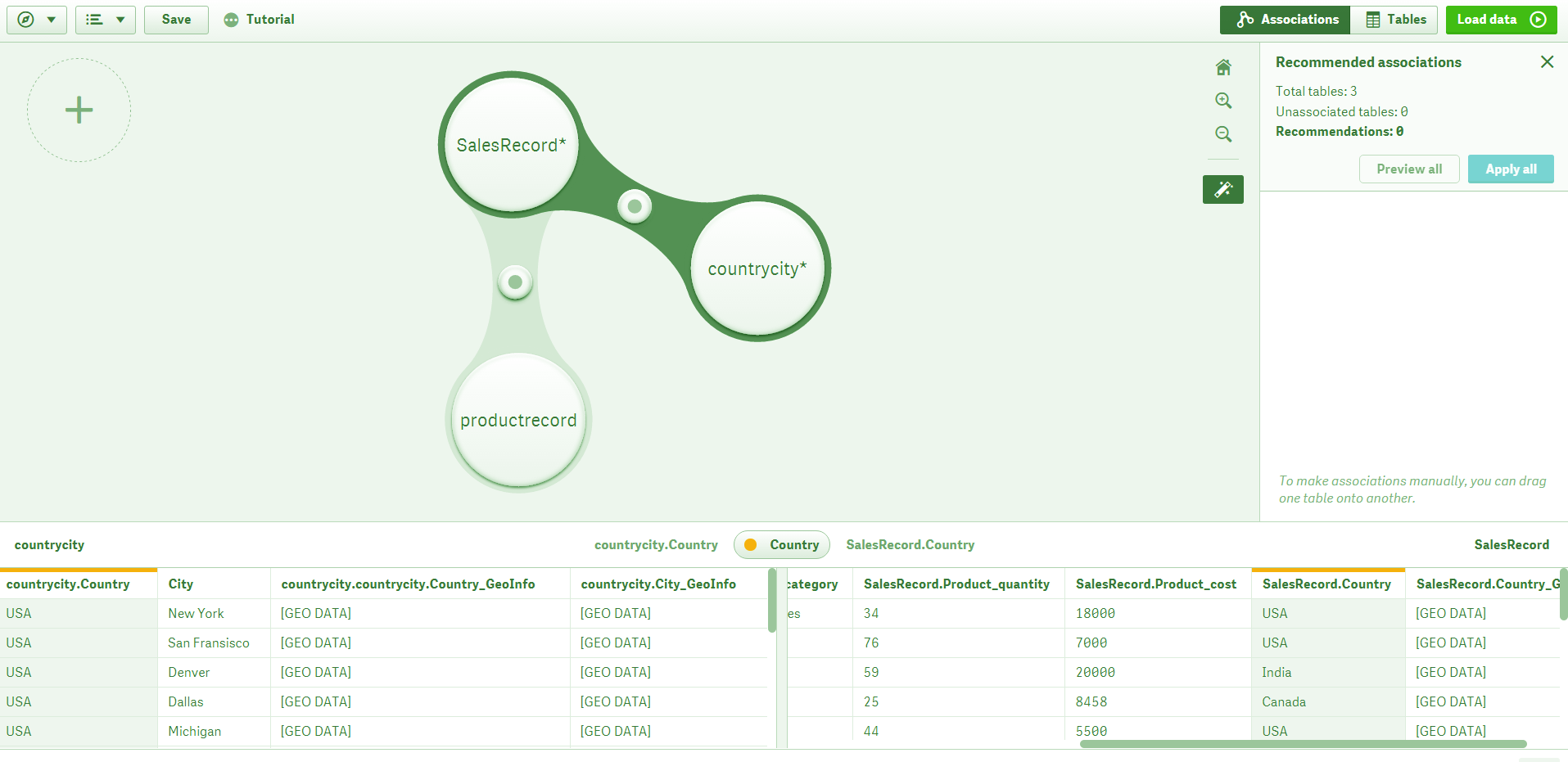
To make the recommended association, click and hold on one of the recommended tables and drag it towards the other. This will create an association between the two tables as soon as you release the mouse button. This newly formed association is shown by a grey bridge made between the bubbles (representing tables). Also, the bar given right beneath the association display pane shows a button at the center having the name of the common field between the two tables (Product_Id) with a green dot (representing a strong recommendation or is a sign of good data structure). On either side of this button are the names of the two associated tables. The section below this displays the contents of each table, with a long green bar on those fields which are common between the two tables.
Qlik Sense Data Model – Association Between Two Table
Know more about Qlik Sense Histogram Visualization
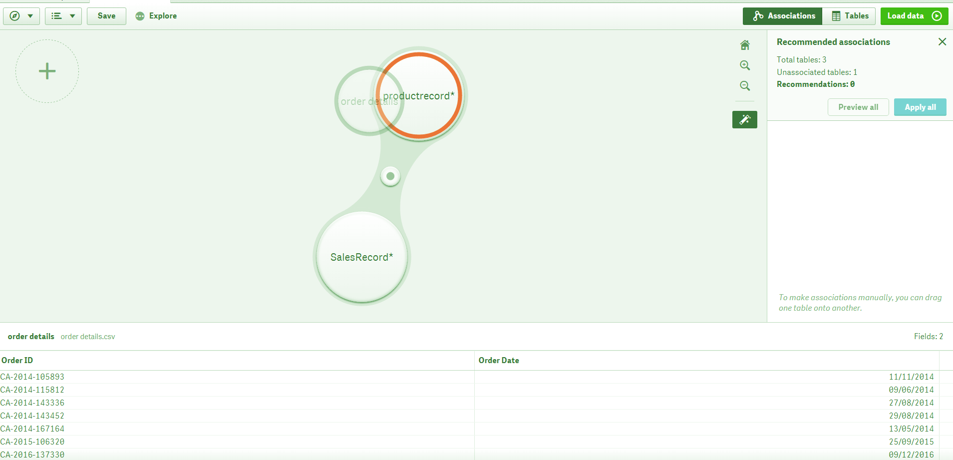
Similarly, you can keep on adding more tables from the plus sign given at the top left corner of the display panel and associate them with relevant tables using the recommendations. However, if you try to make a connection or association which is not recommended by the system’s logic and potentially distorts the good data structure. Such an association is represented in red.
Qlik Sense Data Model – Adding More tables
Qlik Sense Data Model – Association using Recommendation
Let’s discuss Qlik Sense Text and Image Visualizations
Data Model in Qlik Sense – Make a Connection
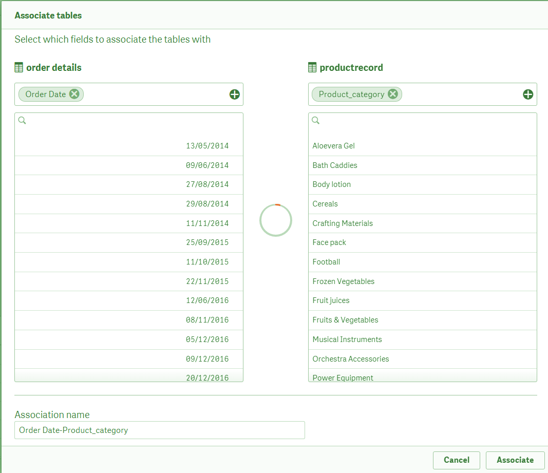
We can make associations in one more way, i.e. recommend mildly or moderately recommended. Such associations represented by the color orange.
Qlik Sense Data Model – Moderately recommendation
Know more about Qlik Sense Gauge Chart
Qlik Sense Data Model – Association representing in Orange
Click on Load Data button present at the top right corner of the editor to confirm the associations you made and work with data and visualizations on the sheet.
You must read Qlik Sense Box Plot
So, this was all in Qlik Sense Associative Data Model. Hope you like our explanation.
4. Conclusion
Hence, this was all about the associative data model in Qlik Sense. Moreover, creating an association is a great way of framing an efficient Qlik Sense Data Model for your application. Also, the importance of a well-structured data model is evident as it ensures proper functioning and behavior data. So, it also maintains the data processing speed and manages data storage well.
Still, if you want to ask any question related to Qlik Sense Data Model, ask in the comment tab.
See also –
Qlik Sense Treemap Visualization
Did we exceed your expectations?
If Yes, share your valuable feedback on Google


i want multiple dataset from one data table with same or different data…hoe can i go with datamodel approach..should i concatenate the multiple data set? or create multiple table out of one main table
Where can I get the data set for this lesson?
Does the association behave like a inner join when using the data? I would like to make a star schema with mutiple facts?? How