Qlik Sense Case Study – How Qlik Sense Benefits Facebook & Tesla
FREE Online Courses: Knowledge Awaits – Click for Free Access!
In our previous Qlik Sense Tutorial, we have learned a lot about Qlik Sense and its features. Now, we will see how Qlik Sense is used by some of the leading firms across the globe to better their functioning and how it helps them to grow their business. We’ll be shining some light on the usefulness of Qlik Sense in the real world. Here, we will see top 3 Qlik Sense case studies of popular companies; Tesla Motors, Facebook and Time Magazine.
Top 3 Qlik Sense Case Studies
Here are some of the most famous Qlik Sense Case Studies that will give you an idea of how you can use Qlik Sense for your business growth.
1. Qlik Sense Case Study: Tesla Motors
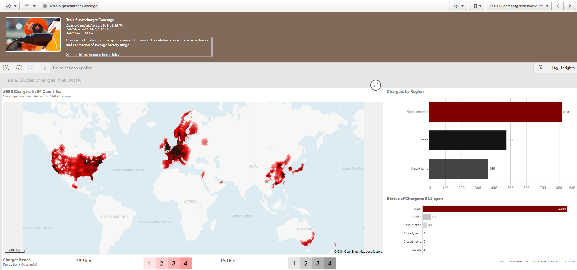
A Qlik Sense application helps Tesla users to track the locations and get information on Tesla supercharger stations. The application involves real road network calculations and overlap estimates based on the average battery range of Tesla cars. This application needs integration with Qlik GeoAnalytics as it displays the supercharging stations on a map.
In the dashboard shown below, you can view stations in regions like North America, Europe, and the Asia Pacific. It also shows the status of chargers. You can make selections based on the region on this dashboard and the software will react as per the associations present between data values.
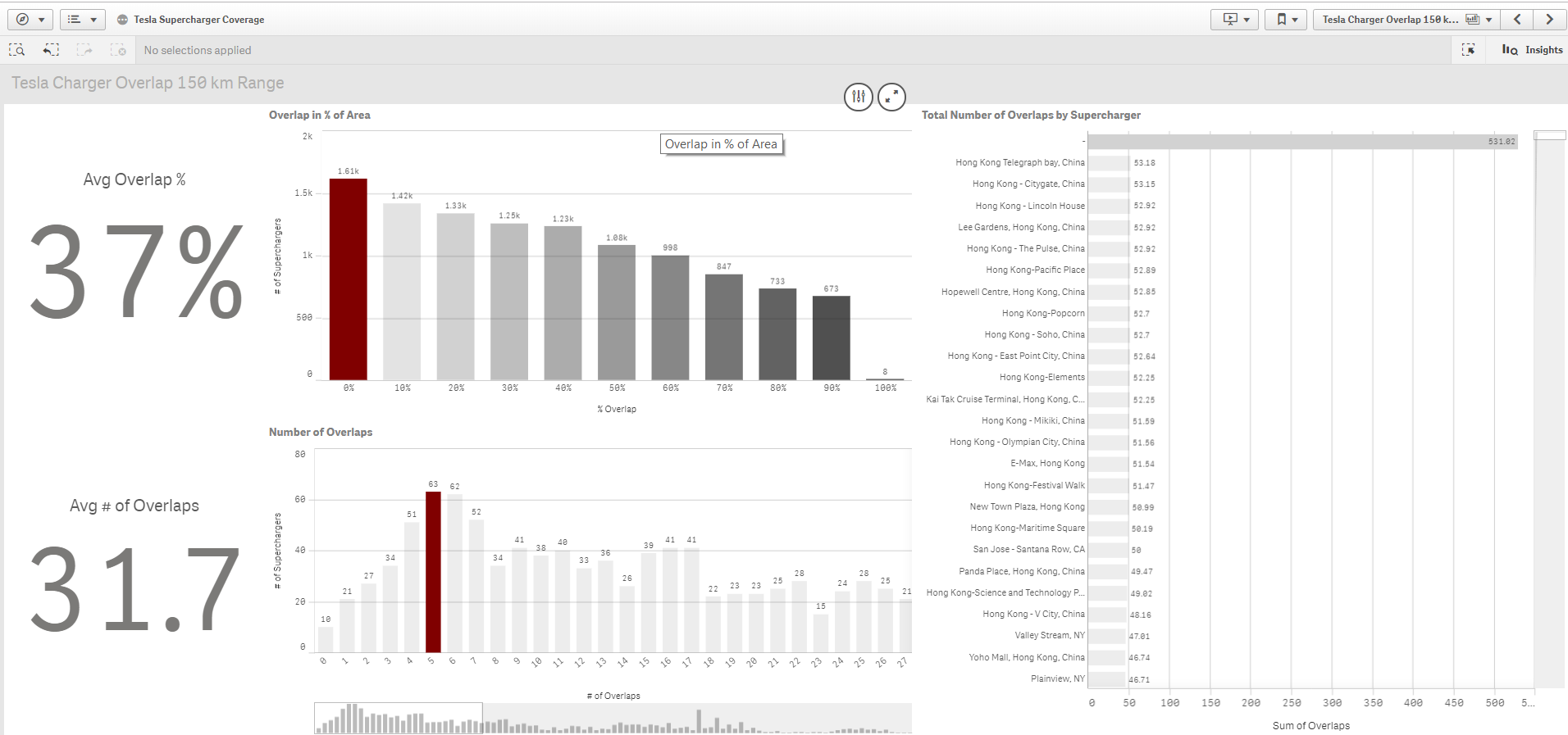
In another sheet of the application, a user can evaluate the average overlap percentage of supercharger stations and analyse relevant data for specific regions.
You must take a look at Qlik Sense Data Model
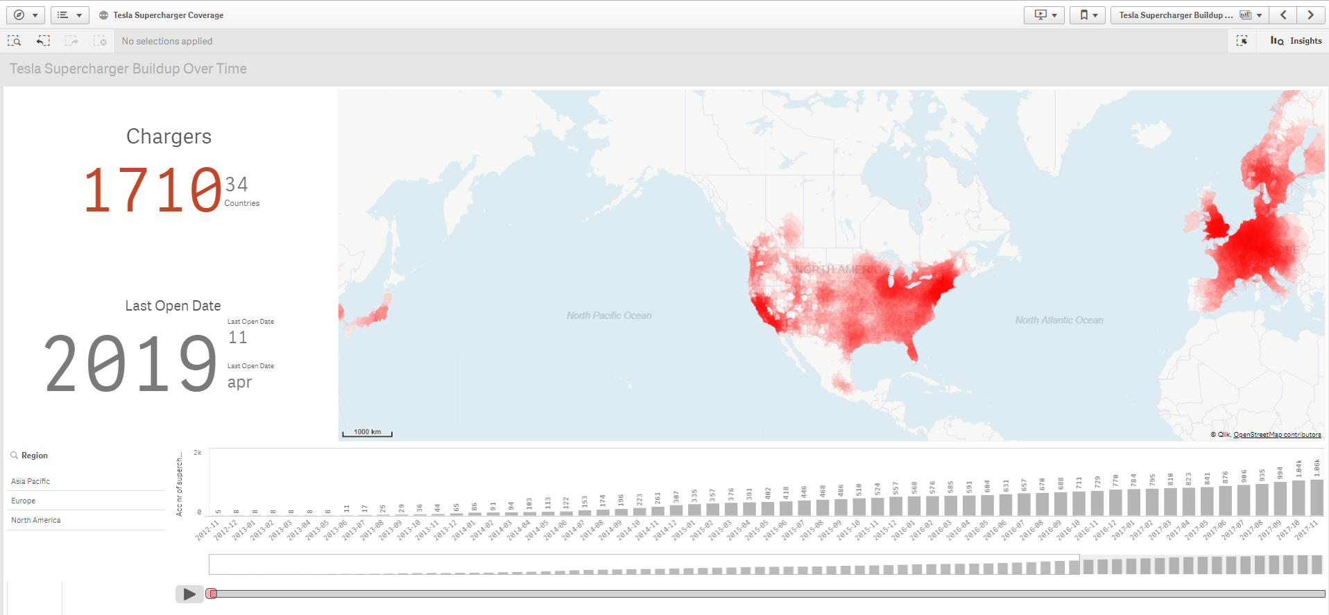
The Tesla Supercharger buildup over time shows the growth of supercharger stations across the globe. It shows the current status as 1710 chargers in 34 countries on 11th April 2019. The data on this dashboard updates on a regular basis so that a user can always see the current status of supercharger stations.
2. Qlik Sense Case Study: Facebook
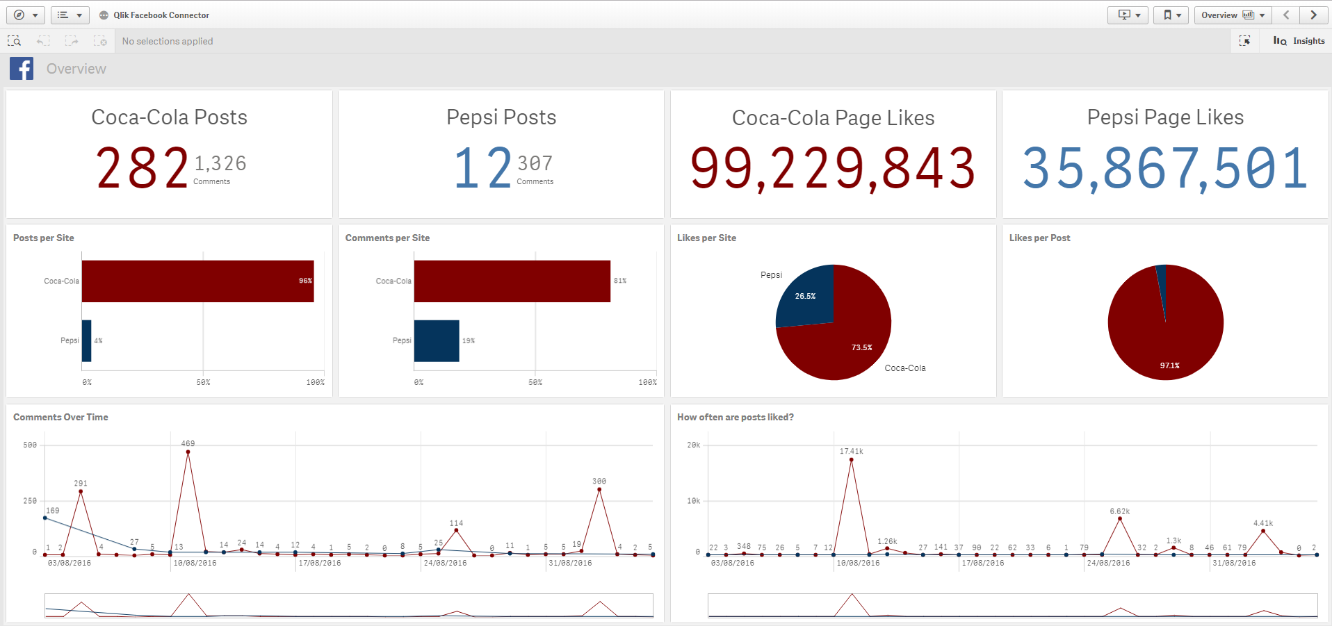
A Qlik Sense application is developed to compare Coca-Cola and Pepsi trends on Facebook. The data is fetched with the help of Qlik Web Connectors from Facebook APIs.
In the dashboard created on Qlik Sense, we can see that values for total Coca-Cola and Pepsi posts, total number of likes on their respective pages, posts per site, comments per site, likes per site and likes per post are displayed using visualizations. Any person who looks at this dashboard for an analytic point of view can easily tell what the graphically represented information is trying to reveal. In this case, the verdict will be Coca-Cola is more popular than Pepsi.
Recommended Reading – Qlik Sense Visualization Expressions
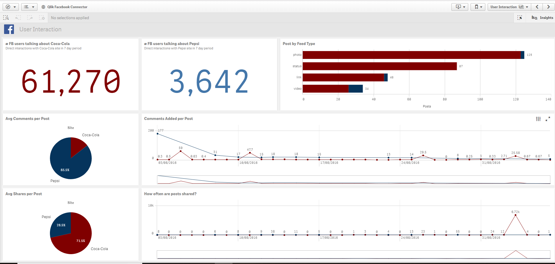
The user interactions were also monitored, and patterns were highlighted by focussing on user activities like direct interactions on the site, average comments per post, average shares per post, post by feed type etc. The use of simple visual elements like pie charts, line charts, KPIs, bar graphs makes comprehending the trends and situations easy for even a non-technical user or the common audience.
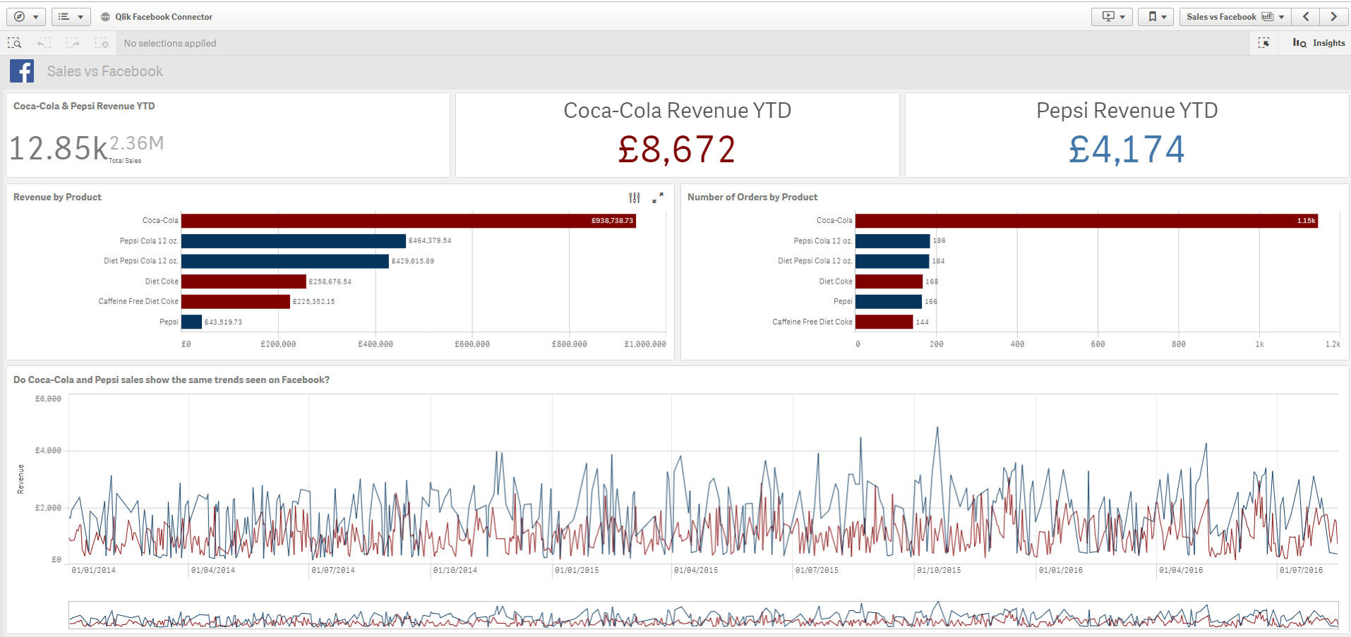
Users can also compare the actual sales and revenues incurred by Coca-Cola and Pepsi with the popularity trends emerging on Facebook. This will show how accurately social platforms like Facebook reflect the market situations and customer preferences.
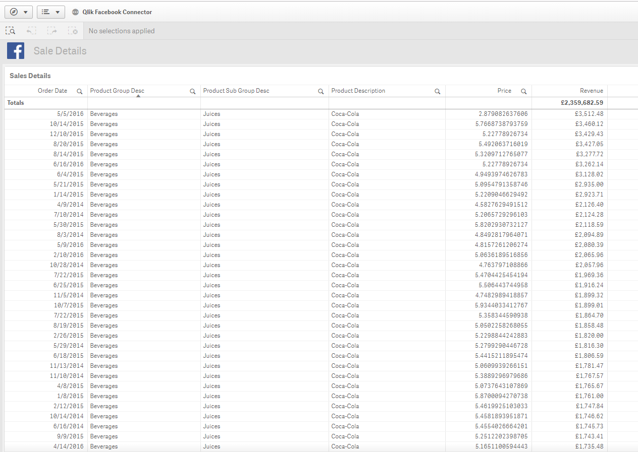
You can also get all the sales data in tabular form in Qlik Sense app.
Do you know the latest Qlik Sense career Opportunities
3. Qlik Sense Case Study: Time Magazine
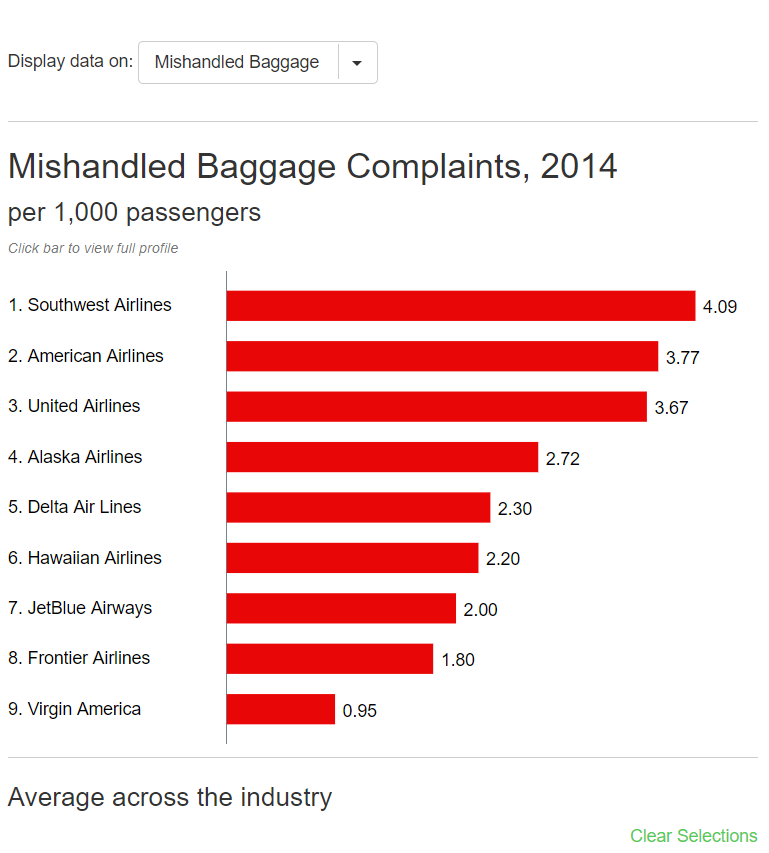
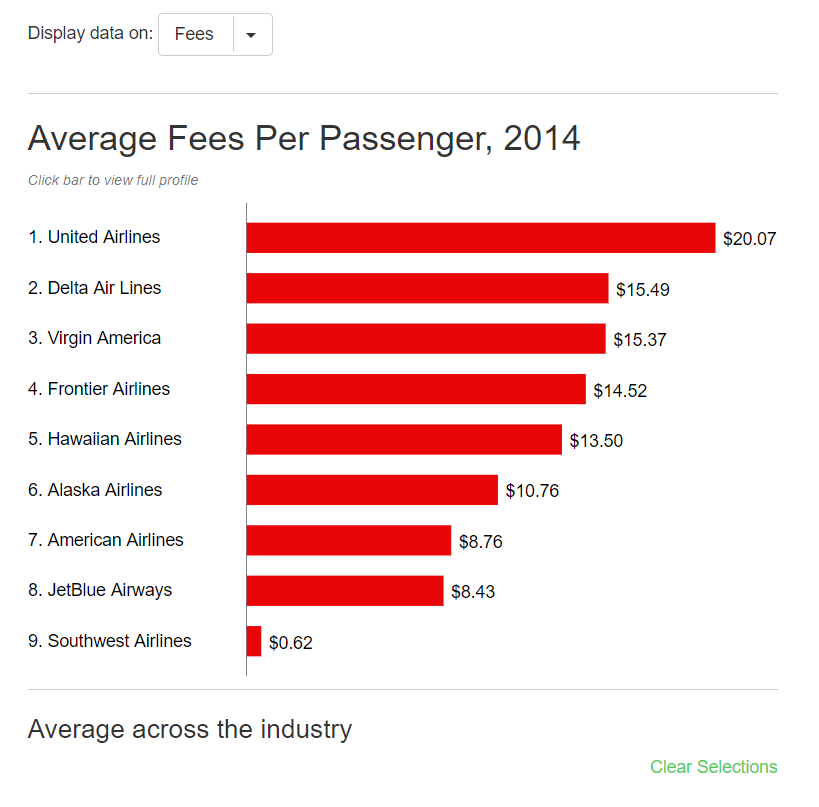
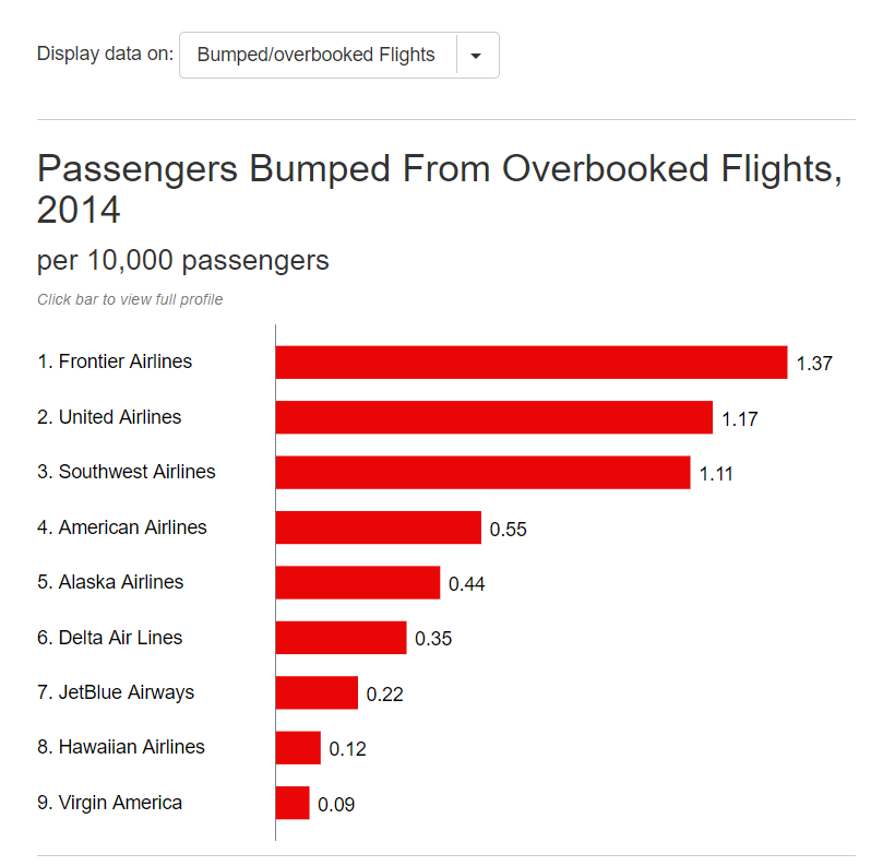
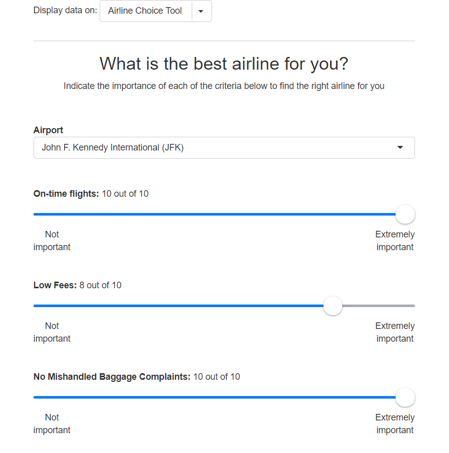
Time Magazine has created an Airline advisor using Qlik Sense. They have developed a Qlik Sense app having airline data using which users can determine best-suited airline for them to travel by. The app has provided the users with certain criterion such as on-time flights, fees, mishandled baggage, overbooked flights, airline profile, based on which they get to see the information.
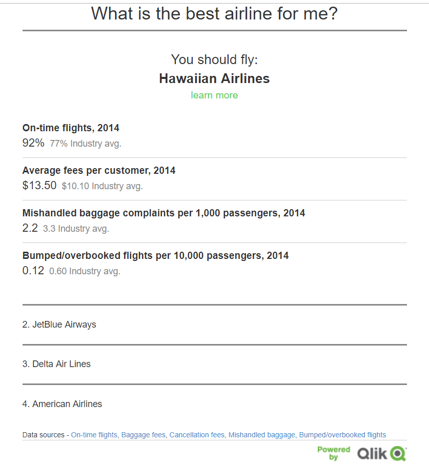
The Airline Choice Tool lets the user set preferences and then recommends the best suited airline accordingly.
For instance, as you can see in the screenshot of Qlik Sense app above, we have selected the airport as JFK and made some additional choices. After this, the app will automatically calculate the best suited airline for you and show details about it.
It is the time to explore top Qlik Sense Certifications and get hype in your career
In addition to this, it also shows the 2nd, 3rd and 4th recommended airlines if, for any reason you don’t wish to go with the 1st recommended choice.
Images source – Qlik.com
Summary
So, this concludes our informative post on Qlik Sense case study. We hope it helped you in understanding the vast application base of Qlik Sense. Stay tuned as we are working to bring more such informative and interesting case studies on other BI technologies.
Enjoyed reading? If you know more interesting Qlik Sense Case Studies share with us through the comment section. We would love to hear from you.
Don’t forget to play the latest Qlik Sense Quiz.
Did you like our efforts? If Yes, please give DataFlair 5 Stars on Google
