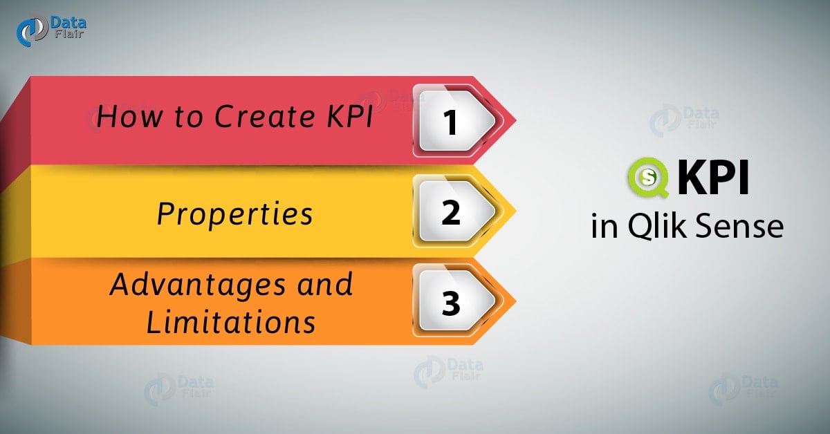
KPI in Qlik Sense – Properties, Advantages and Limitations
Expert-led Online Courses: Elevate Your Skills, Get ready for Future - Enroll Now!
Earlier, we have discussed Qlik Sense Combo Chart. Today, we will see KPI in Qlik Sense. In this tutorial, we are going to learn about how to use KPIs as visualizations in Qlik Sense sheets. Also, we will work towards understanding the role of KPIs in a BI tool like Qlik Sense along and learning how to use KPI visualizations in Qlik Sense sheets.
So, let’s start Qlik Sense KPI Tutorial.
KPI in Qlik Sense – Properties, Advantages and Limitations
1. What is KPI in Qlik Sense?
KPI stands for Key Performance Indicator which are the measure values used as performance trackers. We use KPIs to indicate the current state of an enterprise functioning by displaying calculated values like average sales, maximum sales, minimum sales, total sales etc. You can apply conditional colors and symbols to make them more dynamic and indicative of the performance state they are showing. For instance, you can give a red color to a lower value, symbolize it with a downward arrow, or use green color for a higher value etc. You can also set a range and limit for the values. In Qlik Sense, you can add such KPIs on the sheet as distinct visualizations which we can handle and edit separately.

What is KPI in Qlik Sense
2. How to Create KPI Visualization in Qlik Sense?
In order to create a KPI visualization in Qlik Sense, follow the steps given below.
Step 1: Open the editor of the sheet of the application in which you want to create a KPI visualization. The editor is opened, from the edit option present on the toolbar.
Step 2: Select the option KPI (from the Assets Panel) and add it to the editing grid at the center by dragging and dropping.
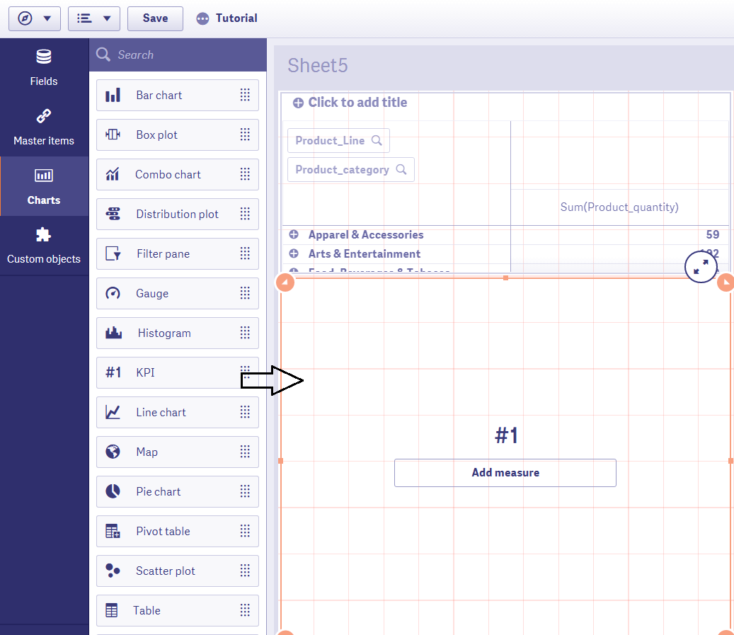
Select KPI from Assert Panel
Step 3: Add a measure for the KPI. You add more measures from the properties panel later.
Recommended Reading – Qlik Sense Histogram Visualizations
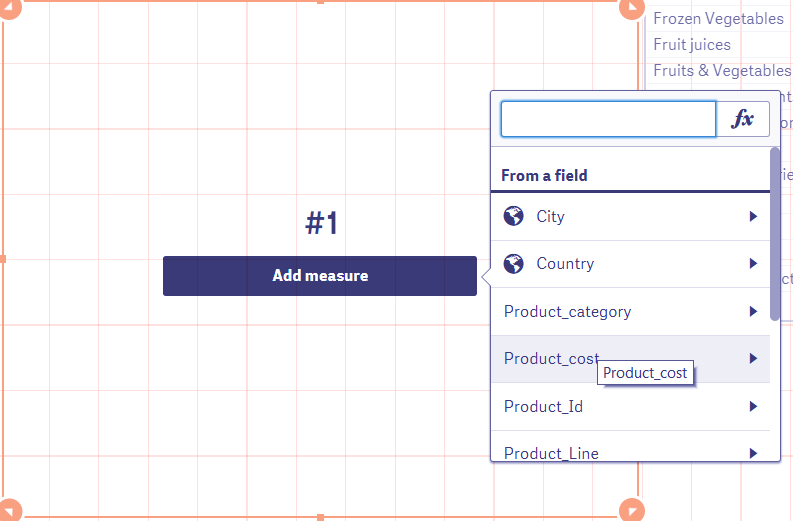
Adding Measure for the KPI
Next, you can add an aggregation type to the values of the selected field/measure.
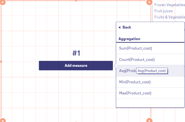
Add Aggregation Type
Step 4: Once you are done with selecting and adjusting all the different aspects of it. The KPI will be displayed on the editor instantly. Click done to bring it on the sheet.
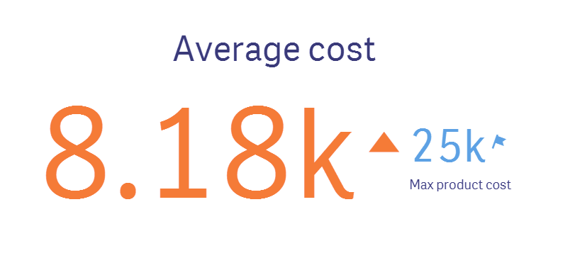
Displaying the KPI in Qlik Sense
The KPI shown above shows two calculations, i.e. average cost and maximum product cost with relevant symbols aside them.
3. Properties of Qlik Sense KPI
From the properties panel present at the right of the editor, you can manage different aspects of the KPI visualization and make it according to your requirement.
You must read – Qlik Sense Text and Image Visualization
i. Data
From the data tab, you can add measures for first and second KPI. You can edit an expression, add a label, set the number formatting for the calculated values. You can add up to two measures only.
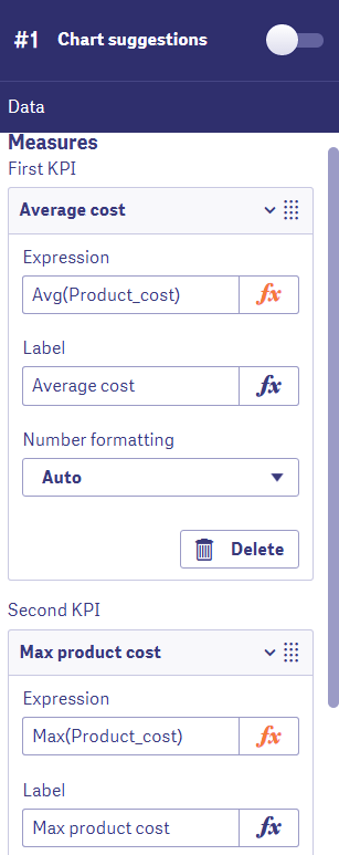
Add measures for the first and Second KPI
ii. Add-ons
In this section, you can use the data handling option to apply certain display conditions on the data. The KPIs are only displayed if the applied condition holds true.
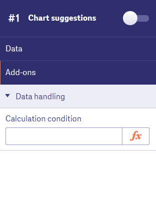
Using Data Handling Options for Add-ons
iii. Appearance
The appearance section contains all the setting related to the appearance of the KPIs.
The first section is the General section has options for showing or hiding titles or details.

Appearance – General Section
The Presentation section in Qlik Sense KPI gives you options to adjust the alignment of the KPI information, font size. You can also link the KPI to other sheets in the app.
Let’s revise Box Plot in Qlik Sense Visualization
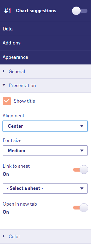
Appearance – Presentation Section
From the Colors section, you set the coloring criteria for the KPIs. You can add a color condition and associate a symbol to it. Also, you can add value limits in KPIs which are shown in a certain color up until that limit and then changes the color when gone beyond the limit.
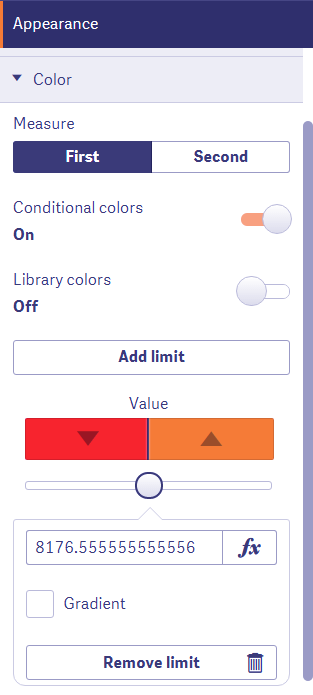
Appearance – Color Section
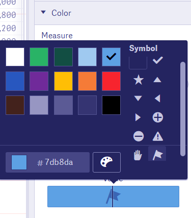
Adding Color Condition
Do you know about Qlik Sense Gauge Chart
4. Advantages and limitations of using KPIs
One major limitation of the KPIs is that you can only have a generalized result of the performance through values and a limited set of symbols. If you want a more clear and relative representation of performance indicators, then you can go for using gauge charts. However, an evident advantage is that KPIs provide a quick and to the point representation of the performance results using which you can reach to conclusions in your analysis easily as to how the enterprise has performed over a certain period.
So, this was all in KPI in Qlik Sense.
5. Summary
We hope through this tutorial, you have learned how to create and use KPIs for an appropriate purpose in your Qlik Sense app. If you have any queries related to the KPI visualization, leave it in the comment box below.
You must check – Qlik Sense Capabilities
Your 15 seconds will encourage us to work even harder
Please share your happy experience on Google


