Qlik Sense Histogram Visualization – Creating Histogram
Placement-ready Courses: Enroll Now, Thank us Later!
1. Objective – Histogram in Qlik Sense
Today, we will see Qlik sense Histogram Visualization tutorial. Moreover, we will discuss the property panel of Histogram in Qlik Sense. Also, we will see when histogram must be used in Qlik Sense and learn how to create it using data loaded in our apps.
So, let’s start Qlik Sense Histogram tutorial.
Do you know Qlik Sense Filter Pane
Qlik Sense Histogram Visualization – Creating Histogram
2. Qlik Sense Histogram
A histogram also known as frequency plot distributes the dimension points over a certain range of intervals and displays the frequency of each bin or bar in the distribution. This gives a continuous range of values placed at equidistant intervals. Each equidistant interval is known as a bin corresponding to which frequency is shown for the data values of the dimension used. On the y-axis, the frequency is shown. To make a histogram, only one numeric dimension is required. Using a histogram, you can analyze in what range of intervals or bins most data is concentrated or in which bins it is minimal. This proves to be very useful when you want to analyze the performance of an entity or behavior of data over time as it shows the frequency of data on a distributed interval patch.
Have a look at Qlik Sense Text and Image Visualization
You can easily create a histogram in Qlik Sense. The next section discusses how to create a Qlik Sense Histogram.
One evident advantage of a histogram in Qlik Sense is that it helps in analyzing large sets of data as it presents an overview by displaying the distribution and frequency patterns of the entire data. However, this also leads to a major disadvantage of using the histogram, which is that it does not provide a detailed account or visual of the data but gives a summary of data using only one dimension. For instance, if you have a histogram made for product quantities in sales and you also want to know which item corresponds to that quantity, the histogram is unable to serve that purpose.
3. How to Create Qlik Sense Histogram?
Before we start with learning how to create a histogram let us first consider a situation, based on which we will create the histogram. Suppose we have data of sales of a store. We want to create the histogram so that we can see the pattern or distribution of sales quantity (number of units sold).
- Go to the Edit option in the sheet toolbar.
- Select Charts from the Assets Panel and then drag and drop Histogram option on the center editing grid.
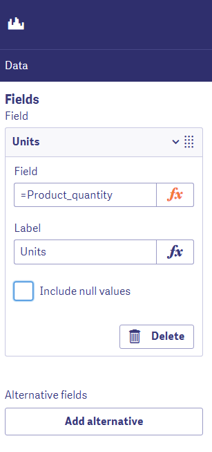
- Click on the Add field option and select a field (numeric) from the list that appears. We have selected the field Product_quantity because we want to create a distribution plot for sales quantity.
Do you know about Qlik Sense Gauge Chart
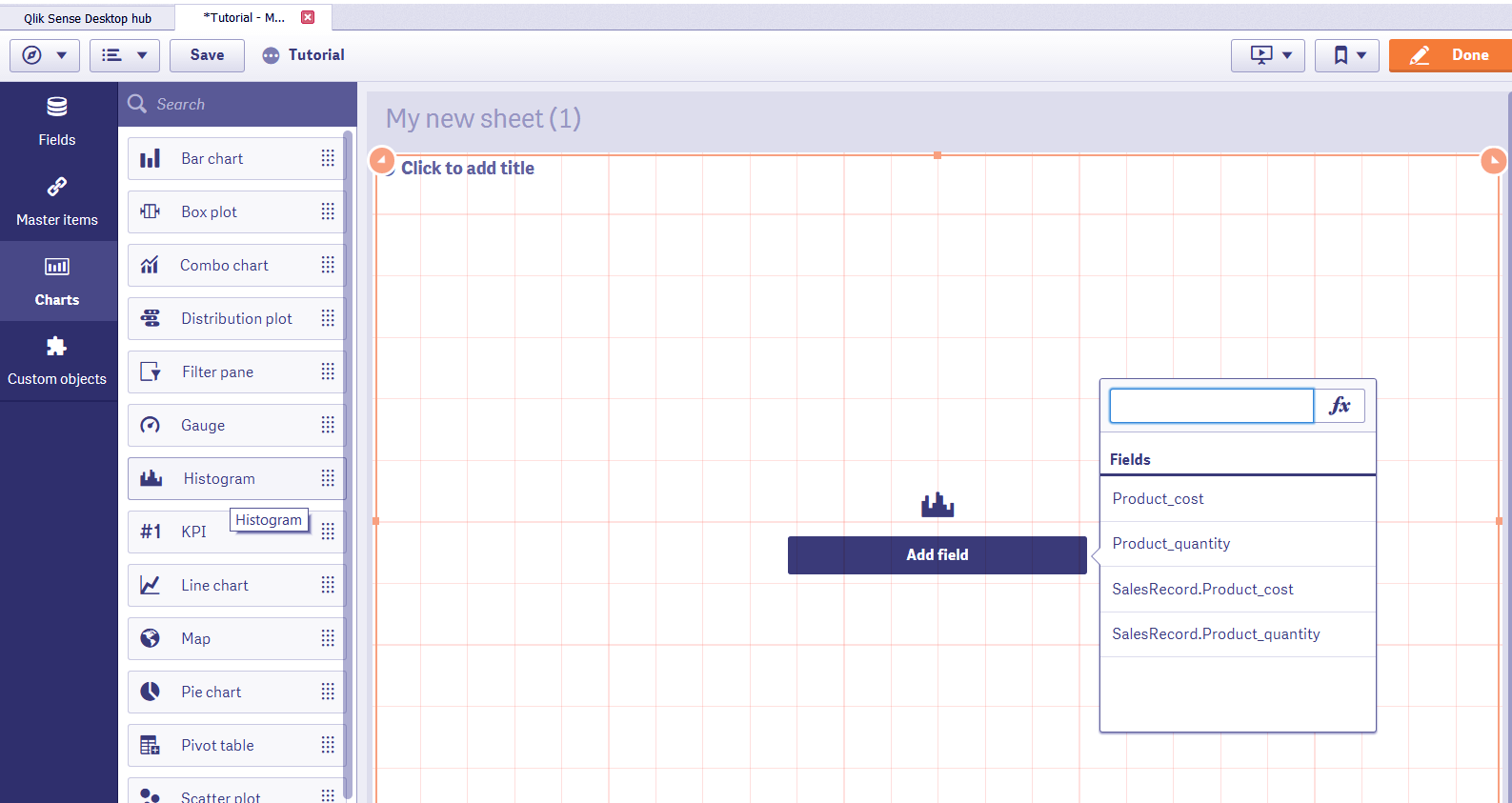
Add Field Option in Qlik Sense Histogram
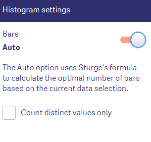
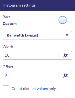
- If you are okay with the way software’s logic has set up the bin intervals or bar width then you can click on Done and get the final histogram displayed on your sheet. But, if not, you can customize some settings like bar width, bar color, x and y-axis value point positions etc.
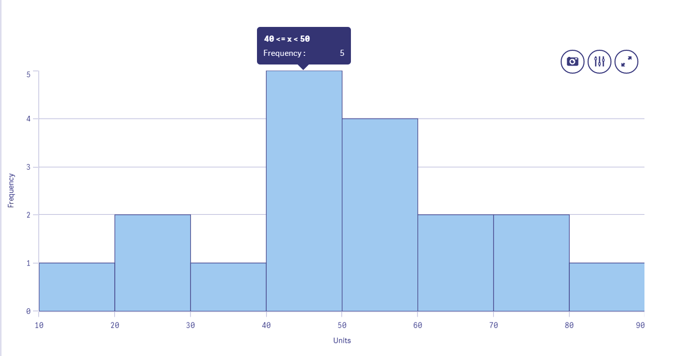
Qlik Sense Histogram
As you can see in the final histogram made, the number of units (quantity of product) is distributed over a range of 10 to 90 on the x-axis with each bin being 10 units wide. On the y-axis, the frequency count interval is calculated automatically by the software using the Sturge’s formula.
Let’s revise Qlik Sense Box Plot
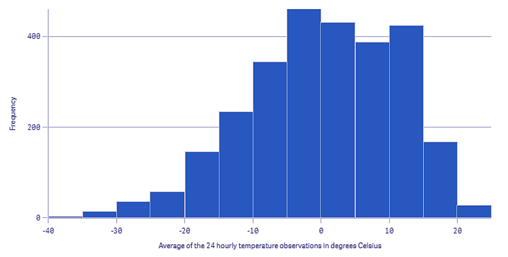
Another example could be of a creating a histogram to see the distribution of average temperature recorded in a city in 24 hours.
Qlik Sense Histogram Example
As can be seen in the image, the histogram has bar width of 5 degree Celsius and upon analyzing the data distribution of this frequency plot, it can be inferred that most of the days the temperature stayed between -5 to 15 degrees.
4. Properties Panel in Histogram
The properties panel of the histogram has four main sections.
a. Data
From the data section, you can add fields to be used in the histogram. The histogram is made using only one numeric field but if you want to add another, you can do it using the Add alternative option which adds an alternate field which shows only when the user chooses to. Also, from this section, you can apply an expression or function on the field and add a label to it.
Know more about Qlik Sense Treemap Visualization
Data in Histogram
b. Histogram Settings
The bar width is configured from this section. It is done in two ways, if you leave the Bar toggle on, then the system will use Sturge’s formula to calculate the bin or bar width and create the histogram accordingly. But, if you turn the toggle off, then it switches to the custom mode, where you can select the bar width or the maximum number of bars that you would like to have in the histogram.
Have a look at Qlik Sense Color Functions
Qlik Sense Histogram Setting
Setting in Qlik Sense Histogram
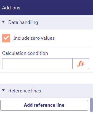
c. Add-ons
In the Add-ons section, you can enter a condition expression on the data under data handling section or add reference lines in the visualization.
Let’s take a tour to Qlik Sense Line Chart
Add-ons in Histogram
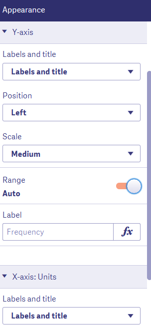
d. Appearance
Through the appearance section, we can show/hide titles and details. Manage the presentation details and select the color of bars. Also, you can set the position, scale and range of the x and y-axis of the histogram.
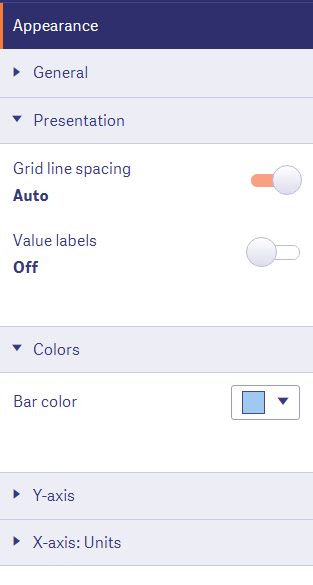
Appearance in Qlik Sense Histogram
Read more about Qlik Sense Scatter Plot
The histogram in Qlik Sense – Appearance
So, this was all in Qlik Sense Histogram tutorial. Hope you like our explanation.
5. Conclusion
Hence, in this Qlik Sense Histogram tutorial, we learned why we use histograms in Qlik Sense. Also, we saw how to create them in a Qlik Sense application. Moreover, we discussed the properties of Qlik Sense Histogram. Try making histograms using your own data and draw inferences from it.
Still, if any confusion in Histogram Visualizations in Qlik Sense.
See also –
Your 15 seconds will encourage us to work even harder
Please share your happy experience on Google


