Qlik Sense Scatter Plot Visualizations – Advantages and Disadvantages
Expert-led Courses: Transform Your Career – Enroll Now
1. Objective
In our last Qlik Sense Tutorial, we discussed Line Chart in Qlik Sense. Today, we will see Qlik Sense Scatter Plot Visualizations. Moreover, we will look at hoe to create Scatter Plot Visualization in Qlik Sense. Also, we will discuss the pros and cons of Qlik Sense scatter plot.
One more important and unique way of visualizing data is through creating a scatter plot. A scatter plot, as its name suggests scatters data values as bubbles or spots on the chart grid. Although there is more to it, which we will discuss in this lesson. Read further if you want to know the significance of scatter plots in Qlik Sense.
So, let’s start Qlik Sense Scatter Plot tutorial.
Qlik Sense Scatter Plot Visualizations – Advantages and Disadvantages
Do you know about Qlik Sense Color Functions
2. Using a Scatter Plot in Qlik Sense
In a scatter plot or chart of Qlik Sense, we represent such instances as dots or bubbles which contains two or three measure values for them. For example, sales and quantity of distinct products displayed by a single dot or bubble. So, when you make a scatter plot in Qlik Sense, we select two measure fields for each x-axis and y-axis against a single dimension field. If you add a third measure of the same dimension, its values will reflect in the size of the bubble.
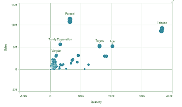
Scatter Plot in Qlik Sense
In the scatter plot shown in the image above, the two measures selected are ‘Sales’ and ‘Quantity’ and the dimension whose values will be plotted as bubbles against the two measure values is ‘Customer’. The third measure which is represented by the size of the bubble is ‘Cost’ i.e. more the cost, greater the size of the bubble. You can use color coding to see the density of data points when a large data set is used in a scatter plot. This helps in visualizing the dense areas or hot spots in the plot which potentially gives useful and important insights to the analyst.
Have a look at Qlik Sense Treemap Visualizations
3. Advantages and Limitations of Qlik Sense Scatter Plot
i. Pros of Scatter Plot
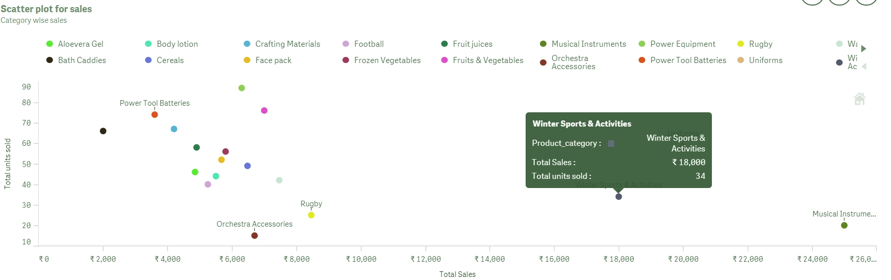
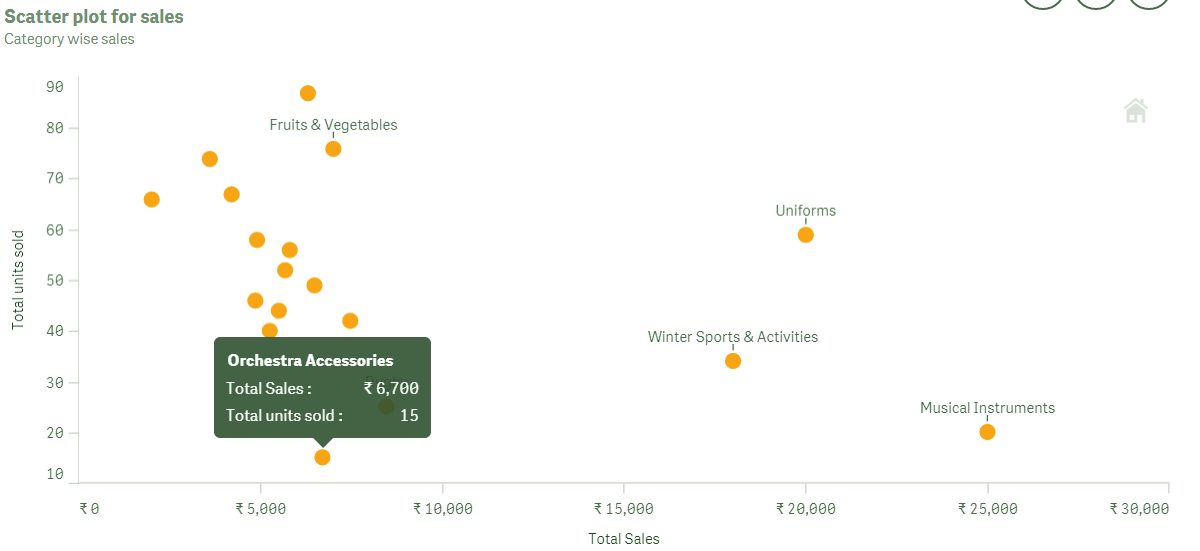
Scatter plots are significant in visualizing data as they show the contribution of different factors in the performance or status of an element which is being analyzed. Suppose, we have a scatter plot as a visualization for sales analysis. Now, we have taken product category or different product types as the dimension which will be plotted in the graph using two values, total sales done, and total units sold for each category of product.
So, just looking at the position of the bubble made on the scatter plot, you can analyze the popularity of a product, as the parameters indicating popularity are how much units of it were sold and for how much (total). Thus, scatter plots are very useful when you want to find out the correlation or relation between two or three measure values corresponding to a single dimension. It easily contains, manages and displays large data sets which are to be analyzed.
ii. Cons of Scatter Plot
However, what has come out as a drawback of using scatter plot is that it might often appear difficult to understand for inexperienced users. This is possible because of scatter plot follows a different concept of creation, i.e. the two measures are on x-axis and y-axis and the dimension values are represented as bubbles. It gets more complex when a third measure is added which is shown as the sizes of bubbles. So, the chart should be made in such a way that it must contain many informative bits on it so that users, regardless of their technical capabilities, can understand the chart.
You must learn Qlik Sense Pie Chart
4. Creating a Qlik Sense Scatter Plot
Follow the steps given below to create a scatter chart in Qlik Sense.
- Open the editor in the sheet you want to create the scatter plot in. The editor is opened by edit icon.
- Select a Scatter plot from the list of visualizations available in the Charts section of the Assets panel. Drag the scatter plot on the editing grid.
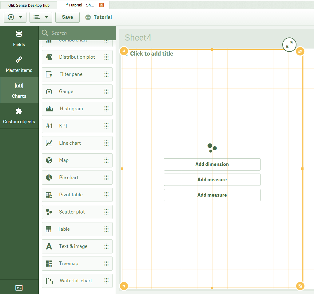
Select Scatter Plot
- First, add the dimension field from Add dimension option. Then add the first measure by Add measure option and select an aggregation type for it. Next, add the second measure and select an aggregation for it.
Let’s revise Qlik Sense Gauge Chart
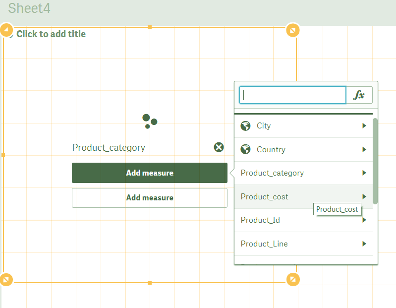
Add Dimension in Scatter Plot
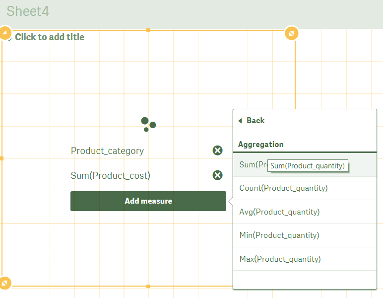
Add Measures in Scatter Plot
- Make other necessary changes from the properties tab if you wish to and click on Done icon to finish editing and view the final scatter plot on the sheet.
Final Scatter Plot on Sheet
Do you know about Qlik Sense Box Plot
5. Properties Panel of Qlik Sense
The properties panel of an active scatter plot in the editor provides many options for managing the properties of the scatter plot. There are several sections in the properties panel from where you can select and set different aspects of scatter plot accordingly.
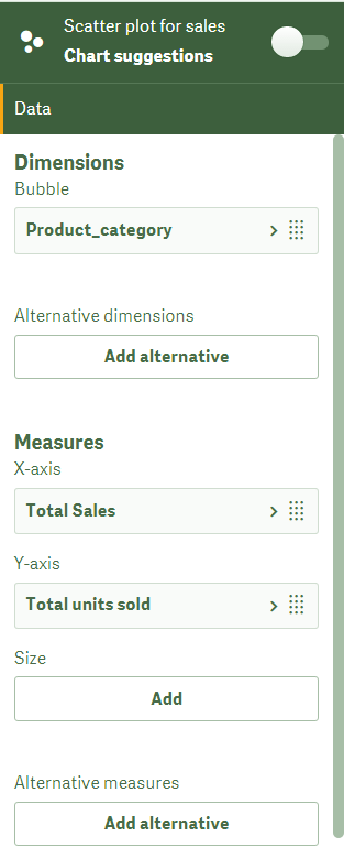
i. Data
From this section, you can add new dimensions and measures and manage the old ones. Basically, you can give labels to the measures which will be displayed on the scatter plot, also, you can edit expressions of the measures if you wish to change the type of aggregation that is applied on the measures.
Data in Scatter Plot
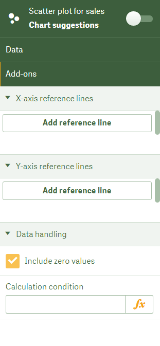
ii. Add-ons
From the Add-ons sections, you can add references of other data sets, or visualizations both for x-axis and y-axis. So, put conditions which control the displaying of the visualization.
Let’s revise Qlik Sense Text and Image Visualization
Add-ons in Scatter Plot
iii. Appearance
The appearance section is to manage all the looks specific elements of a scatter plot. Let us discuss some sub-sections of the appearance section and what we can do with the options.
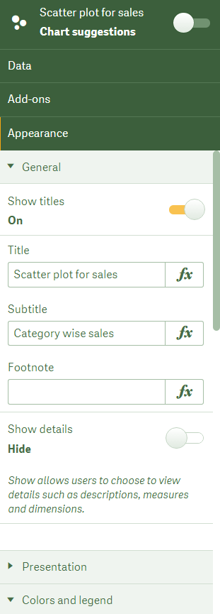
a. General
The first is the General section from where you can add titles, subtitles, and footnotes which are informative texts explaining the scatter plot.
Add Titles, Subtitles in Scatter Plot
Have a look at Qlik sense Histogram Visualization
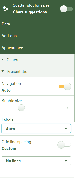
b. Presentation
Below it is the Presentation section which has the Navigation option, used for panning and zooming closer into the scatter plot. You can set the bubble size from the size bar given below the navigation option. Also, you can set the labels and grid line spacing.
Set the labels and grid line spacing
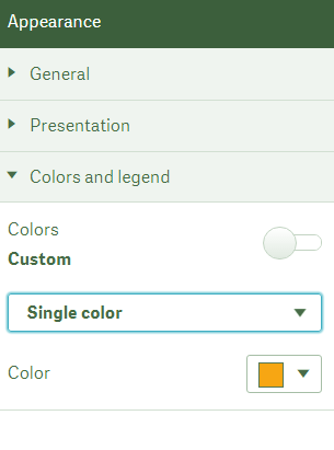
c. Color and Legends
Next is the Appearance section, from where you can set the coloring criterion of the bubbles on the scatter plot. So, you can select coloring from four options, i.e. single color, color by dimension, color by expression and color by measure.
If you select the single color option, you can select the color from the color options and the bubbles of the scatter plot will be displayed in that color, as shown in the screenshots attached below.
You must read Qlik Sense Filter Pane
Select colors in Scatter Plot
Bubbles in Scatter Plot
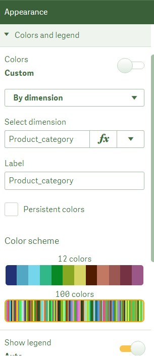
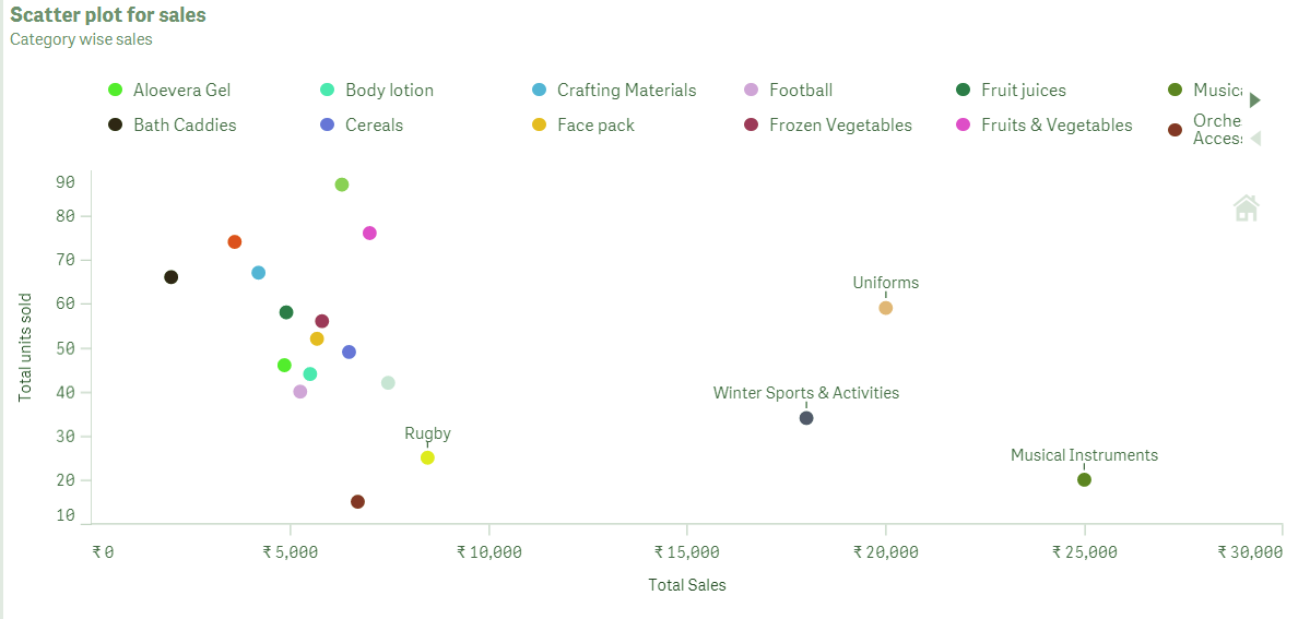
If you select the color by dimension option, then each dimension value will have a distinct color because no two dimensions will the same. You can select the colors from shades of 12 colors or 100 colors. It depends upon the number of dimensions your dataset contains. Here, you also get the option of show/hide legend which are descriptive texts showing which color corresponds to what dimension value.
Selecting Colors in Qlik Sense Scatter Plot
Qlik Sense Scatter Plot Color Selection
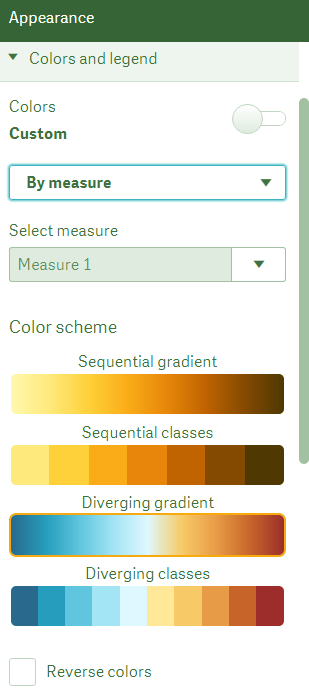
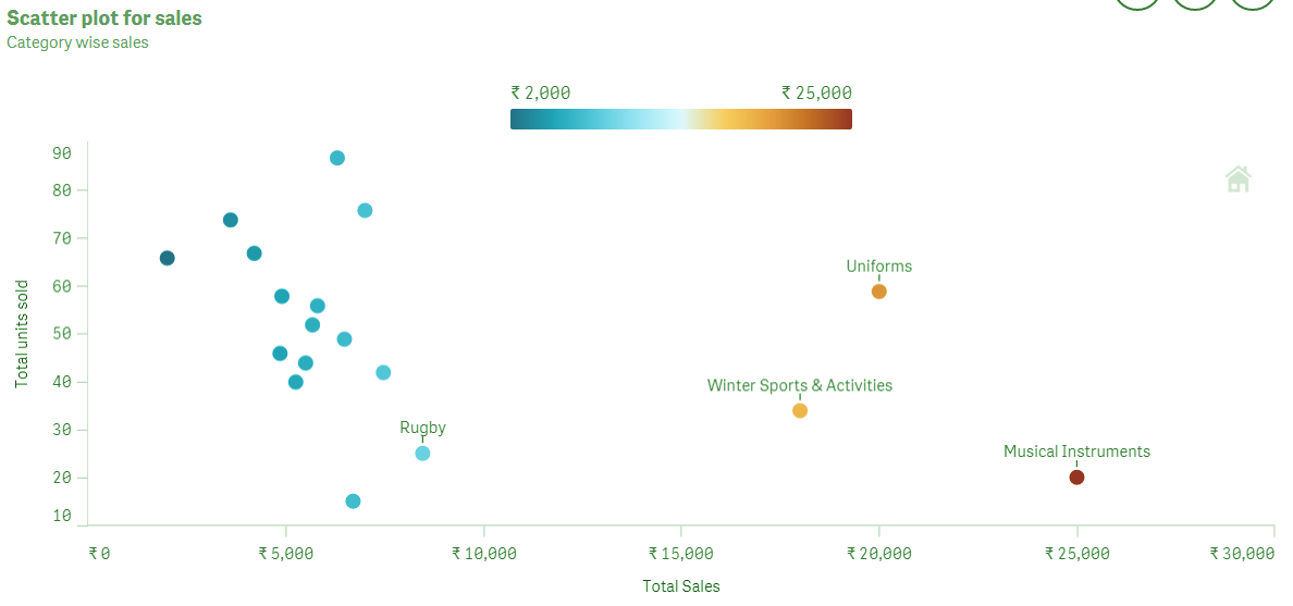
And, if you select the color by measure option then you get gradient color options to choose from. You can also select from the two or three measures you have added in the plot. In the resultant scatter plot, the color grading shows in legend or reference bar given along with it. As you can see in the image of scatter chart given below, the color shades are changing as we move from rupees 2000 to rupees 25,000. And the colors of the dots or bubbles also change corresponding to that moving from left to right along the x-axis.
Select Color by Measure Option
Select Color From two or three Measures
iv. X-axis: (Measure1)
In this section, the properties of the measure field selected as the x-axis measure can be manipulated. You change the label and title settings that is what to show and what not to show, set the position of the axis i.e. bottom or top and adjust the scaling as wide, medium and narrow.
Let’s learn how to install Qlik Sense
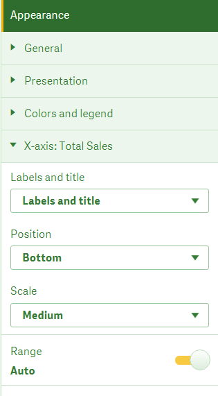
The x-axis in Scatter Plot
v. Y-axis: (Measure2)
The second measure, which is shown on the y-axis can be managed from here. In this section too, you can set the label, title options, axis position and scaling on the y-axis.
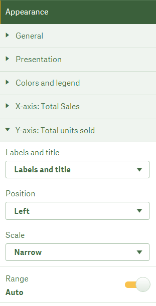
Y-axis in Qlik Sense Scatter Plot
So, this was all in Qlik Sense Scatter Plot. Hope you like our explanation.
6. Conclusion
Hence, in this Qlik Sense Scatter Plot tutorial, we saw how to create Scatter Plots in Qlik Sense. Also, it is just a little challenging to understand these plots until you understand the basics of the plot. Hope we succeeded in explaining you the basics and making the creation of a scatter plot in Qlik Sense easier.
Still, if you have any query regarding Qlik Sense Scatter plot, ask in the comment tab.
See also –
We work very hard to provide you quality material
Could you take 15 seconds and share your happy experience on Google


