Qlik Sense Distribution Plot – Advantages and Disadvantages
Placement-ready Courses: Enroll Now, Thank us Later!
Earlier, we have discussed Qlik Sense Combo Chart. Today, we will see the Qlik Sense Distribution Plot. The next visualization in line is the distribution plot. The distribution plot, as the name suggests is used for one purpose i.e. displaying the distribution and range of data values over a scale. In this tutorial, we will learn about the distribution plot in detail and how to create one yourself in Qlik Sense as well.
Qlik Sense Distribution Plot
1. What is Qlik Sense Distribution Plot?
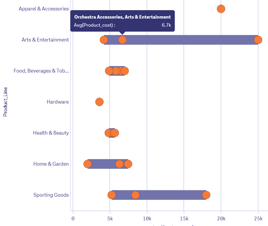
A distribution plot displays a distribution and range of a set of numeric values plotted against a dimension. You can display this chart in three different ways, you can just have the value points displayed showing the distribution, or you can display the bounding box which shows the range or use a combination of both. In the distribution plot shown below, you can see there a range and distribution of the average sales values displayed for each product group. The outer bounding box shows the range whereas inner individual dots show the distribution. Each range and distribution box show how data values for a product group is distributed over the average sales range.
You must read- Qlik Sense Statistical Distribution Function
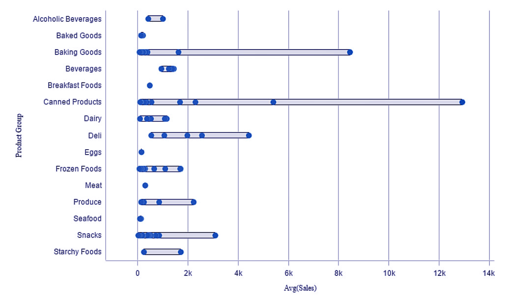
Distribution Plot in Qlik Sense
In a distribution chart, ideally, two dimensions and one measure are used. If so, you will get the individual line of range and distribution. However, you can use one dimension and one measure which will give you only a single line of range and dimension.
2. How to Create a Distribution Plot in Qlik Sense?
In order to create a distribution plot in Qlik Sense, follow the steps given below.
Step 1: Open the editor of the sheet of the application in which you want to create a distribution plot. The editor is opened, from the Edit option present on the toolbar.
Recommended Reading – Qlik Sense Ranking Functions
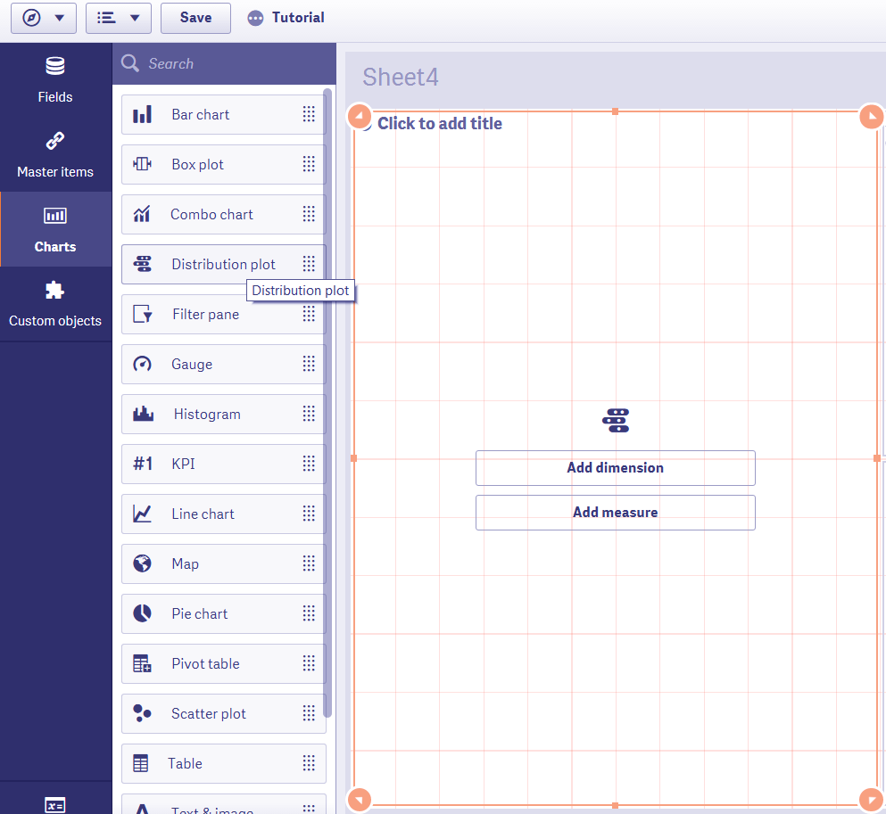
Create a Distribution Plot
Step 2: Select the option Distribution plot (from the Assets Panel) and add it to the editing grid at the center by dragging and dropping.
Step 3: Add dimension and measure to start with creating the plot. You can add another dimension from the Y-axis option given in the data section from the properties panel.
Add Dimension and Measure
Step 4: Once you are done with selecting and adjusting all the aspects of it, the distribution plot will be displayed on the editor instantly. Click Done to bring it on the sheet.
Displaying the Distribution Plot
In the distribution plot that we have made, the inner dimension we took was Product line and the outer dimension is Product category. This means that for each product line entry there will be different data values shown by points on the plot. Here, the product line is taken as the dimension to be displayed on the Y-axis showing the value range and distribution across the range of average sales values.
Do you know about Qlik Sense Geospatial Functions
3. Properties of Qlik Sense Distribution Plot
From the properties panel present at the right of the editor, you can manage different aspects of the distribution plot and make it according to your requirement.
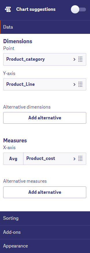
i. Data
From the data tab, you can add as well as manipulate the data in dimensions and measures. You can edit an expression, add a label, set the number formatting etc to make the visualization more customized. Under the dimensions option, you can clearly select a dimension to create points and a dimension for Y-axis. Similarly, you can select a measure to create the X-axis.
Data in Qlik Sense Distribution Plot
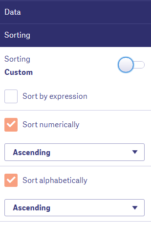
ii. Sorting
From the sorting tab, you can sort the data contained in dimensions and measures in different ways. You can sort by the expression, sort by load order, sort numerically, sort alphabetically etc. Sorting arranges the data as per your viewing choices and analytical requirements.
Explore the latest Qlik Sense Versions
Sorting in distribution plot
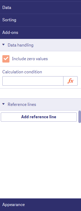
iii. Add-ons
In this section, you can use some data handling options as add-ons to apply certain display conditions on the data being used in the distribution chart. Upon adding a condition, the data only shows if and when a given condition is true. You can also add reference lines from here.
Add-ons in distribution plot
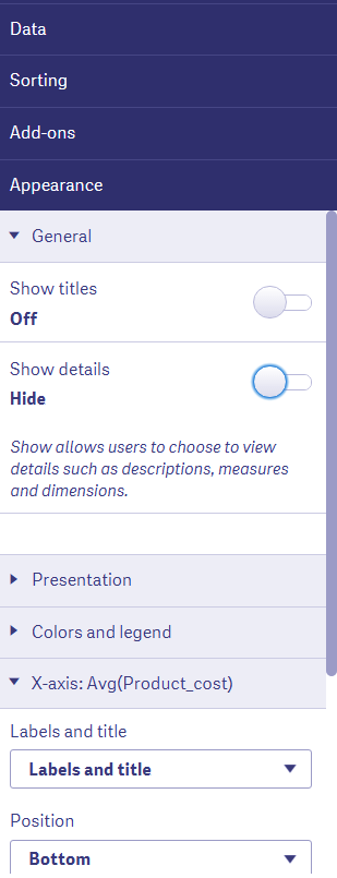
iv. Appearance
The appearance section contains all the settings related to the appearance of the distribution plot.
The first section is the General section that contains options for showing or hiding titles or details on the plot.
Have a look at Qlik Sense Script Syntax
Appearance in distribution plot
The Presentation section gives you options to select between vertical or horizontal orientation of the lines of the plot. You can select what you want to show from the Show tab. Also, you can adjust the grid line spacing, bubble size, and jitter points.
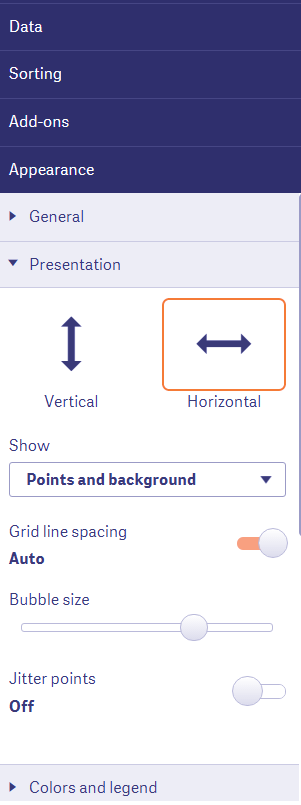
Presentation section in appearance
From the Colors and legends section, you set the coloring criteria for the plot i.e. the colors of box and points.
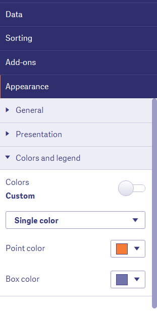
Color and Legends section in Qlik Sense
From the X-axis and Y-axis sections, you can set the label and title, positioning and scaling etc.
Must Read – Qlik Sense Collaboration
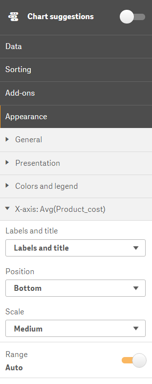
X-axis section for label and title
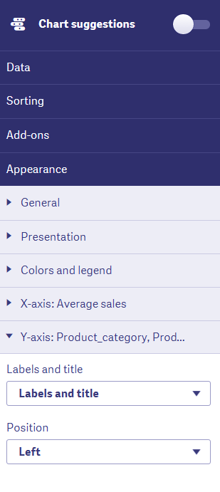
Label and Title in Y-axis section
4. Advantages and Limitations
One major limitation of a distribution plot is that it provides an overview of the values and their distribution. It does not give a detailed account of the ranging and distribution of the values. However, an evident advantage is that it can easily display a general distribution of a set of numeric values over a range.
So, this was all in Qlik Sense Distribution Plot. Hope you liked our explanation.
5. Summary
We hope through this tutorial, you have learned how to create and use a distribution plot for an appropriate purpose in your Qlik Sense app. If you have any queries related to the distribution chart, leave it in the comment box below.
Take the Qlik Sense Quiz and examine your performance
If you are Happy with DataFlair, do not forget to make us happy with your positive feedback on Google


