Qlik Sense Line Chart – Pros and Cons of Line Chart
Placement-ready Online Courses: Your Passport to Excellence - Start Now
1. Objective
In our last Qlik Sense Tutorial, we discussed Exponential and Logarithmetic Functions. Today, we will see Qlik Sense in Line Chart. Moreover, we will learn the basics of a line chart, when to use a line chart. Also, we will discuss the pros and cons of the Line Chart in Qlik Sense. Along with this, we will see how to create a Qlik Sense Line Chart. At last, we will discuss the properties panel and mini chart in Qlik Sense
So, let’s start Qlik Sese Line Chart tutorial.
Qlik Sense Line Chart – Pros and Cons of Line Chart
2. Line Chart in Qlik Sense
We use a line chart to show trends revealed by data represented graphically using lines. We can form the line by connecting all the data points linearly which shows the trends over time. By this, you can see the surges and dips in data values over a certain time period analyzing the performances, profits, and loss etc. In the line chart made in Qlik Sense, you will need a dimension and a measure. The dimension is always on the x-axis and measures on the y-axis. Your data records must have at least two data values for a line chart to be made. There can be gaps in the continuity of time periods like months, fiscal years, quarters etc. Like you might miss the data value for a month or a year which creates a gap in the line of the line chart. In Qlik Sense you can choose ways to display such gaps in the evenly spread data records like you can show them as actual gaps in the line, as connectors or as zeros.
You must learn Qlik Sense Treemap Visualizations
3. Pros and Cons of Qlik Sense Line Chart
The one evident advantage of a line chart is that it is very easy to understand and make. However, some of the disadvantages include not being able to use too many lines as it makes the line chart and the information on it cluttered and hard to understand. There are certain ways to handle large amounts of data as only a line showing up to 1000 data values can be made. In such situations, data points are shown in data sets which are referred to as limited data sets having only a part of the entire data.
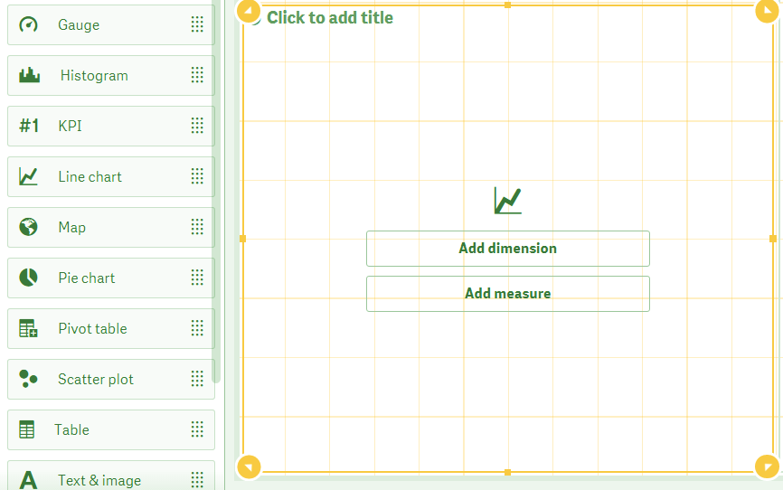
4. Creating a Line Chart in Qlik Sense
Follow the steps given below to create a line chart in Qlik Sense.
- Go to the editor of the sheet that you want to create a line chart in. Select a line chart from the charts list of the assets panel and drag it on the editing grid.
Create a Line Chart
- Add a dimension and a measure (you can add more than one also) either from the properties panel or from the Add dimension and Add measure options given on the empty line chart.
- This will create a line chart. For reference purpose, we have created a line chart using sample data to show total sales for different cities. Although this does not include a time period as a dimension, it still serves the purpose of comparing one city to the other.
Have a look at Qlik Sense Color Functions
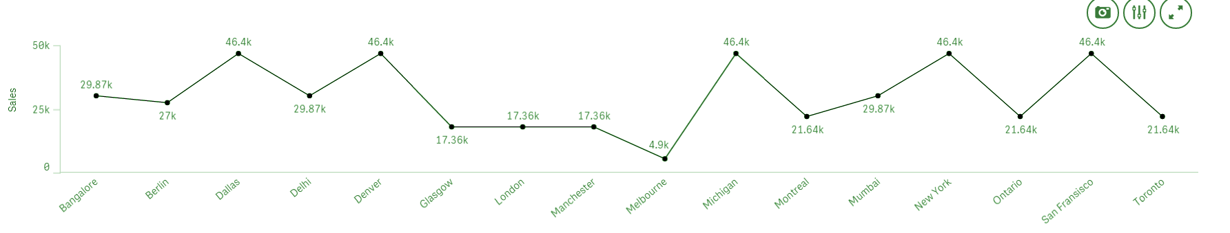
Creating Line Chart using Sample Data
You can also create an area type of line chart which fills the area under the line with the same shade as of the line.

Create Area Type of Line Chart
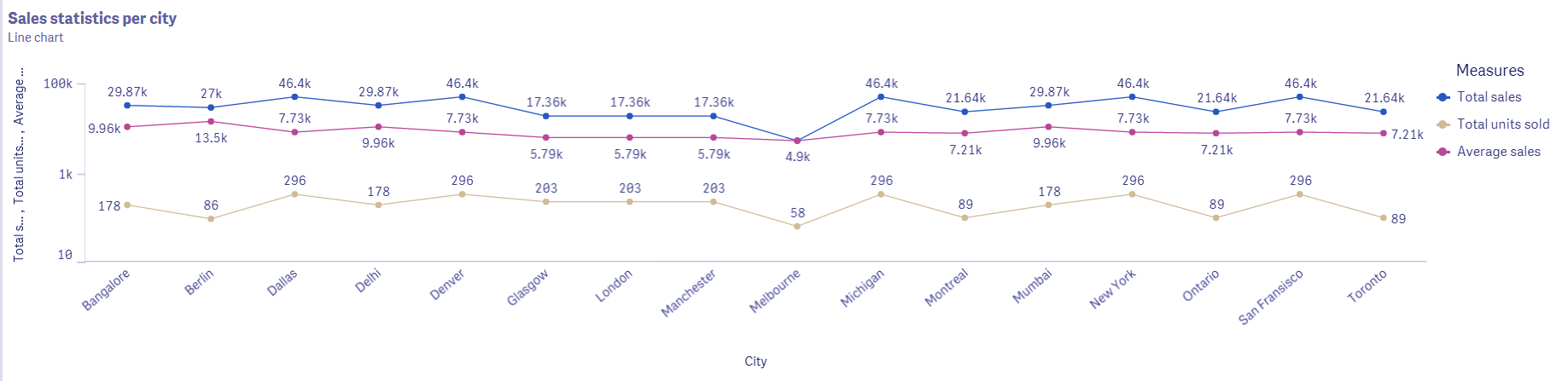
We can include more than one line in a line chart by adding more measures to the same dimension. You can add up to 15 measures in a line chart.
Adding Measures in Line Chart
As you can see in the image of the line chart given above, there are three lines each showing values for different measure fields i.e. total sales, average sales, and total units sold. You can also assign different colors for each line.
Let’s discuss Qlik Sense Filter Pane
5. Properties Panel in Qlik Sense Line Chart
All the settings and properties of the line chart manage from the properties panel of the line chart present at the right in the editing view. There are different sections in the properties panel.
i. Data
From the data section, we can add dimensions and measures. You can add expressions to every dimensions and measure, add labels and set a number format in which the data values must be displayed.
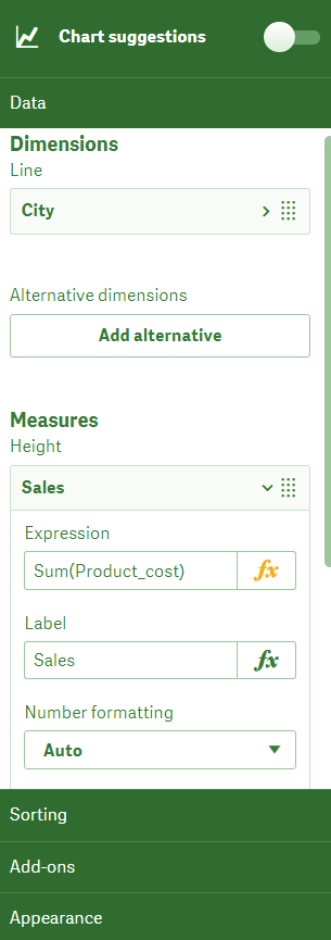
Data in Qlik Sense Line Chart
ii. Sorting
All the data fields (both dimensions and measures) that you use in a line chart are shown in as a list in the sorting section. You can rearrange their order by dragging them up or down according to your needs. This sets the priority for fields and they are displayed on the chart according to that.
Do you know about Qlik Sense Text and Image Visualizations
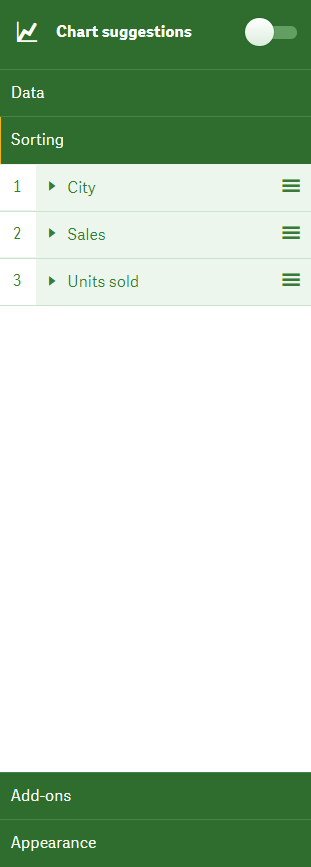
Sorting in Qlik Sense Line Chart
iii. Add-ons
The add-ons settings tab includes options to put a condition on displaying of the object i.e. if the condition you set here evaluates to be True then and only then the object will be displayed on the sheet and if it evaluates to be False then the message you write in the Displayed message will be displayed.
Also, you can add a reference to another sheet object or data record in the current visualization by the Add reference line option from where you can set the label, color expression condition etc. the reference line added.
Let’s revise Qlik Sense Key Concepts
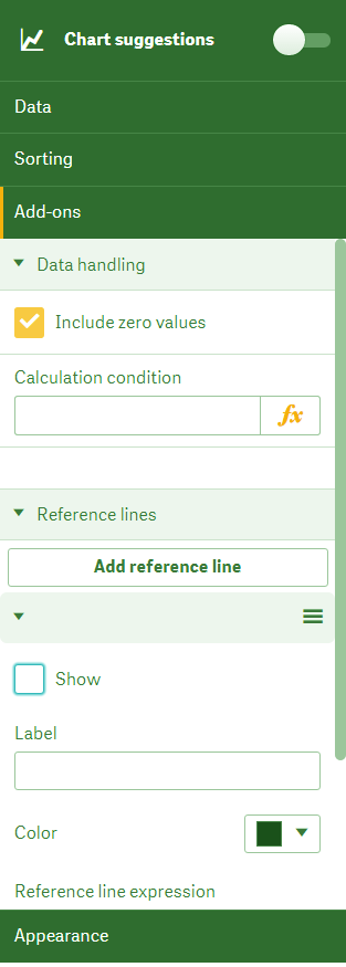
Add-ons in Qlik Sense Line Chart
iv. Appearance
The appearance section contains all the settings related to visual elements of the line chart. There are several sub-sections of this tab which have specific settings option.
a. General
The general section has options for show/hide titles. This means informative text on the line chart describing briefly what the visuals in the line chart are showing. You can add many layers of titles like a main title, subtitle and a footnote. If you want to show even more detail about the measures and dimensions, then activate the Show details option.
Have a look at Qlik Sense Advantages and Disadvantages
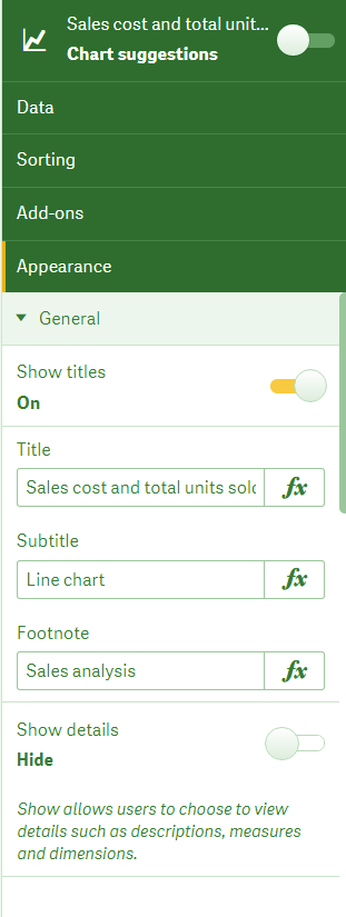
Showing details in Qlik Sense
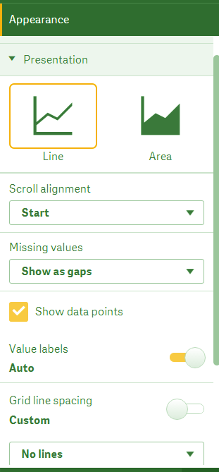
b. Presentation
From this tab, you can set the presentation of the line chart in different ways. You get two options, line and area chart which we have shown in previous sections. Other than this, you can set the scroll alignment, missing values presentation, show/hide data points, label values and set the degree of grid line spacing.
Let’s revise Qlik Sense Capabilities
Qlik Sense Line Chart Presentation
c. Color and Legend
The colors and legends section has settings for color coding the line chart based on different criterions like having a single color (mostly used for single lines), multicolored (when you are using more than one line), by dimension and by measure. If you choose By measure coloring criterion, then you get four coloring schemes to choose from. These schemes are the sequential gradient, sequential class, diverging gradient and diverging class which is the styles of color shading you might like to have. Also, you have options to show/hide legends which gives details on what the colors of different lines represent.

Color and Legend in Qlik Sense Line Chart
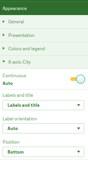
d. X-axis: (Dimension name)
In this section, you can set properties related to the dimension which is on the x-axis. You can select what to display from the labels and titles bar, set the label orientation and position.
You must read Qlik Sense Gauge Chart
The x-axis in Qlik Sense
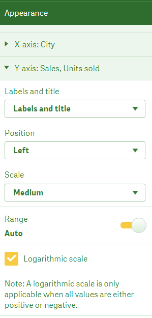
e. Y-axis: (Measure name)
From this section, we can manage the measures that make up each line of the chart (if selected more than one) on the y-axis. Here you have settings options like labels and titles, the position of the y-axis, and degree of scaling of values on the axis. If you set the range option on Auto, it calculates the minimum and maximum of the y-axis values and sets the range accordingly. You turn off the auto mode and set the range manually also. The option is given at the bottom, Logarithmic scale applies a calculation on the data (useful when you are using more than one measure and have several lines) and adjusts the line chart properly.
Y-axis in Qlik Sense
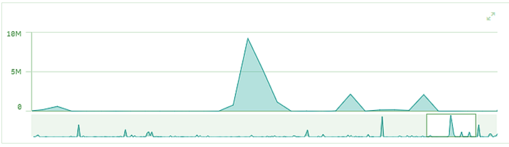
6. Mini Chart in Qlik Sense
A mini chart is made when the number of values of the dimension exceeds the limit and cannot fit on the x-axis. The mini-chart is made and shown below the x-axis of the line chart. It shows the entire chart in a condensed form and you can select sections of the line chart values from a scrollable or slidable window. We use a mini chart when we have a large amount of data with many dimension values so that we can access it all from one display section. The section of the line chart that you select from the scrolling window will zoom into details on the main line chart.
Let’s revise Qlik Sense Box Plot
Qlik Sense Mini Chart
So, this was all in Qlik Sense Line Chart. Hope you like our explanation.
7. Conclusion
Hence, in this Qlik Sense in Line Chart Tutorial, we learned about the significance of line chart in Qlik Sense, its advantages, and limitations. Also, we saw procedure to create it and manage its settings and properties from the properties panel. We hope the information provided here was useful enough for you and helped you in creating line charts in your own Qlik Sense applications.
Still, if you are facing any issues regarding Qlik Sense Line Chart, ask in the comment tab.
See also –
Qlik Sense Conditional Functions
Did you know we work 24x7 to provide you best tutorials
Please encourage us - write a review on Google


