Qlik Sense Pie Chart – Advantages and Disadvantages
Interactive Online Courses: Elevate Skills & Succeed Enroll Now!
1. Objective – Pie Chart in Qlik Sense
In our last Qlik Sense Tutorial, we discussed Qlik Sense Conditional Functions. Today, we will see the Qlik Sense Pie Chart Tutorial. In this, we will learn how to create a Pie Chart in a Qlik Sense application and when should you use Pie Chart in your analysis. Also, we will explore the properties panel from where you can configure and manage the Qlik Sense Pie Chart as you like.
So, let’s start the Qlik Sense Pie Chart Tutorial.
Qlik Sense Pie Chart – Advantages and Disadvantages
2. Qlik Sense Pie Chart
We have used pie charts quite a lot of time as they are the most basic form of representing data showing the relationship between different data information. The pie chart is divided into sections like pieces of pie corresponding to the proportion of that data value, i.e. larger the value, bigger the section of the pie chart. It shows the individual share of data in relation to the whole.
Have a look at Qlik Sense Gauge Chart
For instance, look at the pie chart shown in the picture below.
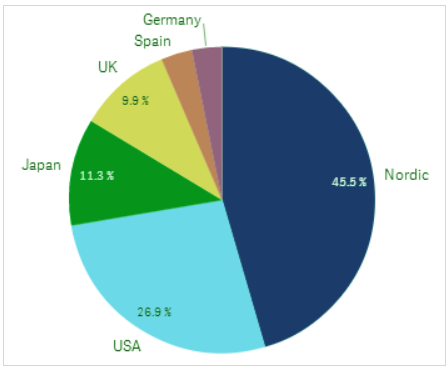
Pie Chart in Qlik Sense Representing Sales Region
This pie chart represents sales per region, in the countries UK, Spain, Germany, Japan, USA, and Nordic. As you can see Nordic has the highest sales share of 45.5% of all.
3. When to Use a Qlik Sense Pie Chart?
In Qlik Sense or in any BI tool, the most ideal scenarios to use a pie chart in are when you want to compare two aspects of an information or see the contribution of different elements in a scenario. Pie Charts are widely used in data analysis where there are sub-categories to a category like several countries in the category ‘Region’, or types of products in the category ‘Electronics’. Pie charts are ideally used for comparing sectors or parts to the whole by graphical representation.
Do you know about Qlik Sense Treemap Visualizations
4. Advantages & Disadvantages of Pie Chart
There are several advantages and disadvantages of pie charts. Like one major benefit is that a pie chart can efficiently and instantly provide the visual of data information being divided into sectors proportionately. But, the visual efficiency of a pie chart remains intact only till when you use 10 or lesser dimensions which makes sectors of the pie. If the number of dimensions goes more than 10 then the visual gets messy and difficult to understand. Another issue that comes with using pie charts is that it takes up a lot of space on the sheet and so, is difficult to use when a compact visualization is needed.
5. Creating a Qlik Sense Pie Chart
Follow the steps given below to create a Pie Chart in Qlik Sense.
- Open the sheet in the Qlik Sense app that you want to create a Pie Chart in. Go to the Edit option which opens the sheet editor.
- From the Assets panel in the editor select Charts and drag an empty Pie chart to the central editing grid.

Qlik Sense Pie Chart – Assets Panel
- Instantly add one dimension and measure in the pie chart from the options Add dimension and Add measure. This will create a pie chart based on the dimension and measure added by you.
You must read Box Plot in Qlik Sense Visualization
- Click on Done button to finish editing and get the pie chart on the sheet.
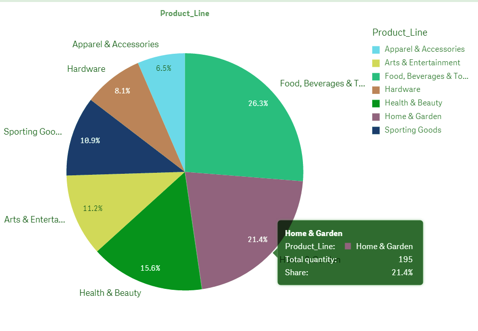
Pie Chart on the Sheet
A pie chart created like this will have some default settings like color by dimension, the dimensions are shown clockwise in descending order, and the value labels are shown in percentage. Although such settings can be changed from the properties panel which we will discuss in detail in the section to follow. The same chart can be made as donut representation.
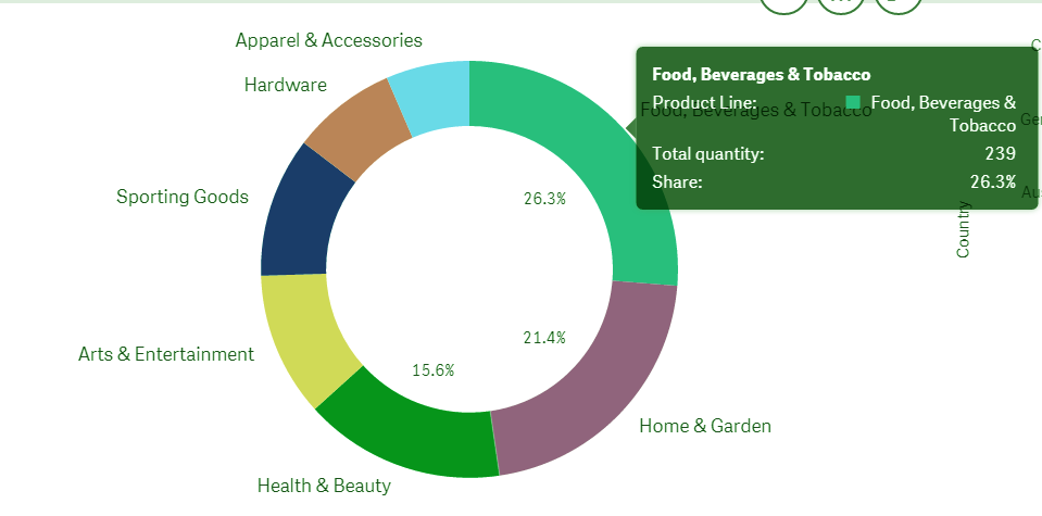
Donut Representation in Pie Chart
The pie chart we created in the steps has Product line (the type of products) as dimension and product quantity as the measure. So, as you can see, there are seven product lines constituting the seven sectors of the pie chart, each showing share percent, total quantity, the name of the product line and color associated with it. On the top right, the legend is shown which is a reference to colors assigned to each product type. Also, when you hover the cursor over a sector it shows all the details related to it. The sectors descend in their size hence share percent when moved in clockwise direction i.e. the largest sector (having the most product quantity, share percent and size) is on the right moving down and coming to the sector with the least size as we complete the circle.
Let’s discuss Selections in Qlik Sense Visualizations
6. Properties Panel in Pie Chart
The properties panel is responsible for all the settings and properties of the pie chart. The properties panel specific to the active object in the editor appears on the right-hand side. There, you will find different sections for specific to set different properties.
i. Data
From the Data section, you get to manage the dimension and measure you add in the pie chart. It refers to as ‘slice’ and ‘angle’ in the as the dimension constitute the slice or sector of the pie and measure decides the central angle of that sector. You can set the expression, label, and formatting of the numbers from this section.
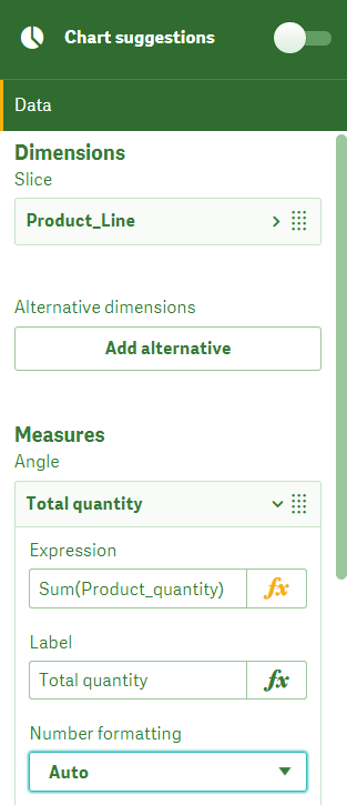
Data in Qlik Sense Pie Chart
ii. Sorting
From here you can sort the order of fields that you select from the data section. You can change the order of fields by switching their positions by dragging them up or down.
Let’s learn how to create a Qlik Sense App
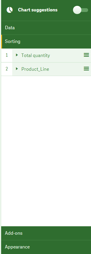
Pie Chart Sorting
iii. Add-ons
From this section, you can add some extra conditions under data handling which controls the using and showing of data in the object.
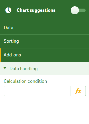
Add-ons in Pie Chart
iv. Appearance
The appearance section takes care of all the presentation related settings and properties. From the different sub-sections of the appearance tab, you can change things like titles, type of pie chart, coloring criterion etc. The first to come is the General tab from where you can select whether to show/hide the titles, subtitles, footnotes, and descriptions.
Have a look at Qlik sense System Requirements
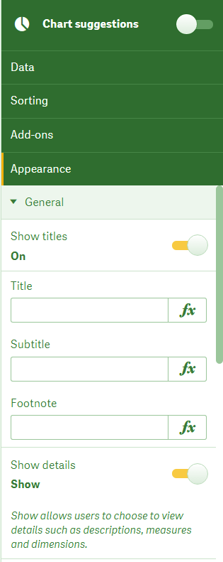
Show or Hide the Titles in Pie Chart
Next comes the Presentation tab which gives you two ways to display the chart; pie and donut. Also, you can show/hide the dimension labels, value labels in percentage (share) or simple numeric values or none at all.
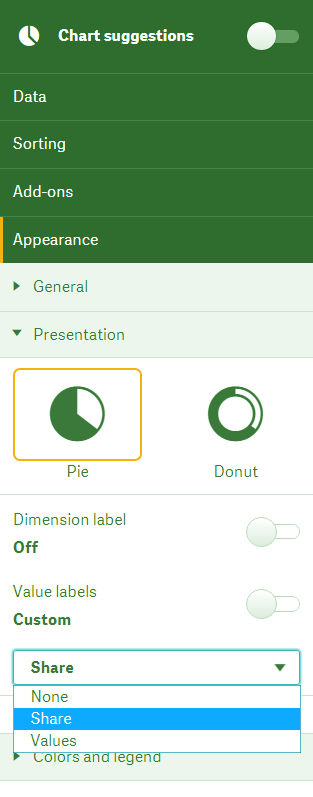
Dimensions Labels in Qlik Sense Pie Chart
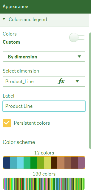
The Colors and legend sections allow you to set the coloring criterion for the pie slices/sectors. You can color the slices by dimension, by measure (which is a gradient coloring) or by expression.
Do you know about text and image visualizations
Color the Slices in Qlik Sense
So, this was all in Qlik Sense Pie Chart. Hope you like our explanation.
7. Conclusion
Thus, in this lesson, we learned about creating a pie chart in Qlik Sense applications. Also, we discussed some other aspects of pie charts as well like when the best situation is to use them in data analysis, and major advantages and disadvantages in using them. However, pie charts are still the most convenient and useful visualization to create and use in your data analysis.
Share your experience of reading Qlik Sense Pie Chart Article through comments.
See also –
Did you like our efforts? If Yes, please give DataFlair 5 Stars on Google


How do i change the font size of the value in the same Pie Chart, Can any one help!!!