Maps in Qlik Sense – 5 Main Layers of Qlik Sense Maps
Expert-led Courses: Transform Your Career – Enroll Now
Earlier, we discussed Tables in Qlik Sense. In this article, we are going to learn about Maps in Qlik Sense. Maps visualization is a unique and important feature of this tool. We use advances geological graphics in maps visualization along with the availability of satellite view. Let us begin with learning about maps and how to create maps in Qlik Sense sheets better.
So, let’s start exploring Maps in Qlik Sense.
Maps in Qlik Sense – 5 Main Layers of Qlik Sense Maps
1. What are Maps in Qlik Sense?
We use maps to geographically display the data loaded in Qlik Sense. Any data which is based on information related to countries, cities, states, region etc., can be displayed using maps visualizations. In maps, first there is a base map which establishes a base impression of the world map, then comes the layers upon it, which are the specific locations highlighted on the map in different ways like area, points, density, lines etc. Hence, a map is comprised of a base map and layers. You can add as many layers as you want. Layers are basically the data values of dimensions or measures. If you want to see specific data points on specific locations, like average sales per city, you can select the points layer on a base map layout. This will show points of certain size and color on the location of specific cities showing the average sales there.
What are Maps in Qlik Sense
In a map, you can set a location scope which sets the focus on one area in the map. Or, if you have a large data set you can create drill-down dimensions (hierarchical arrangement of fields) and add it to a layer. This provides more data which we can view in limited scope by drill-down.
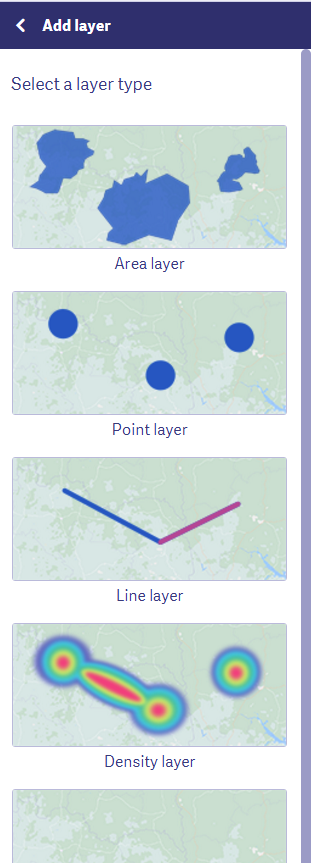
2. Layers in Qlik Sense Maps
Layers are the way through which you display your data on different locations on the map. These are comprised of dimensions and measures. You can add multiple layers which overlap on each other and even set a zoom level for them. By setting the zooming level, you fix after how many drill-downs will a certain layer show. This arranges the data in detailed layers which is easier for you to comprehend and analyze. In Qlik Sense there are five types of layers available.
Recommended Reading – Qlik Sense Mapping Functions
i. Point Layer
In a point layer, data values are displayed as points on corresponding locations on the map. The points can be in different shapes like bubble, triangle, square, pentagon, and hexagon. You can either keep the size of the point fixed or varying according to the measure or the expression. A point layer can contain or display up to 50,000 points at a time on the map.
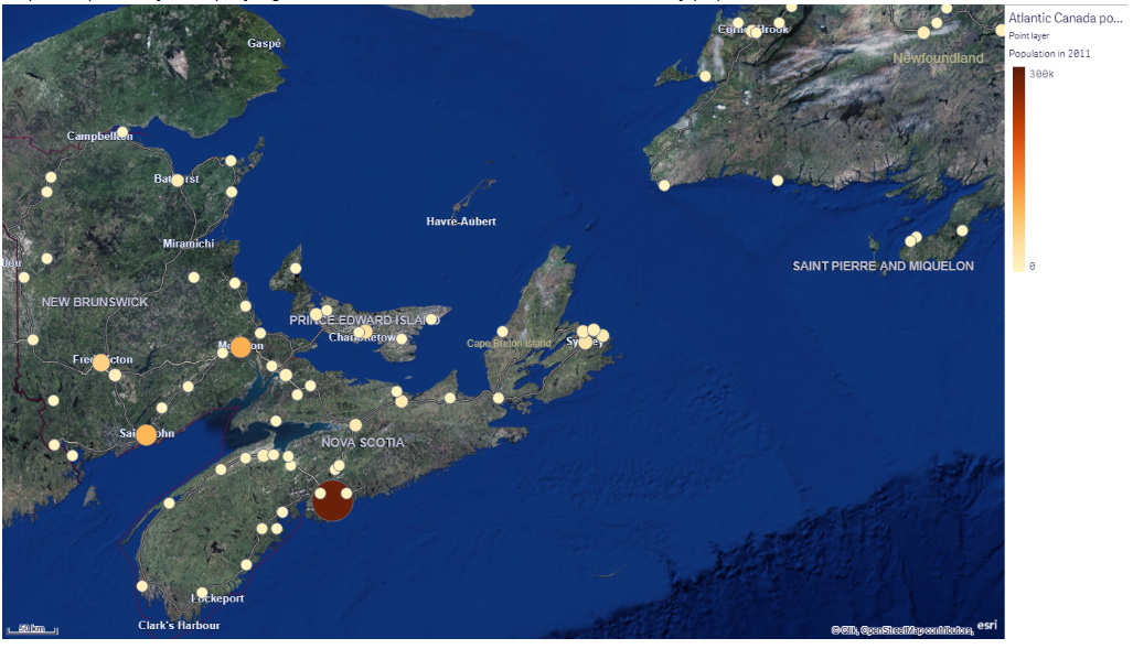
Point layer in Qlik Sense maps
ii. Area Layer
The area layer displays an entire area corresponding to a data value in shaded color. You can select the color scheming and criterion for coloring the areas. The areas can be a country, sate, city etc. You can display up to 10,000 different areas on an area layer at a time.
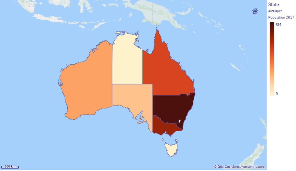
Area Layer
iii. Line Layer
A line layer connects two data points and shows a line between them. We can also color code the lines. Also, you can add an arrow and set the width and curvature of the line. A good example of using line layer is when you want to show air traffic of flights between different cities of different countries. You can display up to 20,000 lines at a time on a map.
You must read about – Qlik Sense Treemap Visualization
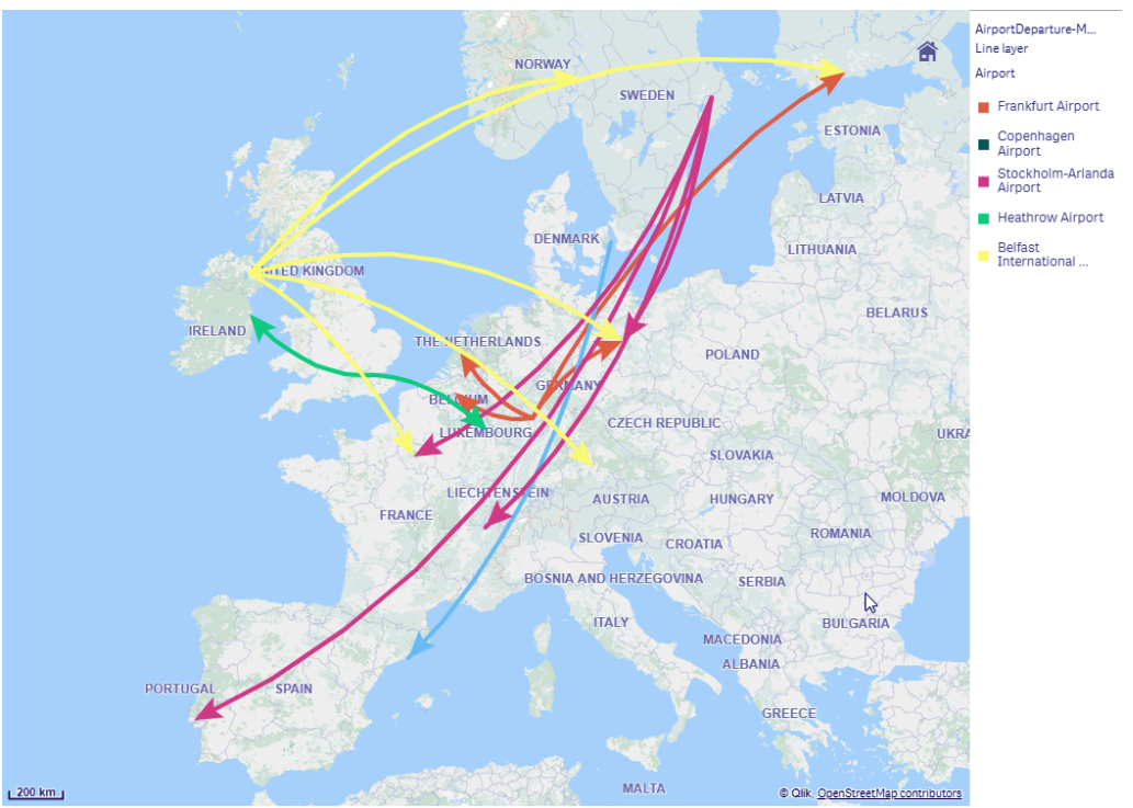
Line Layer
iv. Density Layer
The density layer shows the density point corresponding to the magnitude of data values. The points are shown like influence points with their center showing the highest influence and it declines on the outer areas of the point. Through the properties panel, you can set the radius, color, and scale of the influence point. This layer is used when you want to show activity hotspots, population densities etc. on the map.
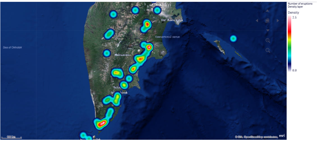
Density Layer
v. Background layer
Background layer is a custom base map layer which you can add according to your requirement. For instance, a background map of an airport can be used as a base map upon which you can add a point layer showing WIFI hotspots available at different locations at the airport.
Let’s revise Qlik Sense Line Chart
Background Layer
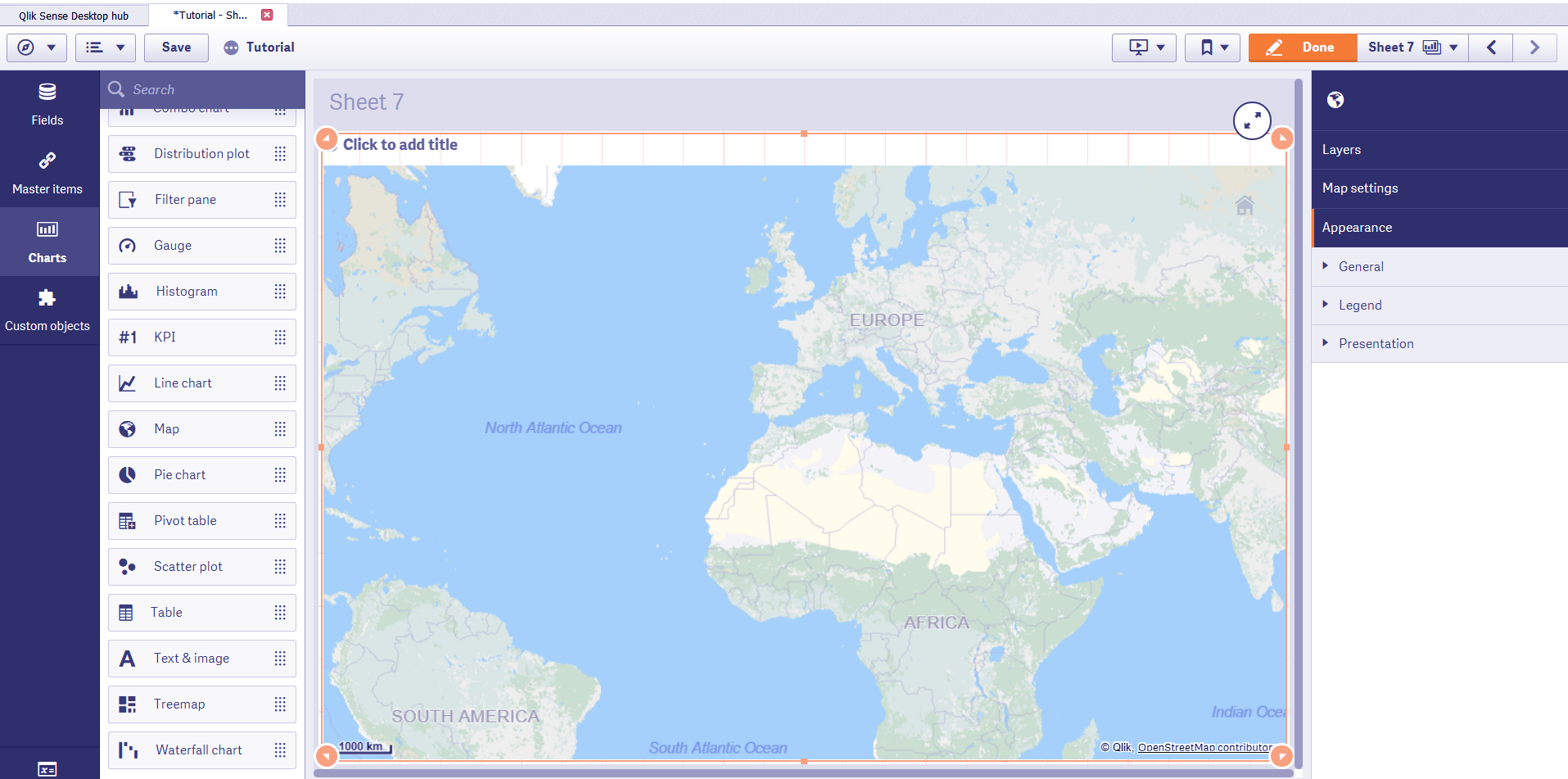
3. How to Create a Map in Qlik Sense?
Follow the steps given below to create a map in Qlik Sense app.
Step 1: Go to the sheet editor by clicking on Edit option on the sheet. In the editor, go to Charts from the panel given at the left. From the list of charts, select the options Map and drop it on the editing grid given at the center. The base map will be displayed.
Create a Map in Qlik Sense
Step 2: Add layers on the base map from the properties panel given at the right.

Add layers
You can select from the different types of layers available in the properties panel.
You must look at Qlik Sense Scatter plot Visualizations
Select from the different type of layers
You can add data by adding a dimension from the properties panel. Each layer has its own set of options to adjust the settings from. We will explore the settings options in the properties panel section.
4. Properties panel in Qlik Sense Maps
The properties panel contains setting options for both individual layers and the map in general. In this section, we will discuss the different sections present in the properties panel.
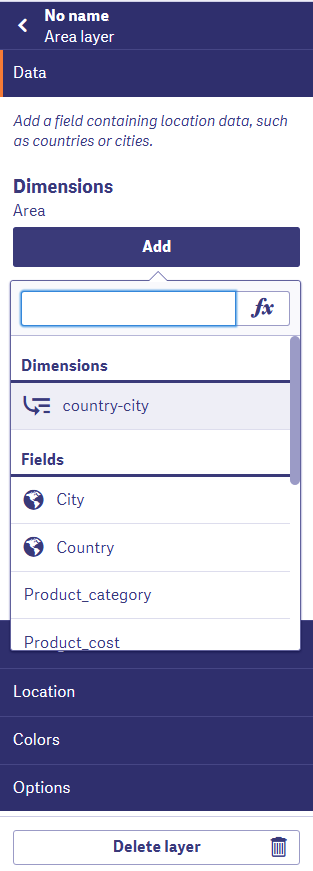
i. Layers
All the layers that you create are shown in the layers tab.

Layers in Property Panel
Click on the arrow beside the name of the layer to access its properties. For each layer, you get tabs like Data, Sorting, Location, Colors, and Options.
Do you know about Qlik Sense Null Functions

Access the properties
We can adjust and manage every aspect of the layer from here. From the Data tab, you can add a dimension (normal or drill-down). Make sure you have a field containing locations to add on the map as a layer.
Adjust the layer
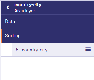
You can sort the dimensions added on the layer from the Sorting tab.
Recommended Reading – Qlik Sense Capabilities
Sort the Dimensions
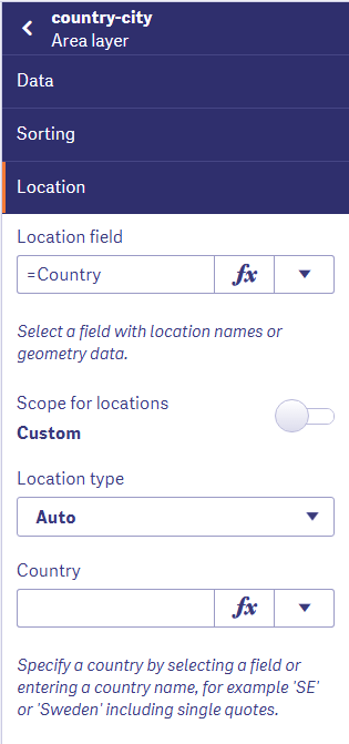
You can set a specific location on which the map should be focused or set a scope for the locations, add conditions etc., from the Locations tab.
Set a Specific Location
From the Colors tab, you can set the coloring criterion for the areas or points or lines of the layer.
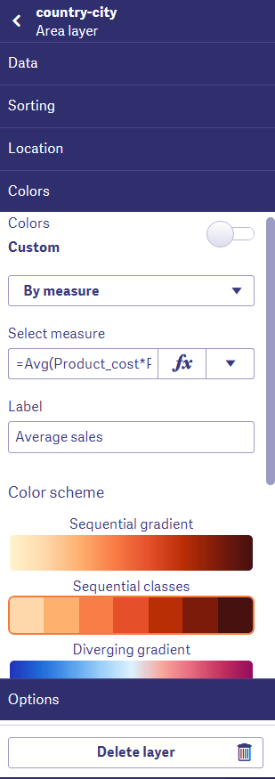
Colors tab in Qlik Sense map
The last tab is the Options tab has the general and layer display tabs. From the general settings, you can manage the legends, set the maximum number of objects that display in the field, show/hide the label. And, from the layers display tab you can set the zooming levels of a layer, show/hide the layer etc.
Let’s discuss how Qlik Sense Manages Data

Layer display tabs
ii. Maps settings
From the map settings tab, you can select the type of map that you want from the base map option. You can select the projection type, map language, type of measurement unit for scaling, and selection method.
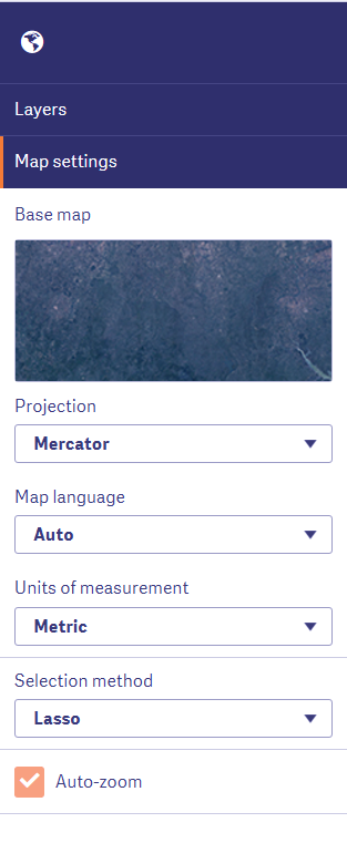
Select the type of map
You must look Qlik Sense Visualization Expression
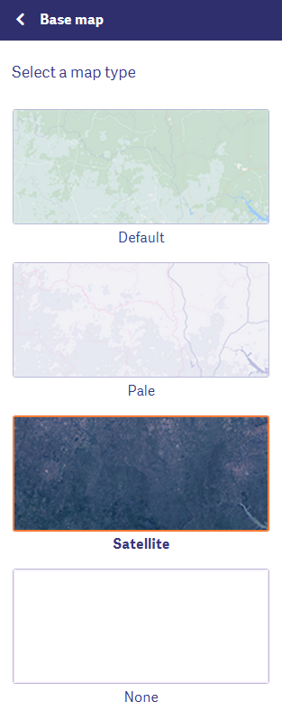
Select the projection type
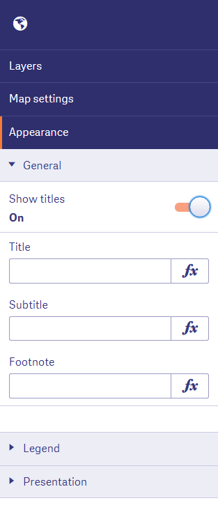
iii. Appearance
From the appearance section, you can add the titles, subtitles, footnotes on the map.
Appearance Section
Adjust the legend settings and position.
Do you know about Qlik Sense Smart Search
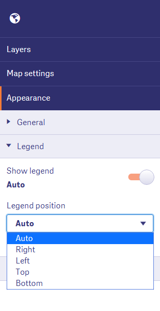
Legend Setting and Position
From the presentation tab, you can set the navigation, zooming, panning, show/hide scale bar etc.
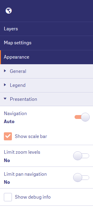
Set the navigation show/hide scale bar
5. Displaying the map on sheet
When you add all the layers and create the map according to your needs. You click on Done to exit the editor. The map will be displayed on the sheet.
You must read the latest Qlik Sense Versions
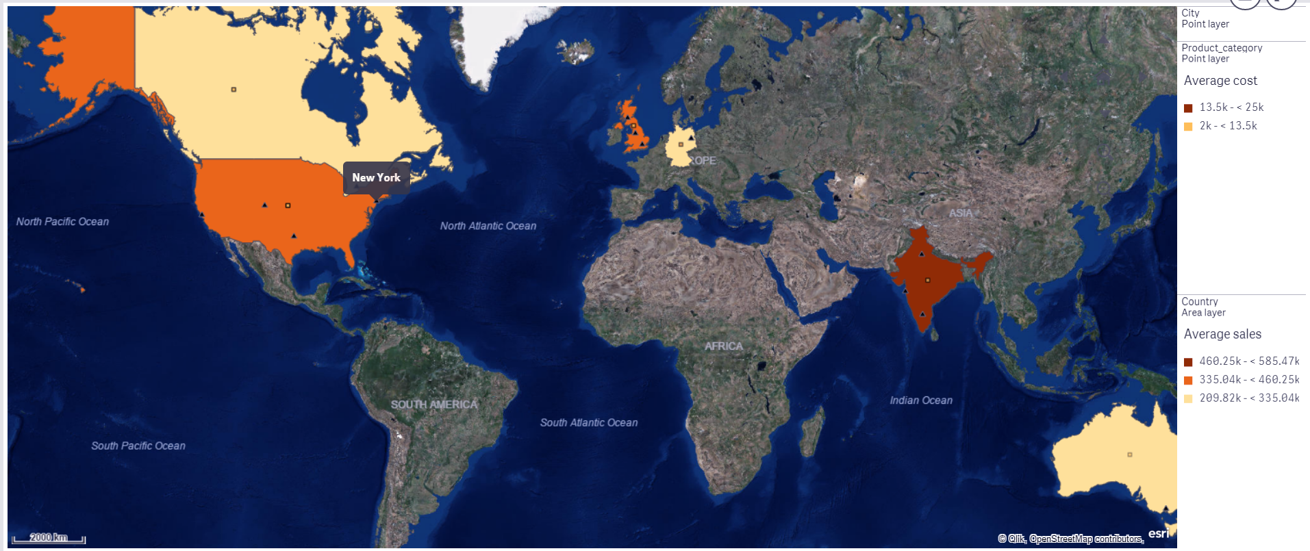
Displaying the Map
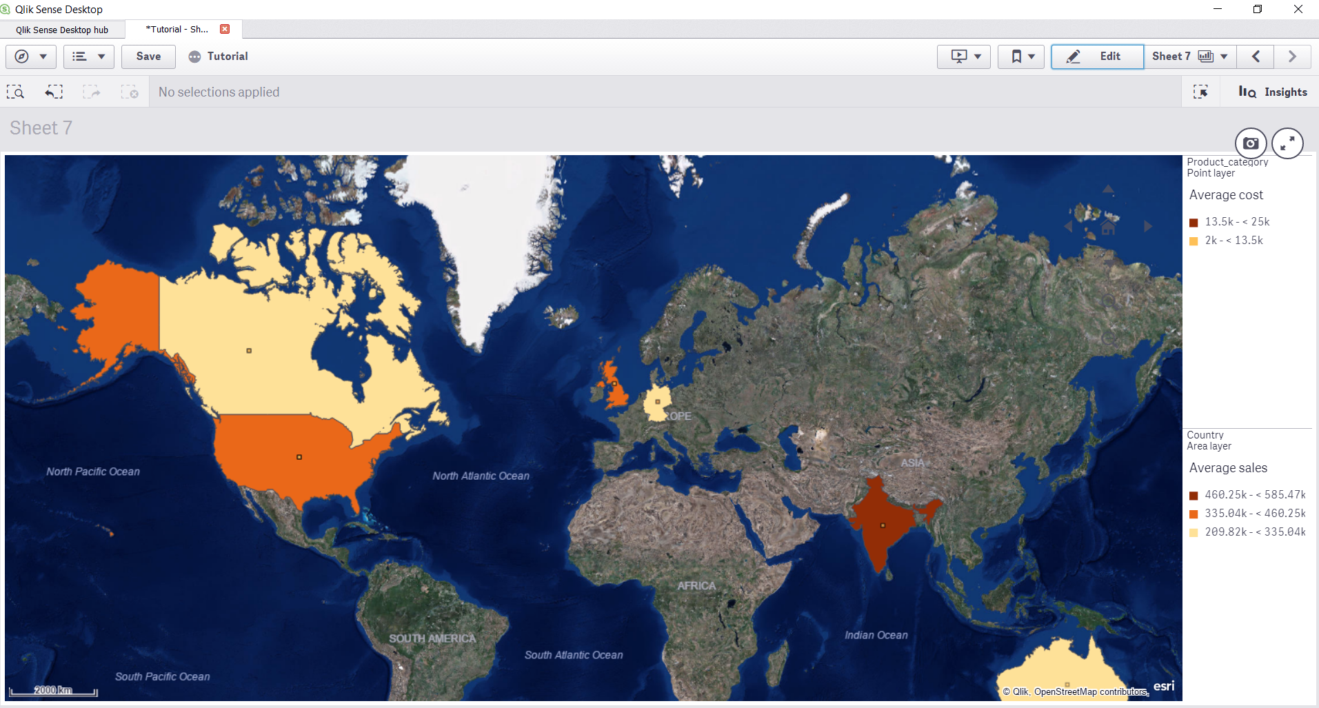
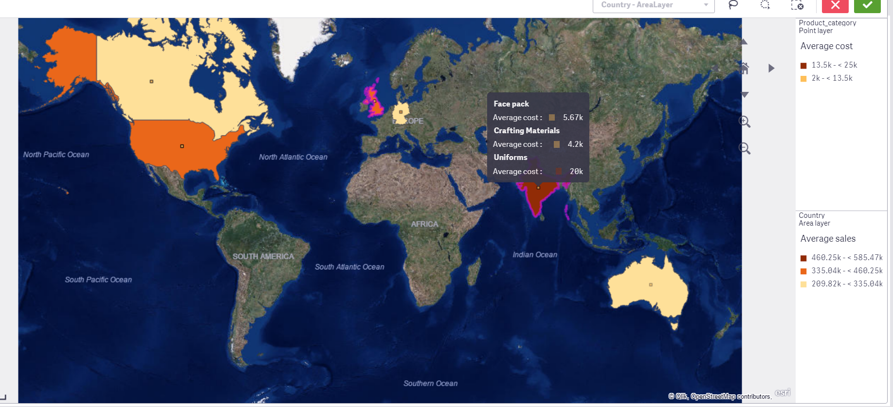
The map given above shows the average sales in different countries highlighted by colored areas. The point layer on the area layer represents the items sold in that country. For instance, in the map given below the average cost for items sold in India are shown.
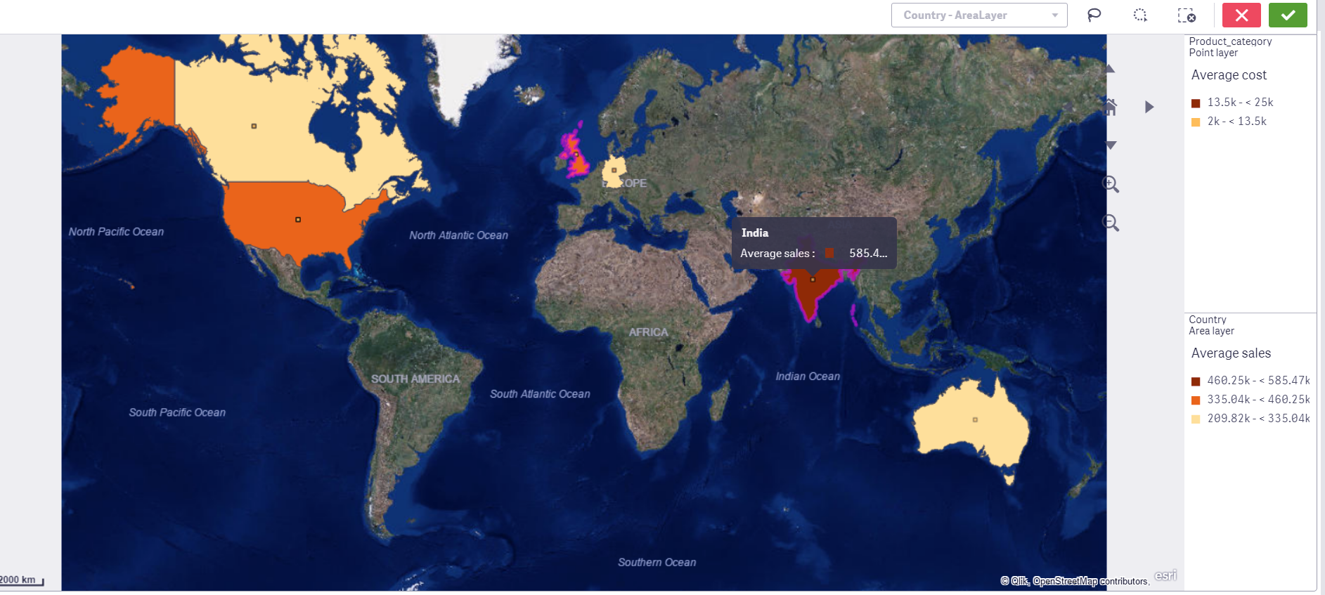
Items sold
Displaying the map on sheet
So, this was all about Maps in Qlik Sense.
6. Summary
This brings our tutorial on maps to the end. We hope this explanation helped you in learning about how to use the maps feature in Qlik Sense. Now try and make Maps in Qlik Sense for your data as well.
In case of any queries related to Qlik Sense Maps, drop your comments in the comment box below.
Also check –
If you are Happy with DataFlair, do not forget to make us happy with your positive feedback on Google


