Qlik Sense App – How To Create a Qlik Sense Application
Expert-led Online Courses: Elevate Your Skills, Get ready for Future - Enroll Now!
1. Objective – Qlik Sense App
Earlier, we saw how to install Qlik Sense. Today, we will see the Qlik Sense App. Moreover, we will look at creating a Qlik Sense Application. It is time for you to learn how to create your first Qlik Sense App.
So, let’s start the tutorial for Creating Qlik Sense App.
Qlik Sense App – How to create Qlik sense Application
You can download the dataset used in this blog here
2. Creating Qlik Sense Application
i. Logging in
Step 1: Once after installing Qlik Sense Desktop, you need to log in with your account as an authorized user. Choose the first option if you are using the free version otherwise select the ‘Add authentication link’ option.
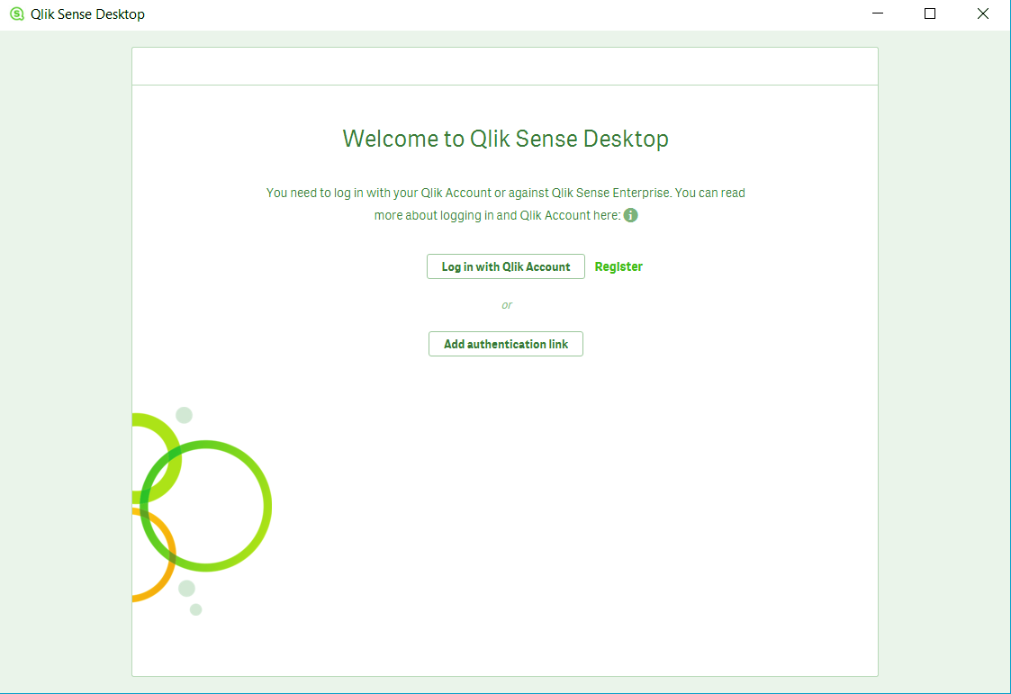
Qlik Sense App – Logging
Step 2: Now, you will be asked to enter the username and password of the Qlik Sense account.
Have a look at Qlik Sense Data Model
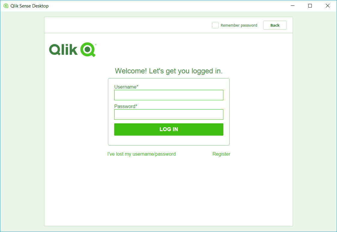
Create Qlik Sense Application – Log in
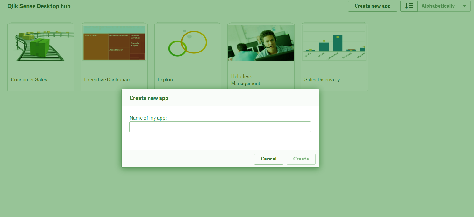
Step 3: As soon as you log in, you will enter the Qlik Sense Hub where the option ‘Create a new app’ will appear. Select that option.
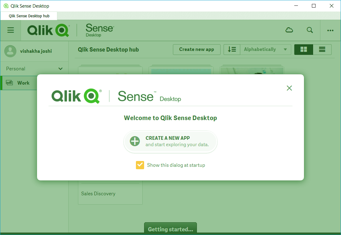
Qlik Sense App – Logging
Do you know about Qlik Sense Text and Image Visualization
ii. Creating a New App
a. Step 1: Naming the App
The first step in creating an app is assigning a name to the application. Enter the name as per your liking.
Qlik Sense App – Naming the App
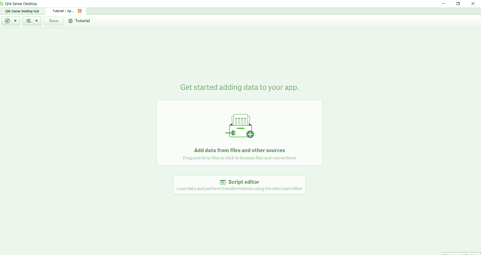
b. Step 2: Adding Data
Now we enter the newly created application. As you can see, there is an option given at the very center to add data from files. Select that option to load data from external sources.
Qlik Sense Application – Adding Data
Let’s revise Qlik Sense Treemap Visualization
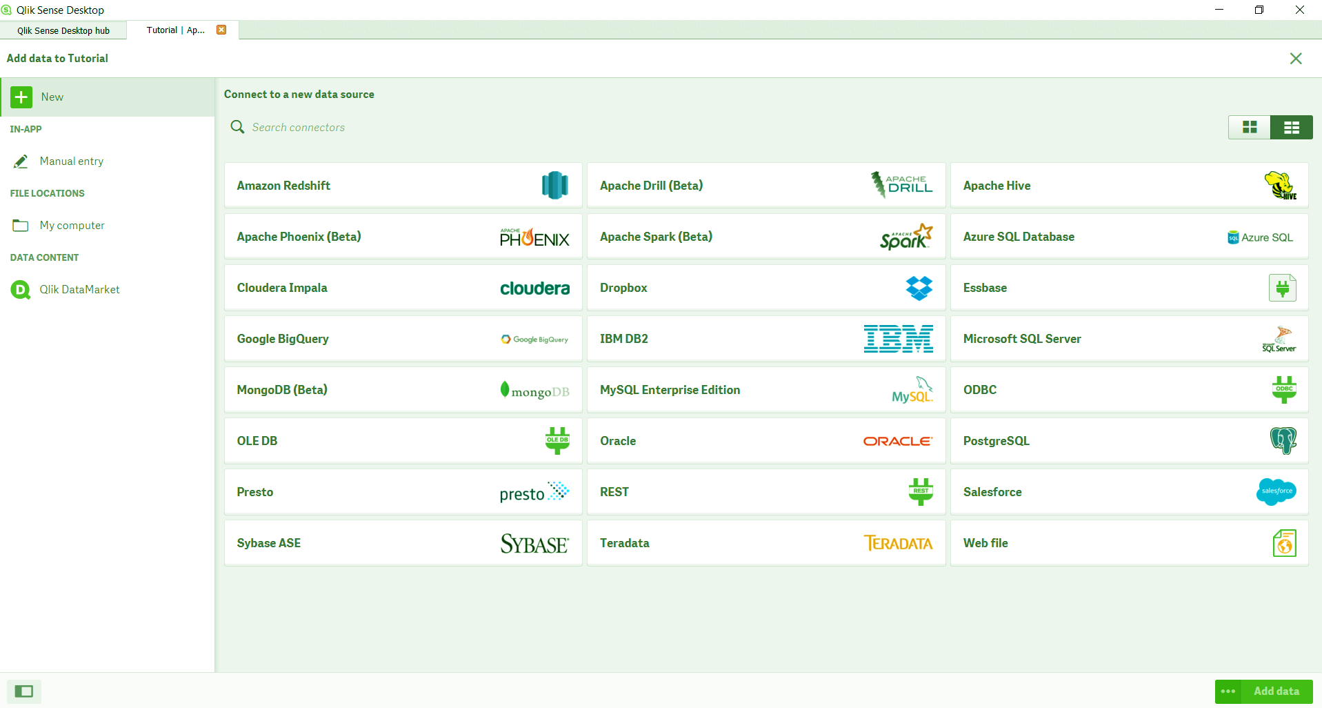
c. Step 3: Selecting the File Path
In the window opened now, there are many pre-existing databases you can connect and fetch data from. But for now, we want to load data from a file residing in the system. So, we select the option My Computer in the File Locations section.
Qlik Sense App – Selecting the File Path
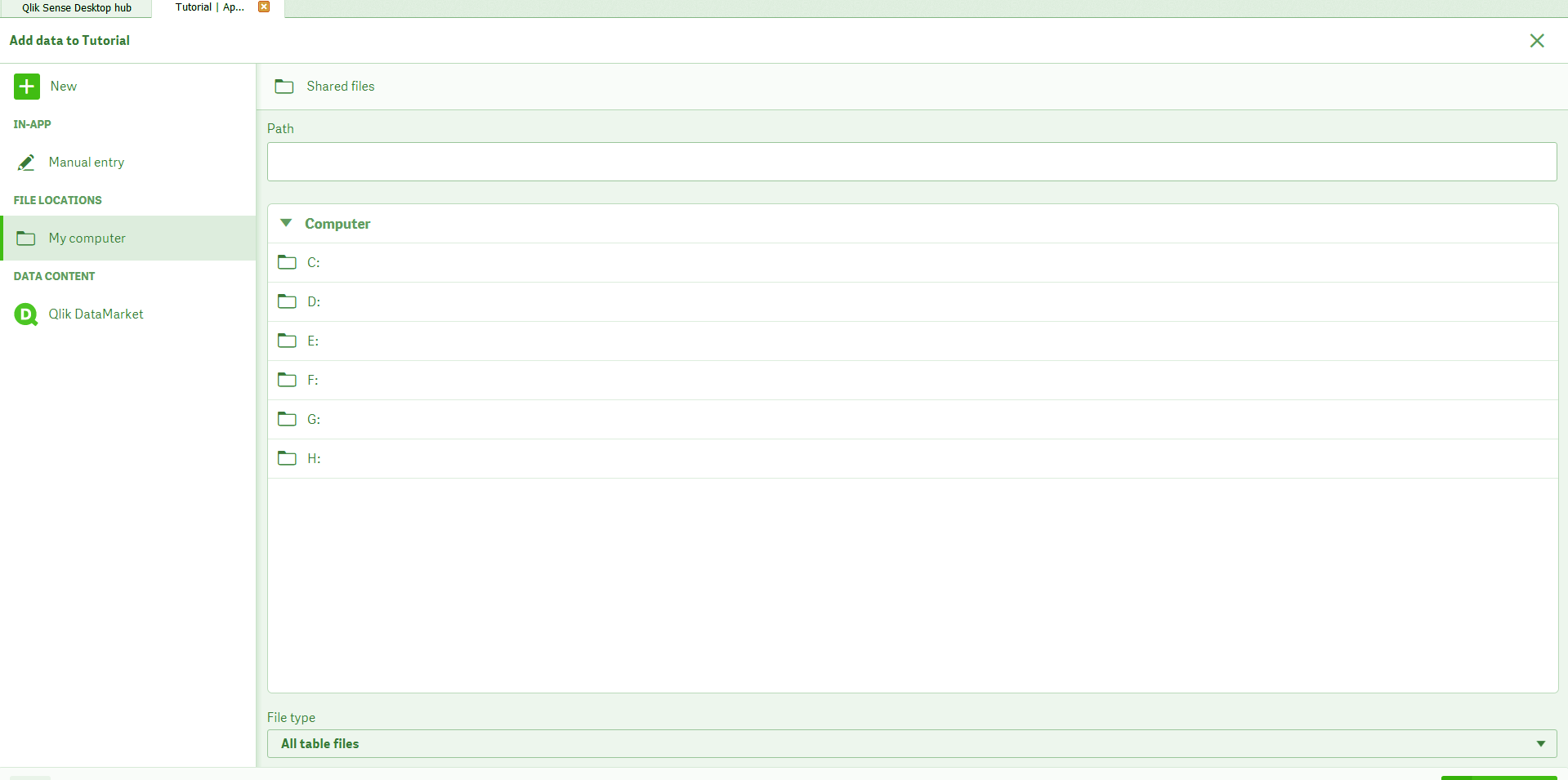
All the drives in your device will be shown in a list. You can select the one in which the data file of your interest lies. Keep select into the folders until you find your data file. The Path bar will show all the folders you have entered defining a file path.
Qlik Sense Application – File Path Selection
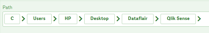
Qlik Sense App – Selecting the File Path
Learn more about Qlik Sense Conditional Functions
d. Step 4: Data Loading
As soon as you click on the file from which you want to load data, the data table will appear. If the first columns are not field names, then select Embedded field names from the Field names option. If you fine with all the adjustments, then click on Add Data button (green in color) at the bottom right of the pane.
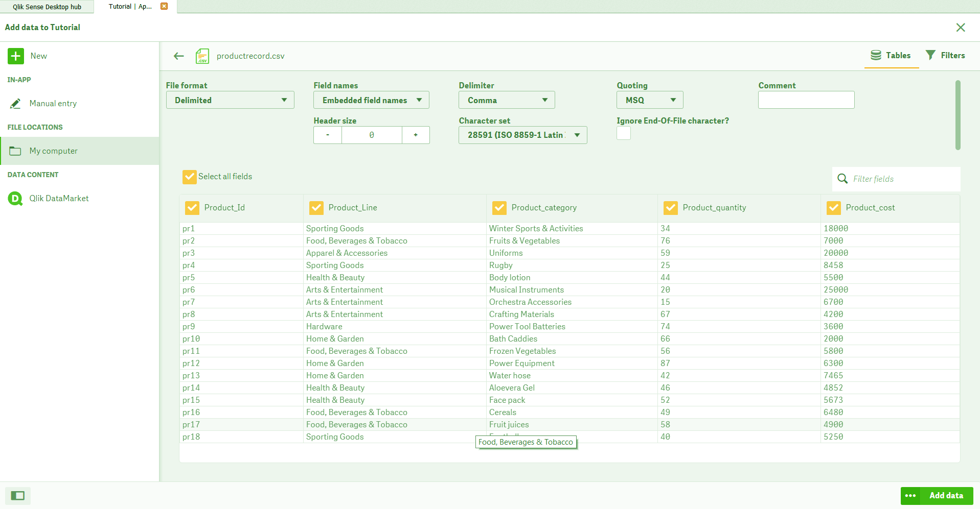
Qlik Sense Application – Data Loading
A message will show confirm the successful data loading and displaying the elapsed time.

Qlik Sense App – Data Loading
The mainsheet will also show all the fields names from the loaded table on the section at the left.
You must read Qlik Sense Visualizations Selections

Qlik Sense App – Loading Data
e. Step 5: Creating a Visualization
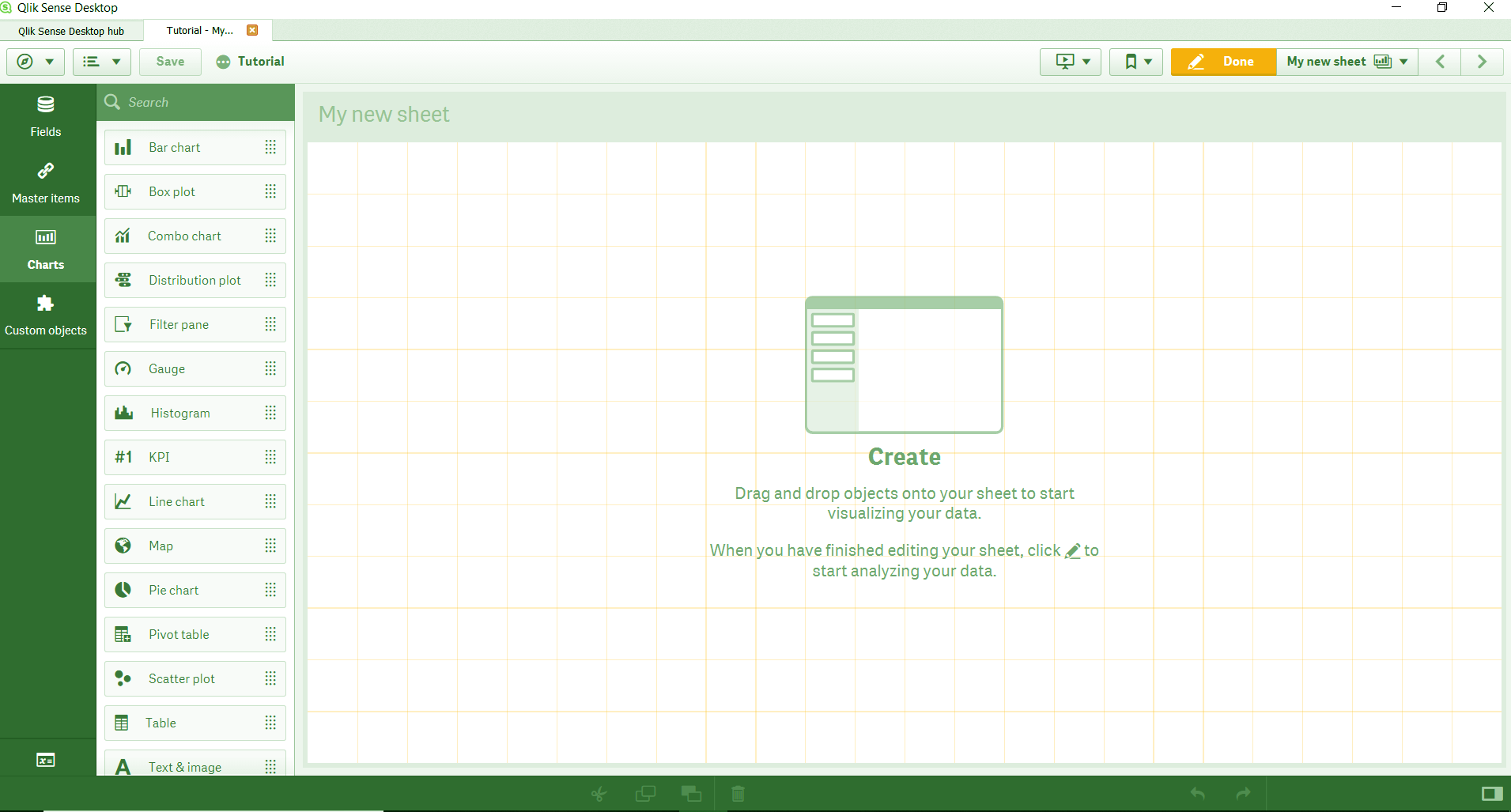
Now, using the loaded data, we will create some visualizations like charts and tables. For this, go to the Edit icon. You will enter the edit mode.
Qlik Sense App – Creating Visualizations
From the data file having some product’s sales details, we will create three types of visualizations from the Charts menu given in the right section of the edit mode. To place the visualization on the editing pane, just select the chart type, drag to the central pane and drop it wherever you want to place it.
Let’s explore Qlik Sense Use Cases
Qlik Sense Application – Creating Visualizations
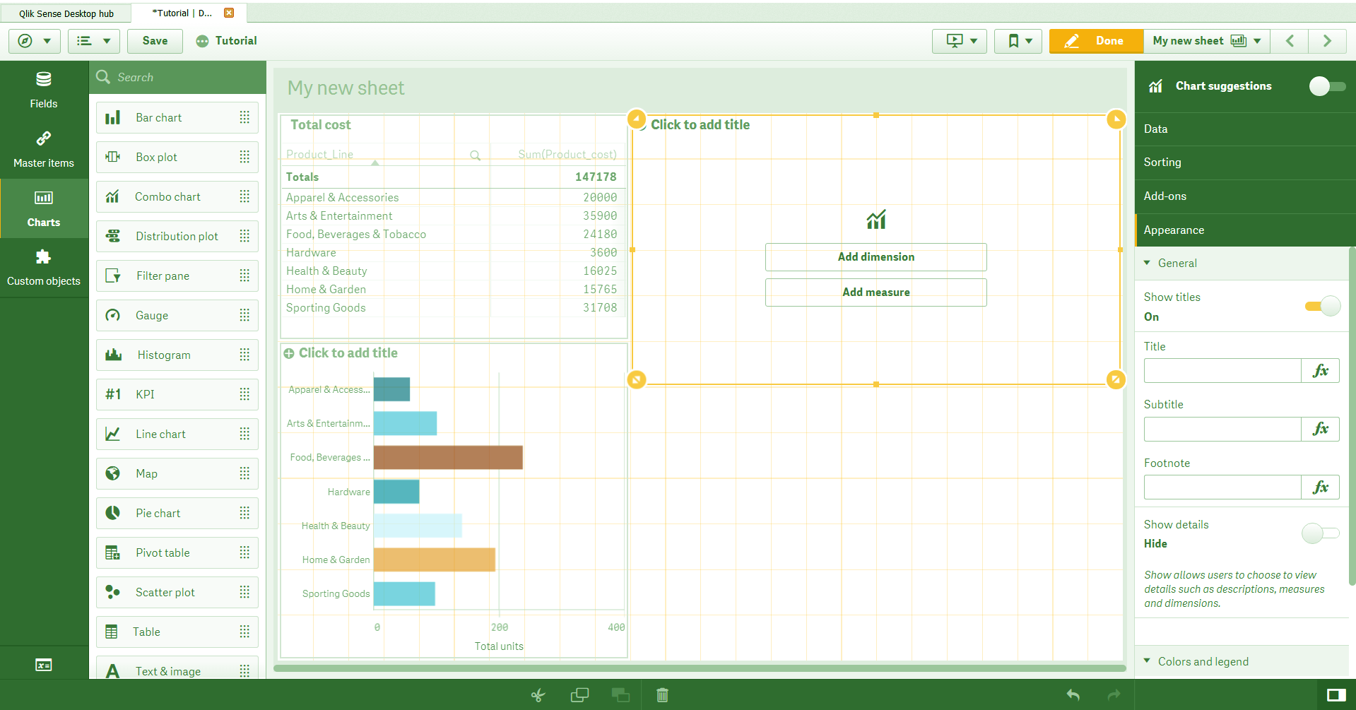
As you can see, we have created a table box and a bar chart. We will also create a Combo chart.
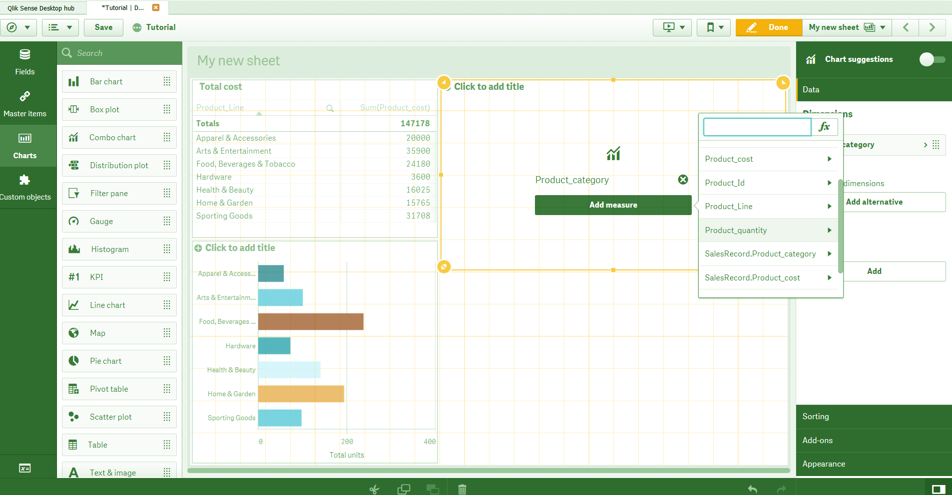
Qlik Sense Application – Visualization
The empty space in the orange box is the activated combo chart in which we need to add the dimension and measures. Select the dimension and measure fields of your choice from the list of fields given in the options ‘Add dimension’ and ‘Add measure’. Now, the chart will display some visuals. From the exploration menu given at the right of the central editing pane, you can further modify the dimensions and measures. You can add expressions to be applied on measures and give them labels.
Read about Qlik Sense Capabilities
Qlik Sense App – Visualizations
Step 6: Resizing and arranging visualizations.
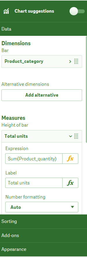
As you can in the image give below, we have changed the position of the combo chart we just created and placed it at the bottom. You can also resize these objects very easily by dragging the corners of the orange box in or out. Also, you can set which colors or color gradient the bars of the chart are going to show from the Appearance option given at the left section. You can also manage the settings of x and y-axis of the graphs.
Qlik Sense App – Resize and arrange visualization
Have a look at Qlik Sense Gauge Chart
f. Step 7: Final Visualizations
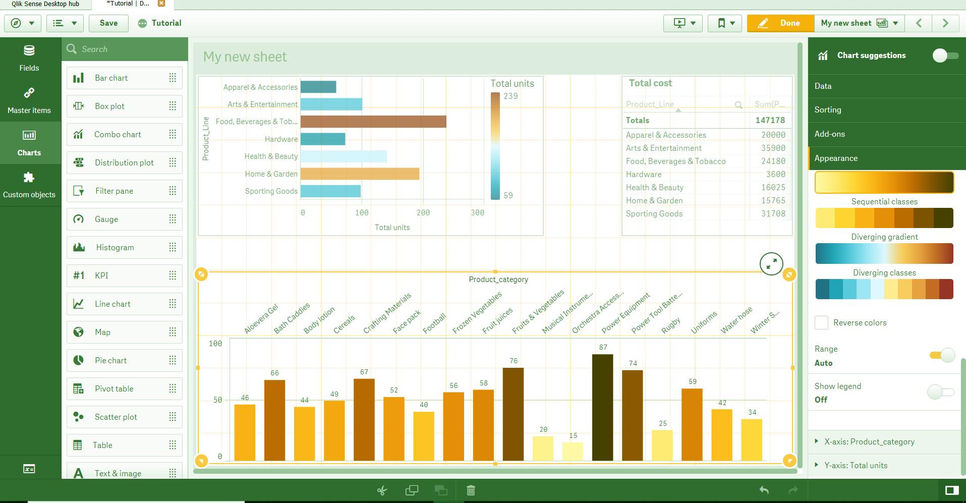
As soon as you click Done in the Editor when you are done with adding and create the visualization, the visualizations will appear on the main sheet view.
Qlik Sense Application – Final Visualization
As you can see in the image above, we have created three visualizations. One bar chart with horizontally oriented bars showing the total sold units of each product line. The second is a simple table which shows the total cost or sales amount for each product line type. And, at the bottom is a combo chart which shows the total number of sold units of each product category type.
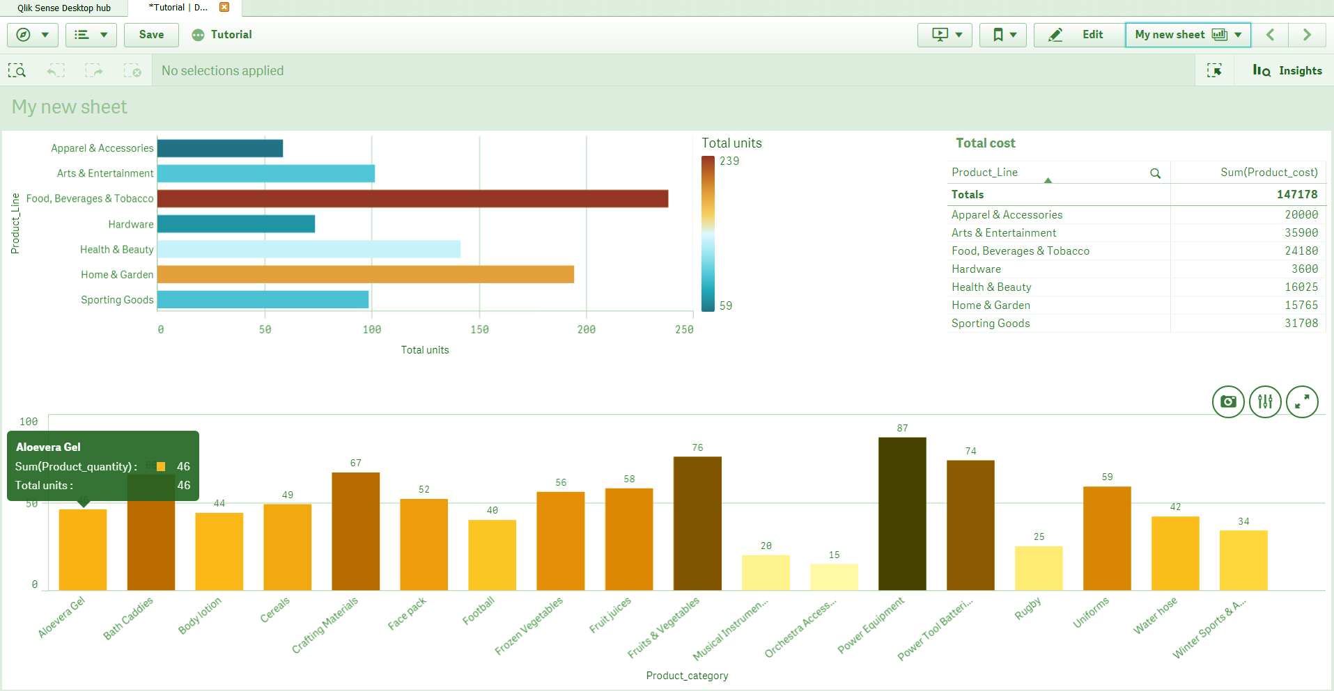
You can analyze data better by making searches and selections. By the virtue of the associative model, where all the relevant fields and their values are associated with each other can be filtered. In our sheet, the result of the selection we made can be seen in the image below. We selected the ‘Food, Beverages & Tobacco’ bar from the chart which filtered and displayed only the relevant data values.
Let’s revise Qlik Sense Pie Chart
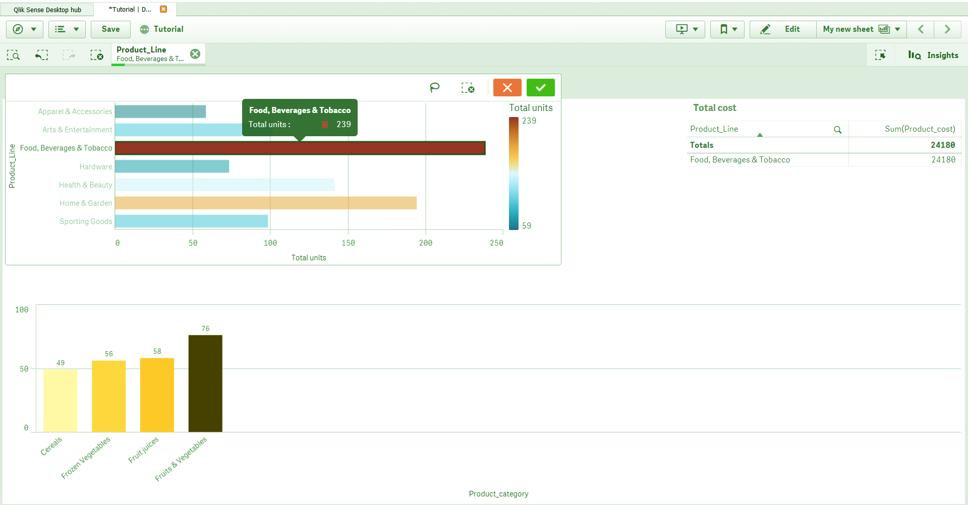
Qlik Sense Application – Final Visualization
So, this was all in how to create the application in Qlik Sense. Hope you like our explanation.
3. Conclusion
We hope now you can create apps in Qlik Sense on your own. Go start exploring this interested and extremely user-friendly software. Practice and explore until we meet for our next lesson, learning a new thing about Qlik Sense.
Still, if you have any confusion, ask in the comment tab.
See also –
You give me 15 seconds I promise you best tutorials
Please share your happy experience on Google


Where can I download the data file used in this tutorial?
Hi Tom,
Apologies for the trouble and thanks for notifying us. We have updated the blog and added the dataset link. Now you can easily download the data file used in this blog.
Keep visiting DataFlair for more interesting articles.
Hi,
Could you please provide the data set link for download and am unable to find the data set link in blog.
Hello Sreekanth,
Here is the data set of the Qlik Sense Application. Download it from here.