Data Preprocessing, Analysis & Visualization – Python Machine Learning
Free Machine Learning courses with 130+ real-time projects Start Now!!
Python course with 57 real-time projects - Learn Python
1. Objective
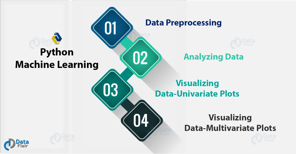
Today in this Python Machine Learning Tutorial, we will discuss Data Preprocessing, Analysis & Visualization. Moreover in this Data Preprocessing in Python machine learning we will look at rescaling, standardizing, normalizing and binarizing the data. Also, we will see different steps in Data Analysis, Visualization and Python Data Preprocessing Techniques.
So, let’s start machine Learning with Python Data Preprocessing.
2. Data Preprocessing in Python Machine Learning
Machine Learning algorithms don’t work so well with processing raw data. Before we can feed such data to an ML algorithm, we must preprocess it. In other words, we must apply some transformations on it. With data preprocessing, we convert raw data into a clean data set.
Some ML models need information to be in a specified format. For instance, the Random Forest algorithm does not take null values. To preprocess data, we will use the library scikit-learn or sklearn in this tutorial.
3. Python Data Preprocessing Techniques
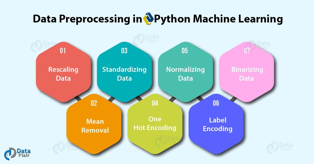
Let’s talk about seven such techniques for Data Preprocessing in Python Machine Learning.
Let’s have a look at data Structure in Python
a. Rescaling Data
For data with attributes of varying scales, we can rescale attributes to possess the same scale. We rescale attributes into the range 0 to 1 and call it normalization. We use the MinMaxScaler class from scikit-learn. Let’s take an example.
>>> import pandas, scipy, numpy
>>> from sklearn.preprocessing import MinMaxScaler
>>> df=pandas.read_csv( 'http://archive.ics.uci.edu/ml/machine-learning-databases/wine-quality/winequality-red.csv ',sep=';')
>>> array=df.values
>>> #Separating data into input and output components
>>> x=array[:,0:8]
>>> y=array[:,8]
>>> scaler=MinMaxScaler(feature_range=(0,1))
>>> rescaledX=scaler.fit_transform(x)
>>> numpy.set_printoptions(precision=3) #Setting precision for the output
>>> rescaledX[0:5,:]
This gives us values between 0 and 1. Rescaling data proves of use with neural networks, optimization algorithms and those that use distance measures like k-nearest neighbors and weight inputs like regression.
b. Standardizing Data
With standardizing, we can take attributes with a Gaussian distribution and different means and standard deviations and transform them into a standard Gaussian distribution with a mean of 0 and a standard deviation of 1. For this, we use the StandardScaler class. Let’s take an example.
Do you know about Python Statistics
>>> from sklearn.preprocessing import StandardScaler
>>> scaler=StandardScaler().fit(x)
>>> rescaledX=scaler.transform(x)
>>> rescaledX[0:5,:]
c. Normalizing Data
In this task, we rescale each observation to a length of 1 (a unit norm). For this, we use the Normalizer class. Let’s take an example.
>>> from sklearn.preprocessing import Normalizer
>>> scaler=Normalizer().fit(x)
>>> normalizedX=scaler.transform(x)
>>> normalizedX[0:5,:]
d. Binarizing Data
Using a binary threshold, it is possible to transform our data by marking the values above it 1 and those equal to or below it, 0. For this purpose, we use the Binarizer class. Let’s take an example.
Learn about Python Data Science Environment Setup
>>> from sklearn.preprocessing import Binarizer
>>> binarizer=Binarizer(threshold=0.0).fit(x)
>>> binaryX=binarizer.transform(x)
>>> binaryX[0:5,:]
This marks 0 over all values equal to or less than 0, and marks 1 over the rest. When you want to turn probabilities into crisp values, this functionality comes handy.
e. Mean Removal
We can remove the mean from each feature to center it on zero.
>>> from sklearn.preprocessing import scale
>>> data_standardized=scale(df)
>>> data_standardized.mean(axis=0)
array([ 3.555e-16, 1.733e-16, -8.887e-17, -1.244e-16, 3.910e-16,
-6.221e-17, 4.444e-17, 2.364e-14, 2.862e-15, 6.754e-16,
1.066e-16, 8.887e-17])
>>> data_standardized.std(axis=0)
array([1., 1., 1., 1., 1., 1., 1., 1., 1., 1., 1., 1.])
f. One Hot Encoding
When dealing with few and scattered numerical values, we may not need to store these. Then, we can perform One Hot Encoding. For k distinct values, we can transform the feature into a k-dimensional vector with one value of 1 and 0 as the rest values.
>>> from sklearn.preprocessing import OneHotEncoder
>>> encoder=OneHotEncoder()
>>> encoder.fit([[0,1,6,2],
[1,5,3,5],
[2,4,2,7],
[1,0,4,2]
])
OneHotEncoder(categorical_features=’all’, dtype=<class ‘numpy.float64’>,
handle_unknown=’error’, n_values=’auto’, sparse=True)
>>> encoder.transform([[2,4,3,4]]).toarray()
array([[0., 0., 1., 0., 0., 1., 0., 0., 1., 0., 0., 0., 0., 0.]])
g. Label Encoding
Some labels can be words or numbers. Usually, training data is labelled with words to make it readable. Label encoding converts word labels into numbers to let algorithms work on them. Let’s take an example.
Let’s discuss Python Packages
>>> from sklearn.preprocessing import LabelEncoder
>>> label_encoder=LabelEncoder()
>>> input_classes=['Havells','Philips','Syska','Eveready','Lloyd']
>>> label_encoder.fit(input_classes)
LabelEncoder()
>>> for i,item in enumerate(label_encoder.classes_):
print(item,'-->',i)
Eveready –> 0
Havells –> 1
Lloyd –> 2
Philips –> 3
Syska –> 4
This gives us a set of numeric labels that map to these words. Let’s confirm this:
>>> labels=['Lloyd','Syska','Philips']
>>> label_encoder.transform(labels)
array([2, 4, 3], dtype=int32)
>>> label_encoder.inverse_transform(label_encoder.transform(labels))
array([‘Lloyd’, ‘Syska’, ‘Philips’], dtype='<U8′)
4. Analyzing Data in Python Machine Learning
Assuming that you have loaded your dataset using pandas (which if you haven’t, refer to Python Pandas Tutorial to learn how), let’s find out more about our data.
a. Describing the dataset
Using the method describe(), we can find out parameters like count, mean, std, and max.
>>> df.describe()
b. Shape of the dataset
Simply, the shape tuple will give us the dimensions of the dataset.
>>> df.shape
(1599, 12)
c. Extracting data from the dataset
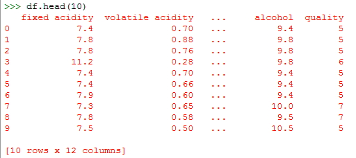
Now if we want only the first ten rows from the dataset, we can call the head() method on it. To this, we can pass it the argument 10.
>>> df.head(10)
d. Performing operations around a variable
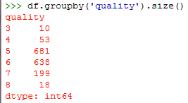
We can perform certain operations on a variable. For instance, here, we demonstrate how to group data on a variable. For this, we use the groupby() function.
Have a look at Python NumPy
>>> df.groupby('quality').size()5. Visualizing Data-Univariate Plots in Python Machine Learning
Finally, when we want to visualize data as plots and charts to learn more about it, we can use pandas with Matplotlib. We will discuss two kinds of plots- univariate and multivariate.
A univariate plot suggests we’re only examining one variable.
a. Histograms
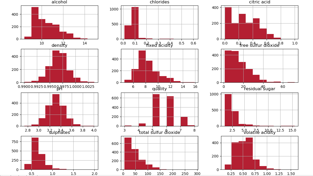
Since histograms group data into bins and give us an idea of how many observations each bin holds, this is a good way to visualize data for ML. The shapes of the bins tell us whether an attribute is Gaussian, skewed, or has an exponential distribution. It also hints us about outliers.
>>> import matplotlib.pyplot as plt
>>> df.hist()
>>> plt.show()
Perhaps the attributes ‘total sulfur dioxide’, ‘free sulfur dioxide’, and ‘residual sugar’ have an exponential distribution. Attributes ‘density’, ‘pH’, ‘fixed acidity’, and ‘Volatile acidity’ have Gaussian or nearly Gaussian distributions.
Let’s discuss Python Descriptive Statistics
b. Density Plots
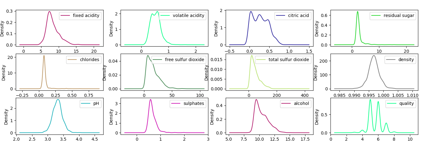
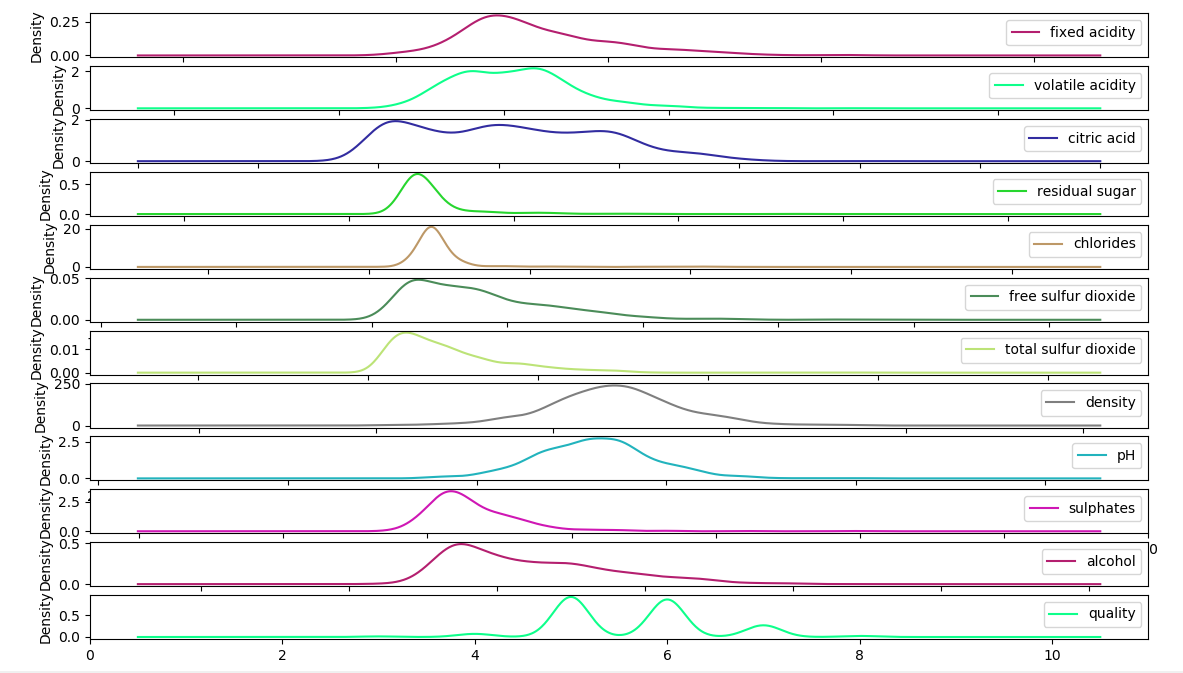
A density plot appears to be an abstracted histogram. Each bin has a smooth curve drawn through its top. Your eyes can rest now.
>>> df.plot(kind='density',subplots=True,sharex=False)
>>> plt.show()
This gives us a clearer idea.
c. Box and Whisker Plots
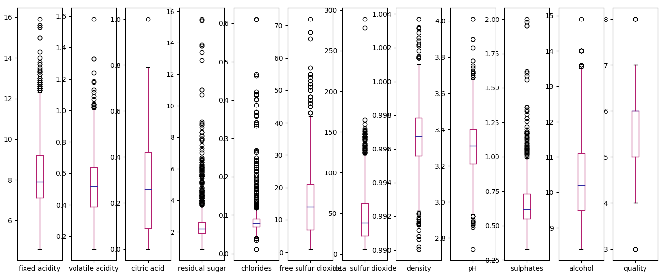
A box plot summarizes how each attribute is distributed. It also draws a line for the median and a box around the 25th and 75th percentiles. Whiskers tell us how the data is spread, and the dots outside the whiskers give candidate outlier values. Let’s plot this for our dataset.
>>> df.plot(kind='box',subplots=True,sharex=False,sharey=False)
fixed acidity AxesSubplot(0.125,0.11;0.0545775×0.77)
volatile acidity AxesSubplot(0.190493,0.11;0.0545775×0.77)
citric acid AxesSubplot(0.255986,0.11;0.0545775×0.77)
residual sugar AxesSubplot(0.321479,0.11;0.0545775×0.77)
chlorides AxesSubplot(0.386972,0.11;0.0545775×0.77)
free sulfur dioxide AxesSubplot(0.452465,0.11;0.0545775×0.77)
total sulfur dioxide AxesSubplot(0.517958,0.11;0.0545775×0.77)
density AxesSubplot(0.583451,0.11;0.0545775×0.77)
pH AxesSubplot(0.648944,0.11;0.0545775×0.77)
sulphates AxesSubplot(0.714437,0.11;0.0545775×0.77)
alcohol AxesSubplot(0.77993,0.11;0.0545775×0.77)
quality AxesSubplot(0.845423,0.11;0.0545775×0.77)
dtype: object
>>> plt.show()
Here, attributes like ‘total sulfur dioxide’, ‘sulphates’, and ‘residual sugar’ appear skewed toward smaller values.
Do you know about Python Machine Learning Techniques
6. Visualizing Data-Multivariate Plots in Python Machine Learning
A multivariate analysis examines more than two variables. For two variables, we call it bivariate.
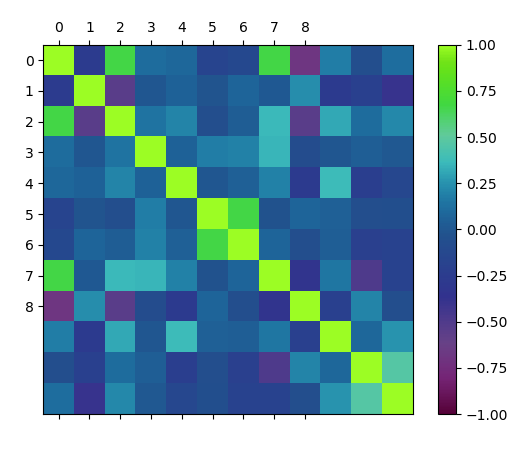
a. Correlation Matrix Plot
Such a plot denotes how changes between two variables relate. Two variables that change in the same direction are positively correlated. A change in opposite directions implies negative correlation. Let’s plot a correlation matrix.
>>> correlations=df.corr()
>>> fig=plt.figure()
>>> ax=fig.add_subplot(111)
>>> cax=ax.matshow(correlations,vmin=-1,vmax=1)
>>> fig.colorbar(cax)
<matplotlib.colorbar.Colorbar object at 0x086D7A30>
>>> ticks=numpy.arange(0,9,1)
>>> ax.set_xticks(ticks)
>>> ax.set_yticks(ticks)
>>> plt.show()
This matrix is symmetrical around a left diagonal.
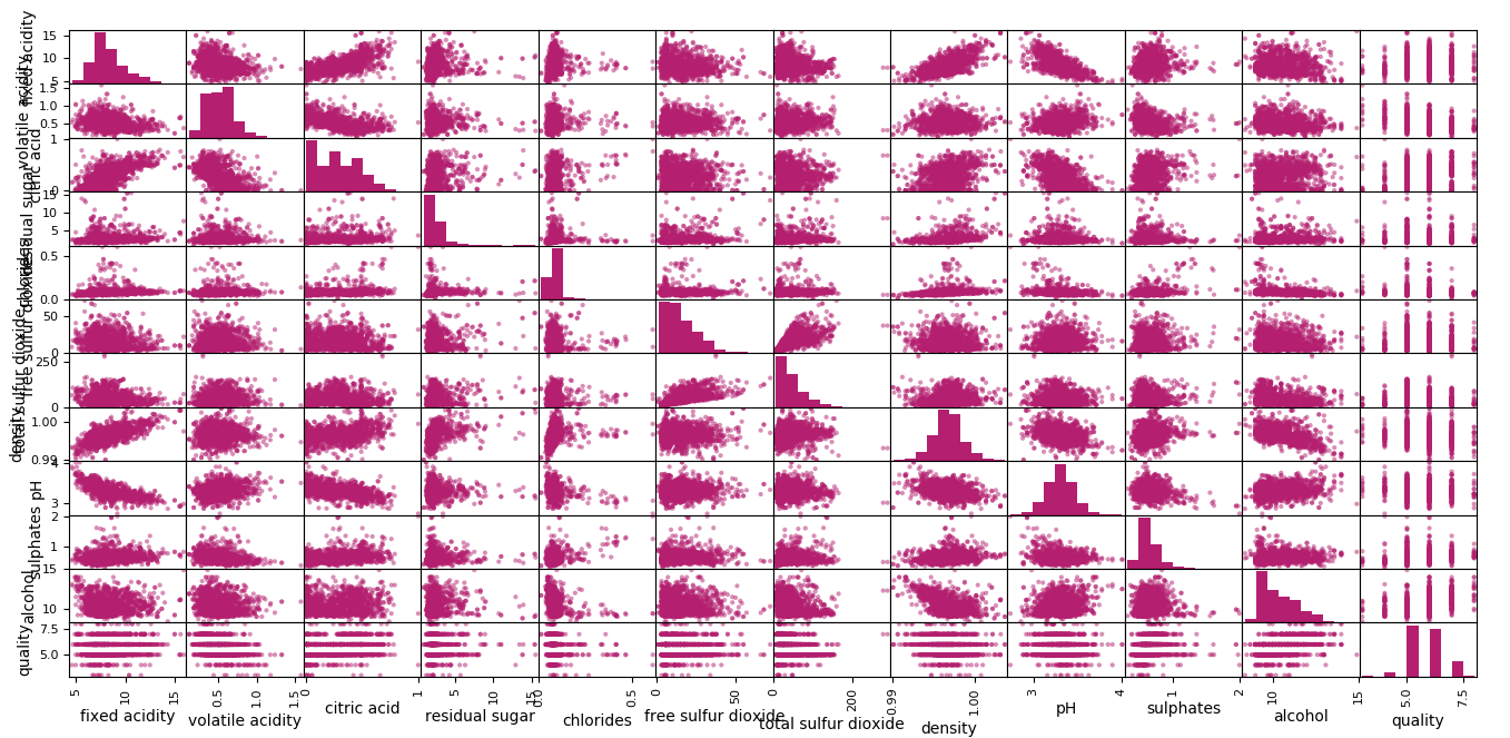
b. Scatterplot Matrix
Scatterplot matrices depict how two variables relate as dots in two dimensions. Plotting all scatterplots for a data together in one place results in a scatterplot matrix. These plots can spot structured relationships between variables. Let’s take an example.
Let’s learn about Python Compilers
>>> pandas.plotting.scatter_matrix(df)
This is symmetrical too. The left diagonal has histograms of the attributes because it doesn’t make much sense to plot an attribute’s scatterplot with itself.
So, this was all in Python machine Learning Data Preprocessing, Visualizing and Analyzing. Hope you like our explanation
7. Conclusion
Hence, in this Python Machine Learning Tutorial, we discussed Machine Learning with Python data Preprocessing. Also, we discussed the Data Analysis and Data Visualization for Python Machine Learning. We saw rescaling, normalizing, binarizing, and standardizing the data in Python machine Learning Data Preprocessing. Still, if you have any doubt regarding Data Preprocessing, ask in the comment tab.
See also –
Python Machine Learning Train & Test
For reference
If you are Happy with DataFlair, do not forget to make us happy with your positive feedback on Google




i want learn Machine learning .
Hello Mohammad,
You can learn Machine Learning easily, refer to Free Machine Learning Tutorials
To late to see ……………………………………
Dear Team,
Excellent job!
You made a tough subject easy to follow!
Keep up the good job.
Thanks