Python Histogram | Python Bar Plot (Matplotlib & Seaborn)
Master Python with 70+ Hands-on Projects and Get Job-ready - Learn Python
Today, we will see how we can create a Python Histogram and a Python Bar Plot using Matplotlib and Seaborn Python libraries. Moreover, in this Python Histogram and Bar Plotting Tutorial, we will understand Histograms and Bars in Python with the help of examples and graphs.
So, let’s understand the Histogram and Bar Plot in Python.
Python Histogram
A histogram is a graph that represents the way numerical data is represented. The input to it is a numerical variable, which it separates into bins on the x-axis. This is a vector of numbers and can be a list or a DataFrame column. A higher bar represents more observations per bin. Also, the number of bins decides the shape of the histogram.
Do you know about Python Packages
Types of Histograms:
- Standard histogram: It is represented with the help of bars.
- Stacked histogram: It helps in comparing multiple datasets by placing the bars on top of each other.
- Step histogram: It is similar to waterfall or line graphs, but it is often used to display the data without filling the bars.
- Cumulative histogram: It is used to show the total number of times a value has occurred in a given time.
a. Example of Python Histogram
Let’s begin with a simple Matplotlib Histogram Example.
>>> import seaborn as sn
>>> df=sn.load_dataset(‘iris’)
>>> sn.distplot(df['sepal_length'])
<matplotlib.axes._subplots.AxesSubplot object at 0x07837230
>>> import matplotlib.pyplot as plt
>>> plt.show()
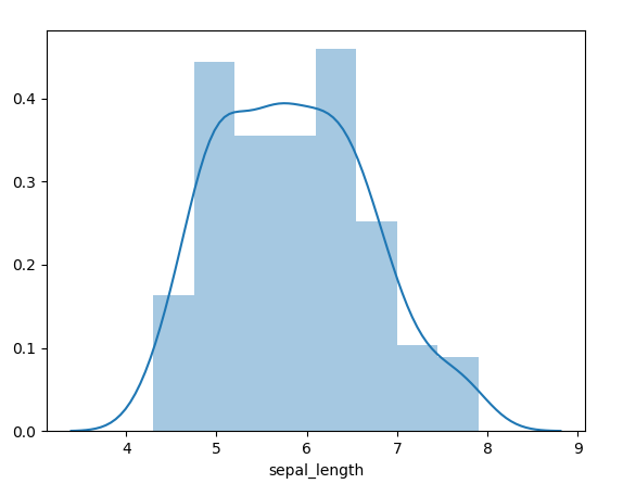
Python Matplotlib Histogram Example
>>> sn.distplot(df['sepal_length'],bins=25)
<matplotlib.axes._subplots.AxesSubplot object at 0x07837230>
>>> plt.show()
Python Matplotlib Histogram Example
To plot this without Seaborn, we can do the following-
>>> import numpy as np
>>> from matplotlib import colors
>>> from matplotlib.ticker import PercentFormatter
>>> np.random.seed(19720810)
>>> N=100000
>>> n_bins=20
>>> x=np.random.randn(N)
>>> y=.7*x+np.random.randn(100000)+7
>>> fig,axs=plt.subplots(1,2,sharey=True,tight_layout=True)
>>> axs[0].hist(x,bins=n_bins)
>>> axs[1].hist(y,bins=n_bins)
>>> plt.show()
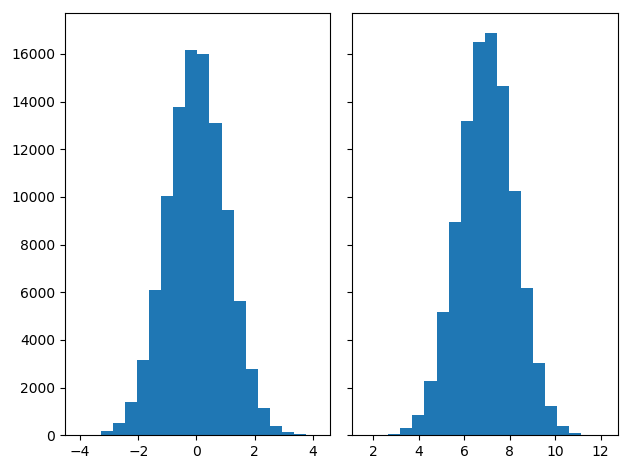
Example – Matplotlib Histogram in Python
b. Displaying Only The Histogram
We can choose to show or hide the Python Histogram, the rug, and the kernel density. Let’s try displaying only the Python Histogram for now.
Let’s revise Python Web Framework
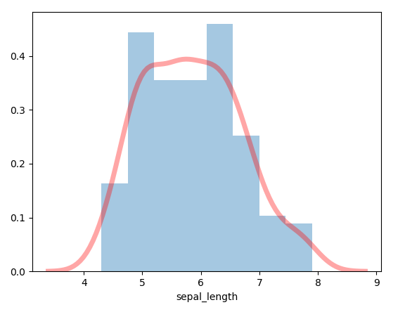
>>> sn.distplot(a=df['sepal_length'],hist=True,kde=False,rug=False)
<matplotlib.axes._subplots.AxesSubplot object at 0x0955C310>
>>> plt.show()
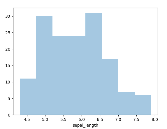
Displaying Only The Histogram
c. Displaying Histogram, Rug, and Kernel Density
Now let’s try displaying all three.
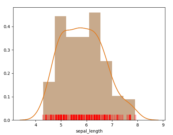
>>> sn.distplot(a=df['sepal_length'],hist=True,kde=True,rug=True)
<matplotlib.axes._subplots.AxesSubplot object at 0x09526EB0>
>>> plt.show()

Displaying Histogram, Rug, and Kernel Density
d. Customizing the rug in Histogram
Let’s set the rug to red.
Let’s learn about Python Datetime Module
>>> sn.distplot(a=df['sepal_length'],rug=True,rug_kws={'color':'r','alpha':0.35,'linewidth':5})<matplotlib.axes._subplots.AxesSubplot object at 0x07B18BD0>
>>> plt.show()
Customizing the rug
e. Customizing the density distribution
Using keywords for kernel density, we can customize the density distribution.
>>> sn.distplot(a=df['sepal_length'],kde=True,kde_kws={'color':'r','alpha':0.35,'linewidth':5})<matplotlib.axes._subplots.AxesSubplot object at 0x07E5B7D0>
>>> plt.show()
Customizing the density distribution
f. Vertical Python Histogram
Now let’s try making a vertical Python Histogram.
Let’s learn about Python Numpy
>>> sn.distplot(df['sepal_length'],color='lightpink',vertical=True)
<matplotlib.axes._subplots.AxesSubplot object at 0x07DCD6D0>
>>> plt.show()
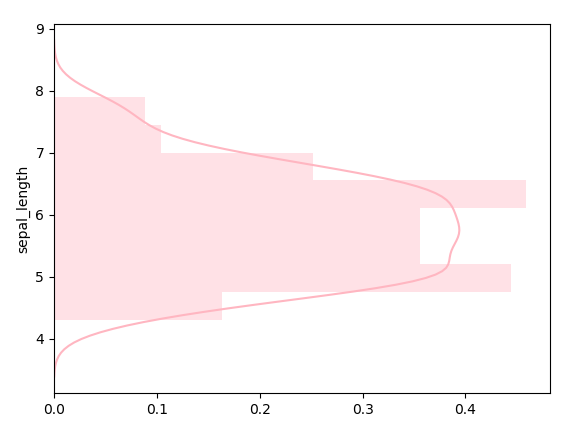
Vertical Python Histogram
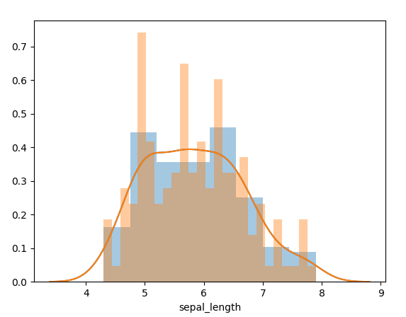
g. Python Histogram with multiple variables
We can view together the histograms for multiple numeric variables.
>>> sn.distplot(df['sepal_length'],color='skyblue',label='Sepal length')
<matplotlib.axes._subplots.AxesSubplot object at 0x0849ABB0>
>>> sn.distplot(df['sepal_width'],color='lightpink',label='Sepal width')
<matplotlib.axes._subplots.AxesSubplot object at 0x0849ABB0>
>>> plt.show()
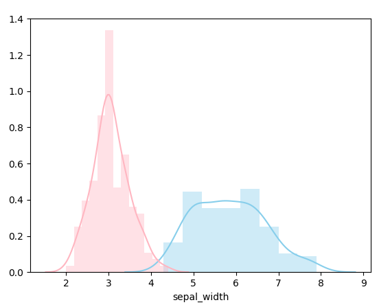
Multiple variables with Histogram in Python
Python Bar Plot
A bar plot in Python, also known as a bar chart, represents how a numerical variable relates to a categorical variable.
Let’s have a look at Python Pandas
a. Example of Python Bar Plot
Let’s take a quick Matplotlib Bar Chart Example.
>>> import numpy as np
>>> import matplotlib.pyplot as plt
>>> marks=[79,45,22,89,95]
>>> bars=('Roll 1','Roll 2','Roll 3','Roll 4','Roll 5')
>>> y=np.arange(len(bars))
>>> plt.bar(y,marks,color=’g’)
<BarContainer object of 5 artists>
>>> plt.xticks(y,bars)
([<matplotlib.axis.XTick object at 0x0942EFD0>, <matplotlib.axis.XTick object at 0x0942E3B0>, <matplotlib.axis.XTick object at 0x0942E2B0>, <matplotlib.axis.XTick object at 0x079E60B0>, <matplotlib.axis.XTick object at 0x079E62F0>], <a list of 5 Text xticklabel objects>)
>>> plt.show()
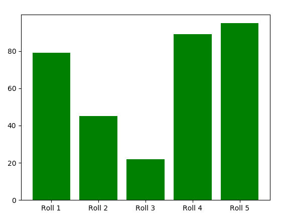
Example of Python Bar Plot
b. Setting a Different Color for Each Bar
Let’s try five different colors for the bars.
>>> plt.bar(y,marks,color=['cyan','skyblue','lightpink','brown','black'])
<BarContainer object of 5 artists>
>>> plt.xticks(y,bars)
([<matplotlib.axis.XTick object at 0x0947B570>, <matplotlib.axis.XTick object at 0x0947B170>, <matplotlib.axis.XTick object at 0x0946EC90>, <matplotlib.axis.XTick object at 0x094954B0>, <matplotlib.axis.XTick object at 0x09495850>], <a list of 5 Text xticklabel objects>)
>>> plt.show()
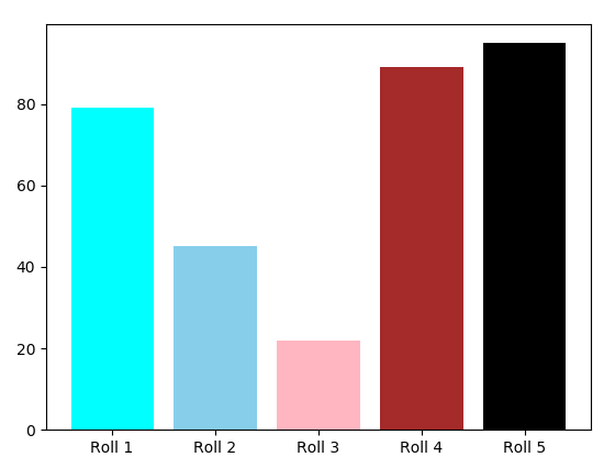
Python Bar Chart – Setting Different Color For Each Bar
c. Setting Border Color
And now for the border color, we use the parameter edgecolor.
Learn Python Data Science Tutorial
>>> plt.bar(y,marks,color=(0.2,0.4,0.2,0.7),edgecolor='deeppink')
<BarContainer object of 5 artists>
>>> plt.xticks(y,bars)
([<matplotlib.axis.XTick object at 0x094A7FB0>, <matplotlib.axis.XTick object at 0x094A7BB0>, <matplotlib.axis.XTick object at 0x094A7770>, <matplotlib.axis.XTick object at 0x09426050>, <matplotlib.axis.XTick object at 0x094261F0>], <a list of 5 Text xticklabel objects>)
>>> plt.show()
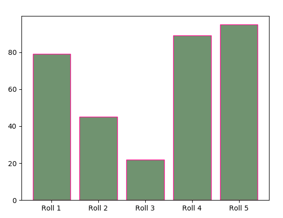
Python Bar Plot – Setting Border Color
d. Horizontal Python Bar Plot
How about a horizontal bar Plot?
>>> plt.barh(y,marks)
<BarContainer object of 5 artists>
>>> plt.yticks(y,bars)
([<matplotlib.axis.YTick object at 0x084DFC70>, <matplotlib.axis.YTick object at 0x09409B90>, <matplotlib.axis.YTick object at 0x09409CF0>, <matplotlib.axis.YTick object at 0x09413D70>, <matplotlib.axis.YTick object at 0x09413790>], <a list of 5 Text yticklabel objects>)
>>> plt.show()
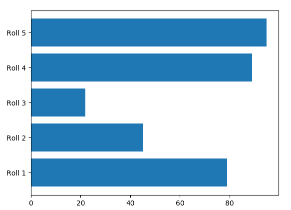
Horizontal Python Bar Plot
e. Adding Title and Axis Labels
Let’s call it the Sample graph, with roll numbers on the x-axis and marks on the y-axis.
Do you know Python Interpreter environment
>>> plt.bar(y,marks,color=(0.5,0.1,0.5,0.6))
<BarContainer object of 5 artists>
>>> plt.title('Sample graph')Text(0.5,1,’Sample graph’)
>>> plt.xlabel('Roll numbers')Text(0.5,0,’Roll numbers’)
>>> plt.ylabel('Marks')Text(0,0.5,’Marks’)
>>> plt.ylim(0,100)
(0, 100)
>>> plt.xticks(y,bars)
([<matplotlib.axis.XTick object at 0x07E991F0>, <matplotlib.axis.XTick object at 0x07E99FD0>, <matplotlib.axis.XTick object at 0x07E999F0>, <matplotlib.axis.XTick object at 0x07E5B1B0>, <matplotlib.axis.XTick object at 0x07DF2CF0>], <a list of 5 Text xticklabel objects>)
Let’s discuss Python Data File Formats
>>> plt.show()
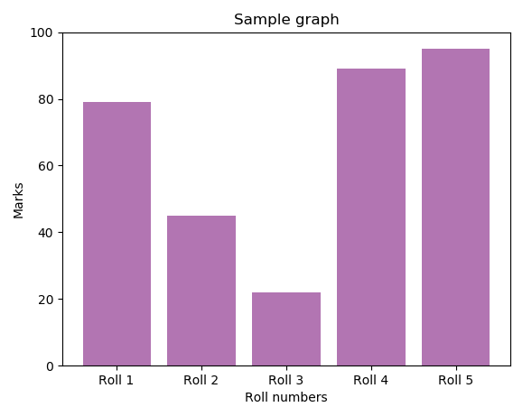
Adding Title and Axis Labels in Python Bar Plot
So, this was all in Python Histogram and Bar Plot using the Matplotlib library. Hope you like our explanation.
Conclusion
Histograms are used to show the distribution of a single numeric variable. They divide the data into bins and count the number of observations in each bin. This makes it easy to identify skewness, normality, and outliers in your data. Python’s hist() function from Matplotlib or the distplot() from Seaborn are commonly used for this purpose. You can also adjust bin sizes and colors to make the plot more informative and visually appealing.
Hence, in this Python Histogram tutorial, we conclude two important topics with plotting- histograms and bar plots in Python. While they seem similar, they’re two different things. Moreover, we discussed an example of a Histogram in Python and a Python bar Plotting example. Still, if any doubt regarding the Python Bar Plot, ask in the comments tab.
For example
You give me 15 seconds I promise you best tutorials
Please share your happy experience on Google


