Python Geographic Maps & Graph Data
Master Python with 70+ Hands-on Projects and Get Job-ready - Learn Python
Today, in this Python tutorial, we will discuss Python Geographic Maps and Graph Data. Moreover, we will see how to handle geographical and graph data using Python and its libraries. We will use Matplotlib and Cartopy, among other libraries, to plot Geographic Maps and Graph Data.
So, let’s start exploring Python Geographic Maps.
Prerequisites for Python Geographic Maps and Graph Data
Do you know about Python Heatmap
We need the following libraries for this Python Geographic Maps and Graph Data-
a. Cartopy in Python
Python Geographic Maps – Cartopy
Cartopy is a Python package for cartography. It will let you process geospatial data, analyze it, and produce maps. As a Python package, it uses NumPy, PROJ.4, and Shapely, and stands on top of Matplotlib. Some of its key features-
- Object-oriented projection definitions.
- Publication-quality maps.
- Ability to transform points, lines, polygons, vectors, and images.
You can install it using pip-
pip install Cartopy
Note that you may need to install Microsoft Visual C++ Build Tools 14.0 or higher for this.
You can import it as-
>>> import cartopy
b. Other modules in Python Matplotlib
There are some other modules we will use here-
pip install Matplotlib
>>> import matplotlib.pyplot as plt
We will import other modules on the way as we’ll need them.
Python Geographic Maps
Python will let us draw Geographical maps. Let’s see how.
a. A simple map
Let’s first simply draw a map and fill it in later.
>>> import cartopy.crs as ccrs
>>> ax=plt.axes(projection=ccrs.PlateCarree()) #Using the PlateCarree projection
>>> ax.coastlines() #Display the coastlines
<cartopy.mpl.feature_artist.FeatureArtist object at 0x06DA3DF0>
>>> plt.show()
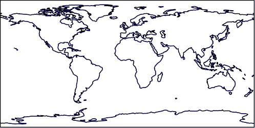
Python Geographic Maps – Simple Map
b. Other projections
>>> ax=plt.axes(projection=ccrs.Orthographic())
>>> ax.stock_img() #Add the stock world map image to the plot
<matplotlib.image.AxesImage object at 0x07427410>
Learn Python data Science environment Setup
>>> plt.show()
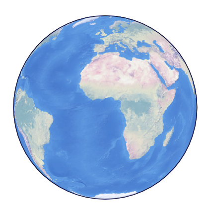
Python Geographic Maps
We have several other projections like Mollweide, Robinson, Sinusoidal, and Gnomonic, among many others.
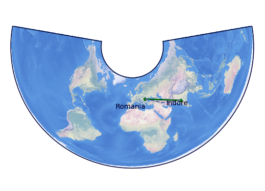
c. Adding data
Let’s try to plot Romania to Indore, India on a map.
>>> ax=plt.axes(projection=ccrs.AlbersEqualArea())
>>> ax.stock_img()
<matplotlib.image.AxesImage object at 0x077466B0>
>>> ro_lon,ro_lat=25,46 #Coordinates/ longitude and latitude
>>> ind_lon,ind_lat=75.8,22.7
>>> plt.plot([ro_lon,ind_lon],[ro_lat,ind_lat], color='green',linewidth=2,marker='*',transform=ccrs.Geodetic(),) #Green line
[<matplotlib.lines.Line2D object at 0x077469B0>]
>>> plt.plot([ro_lon,ind_lon],[ro_lat,ind_lat], color='gray',linestyle='--',transform=ccrs.PlateCarree(),) #Gray, dashed line
[<matplotlib.lines.Line2D object at 0x07746E10>]
Let’s revise Python Pandas
>>> plt.text(ro_lon-3,ro_lat-12,'Romania',
    horizontalalignment='right',
    transform=ccrs.Geodetic()) #Text- Romania
Text(22,34,’Romania’)
>>> plt.text(ind_lon+3,ind_lat-12,'Indore',
    horizontalalignment='right',
    transform=ccrs.Geodetic()) #Text- Indore
Text(78.8,10.7,’Indore’)
>>> plt.show()
Python Geographic Maps – Adding Data
The Geodetic coordinate system is spherical, but since we use AlbersEqualArea, that makes the green line appear straight on the plot. Similarly, the gray line is a PlateCarree but appears spherical.
Now, let’s try adding sky blue pins to a map.
Let’s discuss Python Scipy Tutorial
>>> fig=plt.figure(figsize=(16,12))
>>> ax=fig.add_subplot(1,1,1,projection=ccrs.PlateCarree())
>>> ax.set_extent((10,144,70,-30))
>>> ax.stock_img()
<matplotlib.image.AxesImage object at 0x06D75D90>
>>> ax.coastlines()
<cartopy.mpl.feature_artist.FeatureArtist object at 0x06D75C70>
>>> ax.tissot(facecolor='skyblue',alpha=0.6)
<cartopy.mpl.feature_artist.FeatureArtist object at 0x06D7E210>
>>> plt.show()
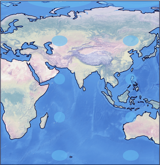
Python Geographic Maps – Adding Data
d. Contour plots
A contour plot represents a 3D surface on a 2D format by plotting contours (constant z slices). Let’s try making one.
Learn Aggregation with Python
>>> from netCDF4 import Dataset as netcdf_dataset
>>> import numpy as np
>>> from cartopy import config
>>> import os
>>> fname=os.path.join(config["repo_data_dir"],
                    'netcdf', 'HadISST1_SST_update.nc'
                    )
>>> dataset=netcdf_dataset(fname)
>>> sst=dataset.variables['sst'][0,:,:]
>>> lats=dataset.variables['lat'][:]
>>> lons=dataset.variables['lon'][:]
>>> ax=plt.axes(projection=ccrs.PlateCarree())
>>> plt.contourf(lons,lats,sst,60,
            transform=ccrs.PlateCarree())
<matplotlib.contour.QuadContourSet object at 0x0B39E830>
>>> ax.coastlines()
<cartopy.mpl.feature_artist.FeatureArtist object at 0x0BC6BBD0>
>>> plt.show()
Python Geographic Maps – Contour Plus
Python Graph Data
Moving on to graph data, let’s see how Python will let us represent a compressed sparse graph. This is abbreviated as CSGraph. Let’s talk about a few concepts it encompasses.
Let’s discuss how to work with NoSQL database
a. Sparse graphs
A sparse graph is a set of nodes that are linked together. Such a graph can represent anything of social network connections to points in a high-dimensional distribution.
To represent such data, we can use a sparse matrix G. Let’s keep it size NxN. The value of the connection between any two notes i and j will be G[i,j]. Now, a sparse graph will hold zeros for most of its members. This means that for most of its nodes, there exist only a few connections.
Some algorithms we use for this are-
- Isomap- This is a manifold learning algorithm that needs to find the shortest paths in a graph
- Hierarchical clustering- This is a clustering algorithm and is based on minimum spanning trees
- Spectral decomposition- This is a projection algorithm and is based on sparse graph laplacians
b. Example – Word Ladder
This is a word game by Lewis Carroll. In this game, players switch letters in words to get from one word to another; they do this one letter at once. Let’s take an example.
wade-> fade-> faze-> gaze-> gate-> date-> hate
In cases like such, when we want to find the shortest possible path from one word to another, we can use the sparse graph submodule.
Do you Know about Python Data File Formats
>>> wordlist="hello how are you can you read this without punctuation do you think this is something what is the meaning of life".split()
>>> wordlist=[word for word in wordlist if len(word) == 3]
>>> wordlist=[word for word in wordlist if word[0].islower()]
>>> wordlist=[word for word in wordlist if word.isalpha()]
>>> wordlist = list(map(str.lower, wordlist))
>>> len(wordlist)
7
>>> import numpy as np
>>> wordlist=np.asarray(wordlist)
>>> wordlist.dtype
dtype(‘<U3’)
>>> wordlist.sort()
>>> i1=wordlist.searchsorted('wade')
>>> i2=wordlist.searchsorted('hate')
>>> wordlist[i1]
‘you’
>>> wordlist[i2]
‘how’
>>> wordlist
array([‘are’, ‘can’, ‘how’, ‘the’, ‘you’, ‘you’, ‘you’], dtype='<U3′)
So, this was all in Python Geographic Maps. Hope you like our explanation of Python Graphs Data.
Conclusion
Hence, in this Python Geographic Maps tutorial, we discussed graph plotting with Python. Moreover, we discussed Python Graph Data. Some of the libraries we used were Cartopy and Matplotlib.
See also –
Python 3 Extension Programming
For reference
Did we exceed your expectations?
If Yes, share your valuable feedback on Google


