Matplotlib in Python Tutorial – Python Plotting For Beginners
Master Python with 70+ Hands-on Projects and Get Job-ready - Learn Python
In our previous tutorial, Python Data Cleansing. Today, we’ll play around with Python Matplotlib Tutorial and Python Plot. Moreover, we will discuss Pyplot, Keyword String, and Categorical Variables of Python Plotting. At last, we will cover Line properties and some Python Matplotlib examples.
So, let’s start Python Matplotlib Tutorial.
What is Python Matplotlib?
Working across platforms, when you want to conceive publication-quality figures in hardcopy formats and interactive environments, you use matplotlib. This is a library for 2-dimensional plotting with Python.
Some plots it will let us build are:
- Plots
- Histograms
- Error charts
- Power spectra
- Bar charts
- Scatter Plots
Some features of Python Plot support-
- Font properties
- Axes properties
- Line styles
Follow this link to know about Python Packages
Prerequisites of Python Matplotlib
For our Python Matplotlib tutorial, we will need two Python libraries.
a. Python Matplotlib
We’ve already discussed this in section 2. To install it, you can use the following command-
C:\Users\lifei>pip install matplotlib
b. Python Pandas
Pandas is another Python library we will use here. It lets us manipulate and analyze data using data structures and operations on numerical tables and time series.
Matplotlib Tutorial – Python Plotting
You can install it with the following command-
C:\Users\lifei>pip install pandas
Pyplot in Python Matplotlib
It has a pyplot interface. This holds command-like functions that let us alter a figure.
a. plot() in Matplotlib
You can use the plot() method to create a plot of points on the graph.
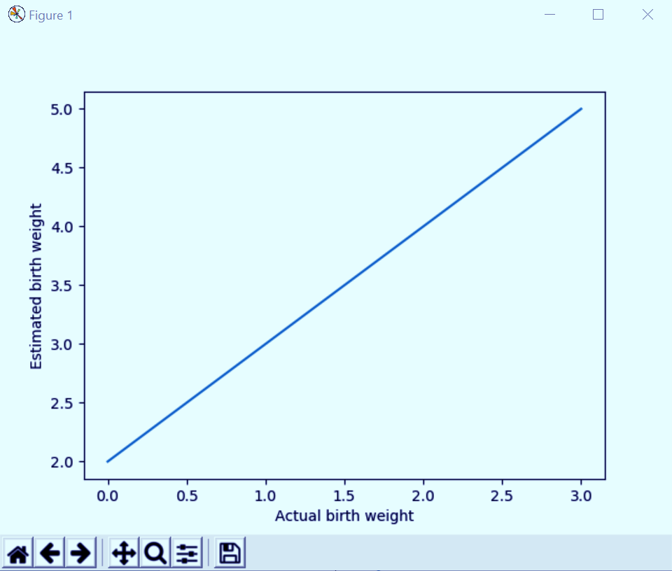
>>> import matplotlib.pyplot as plt
>>> plt.plot([2,3,4,5])
[<matplotlib.lines.Line2D object at 0x00FD5650>]
>>> plt.xlabel('Actual birth weight')Text(0.5,0,’Actual birth weight’)
>>> plt.ylabel('Estimated birth weight')Text(0,0.5,’Estimated birth weight’)
>>> plt.show()
Let’s explore Python Property – The Problem and Solution
Python Matplotlib Tutorial – Python Plotting
Here, the methods xlabel() and ylabel() let us set labels for the x and y axes, respectively. It takes values from our list of parameters for the y-axis; for the x-axis, it uses 0.0, 1.0, 2.0, and 3.0 for the four points.
We can give it more than one list of parameters-
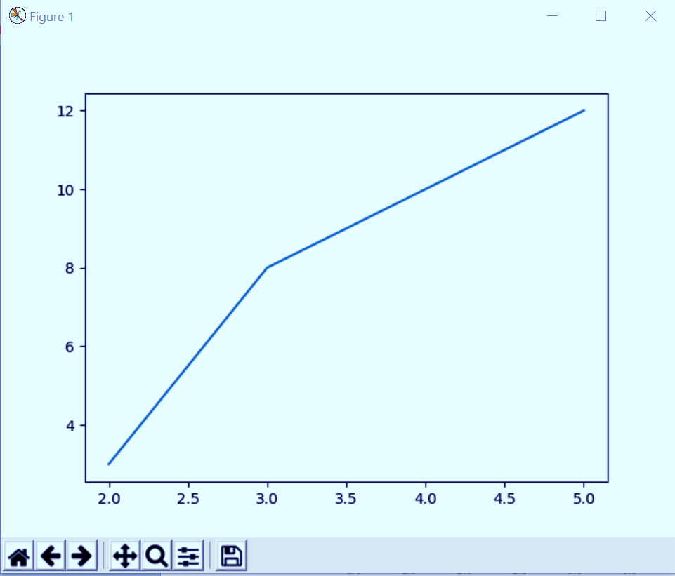
>>> plt.plot([2,3,4,5],[3,8,10,12])
[<matplotlib.lines.Line2D object at 0x0153EFF0>]
>>> plt.show()
Python Matplotlib Tutorial – Python Plotting
This takes the first list for the x-axis and the second for the y-axis.
b. Formatting your Python Plot
A third argument will let you choose the color and the line type of the plot in Python Programming Language. The default format string gives us a solid blue line, as we’ve seen in the examples so far. This is ‘b-‘. You see, these strings are from MATLAB.
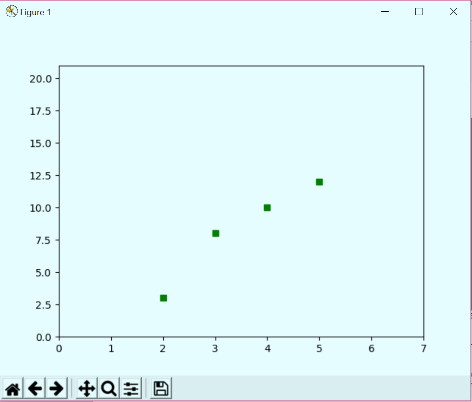
>>> plt.plot([2,3,4,5],[3,8,10,12],'gs')
[<matplotlib.lines.Line2D object at 0x01AD1050>]
>>> plt.axis([0,7,0,21])
[0, 7, 0, 21]
>>> plt.show()
Python Matplotlib Tutorial – Python Plotting
Formatting your Python Plot. The axis() method lets us set the viewport for the axes in terms of xmin, xmax, ymin, and ymax. The format string ‘gs’ here gives us green squares. Similarly, we can plot green, red, and blue orbs, squares, and triangles too.
Let’s take another example.
Read about CGI Programming in Python with Functions and Modules
>>> import numpy as np
>>> t=np.arange(0,5,0.2)
>>> plt.plot(t,t,'r--',t,t**3,'b^',t,t**2,'gs')
[<matplotlib.lines.Line2D object at 0x0A66B670>, <matplotlib.lines.Line2D object at 0x0A66B7B0>, <matplotlib.lines.Line2D object at 0x0A66BA90>]
>>> plt.show()
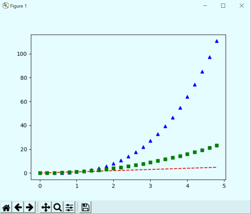
Matplotlib Tutorial – Python Plotting
Keyword Strings with Python Matplotlib
Using a data keyword argument, we can produce Python plots with strings that relate to some variables. We can access these variables with strings.
>>> data={'a':np.arange(50),
'c':np.random.randint(0,50,50),
'd':np.random.randn(50)}
>>> data['b']=data['a']+10*np.random.randn(50)
>>> data['d']=np.abs(data['d'])*100
>>> plt.scatter('a','b',c='c',s='d',data=data)
<matplotlib.collections.PathCollection object at 0x0A7E8AD0>
>>> plt.show()
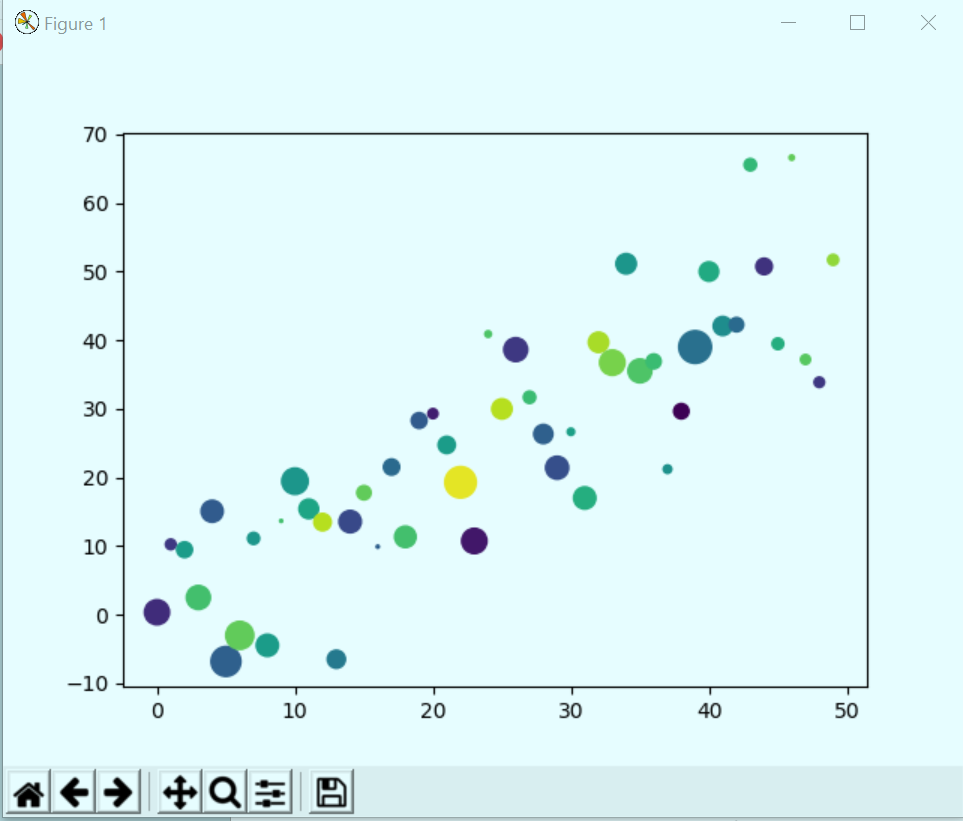
Matplotlib Tutorial -Keyword Strings
Categorical Variables to Python Plotting
We can pass categorical variables to Python plotting functions.
>>> names=["Dingos","Wild Cats","Tigers"]
>>> values=[1,11,111]
>>> plt.figure(1,figsize=(9,3))
<Figure size 900×300 with 0 Axes>
>>> plt.subplot(131)
<matplotlib.axes._subplots.AxesSubplot object at 0x00FD5B30>
>>> plt.bar(names,values)
<BarContainer object of 3 artists>
>>> plt.subplot(132)
<matplotlib.axes._subplots.AxesSubplot object at 0x01889610>
>>> plt.scatter(names,values)
<matplotlib.collections.PathCollection object at 0x0A191AB0>
>>> plt.subplot(133)
<matplotlib.axes._subplots.AxesSubplot object at 0x0A171110>
>>> plt.plot(names,values)
[<matplotlib.lines.Line2D object at 0x0A1ADE30>]
>>> plt.suptitle('Varsity')Text(0.5,0.98,’Varsity’)
>>> plt.show()
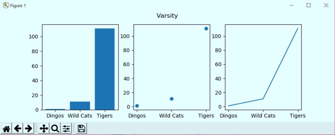
Python Matplotlib Tutorial – Python Plotting
Python Matplotlib Tutorial – Categorical Variables to Python Plotting
Do you know How Python sends email via SMTP | SMTP Server
Some Line Properties of Matplotlib
Using some keyword arguments, we can alter how a graph looks. Let’s look at some.
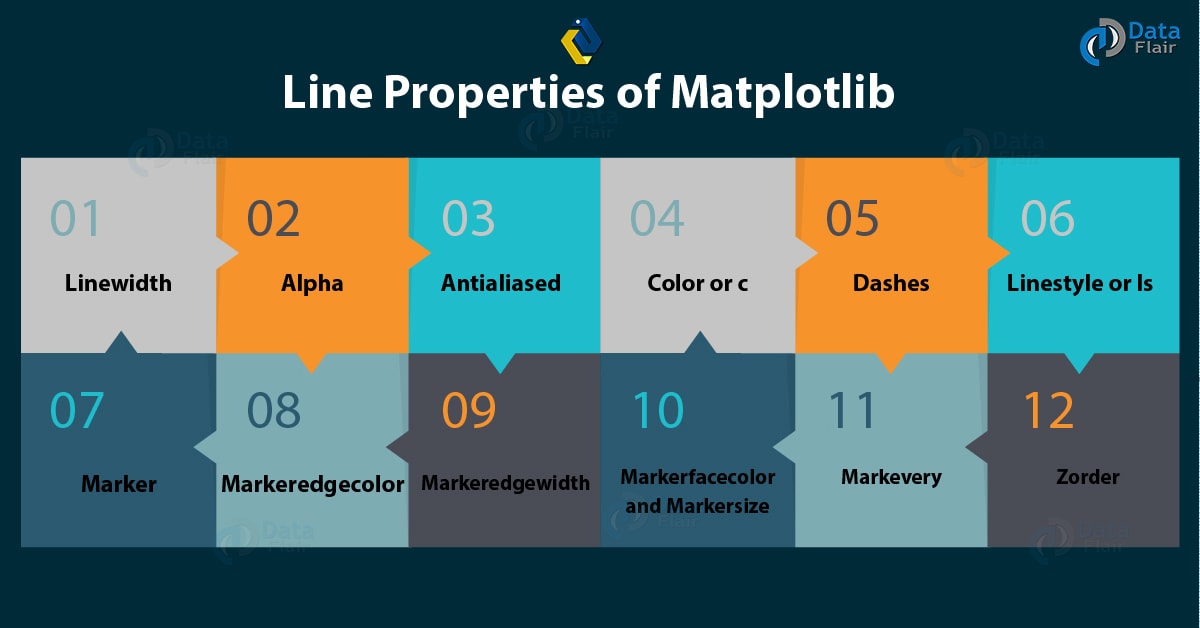
Python Matplotlib Tutorial – Line Properties
a. Linewidth in Matplotlib
>>> plt.plot([1,2,3],[2,4,9],linewidth=4.0)
[<matplotlib.lines.Line2D object at 0x010D05D0>]
>>> plt.show()
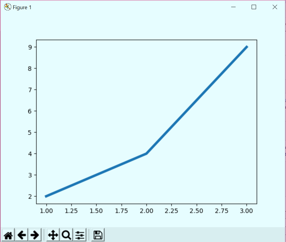
Python Matplotlib Tutorial – Linewidth
b. Alpha in Matplotlib
We can use the alpha channel to create prettier plots by softening colors.
>>> plt.plot([1,2,3],[2,4,9],alpha=5.5)
[<matplotlib.lines.Line2D object at 0x00BC9310>]
>>> plt.show()
Python Matplotlib Tutorial – Alpha
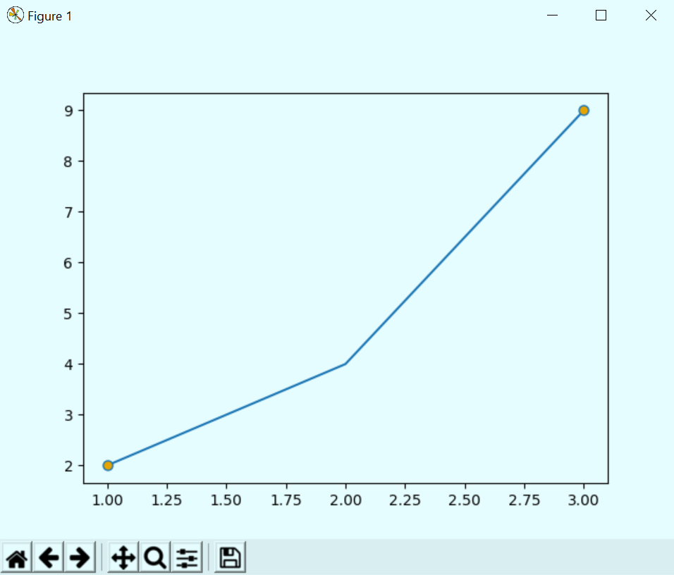
c. Antialiased in Matplotlib
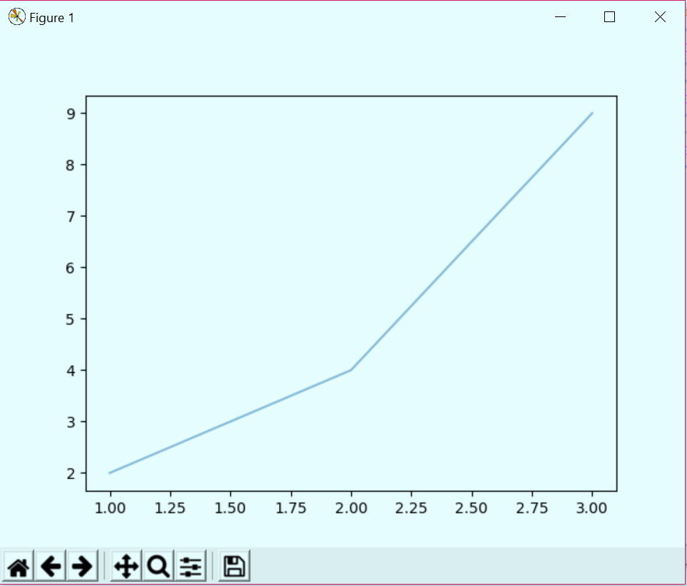
If you look closely, the lines look quite smooth. But we can turn antialiasing off- this will show us the aliasing in the lines.
>>> plt.plot([1,2,3],[2,4,9],antialiased=True)
[<matplotlib.lines.Line2D object at 0x087278B0>]
>>> plt.show()
Python Matplotlib Tutorial – Antialiased
Let’s read about Image Processing with SciPy and NumPy in Python
d. Color or c in Matplotlib
You can set the color of the plot with this parameter.
>>> plt.plot([1,2,3],[2,4,9],color='Chartreuse')
[<matplotlib.lines.Line2D object at 0x0AE98D70>]
>>> plt.show()
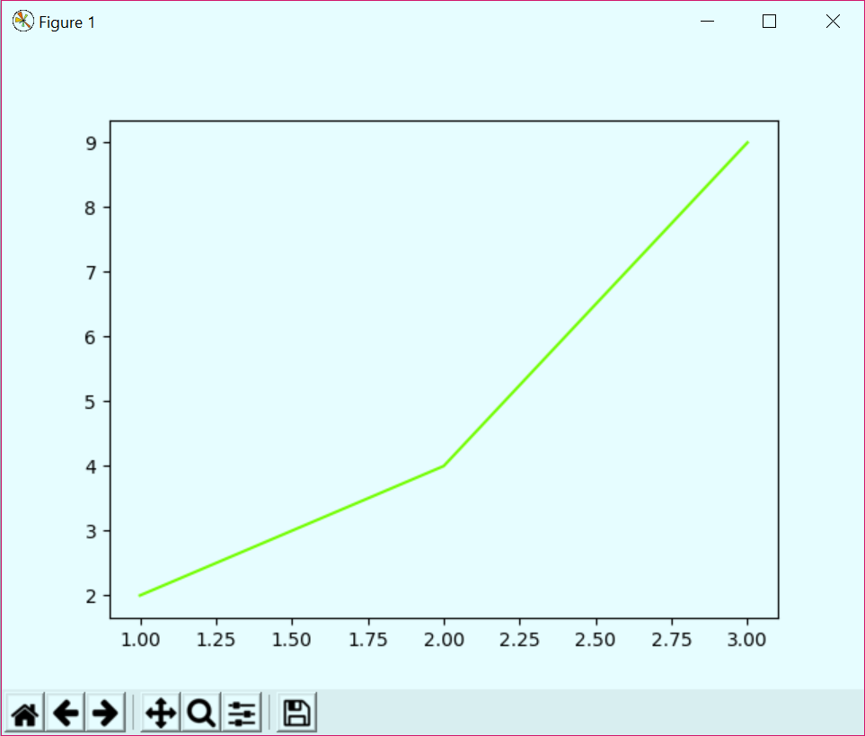
Matplotlib Tutorial – Color
e. Dashes in Matplotlib
>>> plt.plot([1,2,3],[2,4,9],dashes=[1,2,4,4])
[<matplotlib.lines.Line2D object at 0x099ED290>]
>>> plt.show()

Python Dashes
f. Linestyle or ls in Matplotlib
You can choose the style of line you want for your plot.
>>> plt.plot([1,2,3],[2,4,9],linestyle='steps')
[<matplotlib.lines.Line2D object at 0x00B816D0>]
>>> plt.show()
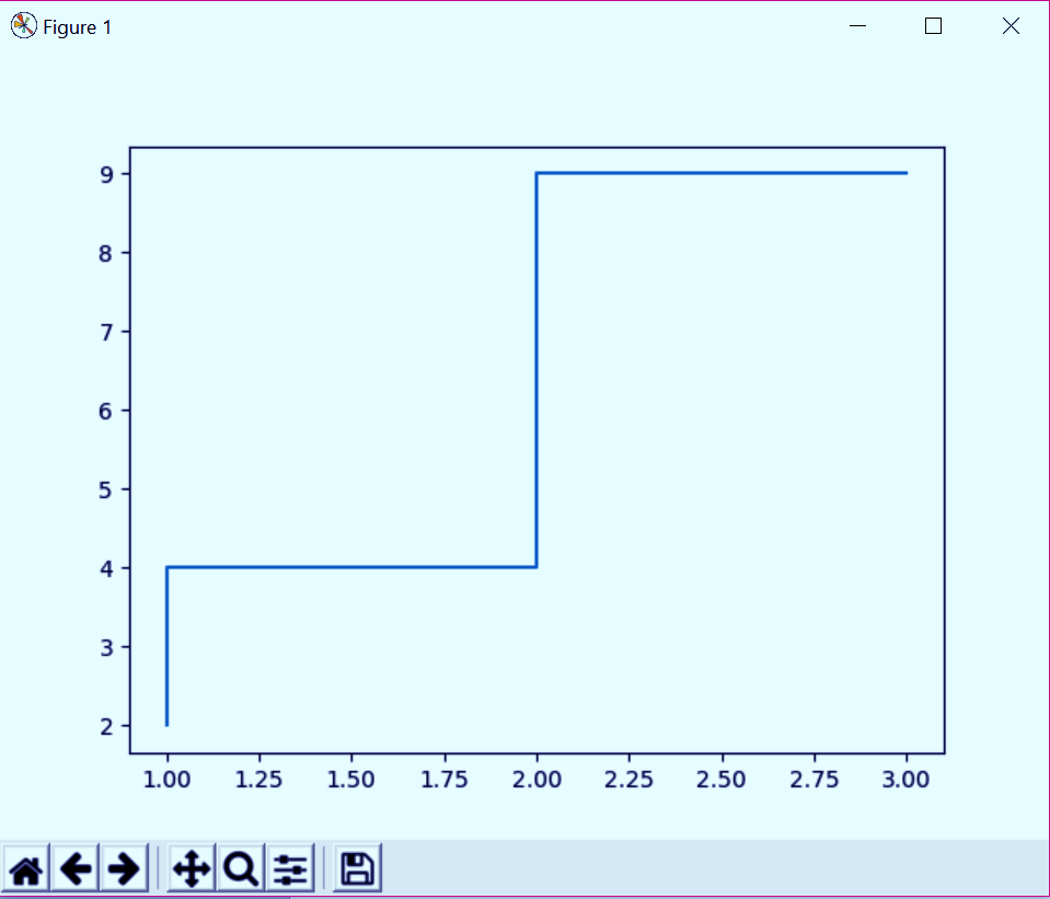
Python Matplotlib Tutorial – Linestyle or ls
>>> plt.plot([1,2,3],[2,4,9],linestyle=':')
[<matplotlib.lines.Line2D object at 0x0AC892D0>]
>>> plt.show()
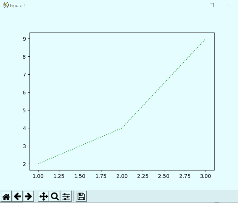
Matplotlib Tutorial – Python Linestyle or ls
Let’s explore Python Database Access – Python 3 MySQL
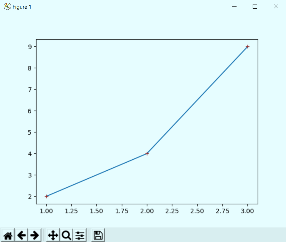
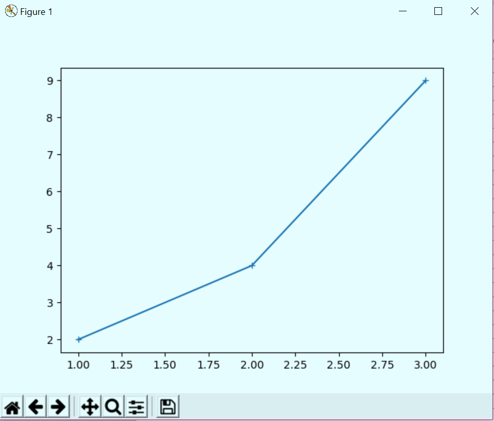
g. Marker in Matplotlib
A marker will let you select what symbol you want to display at breakpoints and bends.
>>> plt.plot([1,2,3],[2,4,9],marker='+')
[<matplotlib.lines.Line2D object at 0x01018790>]
>>> plt.show()

Python Marker
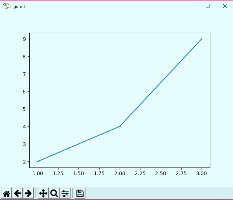
h. Markeredgecolor in Matplotlib
You can also decide on a color for your markers’ edges.
>>> plt.plot([1,2,3],[2,4,9],marker='+',markeredgecolor='brown')
[<matplotlib.lines.Line2D object at 0x01280110>]
>>> plt.show()
Matplotlib Tutorial – Markeredgecolor
i. Markeredgewidth in Matplotlib
This lets us decide how thick we want our markers to be.
>>> plt.plot([1,2,3],[2,4,9],marker='+',markeredgewidth=0.4)
[<matplotlib.lines.Line2D object at 0x0AE54290>]
>>> plt.show()
Matplotlib Tutorial – Markeredgewidth
Let’s Learn Aggregation and Data Wrangling with Python
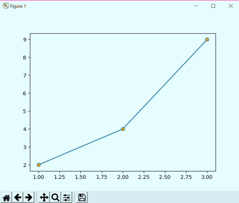
j. Markerfacecolor and Markersize in Matplotlib
This will let you choose which color to fill in your marker and what size to keep it.
>>> plt.plot([1,2,3],[2,4,9],marker='.',markerfacecolor='orange',markersize=13.0)
[<matplotlib.lines.Line2D object at 0x0AE9BC10>]
>>> plt.show()
Python Matplotlib Tutorial – Markerfacecolor and Markersize
k. Markevery in Matplotlib
This parameter lets us decide at what parameters we want to put markers.
Python Markevery
plt.plot([1,2,3],[2,4,9],marker='.',markerfacecolor='orange',markersize=13.0,markevery=2)
[<matplotlib.lines.Line2D object at 0x0103C8B0>]
>>> plt.show()
>>> plt.plot([1,2,3],
[2,4,9],marker=’.’,markerfacecolor=’orange’,markersize=13.0,markevery=3) [<matplotlib.lines.Line2D object at 0x01025F10>]
>>> plt.show()
Matplotlib Tutorial – Python Markevery
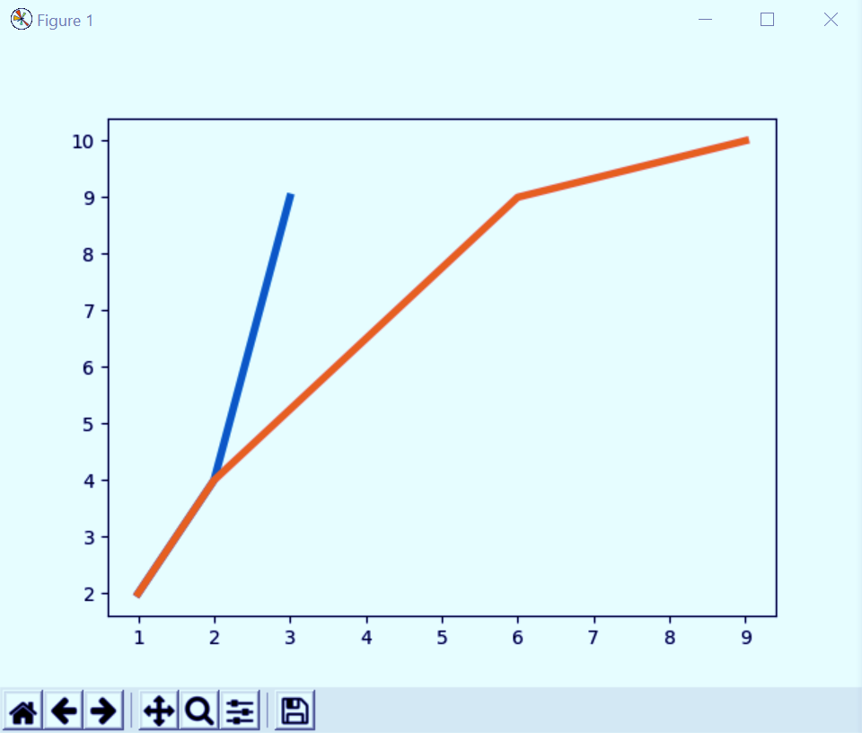
l. Zorder in Matplotlib
This lets us decide which plots will show up in the front and which to send to back.
>>> plt.plot([1,2,3],[2,4,9],zorder=1,linewidth=4)
[<matplotlib.lines.Line2D object at 0x01255E70>]
>>> plt.plot([1,2,6,9],[2,4,9,10],zorder=2,linewidth=4)
[<matplotlib.lines.Line2D object at 0x01255770>]
>>> plt.show()
Matplotlib Tutorial – Python Plotting
In this graph, in the area enclosed by the points (1,2) and (2,4), both plots cover the same points, but the one in orange is in the front. This is because we give it a higher zorder. This is like z-index in CSS.
Let’s Know about Python Stemming and Lemmatization – NLTK
Showing a Grid in Python Plot
You can use the grid() method to toggle a grid in your plot.
>>> plt.grid(True)
>>> plt.plot([1,2,6,9],[2,4,9,10],zorder=2,linewidth=4)
[<matplotlib.lines.Line2D object at 0x00DC02B0>]
>>> plt.show()
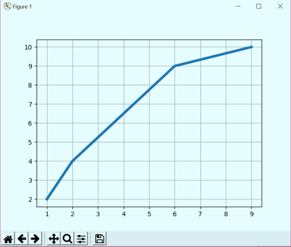
Showing a Grid in Python Plot
So, this was all about Python Matplotlib Tutorial. Hope you like our explanation.
Conclusion
Matplotlib is the starting point for almost all the data visuals in Python. By learning it, you’ve unlocked the ability to create everything from basic to a professional level. It’s the ultimate tool for turning data into insights, which is really important.
Hence, we have studied Matplotlib, which is a Python library used for plotting and much more. Libraries like Seaborn and Pandas plotting functions are built on top of Matplotlib. Once you understand the basics, you can use it to build visuals for dashboards, reports, and Jupyter notebooks that clearly communicate your insights.
Furthermore, if you have any information regarding it, feel free to share it with us.
We work very hard to provide you quality material
Could you take 15 seconds and share your happy experience on Google


The article is really nice and helpful. I feel so much confident in handling any challenge related to matplotlib.
Thank you.