Python Time Series Analysis – Line, Histogram, Density Plotting
Master Python with 70+ Hands-on Projects and Get Job-ready - Learn Python
In this Python tutorial, we will learn about Python Time Series Analysis. Moreover, we will see how to plot the Python Time Series in different forms, like the line graph, Python histogram, density plot, autocorrelation plot, and lag plot.
So, let’s begin.
What is Time Series in Python?
Consider a sequence of points of data. Suppose we look at the rate of the dollar ($) to the Indian Rupee. We can link each point of data with a timestamp. Let’s try plotting for this rate over a period of one week. Let’s use Python pandas for this.
- The main objective of time series is to study the data from time to time to get some useful predictions and patterns.
- It makes decision-making easier and supports forecasting.
- To find the latest trends, seasonal patterns and behaviour, data analysis and visualisation are very important.
Time series is used in industries such as:
- Pharmaceuticals
- Finance
- Social media platforms
- Research
a. Data to Use in Python Time Series Analysis
We save the following data in a CSV file–
Date, Rate
18-07-2018, 68.625
19-07-2018, 68.9453
20-07-2018, 68.745
21-07-2018, 68.747
22-07-2018, 68.7415
23-07-2018, 68.9449
24-07-2018, 68.9486
We save this as dollartorupee.csv.
Do you know about Python NumPy?
b. Plotting a Python Line Chart/Graph
Let’s use this data to plot a simple line graph with this.
>>> from pandas import Series
>>> from matplotlib import pyplot
>>> series=Series.from_csv('dollartorupee.csv',header=0)
>>> series.plot()
<matplotlib.axes._subplots.AxesSubplot object at 0x031948D0>
>>> pyplot.show()

Plotting a Line Graph in Time Series Python Analysis
We can use a line style with this-
Learn more about Python SciPy
>>> series.plot(style='k.')
<matplotlib.axes._subplots.AxesSubplot object at 0x033969B0>
>>> pyplot.show()
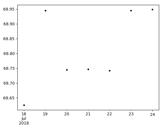
Plotting a Line Graph
Plotting a Python Histogram
Now, to plot a Python histogram, we can try the hist() method.
>>> series.hist()
<matplotlib.axes._subplots.AxesSubplot object at 0x05D683D0>
>>> pyplot.show()

Plotting a Python Histogram in Time Series Python Analysis
Density Plot in Python Time Series
What if we want to find out the density of the rate values for the entire week?
>>> series.plot(kind='kde')
<matplotlib.axes._subplots.AxesSubplot object at 0x03194C70>
Let’s discuss Python Interpreter
>>> pyplot.show()

Plotting a Density Plot in Time Series Python Analysis
Autocorrelation Plot in Time Series
This gives us how the elements of the series correlate to each other.
>>> from pandas.tools.plotting import autocorrelation_plot
>>> autocorrelation_plot(series)
<matplotlib.axes._subplots.AxesSubplot object at 0x08C5CA90>
>>> pyplot.show()
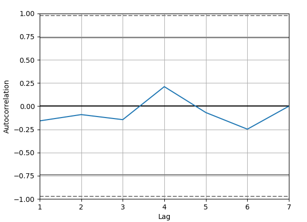
Autocorrelation Plot in Time Series Python Analysis
Plotting a Lag Plot in Time Series
Such a plot tells us whether a time series is random. If you can identify a structure in the plot, the data isn’t random.
Do you know about Python Matplotlib
>>> from pandas.tools.plotting import lag_plot
>>> lag_plot(series)
<matplotlib.axes._subplots.AxesSubplot object at 0x08EF4FF0>
>>> pyplot.show()
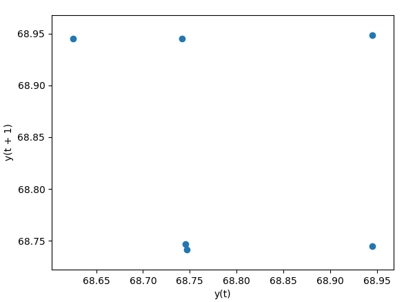
Plotting a Lag Plot in Time Series in Python Analysis
So, this was all in Time Series Analysis in Python. Hope you like our explanation.
Conclusion
Time series analysis is used when data points are collected over time—like daily stock prices, monthly sales, or hourly weather readings. These types of data often show patterns such as trends, seasonality, and cycles. Python offers several libraries for handling time series, including Pandas for indexing and manipulating datetime objects, and statsmodels and Prophet for modelling and forecasting. This data is used in many industries for prediction and decision-making.
Hence, in this Python tutorial, we discussed what Time Series is, its analysis in Python and plotting in Python. Now you know how to plot it in different forms. Got any questions? Leave them in the comments below.
See also –
Python Django
For reference
We work very hard to provide you quality material
Could you take 15 seconds and share your happy experience on Google


