Python Heatmap | Word Cloud Python with Example
Master Python with 70+ Hands-on Projects and Get Job-ready - Learn Python
Next in our series of graphs and plots with Python is Python Heatmaps and Word Cloud. Moreover, we will see what a Python Heatmap and a Python Word Cloud are. Also, we will discuss the Python heatmap example and the Word Cloud Python Example.
So, let’s start with creating a Python Heatmap.
How to Create a Heatmap in Python?
So, what is a heat map? A way of representing data as a matrix of values. Basically, using different colors to represent data, it gives you a general view of the numerical data. Some manipulations when working with heatmaps. Python Heatmap includes normalizing the matrices, performing cluster analysis, choosing a color palette, and permuting rows and columns to place similar values nearby.
Do you know about Python Numpy
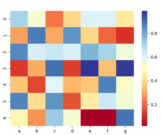
a. A Simple Python Heatmap Example
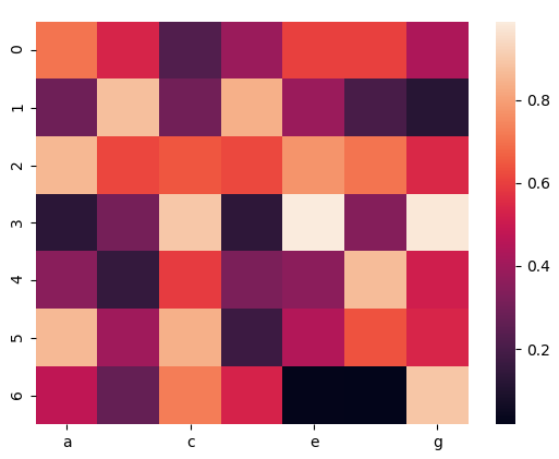
First, let’s make a simple heat map to get an idea of what it is.
>>> import seaborn as sn
>>> import numpy as np
>>> import pandas as pd
>>> df=pd.DataFrame(np.random.random((7,7)),columns=['a','b','c','d','e','f','g'])
>>> sn.heatmap(df)
<matplotlib.axes._subplots.AxesSubplot object at 0x078DAA10>
>>> import matplotlib.pyplot as plt
>>> plt.show()
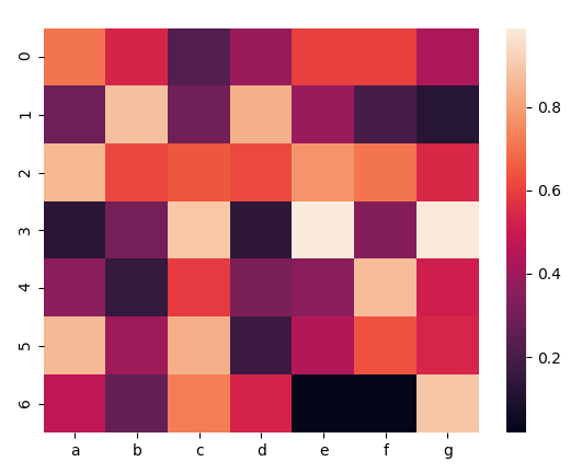
Python Heatmap example
Here, we create a DataFrame and then call the heatmap() method on it, borrowing from seaborn.
b. Annotating your Python heatmap
You can add an annotation to every cell of your Python heatmap.
>>> sn.heatmap(df,annot=True,annot_kws={'size':7})<matplotlib.axes._subplots.AxesSubplot object at 0x078529D0>
>>> plt.show()
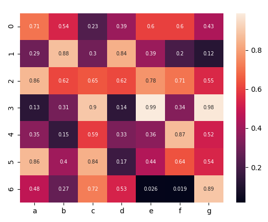
Python Heatmap Annotation
Here, annot_kws lets us set the size of the annotations with the ‘size’ parameter. We set it to 7 for this demo.
c. Adding Grid Lines
It is possible to add grid lines to your Python heatmap. In the following piece of code, we add pink grid lines of thickness 2.5.
Let’s discuss Python Scipy
>>> sn.heatmap(df,linewidths=2.5,linecolor='pink')
<matplotlib.axes._subplots.AxesSubplot object at 0x07AFD970>
>>> plt.show()
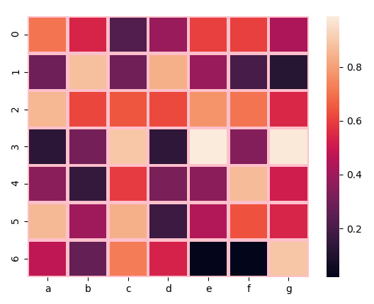
rid lines in Python Heatmap
d. Removing X or Y labels
In the next piece of code, we remove the x tick labels from the map.
>>> sn.heatmap(df,xticklabels=False)
<matplotlib.axes._subplots.AxesSubplot object at 0x07B5F0D0>
>>> plt.show()
Removing labels in Python Heatmap
e. Removing the color bar
The vertical bar at the extreme right of this Python Heatmap tells us what values the colors represent. But we can choose to not display it.
Let’s revise Python Array Module
>>> sn.heatmap(df,cbar=False)
<matplotlib.axes._subplots.AxesSubplot object at 0x08083090>
>>> plt.show()

Removing color bar in Heatmap
f. Keeping only a few labels
Basically, when there are too many cells/labels, there may be overlapping. To avoid this, you can give a value x to the xticklabels parameter. It then shows labels every x labels.
>>> sn.heatmap(df,xticklabels=2)
<matplotlib.axes._subplots.AxesSubplot object at 0x082E4C70>
>>> plt.show()
Keeping few labels inPython heatmap
g. Choosing a color theme for your heatmap
Let’s try a green.
>>> sn.heatmap(df,cmap='Greens')
<matplotlib.axes._subplots.AxesSubplot object at 0x0AF5D510>
Read Python Descriptive Statistics
>>> plt.show()
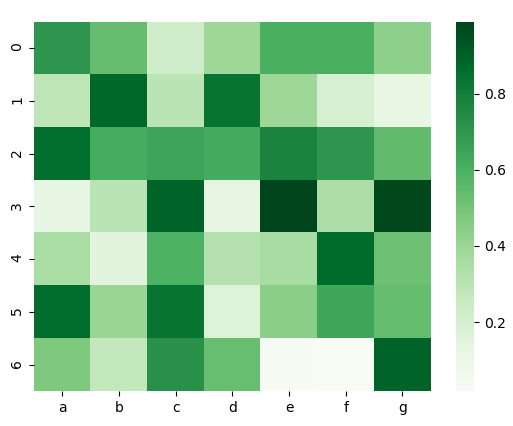
Heatmap – Color Theme
Now, let’s try blue and purple.
>>> sn.heatmap(df,cmap='BuPu')
<matplotlib.axes._subplots.AxesSubplot object at 0x0B0CFAB0>
>>> plt.show()
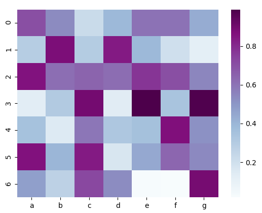
Heatmap Python – Color theme
Yellow, green, and blue-
>>> sn.heatmap(df,cmap='YlGnBu')
<matplotlib.axes._subplots.AxesSubplot object at 0x0B26F1D0>
>>> plt.show()
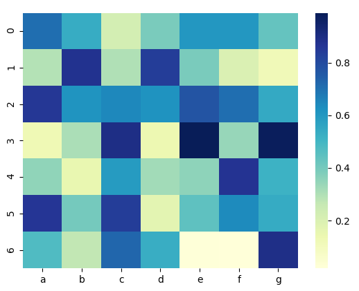
Heatmap in Python – Color Theme
Red, yellow, blue-
>>> sn.heatmap(df,cmap='RdYlBu')
<matplotlib.axes._subplots.AxesSubplot object at 0x09DF3A70>
Have a look at the Python Interpreter
>>> plt.show()
Heatmap Python – Color theme
h. Plotting a discrete heatmap
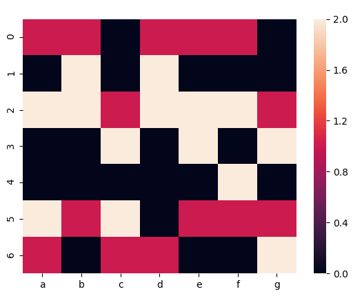
Plotting a discrete heatmap
For discrete data, you can choose to plot it with a Python heatmap.
i. Normalizing a column
So, consider the following piece of code-
>>> df=pd.DataFrame(np.random.randn(7,7)*4+3)
>>> df[1]=df[1]+37
>>> sn.heatmap(df,cmap='plasma')
<matplotlib.axes._subplots.AxesSubplot object at 0x09E1FC90>
>>> plt.show()

Normalizing a column in a heatmap in Python
Now, in this plot, 1 has considerably higher values. To get around this, we normalize it.
>>> df_norm=(df-df.mean())/df.std()
>>> sn.heatmap(df_norm,cmap='plasma')
<matplotlib.axes._subplots.AxesSubplot object at 0x07EDEDD0>
Do you know about Python Matplotlib
>>> plt.show()
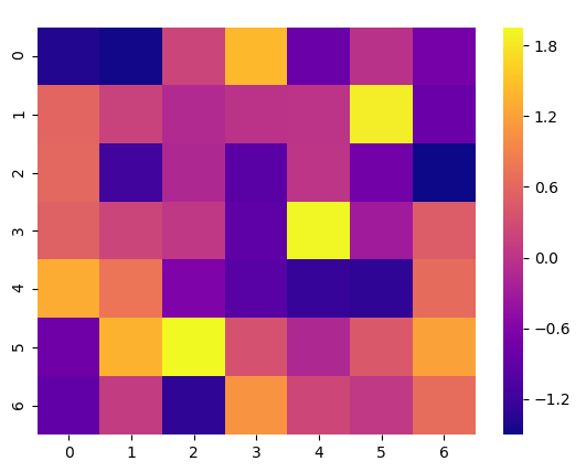
Normalizing a column in heatmap Python
How to Create a Word Cloud in Python?
A word cloud in Python visually represents text data. Also called a tag cloud, it uses different font sizes and colors to highlight the importance of each word. This way, the most prominent terms will come across to the user. We will use the Word Cloud library here.
They are important because:
- It lets you understand what is the topic of discussion in large text data easily.
- It helps you in identifying important words easily.
- It can show the common words used in the text quickly.
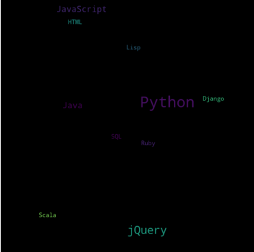
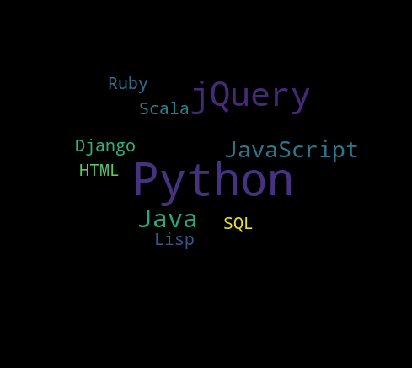
a. A simple Word Cloud Python Example
>>> from wordcloud import WordCloud
>>> text=("Python Python Python C Java JavaScript jQuery jQuery R Python Python SQL HTML Lisp Java Ruby jQuery Python Python Django Scala Python JavaScript jQuery")
>>> wordcloud=WordCloud(width=500,height=500,margin=1).generate(text)
>>> plt.imshow(wordcloud,interpolation='bilinear')
<matplotlib.image.AxesImage object at 0x09D1CC50>
>>> plt.axis('off')(-0.5, 499.5, 499.5, -0.5)
>>> plt.margins(x=0,y=0)
>>> plt.show()
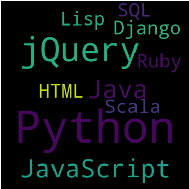
Word Cloud Python Example
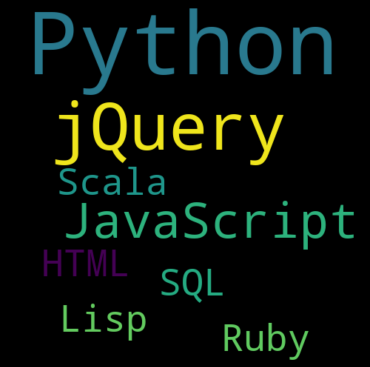
b. Setting the font size
Now, you can set a maximum and minimum font size for your Word cloud Python.
>>> wordcloud=WordCloud(width=500,height=500,max_font_size=30, min_font_size=10,margin=1).generate(text)
>>> plt.imshow(wordcloud,interpolation='bilinear')
<matplotlib.image.AxesImage object at 0x0832CB70>
>>> plt.axis('off')(-0.5, 499.5, 499.5, -0.5)
Learn Aggregation and Data Wrangling with Python
>>> plt.margins(x=0,y=0)
>>> plt.show()
Setting the font size in Word Cloud Python
c. Limit the number of words
Now, let’s see what happens if we don’t call the axis() and margins() methods.
>>> wordcloud=WordCloud(width=500,height=500,max_words=4,margin=1).generate(text)
>>> plt.imshow(wordcloud,interpolation='bilinear')
<matplotlib.image.AxesImage object at 0x07EDECD0>
>>> plt.show()

Python Word cloud – Limit the number of words
d. Exclude some words
Generally, it is possible to use only some words from the text.
>>> wordcloud=WordCloud(width=500,height=500,stopwords=['Java','Django']).generate(text)
>>> plt.imshow(wordcloud,interpolation='bilinear')
<matplotlib.image.AxesImage object at 0x09E14030>
>>> plt.axis('off')(-0.5, 499.5, 499.5, -0.5)
>>> plt.margins(x=0,y=0)
>>> plt.show()
Python Word cloud – Exclude some words
e. Change the background
Now, you can set the background to a certain color.
Want to learn about Python Django
>>> wordcloud=WordCloud(height=500,width=500, background_color='darkturquoise').generate(text)
>>> plt.imshow(wordcloud,interpolation='bilinear')
<matplotlib.image.AxesImage object at 0x079B7190>
>>> plt.axis('off') (-0.5, 499.5, 499.5, -0.5)
>>> plt.margins(x=0,y=0)
>>> plt.show()
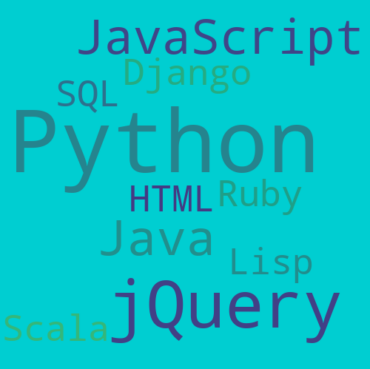
Change the background in Word cloud Python
f. Setting word color
Now, how about changing the color of words?
>>> wordcloud=WordCloud(height=500,width=500,background_color='white', colormap='plasma').generate(text)
>>> plt.imshow(wordcloud,interpolation='bilinear')
<matplotlib.image.AxesImage object at 0x080AA830>
>>> plt.axis('off')(-0.5, 499.5, 499.5, -0.5)
>>> plt.show()
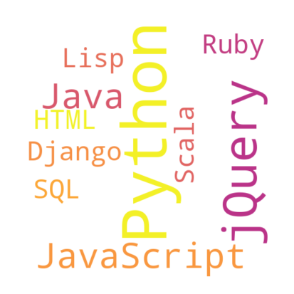
Setting word color in Python Word Cloud
g. Shaping a word cloud
Now, it is possible to set a Python word cloud for a custom shape. Let’s use a diamond:

Shaping a word cloud Python
>>> from PIL import Image
>>> mask=np.array(Image.open('diamond.png'))
>>> wordcloud=WordCloud(mask=mask).generate(text)
>>> plt.imshow(wordcloud)
<matplotlib.image.AxesImage object at 0x07852630>
Let’s explore Python data File formats
>>> plt.axis('off')(-0.5, 488.5, 438.5, -0.5)
>>> plt.show()
Shaping a word cloud Python
So, this was all in Python Heatmap. Hope you like our explanation of Word Cloud Python.
Conclusion
Heatmaps are effective in exploring categorical data, such as showing click-through rates across multiple pages and user segments. They are visually appealing and easy to interpret for both technical and non-technical audiences. When used properly, heatmaps can highlight valuable insights that might be missed in raw tables or summary statistics.
Hence, in this Python Heatmap tutorial, we discussed what a heat map is and how to create a Python Heatmap. Moreover, we discussed Word Cloud Python. In this, we saw what a Word cloud is and how to make a Word Cloud. Also, we saw the Word Cloud Python Example. So this is how we create heat maps and word clouds in Python. For this, we used the libraries matplotlib and word cloud in this tutorial. Still, if any doubt regarding Python Heatmap, ask in the comments tab.
See also –
Python Charts
For reference
Did we exceed your expectations?
If Yes, share your valuable feedback on Google


