Wondering how to work on Power BI KPI? Check out this Ultimate Guide!
Expert-led Online Courses: Elevate Your Skills, Get ready for Future - Enroll Now!
In this tutorial, we will learn about Key Performance Indicators (KPIs) in Power BI. KPIs are an essential part of an analytics report as it shows important statistics of the data. We will do a thorough learning of Power BI KPI. So, let’s quickly start!
What are KPIs?
The KPIs evaluates an organization’s performance in different areas by evaluating quantifiable measure values. In businesses, KPIs play an essential role as visual cues that indicates the growth by evaluating values and measurable goals. A KPI always has a base value or measure which is evaluated against a target value. That is, comparing the actual performance with the target set. You can evaluate the performances in an analysis just by seeing the KPIs.
KPIs will show whether the goals that you have set are met or not. For instance, a company’s sales department might use KPIs to evaluate sales gross profit against projected gross profit for a selected period. The low-level KPIs focus on the individual aspects such as employees, sales, marketing, production, etc whereas, the high-level KPIs display the overall performance of an organization giving a generalized insight.
Do you know – How to Use Slicer in Power BI
KPI Elements in Power BI
Every KPI that you use in Power BI can be broken down into three parts; Base value, Target value, and Status thresholds.
- Base value: A base value is a measure value which is generally an average of the sum of sales, gross profit, etc.
- Target value: The target value is also a measure which is an absolute value. This target value is set as a goal against which a target value is evaluated. For instance, you set the target value for total units to be sold in a month as 200. Now, your base value will be the recorded value for a month. It can be less than 200, 200 or greater than 200.
- Status thresholds: The status thresholds provide a range to evaluate the base value and target values. The visual also presents a high and low end of range between which the base and target values fall.
Uses of KPIs in Power BI
Working with KPIs is easy and you can use them to display equally complex information. The two main reasons why you should use KPIs in your Power BI reports are:
- We use KPIs to measure progress i.e. the positive or negative change occurring over time. For example – whether you are getting correct results or not, meeting targets or lagging behind.
- We also use KPIs to measure the distance to a target or a goal. In this case, you analyze how far behind you are in meeting your target.
Prerequisites to Use KPI in Power BI
The two very basic prerequisites to make KPIs in Power BI are:
- You must have Power BI Desktop downloaded on your system.
- You must have a data source or an existing report in relevance to which you can create a KPI.
Requirements for Creating KPI in Power BI
The basic requirements for creating a KPI in Power BI Desktop are a base measure value, a target value and a trend or threshold value. You will be needing a base measure to evaluate a value. You can select a goal, target and base value from the dataset you are working with to make your Power BI report. In the next section, we will learn how to create a KPI by adding these values from your dataset.
Learn to work on Power BI Desktop in easy steps
How to Create a KPI in Power BI Desktop
Now, let’s learn how to create a simple KPI in Power BI Desktop from these simple steps:
Open your report editor in Power BI Desktop then select a report on which you are working.
On your right, you will see a Visualizations pane and a Fields pane.
From the Visualizations pane, select the KPI visual.
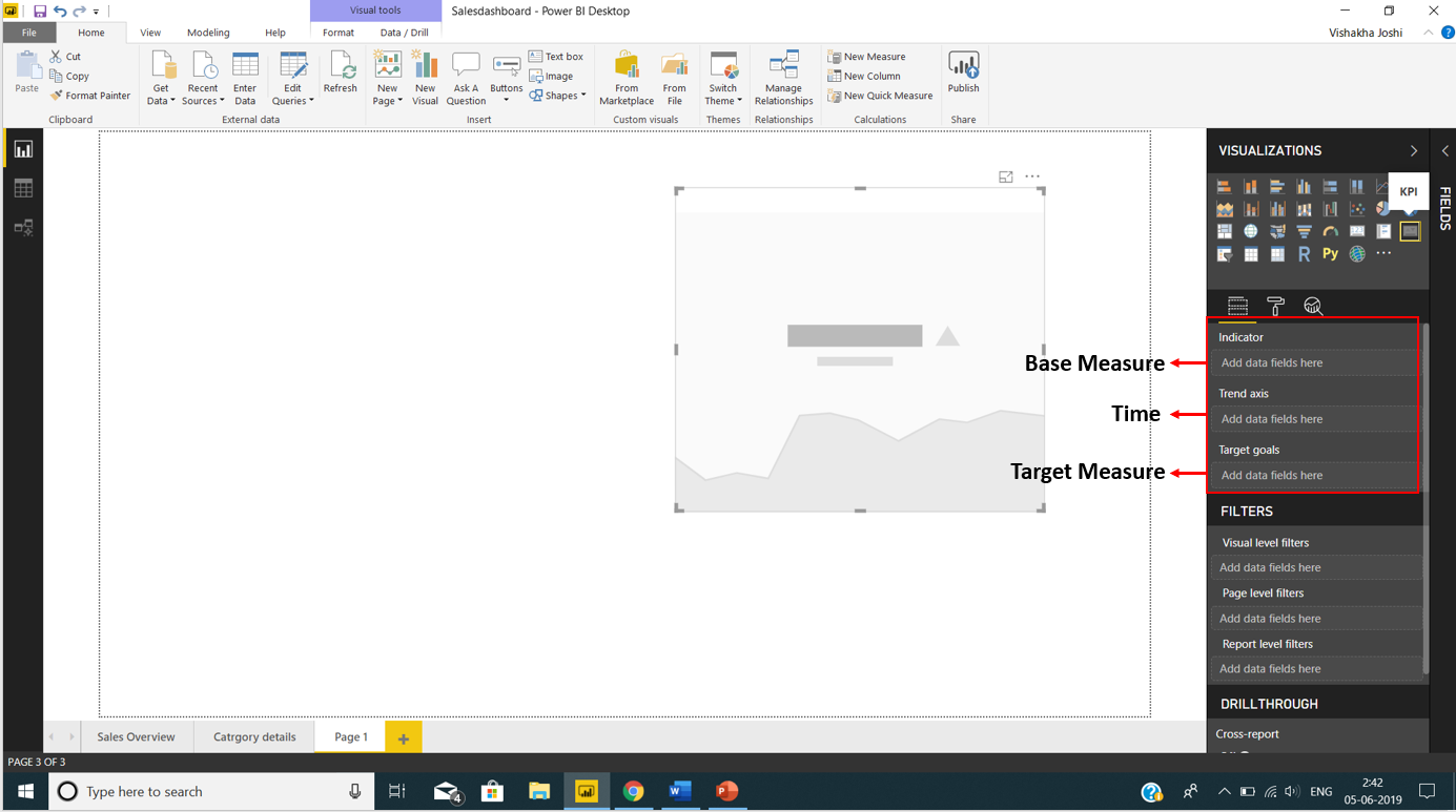
As soon as you select the KPI visual, you will see three blank spaces in the Fields section; Indicator, Trend axis, and Target measure.
In our Fields pane, we have all the fields from the imported tables. We selected the field values (from table TotalSalesThisYear) and put it into the Indicator column. Then we put the field FiscalMonth in Trend axis column and the Goals field into Target measure column.
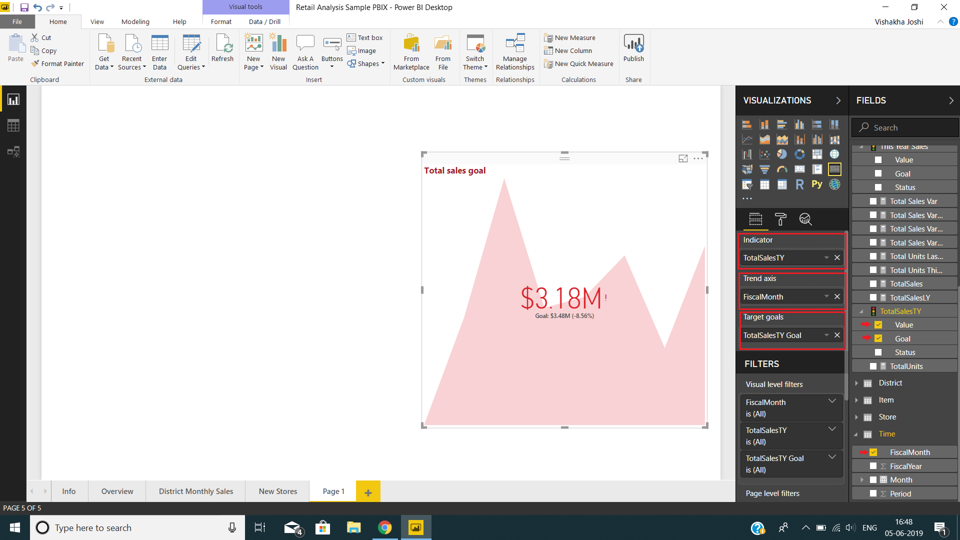
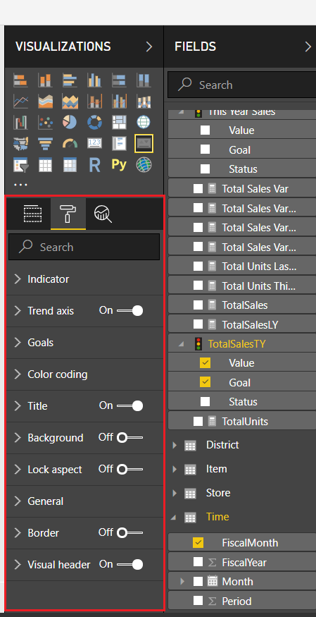
As you can see in the image above, our KPI is ready with the values we selected. You can also format this KPI by selecting the paint roller icon i.e. the Format section. From here you can set the properties of indicator, goal, trend axis, color coding, title, background, etc.
After formatting the KPI as per our preferences, the KPI looks as shown in the image below.
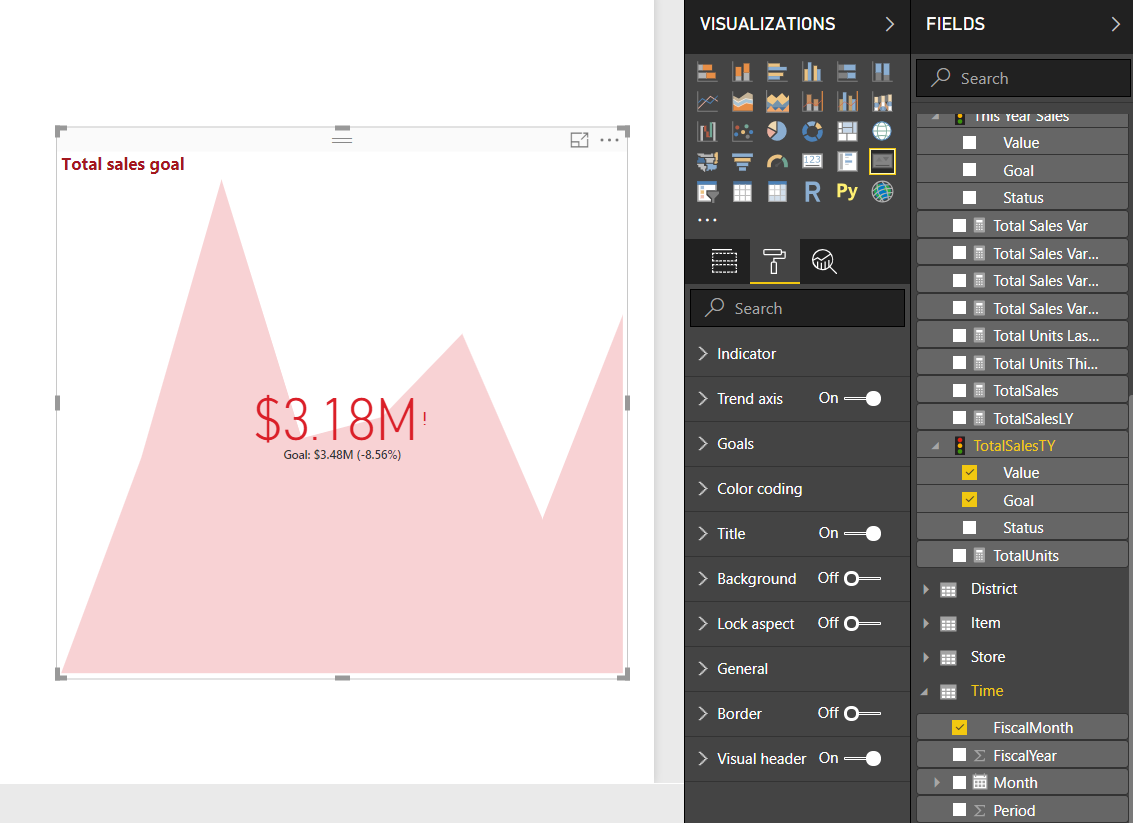
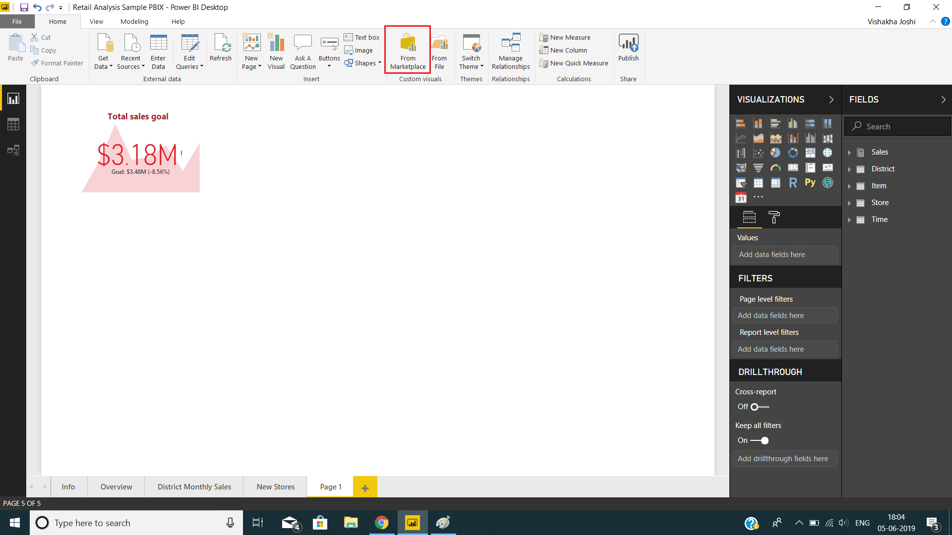
The KPI shows total sales goal for the fiscal months of a fiscal year. As you can see, the goal or target value of sales is $3.48 million, but the sales done were $3.18 million. This indicates that the goal is not met and there is a negative difference of 8.56% between the base value and the target value. This is the reason why the value is shown in red. If the goal was met, then the value would have been green with a tick mark. If the base value exceeds the target value with some amount then the corresponding percentage will be shown with a plus sign.
Explore the Deployment Channels in Power BI Custom Visuals
KPI Custom Visualizations
The KPI we just built was built-in KPI which is a basic KPI visual that comes in Power BI Desktop. In addition to this built-in KPI, there are several other KPI-related visualizations that you can download from the Power BI Marketplace.
To add custom KPI visualizations from the marketplace, click on From Marketplace icon.
From the Power BI Visuals dialog box, you will have all the available add-in visualizations. For KPI related visuals, go to KPIs option and select from the list of visuals like Bullet Chart, Dual KPI, Power KPI, etc.
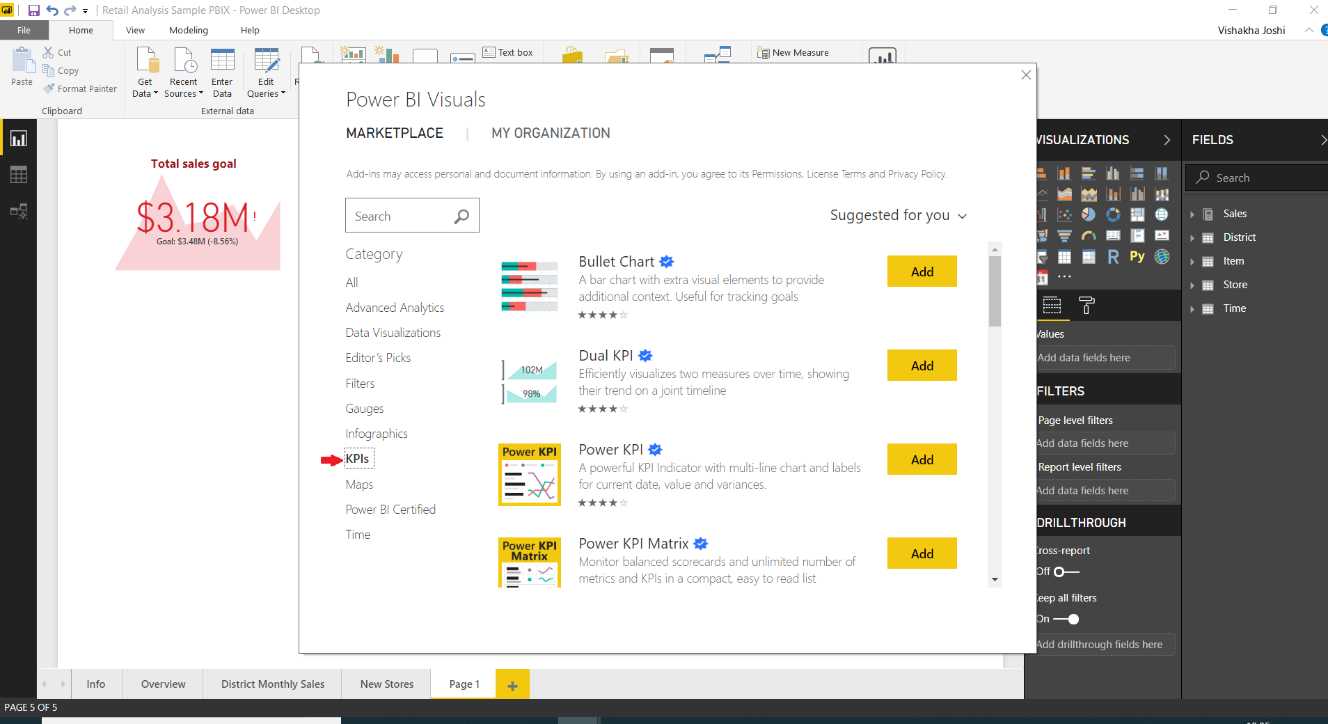
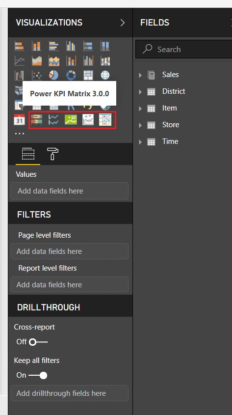
All the visuals that you’ll select will appear in the Visualizations section of your report editor.
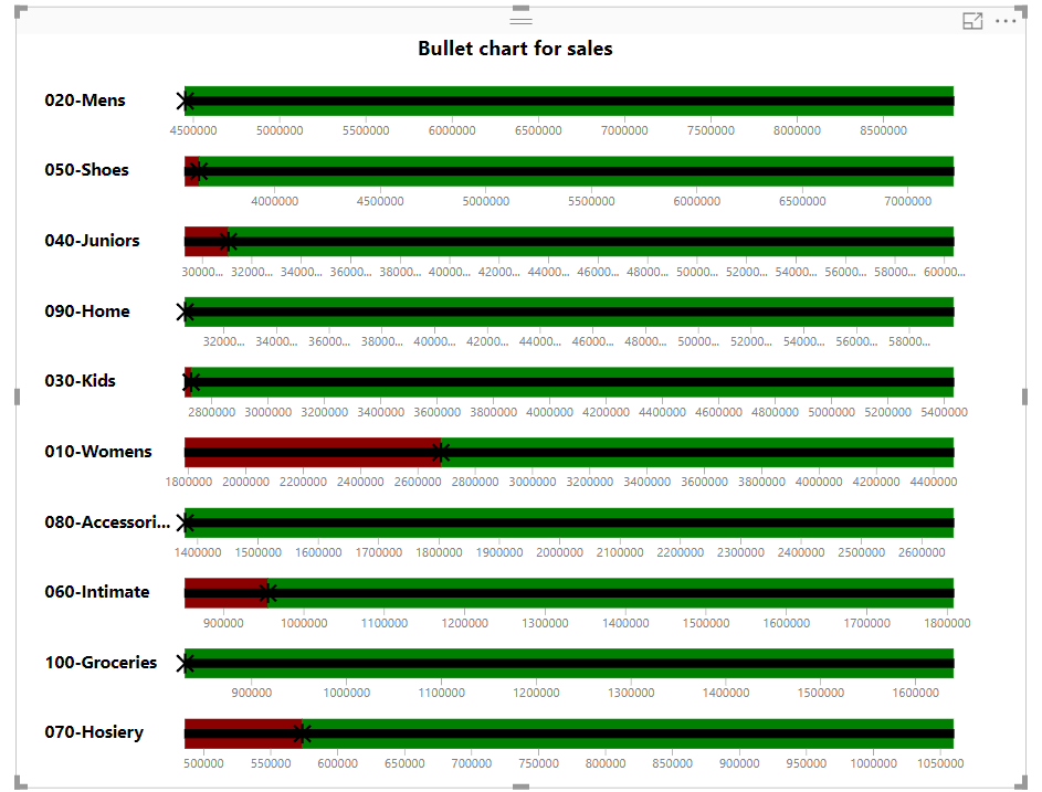
Bullet Chart
The bullet chart represents a measure value and evaluates it against a target value. Along with this, it provides a context to evaluate performances by performance markers like poor, need improvement, satisfactory, good, and very good. These performance markers are indicated by different colors such as red (poor), yellow(satisfactory), green (good) or dark green (very good), etc. Every bullet bar is divided into these colored sections.
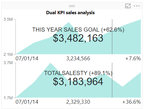
Dual KPI
A dual KPI shows two KPI visuals next to each other. Such KPI visuals are dynamic in nature and change values and info as you hover over the KPI. The dual KPIs does not occupy much space and are very informative. It has small icons and labels marking details related to the values shown.
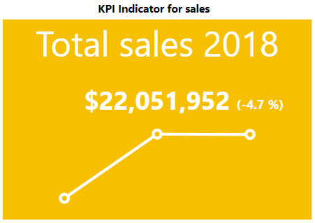
KPI Indicator
The KPI indicator visual shows the status through a colored background. The base value is shown by it and the difference between the base and target value is indicated via percentage. The trend line in KPI indicator is shown as a line or a bar chart.
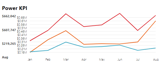
Power KPI
A Power KPI is a simple multi-lined chart that represents base values in the form of lines of different colors. The target values are highlighted separately in the visual. The Power KPI represents information in both graphic and textual way making it very informative for the users.
Considerations and Troubleshooting
As we have seen by far, KPIs look easy, but they can be equally complex and lead to problems in creating them. Often times when you are new in working with KPIs, your KPI might look up to the mark. This can be due to several reasons. One, you might not have placed the right fields in the right sections (indicator, trend axis, target measure). Or, you might not have sorted the year or month fields properly. In the newer versions of Power BI Desktop, you will see the Filters option through which you can sort the fields.
Have you checked our Latest Tutorial on Filters in Power BI?
Summary
This concludes our tutorial on KPIs in Power BI. We hope you liked our explanation and found it helpful. Using this information, you can create KPIs for your reports with your data set in Power BI. Please provide your valuable feedback to us and stay tuned as we’ll teach you some interesting concepts of Power BI.
Your 15 seconds will encourage us to work even harder
Please share your happy experience on Google


Thanks for the information
Wooow what are very much comprehensive knowledge to a measuring performance of business concepts.. I mean it’s a very useful tools to obtain excellent success. I really love it.
Thankyou.
Thanks for the Information.