Incredibly Easy Method to Create Power BI Dashboard – Best Tutorial Ever!
FREE Online Courses: Click, Learn, Succeed, Start Now!
Moving forward in our DataFlair series of Power BI tutorials, the next interesting topic is Power BI Dashboard. Power BI Dashboard is a fundament element in Power BI Desktop. Every time you are working on Power BI Desktop, you are essentially working in the direction of creating a dashboard. So, having good knowledge of the Power BI dashboard is very important.

What is Power BI Dashboard?
A dashboard is a canvas on which you bring different elements or visualizations representing datasets together. It will give you an overview of the story that lies in the detailed BI report as it contains all the important elements from a report. A dashboard is always a single page whereas a report can be many pages long.
You can add important or main visualizations made on a Power BI development tool on a dashboard. Each visualization is represented as a tile on the dashboard. Tiles make a dashboard look more organized and understandable. To add a visualization from your report to a dashboard, simply pin it on the dashboard. A user or consumer can access the source report from where visualization is taken by clicking on its tile.
The designers create a dashboard and publish it on Power BI sharing platforms and consumers use the dashboards from there. A consumer cannot make changes in a dashboard. Rather, they use the dashboard for analytical purposes like getting a quick insight into their business, making an important decision based on the information given on a dashboard, etc.
How to Create Dashboard in Power BI
Before proceeding ahead, please download Datasets:
In this section, we’ll learn how to create a Power BI dashboard from scratch. In our exercise, we’ll create a Sales and performance dashboard. To create this dashboard, we will import sales data related to customers, products, regions, orders, and sales details into Power BI system. Using this data, we’ll create different kinds of visualizations to represent various aspects of the imported data.
So, let’s get started with dashboard creation.
As soon as you open Power BI Desktop, a workspace will appear. Notice the sections indicated by red arrows in the image below.
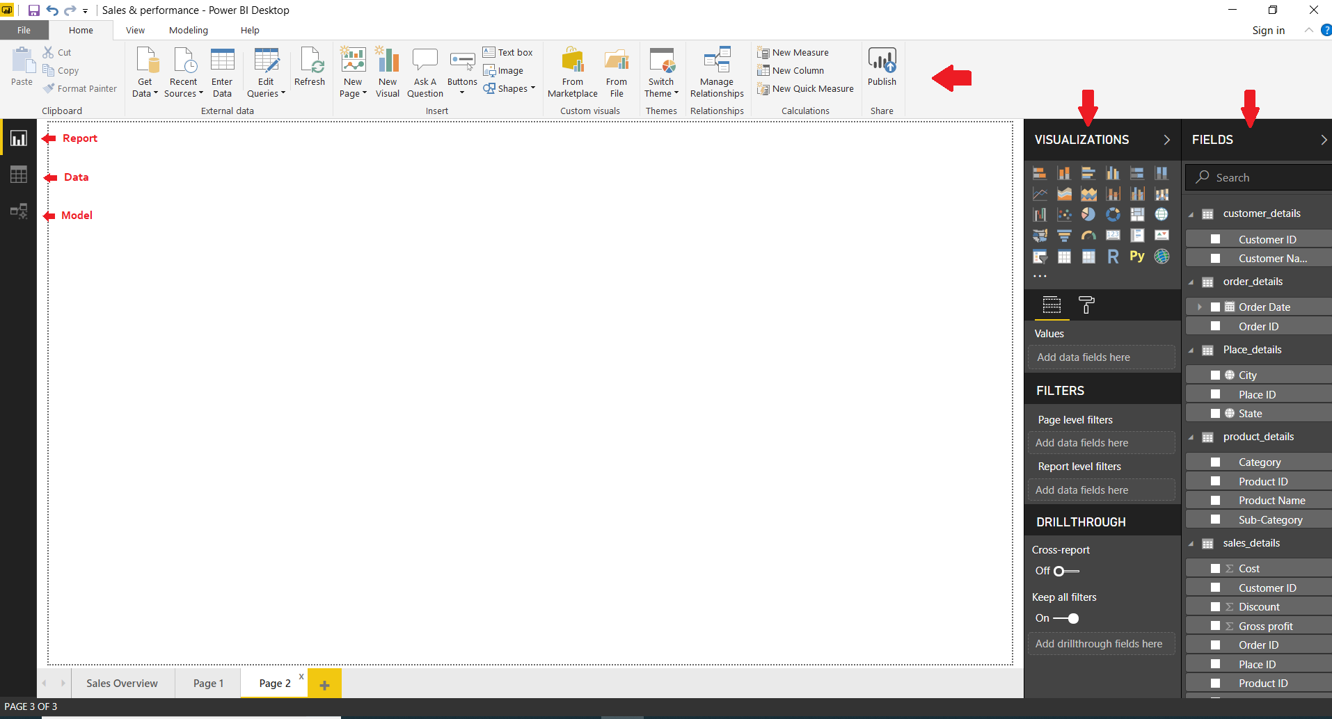
On the top bar, you have tabs like Home, View, Modeling, and Help having a range of options in them. On the right are two sections, Visualizations and Fields. From the Visualizations section, you can select a visual and edit it. The Fields section contains all the fields from the data tables you imported. Just select fields from here to add them to your visual.
Explore the Deployment Channels in Power BI Custom Visuals
On the left, there are three buttons for Report, Data, and Model. We will discuss them later.
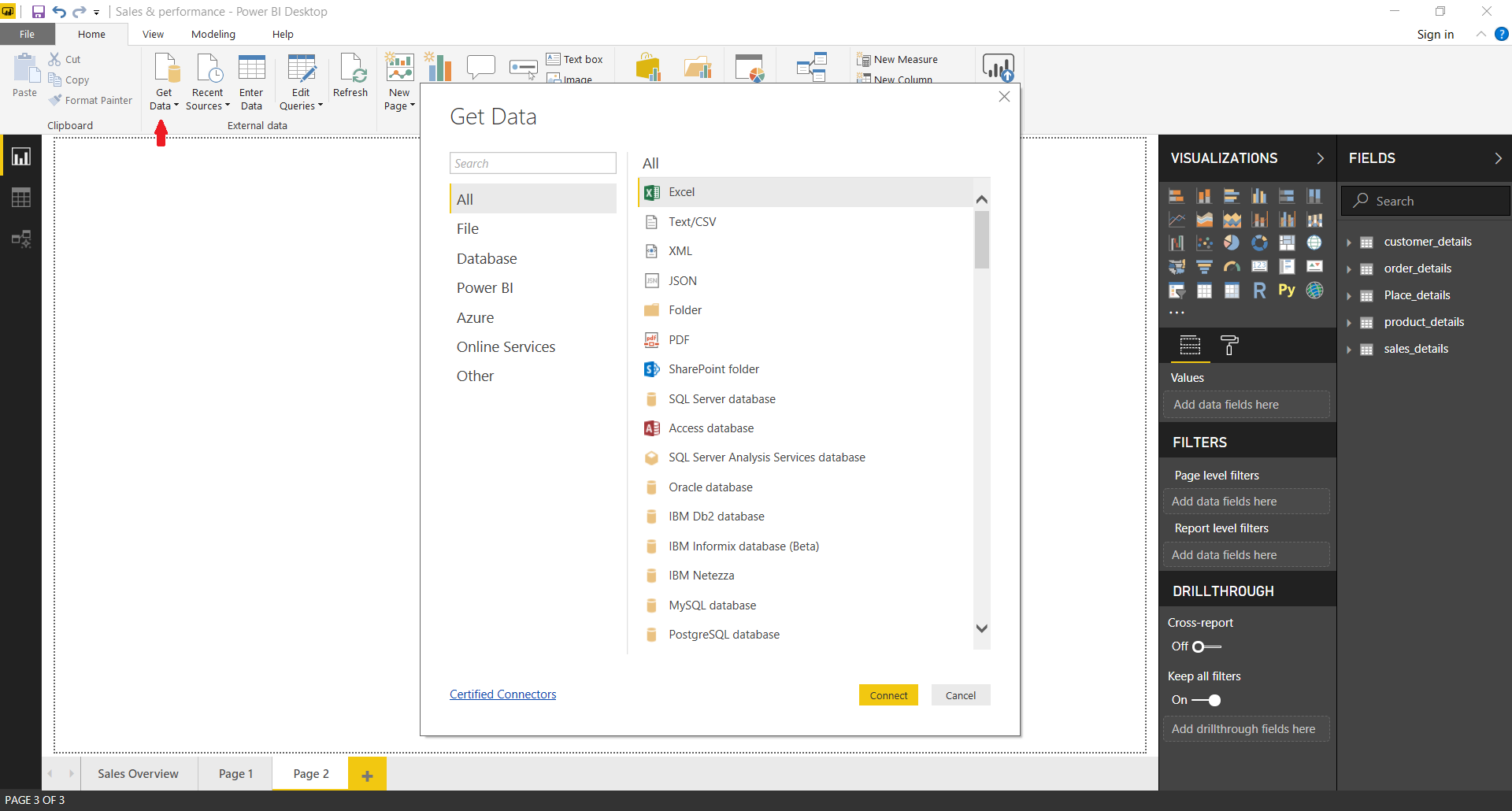
Step 1: Importing data
The first task you need to do when you start with creating a dashboard in Power BI is to import data from source files. Click on Get Data option to select a data source of your choice. Select a data source and click on Connect. You can prepare the data imported in the Power Query Editor.
Step 2: Formatting
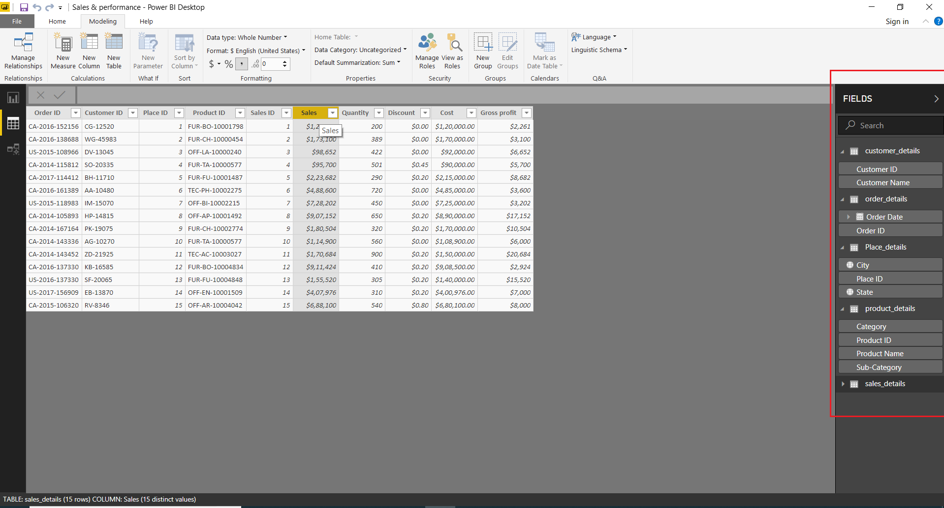
From the Data tab, you can access all the imported tables and view them in tabular form. On the right, you’ll find a list of tables and fields within those tables. You can select a table or field to perform formatting actions on them. If you have fields such as date, time, city, state, percentage value, currency, etc. you can change the format or data type from the Modeling tab.
Learn to Create Calculated Columns in Power BI Data Modeling
Step 3: Modeling
Although the relationships and associations between the tables that you load are already created by the Power BI’s engine, still you can view and make changes in the data model from the Model tab given on the left horizontal bar. The relationships between the two tables are indicated by links joining two common fields.

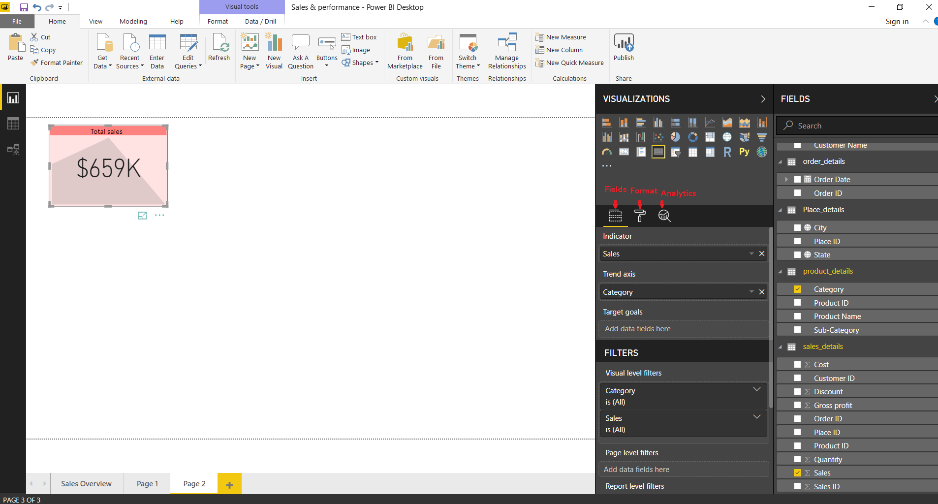
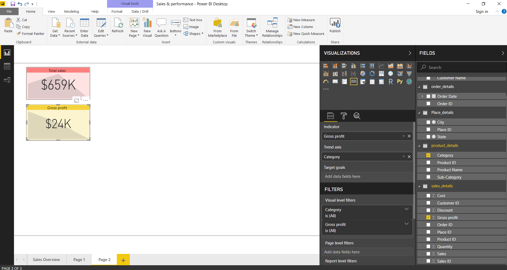
Step 4: Creating a KPI for Total Sales and Gross profit
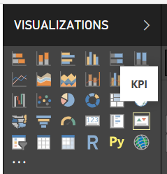
So, for our dashboard, we imported five tables; customer details, order details, place details, product details, and sales details. The first visualization that we’ll make is a KPI. Select KPI from the visualizations section.
Select fields you want to add in the visual from the Fields section. You can also drag and drop the fields into respective columns indicated by the arrow in the image below.

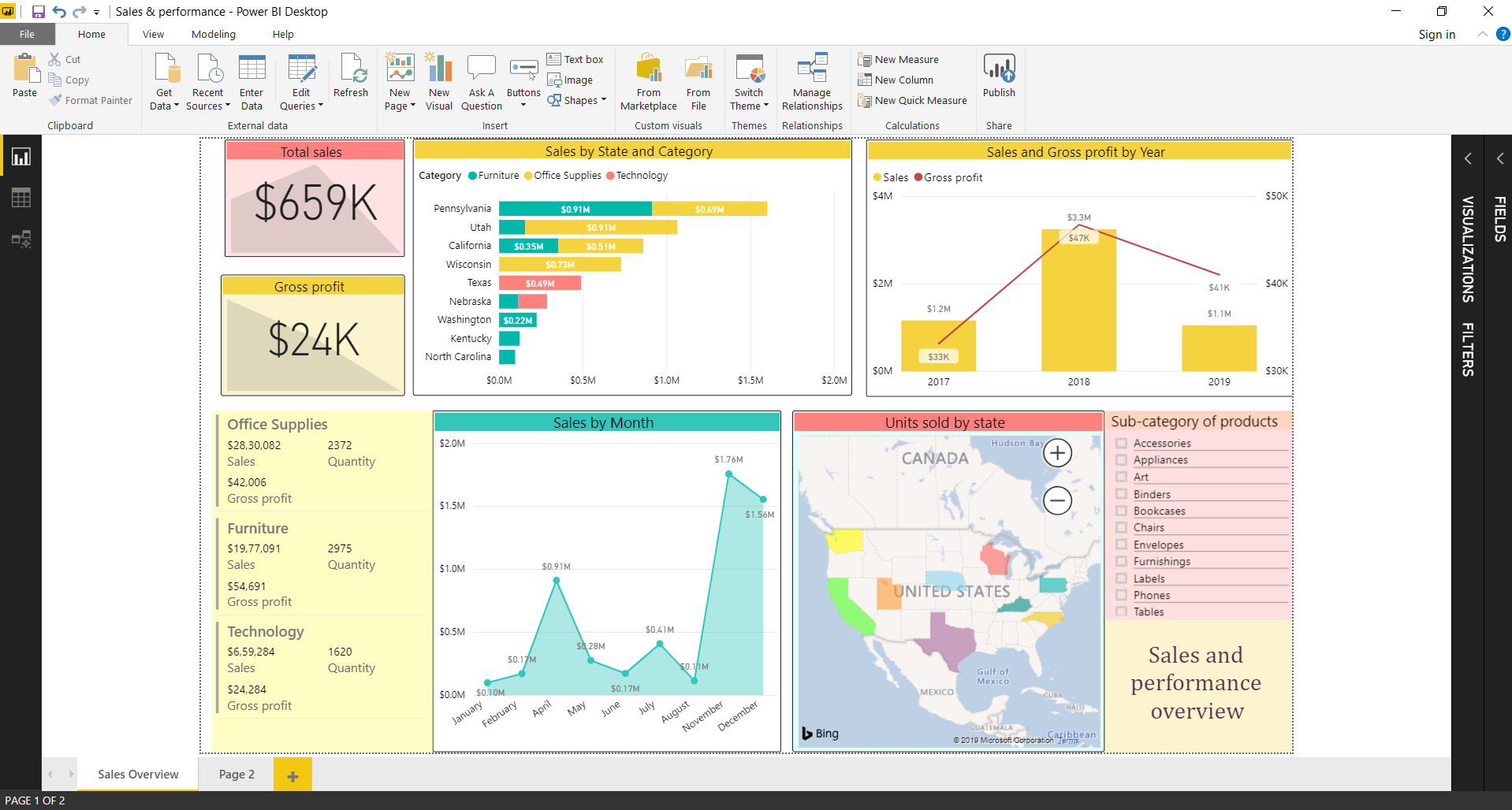
You can select fields, apply filters and format the visual from the Format icon. The first KPI we prepared shows Total sales.
The second KPI shows the Gross profit.
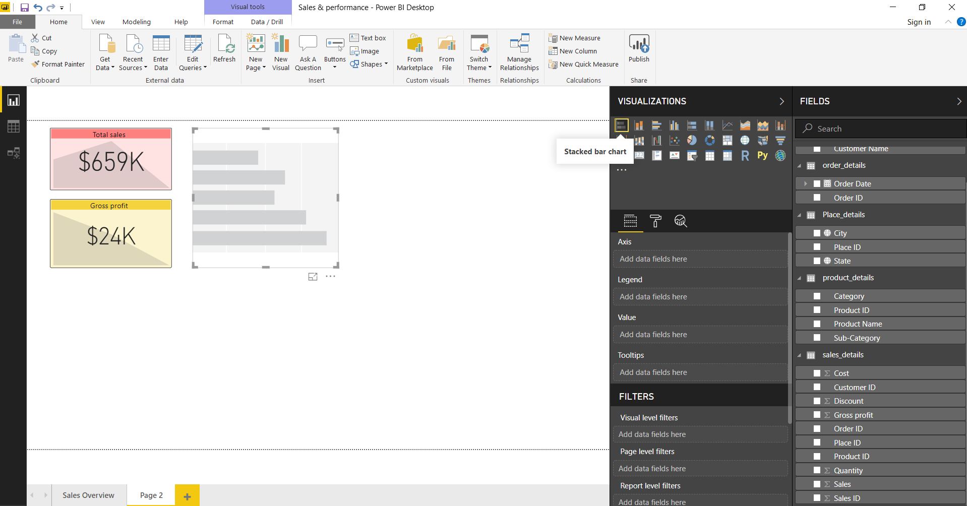
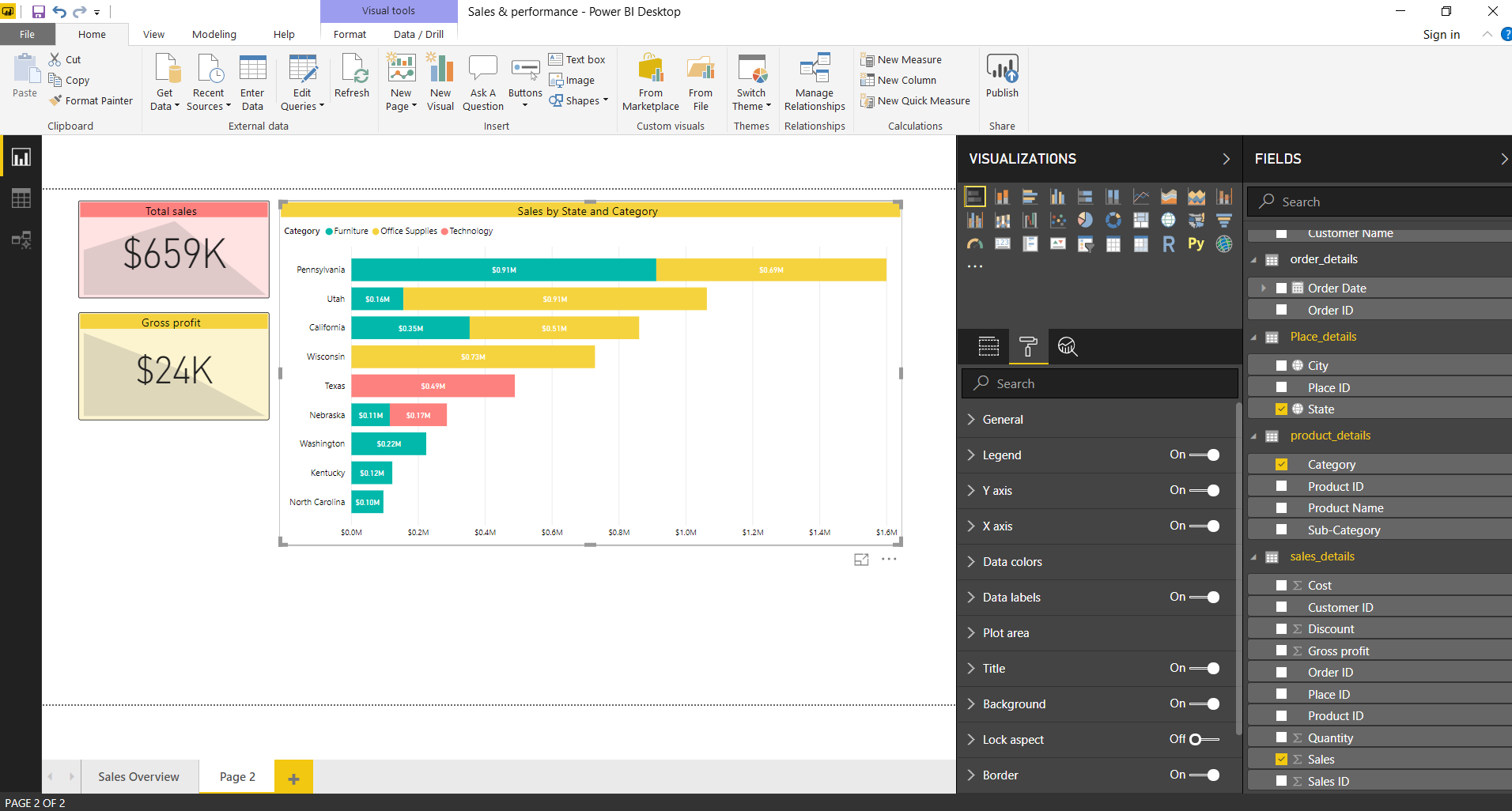
Step 5: Creating a chart showing Sales by State and Category
Next, we’ll create a Stacked bar chart which is going to show sales value by state and category of product. Add this chart from the Visualizations.
Add fields in the chart and format the title, data labels, legend, axes, plot area, data colors, etc. As you can see in the image below, the stacked bar chart shows total sales in each state for the three main categories (Furniture, Office supplies, and Technology).
Step 6: Creating a chart showing Sales and Gross profit by Year
Moving on, the next visualization we need to create is a column chart (Line and clustered column chart). We will create this visual to show the total sales and gross profit by year (2017,2018 and 2019).
Select a Line and Clustered Column Chart from the Visualizations section.
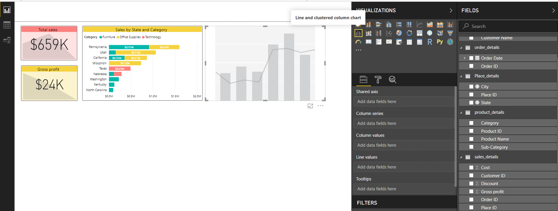
Then add fields to add into the visual. You can see the selected fields in the Fields tab.
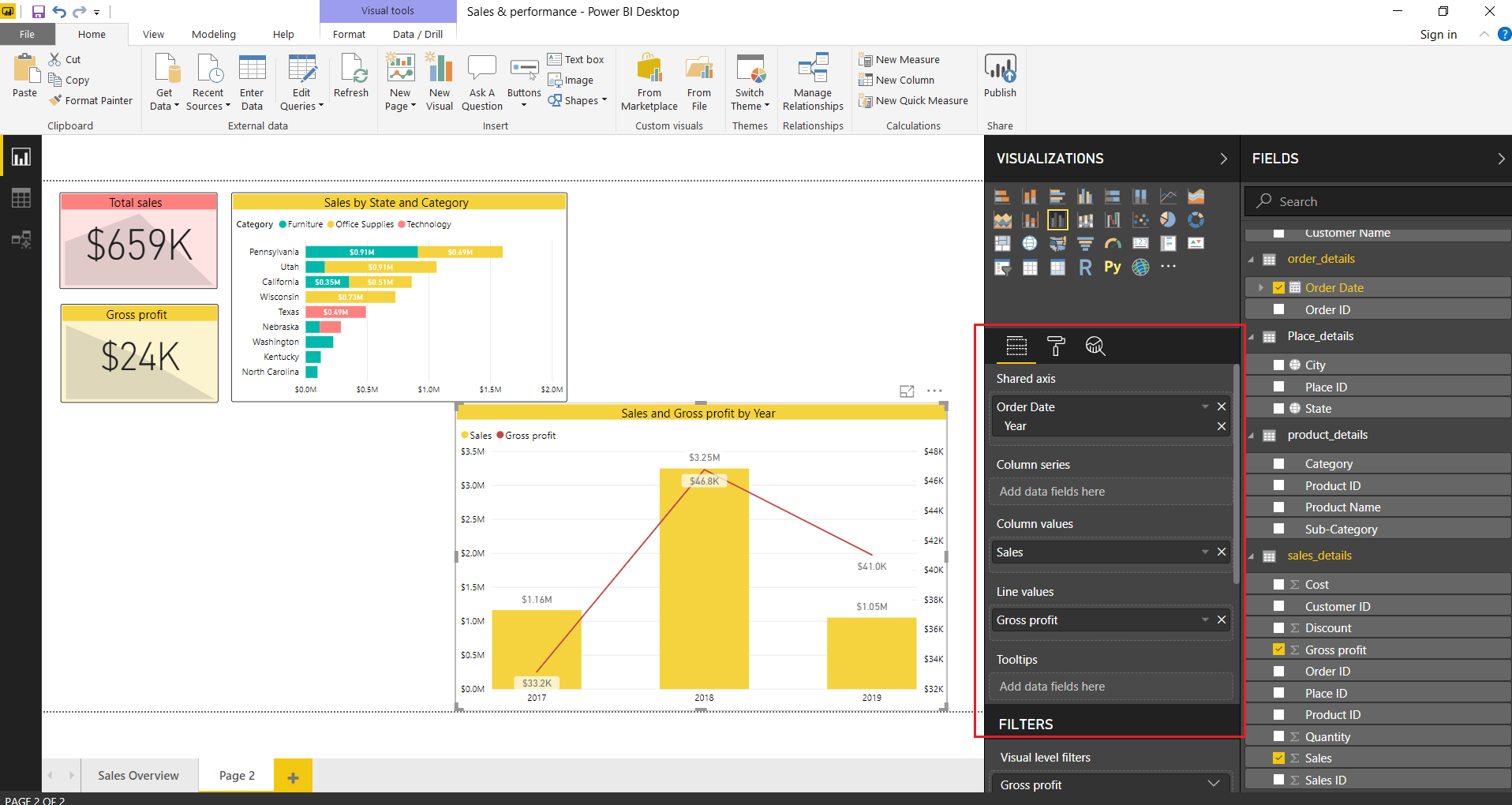
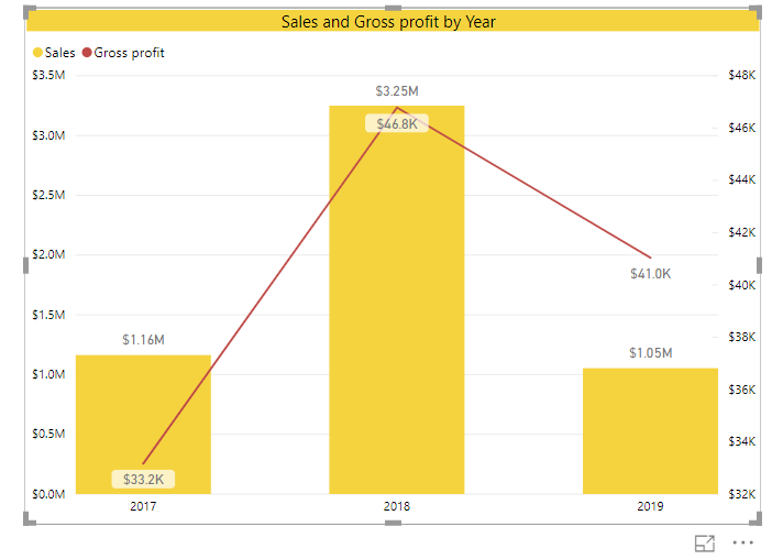
Our final visual looks as shown in the picture below. The yellow bars shows the total sales of three years (for about 5 months of 2019) and the red line shows the profit trend of three years.
Step 7: Creating a chart showing Sales by month
Next, we’ll create an area chart that will show the total sales of products over a span of 12 months. We created an area chart by selecting the Area chart from Visualizations and adding respective fields into it.
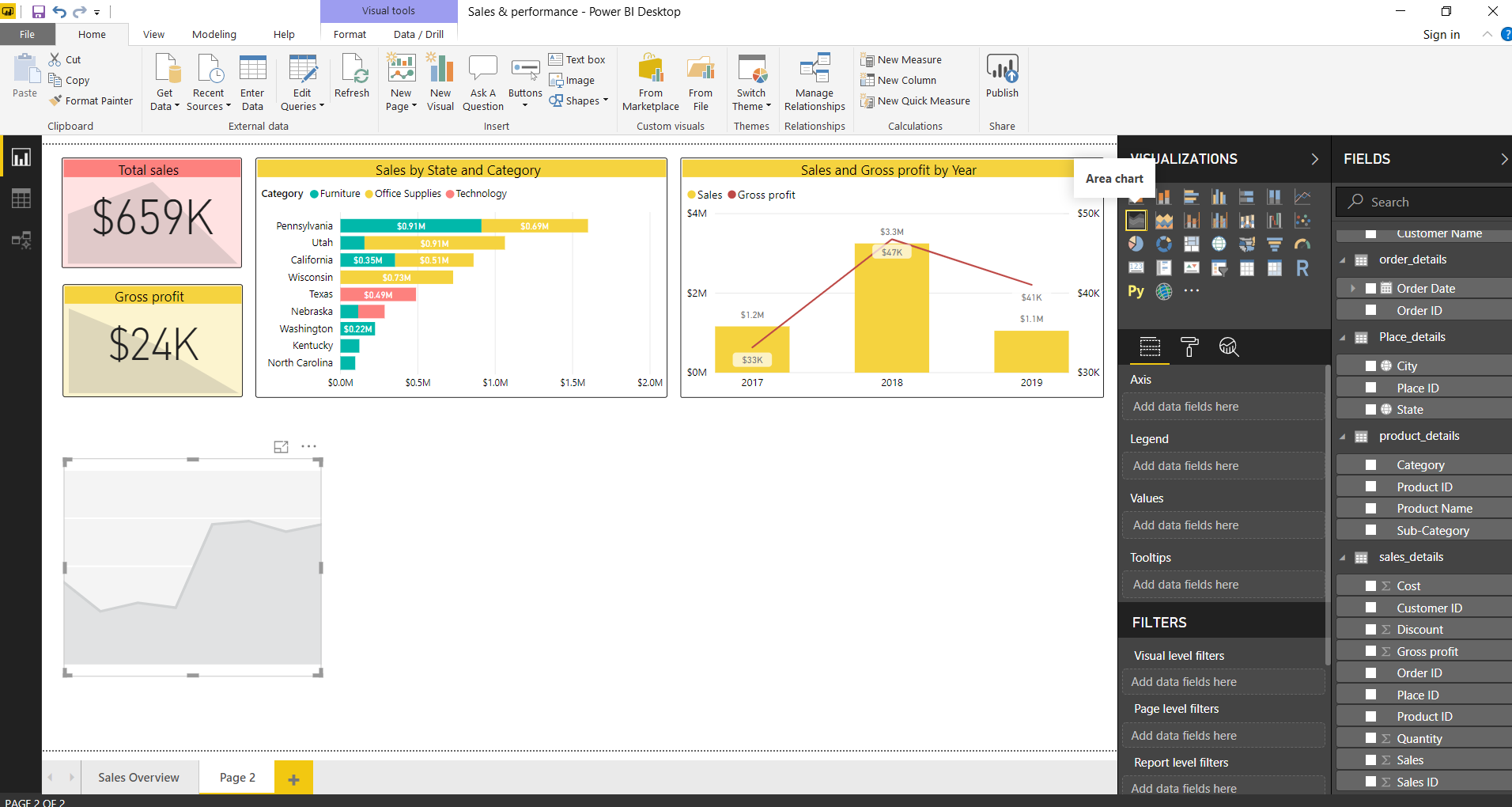
Area chart option in visualizations section
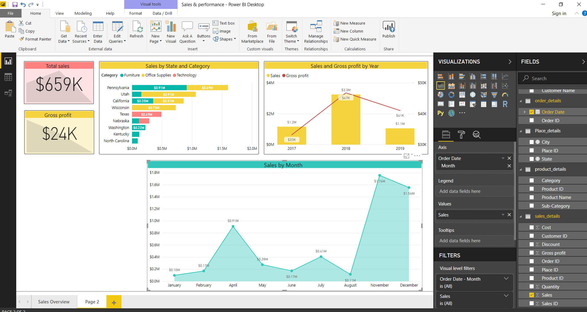
The area chart that we created looks something like this.

On the x-axis, it has months in which product was sold and the y-axis displays the sales values.
Know all the aspects of Basic Area Chart in Power BI
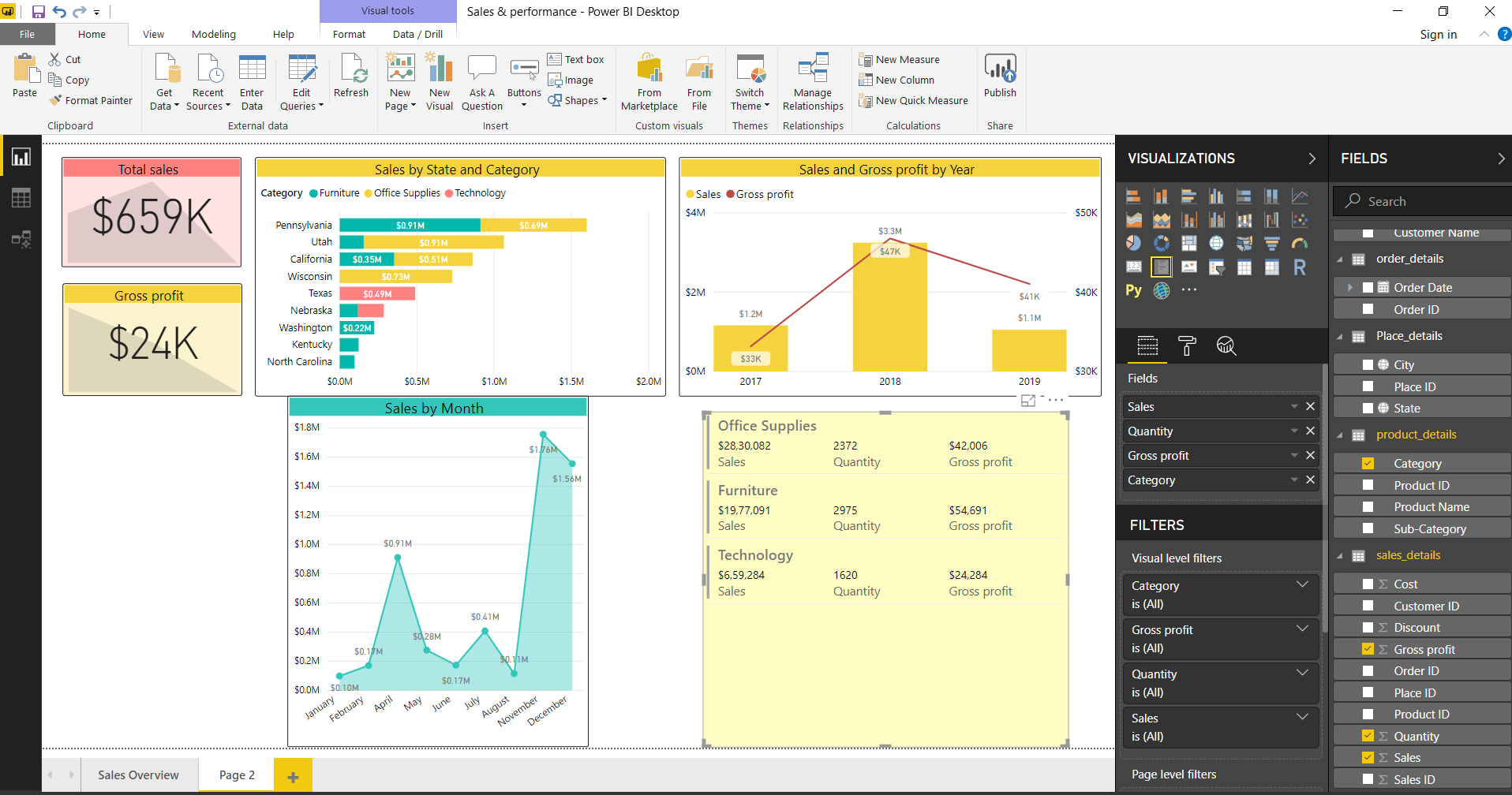
Step 8: Creating a multi-row card
In addition to visually representing data via graphs and charts, you can display data as textual information using cards or multi-row cards. So, we’ll add a Multi-row card from the Visualizations section.
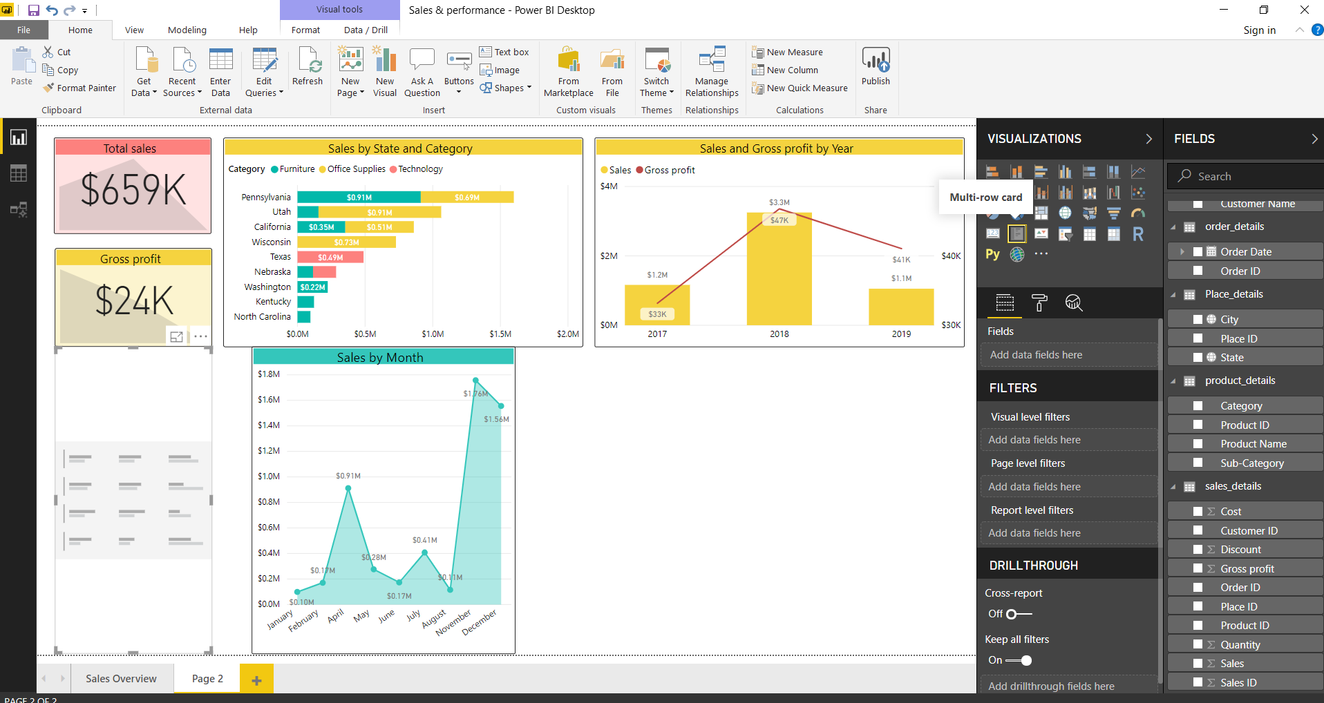
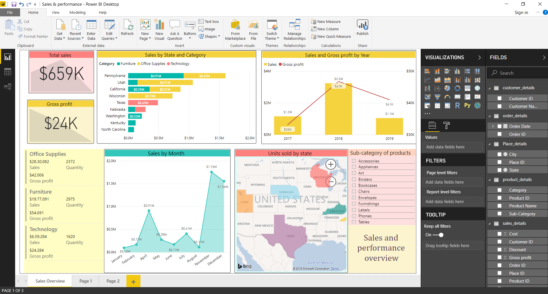
We have a multi-row card which shows the information related to product categories, total sales per category, total units sold and gross profit.
Step 9: Creating a map showing total units sold by state
From the wide range of visualizations available, we can also represent information on the map. In our dashboard, we will add a map showing total units sold per state in the USA. We selected a Filled map from the Visualizations section.
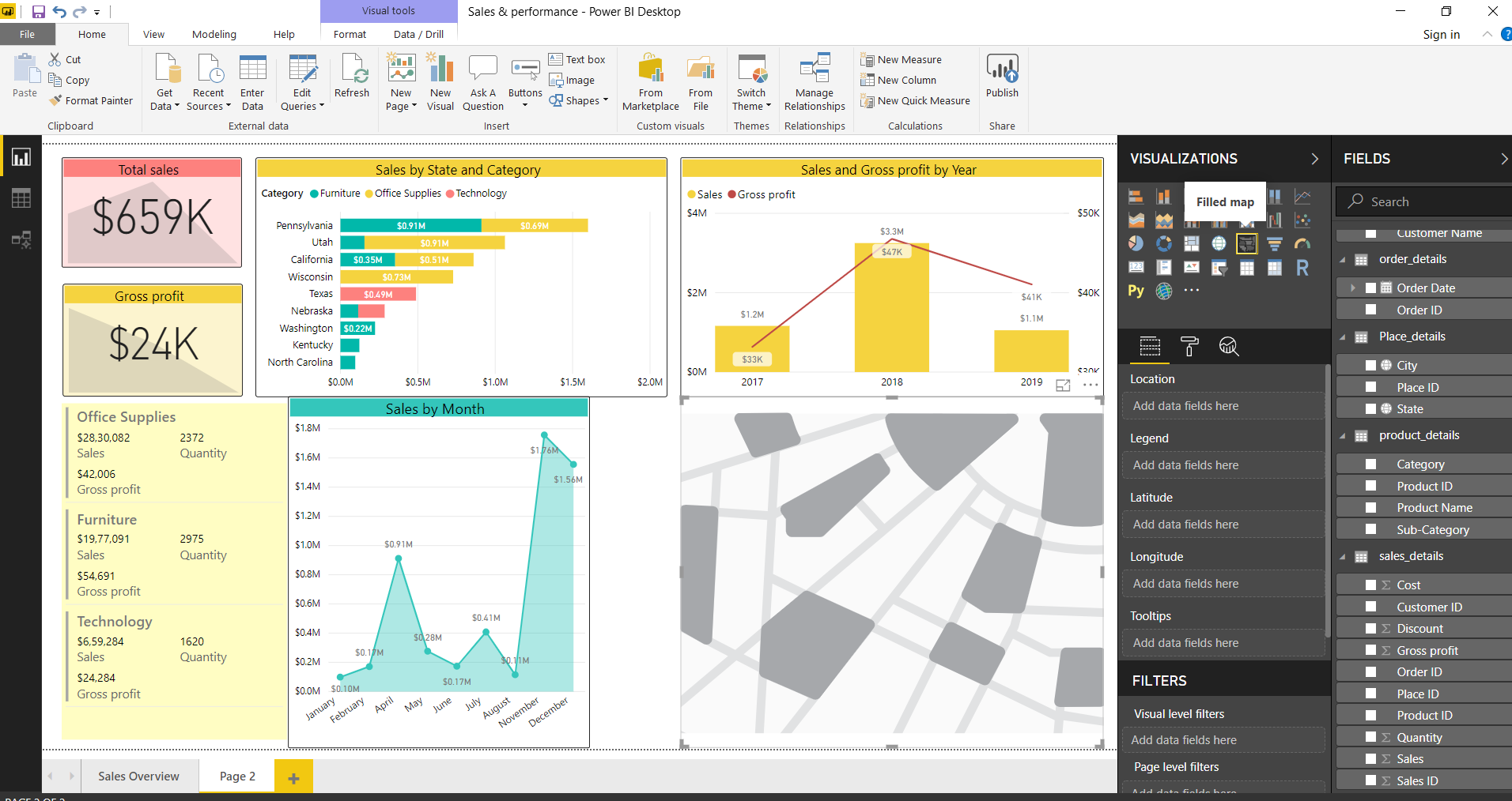
Next, we will add fields into the map.
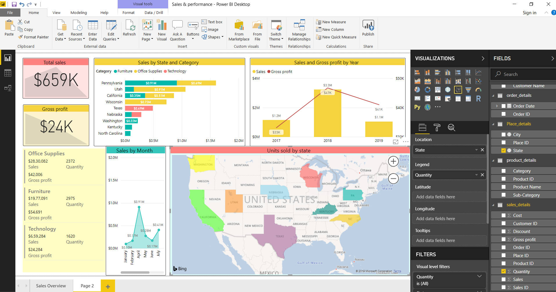
The final map will show the total number of units sold in the states.

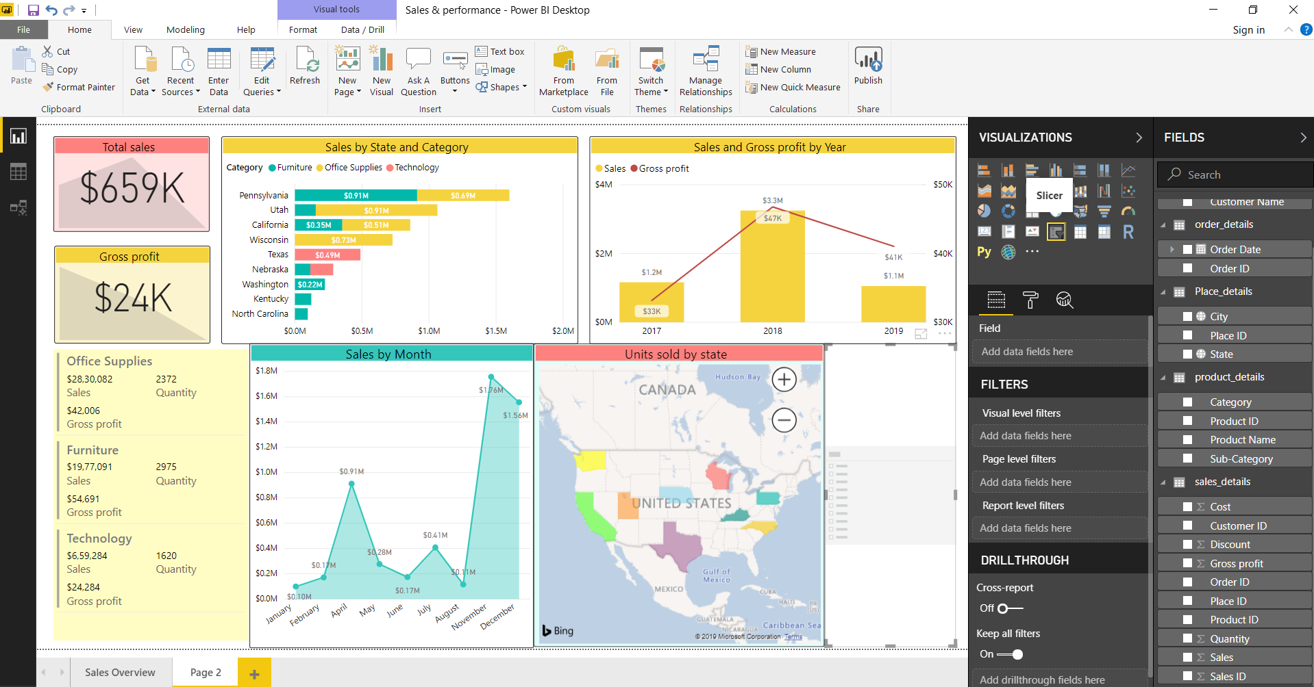
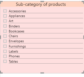
Step 10: Adding a Slicer for Sub-categories of products
Lastly, we’ll add a Slicer for Sub-categories of products in the record. Using this slicer, users can select specific categories and filter through data. Upon making a selection in the slicer, all the other visuals will undergo changes and show only the visuals related to the selected field or value.
Here is a closer look at the slicer we added into our dashboard.
Step 11: Finish the final dashboard
Now that we are done adding all the different types of visuals and graphics that we needed on our dashboard, we are nearing the final steps. Adjust and resize the visualizations on the dashboard as you like. You can also select a theme for the dashboard, its page size, background, etc.
Step 12: Publish the dashboard
Once your dashboard is ready, you can publish it on the Power BI workspace. First, save your dashboard in your system.
Go to the Publish option to publish the dashboard on the web. Log in into your Power BI account and publishing process will be successful. Then, you will get a link to a web source where the dashboard is uploaded and available for other users’ access.
Dashboard vs Report
Let us run through some quick points to make the difference between a dashboard and a report clear.
Capability | Dashboard | Report |
Pages | Consists of one page only | Can be of one or more pages |
Data sources | Can have data tiles from one or more datasets or reports | It has a single dataset per report |
Filtering | Cannot perform filtering or slicing | Can perform filtering, slicing and highlighting |
| Set alerts | Enables you to set alerts for emails | No option for setting alerts |
| Featured reports | Enables you to set only one dashboard as a featured dashboard | No option to create a featured dashboard |
| Accessing dataset tables and fields | Does not allow viewing or accessing underlying datasets tables and fields | Provides the option for viewing dataset tables, fields and values |
Summary
With this, we conclude our Power BI Dashboards Tutorial. We learned about the dashboards and how they are different from reports. Also, we conducted a detailed exercise of creating a dashboard in Power BI with sample data. You can use your own data sets and create a dashboard suiting your situation and requirements.
Did you like this article? If Yes, please give DataFlair 5 Stars on Google


Link to customer dataset for this tutorial is not present.
Thanks for pointing, we have added the datasets download links in the tutorial
Hi,
Could you please provide sample data set.
The Dataset download link has been added in the article.
Thanks, keep visiting DataFlair
Hi,
Could you please provide same data set.
Thanks,
Srikanth
Gross Profit column is not existing on sales_details table
Gross Profit column is not existing on sales_details table, is it calculated column ???