Data Science Project – Customer Segmentation using Machine Learning in R
Job-ready Online Courses: Knowledge Awaits – Click to Access!
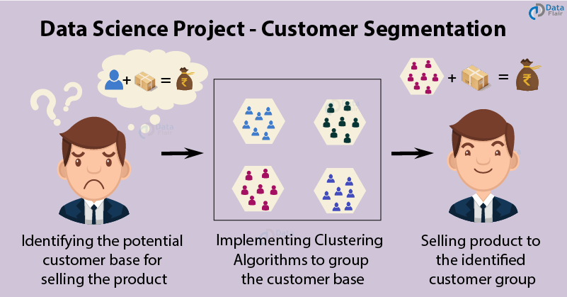
Cluster In this Data Science R Project series, we will perform one of the most essential applications of machine learning – Customer Segmentation. In this project, we will implement customer segmentation in R. Whenever you need to find your best customer, customer segmentation is the ideal methodology.
In this machine learning project, DataFlair will provide you the background of customer segmentation. Then we will explore the data upon which we will be building our segmentation model. Also, in this data science project, we will see the descriptive analysis of our data and then implement several versions of the K-means algorithm. So, follow the complete data science customer segmentation project using machine learning in R and become a pro in Data Science.
Customer Segmentation Project in R
Customer Segmentation is one the most important applications of unsupervised learning. Using clustering techniques, companies can identify the several segments of customers allowing them to target the potential user base. In this machine learning project, we will make use of K-means clustering which is the essential algorithm for clustering unlabeled dataset. Before ahead in this project, learn what actually customer segmentation is.
What is Customer Segmentation?
Customer Segmentation is the process of division of customer base into several groups of individuals that share a similarity in different ways that are relevant to marketing such as gender, age, interests, and miscellaneous spending habits.
Companies that deploy customer segmentation are under the notion that every customer has different requirements and require a specific marketing effort to address them appropriately. Companies aim to gain a deeper approach of the customer they are targeting. Therefore, their aim has to be specific and should be tailored to address the requirements of each and every individual customer. Furthermore, through the data collected, companies can gain a deeper understanding of customer preferences as well as the requirements for discovering valuable segments that would reap them maximum profit. This way, they can strategize their marketing techniques more efficiently and minimize the possibility of risk to their investment.
The technique of customer segmentation is dependent on several key differentiators that divide customers into groups to be targeted. Data related to demographics, geography, economic status as well as behavioral patterns play a crucial role in determining the company direction towards addressing the various segments.
Furthermore, customer segmentation assists firms in avoiding generic messaging to their clientele since the goal is to take targeted approaches that shall be more appealing to the selected groups. Consequently, by separately identifying segments, the companies can also tailor their ways for producing and designing their products as well in order to cover the needs of each segment effectively as a result of the raised customer satisfaction and loyalty.
You can download the dataset for customer segmentation project here.
How to Implement Customer Segmentation in R?
In the first step of this data science project, we will perform data exploration. We will import the essential packages required for this role and then read our data. Finally, we will go through the input data to gain necessary insights about it.
Code:
customer_data=read.csv("/home/dataflair/Mall_Customers.csv")
str(customer_data)

names(customer_data)
Output Screenshot:

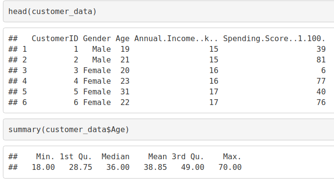
We will now display the first six rows of our dataset using the head() function and use the summary() function to output summary of it.
Code:
head(customer_data)
summary(customer_data$Age)
Output Screenshot:
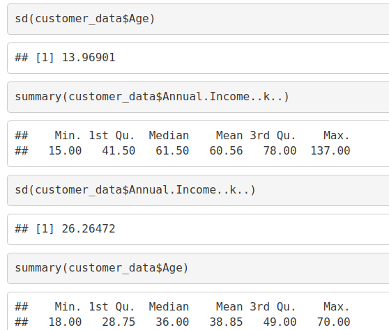
Code:
sd(customer_data$Age)
summary(customer_data$Annual.Income..k..)
sd(customer_data$Annual.Income..k..)
summary(customer_data$Age)
Output Screenshot:
Code:
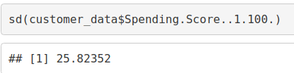
sd(customer_data$Spending.Score..1.100.)
Output Screenshot:
Have you Checked DataFlair’s Trending Project on Data Science? Must Check – Sentiment Analysis using R
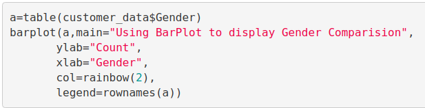
Customer Gender Visualization
In this, we will create a barplot and a piechart to show the gender distribution across our customer_data dataset.
Code:
a=table(customer_data$Gender)
barplot(a,main="Using BarPlot to display Gender Comparision",
       ylab="Count",
       xlab="Gender",
       col=rainbow(2),
       legend=rownames(a))
Screenshot:
Output:

From the above barplot, we observe that the number of females is higher than the males. Now, let us visualize a pie chart to observe the ratio of male and female distribution.
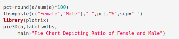
Code:
pct=round(a/sum(a)*100)
lbs=paste(c("Female","Male")," ",pct,"%",sep=" ")
library(plotrix)
pie3D(a,labels=lbs,
   main="Pie Chart Depicting Ratio of Female and Male")
Screenshot:
Output:
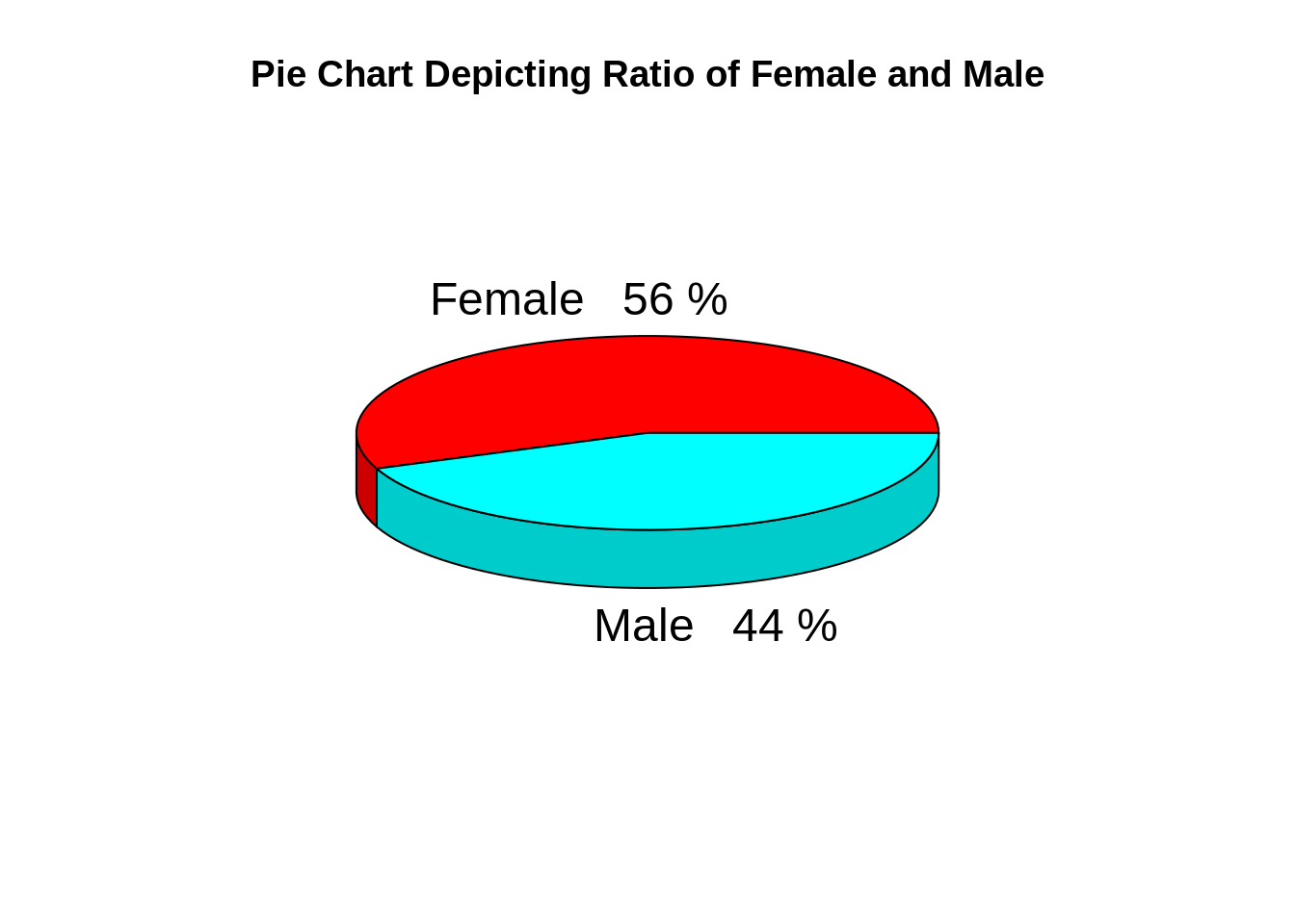
From the above graph, we conclude that the percentage of females is 56%, whereas the percentage of male in the customer dataset is 44%.
Visualization of Age Distribution
Let us plot a histogram to view the distribution to plot the frequency of customer ages. We will first proceed by taking summary of the Age variable.
Code:
summary(customer_data$Age)
Output Screenshot:
Code:
hist(customer_data$Age,
    col="blue",
    main="Histogram to Show Count of Age Class",
    xlab="Age Class",
    ylab="Frequency",
    labels=TRUE)
Screenshot:
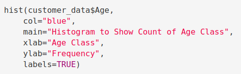
Output:
Code:
boxplot(customer_data$Age,
       col="ff0066",
       main="Boxplot for Descriptive Analysis of Age")
Screenshot:
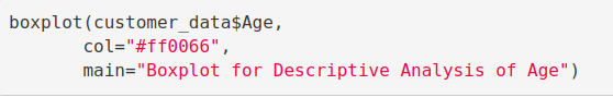
Output:

From the above two visualizations, we conclude that the maximum customer ages are between 30 and 35. The minimum age of customers is 18, whereas, the maximum age is 70.
Don’t forget to practice the Credit Card Fraud Detection Project of Machine Learning
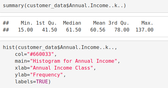
Analysis of the Annual Income of the Customers
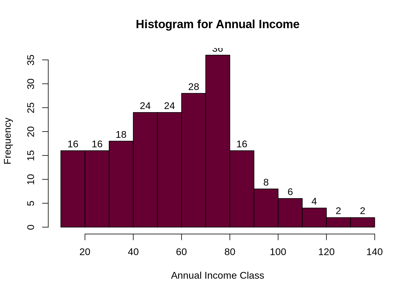
In this section of the R project, we will create visualizations to analyze the annual income of the customers. We will plot a histogram and then we will proceed to examine this data using a density plot.
Code:
summary(customer_data$Annual.Income..k..)
hist(customer_data$Annual.Income..k..,
  col="#660033",
  main="Histogram for Annual Income",
  xlab="Annual Income Class",
  ylab="Frequency",
  labels=TRUE)
Screenshot:
Output:
Code:
plot(density(customer_data$Annual.Income..k..),
    col="yellow",
    main="Density Plot for Annual Income",
    xlab="Annual Income Class",
    ylab="Density")
polygon(density(customer_data$Annual.Income..k..),
        col="#ccff66")
Screenshot:

Output:
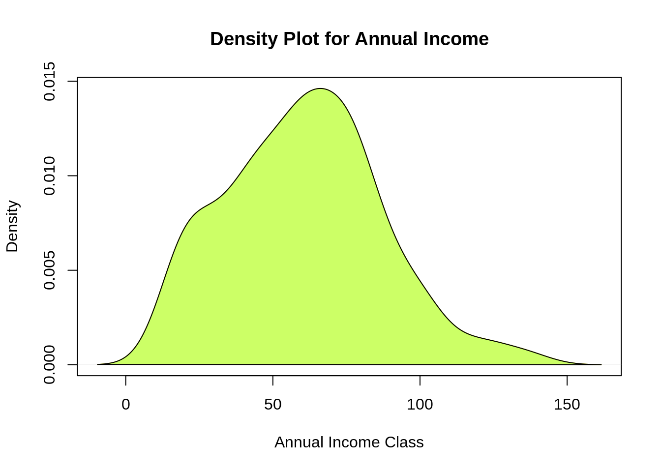
From the above descriptive analysis, we conclude that the minimum annual income of the customers is 15 and the maximum income is 137. People earning an average income of 70 have the highest frequency count in our histogram distribution. The average salary of all the customers is 60.56. In the Kernel Density Plot that we displayed above, we observe that the annual income has a normal distribution.
Analyzing Spending Score of the Customers
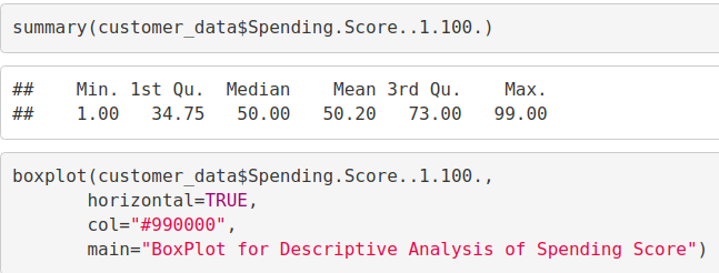
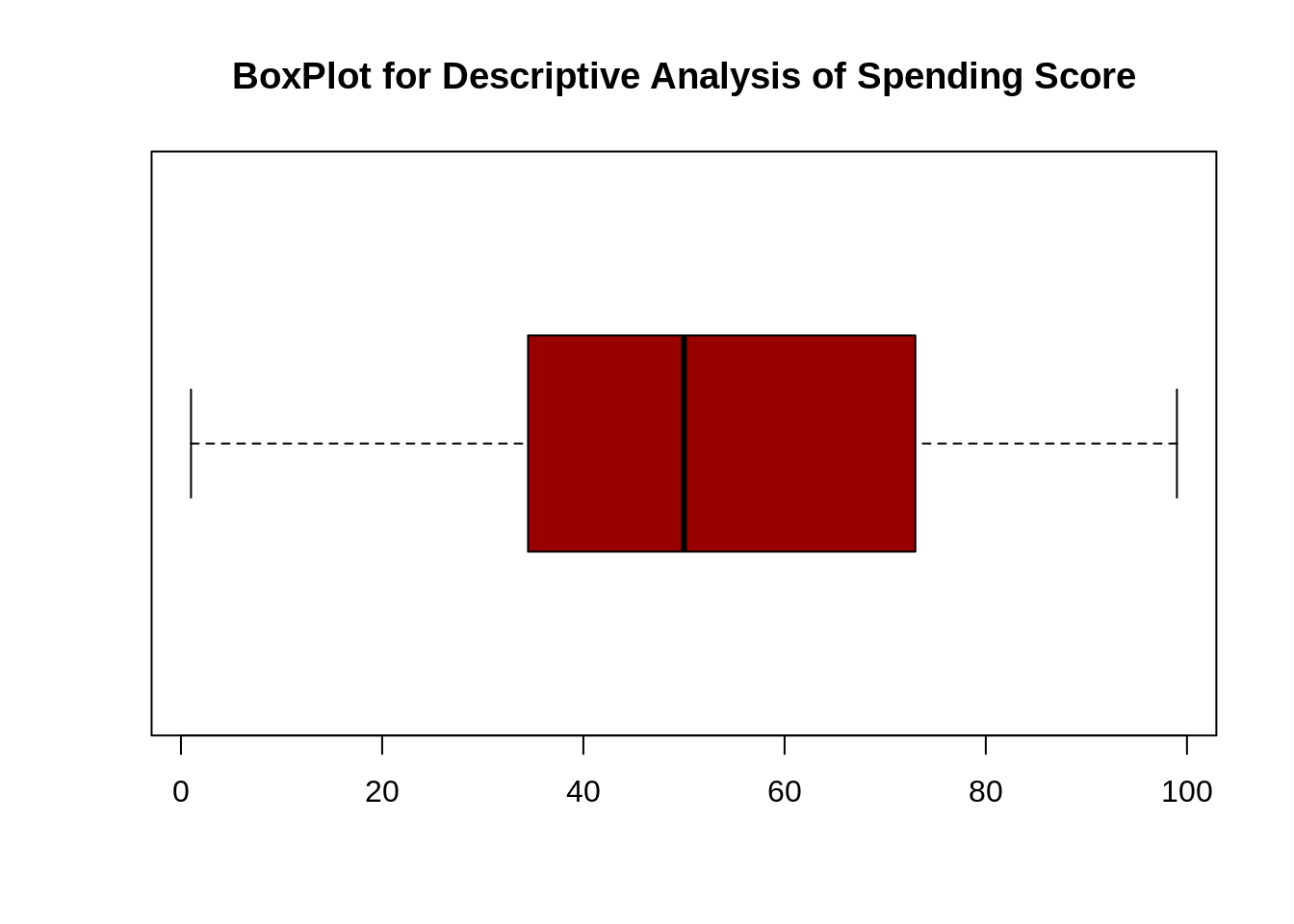
summary(customer_data$Spending.Score..1.100.)

Min. 1st Qu. Median Mean 3rd Qu. Max.
## 1.00 34.75 50.00 50.20 73.00 99.00

boxplot(customer_data$Spending.Score..1.100.,
   horizontal=TRUE,
   col="#990000",
   main="BoxPlot for Descriptive Analysis of Spending Score")
Screenshot:
Output:
Code:
hist(customer_data$Spending.Score..1.100.,
    main="HistoGram for Spending Score",
    xlab="Spending Score Class",
    ylab="Frequency",
    col="#6600cc",
    labels=TRUE)
Screenshot:
Output:
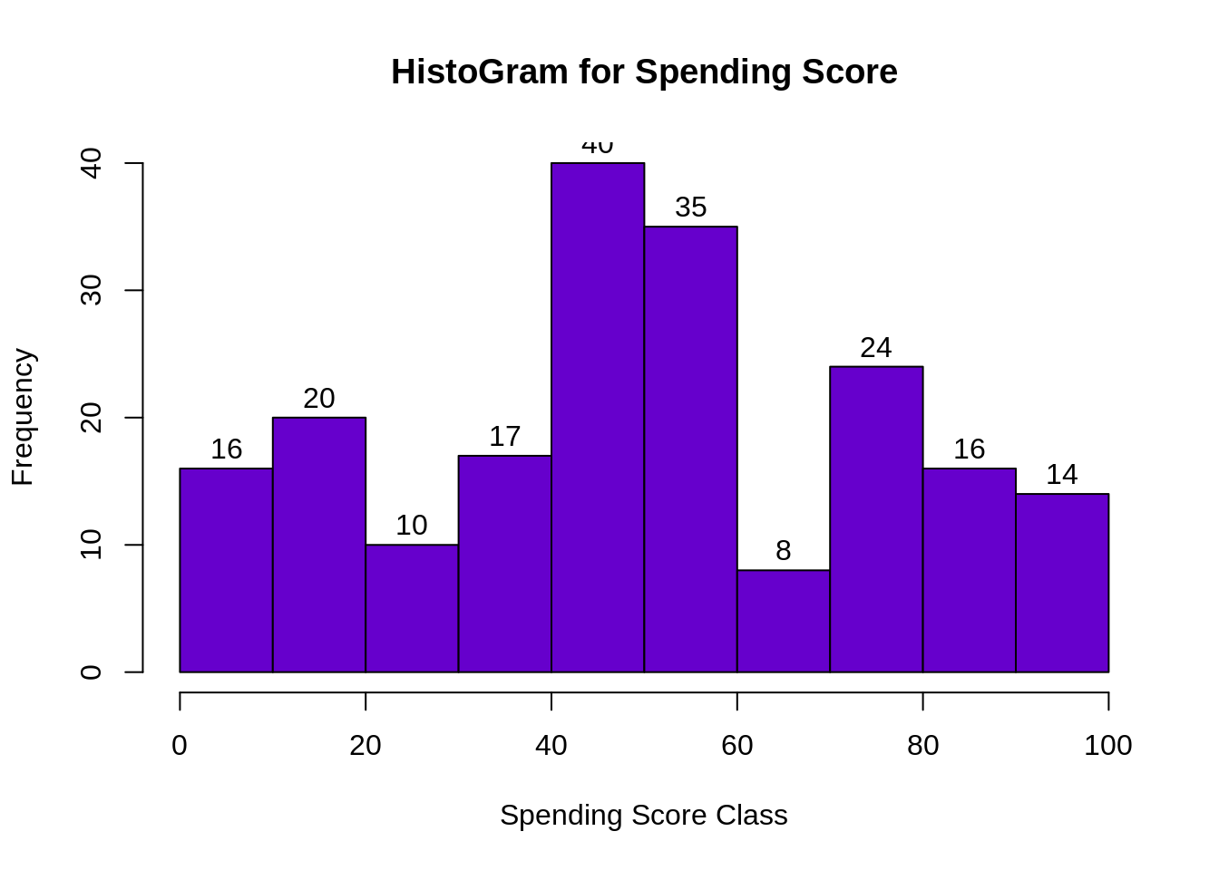
The minimum spending score is 1, maximum is 99 and the average is 50.20. We can see Descriptive Analysis of Spending Score is that Min is 1, Max is 99 and avg. is 50.20. From the histogram, we conclude that customers between class 40 and 50 have the highest spending score among all the classes.
K-means Algorithm
While using the k-means clustering algorithm, the first step is to indicate the number of clusters (k) that we wish to produce in the final output. The algorithm starts by selecting k objects from dataset randomly that will serve as the initial centers for our clusters. These selected objects are the cluster means, also known as centroids. Then, the remaining objects have an assignment of the closest centroid. This centroid is defined by the Euclidean Distance present between the object and the cluster mean. We refer to this step as “cluster assignment”. When the assignment is complete, the algorithm proceeds to calculate new mean value of each cluster present in the data. After the recalculation of the centers, the observations are checked if they are closer to a different cluster. Using the updated cluster mean, the objects undergo reassignment. This goes on repeatedly through several iterations until the cluster assignments stop altering. The clusters that are present in the current iteration are the same as the ones obtained in the previous iteration.
If you want to work one of the major challenges then knowledge Big Data is crucial. Therefore, I recommend to check out Hadoop for Data Science.
Summing up the K-means clustering –
- We specify the number of clusters that we need to create.
- The algorithm selects k objects at random from the dataset. This object is the initial cluster or mean.
- The closest centroid obtains the assignment of a new observation. We base this assignment on the Euclidean Distance between object and the centroid.
- k clusters in the data points update the centroid through calculation of the new mean values present in all the data points of the cluster. The kth cluster’s centroid has a length of p that contains means of all variables for observations in the k-th cluster. We denote the number of variables with p.
- Iterative minimization of the total within the sum of squares. Then through the iterative minimization of the total sum of the square, the assignment stop wavering when we achieve maximum iteration. The default value is 10 that the R software uses for the maximum iterations.
Determining Optimal Clusters
While working with clusters, you need to specify the number of clusters to use. You would like to utilize the optimal number of clusters. To help you in determining the optimal clusters, there are three popular methods –
- Elbow method
- Silhouette method
- Gap statistic
Elbow Method
The main goal behind cluster partitioning methods like k-means is to define the clusters such that the intra-cluster variation stays minimum.
minimize(sum W(Ck)), k=1…k
Where Ck represents the kth cluster and W(Ck) denotes the intra-cluster variation. With the measurement of the total intra-cluster variation, one can evaluate the compactness of the clustering boundary. We can then proceed to define the optimal clusters as follows –
First, we calculate the clustering algorithm for several values of k. This can be done by creating a variation within k from 1 to 10 clusters. We then calculate the total intra-cluster sum of square (iss). Then, we proceed to plot iss based on the number of k clusters. This plot denotes the appropriate number of clusters required in our model. In the plot, the location of a bend or a knee is the indication of the optimum number of clusters. Let us implement this in R as follows –
Code:
library(purrr)
set.seed(123)
# function to calculate total intra-cluster sum of square
iss <- function(k) {
  kmeans(customer_data[,3:5],k,iter.max=100,nstart=100,algorithm="Lloyd" )$tot.withinss
}

k.values <- 1:10


iss_values <- map_dbl(k.values, iss)

plot(k.values, iss_values,
    type="b", pch = 19, frame = FALSE,
    xlab="Number of clusters K",
    ylab="Total intra-clusters sum of squares")
Screenshot:
Output:
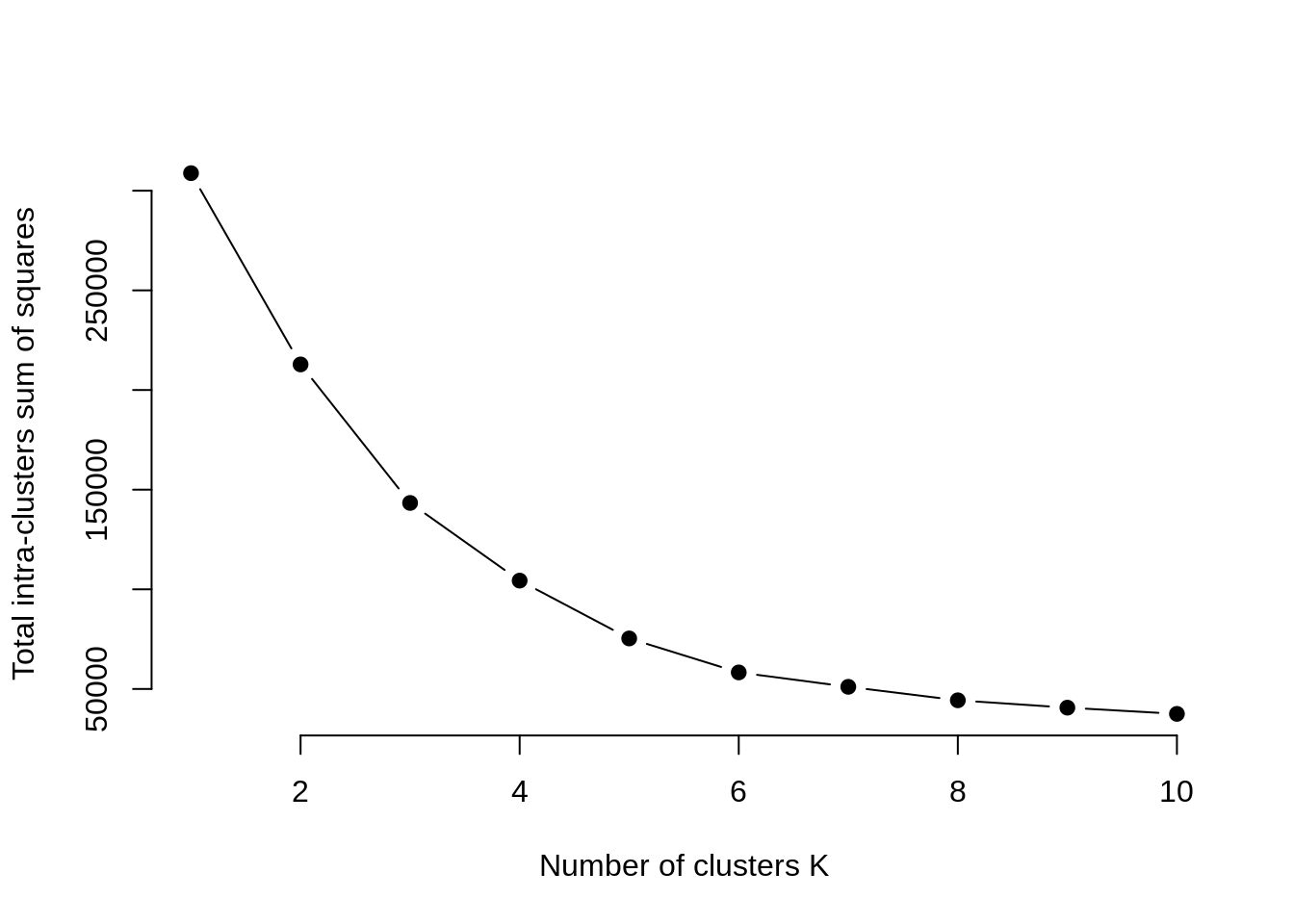
From the above graph, we conclude that 4 is the appropriate number of clusters since it seems to be appearing at the bend in the elbow plot.
Want to be the next Data Scientist? Follow DataFlair’s guide design by industry experts to become a Data Scientist easily
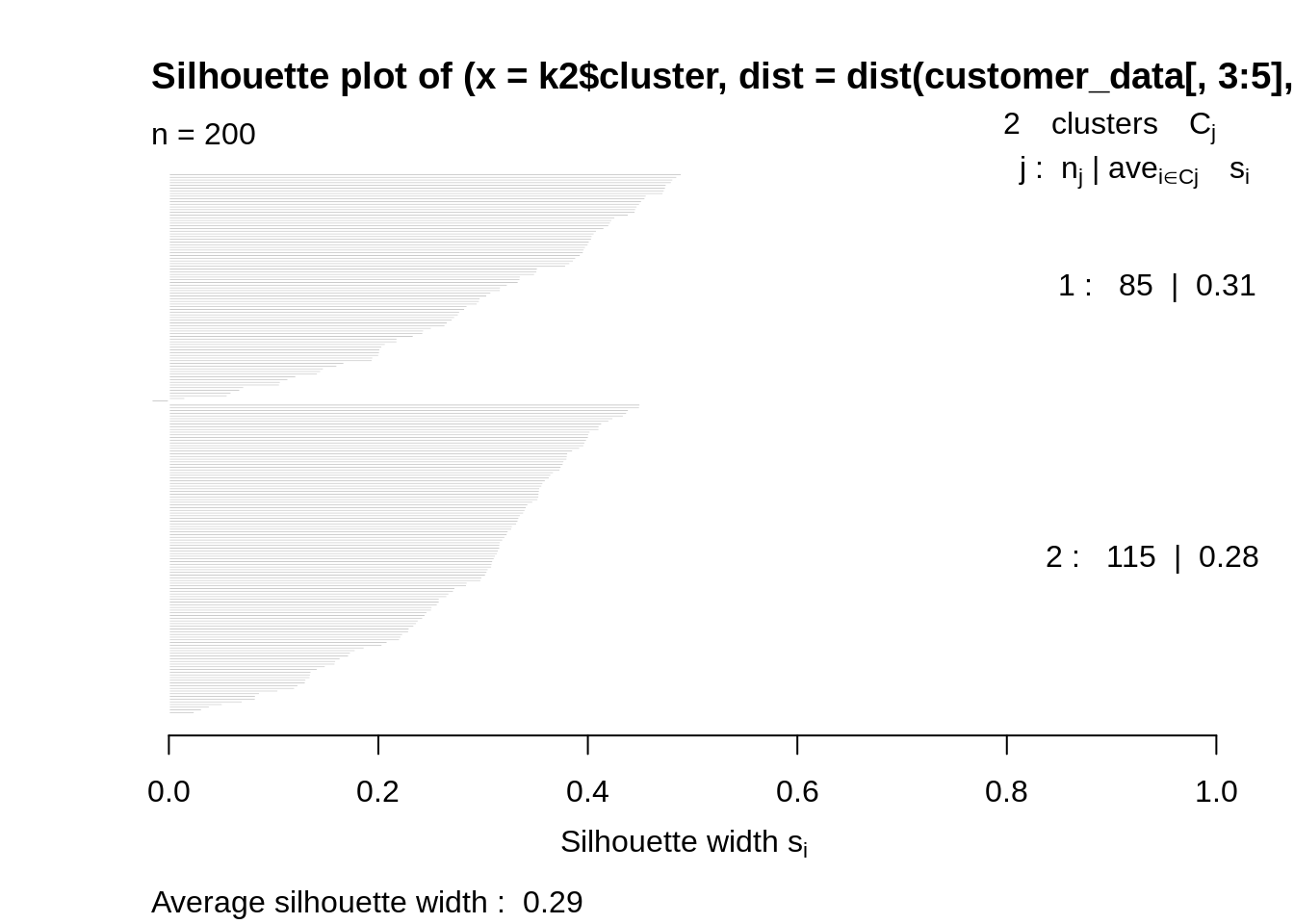
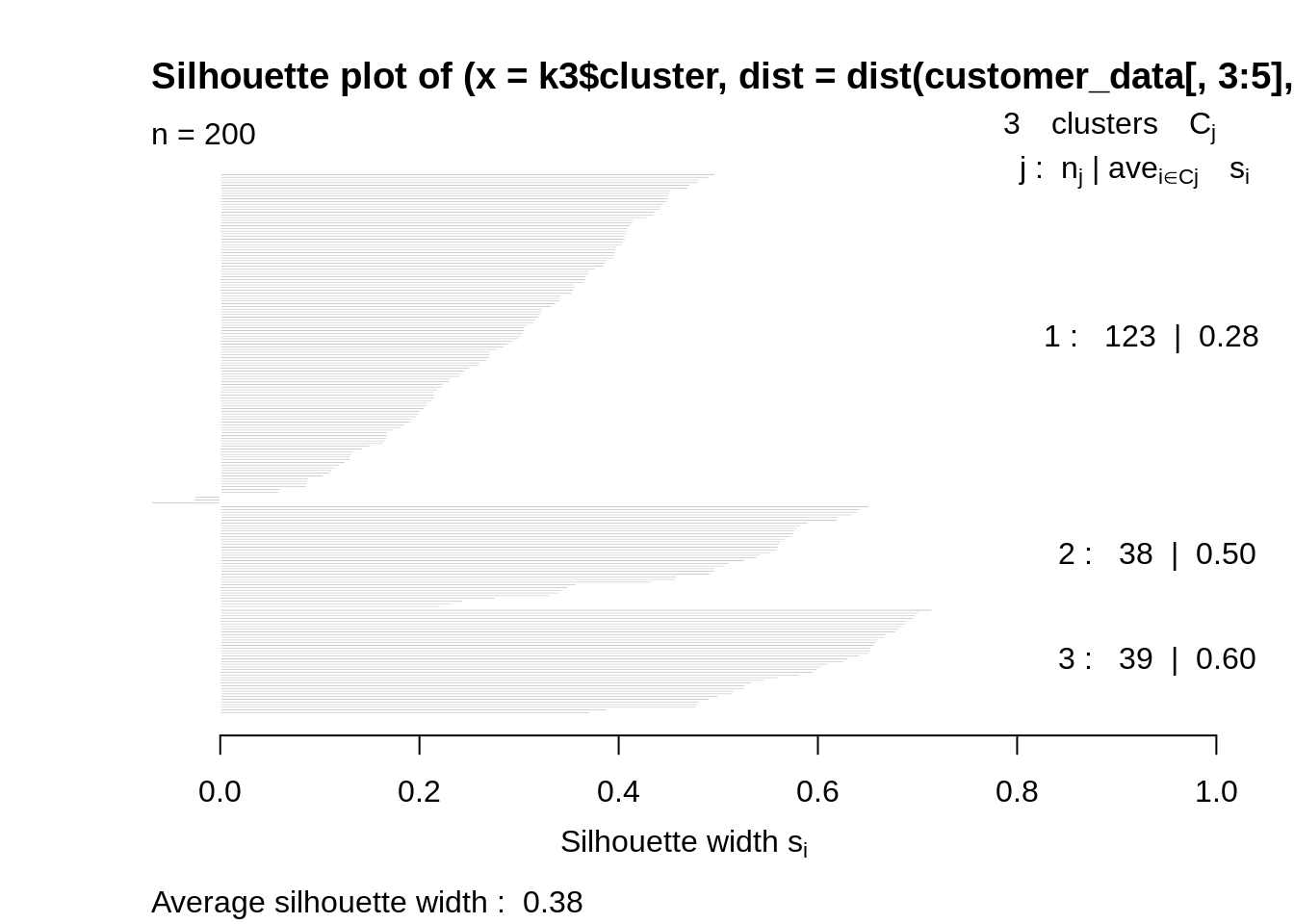
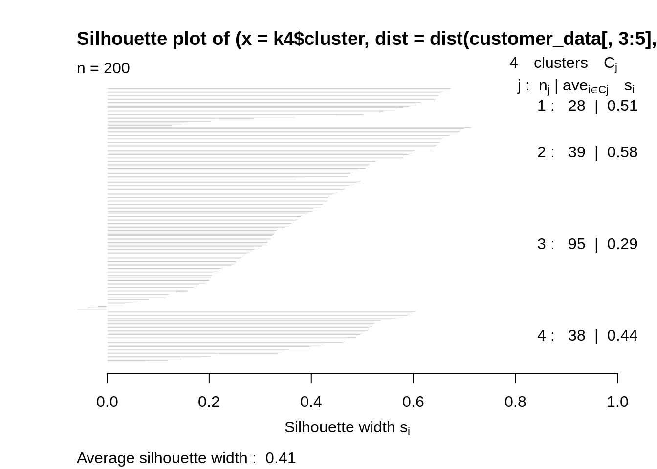
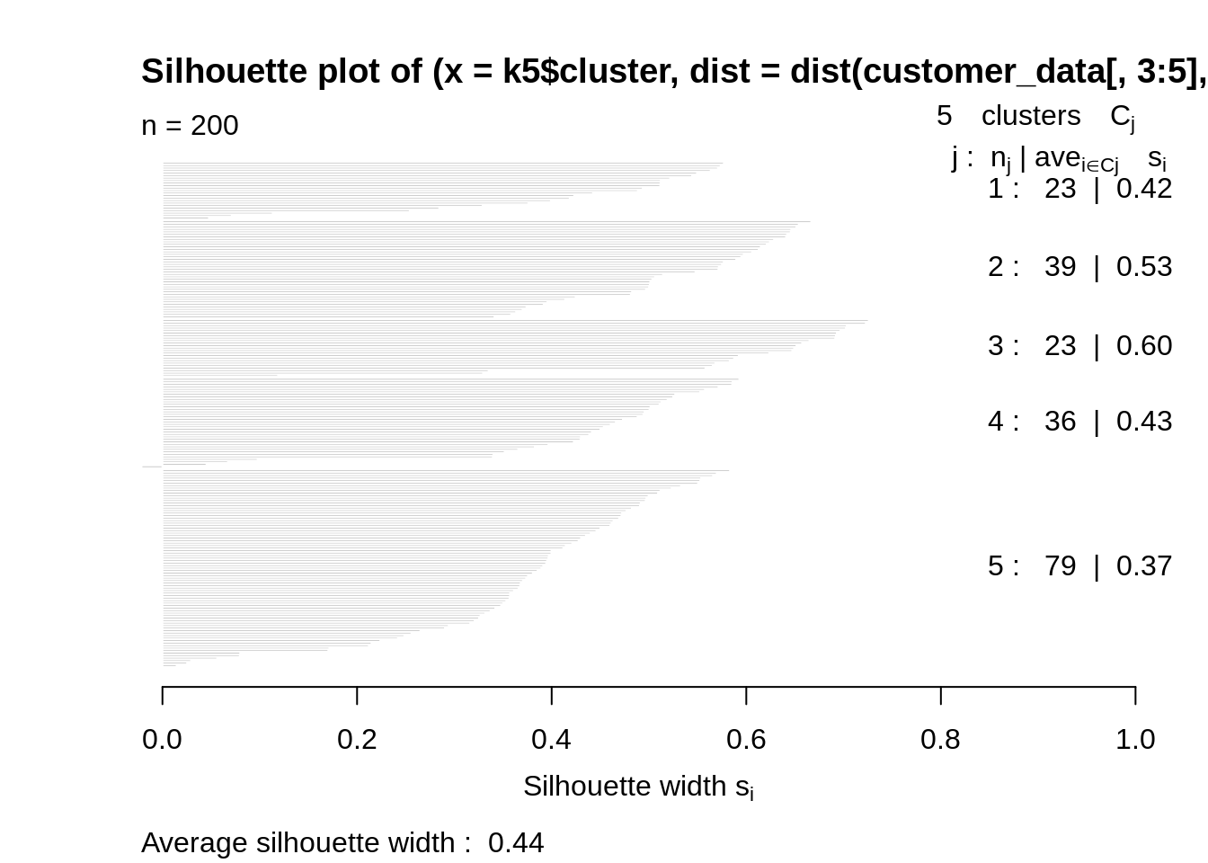
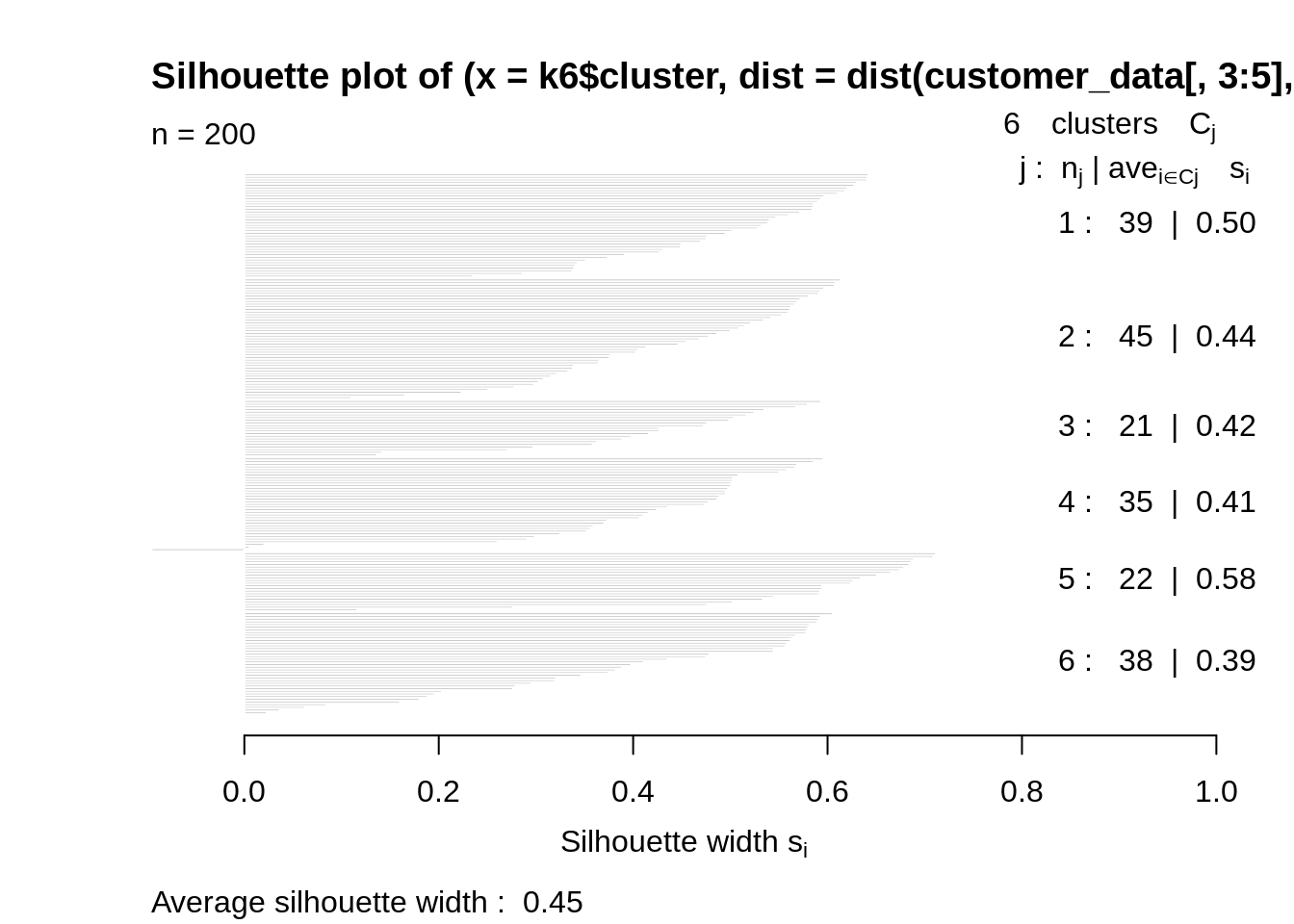
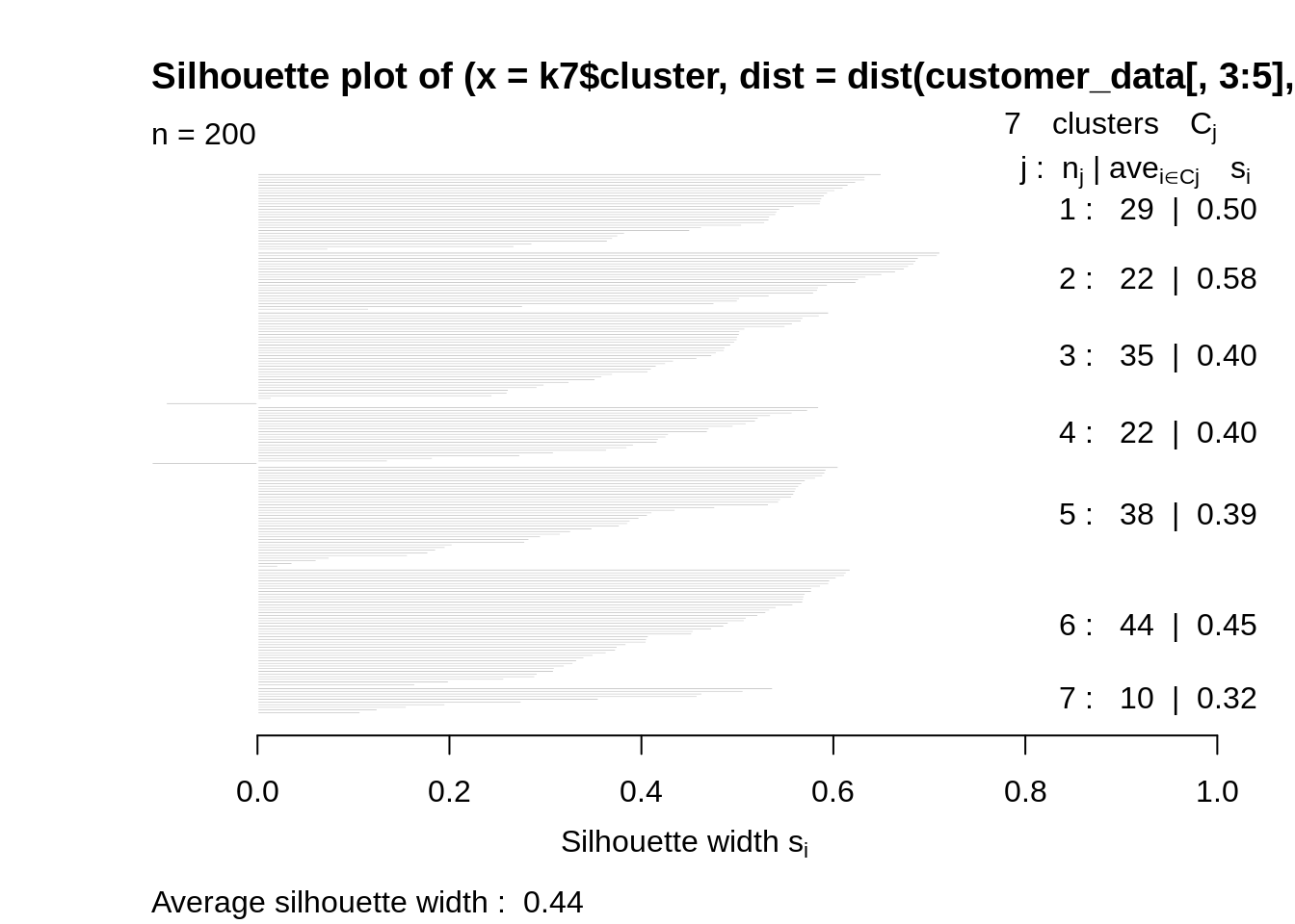
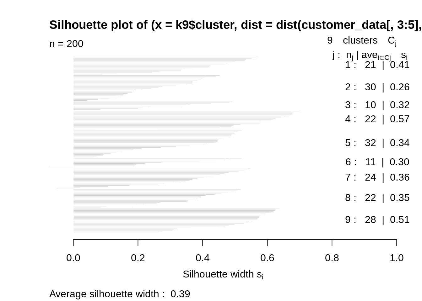
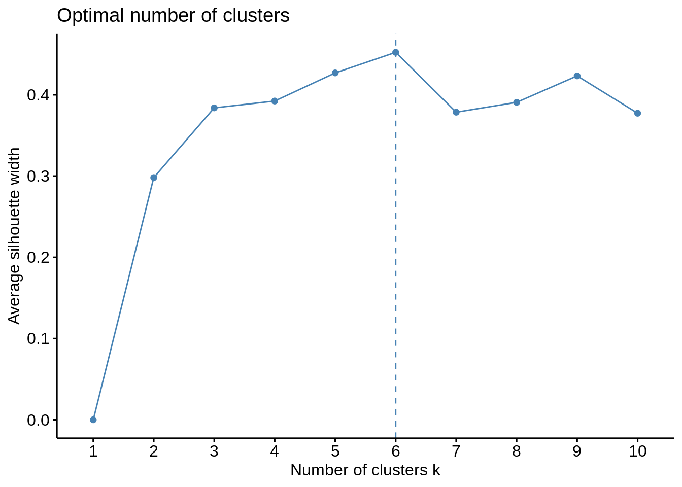
Average Silhouette Method
With the help of the average silhouette method, we can measure the quality of our clustering operation. With this, we can determine how well within the cluster is the data object. If we obtain a high average silhouette width, it means that we have good clustering. The average silhouette method calculates the mean of silhouette observations for different k values. With the optimal number of k clusters, one can maximize the average silhouette over significant values for k clusters.
Using the silhouette function in the cluster package, we can compute the average silhouette width using the kmean function. Here, the optimal cluster will possess highest average.
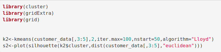
Code:
library(cluster)
library(gridExtra)
library(grid)


k2<-kmeans(customer_data[,3:5],2,iter.max=100,nstart=50,algorithm="Lloyd")
s2<-plot(silhouette(k2$cluster,dist(customer_data[,3:5],"euclidean")))
Screenshot:
Output:
Code:
k3<-kmeans(customer_data[,3:5],3,iter.max=100,nstart=50,algorithm="Lloyd")
s3<-plot(silhouette(k3$cluster,dist(customer_data[,3:5],"euclidean")))
Screenshot:

Output:
Code:
k4<-kmeans(customer_data[,3:5],4,iter.max=100,nstart=50,algorithm="Lloyd")
s4<-plot(silhouette(k4$cluster,dist(customer_data[,3:5],"euclidean")))
Screenshot:

Output:
Code:
k5<-kmeans(customer_data[,3:5],5,iter.max=100,nstart=50,algorithm="Lloyd")
s5<-plot(silhouette(k5$cluster,dist(customer_data[,3:5],"euclidean")))
Screenshot:

Output:
Code:
k6<-kmeans(customer_data[,3:5],6,iter.max=100,nstart=50,algorithm="Lloyd")
s6<-plot(silhouette(k6$cluster,dist(customer_data[,3:5],"euclidean")))
Screenshot:

Output:
Code:
k7<-kmeans(customer_data[,3:5],7,iter.max=100,nstart=50,algorithm="Lloyd")
s7<-plot(silhouette(k7$cluster,dist(customer_data[,3:5],"euclidean")))
Screenshot:

Output:
Code:
k8<-kmeans(customer_data[,3:5],8,iter.max=100,nstart=50,algorithm="Lloyd")
s8<-plot(silhouette(k8$cluster,dist(customer_data[,3:5],"euclidean")))
Screenshot:

Output:

Code:
k9<-kmeans(customer_data[,3:5],9,iter.max=100,nstart=50,algorithm="Lloyd")
s9<-plot(silhouette(k9$cluster,dist(customer_data[,3:5],"euclidean")))
Screenshot:

Output:
Code:
k10<-kmeans(customer_data[,3:5],10,iter.max=100,nstart=50,algorithm="Lloyd")
s10<-plot(silhouette(k10$cluster,dist(customer_data[,3:5],"euclidean")))
Screenshot:

Output:

Now, we make use of the fviz_nbclust() function to determine and visualize the optimal number of clusters as follows –
Code:
library(NbClust)
library(factoextra)

fviz_nbclust(customer_data[,3:5], kmeans, method = "silhouette")
Screenshot:
Output:
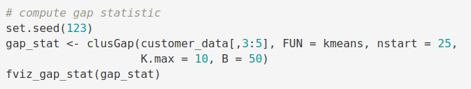
Gap Statistic Method
In 2001, researchers at Stanford University – R. Tibshirani, G.Walther and T. Hastie published the Gap Statistic Method. We can use this method to any of the clustering method like K-means, hierarchical clustering etc. Using the gap statistic, one can compare the total intracluster variation for different values of k along with their expected values under the null reference distribution of data. With the help of Monte Carlo simulations, one can produce the sample dataset. For each variable in the dataset, we can calculate the range between min(xi) and max (xj) through which we can produce values uniformly from interval lower bound to upper bound.
For computing the gap statistics method we can utilize the clusGap function for providing gap statistic as well as standard error for a given output.
Code:
set.seed(125)
stat_gap <- clusGap(customer_data[,3:5], FUN = kmeans, nstart = 25,
            K.max = 10, B = 50)
fviz_gap_stat(stat_gap)
Screenshot:
Output:

Learn everything about Machine Learning for Free – Check 90+ Free Machine Learning Tutorials
Now, let us take k = 6 as our optimal cluster –
Code:
k6<-kmeans(customer_data[,3:5],6,iter.max=100,nstart=50,algorithm="Lloyd")
k6
Output Screenshot:
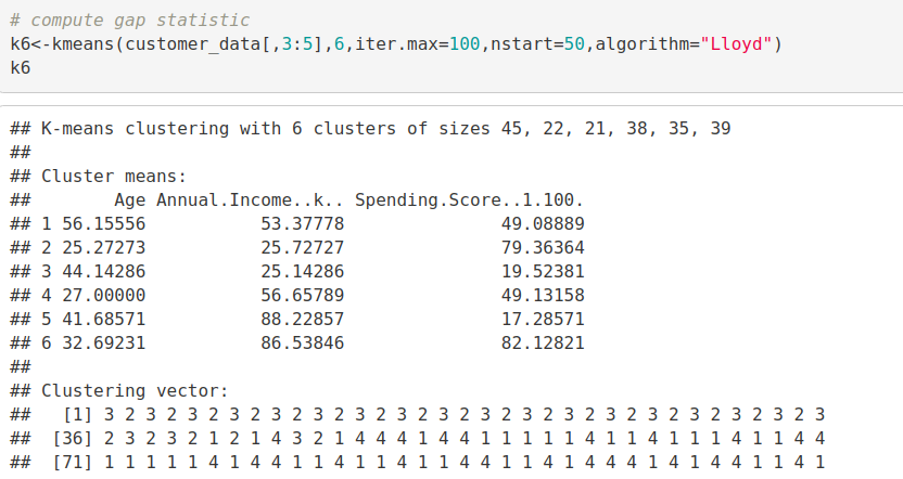
In the output of our kmeans operation, we observe a list with several key information. From this, we conclude the useful information being –
- cluster – This is a vector of several integers that denote the cluster which has an allocation of each point.
- totss – This represents the total sum of squares.
- centers – Matrix comprising of several cluster centers
- withinss – This is a vector representing the intra-cluster sum of squares having one component per cluster.
- tot.withinss – This denotes the total intra-cluster sum of squares.
- betweenss – This is the sum of between-cluster squares.
- size – The total number of points that each cluster holds.
Visualizing the Clustering Results using the First Two Principle Components
Code:
pcclust=prcomp(customer_data[,3:5],scale=FALSE) #principal component analysis
summary(pcclust)

pcclust$rotation[,1:2]
Output Screenshot:

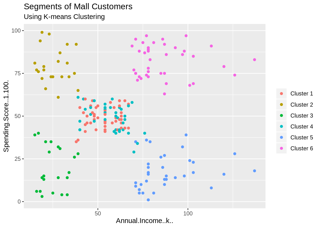
Code:
set.seed(1)
ggplot(customer_data, aes(x =Annual.Income..k.., y = Spending.Score..1.100.)) +
  geom_point(stat = "identity", aes(color = as.factor(k6$cluster))) +
  scale_color_discrete(name=" ",
              breaks=c("1", "2", "3", "4", "5","6"),
              labels=c("Cluster 1", "Cluster 2", "Cluster 3", "Cluster 4", "Cluster 5","Cluster 6")) +
  ggtitle("Segments of Mall Customers", subtitle = "Using K-means Clustering")
Screenshot:
Output:

From the above visualization, we observe that there is a distribution of 6 clusters as follows –
Cluster 6 and 4 – These clusters represent the customer_data with the medium income salary as well as the medium annual spend of salary.
Cluster 1 – This cluster represents the customer_data having a high annual income as well as a high annual spend.
3rd Cluster – This cluster denotes the customer_data with low annual income as well as low yearly spend of income.
Cluster 2 – This cluster denotes a high annual income and low yearly spend.
Cluster 5 – This cluster represents a low annual income but its high yearly expenditure.
Code:
ggplot(customer_data, aes(x =Spending.Score..1.100., y =Age)) +
  geom_point(stat = "identity", aes(color = as.factor(k6$cluster))) +
  scale_color_discrete(name=" ",
                      breaks=c("1", "2", "3", "4", "5","6"),
                      labels=c("Cluster 1", "Cluster 2", "Cluster 3", "Cluster 4", "Cluster 5","Cluster 6")) +
  ggtitle("Segments of Mall Customers", subtitle = "Using K-means Clustering")
Screenshot:
Output:
Code:
kCols=function(vec){cols=rainbow (length (unique (vec)))
return (cols[as.numeric(as.factor(vec))])}

digCluster<-k6$cluster; dignm<-as.character(digCluster); # K-means clusters

plot(pcclust$x[,1:2], col =kCols(digCluster),pch =19,xlab ="K-means",ylab="classes")
legend("bottomleft",unique(dignm),fill=unique(kCols(digCluster)))
Screenshot:

Output:
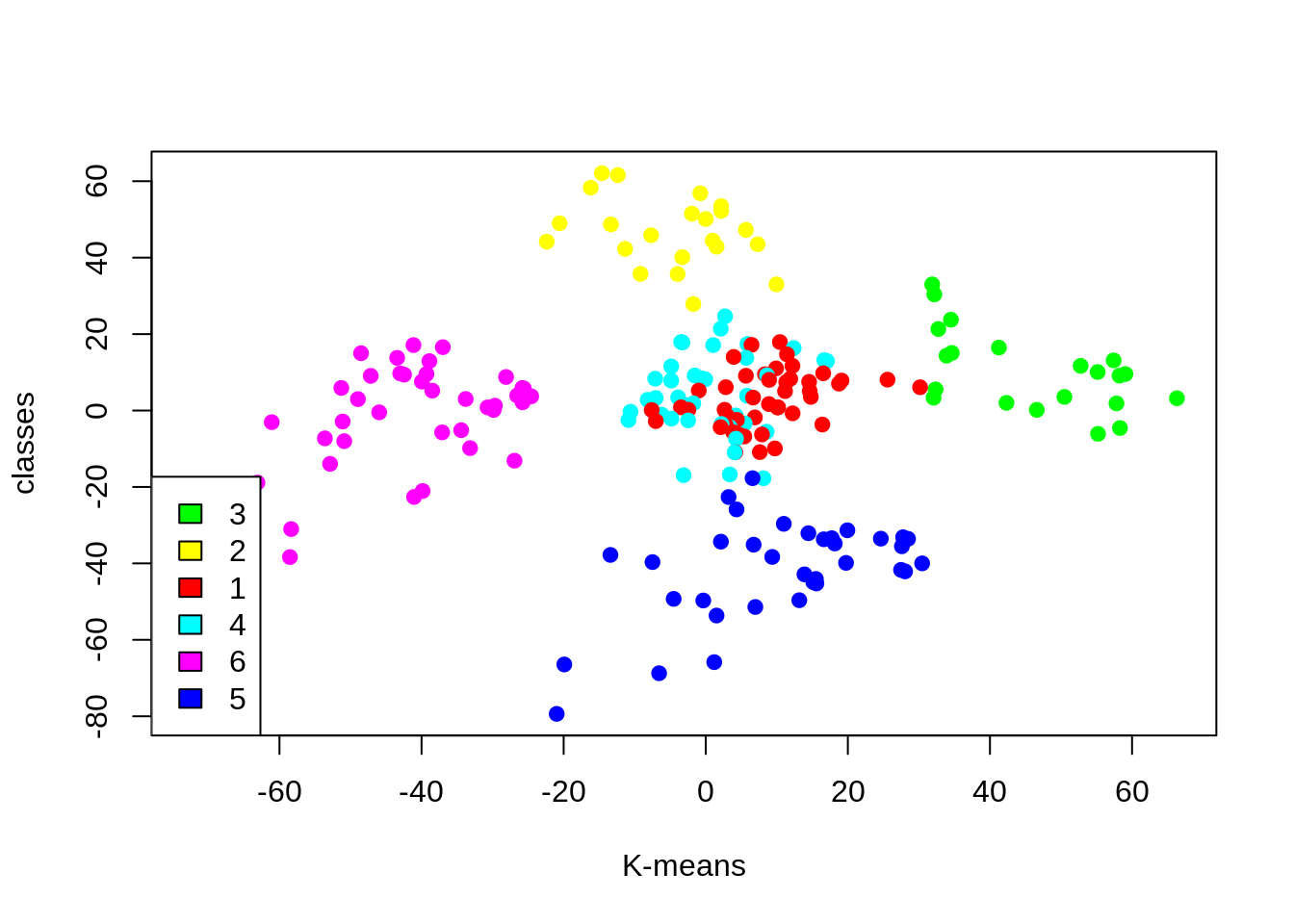
Cluster 4 and 1 – These two clusters consist of customers with medium PCA1 and medium PCA2 score.
Cluster 6 – This cluster represents customers having a high PCA2 and a low PCA1.
5th Cluster – In this cluster, there are customers with a medium PCA1 and a low PCA2 score.
Cluster 3 – This cluster comprises of customers with a high PCA1 income and a high PCA2.
Cluster 2 – This comprises of customers with a high PCA2 and a medium annual spend of income.
With the help of clustering, we can understand the variables much better, prompting us to take careful decisions. With the identification of customers, companies can release products and services that target customers based on several parameters like income, age, spending patterns, etc. Furthermore, more complex patterns like product reviews are taken into consideration for better segmentation.
Summary
In this data science project, we went through the customer segmentation model. We developed this using a class of machine learning known as unsupervised learning. Specifically, we made use of a clustering algorithm called K-means clustering. We analyzed and visualized the data and then proceeded to implement our algorithm. Hope you enjoyed this customer segmentation project of machine learning using R.
Are there any other Data Science Project on which you have worked on? Do share your experience with us through comments. Here is DataFlair’s next project for data science enthusiasts – Uber Data Analysis Project.
Did we exceed your expectations?
If Yes, share your valuable feedback on Google


map_dbl
fivz_nbClust
and some other functions are not working after installing the packages also. please help
Hi, Thanks for this highly highly informative and well-designed project.
I’d like to ask if this can also be built using a k-means distribution clustering algorithm instead of this centroid-based Algorithm implementations using the same dataset.
This was a very good Machine Learning Exercise. Very well put together and explained. Is there any example for supervised learning.
Very Informative !!! Thanks
Informative….well presented!!!
How can we find for a new customer in which cluster will be?