Data Visualization in R – Upgrade your R Skills to become Data Scientist!
We offer you a brighter future with industry-ready online courses - Start Now!!
Going further in our R tutorial DataFlair series, we will learn about data visualization in R. We will study the evolution of data visualization, R graphics concept and data visualization using ggplot2. We will also explore the various concepts to learn in R data visualization and its pros and cons.
Before diving into data visualization in R, you should definitely have a basic knowledge about R graphical analysis. So, check out our easy to learn tutorial on R Graphical Analysis before proceeding ahead.
What is R Data Visualization?
Using the diverse functionalities provided by R, one can create visually appealing data visualizations with only a few lines of code. Data visualization is an efficient technique of gaining insights about data through a visual medium.
- With the help of visualization techniques, humans can easily gain insights about the hidden patterns in data which might otherwise be neglected.
- Using data visualization, one can work with large datasets to efficiently obtain key insights about it.
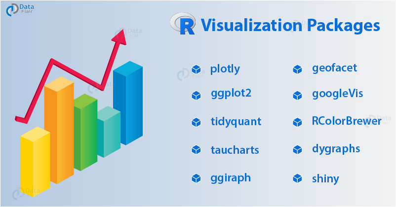
R Visualization Packages
Following are some of the essential visualization packages in R Programming:
Use of R Programming
For most of our work in R Programming, we will use the environment RStudio.
RStudio of R has four panels:
- Console – This is the actual R window, you can enter R commands here. And, thus execute them by pressing enter.
- Source – This is where we can edit scripts. It is where you should always be working. Control-enter sends selected codes to console.
- Plots/Help – Here plots and help pages will be shown.
- Workspace – Shows which objects you currently have.
Anything following a # symbol is treated as a comment.
Hold On! Please confirm that you have completed – R Graphical Models Tutorial
Note – We need R data visualization because it provides a clear understanding of patterns in data. Also, it has the ability to detect hidden structures in data.
R Graphics
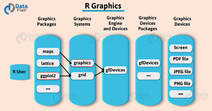
1. Standard Graphics
R standard graphics available through package graphics, include several functions that provide statistical plots, like:
- Scatterplots
- Boxplots
- Piecharts
- Barplots etc.
We use these graphs which are typically a single function call.
2. Graphics Devices
- Its functions produce output that totally depends on the active graphics device.
- A screen is the default and more frequently used device.
- R graphical devices, like the PDF device, the JPEG device, etc.
- The user just needs to open the graphics output device that she/he wants. Hence, R takes care of producing the type of output required by the device.
- This means, to produce a certain plot on the screen or as a GIF R graphics file, the R code should exactly be the same. You only need to open the target output device before!
- Several devices may be open at the same time, but only one is the active device.
3. The basics of the grammar of graphics
Key elements of a statistical graphic:
- Data
- Aesthetic Mappings
- Geometric Objects
- Statistical Transformations
- Scales
- Coordinates system
- Faceting
Now, let us discuss each of them.
3.1 Aesthetic Mappings
- It controls the relation between data variables and graphics variables.
- Also, it helps to map the temperature variable of a data set into the X variable in a scatter plot.
- It helps to map the species of a plant into the colour of dots in graphics.
3.2 Geometric Objects
It shows each observation by a point using the aesthetic mappings that map two variables in the data set into the x,y variables of the plot.
3.3 Statistical Transformations
- It allows us to calculate and also perform a statistical analysis of the data in the plot.
- Also, the statistical transformation uses the data and approximates it by a regression line x,y coordinates.
- It counts occurrences of certain values.
3.4 Scales
It maps the data values into values in the coordinate system of the graphics device.
3.5 Coordinate system
We use it to plot the data.
- Cartesian
- Plot
3.6 Faceting
It splits the data into subgroups and draws sub-graphs for each group.
Time to gain expertise in Descriptive Statistics in R Programming
Data Visualization in R using ggplot2
“ggplot2 is the most widely used data visualization package of the R programming language.”
What type of data visualization in R should be used for what sort of problem? I will provide you with tips which will help you to choose the right type of chart for your specific objectives. We will also learn to implement data visualization in R using ggplot2.
- Introduction to ggplot2
- Customizing the look and feel
1. Introduction to ggplot2
It is a plotting system. We use it to build professional-looking graphs. Also, use plots quickly with minimal code. It helps to take care of many complicated things that make plotting difficult. Hence, ggplot2 is very different from base R plotting but it is also very flexible and powerful.
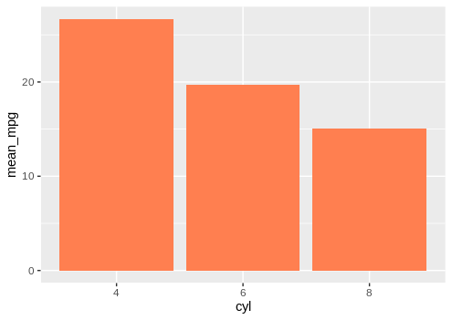
We can create a histogram using ggplot2 as follows:
library(magrittr)
library(dplyr)
library(ggplot2)
data_histogram <- mtcars %>%
  mutate(cyl = factor(cyl)) %>%
  group_by(cyl) %>%
  summarize(mean_mpg = round(mean(mpg), 2))

ggplot(data_histogram, aes(x = cyl, y = mean_mpg)) +
  geom_bar(fill = "coral", stat = "identity")
Output:
It uses data frames as input:
- Data must be in long format. This means each row is an observation and each column is a variable.
- Use reshape2 to get data in long format.
2. Important things to remember for ggplot
- It was developed by Hadley Wickham as an implementation of the grammar of graphics.
- ggplot is relatively complete and is a powerful graphics package.
- It can do many things but cannot build 3D visuals.
3. How to install ggplot2 package
- ggplot2 can be easily installed by typing:
install.packages(“ggplot2”)
- Make sure that you are using the latest version of R to get the most recent version of ggplot2.
4. Applications of ggplot2
- Aesthetics: It refers to visual attributes that affect how data is displayed in a graphic, e.g., color, point size, or line type.
- Geometric objects: We use it for a visual representation of observations such as points, lines, polygons, etc.
- Faceting: It is applied to the same type of graph.
- Annotation: We use it to add text and/or external graphics to a ggplot.
- Positional adjustments: It helps to reduce the overplotting of points.
5. Why ggplot2?
- It is used professionally.
- Easy to manipulate.
- Has great support online.
- It has knowledge transfers to other packages/languages.
Any queries in R Data Visualization till now? Please comment below.
What to Learn in Data Visualization in R?
R Programming helps us to learn this art by offering a set of inbuilt functions and also libraries to build visualizations and present data. Before we move forward for the technical implementation of the visualization, let’s see first how to select the right chart type.
Selecting the Right Chart Type
There are four basic presentation types:
- Comparison
- Composition
- Distribution
- Relationship
Following are the most used charts in data visualization:
- Scatter Plot
- Histogram
- Bar & Stack Bar Chart
- Box Plot
- Area Chart
- Heat Map
- Correlogram
Now we will discuss when to use each of them:
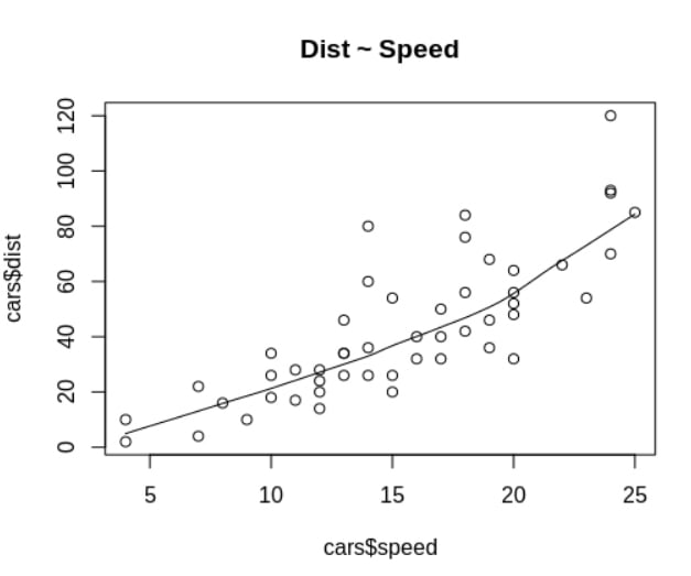
1. Scatter Plot
To see the relationship between two continuous variables.
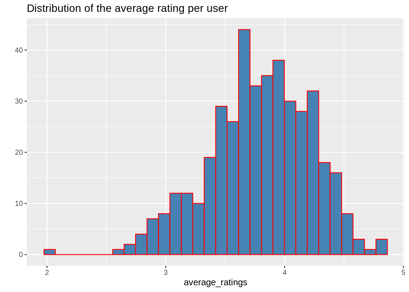
2. Histogram
A histogram is used to plot a continuous variable. Also, It helps to break the data into bins and shows the frequency distribution of these bins. Thus, we can always change the bin size and see the effect it has on visualization.
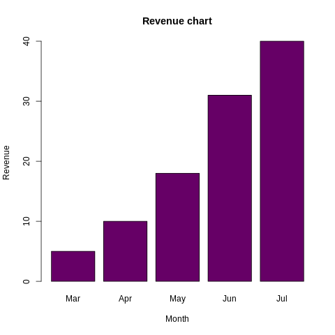
3. Bar Chart
We use bar charts to plot a categorical variable.
Get to know everything about Bar Chart and Histogram in R Programming
4. Box Plot
Box plots are used to plot an aggregation of categorical and continuous variables. It is also used for visualizing the spread of the data and detect outliers. Moreover, it shows five statistically significant numbers:
- Minimum
- 25th percentile
- Median
- 75th percentile and
- Maximum.

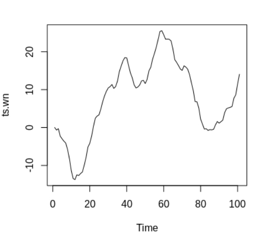
5. Area Chart
We use it to show the continuity across a variable or data set. It is almost same as a line chart. Also, we can use it for time series plots. We can use it alternatively to plot continuous variables and analyze the underlying trends.
6. Heat Map
We use it for the intensity of colours. It is also used to display a relationship between two or three or many variables in a two-dimensional image. Thus, it allows us to explore two dimensions of the axis and the third dimension by an intensity of colour.

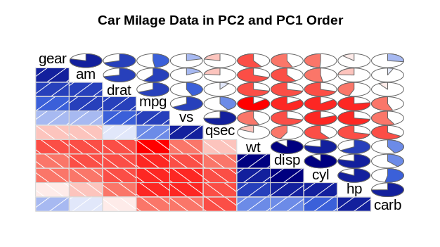
7. Correlogram
We use it to test the level of correlation and also among the variable available in the dataset. Thus, the cells of the matrix can be shaded or coloured to show the co-relation value.
Pros and Cons of Data Visualization in R
Let’s have a look at the advantages and disadvantages of data visualization in R programming:
Advantages of Data Visualization in R
1. Understanding
It may be more appealing to look into the business. And, it’s easy to understand through graphics and charts when compared to a written document comprising text and numbers. Thus, it can attract a wider audience. Also, it promotes widespread utilization of those business insights to arrive at better decisions.
2. Efficiency
Its app allows us to display a lot of information in a small space. While the process of decision making in business is inherently complex and multifaceted, displaying evaluation findings in a graph can allow the companies to organize lots of interrelated information in useful ways.
Do you know about Generalized Linear Models in R Programming
3. Location
Its app that uses features like geographical maps and GIS can be especially relevant for extensive businesses when a location is a very relevant factor. We use maps to show business insights from different places, giving an idea of the severity of issues, the reasons behind them and also the workarounds to address them.
Disadvantages of Data Visualization in R
1. Cost
Its applications cost a decent sum of money, and it may not be possible for especially small companies to spend that many resources upon purchasing them. In order to generate reports, many companies may hire professionals to produce charts which may increase the costs. Small enterprises are often working in resource-limited settings, and also getting evaluation results in a timely manner that can often be of high importance.
2. Distraction
Although at times, the data visualization apps create reports and charts laden with highly complicated and fancy graphics, which may be tempting for the users to focus more on form than on function. The overall value of the graphic representation will be minimal if we first add visual appeal. In a resource-setting, it is also important to think carefully about how resources can be best used. And also not get caught up in the graphics trend without a clear purpose.
Summary
In this article, we took a brief look at the complete concept of data visualization in R. And, we have also focused on ggplot2 in R which is mainly used in data visualization. Apart from ggplot2, we have also learned about visualization along with their pros and cons.
Next, you must go through our article on R Lattice Package
Hope you liked the article. Still, if you have any doubt regarding data visualization in R, ask in the comment section.
You give me 15 seconds I promise you best tutorials
Please share your happy experience on Google


