Bar Chart and Histogram in R | An in-depth tutorial for Beginners
Placement-ready Courses: Enroll Now, Thank us Later!
Now, we will discuss the most popular way of representing the data, that is, in the form of a bar chart and histogram. First, we will explore the concept of data visualization and data set, then learn about the central tendency measures and also understand the types of bar charts with examples.
So, let’s quickly start the tutorial.
What is Data Visualization in R?
Generally, R has the ability to create data visualizations with a couple of lines of code.
- It is an art of turning numbers into a useful piece of knowledge.
- Basically, data visualization is the process of presenting data through pictures and shapes.
- Also, it can be considered as a modern equivalent of visual communication. The goal is to communicate information to users.
- It is said that one meaningful picture is powerful than a thousand words!
Data visualization can help us in the following ways:
- Identify areas that need attention or improvement.
- Clarify which factors influence customer behaviour.
- Help you understand the right placement of the products.
- Predict sales volume.
Get a deep insight into Data Visualization in R
Data Set in R
A data set is defined as the field in the following data. Thus, it provides a number of sample data sets as there are thousands of data sets present. We can use them to practice and get better at machine learning.
Although, in U.C.I Machine Learning Repository, most of data sets are hosted for free. These data sets are very useful as they are small, well behaved and well understood.
- It can download easily and fast.
- One can fit them into memory easily.
- You can run algorithms on them quickly.
Central Tendency Measures
- Mean – Add up the values in the dataset and then divide by the number of values that you added.
- Median – List the values of the data set in numerical order and identify which value appears in the middle of the list.
- Mode – Measure the values that occur most frequently.
Bar Chart and Histogram in R
Let’s study about the bar chart and histogram in R, in detail.
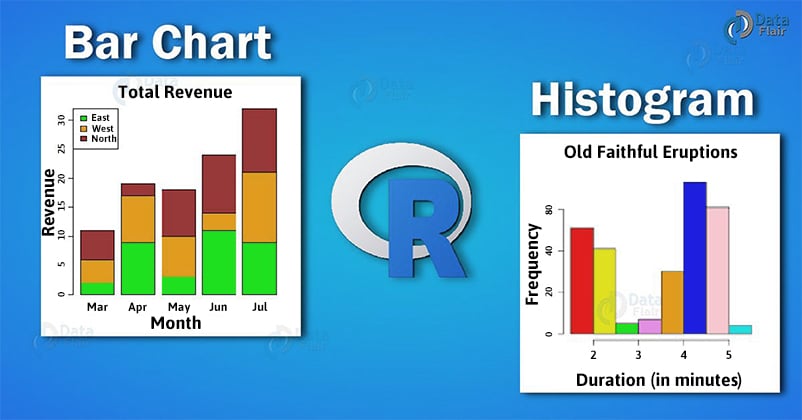
What is Bar Chart?
Basically, we use the bar chart in R to display and compare the density, frequency. Also, there are several variations of the standard bar chart including:
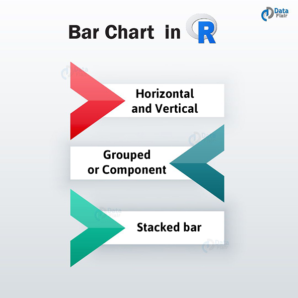
1. Vertical and Horizontal Bar Chart
In a horizontal bar chart, longer the bar, larger is the category. While in a vertical bar chart, taller the bar, larger is the category. In order to effectively present data in data categories that possess long titles, we make use of these bar graphs.
2. Grouped Bar Chart
These bar charts are used to show information about different sub-groups of the main categories. Each sub-group is represented by a separate bar. Furthermore, these bars are coloured and shaded in a way that differentiates them from the other categories.
3. Stacked Bar Chart
They are similar to group bar charts as we use these charts to display information about the sub-groups that make up the different categories.
Wait! Have you checked – Descriptive Statistics in R
What is Histogram?
A histogram in R is the best choice for visualizing central tendency of data.
Basically, the histogram is a special form of bar chart.
In a bar chart, the length of the bar indicates the size of the category but in a histogram, it is the area of the bar that is proportional to the size of the category.
Parts of Histogram
- Title – The title represents the information that is included in the histogram.
- X-axis – The X-axis or the horizontal axis represents the intervals under which the independent measurements lie.
- Y-axis – The Y-axis or the vertical axis provide the number of times a value occurs in the interval that is dependent on the X-axis.
- Bars – The height of the bars represent the number of times the value occurs in the interval. The histograms possessing equal bins should have a uniform width across all the bars.
You must definitely learn to save graphs to files in R
Why are Histograms important?
Histograms provide us with a visual representation of the data. A large amount of data, as well as the frequency of the data values, is represented by the histogram. A histogram determines the median and distribution of the data.
Different Distributions of Histograms:
1. Normal Distribution
In normal distribution histogram, the data on one side of the average is the same as another side. Normal distribution is also known as Gaussian Distribution.
2. Bimodal Distribution
There are two peaks in a bimodal distribution. Data, in this case, is separated and analyzed in the form of two normal distributions.
3. Right Skewed Distribution
Also known as a positively skewed distribution, a large number of data values occur on the left side with very few data points on the right side.
This type of distribution takes place when the data has a range boundary on the left side of the histogram.
4. Left Skewed Distribution
This type of distribution is also called negative skew. In the left-side distribution, a large number of data values occur on the right side with very few points occurring on the left side. A left skewed histogram occurs when the data has a ranged boundary on the right side of the histogram.
5. Random Distribution
A random distribution histogram does not possess a structured pattern and has several peaks in it. In the case of a randomly distributed histogram, it can be the case that several data points are combined. Data is, therefore, separated and analyzed.
Major Difference between Histogram and Bar Chart:
In a histogram, both the x-axis and y-axis have a scale while in a bar chart, only the y-axis has a scale.
Summary
We have studied about data visualization, dataset and central tendency measures in R. We also looked at types of bar chart and histogram in R, in detail. As we saw, bar charts and histograms helps us to understand any data in a precise and informative way. Therefore, they are very useful in almost every sector.
The next stop in our R programming journey is Introduction to R Lattice Package
If you have any queries regarding the tutorial, feel free to ask in the comment section.
Did you know we work 24x7 to provide you best tutorials
Please encourage us - write a review on Google


