Graphical Data Analysis with R Programming – A Comprehensive Handbook!
Job-ready Online Courses: Knowledge Awaits – Click to Access!
With this article, we will take you through a comprehensive tour of graphical data analysis with R. We will explore the types of plots available in R and learn to create them with the help of functions and implementation examples.
Also, we will look at saving graphics to file in R and the selection of the appropriate graph. So, let’s start exploring the tour.
What is Graphical Data Analysis with R?
Much of the statistical analysis is based on numerical techniques, such as confidence intervals, hypothesis testing, regression analysis, and so on. In many cases, these techniques are based on assumptions about the data being used. One way to determine if data confirm to these assumptions is the graphical data analysis with R, as a graph can provide many insights into the properties of the plotted dataset.
Graphs are useful for non-numerical data, such as colours, flavours, brand names, and more. When numerical measures are difficult or impossible to compute, graphs play an important role.
Statistical computing is done with the aim to produce high-quality graphics.
Various types of plots drawn in R programming are:
- Plots with Single Variable – You can plot a graph for a single variable.
- Plots with Two Variables – You can plot a graph with two variables.
- Plots with Multiple Variables – You can plot a graph with multiple variables.
- Special Plots – R has low and high-level graphics facilities.
First, you must complete the Graphical Models Tutorial before proceeding ahead
1. Plots with Single Variable
You may need to plot for a single variable in graphical data analysis with R programming. For example – A plot showing daily sales values of a particular product over a period of time. You can also plot the time series for month by month sales.
The choice of plots is more restricted when you have just one variable to the plot. There are various plotting functions for single variables in R:
- hist(y) – Histograms to show a frequency distribution.
- plot(y) – We can obtain the values of y in a sequence with the help of the plot.
- plot.ts(y) – Time-series plots.
- pie(x) – Compositional plots like pie diagrams.
The types of plots available in R:
- Histograms – Used to display the mode, spread, and symmetry of a set of data.
- Index Plots – Here, the plot takes a single argument. This kind of plot is especially useful for error checking.
- Time Series Plots – When a period of time is complete, the time series plot can be used to join the dots in an ordered set of y values.
- Pie Charts – Useful to illustrate the proportional makeup of a sample in presentations.
A common mistake among beginners is getting confused between histograms and bar charts. Histograms have the response variable on the x-axis, and the y-axis shows the frequency of different values of the response. In contrast, a bar chart has the response variable on the y-axis and a categorical explanatory variable on the x-axis.
Get an in-depth understanding of Bar Chart and Histogram in R Programming
1.1 Histograms
Histograms display the mode, the spread, and the symmetry of a set of data. The R function hist() is used to plot histograms.
The x-axis is divided into which the values of the response variable are distributed and then counted. This is called bins. Histograms are tricky because it depends on the subjective judgments of where exactly to put the bin margins that what graph you will be looking at. Wide bins produce one picture, narrow bins produce a different picture, and unequal bins produce confusion.
Small bins produce multimodality (a combination of audio, textual, and visual modes), whereas broad bins produce unimodality (contains a single-mode). When there are different bin widths, the default in R is for this to convert the counts into densities.
The convention adopted in R for showing bin boundaries is to employ square and round brackets, so that:
- [a,b) means ‘greater than or equal to a but less than b’ [square than round).
- (a,b] means ‘greater than a but less than or equal to b’ (round than square].
You need to take care that the bins can accommodate both your minimum and maximum values.
The cut() function takes a continuous vector and cuts it up into bins that can then be used for counting.
The hist() function in R does not take your advice about the number of bars or the width of bars. It helps simultaneous viewing of multiple histograms with similar range. For small integer data, you can have one bin for each value.
In R, the parameter k of the negative binomial distribution is known as size and the mean is known as mu.
Drawing histograms of continuous variables is a more challenging task than explanatory variables. This problem depends on the density estimation that is an important issue for statisticians. To deal with this problem, you can approximately transform continuous model to a discrete model using a linear approximation to evaluate the density at the specified points.
The choice of bandwidth is a compromise made between removing insignificant bumps and real peaks.
Time to master the concept of Binomial and Poisson Distribution in R Programming
1.2 Index Plots
For plotting single samples, index plots can be used. The plot function takes a single argument. This is a continuous variable and plots values on the y-axis, with the x coordinate determined by the position of the number in the vector. Index plots are especially useful for error checking.
1.3 Time Series Plot
The time series plot can be used to join the dots in an ordered set of y values when a period of time is complete. The issues arise when there are missing values in the time series (e.g., if sales values for two months are missing during the last five years), particularly groups of missing values (e.g., if sales values for two quarters are missing during the last five years) and during that period we typically know nothing about the behaviour of the time series.
ts.plot and plot.ts are the two functions for plotting time series data in R.
1.4 Pie Chart
You can use pie charts to illustrate the proportional makeup of a sample in presentations. Here the function pie takes a vector of numbers and turns them into proportions. It then divides the circle on the basis of those proportions.
To indicate each segment of the pie, it is essential to use a label. The label is provided as a vector of character strings, here called data$names.
If a names list contains blank spaces then you cannot use read.table with a tab-delimited text file to enter the data. Instead, you can save the file called piedata as a comma-delimited file, with a “.csv” extension, and input the data to R using read.csv in place of read.table.
#Author DataFlair
data <- read.csv("/home/dataflair/data/piedata.csv")
data
Output:

The pie chart can be created, using the following command:
pie(data$amounts,labels=as.character(data$names))
Output:

You must definitely have a look at Numeric and Character Functions in R
2. Plots with Two Variables
The two types of variables used in the graphical data analysis with R:
- Response variable
- Explanatory variable
The response variable is represented on the y-axis and the explanatory variable is represented on the x-axis. Nature of the explanatory variable determines the kind of plot produced. When the explanatory variable is a continuous variable, such as length or weight or altitude, the appropriate plot to use is a scatterplot.
When an explanatory variable is categorical, like genotype or colour or gender, the appropriate plot is either a box-and-whisker plot or a barplot.
We can represent sets of numerical data with the help of box and whisker plot which makes use of quartiles and it depends on the minimum and maximum values, and upper and lower quartiles.
A barplot provides a graphical representation of data in the form of bar charts.
The most frequently used plotting functions for two variables in R:
- plot(x, y): Scatterplot of y against x
- plot(factor, y): Box-and-whisker plot of y at each factor level.
- barplot(y): Heights from a vector of y values (one bar per factor level).
The types of plots available in R:
- Scatterplots – When the explanatory variable is a continuous variable.
- Stepped Lines – Used to plot data distinctly and provide a clear view.
- Boxplots – Boxplots show the location, spread of data and indicate skewness.
- Barplots – It shows the heights of the mean values from the different treatments.
2.1 Scatterplots
Scatterplots shows a graphical representation of the relationship between two numbered sets. The plot function draws axis and adds a scatterplot of points. You can also add extra points or lines to an existing plot by using the functions, point, and lines.
The points and line functions can be specified in the following two ways:
- Cartesian plot (x, y) – A Cartesian coordinate specifies the location of a point in a two-dimensional plane with the help of two perpendicular vectors that are known as an axis. The origin of the Cartesian coordinate system is the point where two axes cut each other and the location of this point is the (0,0).
- Formula plot (y, x) – The formula based plot refers to representing the relationship between variables in the graphical form. For example – The equation, y=mx+c, shows a straight line in the Cartesian coordinate system.
The advantage of the formula-based plot is that the plot function and the model fit look and feel the same. The Cartesian plots build plots using “x then y” while the model fit uses “y then x”.
The plot function uses the following arguments:
- The name of the explanatory variable.
- The name of the response variable.
The basic syntax of a scatterplot is as follows:
plot(x, y, main, xlab, ylab, xlim, ylim, axes)
where x is the data present on the horizontal coordinates.
y is the data that is present on the vertical axis.
main represents the title of our plot.
xlab is the label that denotes the horizontal axis.
ylab is the label for the vertical axis.
xlim is the limits of x for plotting.
ylim is the limits of y for plotting.
axes give an indication that both the axes should be present on the plot.
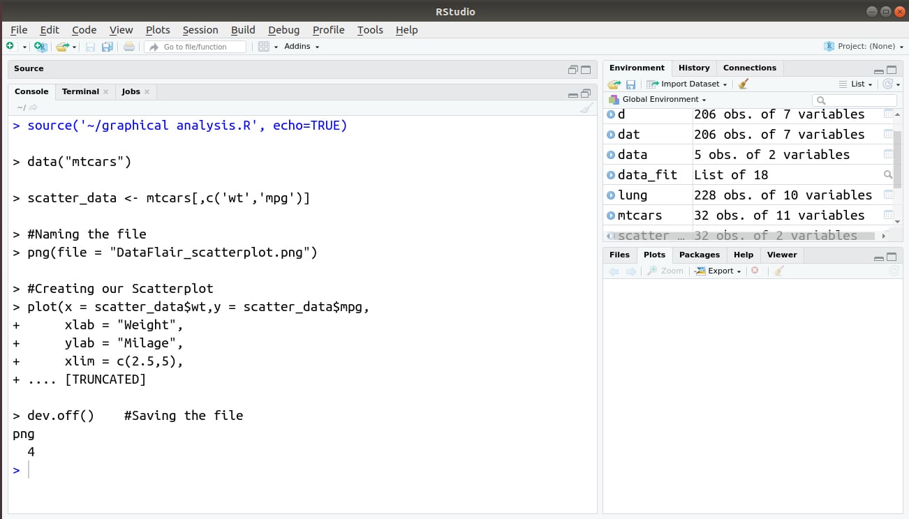
For creating our scatterplot, we will use the ‘mtcars’ dataset that is present in the R data library. We plot the graph between the labels ‘wt’ and ‘mpg’.
data("mtcars")
scatter_data <- mtcars[,c('wt','mpg')]
#Naming the file
png(file = "DataFlair_scatterplot.png")
#Creating our Scatterplot
plot(x = scatter_data$wt,y = scatter_data$mpg,
     xlab = "Weight",
     ylab = "Milage",
     xlim = c(2.5,5),
     ylim = c(15,30),
     main = "Weight vs Milage"
)
dev.off()    #Saving the file
Output:
The best way to identify multiple individuals in scatterplots is to use a combination of colours and symbols. A useful tip is to use as.numeric to convert a grouping factor into colour and/or a symbol.
Wait! Have you checked – Generalized Linear Models in R Programming
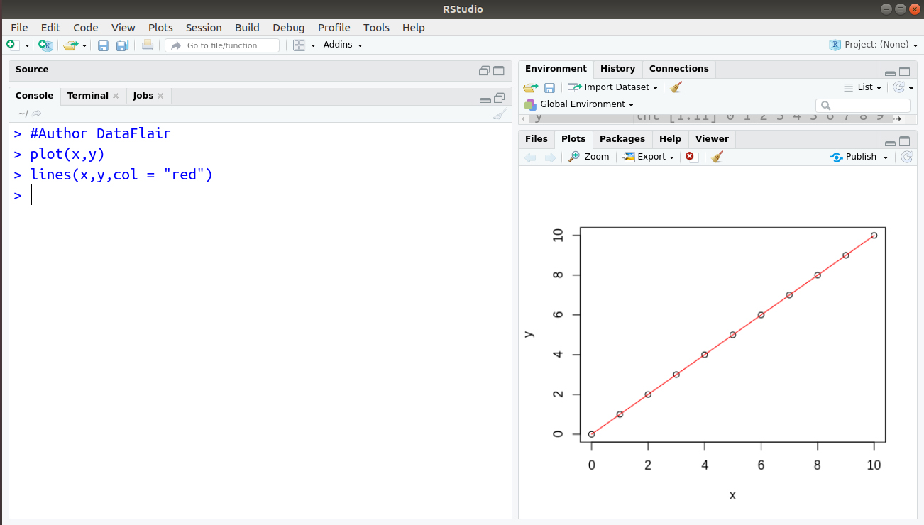
2.2 Stepped Lines
Stepped lines can be plotted as graphical representation displays in R. These plots, plot data distinctly and also provide a clear view of the differences in the figures.
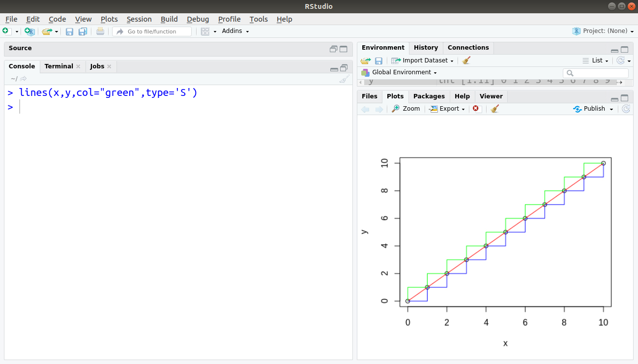
While plotting square edges between two points, you need to decide whether to go across and then up, or up and then across. Let’s assume that we have two vectors from 0 to 10. We plot these points as follows:
x = 0:10
y = 0:10
plot(x,y)
Output:

We can draw a straight line by using the following command:
> #Author DataFlair
> plot(x,y)
> lines(x,y,col = "red")
Output:
Also, generate a line by using the upper case “S” as shown below:
> lines(x,y,col="green",type='S')
Output:
2.3 Box and Whisker Plot
A box-and-whisker plot is a graphical means of representing sets of numeric data using quartiles. It is based on the minimum and maximum values, and upper and lower quartiles.
Boxplots summarizes the information available. The vertical dash lines are called the ‘whiskers’. Boxplots are also excellent for spotting errors in data. The extreme outliers represent these errors.
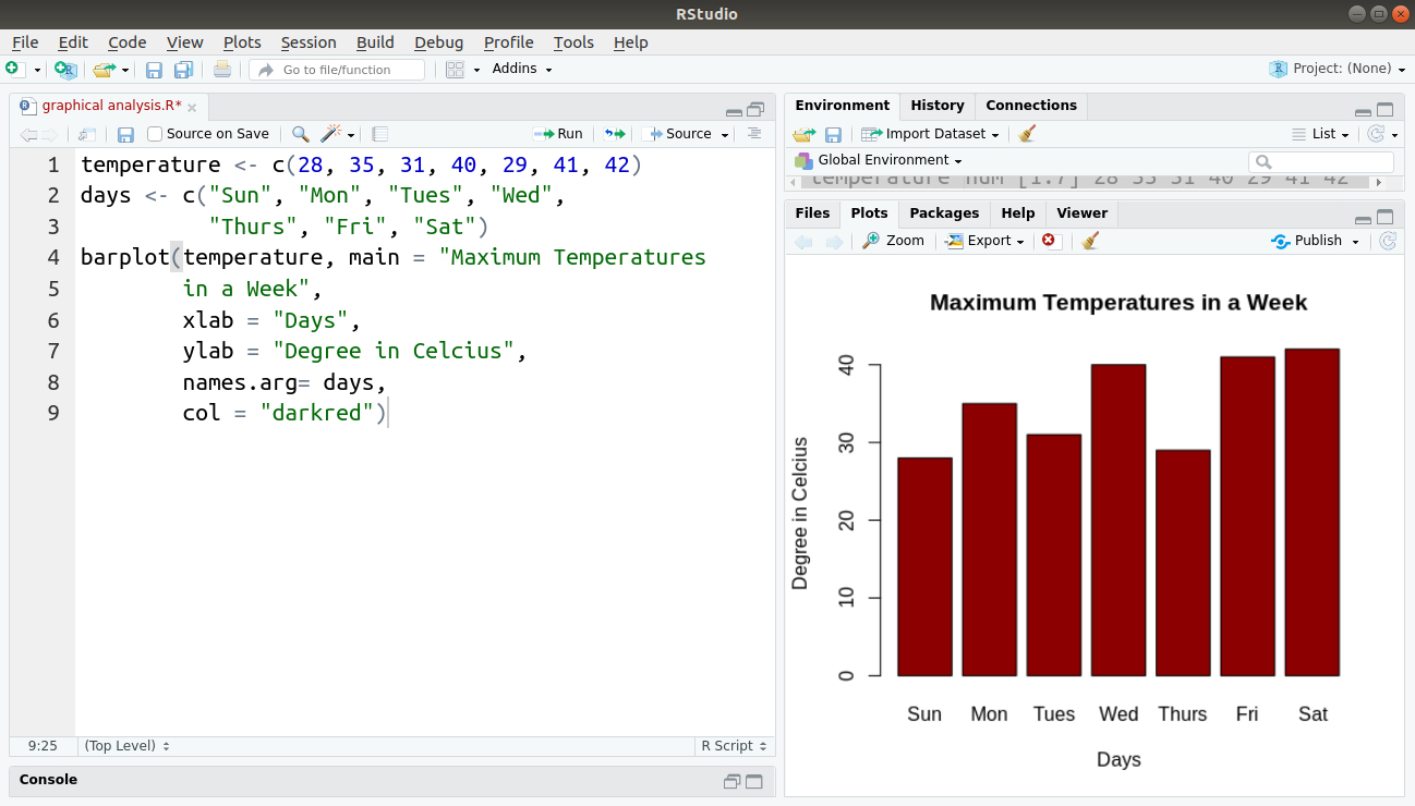
2.4 Barplot
Barplot is an alternative to boxplot to show the heights of the mean values from the different treatments. Function tapply computes the height of the bars. Thus it works out the mean values for each level of the categorical explanatory variable.
Let us create a toy dataset of temperatures in a week. Then, we will plot a barplot that will have labels.
temperature <- c(28, 35, 31, 40, 29, 41, 42)
days <- c("Sun", "Mon", "Tues", "Wed",
          "Thurs", "Fri", "Sat")
barplot(temperature, main = "Maximum Temperatures
        in a Week",
        xlab = "Days",
        ylab = "Degree in Celcius",
        names.arg= days,
        col = "darkred")
Output:
Any doubts in graphical data analysis with R till now? Please comment your queries below.
3. Plots with Multiple Variables
Initial data inspection using plots is even more important when there are many variables, any one of which might have mistakes or omissions. The principal plot functions that represent multiple variables are:
- The Pairs Function – For a matrix of scatterplots of every variable against every other.
- The Coplot Function – For conditioning plots where y is plotted against x for different values of z.
It is better to use more specialized commands when dealing with the rows and columns of data frames.
3.1 The Pairs Function
For two or more continuous explanatory variables, it is valuable to check for subtle dependencies between the explanatory variables. Rows represent the response variables and columns represent the explanatory variables.
Every variable in the data frame is on the y-axis against every other variable on the x-axis using the pairs function plots. The pairs function needs only the name of the whole data frame as its first argument.
Let’s revise the topic of Arguments in R Programming Language
3.2 The Coplot Function
The relationship between the two variables may be obscured by the effects of other processes in multivariate data. When you draw a two-dimensional plot of y against x, then all the effects of other explanatory variables are shown onto the plane of the paper. In the simplest case, we have one response variable and just two explanatory variables.
The coplot panels are ordered from lower left to upper right, associated with the values of the conditioning variable in the upper panel from left to right.
Coplot involves the ‘shingles’ shown in the upper margin which is its biggest disadvantage. The overlap between the shingles shows the extent of overlap between one panel and the next panel with respect to the number of common data points between them.
4. Special Plots in Graphical Data Analysis with R
R has extensive facilities for producing graphs. It also has low and high-level graphics facilities as per the requirement.
The low-level graphics are the basic building blocks that can build up graphs step by step, while a high-level facility provides the variety of pre-assembled graphical display.
Apart from the various kinds of graphical plots discussed, R supports the following special plots:
- Design Plots – Effective sizes in designed experiments can be visualized using design plots. One can plot the design plots using the plot.design function – plot.design(Growth.rate~Water*Detergent*Daphnia)
- Bubble Plots – Useful for illustrating the variation in the third variable across different locations in the x–y.
- Plots with many Identical Values – Sometimes, two or more points with count data fall in exactly the same location in a scatterplot. As a result, the repeated values of y are hidden, one beneath the other.
Adding Other Shapes to a Plot
Using the following functions, we can add the extra graphical objects in plots:
- rect – For plotting rectangles – rect(xleft, ybottom, xright, ytop)
Using the locator function, we can obtain the coordinates of the corners of the rectangle. But the rect function does not accept locator as its argument.
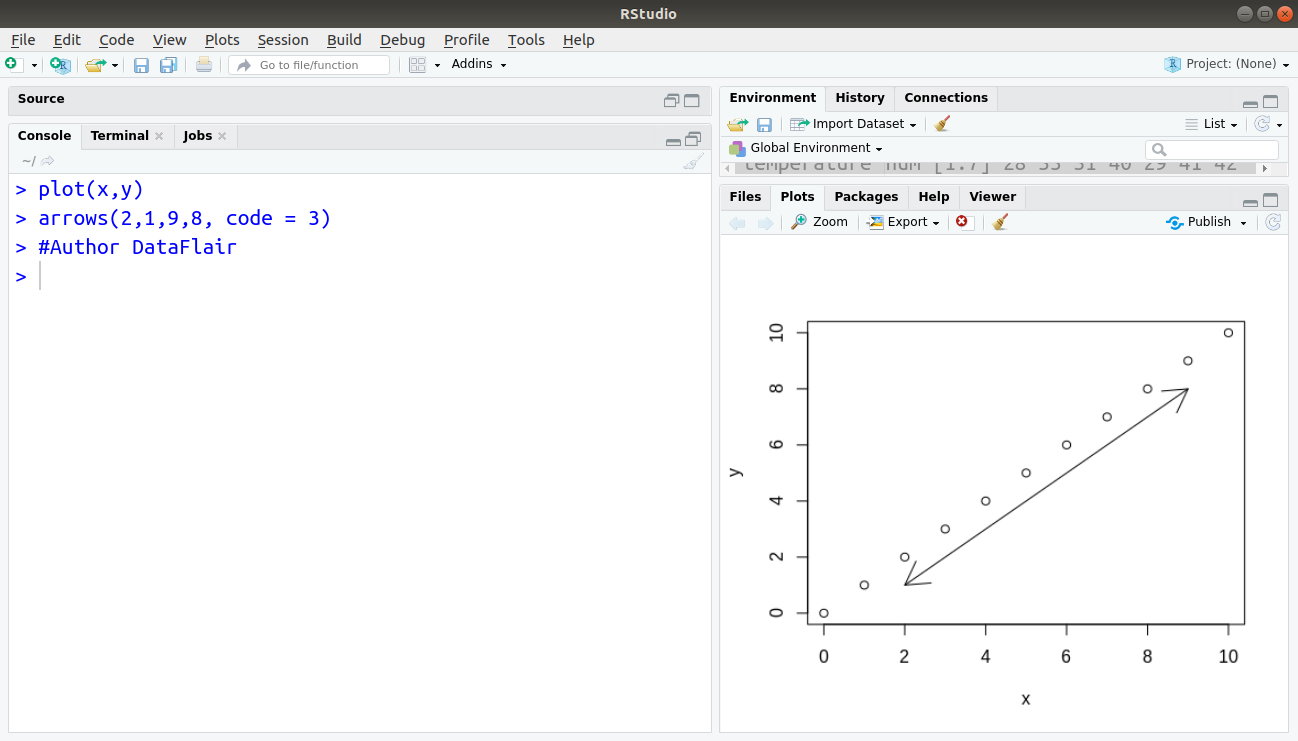
- arrows – For plotting arrows and headed bars – The syntax for the arrows function is to draw a line from the point (xO, yO) to the point (x1, y1) with the arrowhead, by default, at the “second” end (x1, y1).
arrows(xO, yO, xl, yl)
Adding code = 3 produces a horizontal double-headed arrow from (2,1) to (9,8), for example:
plot(x,y)
arrows(2,1,9,8, code = 3)
#Author DataFlair
Output:
Saving Graphics to File in R
You are likely to want to save each of your plots as a PDF or PostScript file for publication-quality graphics. This is done by specifying the ‘device’ before plotting, then turning the device off once finished.
The computer screen is the default device, where we can obtain a rough copy of the graph, using the following command:
data <- read.table (filename, header=T)
attach(data)
There are numerous options for the PDF and postscript functions, but width and height are the ones that you will want to change most often. The sizes are in inches. You can specify any nondefault arguments that you want to change using the functions pdf.options and ps.options before you invoke either PDF or postscript.
Selecting an Appropriate Graph in R
You have learned about different types of graphs. Now, you can easily draw these graphs in R. It is also important to select an appropriate type of graph according to the requirements.
Some common graphs and their uses are as follows:
- Line Graph – It displays over the time period. It generally keeps the track of records for both, long-time period and short-time period according to requirements. In the case of small change, the line graph is more common than the bar graph. In some cases, the line graphs also compare the changes among different groups in the same time period.
- Pie Chart – It displays comparison within a group. For example – You can compare students in a college on the basis of their streams, such as arts, science, and commerce using a pie chart. One can not use a pie chart to show changes over the time period.
- Bar Graph – Similar to a line graph, the bar graph generally compares different groups or tracking changes over a defined period of time. Thus the difference between the two graphs is that the line graph tracks small changes while a bar graph tracks large changes.
- Area Graph – The area graph tracks the changes over the specific time period for one or more groups related to a similar category.
- X-Y Plot – The X-Y plot displays a certain relationship between two variables. In this type of variable, the X-axis measures one variable and Y-axis measures another variable. On the one hand, if the values of both variables increase at the same time, a positive relationship exists between variables. On the other hand, if the value of one variable decreases at the time of the increasing value of another variable, a negative relationship exists between variables. It could be also possible that the two variables don’t have any relationship. In this case, plotting graph has no meaning.
Summary
We discussed the complete concept of graphical data analysis with R Programming. We also understood the creation of various types of plots and saving graphics to file in R and how to select an appropriate graph.
The next article in our R Tutorial DataFlair Series – Top Graphical Models Applications
Still, if you have any query related to Graphical Data Analysis with R, so feel free to share with us. We will be happy to solve them.
You give me 15 seconds I promise you best tutorials
Please share your happy experience on Google


